Is It Wednesday Yet?
12 August 2011 � Here we are again with another installment of your favorite comic book review series. As always, the reviews are free of spoilers, so read on without fear of having your experience ruined!
Our grading scale is simple:
Buy: An excellent comic book.
Borrow: A good comic, but save yourself some money by reading a friend's copy.
Flip Through: Give it a once-over at the comic shop.
Skip: This doesn't need to be explained.
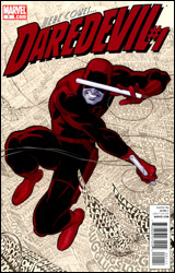 Daredevil #1
Publisher: Marvel
Released: 20 July 2011
Writer: Mark Waid
Artists: Paolo Rivera and Marcos Martin
Inker: Joe Rivera
Colorists: Javier Rodriguez and Muntsa Vicente
Letterer: VC's Joe Caramagna
Cover: Paolo Rivera
Cover price: $3.99
Review: Sean Lemberg
It was bound to happen sooner or later. When the primary facet of a character's personality is the way he handles a series of increasingly gloomy situations, eventually there's going to come a time when the storm has to break. A hero can either resign himself to his fate and curl up in the gutter, or seek to reverse his fortunes with a new outlook on life. And I'll give you one guess which direction Matt Murdock has chosen.
In the wake of Shadowland, where Matt truly dove off the deep end and embraced his dark side, this sudden about-face is like watching a different man beneath familiar skin. Mark Waid handles the change of pace more than adequately, but it's going to be difficult for long-term fans of the series to accept a shift in tone so drastic. Fortunately, Waid's take is brimming with fresh ideas relating to the hero's powers and his place in the Marvel Universe; seeing them in action for the first time is a crisp, refreshing sensation that's tough to turn away from. I'm just not sure if there's a reasonable way to explain away Matt's transition from the demon-possessed master of a murderous ninja sect to a kiss-stealing, tune-whistling, head-in-the-clouds optimist.
Fortunately, Waid hasn't completely abandoned the wealth of storytelling that preceded him. The majority of New York still believes Murdock is Daredevil, an accusation Matt jokingly deflects more than once this month, and the law practice isn't exactly running smoothly following his lengthy sabbatical. There's still plenty of thunder on the horizon, but for the moment it's grinnin' 1970s Murdock at the wheel, not the self-absorbed, violently angry model.
Paolo Rivera's artwork serves as an appropriate compliment to the shift in tone and texture. Following a long line of gritty, darkly realistic pencil pushers, his lighter touch and bright, airy rendition of the city is a breath of fresh air. With the villain Spot to play around with and an original perspective on Matt's oft-documented "radar sense" in his arsenal, Rivera makes his first showing a strong one. His work may not be as moody nor as flashy as his predecessors', but it's no less fitting to the style of storytelling it accompanies and on the two or three occasions his gets to stretch his legs with a splash page, it really hits the mark.
Coming straight from the mouth of a longtime reader, the new Daredevil can be considered a success, but not an unbridled one. The bits of promise that Mark Waid shows in his writing are the first hints of a proposed "new direction" that really feels new, despite the similar promises made by each new writer to take the reigns since Frank Miller himself. It's an enterprising new angle that's sure to alienate some readers, but should ultimately be for the best as far as the character is concerned. Nobody should lose all the time. Not even Matt Murdock. Borrow it.
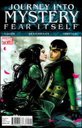 Journey into Mystery #625
Publisher: Marvel
Released: 13 July 2011
Writer: Kieron Gillen
Penciler: Doug Braithwaite
Colorist: Ulises Arreola
Letterer: VC's Clayton Cowles
Cover: Stephanie Hans
Cover price: $2.99
Review: Hannah Krueger
Because of Mephisto's treachery and the Serpent's machinations, Hell and Hel are on the brink of war. Loki must play a game of brinksmanship, manipulating both sides to his advantage while taking out the Serpent's spokesman and learning of his ultimate plans for Earth. But can Loki use his wits to uncover these plans while keeping the two sides at each other's throats?
Journey into Mystery was one of the books I was expecting to care the least about when the Fear Itself tie-ins started rolling out. And then our own Chris Johnson made an avatar in which kid-Loki declared that the humans of the Internet were most uncouth � an actual quote from an earlier issue. After that, there was no going back.
What we have with this book is a young Loki, who is essentially working with a completely blank slate and guided by his former personality, in the form of a raven named Ikol. However, in order to save the nine world from the Serpent, he must rely on nothing but his own inherent mischievousness to negotiate the plans he himself appears to have laid long before this day. That, and trying not to be killed by everyone else he royally pissed off in his former life.
In short, this book is nothing but a nine-year-old, powerless Loki kicking ass and taking names while using his own cleverness to save the world. That sentence alone should be enough for you to go and read this one. Loki looks to play an integral, though possibly behind-the-scenes hand in bringing down the Serpent. And I would love to see that, especially if what Loki is saying about the existing prophecy with Thor and the Serpent being similar to the way adults trick the young into doing something they'd rather not. Or, in his own words: "And lo! It is prophesized that Loki shall eat his vegetables!"
Also, this book is incredibly quotable. This issue's standout quote is as follows: "You know what sound that is? The symphonic perfection of a spine breaking."
Doug Braithwaite's art is done in a watercolorish style that fits the mythical tone of the setting, and is definitely something I can get behind. However, at times, there seems to be odd errors. For instance, Hela is seemingly missing a hand in one panel. Also, there appears to have been an issue with the printing where darker tones didn't get layered on some pages, or it's only dark tones and not lighter, which really detracts from the art. I had two separate copies of this, and both contained the same sort of error but in different places. Hopefully this is something that can be rectified in future collections.
Buy this. While it's not the greatest tie-in that came out this past week (that honor goes to Alpha Flight), it's definitely a great book with some minor art issues that's worth looking into and will hopefully continue on past this event.
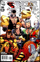 Secret Six #36
Publisher: DC Comics
Released: 03 August 2011
Writer: Gail Simone
Artist: Jim Calafiore
Colorist: John Kalisz
Letterer: Travis Lanham
Cover: Jim Calafiore
Cover price: $2.99
Review: Hannah Krueger
Bane has decided that in order to make the Six a respected team again, they have to get back at Batman, mainly by taking out the various members of the family: Batgirl, Red Robin, Catwoman, and Huntress. However, as is wont to happen with the Six, things go horribly wrong. As the Six face what may be their final hour, they get ready to show the world what they're made of.
Oh, what a difference a year and a half makes. I used to be pretty big on Secret Six, probably right up until Blackest Night, and then I had to drop comics for a while due to a lack of money. I came back to it a year later and found it wasn't nearly as good as I'd remembered. And now, six months after that, I'm quite glad that this will be its final issue.
A lot of my problems are in the characterization of Bane, who the entire arc centers around. Up until now, Gail Simone has been working a redemption angle with him, showing the squishier side of Bane, such as the aftermath of his night with that one not-Scandal girl he took on a date a few issues prior. His descent back into villainy seems quite sudden, but for most of the issue he is huge on the honor part of his character, which is bearable.
That is until the last two pages.
Now, if you care about how Secret Six ends, skip this next paragraph, because there will be spoilers.
The book winds up with the Secret Six surrounded by seemingly everyone in the DC Universe. Bane knows there's no way they're going to get out alive, so he gives everyone vials of Venom so they can go out fighting. The Six die, and Huntress, through an awful monologue, pontificates on how brave the Six are and how the superheroes aren't really the heroes this time. Blah! Blah! Blah! This is awful writing. In the last two pages, Bane too takes up an internal monologue about how he could not be Bane so long as he was attached to the Six. He bids farewell to Scandal, then breaks free, very much alive and aiming to bring Gotham to its knees. Admittedly, I know very little about Bane outside of Secret Six, but this strikes me as horribly out of character. On top of this, it cheapens the impact of the Six fighting to their deaths when it's revealed that Bane planned to have them killed all along. And on top of this, Simone appears to be throwing things at the wall to see what sticks. King Shark shows up again, and part of his big shtick is to eat a loan shark alive. What? Knockout is back from Hell, and Scandal brings her to meet the stripper she's been dating. Said stripper, who looks like Knockout, is in the hospital after almost having her eyes eaten out. Scandal decides to remedy this lesbian love triangle by marrying both of them. Yay... I guess.
The art is absolutely abysmal. There are times when faces look like blobs with lines for eyes and a mass where lips should be, and action scenes are just as poorly rendered. However, the figure drawings are acceptable when Jim Calafiore isn't asked to draw closeups. Honestly, Calafiore taking over as artist was one of the nails in the coffin of Secret Six.
To give this a flip through is to be extremely kind. That assumes you want to see how this series ends, and have managed to stick with it until now � in which case you have my sympathies. Had you asked me two years ago, I would've never wanted to see this end. Now, I'm all too glad, even if the way it did so is kind of awful. Good night, Secret Six, you overstayed your welcome.
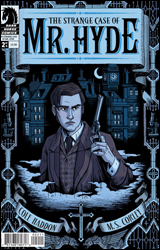 The Strange Case of Mr. Hyde #2
Publisher: Dark Horse
Released: 25 May 2011
Writer: Cole Haddon
Artist: MS Corley
Colorist: Jim Campbell
Letterer: Richard Starkings & Comicraft
Cover: MS Corley
Cover price: $3.50
Review: Tom Hemmings
Having never read the original novel, I'm not best-positioned to explain the relationship between this and the source material. Jekyll and Hyde is an idea that has been explored widely in comics and science fiction. Versions have included the Marvel supervillain, Alan Moore's League of Extraordinary Gentlemen, and Steven Moffat's BBC series, not to mention the less than subtle cover-versions of this notable tale; The Incredible Hulk was hardly the first work of fiction to depict rather consequential mood swings.
This is an exploration of the story beyond the original book, a sequel of sorts. Setting aside individual quality of this issue, I do hope that this is amongst many efforts by Dark Horse in this area. A while ago Marvel started strict adaptations of Jane Austin and others into short series, but whilst those sorts of titles are largely at odds with Marvel's general output, The Strange Case of Mr. Hyde seems entirely in keeping with the style of much of Dark Horse's output. Hellboy and BPRD, in particular, exhibit great affection for the literary side of gothic horror, and the choice of art and shading in this title clearly nods towards the Mignola titles. Other classics such as Frankenstein and Dracula would be very interesting to explore further with the right creative team.
However, creating an original comic based on a classic is far from easy. Modern comics are a very different medium to classic fiction. This book feels like a lot occurs over its 22 pages of story, and this is because it apes a dense story structure characteristic to the period. To judge the individual issue seems harsh because works like this are difficult to structure. I would commend Haddon, as this does feel quite authentic to the style of the era, but it also feels truncated; it feels like an adaptation of a novel rather than an original work in itself.
The art is curiously interesting. There are moments of genuine excellence. In one panel I was slightly transfixed by the mechanical yet fascinating contrast between a hand and the prison door it is protruding from. The use of shadow and contrast is exactly what you'd expect from a Dark Horse book in this genre. However, I have a major bone to pick with the depiction of the main characters. Inspector Thomas Adye and Jekyll / Hyde both look extraordinarily like David Tennant as The Doctor, with Jekyll / Hyde having a slight dash of Edward from Twilight. This is distracting in itself, but it also means that neither look especially period-appropriate. This might be because many of the faces have a slightly generic quality; as a whole the complexity of the use of shade and backgrounds is let down by overly simplistic faces. Then again the emotions of the characters are always clear, so the artist is performing the job as required. It just seems as though a classic sci-fi story should have a less cartoonish look at times.
I would wait for the trade if I were to get this. Flip through it by all means, but somehow it doesn't feel like the sort of thing you should be getting in instalments. It has, however, given me the bug to read the original. In many ways, I guess, that's evidence that it's achieved its goal. Once I have done that I may return to this.
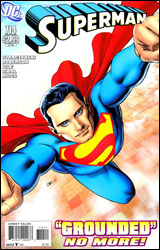 Superman #714
Publisher: DC Comics
Released: 03 August 2011
Writers: J. Michael Straczynski and Chris Roberson
Penciler: Jamal Igle
Inkers: Jon Sibal and Robin Riggs
Colorist: Marcelo Maiolo
Letterer: John J. Hill
Cover: John Cassaday
Cover price: $2.99
Review: Sean Lemberg
With their days numbered thanks to the company-wide relaunch that arrives later this month, one could easily come to the conclusion that the air's been let out of many of DC's upper-tier books. And I'd love to tell you differently � that the creative teams in question are using the impending shake-up as motivation to tell the stories they've always wanted to tell, not a death sentence looming directly overhead � but this month's issue of Superman serves as no such proof.
J. Michael Straczynski's plot feels like a limp-wristed placeholder without any purpose beyond keeping the racks supplied with a fresh cover. It's as run-of-the-mill as they come, almost insulting in its reluctance to move forward with any sense of purpose or revelation. Worse, it retrofits recent storylines to fit a cheap, cop-out of a payoff with neither rhyme nor reason.
This month's issue has Superman at his preachy worst, bleeding heart in one hand and random Kryptonian plot device in the other. It's one retreaded flashback after another, serving no significant purpose beyond reminding the readers once again of where the character has been and giving Supes a reason to don a goofy, ill-timed grin in the middle of a brawl. It's a series of narrative thought balloons spoken aloud to no one in particular. It's every bad stereotype I've come to associate with the character, but always hoped could be disproven. It's a waste of time, and I can't just relegate that criticism to the storytelling.
Jamal Igle makes for a spectacular background artist, but his foreground work could do with a major overhaul. Under Igle's watch, Superman himself moves clumsily, wears a series of over-rendered facial expressions, and looks like a genuinely dated character out-of-place with modern society. Accompanied by Marcelo Maiolo's harsh, drastic color choices, though, his efforts seem even worse. Amidst an excess of contrast and a reckless amount of detail, this month's visuals are difficult to decipher at best and downright ugly at worst. It's the tag team from Hell, and they're double-teaming your eyeballs behind the referee's back.
Naturally, a bad plot, terrible script, overwrought pencils, and overbearing colors don't often come together to produce a worthwhile finished product, and in that regard Superman #714 performs no miracles. It's a burden of an issue, traumatic to the bitter end, and something I wouldn't loan to my worst enemies for fear of how far they'd have to reach to seek true retribution. An abysmal failure of a comic book, it proves that in some instances the great DC renumbering is something of a mercy killing. Skip it.


