Is It Wednesday Yet?
24 August 2010 — Here we are again with another installment of your favorite comic book review series. As always, the reviews are free of spoilers, so read on without fear of having your experience ruined!
Our grading scale is simple:
Buy: An excellent comic book.
Borrow: A good comic, but save yourself some money by reading a friend's copy.
Flip Through: Give it a once-over at the comic shop.
Skip: This doesn't need to be explained.
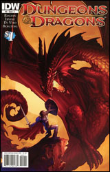 Dungeons & Dragons #0
Publisher: IDW
Released: 11 August 2010
Writers: John Rogers and Alex Irvine
Artists: Andrea DiVito and Peter Bergting
Colorists: Andrew Dalhouse and Ronda Pattison
Letterer: Chris Mowry
Cover: Paul Renaud
Cover price: $1.00
Review: Tom Hemmings
A Dungeons & Dragons comic you say? In the fine tradition of comic book tie-ins? My enthusiasm o'erfloweth! Okay, I'm not really the target audience for this book, so rather than waste your time with my uneducated commentary, I thought I'd bring in a pro-D&D enthusiast and highly experienced player: Dungeon Master Jon. Jon is actually the DM of my own group as well as others, and has a significant working knowledge of the rules, background, lore, and minutiae of the whole hobby. Given that this is a D&D comic, he must be the target audience they're after, right? So, Jon, first impressions?
Thanks for having me, or rather accosting me whilst I was carrying an infant and woozy from lack of sleep. My first impression of this comic was actually created well before reading it when I heard it was based in the generic setting. There is a fine tradition of good fantasy fiction being based in D&D campaign settings, specifically Dragonlance and Forgotten Realms. However, whilst they had worlds to call their own and define as required for the story, generic is just that: a default setting that has no real history or character. In gameplay terms, it's there to allow a DM to create his own story without being constrained by a pre-written back story.
So a D&D comic in this setting literally has generic written into it then.
Exactly. Having said that, it definitely is possible to tell interesting stories here, but in order to do so you have to define the world, which slightly undermines the purpose of the generic setting in the first place. You also need decent characters in order to do this. This team feels like pre-made characters you'd find in the rulebooks. Every one is a typical race / class combination (e.g. elf / ranger, halfling / rogue, etc.) to the detriment of the party formation itself. It would have made much more sense to make the dwarf a cleric and the Teifling a wizard, which would provide the same aesthetics for the story but be more true to an effective party. The plot developments feel unrealistic as well, since this party is encountering foes and going places that should have been built up to instead of just thrown into the first issue.
Any opinions on the art?
It's serviceable but the Gnolls look horrible, like Doctor Who furries rather than actual bestial creatures. Real Gnolls should be part-demon, part-hyena; they don't have any human in them. The rules article illustrated by Stephan Crowe shows a much less humanoid creature.
There are actually two previews of forthcoming titles here, the other being for the Dark Sun Campaign Setting. (No they didn't bother to remove the words "campaign setting" from the logo.) What did you think of the second story?
I thought it was all the more disappointing for the potential it could have had. Dark Sun is an interesting setting that skews a lot of fantasy tropes, with halflings cast as cannibals and Elves becoming fierce desert pirates. It literally removes swords and sorcery by making both magic and metal incredibly rare. The new Dark Sun rulebook is about to be released, hence this title, but this doesn't really show off how different Dark Sun feels to other fantasy worlds. The plot is nothing more than a setup; it doesn't feel worth the preview to be honest. It could still be a good comic, but it's not really showing us anything. Same with the art; it's perfectly fine and could work in a wider context, but it's too early to say.
So would you say that this preview would really appeal to the average D&D gamer? Would you consider picking up either of these titles?
No. The average gamer is going to be telling better stories in their own games than we've seen in these previews. They don't really show the more fun aspects of the hobby, they just highlight the more embarrassing nerdy areas. Plus, watching someone play the game as opposed to participating is rarely fun at all.
So that's a skip then?
I might flick through the Dark Sun one, but that's not based on this preview. Skip it.
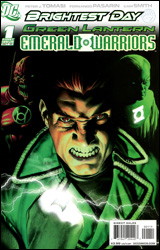 Green Lantern: Emerald Warriors #1
Publisher: DC Comics
Released: 11 August 2010
Writer: Peter J. Tomasi
Penciler: Fernando Pasarin
Inker: Cam Smith
Colorist: Randy Mayor
Letterer: Steve Wands
Cover: Rodolfo Migliari
Cover price: $3.99
Review: Preston Nelson
I fucking love Guy Gardner. Like, this cannot possibly be understated. I despise Hal Jordan, John Stewart bores me to tears, and I'm pretty fond of Kyle Rayner. But I love Guy Gardner. At his best, he's a badass with a heart of gold. At his worst, he's boorish but still lovable. When Pete Tomasi writes Gardner, he's at his best. The issue starts with Gardner in his apartment on Oa, having a slow character moment, but as with all things Guy he's shortly off to the races, chasing down a heist. The chase scene is absolutely awesome. Pasarin is totally at home drawing the cosmic insanity that a Guy Gardner book requires, and he gets Guy.
Often, GL constructs are kind of boring: boxing gloves, hammers, spiked maces, etc. Whenever I've seen Tomasi write the Corpsmen, this has never been the case. In his recent run on Green Lantern Corps, Tomasi pushed the envelope with what the Lanterns did, fitting things to the personality of each Lantern perfectly, culminating in the awesomeness that was Guy Gardner dual-wielding green and red rings with badass hooks and chains. Tomasi continues the use of awesome constructs here; we see Guy make video cameras, a motorcycle, baseball gear, and I'm sure I'm missing something else.
The issue is almost entirely setup for what's to come, but it works. We see the Guardians, Atrocitus, Ganthet, and a character that most had left for dead. The book goes a lot of places, but never loses the focus on Guy Gardner's plot thread.
I need to raise a couple of complaints, sadly. While the mystery is intriguing, we get very little pay off. I know that this is a first issue, but intrigue can only take you so far. We're reminded of the tiny things we already knew, like the Red Lantern taint within Guy, but we're given nothing new. The other complaint I have with the book is simple: the solicitations promised me Kilowog. There was no Kilowog to be had, however. And, as someone who loves Kilowog dearly, this was something of a letdown.
But honestly, this book is spectacular. The story is a rapidly developing mystery, written by one of the best guys working today. The art is gorgeous, dynamic, and has great panel to panel storytelling. Do yourself a favor, buy it.
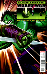 Incredible Hulk #611
Publisher: Marvel
Released: 11 August 2010
Writer: Greg Pak
Penciler: Paul Pelletier
Inker: Danny Miki
Colorist: Frank D'Armata
Letterer: Simon Bowland
Cover: John Romita, Jr.
Cover price: $3.99
Review: Sean Lemberg
It's been years since the original green-skinned, purple-pantsed, Banner-bayed Incredible Hulk was free. Yet even before his sabbatical, Hulk's unavoidable face-off with the son he'd abandoned on an alien world had been simmering on the backburner, growing more pent-up and furious by the minute. If the one true King Hulk is now finally back, ready to claim his throne, Skaar wants to be the first in line to offer a proper greeting. Though this issue technically acts as the conclusion to the recent "World War Hulks" storyline, in reality it's just as much the final act of the three-year-old "World War Hulk" crossover that gave Skaar a mission, sent the Hulk off on his greatest rampage, and started the ball rolling on everything that's been going on in this family of comics ever since.
Adept at putting off the inevitable – and nearly breaking his readers' wills along the way – regular Incredible Hulk scribe Greg Pak proves equally proficient at finally delivering that long-awaited grand payoff in this month's edition. It's actually surprising how little time Pak wastes on setup considering his concentration on that in the past, but the shift is neither unwelcome nor inappropriate. Skaar and the Hulk spend just a single page on the requisite standoff before the first strike is thrown, and from that point it's a melee, nearly all the time. On the few instances the two combatants take a moment to blink, Pak smoothly works in fitting flashbacks to several of Hulk and Banner's most emotional moments. Brief glimpses into his life with Caiera refresh the present story, then flashbacks to childhood violence at the hands of his own father reinforce the parallels between his tale and that of his offspring. It's an obvious line to draw, and a part of Banner's upbringing that comes up more often than not in such major moments, but that doesn't make it any less powerful here, especially when the battle draws to a close in the final pages.
Naturally, any issue that relies so heavily on a major league slugfest is going to depend heavily on the work of its artist, and Incredible Hulk #611 is fortunate to have Paul Pelletier on board in that department. Pelletier crams the issue to the breaking point with brutality harsh details and brash, wanton violence. Through careful framing and an occasional break from the action, Pelletier takes situations that sound completely idiotic in theory (i.e. sailing through the stratosphere after an uppercut, Skaar actually catches fire from re-entry before taking a spinebuster into the ocean) and delivers them in a way that one can't help but appreciate the excess of the moment. He's singularly responsible for most of the issue's successful moments, ultimately making a name for himself under a big spotlight.
Your appreciation of this issue will likely depend on your feelings about the Hulk family to begin with. Longtime followers and fans of the series will be enthralled by this installment, a climax they've waited half a decade to experience. Less-enraptured readers, though, might find Pak's cutaways a bit clunky and redundant, with Pelletier's artwork affected negatively by its stiff coloring. Neither side can deny that the action is loaded up and entertaining, and as a result the story just breezes right by. As someone in between those two camps, I enjoyed it in spite of a few weaknesses. Borrow it and make the final call for yourself.
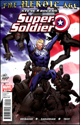 Steve Rogers: Super-Soldier #2
Publisher: Marvel
Released: 11 August 2010
Writer: Ed Brubaker
Artist: Dale Eaglesham
Colorist: Andy Troy
Letterer: VC's Joe Caramagna
Cover: Carlos Pacheco
Cover price: $3.99
Review: Sean Lemberg
Since literally his very first moments among the elite, Steve Rogers has been on a quest to discover and conceal the secrets of his origin. Though Nazis may have gunned down the scientist behind his Super-Soldier serum 60 years ago, the hunt for its successor still rages today. While it may not have always been at the forefront of his actions, that ongoing desire to find and protect the very compound that created him has always been at the core of Steve's character. Now freed of his responsibilities as Captain America, Rogers is hot on that trail once again, and not a moment too soon, in Steve Rogers: Super-Soldier.
It doesn't take long for Ed Brubaker to prove he's barely scratched the surface with this character. At its root, this is just a book about Steve's continuing quest for the next iteration of the serum, but under the covers there's so much more. Habitually, the author has skinned this tale under layers upon layers of secrets, swerves, and suspicions, but he's kept the actual storytelling amazingly streamlined and restrained. That results in an issue that's extremely simple to browse, but unmistakably difficult to predict.
Brubaker's take on Rogers is a classic, too: one part action hero, one part super sleuth, one part international spy, one hundred percent business. It's difficult for some authors to manage one of the above, let alone all four, but Bru boils each down to its basest flavor, then mixes the whole lot together so precisely it resembles something entirely different. His rendition of Steve Rogers is the rendition of Steve Rogers, at least in the modern setting, and it's tough to imagine a tighter pairing between writer and character.
Dale Eaglesham's artwork is a different look than I'm used to seeing alongside Brubaker's writing, but it's a welcome change of pace. Where the writer's previous collaborators on Captain America and Daredevil have employed a gritty, harsh, noir quality, Eaglesham delivers a bright, lively, energetic mood that's grounded in reality but still fantastic to behold. Like John Cassaday and Bryan Hitch, his work has a certain trustworthy believability, but Eaglesham leans less to strict detail, employing slightly more artistic liberty and subtle, effective exaggeration than his more celebrated peers. He grants Super-Soldier #2 a distinct, memorable personality right from the first panel, and while his contributions aren't without a few moments of weakness (in particular the wild fluctuations in the size of Steve's hands), for the most part this is a very solid showing.
Super-Soldier is a fine example of a classic story set against a modern backdrop. It has all the elements of a modern masterpiece: great artwork, simple but imaginative storytelling, a wild cliffhanger of a last page, and an important central figure with deep ties to the entire Marvel Universe. It's a pity this miniseries is only scheduled for two more issues, but that might just be a blessing in disguise. Nothing this good can possibly last forever. Buy it.
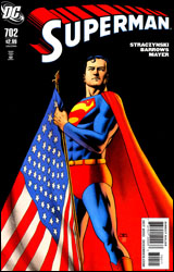 Superman #702
Publisher: DC Comics
Released: 11 August 2010
Writer: J. Michael Straczynski
Penciler: Eddy Barrows
Inker: JP Mayer
Colorist: Rod Reis
Letterer: John J. Hill
Cover: John Cassaday
Cover price: $2.99
Review: Michael David Sims
We've all read Superdickery.com, with its crazy Silver Age covers, all portraying Superman as a cock. It would seem J. Michael Straczynski reads the site too and thinks that's how Superman is supposed to be portrayed, because there's no other way to explain why a writer of his caliber would ever write Superman this poorly.
For the uninformed, Superman spent some time in space with other Kryptonians, and now he's walking across America because he wants to reconnect with humans. In this issue, he finds himself in Detroit where he uncovers a small group of peaceful aliens disguised as humans.
Upon meeting them, though, a fight breaks out. To the attacker Superman says, "The hard part isn't hurting me. The hard part is surviving me." That's a line Wolverine would deliver, not the Man of Steel. So why, exactly, is Superman saying such words?
The mischaracterization doesn't stop there, however. In fact, it gets worse. Much, much worse.
After the fight, Superman threatens to kick the aliens off Earth because, "You can't just come here from an alien world." When one of the aliens calls him on his bullshit (RE: "You did."), Superman reminds them that it wasn't his choice to leave Krypton. Never mind the fact that these guys just said they fled their home because it became an oppressive dictatorship; they left because they feared government-sanctioned death.
Here's a history lesson for you. It's free, so listen up. If one examines Superman's roots, it's quite clear that he was created as an allegory for the Eastern European Jews who fled to America because of Adolf Hitler. So having Superman basically tell these refugee aliens to deal with it is complete bullshit that disrespects his Jewish creators and the historical significance of the character. (End lesson.)
Oh, but the aliens can stay... if Superman lets them. He hasn't decided yet.
Superman then has a pointless conversation with an old man, a conversation that's only there to illustrate what a shambles Detroit has become, and to move the story to the next scene. It adds nothing in the way of characterization or depth to Superman or the elderly fellow.
Moments later, when the guy falls over from an unnamed illness, Superman takes his body back to the aliens and says, "Help him... You can't just let him die. I won't let you, even if I have to expose your presence here to do it." That's right, dear reader: if you don't do exactly what Superman says, when he says it, he will air your dirty laundry to the world. In this case, to the universe, because these aliens would be forced back into space and potentially found by the conquering leaders who want them dead.
Eventually the aliens bow to Superman by helping the old man, which leads to the aliens instantly opening a medical research company, which firms up Superman's mind about letting them stay on Earth, and which revitalizes Detroit. Superman: Saving cities and lives through douchebaggery!
If J. Michael Straczynski wants to soapbox against illegal immigration (which seems to be his intention here), fine. But doing so in a Superman comic book, in which Superman is the one against said immigration, is beyond wrong. Superman is the definition of an integrated yet illegal immigrant, and he cannot lord over other integrated yet illegal aliens; he should embrace them lovingly, not threaten them with exposure and certain death.
Babychest doesn't even begin to describe how bad Superman #702 is. This is insulting. Not because it's a bad comic — I can get past that — but because it actually disrespects the character and spits in the face of Superman's creators.
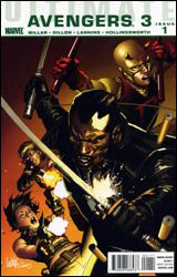 Ultimate Avengers 3 #1
Publisher: Marvel
Released: 11 August 2010
Writer: Mark Millar
Penciler: Steve Dillon
Inker: Andy Lanning
Colorist: Matt Hollingsworth
Letterer: VC's Cory Petit
Cover: Leinil Yu
Cover price: $3.99
Review: Preston Nelson
More than any other writer working today, Mark Millar runs so hot and cold for me. This is the genius who wrote Superman: Red Son. But he's also the bastard that wrote Wanted. I love his run on The Authority, and I want to beat him senseless with a hunk of rebar for creating Nemesis. That said, Millar has done some great things with Marvel's Ultimate Universe. And here with the Ultimate Avengers, he's neither hot nor cold — he's just here.
Millar tends to work with iconic artists, and this book in no exception. Millar is paired with the man that defined the Punisher for a decade: Steve Dillon. Dillon is an iconic artist in that you can look at basically any page that he's done and automatically know that it's a Dillon piece. It's neither a good thing nor a bad thing; it's merely a fact. The team of Millar and Dillon brings a sort of prestige back to the Ultimate line that Jeph Loeb nearly destroyed.
This rebuilt Ultimate Marvel is still slowly coming together, and in its way, that's a really intriguing thing. We actually don't see the Avengers until the end of the issue; most of it is spent building up two new characters for the Ultimate Universe. The first is the vampire-hunter, Blade. And this may still be echoes of Black Dynamite ringing in my head, but Blade is being played very different than I've seen him in the main continuity. This Blade seems to be less Wesley Snipes and more John Shaft, which works for me. I could get into the reasons that using a stereotypical character like that is sort of racist, but honestly, I just don't care, because it's pretty awesome.
The second new character is the all new Daredevil. Because Matt Murdock was killed in Ultimatum, we find his teacher, Stick, standing over a much younger boy who suffered the same kind of accident. And as these things go, I can accept it. Do I like that they're being forced to shoehorn in a new kid to take the reigns? No. But it's better than the alternative of raising Murdock from the dead.
All that said, I have a message to the media, but Marvel mostly, at the moment: Enough with the fucking vampires already. Yes, Twilight is making piles of fucking money. But here's a spoiler for you: the target audience of Twilight could give a fuck about comics. You have the X-Men fighting vampires in the main continuity, and you have a vampire clone of The Hulk running around fighting the Avengers here. I like my vampires like I like my space Westerns: directed by Joss Whedon.
All that said, the narrative is a little jumpy, the characters are mostly unlikeable (new Daredevil and Stick feel like leftovers from Kick-Ass), and the concept is tired. But, aside from that, I did actually like this book, a bit. It certainly merits a borrow.
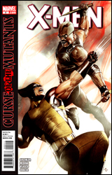 X-Men #2
Publisher: Marvel
Released: 11 August 2010
Writer: Victor Gischler
Penciler: Paco Medina
Inker: Juan Vlasco
Colorist: Marte Gracia
Letterer: VC's Joe Caramagna
Cover: Adi Granov
Cover price: $3.99
Review: Tom Hemmings
X-Men v vampires! No, it's not cheap fanfic; it's Marvel's relaunched X-Men title, and the first foes our heroes are set to take on post-Dark Reign are the unholy dark lords of the night.
The relaunch of the vampires into mainstream Marvel actually started in the excellent but unfortunately short-lived Captain Britain and MI13, complete with Dracula operating out of his castle on the moon and attempting to conquer nations with grand schemes. This is something of a different animal, splitting the vampires into the more modern idea of different breeds, some far more monstrous than others (probably in order to give Colossus and Wolverine something worth fighting). The whole mood switches back towards something more modern horror-orientated. What is consistent is that where the vampires go, the Daywalker follows. Blade (not a spoiler, he's on the cover) is naturally going to be a part of all this, and not just to help represent the more diverse world of mutants that Marvel has stated this book is meant to explore. It's really cool to see him here. Blade was a standout wild card in MI13, and you know that with him involved there's going to be serious disruption of the team dynamic as this story progresses.
My issue with this book is that whilst it deals effectively with the use of several vampire tropes, I don't really feel as though there is some great threat here — at least not to our heroes. I suppose that the X-Men are just coming down from a few years of nail-biting, edge-of-extinction action so it's nice to tone it back for a bit. Plus given the camp value of vampires it really is tough to make them scary anymore without resorting to wholesale and unnecessary slaughter of name characters — which isn't something I'm in favor of in a mainstream Marvel book. Whilst this issue might not have caught my attention in itself, it did cause me to go back and check out the first part (and the recent bridging one-shot): Death of Dracula. My interest is more focused on the mainstream revival of vampires in Marvel as opposed to caring about the ongoing fortunes of the X-Men, but I still praise the story for piquing my interest to some extent.
I suppose the problem with vampires being a horror icon but Marvel using them as mainstream villains is that they have trouble being both. It's hard to launch what it supposed to be a big new book and immediately make it horror orientated, so the vamps just wind up being a bit neutered.
On the art, this is mostly well-defined modern superhero stuff, but for this story I can't help but think they should have gone grimier. The horror aspect that the story and setting imply is nullified to some extent by the very superhero-orientated look. It really takes away a lot of the already-lessened threat of the villains, as they become mere monsters rather than something with any real substance. Oh, and for some reason — despite good detail, body proportions, use of shade, and panel arrangement — Paco Medina still seems to have a problem drawing symmetrical faces, especially on women. Jubilee looks downright bizarre at one point, and Storm isn't much better.
This isn't exactly the home run you'd hope for on a new X-Men title, but Joss Whedon might have set the bar unreasonably high on that one anyway. Flip through it. It's pretty decent but lacks the edge I was hoping for in order to make it truly interesting in itself.


