Is It Wednesday Yet?
03 August 2010 � Here we are again with another installment of your favorite comic book review series. As always, the reviews are free of spoilers, so read on without fear of having your experience ruined!
Our grading scale is simple:
Buy: An excellent comic book.
Borrow: A good comic, but save yourself some money by reading a friend's copy.
Flip Through: Give it a once-over at the comic shop.
Skip: This doesn't need to be explained.
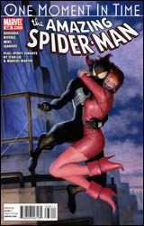 Amazing Spider-Man #638
Publisher: Marvel
Released: 21 July 2010
Writers: Joe Quesada, Jim Shooter, and David Michelinie
Artists: Paolo Rivera, Joe Quesada, Danny Miki, Paul Ryan, and Vince Colletta
Colorists: Richard Isanove and Bob Sharen
Letterers: VC's Joe Caramagna and Rick Parker
Cover: Paolo Rivera
Cover price: $3.99
Review: Sean Lemberg
Well, I'm sure you've seen the promotions for this one. Finally, after years of dragging their feet and avoiding the answers, Marvel is ready to come to terms with what actually happened on Peter and Mary Jane's wedding day. Well, perhaps the word "actually" isn't entirely appropriate in this instance. We know what "actually" happened the first time around, but ever since "One More Day" rewrote history, it's become obvious that the couple's big day was the specific moment when Spider-Man's original timeline and the one he currently occupies made their big split. If we've learned anything from this lingering fart of a storyline, it's that no historical event is too big to be tampered with, so perhaps using a word with such finality isn't entirely appropriate. After all, who knows how long it'll be before these new revelations are being tweaked and reworked themselves.
Written by the EIC himself, Joe Quesada (who also provides a few pages of artwork), "One Moment in Time" aims to answer all the questions Spidey fans were supposed to ask themselves after that poorly received storyline hit shelves in 2007. That's a problem, not just because most of the audience has been anxious to leave the controversial tale behind them, but also because Quesada himself is anything but a quality writer.
Beyond my obvious reservations about any story that tinkers around with the past, the timing, pace, and general structure of this issue hit me like a succession of flat notes. The focus leaps unannounced from present to past to revisionist history and back again, slipping pages from Amazing Spider-Man Annual #21 in between awkward breaks in Peter and MJ's strangely emotionless conversation in the present. In the midst of those flashbacks, certain pages of the original story are omitted and a series of new panels exploring a lame side storyline are crammed in. The idea was to match the look and feel of the original, but it fails in both respects. Jim Shooter and David Michelinie's original pages, despite their age, feature both a more personable set of characters and a more poignant, introspective narration. The new variations Quesada and company try to slide in are ham-fisted imposters; rather than enhancing the new revelations with a sense of authenticity, the inclusion of these old panels only serves to spotlight how far from the book's core the new direction is carrying us.
The issue's artwork is all over the place, from Paolo Rivera's unsuccessful Paul Ryan impression to Quesada's thick, over-dynamic compositions. Rivera's work is probably the best of the lot, making the most of a tough assignment with a limited but effective approach. His actual pencils aren't far off from the dated style he's asked to mimic, but the work is betrayed by an extremely muted, flavorless coloring effort that leads it to stick out where it's meant to be fading in. Paul Ryan's efforts, a product of a time when colors were blunt and artwork more literal, stands the test of time fairly well. His style may not be the modern flavor, but it's clear even in retrospect that he was trying out new ideas in storytelling and composition at the time of the story's original publication. Quesada's artwork, usually the centerpiece of his involvement in a series, is totally out of place here � a true rotten egg. Inactivity has spoiled his consistency, and too much willingness to push the visual envelope results in artwork that constantly thinks it should be doing more than is ever really necessary.
From cover to cover, the first chapter of "One Moment in Time" is a great disappointment, soiling a strong story from the publisher's vaults in the hunt for another big event. It's very much the spiritual successor to "One More Day," and I don't mean that as any kind of a positive. The issue is ill-conceived, confusing, and convoluted; the ramifications are painful and plentiful; and the message is clear and simple: Marvel isn't above sullying their own history for the sake of a few extra sales. It's an awful story that sets a terrible precedent for the future direction of this series. Skip it.
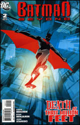 Batman Beyond #2
Publisher: DC Comics
Released: 21 July 2010
Writer: Adam Beechen
Penciler: Ryan Benjamin
Inker: John Stanisci
Colorist: David Baron
Letterer: Travis Lanham
Cover: Dustin Nguyen
Cover price: $2.99
Review: Hannah Krueger
There's a new villain in Neo-Gotham, and he's going after Batman's still-surviving enemies. (Seriously, how did some of these guys manage to live this long?) The identity that he's chosen to assume? Hush. Terry has to get to the bottom of things, and soon, 'cause the killings are being ramped up. But, what's this? A Catwoman to Terry's Batman? The plot thickens!
I'm not sure what to think of this. The issue is pretty much setting up what's to come. And while it does that fairly decently, it's still disjointed in terms of writing. The introduction of Catwoman feels like something from an entirely separate book, and an attempt to pad pages. And once it happens, it's tossed aside to go back to the main plot like a kid with ADHD going onto the next shiny bit.
And this new Catwoman brings up another major part of this book, and one I find questionable in some cases: the big "Where are they now?" emphasis of the plot, or bringing in future versions of the old rogues gallery. I didn't get to watch much of the Batman Beyond cartoon when it aired, but it seemed pretty well set on establishing Terry with his own foes, only occasionally introducing Bruce's enemies. Here, it's all about Bruce's rogues: aged or updated. To be honest, I don't much care about where Calendar Man is now. Give me more of Terry becoming his own Batman, not just facing Bruce's past.
Then there's the question of Hush. Readers who don't know who he is will appreciate the recap, but I have a feeling that it could be a bit misleading. If it does turn out to be the original, then I'm quite interested to see exactly what Hush did to himself to survive this long. But there are clues here, specifically in how Hush goes after his victims, and what he says to Terry about deserving the mantle. These hints mean it could be someone entirely different, but still close to Bruce. If for nothing else, I'm interested to see where this goes.
I really hope that I can avoid any future issues where Ryan Benjamin is the artist, because, I'm sorry, this is absolutely awful. At times Bruce looks completely sunken, especially around the mouth (like he suddenly doesn't have a skull), or he's all angles in the wrong places (making him look like a Picasso). Said angles also apply to Terry's poses, which are painfully contorted. The colorist attempts to redeem the art, but there's only so much he can salvage.
Flip through this at the comics store; if you really like Batman Beyond, are intrigued by the ideas presented here, can stand the art, and don't mind a story that weaves all over the place, then this is for you.
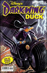 Darkwing Duck #2
Publisher: Boom! Studios / Boom! Kids
Released: 21 July 2010
Writer: Ian Brill
Artist: James Silvani
Colorist: Andrew Dalhouse
Letterer: Deron Bennett
Cover: Magic Eye Studios
Cover price: $3.99
Review: Preston Nelson
On the cover of this book, it proudly exclaims, "Now an ongoing series!" And honestly, that's just perfect. Who cares if the economy is in the crapper? Sorry about the oil in the Gulf of Mexico. But I'm just too fucking ecstatic about this to be down. Allow me to repeat this for emphasis: Darkwing Duck has an ongoing comic book, and it's fucking awesome! As a slightly smaller, less misanthropic Preston, I loved the Darkwing Duck cartoon, to the point that as a five year old, I may or may not have tied a blanket around my neck, thrown on a cowboy hat, and taken off on my bike, demanding that evildoers suck gas.
The book opens with the notion that the supervillains of St. Canard, as well as our caped crusader, have been absent for some time, due to the rise of Quackwerks, a super-powerful private conglomerate. Everyone in the city (with the seeming exception of Launchpad McQuack, DW's longtime sidekick), works for Quackwerks, and they've even managed to privatize the police force. Naturally, this sets off some alarms in the head of Drake Mallard, the once and future Darkwing Duck. Mallard takes the mantle back up and begins his investigation. Of course, for completely unrelated reasons, the Fearsome Five of the cartoon reunite, minus Negaduck. Quackerjack, Liquidator, Bushroot, and Megavolt have sworn revenge on Quackwerks, for ruining the city for them.
This book does one thing that the show did perfectly: it balances the kid friendly elements with the dark and mature ones. There are jokes for kids and adults, and as I'm an incredibly immature adult, I enjoyed both. But all the same, it's incredible to me just how mature the story is, if you think about it. A lone vigilante investigates a corporation that has arisen, and all but taken over the city in which he lives. This is less Disney and more Ditko. And Quackerjack has an insane rampage that The Joker would be proud of, finishing it by rebuilding his doll sidekick, and exclaiming that the new Mr. Banana Brain was "full of hate and wires."
The book looks exactly like the cartoon, which is to say, perfect. Darkwing Duck was the pinnacle of the Disney afternoon block, with its moody city and inventive character designs. There are even some great in-jokes for people like me who know the show forward and back � like a tease of the villain Steelbeak.
Darkwing Duck was one of the best things to happen to my childhood. I am the nerd I am today, in a large part, because of this show. This book continues the high standard set there. If you have kids, buy it. If you don't, buy it. Either way, it's sure to please.
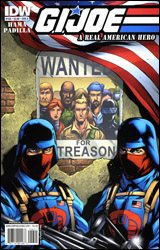 GI Joe: A Real American Hero #156
Publisher: IDW
Released: 21 July 2010
Writer: Larry Hama
Artist: Agustin Padilla
Colorist: J. Brown
Letterer: Robbie Robbins
Cover: Agustin Padilla
Cover price: $3.99
Review: Preston Nelson
I was a little too young to really get on the original GI Joe train, and I have had zero interest in the franchise, pretty much ever. I'm not trying to rag on it; it seems like it has a rich and interesting history, but, really, I know nothing about GI Joe.
But in the interest of fairness, I do want to give this book a shot to pull me in. And the premise is, admittedly, interesting. The Joes are fugitives and Cobra has weaseled its way into government power. And though we've seen piles of this kind of thing in recent memory, it's different enough here to be fresh. Kind of. I still have issues with the American government hiring a known terrorist organization to hunt down former special agents. Very publicly, might I add. And yeah, I know that the government may or may not make strange bedfellows in bad situations, but terrorists? Really?
That said, if I suspend my disbelief a little, there are some really fun, badass things happening in here, the most of which revolve around the only Joe I give a crap about: Snake Eyes. The last GI Joe book I read had a crippling lack of ninjas, but this one has the perfect amount. Snake Eyes fights other ninjas while Duke (or Hawk or some other generic blonde Joe) narrates about how awesome Snake Eyes is. Is it deep? No, but I really did enjoy it.
The art is fine, but I was legitimately worried that Jim Calafiore was drawing this. The heads and faces are a little identical and blocky. But, unlike the skillet-faced creations of the man I won't name anymore, this book is dynamic. Motion is fluid and realistic, but nothing is pretty. The art is totally serviceable, but nothing special.
Honestly, the book isn't for me. I didn't hate it. I actually really enjoyed parts of it, but in the end it meant nothing to me. That said, I don't care, but I still rather like it. If you know the mythos, you'll probably love it. If you're a novice, like me, give it a flip through.
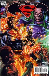 Superman / Batman #74
Publisher: DC Comics
Released: 21 July 2010
Writer: Paul Levitz
Artist: Jerry Ordway
Colorist: Pete Pantazis
Letterer: Steve Wands
Cover: Adrian Syaf
Cover price: $2.99
Review: Hannah Krueger
Lex Luthor is plotting, again, something involving keeping Batman busy and away from Metropolis while Superman deals with being inexplicably hated on another planet.
Yeah. Really short summary here, because nothing happens in this book. This is something any writer could've thrown together in a few minutes, and was then stretched to pad the book. Even then, it feels like two entirely separate stories, with the only connecting thread being Luthor. The real show is coming next month � as that's the 75th issue � which is advertised very heavily at the end of this issue. And honestly, that's probably what Levitz was focusing on.
Luthor, frankly, is the best part of this issue. He's scheming and smirking the whole way through. He never tells us everything, but gives us just enough. Oh, sure, he lays out the main plot of the issue pretty bluntly, but there's something up his sleeve for the next-issue spectacular.
The dual narrations of Batman and Superman are really clunky, and this becomes a problem. Batman's are either "My parents are dead" or "I am the night," while Superman's are almost like an innocent puppy trying to figure out why these people hate him. I found myself skipping through most of the issue, trying to get to the end.
The art isn't anything really that remarkable, but neither is it bad. It just is.
Skip this. It's clear the real show is coming next month, and it doesn't feel like any effort went into this because of that.
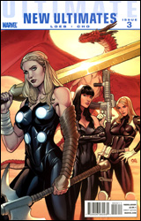 Ultimate Comics New Ultimates #3
Publisher: Marvel
Released: 21 July 2010
Writer: Jeph Loeb
Artist: Frank Cho
Colorist: Jason Keith
Letterers: Richard Starkings and Comicraft's Albert Deschesne
Cover: Frank Cho
Cover price: $3.99
Review: Tom Hemmings
I often get the feeling that Jeph Loeb read the Ultimate comic books of Mark Millar and Brian Michael Bendis and saw something that just wasn't there. His addition to the original Ultimates series was (and I don't think I'm over stretching here) widely regarded as one of the worst comics in years. Ultimatum, the event that ended the Ultimate line (subsequently relaunched as Ultimate Comics) did not get much better, with rampant cannibalism, random deaths for the sake of shock value, and little in the way of critical praise. Put all this together and you'd be forgiven for asking why the fudge Loeb has been allowed to continue working on a beloved line of comics that he came so close to utterly wrecking.
However, I didn't mind this issue that much. It's dealing with a lot of the fallout of Loeb's previous Ultimates work, but it's also tied back into volume two, which is nice since Loeb's previous work lead many to doubt whether he'd ever read an Ultimate comic before. I'm not sure why critically successful writers feel the need to push the envelope with the most extreme, violent, and offensive themes. Like Frank Miller on All-Star Batman, Loeb seemed to believe that the Ultimate Universe assignment was the opportunity to write some sort of wish fulfillment book where anyone could die at any second. The problem is that whilst All-Star Batman was daft beyond belief, at least it was harmless, what with it being set in its own continuity-free universe. Conversely, Marvel's Ultimate line has been running for a decade, with lots of tie-ins and continuity.
Thankfully, Loeb seems to have taken on board this criticism, toning down the extreme violence and creating something more in keeping with the original idea that Mark Millar presented in the first two volumes. Half of it is presented through the inner monologue of Valkyrie, which is completely banal and listless (especially her last line in the issue), but the rest is good, solid traditional team storytelling; the characters are working through a crisis, and it's not completely useless. I wouldn't mistake it for the work of a seasoned pro however, as Loeb still relies on shock value in order to make an impact, with several big plot twists in this issue alone.
Historically, one of the main issues readers have had with Loeb's run was the choice of partnering artist. For Ultimates 3 Joe Madureira was chosen, which was a radical departure from the artistic norms of the Ultimate line of comics, such as realistically proportioned characters. Whilst on Ultimatum David Finch represented something closer to the art of the original Ultimates as drawn by Bryan Hitch, but Frank Cho is probably the most similar style we've seen to the classic Ultimates since Hitch left. Cho's great all around; his work feels crisp and dynamic, yet grounded in a real world, just like Hitch. His art here is a big part of why this feels less wretched than previous installments. That being said, there are a couple of lazier panels (although I can't blame Cho entirely). The choice to have Hawkeye grow his hair out means that two of the male Ultimates are tall, muscular blondes. I had no clue that I was reading a conversation between Hawkeye and Carol Danvers until she actually called him Barton. Facially, some of the close-ups are a step down from what Cho did on Mighty Avengers, the big action panels are as great as ever, but consistency is important in the little things. Had I not checked, I would have been sure some of these pages had been farmed out to another artist.
I can't seriously recommend this book to anyone. Despite it being better than Loeb's current standard, you have to have read Ultimates 3 and Ultimatum in order to understand it. That said, skip it.
(Number of times the words ultimate, ultimates, and / or ultimatum are used in this review: 17.)
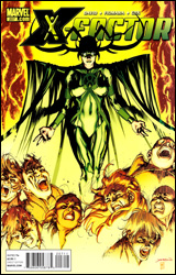 X-Factor #207
Publisher: DC Comics
Released: 21 July 2010
Writer: Peter David
Artist: Sebastian Fiumara
Colorist: Jeromy Cox
Letterer: VC's Cory Petit
Cover: David Yardin
Cover price: $2.99
Review: Sean Lemberg
Now well past the corner of its bicentennial, X-Factor presses onward with off-and-on series mainstay Peter David behind the wheel, and a roster so overstuffed it nearly takes the entire recap paragraph to run through their names. With plot threads sprayed out to every corner of the X-Men Universe and membership pulled from every team to ever include the letter X, at this point X-Factor's readership appears to run the risk of becoming an exclusive club. If you can get past all that, though, David's pulled together a ragtag cast of some of the family's most interesting, yet overlooked, secondary characters and given them a few continuity-heavy tasks with which to occupy themselves in between snide one-liners and not-quite-heroic poses.
Peter David's writing is every bit as professionally clever as it's always been, at least in terms of narration and dialog. His cast is never short on zingers or witty comebacks, and the membership is a charmingly odd assortment of personalities and demeanors. Although their lines don't always match up with their historical personalities (I can't remember Longshot being quite so brainless in the past), the team's membership provides (and exploits) countless opportunities for colorful character interactions and bouncy back-and-forths.
His plots aren't faring quite as well, though. The story leaps all over the place, from one locale to the next in a desperate, rapid-fire attempt to keep up with the squad's scattered membership. David doesn't seem to have much trouble keeping tabs on each character's current whereabouts and directive, but he just might be the only one. With so many faces on so many different paths and just over 20 pages to keep track of them all, this is beginning to feel like a slightly more involved rendition of the old Marvel Comics Presents anthology. X-Factor might be one team in theory, but it's five teams in action and their connections to one another aren't presently at the top of David's list of things to explore.
Artist Sebastian Fiumara generally delivers a solid showing, with a few minor hiccups. Perhaps the most pronounced is right there on the issue's opening page, when a mysteriously exotic new supporting character strolls in Madrox's front door. While the narration describes her as "eighty percent legs," it seems Fiumara misunderstood that metaphor and adorned the character with a set of limbs around 80% the length of a normal human being's. Which, I'm sure you'd agree, sort of kills off the power of her entrance. His work throughout the rest of the issue is more adequate, especially when the scene shifts to a darker, grimier setting. Brightly lit, his style leans more toward exaggeration, like a more generic Frank Cho. Against a dimly lit background, Fiumara's work changes shape and shifts tone, adopting a stricter, more grounded look that I found more original and interesting.
The current shape of X-Factor is tough to classify. It's bursting at the seams with character, wit, and good humor, which is both a blessing and a curse. The team's half-dozen simultaneous adventures make for good entertainment, but the all-at-once presentation means each chapter takes an eternity to reach any sort of resolution. It's enough material for at least three different books, most of which would be worth regularly reading on their own. Stuff the whole lot into one monthly title, however, and they all suffer. Borrow it.


