Is It Wednesday Yet?
27 July 2010 � Here we are again with another installment of your favorite comic book review series. As always, the reviews are free of spoilers, so read on without fear of having your experience ruined!
Our grading scale is simple:
Buy: An excellent comic book.
Borrow: A good comic, but save yourself some money by reading a friend's copy.
Flip Through: Give it a once-over at the comic shop.
Skip: This doesn't need to be explained.
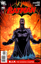 Batman #701
Publisher: DC Comics
Released: 14 July 2010
Writer: Grant Morrison
Artist: Tony Daniel
Colorist: Ian Hannin
Letterer: Jared K. Fletcher
Cover: Tony Daniel
Cover price: $2.99
Review: Tom Hemmings
Hey, it's the missing chapter of RIP! This covers the gap between RIP and Final Crisis, the last days of Bruce Wayne. Of course those gaps were probably deliberate, but given the nature of Final Crisis, you could easily be forgiven for thinking Morrison didn't feel it was relevant � like so many of the details that got lost in that series.
Regardless of how you feel about his approach to linear storytelling, no one could ever accuse Morrison of writing an inelegant phrase, at least not deliberately. Bruce's inner monologue drives this issue forward, and the voice of Batman is filled with both purpose and fear. Fear of Hurt and the fallout from RIP, but purpose found in his calling as Batman and the evidence he uncovers of his good influence at work. What could ordinarily be dismissed as a filler issue takes on greater significance as we learn Bruce's mindset leading up to Final Crisis. This also goes a long way towards establishing Hurt as a future threat. When Hurt was introduced I felt we had already reached the limit for fresh, personal villains in the Bat-books. Hush and Red Hood are still relatively new, and have a lot more mileage before they grow tired. Hurt just never seemed to go beyond the stereotype of a mysterious villain who might be someone from Bruce's past. What's important here is the thoroughness and seriousness with which Bruce treats Hurt. This establishes his level as a villain; it's the difference between being Killer Moth and The Joker. I'm actually looking forward to seeing what Morrison can do with him in the future.
Tony Daniel has some unique ideas about how to illustrate certain characters, which has drawn flak from critics. His Bruce Wayne has a harsh, angular face that wouldn't be out of place on Vandal Savage; he looks far more normal in his mask than out. Even so, this is probably some of his best work on the book; there's great consistency, and plenty of detail and imagination are shown. The moment the red skies appear, you feel like this is connected to a huge event, and the art team makes sure that this glow permeates every panel.
The inner monologue of Bruce is shown in script on notepaper shreds, which would not have been my first choice. It's occasionally hard to read and it's tough to picture Bruce having the time to actually physically write it due to the pace of this issue. If I could change one thing, it would be that.
I genuinely feel that this went a long way towards redeeming the story gaps in the lead up to Bruce's death, which leaves me incredibly anxious for the next / concluding issue. Buy this. Both this and the next issue are essential.
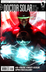 Doctor Solar, Man of the Atom #1
Writer: Jim Shooter
Artist: Dennis Calero
Letterer: Blambot!
Cover: Michael Komarck
Cover price: $3.50
Review: Sean Lemberg
One of comic's more enduring characters, Solar has been around the block with far more publishers than any of his contemporaries, without undergoing so much as a single wardrobe revision. Bouncing from Gold Key to Valiant, along for the ride when the latter transformed into Acclaim Comics, the character is back in the limelight with yet another new first issue under the Dark Horse banner. Likewise, the career of the title's author, Jim Shooter, has enjoyed similar leaps and bounds across company lines. The big question, though, is whether an author who made his name in the mid-1970s still has what it takes to rejuvenate a character that didn't exactly connect with modern audiences in his last outing. The short answer? No. No, he certainly does not.
A brief monologue early in this issue provides a good example of what's wrong with Shooter's dated style of writing. Realizing that his creations are literally leaping off the page and coming to life, a struggling comic book writer embarks on a lengthy diatribe from his lonely home office. Problem is, there's nobody else in the room for him to talk to. He's literally emptying his brain to the reader, which wouldn't be completely terrible if he weren't taking so long to explain something that was fairly obvious from the first panel. Evidently subtlety and restraint aren't utensils that Jim Shooter has seen fit to carry in his toolbox this year. After all, why leave your readers to think for themselves when you can spell everything out in three dull pages of excessive dialog? Later, Solar himself goes into the same kind of word-heavy trance when outlying his farfetched origin. Shooter overloads the scene with irrelevant details and still somehow forgets to make it even remotely interesting. It's like reading a textbook with bad illustrations.
Oh, right. The illustrations. Dennis Calero handles the entirety of the art duties � from pencils and inks to the digital colors � but it quickly becomes clear that his contributions aren't worth any kind of celebration. The issue's visuals are stiff and awkward, lost in a futile attempt to follow in Jae Lee's somewhat minimalistic footsteps. While he successfully matches Lee's unusual habits in terms of shading and rendering, Calero's compositions are missing the attention to detail and impressive framing that's persistent in the Dark Tower alum's work. Solar's backdrops are also nowhere near as textured, so they feel sparse and empty without a valid reason. Calero tries to erase this shortcoming by way of a few digital coloring shortcuts, but they're really more of a cheap bandage than a viable alternative to the issue's visual missteps. It's hollow, uncomfortable, third-rate work that would've singlehandedly kept this issue from being considered a serious work if the writing weren't also so dim.
The new Solar is about as much fun as a party with Stephen Hawking; if you wait long enough and stretch your brain far enough you might learn something new, but the road to get there is long and dry, and you'll need a special encyclopedia and superhuman patience to understand it. It's overwritten but short on concept, accompanied by shoddy artwork and a wooden cast of characters. Don't waste your life in this way. Skip it.
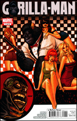 Gorilla-Man #1
Publisher: Marvel
Released: 14 July 2010
Writer: Jeff Parker
Artist: Giancarlo Caracuzzo
Colorist: Jim Charalampidis
Letterer: Ed Dukeshire
Cover: Dave Johnson
Cover price: $3.99
Review: Tom Hemmings
When I was assigned this comic I thought, "Oh, it's a spin-off of the Justice League, focusing on their new member." So I was confused as hell to look at this and realize it was a Marvel book. DC fans may now be saying, "Duh! The gorilla superhero in the JLA is Congorilla, not Gorilla-Man! Your ignorance astounds me!" Pardon, but there are too many bloody monkeys in comics these days. I'll throw DC a bone here, because they have a race of super-intelligent gorillas and a long history of monkey business. Marvel Apes, the Marvel Zombies follow-up, was a flop, yet they're delving into Hit-Monkey and now this � a spin-off of the cancelled (again) Agents of Atlas / Atlas series. I'll try not to hold this book's superfluous nature against it, but it's tough.
If you've never read Agents of Atlas you'll be stumped. I don't think a single character in this book was familiar to me, which in itself isn't a bad thing � unless you jump into a situation midstream, like here. Don't know who the Uranian is? That's your problem apparently.
As is standard for a mini covering a little-known hero, half of this is a flashback to Gorilla-Man's origin. It's disturbing to note that Ken Hale / Gorilla-Man's story starts in the same way as a lot of child-kidnappings; if strangers offer you stuff, just get in their car. Worst that can happen is you wind up as an international secret agent / gorilla. This super-spy / hero deal is the rest of it, and it's wildly inconsistent in tone, moving from sci-fi museum-theft to African death-squad themes as the book progresses. Parker also seems to feel that every villain needs their own identikit army of loyal slaves, like they're the Putties to their monster from Power Rangers.
Atlas feels out of continuity, given that it's a global organization of heroes fighting a huge array of villains and I've never heard of any of them. I can't reconcile their existence with the rest of the Marvel Universe. It feels like the only reason this isn't outside of the normal continuity is so they can do crossovers to try and keep Atlas on life support � but even that's too late.
The nicest way to describe the art is "scrappy." I don't know if it's Caracuzzo or Parker's fault, but a lot of characters have word balloons in panels they aren't even involved in, so you have to figure out who is speaking for yourself. Even worse is that the main villain has two sets of word balloons, so it gets really confusing. The panel to panel is iffy at best. There is no suggestion, for instance, of how a giant cyborg tentacle monster got inside a building in two panels without destroying a wall or doorway. To be fair, I don't expect much from this level of book � and much of it is okay, considering it's a low-priority miniseries tied to a dead series � but you won't be blown away by anything here.
I tend to like Jeff Parker, but this is quite poor. It jumps all over the place in order to try and fulfill the James Bond-style cover the issue was given, but nothing seems to tie together beyond the presence of the titular hero. I never really felt any level of emotional involvement because the book never stopped in once place or created any other character for G-Man to play off of. Maybe you'll buy this because you love Atlas, but I can't recommend it at all: skip.
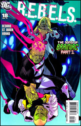 REBELS #18
Publisher: DC Comics
Released: 14 July 2010
Writer: Tony Bedard
Penciler: Claude St. Aubin
Inker: Scott Hanna
Colorists: Tanya and Richard Horie
Letterer: Travis Lanham
Cover: Kalman Andrasofszky
Cover price: $2.99
Reviewer: Hannah Krueger
So, apparently, Brainiac had kids: one good-ish, and one bad. The good one is trying to redeem himself to the planet of Colu, while the other is reciting family history to a sentient supernova and is skipping off to destroy Colu. Meanwhile, most of the Legion is sitting around doing not much of anything, and Starfire and some guy named Adam Blake are having space sex. But she still loves Dick, from what I understand. Oh, and also, shit is about to go down on Colu between all the Brainiacs.
To be honest, I don't really know any of the characters in this comic, except for a passing familiarity with Starfire. And except for maybe the Brainiac stuff, this doesn't really feel like it was designed to be a jumping on point. Happily, there are a few pages of evil-son exposition to catch everyone up to speed. I only wish it was the same for the rest of the Legion, besides the little blurbs that at least tell us who everyone is and what their powers are, which is appreciated.
The space sex is tastefully handled, as Claude St. Aubin creatively uses Starfire's hair and the zero gravity to hide things, but it's the aftermath that interests me; it seems like it could be setting something up, something that might possibly connect to The Return of Bruce Wayne. Also, who knew that Starfire was familiar with the concept of friends with benefits? (Note: The extent of my knowledge of Starfire is limited to the Teen Titans cartoon, so this may not be a current / accurate idea of who she is in comic book continuity.)
I have to give props to the artist, because he managed to work the space aspect of the story in this in really good ways. Again, especially the lack of gravity and Starfire's hair. Characters are well-defined enough that I can at least tell who is who, and the colors are quite vibrant, fitting the book perfectly.
I'm gonna give this a flip through. It's not the greatest place to start, but it's at least interesting enough that it's worth a look.
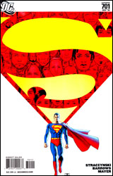 Superman #701
Publisher: DC Comics
Released: 14 July 2010
Writer: J. Michael Straczynski
Penciler: Eddy Barrows
Inker: JP Mayer
Colorist: Rod Reis
Letterer: John J. Hill
Cover: John Cassady
Cover price: $2.99
Review: Preston Nelson
One of my favorite exchanges in Pulp Fiction is when Jules Winnfield has decided to give up his life of crime, and his friend Vincent Vega is skeptical as to what he will do with himself. Jules' response is simple: "Basically, I'm just going to walk the Earth. You know, like Caine in Kung Fu. Walk from place to place, meet people, get into adventures." In a rare moment of clarity, Vincent tells him that he's basically just becoming a hobo. And in Superman #701, we get to see Kal-El become the Hobo of Steel.
Following the fall of New Krypton, Superman has decided that he needs to get back in touch with humanity, and the best way to do this is for him to walk around until he feels less bad about himself. The book focuses on Superman and his adventures with the common man. Lois gets all of six lines, and none of them are, "Hey, douche, you just spent a year in space. How about spending some time with your fucking wife?" Of course, she's totally fine with Superman's walkabout, further continuing the utter waste of space Lois Lane has devolved into.
Superman cleans a diner, fixes a truck, and in one of the book's genuinely funny moments, harasses an idiot reporter. And while this is all well and good, it's all a little too trivial for the mainstream Superman. Yes, I understand the whole New Krypton thing was traumatic. And yes, I understand that he is trying to "push back the darkness, one piece at a time." But he's fucking Superman. He can do a hell of a lot more than tell a suburban husband that the problem with his pickup truck is that the fuel line is blocked. Isn't Lex Luthor trying to amass a power that almost destroyed the goddamned universe, like a week ago, in Action Comics right now? That can be ignored, because Superman feels dejected about New Krypton getting blown up.
And if that weren't bad enough, this book actually directly apes All-Star Superman #10. Yeah. That All-Star Superman #10. I won't go into much more detail than that, but fuck that.
I like JMS. I really do, and I really hope this works out. Maybe I'm just not looking past the way the whole thing makes me feel, but this really doesn't work for me.
The art is solid. It has a nice use of light and shadow, which is actually pretty rare in a Superman book. There's something of a muted tone about the colors that works well.
This book is just so weird. It's not bad, but the whole thing feels pretentious. JMS is trying to fix Superman, when there was nothing wrong with him in the first place. I'd say flip through this one, and see if it's more to your taste.
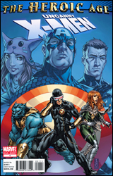 Uncanny X-Men: The Heroic Age
Writer: Matt Fraction
Pencilers: Whilce Portacio, Steve Sanders, and Jaime McKelvie
Inkers: Ed Tadeo, Jaime Mendoza, and Jaime McKelvie
Colorists: Brian Reber, Ian Hannin, and Chris Sotomayor
Letterer: VC's Joe Caramagna
Cover: Mark Brooks
Cover price: $3.99
Review: Sean Lemberg
The Marvel Universe has changed shape yet again, and the publisher would certainly be remiss to skip an opportunity for a whole fleet of one-shots and miniseries geared to elaborate upon those transformations. In this case, the publisher's taking advantage of a rare bit of downtime for one of their premiere families: the X-Men. With Second Coming now in the rearview mirror, the timing is right for the mutants to take a breath and look around at what their peers have sown. While the team was off in San Francisco doing what they do best, the rest of the world didn't quit changing. Maybe, just maybe, that means their spot in it is also ready to shift a little bit.
This extra-sized issue takes the interesting approach of assigning each of its three primary artists to a different focal character, with Whilce Portacio handling Cyclops in the Savage Land, Steve Sanders following the Beast on sabbatical, and Jaime McKelvie covering Hope's visit to the Baxter Building. The three employ very different styles, which makes the transition from one setting to the next seem more like a new chapter and less like a subtle conversion.
Portacio works a slightly cut-back version of his action-friendly, ink-heavy technique from the early 1990s, which is a good fit for Scott's moody, brooding adventures in the jungle. He's loosened up a bit since his first run with the X-Men two decades ago, noticeably streamlining his approach. Although I'm not quite sure which version I prefer. Steve Sanders couldn't provide much more of a contrast, balancing the issue with an extremely simple, cartoonish approach that's more along the lines of America's Best Comics veterans Zander Cannon and Chris Sprouse. His rendition of Beast, and his ensuing interactions with Runaways graduate Molly Hayes, may as well have been pulled directly from a fairy tale. Take that for what you will, but there's no question it's an appropriate choice for the playful mentality of the two central characters.
Finally, Jaime McKelvie rounds out the artistic trifecta with an effort that seems to be an awkward marriage of Portacio and Sanders's preceding works. McKelvie's clean lines and vast expanses of negative space give his chapters a simple, straightforward flavor but the lack of exaggeration and more grounded perspective also lends his work a more serious tone. Of the three, his style is the least interesting, although he's also dealing with pretty dry subject matter, at least visually: Hope passing the time during an array of tests, evaluations, and body scans while getting to know Franklin Richards.
While the concept of a three-headed narration may lend itself to visions of disjointed narrative leaps and a jerky, confusing pace, Matt Fraction actually manages to handle it with some grace. Remember those old sketch comedy formulas, when one skit would lead into the next with a shared word, action, or object, somehow bridging the gap between two totally unrelated stories? It was a staple of Monty Python's Flying Circus and, years later, The State. Fraction spins something similar here, expertly shifting locations, moods, and characters without bucking his readers in between pages. It probably helps that each chapter is somewhat laidback, focused more on a calm, casual series of chats on a variety of subjects than the next great mutant menace. Fraction manages this kind of story skillfully, not that he always gets a chance to show it in the fast-paced land of the Uncanny X-Men, so it's nice to see a different side of both the writer and the characters for a change.
Uncanny X-Men: The Heroic Age isn't required reading, but that doesn't mean it's without merit. In fact, given the hectic pace of the regular books and the sheer number of faces bouncing around the fringes of the team, this might be your only chance to enjoy some quality character moments without the backdrop of a big ongoing storyline looming over every word. Matt Fraction brings the goods, and though each artistic showing is spotty at times, the whole book comes together nicely when all is said and done. Borrow it, even if you're not a present fan of the X-Men. It's good, intelligent reading.
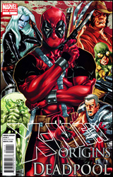 X-Men Origins: Deadpool
Publisher: Marvel
Released: 14 July 2010
Writer: Duane Swierczynski
Artist: Leandro Fernandez
Colorist: Steve Buccellato
Letterer: Jeff Eckleberry
Cover: Mark Brooks
Cover price: $3.99
Reviewer: Hannah Krueger
There's something I need to get off my chest: I am sick of Marvel's recent trend with Deadpool comics. Mainly, having him appear in just about every damn book in existence, whether he's relevant to the plot or not. It's getting to the point where he's just about as over-whored as Wolverine. And if my last look at the most recent solicitations is right, he may be surpassing Wolverine in that department. I ended up dropping the main Deadpool ongoing not that long ago due to this.
All that said? This is actually a pretty damn good comic.
The bulk of the issue is Deadpool pitching his story to various screenwriters as they come a-knockin' to make a movie about him. It's actually a really good framing device for his origin story. And the comic, in turn, is a pretty wonderful parody of the movie business today, especially with the end product, and each of the subsections' titles being a riff on some fairly famous movies. Probably my favorite part of the entire comic is towards the end, when Deadpool ends up MST-ing his own movie.
This is actually a lot more serious than most of the Deadpool comics on the market. And that fits, because it's not the usual Deadpool misadventure; it's a serious look at who Wade was, and how he became who he is. There's not so much of the slapstick, fourth-wall-breaking, talking-to-himself humor that you'll find in most of his books, either. Instead, when humor is used, it's usually pretty self-depreciating and lightens the otherwise somber mood of the story. We do get some rip-roaring misadventures, but it's completely in line with everything we've seen before. The final few pages end up being a real punch to the gut, too, especially coming off of the comedy with the movie, and was something I wasn't expecting at all.
And that's the other thing: Swierczynski really has Deadpool down. I could see the character reacting pretty much the way he did to everything that happened in the story, and being asked about his story like this. And I have to admit that if Deadpool were real and he knew about the movie (the one in the comic or the one that's actually coming down the pipes), he would probably react exactly the way he did. Side note: Ryan Reynolds, you might wanna watch your back.
The art isn't anything particularly spectacular, but neither is it abysmal. Leandro Fernandez does a good job with facial expressions, even with the hindrance of a mask, and really gets across the extent of Wade's mutation.
I'm going to put this at a borrow; the price point makes it a bit high to be an automatic buy, but even if you hate what's being done with Deadpool right now, this origin story is worth a look.


