Is It Wednesday Yet?
13 July 2010 � Here we are again with another installment of your favorite comic book review series. As always, the reviews are free of spoilers, so read on without fear of having your experience ruined!
Our grading scale is simple:
Buy: An excellent comic book.
Borrow: A good comic, but save yourself some money by reading a friend's copy.
Flip Through: Give it a once-over at the comic shop.
Skip: This doesn't need to be explained.
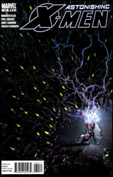 Astonishing X-Men #34
Publisher: Marvel
Released: 30 June 2010
Writer: Warren Ellis
Penciler: Phil Jimenez
Inker: Andy Lanning
Colorist: Frank D'Armata
Letterer: VC's Joe Caramagna
Cover: Phil Jimenez
Cover price: $2.99
Review: Sean Lemberg
The slowest-moving series in the X-Men family is back for another joyride this month, as Astonishing X-Men finally delivers its 34 installment. I thought the setup for this issue � detailing Abigail Brand's fall from the cosmos and the appearance of an organic-skinned Sentinel in the streets of San Francisco � sounded a bit familiar; turns out that's for good reason. I last covered the series with issue 32 � eight months ago. With the mutant landscape changing drastically every minute, that long of a delay makes a storyline such as this one feel more like a time capsule and less an account of current events.
At least the content hasn't gone sour during the months of neglect. After diving feet-first into the action in preceding issues, Warren Ellis spends a fair portion of this month sorting out the personal ramifications of what's gone wrong. A nameless villain has hacked into Hank McCoy's research database, using his investigations into reviving the mutant gene against the team on as grand and twisted a scale as one could imagine. It's not exactly a fresh idea, but that doesn't mean it no longer bears fruit. Ellis gives Beast a sharp set of pages to stand up for himself under scrutiny, and as can be expected when a brainy, intellectual writer sinks his teeth into a brainy, intellectual character, the results are witty, brilliant, and entertaining.
Pity the same can't be said for the whole of this month's dialog. It's universally quick-witted, snarky, and sarcastic, even if that kind of attitude hadn't previously been in certain characters' playbooks. I can't say the punch lines don't ring true, because many are genuinely funny, self-deprecating jabs, but it gives the entire roster a homogenous, hive-minded aura that doesn't fit well with the team's history of individuality. I'd have no problem with this issue's writing if it involved a lesser-known set of characters, but when you're dealing with a squad of classics like Logan, Storm, Cyclops, and Beast, some attention should be paid to their existing personalities. The issue is decently written, but the cast doesn't feel right.
Though Phil Jimenez has successful provided action-friendly issue before, he struggles with a more dialog-heavy chapter this month. In a frantic, chaotic fight scene, Jimenez seems right at home. He shows an eye for precision when the situation calls for detail and a knack for restraint when subtlety would be more successful. When the tone is more downplayed and the focus turns toward character moments, though, he seems to second-guess his work and loses touch with that sense of timing. This month Jimenez over-renders the cast, particularly Emma Frost, crushing them under the weight of too much linework. His compositions feel heavy and thick, overburdened with an unnecessary amount of shadows. Tasked with illustrating a long conversation, he uses each panel to slowly zoom in on the speaker's face, to the point it starts to feel uncomfortable. In a few select panels, particularly the vast alien landscapes at the end of the issue, Jimenez shows a master's hand. The rest of his effort isn't quite up to par.
Astonishing X-Men has become a series both out of place and out of time. Its sister publications have already moved on to the next big crossover event, lessening the importance of the story's resolution. Ellis himself has even taken part, showing a much tighter grip of the same cast in Xenogenesis than is on display here. Chances are you've already forgotten the purpose of the story after so much time away from the shelves. I'm here to tell you that, despite a few glimmers, what Ellis and Jimenez deliver this month isn't worth getting reacquainted with. It's become the lost adventure of a squad that's already done more adventuring than anyone could possibly keep up with. Flip through it if you're inclined, but don't take it home.
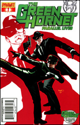 Green Hornet: Parallel Lives #1
Publisher: Dynamite
Released: 30 June 2010
Writer: Jai Nitz
Artist: Nigel Raynor
Colorist: Inlight Studio
Letterer: Bill Tortolini
Cover: Paul Renaud
Cover price: $3.99
Review: Preston Nelson
Like a lot of pulp heroes, I know relatively little about Green Hornet. And sadly, if this book is any indication, I have no desire to know any more. The book opens with Green Hornet and Kato on a rooftop, bickering like a married couple about how Hornet is too incompetent to use any of Kato's inventions. They take out some thugs, and Hornet asks how Kato learned all of this stuff. Kato reveals that growing up in Communist China, he worked in a toy factory. Rather than it being the stuff of nightmares, it was pretty much Willy Wonka's Goddamned Toy Experience. He met an old man who taught him crap, became an inventor, and then the toy factory got shut down due to something stupid that Britt Reid / Green Hornet did.
I could not bring myself to care about this book. The story is boring, the characters are totally unlikeable, and nothing fucking happens. I don't know if this is a new development in the history of the character, but every time I see Green Hornet, he's an incompetent, unlikeable fuck-bag. A hero can be unlikeable, but he has to be good. So good that those around him are forced to follow him, regardless of how they feel about the way they're treated. A hero can be incompetent, but as long as he has a big heart and a genuine desire to improve, the others around him will tolerate and guide him. An incompetent and unlikeable piece of shit, however, would have gotten shot in the back of the head by Kato three pages into the book. Of course, Kato doesn't seem to escape this douche-ification either. When little Kato is surrounded by bullies, who have yet to do anything but posture and quip at him, he kicks one of them right in the balls. Rather than walk away, he starts a fight. With a gang of older boys. By kicking a guy in the joeys. And then he's surprised when they beat the tar out of him! And he has to swear revenge, which of course, his mentor helps with.
If the story was bad, the art was worse. I don't like to say this about books, but I don't know what the hell the artist and editorial were thinking. This guy has a sketchy, cartoony style that is exactly the wrong fit for what should be a pulpy, noir comic.
This book is clearly designed to be in the vein of the upcoming, sure-to-be-terrible film, and that really hurts it. Kato's origin as an orphan on the streets of an oppressive Shanghai could have made for a really dark, heart-wrenching issue. Instead we're given something that I wouldn't read to someone I hate. Skip it.
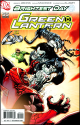 Green Lantern #55
Publisher: DC Comics
Released: 30 June 2010
Writer: Geoff Johns
Penciler: Doug Mahnke
Inkers: Christian Alamy, Tom Nguyen, Keith C. Champagne, and Doug Mahnke
Colorists: Randy Mayor and Gabe Eltaeb
Letterer: Nick J. Napolitano
Cover: Doug Mahnke
Cover price: $2.99
Review: Hannah Krueger
The first few pages of this comic shows us lots of dead cows in Montana. I'd assume that some slightly sociopathic kid got bored cow tipping, but no, apparently The Spectre is collecting the Entities of all the Lanterns like Pokemon, and the cows were full of rage.
And with that random aside done, we segue into the main comic, which is mainly an all-out, knock-down brawl between Atrocitus, Carol, Hal, Sinestro, and Lobo (who's trying to collect a long-standing bounty on Atrocitus) in the middle of NYC. Y'know, like ya do. Apparently Atrocitus is on Earth because of what The Spectre is doing. And then Lobo leaves, 'cause his cameo time is up.
This was okay.
The fight scene is pretty fun to read, especially with how Lobo reacts to each of the Lanterns' attack strategies. And how he reacts to Star Sapphire's power is probably the best of them. I don't really see any real purpose for him to be in here, other than to give him some comic time, and to have some nice brawlin' fun. But even then, he reads like a parody of all the best and worst parts of the 1990s, and seems to duck out once his part in padding the issue is done. (Side note: I've not seen much Lobo before this, but what I understand of him is that his entire existence is a parody of the extremeness of the 90s, and I'm sticking with that.)
The pencils are excellent, as expected with Mahnke, and the colors and inks add nicely to his art. This is surprising considering the number of colorists and inkers.
The origin story for Dex-Starr, the Red Lantern cat who's practically become a meme these last few months, gets its own paragraph? Yes, because it is that damn good. I don't necessarily recommend the rest of the comic, but if at all possible, find a way to get your hands on this part, and have tissues handy because it will make you sob. Especially the last few panels. And I rarely cry, so that's a testament to how good this six-page origin story is.
Most of this issue is a flip through, 'cause you'll probably be able to tell whether or not this is for you within the first few pages. But once you've done that, go to the last few pages for the origin story of Dex-Starr, and read it through.
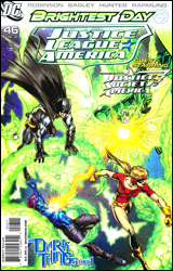 Justice League of America #46
Publisher: DC Comics
Released: 30 June 2010
Writer: James Robinson
Penciler: Mark Bagley
Inkers: Rob Hunter and Norm Rapmund
Colorist: Ulises Arreola
Letterer: Rob Leigh
Cover: Mark Bagley
Cover price: $3.99
Review: Tom Hemmings
I have no idea what's going on. This is part one of a JLA / JSA crossover entitled "Dark Things," and it drops you right in like you've read everything involving the JLA, JSA, and all their characters for the last year. Something about a 100 Minute War is mentioned, and a couple of heroes have been kidnapped which means that (DC trope #22) magic has gone wrong. This has the inevitable side effect of making all the magic-based people go nuts. So what with this being a team-up issue, you get various unlikely duos going off to stop the newly nuts, whilst the rest try to unravel the mystery. It's nice to see the JLA consisting of some new blood, something that isn't lost by sharing the bill with the JSA, because the JSA is heavily marginalized throughout.
Writing wise, a lot of the characters seem a little dense. Supergirl blatantly calls Batman "Grayson" while she's holding a civilian in her arms. Wildcat abandons his gruff, yet well-meaning demeanor to be an asshole for a few inexplicable seconds. Apparently every character needs an inner monologue, even to express the most monosyllabic of sentiments. Its not that Robinson doesn't have a handle on a lot of these characters; it's just that a couple seem quite different to how I've read them before, and occasionally that's quite a negative for me. I did like how he portrayed Batman, though. Dick's clearly stepped up into the big role and can handle himself, both in the field and when prepping a game plan with the other heroes. Yet this is completely counteracted by the image of him jumping out of the flying Batmobile holding a gun big enough to give Rob Liefeld an erection, and grinning like Robin put Joker toxin in his coffee.
The art is hit-or-miss. I love Bagley's work on Ultimate Spider-Man, but some of this felt sloppy by comparison. I have sympathy for the guy; he always works a hell of a schedule and probably pumps out more pages than anyone in the industry, but I wish he'd take his time and draw to his full potential every so often. Not to say there aren't some top-notch panels here, but it's distracting on close-ups. Face are poorly drawn and Jade appears to have a lazy eye. In fact, it's so constant I began wondering if it was part of some character development. Oh, and Wildcat's cowl looks like Juggernaut's helmet for some reason, and I was convinced he was Hourman until the dialog indicated otherwise. Bagley really is trying to make the myriad of women in this book different from each other, but that results in Donna Troy looking constantly pissed off and having scary muscular Madonna-arms. It's a noble but patchy effort by a great artist.
The issue does clip along at a decent pace and by the end you've got a feel for what's going on, but this really isn't the place to join this story. Sadly, from what I've read, it hasn't inspired me to go back and find that point either. Maybe I'll come back to it once the story is done. Flip through.
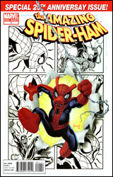 Spectacular Spider-Ham 25th Anniversary Special
Publisher: Marvel
Released: 30 June 2010
Writers: Tom DeFalco and Tom Peyer
Pencilers: Jacob Chabot, Adam DeKraker, and Agnes Garabowska
Inkers: Jacob Chabot, Robert Campenella, and Agnes Garabowska
Colorists: Emily Warren, Bruno Hang, and Agnes Garabowska
Letterers: Jared K. Fletcher and Dave Sharp
Cover: Joe Jusko
Cover price: $3.99
Review: Preston Nelson
I have no idea why Marvel published this book. Anyone that is old enough to have grown up with Spider-Ham will be old enough that reading this will be sheer torment. Any child that sees the piggish-Spidey will be instantly turned off by how stupid this is. There is simply no reason this book should exist. And to be fair, I wanted to like this one. DeFalco is a great writer, and for a few pages at a time, this book wasn't too painful. But page after page of awful animal puns slowly began to take a toll on my sanity. That said, Nick Fury was a goddamned teddy bear, and, Heaven help me, it was adorable.
We're given three stories and two of them are awful. First, we have Spider-Ham saving J. Jonah Jackal, May Porker, and Mary Crane Watson from the Swinister Six on his 25th birthday. We're given a short origin flashback that unfolds exactly how you would expect: full of enough animal puns to make you want to drive a knife into your eye. We also have Swiney-Girl, a pig version of Spider-Girl facing off with Crayfin the Bunter, a baseball-playing crayfish. This story is also a source of nigh unending pain, because the shitty animal puns are compounded with shitty baseball puns. It's exactly the same story as before. I don't care. Halfway through the abomination based on Kraven's Last Hunt, we're given the sole redeeming part of this book, a short story framed by the Watcher's Assistant: "Why Not Have Spider-Ham Be a Human?" It's blessedly short enough that it doesn't drag, there are no animal puns, and the ending is chock full of black humor. Right up my alley.
The art is fine for what it is, but anthropomorphic animal versions of superheroes are hardly the prettiest things in the world. It's extremely cartoony, but it's just fine. It's clearly inspired by Charles Schulz and Bill Waterson, but lacks the charm of both.
I can't in good conscience give this thing anything but a skip.
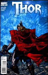 Thor #611
Publisher: Marvel
Released: 30 June 2010
Writer: Kieron Gillen
Artist: Rich Elson
Colorist: Andy Troy
Letterer: VC's Joe Sabino
Cover: Mico Suayan
Cover price: $3.99
Review: Tom Hemmings
Despite its content, this comic completely avoids being stamped with Siege: Aftermath. That's such a nice touch it required comment. With every title and its sister being hooked into events, somehow it was inevitable that Thor should do the same during the recent battle for Asgard, but in this issue they've managed to return to the simple style that marked J. Michael Straczynski's recent run. I think it's a real plus for this book to look different from everything else on the stands by being less cluttered with advertising or labels that might detract from what is essentially a swords and sorcery title, albeit one where the hero gets to fight his evil cyborg clone. It's a great cover, and I'd hate to see it spoiled with advertising clutter; it would be like leaving a McDonald's wrapper in an art gallery.
The recent Thor run has been driven by Loki's machinations, and with him no longer being an issue, the challenge for writer Kieron Gillen (of Phonogram fame) is to find a direction for this brave new world. His answer is simple: What do you do after battle? Bury the dead. Of course for the Gods this creates a whole new set of problems.
Gillen is delving into the nature of a universe with competing mythologies and the consequences of this state of affairs, really taking Thor back into the supernatural after the majority of the recent run being focused on the juxtaposition of the magical and mundane worlds. Gillen's only on for six issues, but this does a superb job of setting up what's to come, and I have faith in the writer to see it through in the time he's been given.
The art is perfectly suited to this sort of story; it's beautifully rendered, has epic settings, and subtle colors that are bold when required. Thor is Rich Elson's first major ongoing with Marvel or DC, and he's really doing a fine job, especially paired with the experienced Andy Troy on colors. I have a couple of minor issues with continuity, but there's really nothing else to complain about. The appearance of a significant villain is more than usually threatening, especially since this particular character I've personally regarded as a bit of a joke before. This show's him in his element, and the creative team does an excellent job of conveying easy charm and malevolence all at once. You know that before this story is through he'll have his part to play again.
Buy this. Buy it now. If you followed any of J. Michael Straczynski's excellent run, this is a quality continuation, a fresh direction, and a new adventure that you won't want to miss. If you haven't been buying Thor, then you've been missing one of the best comics on the shelves in recent years.
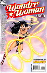 Wonder Woman #600
Publisher: DC Comics
Released: 30 June 2010
Writers: Gail Simone, Amanda Conner, Louise Simonson, Geoff Johns, and J. Michael Straczynski
Artists: George Perez, Amanda Conner, Eduardo Pansica, Scott Kolins, and Don Kramer
Inkers: Scott Koblish, Bob Wiacek, and Michael Babinski
Colorists: Hi-Fi, Paul Mounts, Pete Pantazis, Michael Atiyeh, and Alex Sinclair
Letterer: Travis Lanham, John J. Hill, and Nick J. Napolitano
Cover: George Perez
Cover price: $4.99
Review: Sean Lemberg
Wonder Woman #600 isn't an anniversary issue so much as it is a thick, padded digest. Placing any continuity-focused storytelling on hold, this commemorative edition instead spends its energy on a fistful of pinups, half a dozen short stories with sometimes-questionable ambitions, a rambling preamble by Lynda Carter, and an Action Comics sneak peek that somehow steals the show by shifting the focus to an entirely different cast of characters. It might make a fine coffee table book for more dedicated fans of the Amazon Princess, but an issue worthy of celebration it surely is not.
The special edition opens with a Gail Simone / George Perez yarn so ridiculously cheeseball it takes the proverbial cake from the Hostess promotional strips that filled out our comics in the Bronze Age. Seven pages of tiny panels jammed full of peripheral characters, word balloons, terrible puns, and incredulous onlookers. It's less a tribute and more an unintentional parody that grows weirder by the panel. The only male presence in the story takes the shape of a United States Congressman, brainwashed by an invading force of feminine robots dubbed, you guessed it, the Sirens. By the time Diana's army of lady superheroes had toppled the threat and surrounded her in pursuit of an autograph, I'd already seen enough.
At least Amanda Conner's contribution, concentrating on the aftermath of a throwdown between Chang Tzu (Egg Fu) and a trio of DC's upper-level lady powerhouses, doesn't take itself too seriously. That may be why it's, hands down, the issue's most successful mini-adventure. Conner doesn't get caught up in the heavy-handed "girl power" theme that runs throughout; she gives us an informal chat between Wondy and Power Girl that's more telling in its mundane nature than any number of superpowered fights against robo-masculinity ever could.
Louise Simonson and Eduardo Pansica chime in with a terribly stereotypical account of Diana's team-up with Superman, as the two face off with the generic threats of Nikos Aegeus. Armed with Zeus' lightning, among other mythological weaponry, he's chosen to use his arsenal as a terrorist threat, demanding $100 million in exchange for a promise to quit wrecking Washington's more popular modes of public transit. Spoiler: the super-duo solves the problem via knockout punch. Every single line of this bit, both written and illustrated, is excruciatingly generic. I've read this story a thousand times before and I've never enjoyed it.
Geoff Johns and Scott Kolins provide the lightest chapter of the issue: six pages that read like one and a half. Their tale, which takes the shape of a dream, effortlessly leaping from past to present and back again, appears to be little more than a showcase for Kolins' digitally painted artwork. It has its moments, albeit more in terms of color than composition.
Finally, J. Michael Straczynski and Don Kramer polish off the issue with a proposed glimpse into the character's future with a prologue to their upcoming "Odyssey" storyline. Much to the chagrin of hardcore fans, the pair is pushing forward with a generic new outfit for the iconic figure, and if this slice of the pie is any indication, they're also giving her a grittier, underground attitude. Neither makes for a good fit. Straczynski's promises to give Wonder Woman a concrete direction and a new big picture are betrayed by his immediate failures to make either click in this short preview.
This really isn't a must-have issue, particularly as milestone commemorative editions are concerned. Where most books try to build a major event to coincide with such issues, Wonder Woman #600 represents the pause in between major arcs. It's not the traditional path, but that isn't the problem here � it's the quality of work they chose to take its place. Of the cluster of short tales DC has gathered, only the Amanda Conner chapter has any sort of redeeming value, and even that would be better suited as a backup story. This anniversary is a disappointing one for the first lady of comics, and if the peek we've been granted into Straczynski's plan is any indication, her future may be even rockier. Skip it.
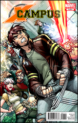 X-Campus #1
Publisher: Marvel
Released: 30 June 2010
Writer: Francesco Artibani
Pencilers: Denis Medri and Robert Di Salvo
Inker: Marco Failla
Colorists: Sergio Algozzino, Fabio Bonechi, and Cecilia Giumento
Letterers: Brady Webb and VC's Clayton Cowles
Cover: Todd Nauck
Cover price: $4.99
Review: Hannah Krueger
Somewhere down in Georgia there's a young girl called Anna, and she's just had her first kiss. Only she's kinda sent someone into a coma with it. After being hounded by the police, her neighbors, and others around her, she gets a visit from some lovely folks from the Worthington Foundation, who offers her a special scholarship to a school in Connecticut for other gifted youngsters. At the high school, she meets all sorts of interesting teenagers. Some can control the weather, while others shoot beams from their eyes.
Wait. I'm getting a feeling of deja vu. Haven't I seen this before?
Oh yeah. I have. It's a cartoon called X-Men: Evolution, and it came out a decade ago. And this is the same exact premise, only with some people aged down, others aged up, and some characters we didn't see in the cartoon. But at its core it's the same thing: the X-Men are in high school and they're dealing with their mutant powers! Oh shock! Oh drama!
To be fair, as I understand the history of this, this was a licensed comic done over in Europe a few years ago, and then bought over to America by Marvel. And it's perfectly serviceable for what it is.
But these first few chapters follow every basic intro issues that I've seen for pretty much any X-title ever: a young hormonal teenager unleashes mysterious powers through some traumatic event, is recruited by a school for gifted youngsters, finds out there are other people like them, and gets contacted by a darker subculture within the school and tempted to the dark side, only to find that there are those opposed to the others. I mean, come on, I could tell within the first page where this was going, and all I've ever known the X-Men from was the movies and the cartoon. Give me some variety here, Marvel!
The art is solid enough. It seems a bit more on the sketchy, rougher side, which is really odd when paired with the inking and coloring. Characters can look really weird, especially in the facial expression department at times. But, all in all, it's not outright awful, but neither is it good.
Skip this. If you've read the first title of any X-comic, then you've read this story. And at this price point, it's not worth your time or money. Maybe it'll prove itself in later issues, but for now, you're not missing much.


