Is It Wednesday Yet?
06 July 2010 � Here we are again with another installment of your favorite comic book review series. As always, the reviews are free of spoilers, so read on without fear of having your experience ruined!
Our grading scale is simple:
Buy: An excellent comic book.
Borrow: A good comic, but save yourself some money by reading a friend's copy.
Flip Through: Give it a once-over at the comic shop.
Skip: This doesn't need to be explained.
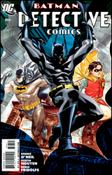 Detective Comics #866
Publisher: DC Comics
Released: 23 June 2010
Writer: Denny O'Neil
Artists: Dustin Nguyen and Derek Fridolfs
Colorist: David Baron
Letterer: Todd Klein
Cover: Dustin Nguyen
Cover price: $3.99
Review: Tom Hemmings
Denny O'Neil on a Batman comic? I'm there.
Let me just start by saying that I don't expect anything involved in this comic to turn up ever again, given how similar teases have been thrown out before and then roundly ignored. What I will say is that this comic attempts to tie together more elements of Batman than I've seen tried in years. The story takes place in two parts: the modern era with Dick Grayson as Batman, and Dick's memories of his early career as Robin. Whilst the modern stuff is a nice framework, the real value of the book is seeing the Batman: The Animated Series-inspired flashbacks. Within the first two pages you'll know what the deal is, you'll hear the voices from the show, and get the references immediately. O'Neil also works in other references to Batman lore, expanding into the 90s comics, and tying them all together into one overarching if slightly inconsequential plot. Overall this feels a little too all over the place to properly work as one story; it has interesting elements, but at the end I wasn't feeling the emotional punch I think they wanted. In addition, leaps in logic are required in trying to understand the characters the issue introduces. Some of them seem to have literally no reason for being where they are, it's just convenient for the plot. I'd have to say that despite some good moments and real attempts at widespread ties throughout Batman history, this winds up as a little bit of a mess. The story's fine if you don't think about it too much, but I doubt you'll be blown away.
The art here is a mixed bag as well. The flashbacks clearly reference Batman: The Animated Series, in sharp contrast to the dark, modern era with its harsh shadows and striking poses. I'll say this for Nguyen: he draws a hell of a modern Batman, and the cityscape backgrounds are appropriately dramatic. My issue comes with the other characters. They just don't look like they fit with his sleek Dark Knight. The rubbery faces are quite distracting. This actually becomes worse in the classic era, which is artistically an homage to the art of early Batman comics, replicating printing effects and even artificially aging the pages. The character models don't seem to fit that period, at least not from my own experience. The combination of a BTAS style, the 1960s authenticity, and heavily cartoony art leaves you wondering exactly what they were trying for, since the animated show was actually closer to the shadow-heavy feel of modern comics. Due to details like this, and despite the effort and skill that went into it, the resulting hybrid style lacks the era-authenticity it is trying so hard to generate.
I'm a little torn on this, because I really wanted to like it. Tonally it's a little confusing, some of the art is distracting, and in the long run it doesn't mean a whole lot. That being said, there are some definite highlights, and O'Neil obviously has genuine great affection for Batman lore regardless of the era. Flip through it; it might be for you, but it's far from essential.
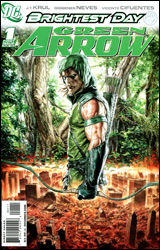 Green Arrow #1
Publisher: DC Comics
Released: 23 June 2010
Writer: JT Krul
Penciler: Diogenes Neves
Inker: Vincente Cifuentes
Colorist: Ulises Arreloa
Letterer: Rob Leigh
Cover: Mauro Cascioli
Cover price: $3.99
Review: Preston Nelson
That's it, DC. I was really high on you during Batman and Robin and Blackest Night. I was even willing to overlook the whole Cry for Justice thing, because it was James Robinson and I trust him. But seriously? Honestly, the sheer depths of crap in this piece of fetid bile have left me, of all people, speechless.
And it's not just because they've ruined Roy Harper, fridged a six year old girl, dissolved the marriage between Oliver Queen and Black Canary, and made all of the JLA members like look total tools in their treatment of Green Arrow. Even if I ignored all the previous mischaracterization, violence, drug use, and basic awful goddamned storytelling, this would still be the worst thing ever committed to the page by man. There is literally nothing redeeming about this book. It's stupid, it's overreaching, and trying to be something deep. It's fucking ugly.
Okay, let's actually dive face-first into this pool of pus. In Cry for Justice, Prometheus blew up Star City, killing a bunch of people. Ollie did what any sane archer would do. He executed the terrorist via arrow / brain intercourse. This caused the world to flip a tit for some reason. Long story short: Dinah left him and he was kicked out of both Star City and the League. But thanks to the magic of the deus ex machina, I mean, the White Lantern, a magical star-shaped forest has grown where the blast site was. To avoid leaving Star City, Ollie has taken up residence in the forest, playing Robin Hood to all those who would dare come near it, while still lashing out at corrupt city officials. And honestly, that last sentence is awesome. If this book were all about Ollie playing Robin Hood, diving through the forest, chased by pissed off cops, while cracking wise at the evil Sheriff of Star City, it would be awesome. Of course, it's not awesome; it's emo. And I'm not talking about the look of the book, sadly. Green Arrow isn't wearing eyeliner. I'm talking about the content. If this book was filled with anymore self-loathing, all the dialog could be replaced with My Chemical Romance lyrics.
And now would be the time to talk about the political message this book is trying to have. I'm not stupid, when I pick up a Green Arrow book, I know to expect a certain liberal slant. It's a big part of who Ollie is, and when it's done right, it works very well. Hell, my favorite book of all time (Denny O'Neil's The Question) has a very Green Arrow vibe to it, what with the hero fighting a corrupt and broken government for the people. And when it's done right, it's amazing. The problem here is, it's stilted beyond belief. I'm reasonably middle of the road, but by the end of the book, I wanted to shut Ollie's hippy mouth for him.
I don't want to say no effort was put into this comic, because I think that would be wrong. I'm sure the creative team is trying very hard. The problem is, they're fucking awful. The book is needlessly gory, filled with plot holes, and is hideous to look at. There's no other rating besides babychest. May God have mercy on your souls, creative team. I award you no points. Now do better.
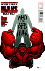 Hulk #23
Publisher: Marvel
Released: 23 June 2010
Writer: Jeph Loeb
Artists: Ed McGuinness, Herb Trimpe, Dave McCaig, Tim Sale, Dave Stewart, Dale Keown, Sal Buscema, Brad Anderson, Ian Churchill, Edgar Delgado, Leinil Yu, Gerry Alanguilan, Marte Gracia, John Romita Jr., Klaus Janson, Emily Warren, Dean White, Mike Deodato, and Rain Beredo
Inker: Mark Farmer
Colorist: Morry Hollowell
Letterer: Richard Starkings & Comicraft
Cover: Ed McGuinness
Cover price: $4.99
Review: Tom Hemmings
Spoiler: General Ross is the Red Hulk. I'm sorry if you didn't know that, but it was revealed last issue and it would be practically impossible to talk about this issue without mentioning it � especially because every single page is devoted to how and why it happened. If I ruined this for you, I'm sorry. Maybe you should be directing your anger elsewhere, like at Jeph Loeb for coming up with the idea.
This issue is structured like one of those greatest hits collections; Loeb has most of the big name artists who worked on Hulk at one point or another, and used their art from their stints on the book to illustrate the events of the Hulk's story from General Ross' point-of-view. You've got Tim Sale replicating his work on Hulk: Gray to show Hulk's beginning. (Which I thought was a trifle pointless when I consulted my copies of the miniseries and found that it was word for word the same script. All Sale had done was move the viewpoint 90 degrees.) They've got Deodato to illustrate the period when he worked with Peter David, etc. It's all very nicely put together, not to mention less taxing on Ed McGuiness, the regular series artist. Its hard to comment on quality when you've got this many artists; some you're going to like, some you're going to just accept as typical of its time and move on.
The problem with this book comes from its overreaching aim to encompass the entirety of The Hulk's story. For years the biggest problem with Hulk has been his lack of a natural story or setting. Spider-Man is a young man who's trying to live his life while being a superhero in the big city. The X-Men are hated and feared by a world they protect, operating out of their Westchester mansion (or San Francisco-based island). Hulk's natural story really is as simple as "Hulk just wants to be left alone!" That, however, is not enough for a creator to go on. This is why for years the Hulk's book has suffered from a personality disorder almost as destructive as its titular character's, as each new writer creates the book from the ground up. Attempting to tie all these disparate story elements into one overarching story is problematic at best. General Ross himself dies twice in this book as they try to tie his twisted continuity together. It just doesn't succeed in forming a coherent narrative that well, and the only continuity that Loeb is reflecting is that of his own run; he's mashing in everything else to make it fit his plot twist-centric writing.
I'm sure a more dedicated Hulk fan would be able to find many plot holes big enough to drive a Hulkbuster battalion through, but I really only have the one, and its so stupid that I can't believe they had the balls to actually show it directly on the page. His moustache disappears when he becomes the Red Hulk. When Bruce has a beard and turns into the Hulk, the Hulk has a beard, so why does Ross' moustache disappear when he transforms?
Flip through it if you've extensively followed the history of the Hulk, because this book is for you. For most of you, I just can't recommend this. The whole thing feels like an overlong, piss-poor reworking of Loeb's Hush. My final verdict can be nothing but apathy: skip it.
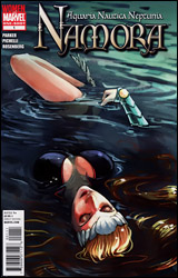 Namora
Publisher: Marvel
Released: 23 June 2010
Writer: Jeff Parker
Artist: Sara Pichelli
Colorist: Rachelle Rosenberg
Letterer: Dave Sharpe
Cover: Stephanie Hans
Cover price: $3.99
Review: Hannah Krueger
So, there are these distressed Russian submariners out in the middle of the sea, and then something tears through their hull. It's some chick announcing that she's an Atlantean princess, and that she's there to save them - as she tears their submarine apart. She recruits a whale to help them breathe, then dumps them somewhere while she goes off to find a lost colony of her people. She finds them, but something isn't quite right.
From what I can tell, this is a spin-off of Atlas. That said, I have no clue who this girl is, or if she's related to Namor (I'm guessing that she is), but the one-shot does a pretty good job characterizing her and at least gives me a decent idea of her backstory. There's a lot I still can't quite figure out, but, to be honest, I have a feeling that this is meant to be a plug for the ongoing and nothing more. And from what I've seen here, I'm at least mildly intrigued by her, and, for that matter, what part she has in the actual Agents of Atlas.
The art on this is fairly solid. There are a few times when Namora looks a little weird � mostly in the way she's posed and how her hair is drawn � but they seem more like momentary slipups. And despite her face being randomly red at points, the colors are very well done � especially in the parts that revolve around the sea.
However, this book has two major issues that I'd like to address.
First off, the fact that the cover of this is emblazoned with the Women of Marvel banner, something I know the company has been trying hard to push lately. And the cover � both the normal and variant � has her draped lovingly so that she's sprawled provocatively; her chest is heaving, her hair is floating around her, and she's generally positioned sexily like an Aquaman porno mag. This isn't the only time we see this throughout the comic. Most of the panels focus on Namora's ass or tits.
Here's a hint, Marvel: if you're trying to market this towards women � which is, as I understand, what the whole big push of this Women of Marvel thing is about � don't make the main selling point of the book how sexy Namora is. Yes, I swing both ways, but you know what? As a lady, I'm not going to buy something marketed towards me if its main selling point is "Hey, hey! The main character is a sex symbol, and not much else!"
Also, there's the price. I'm sorry, but at $3.99, a one-shot had better be good.
If you're a woman and / or if you don't know anything about the Agents of Atlas, skip this, as you're clearly not its market. If you're a guy and / or are really interested in the individual Atlas members, flip through it.
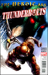 Thunderbolts #145
Publisher: Marvel
Released: 23 June 2010
Writer: Jeff Parker
Artist: Kev Walker
Colorist: Frank Martin
Letterer: Comicraft's Albert Deschesne
Cover: Marko Djurdjevic
Cover price: $2.99
Review: Hannah Krueger
So, Baron Zemo's back and ready to take over the Thun � PSYCHE!
It was a test, but not to see if the teammates actually wanted rehabilitation. No, it was a test by Luke Cage, Songbird, and the other instructors and wardens to see whether or not the nanites that they implanted in the new Thunderbolts actually work! Yeah, that's right. Nanites to restrain powers if they're out of line, 'cause god knows they can't be trusted at all, no sir. The instructors talk lots about how the team can't be trusted, and amidst this wonderful, nurturing environment, they go on their first mission: rounding up trolls that were apparently imprisoned in Asgard.
The last time I picked this book up was when it crossed over with Deadpool. I ended up following it after the crossover, because I liked the way it focused on the dynamic of these obviously messed up individuals, how they dealt with and related to good ol' Norman, and whether or not they had a conscience was interesting. And the answers were sometimes surprising. At the very least, it was an intriguing book with good characters.
I don't know what the hell's happened since I last picked it up, but this is nothing like what I was reading before.
Maybe it's the fact that we've now switched over to the Heroic Age. Either way, the focus is off of the actual members of the team, and the brunt of the focus is now on their instructors. And to be frank, the shift is kind of uncomfortable. Emphasized over and over again ad nauseam is how horrible the team members are, how there's no way they can be trusted, how they're even lucky to be given this chance, and not telling them about the fact that they've all been implanted with nanites.
And then they act surprised when Juggernaut and others decide to make a break for it when the Baron seemingly shows up. I mean, come the hell on. If you don't even give these people the slightest amount of trust, or at least show that you're going to give them a chance at rehabilitation, why the hell would they stick around? You're not exactly creating the most nurturing environment for them.
I don't know Luke Cage or Songbird much from other books, but if this was all I had to go on, I'd think they were right bastards. This is not exactly the impression you are wanting to give your audience going into the Heroic Age where the focus is on these people who are supposed to be the good guys.
And then there's the art. I'm sorry, but the pencils are absolutely ugly, especially when it comes to facial expressions. Most of them suffer from Daniel Acuna Syndrome: they have closed eyes and contorted facial expressions that I think are supposed to be conveying intense emotions, but it looks like they're constipated. Characters look like they're off-model, or are contorted into odd positions. There are some times when it looks like maybe the art's going to be passable, but it just ends up falling flat.
Skip this. Between the new attitude and the new artist, it's not worth your time.
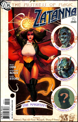 Zatanna #2
Publisher: DC Comics
Released: 23 June 2010
Writer: Paul Dini
Penciler: Stephane Roux
Inkers: Karl Story and Stephane Roux
Colorist: John Kalisz
Letterer: Pat Brosseau
Cover: Stephane Roux
Cover price: $2.99
Review: Preston Nelson
It's hard for me to say anything bad about Paul Dini, because the guy has brought all sorts of joy into my life. Tiny Toons, Batman: The Animated Series, and his comics, I generally love it all. But my one complaint about Dini is simple: when it comes to Zatanna, the dude is really freakin' creepy. I mean, I may have a certain taste for Power Girl, but I don't intend to marry a buxom blonde and then shoehorn the character into every comic I write for the rest of my career. It's just a little more fanboy than I'd be comfortable with. So, I was a little concerned going into this issue, but I was actually surprised at how restrained Dini was.
Sure, there was a little cheesecake, and she maybe did a few things that seemed a bit deus ex machina, but on the whole, I didn't hate the book. The plot was kind of by-the-numbers, but it was a fun little exploration of who Zatanna is. Basically, after a long night with Black Canary and Vixen, Zatanna returns home and has her dreams invaded by a demon. These sequences are fluid, gorgeous, and pretty interesting. They shine a bright light on Zatanna's insecurities, particularly those relating back to Identity Crisis. There's also some stuff with a police department, which practically bleeds "padding." And when we finally get somewhere with the police department gents, it's only to have the big bad of the book, Brother Night, stick his head in the door and remind them that he's still evil.
While I'm on the subject, I love the way Brother Night looks. He's got a look that brings to mind Dennis Hopper as Frank Booth in Blue Velvet, except some kind of crazy demonic zombie. Outside of this, he seems to be your standard "I'm taking over this city! Muah-ha-ha-ha!" villain.
And while I generally do like the art, there are places where things bothered me, mostly the panel where the chair the young love interest police officer is sitting in just goes away. He's still sitting, but there is no chair. Granted, it's a Zatanna book, so I'm comfortable just saying that a wizard did it. Other than that, I rather like Stephane Roux's art. He's got something of an Amanda Conner vibe, which is high praise coming from me. He's a little stiffer than I'd like in places, but it's a nice, light style that fits the book.
I was surprised with how much Dini managed to restrain himself, and the art is pretty nice, but I can't justify anything more than a flip through, considering how padded this love letter from a fanboy is.


