Is It Wednesday Yet?
15 June 2010 � Here we are again with another installment of your favorite comic book review series. As always, the reviews are free of spoilers, so read on without fear of having your experience ruined!
Our grading scale is simple:
Buy: An excellent comic book.
Borrow: A good comic, but save yourself some money by reading a friend's copy.
Flip Through: Give it a once-over at the comic shop.
Skip: This doesn't need to be explained.
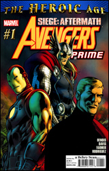 Avengers Prime #1
Publisher: Marvel
Released: 03 June 2010
Writer: Brian Michael Bendis
Penciler: Alan Davis
Inker: Mark Farmer
Colorist: Javier Rodriguez
Letterer: Chris Eliopoulos
Cover: Alan Davis
Cover price: $3.99
Review: Preston Nelson
There are few men as polarizing in comics today as Brian Michael Bendis. Some people love the guy, some people hate him. Me? Well, I'm of two minds. I loved Ultimate Spider-Man, but Mighty Avengers left me cold. That being said, I love the idea behind Avengers Prime. Take the most iconic founding Avengers, and set them on a road trip / buddy cop thing that forces them to confront their issues and strengthen their bond once more. And let's face it, Steve Rogers, Thor, and Iron Man are the Avengers. No slight to the other founders, but Janet Van Dyne is dead, Hank Pym kind of sucks, and Hulk was never really that much of an Avenger anyway. So, we're left with Steve, Thor, and Tony confronting a danger similar to the one that brought the Avengers together in the first place: an Asgardian threat. Originally it was Loki tricking The Hulk, now it's an Asgardian vortex.
If you've noticed that I'm kind of avoiding the book itself, there's a pretty good reason for that; it's not bad, but it's not good either. It's just there. I mean, Alan Davis' pencils are tight, accentuated very nicely by Farmer's inks and Rodriguez's colors. It's a good looking book, I can't deny that. And Bendis is very much himself here. The dialog is sharp and the characters have distinct voices, but it's just inconsequential.
Tony and Steve get in a pissing contest about Tony's armor. Due to Norman Osborn's hijacking of the tech, Steve wonders whether Tony should be allowed to keep it. To me, this is the book's greatest failing. One, it's heavy-handed, having Tony and Steve both launch catchphrases at one another. Two, it's a gross mischaracterization of both guys. Steve has always been a proponent of individual rights over the greater government good. This is the guy who has renounced the Captain America name three times. Twice over schisms with the government. And I don't care what Tony may or may have not done to his brain, he's not a hypocrite. Steve was doing to him exactly what he had done to countless superhumans during his tenure with SHIELD. Stark knows fair is fair, so I can't see him fighting Steve on this one. And yes, I know, conflict is the heart of drama. Without conflict, Avengers Prime would be the guys sipping tea and quietly chatting about the weather. But this conflict is sort of superfluous. Didn't Tony's actions during Civil War lead to Cap, y'know, dying? Doesn't Steve have enough of a beef without this armor thing? The only person acting remotely in character is Thor, and that's because he's morose over the destruction of his father's kingdom. And it's not like Thor doesn't have conflict with Tony "let's clone Thor and have him kill Black Goliath" Stark, but like the hero he's supposed to be, he knows that the squabbling can wait until the job is done.
In short, the book has nice art with Bendis being Bendis. This is great if it's your thing, but it's not really mine. It's a great concept, one that could definitely be redeemed in the coming issues, but it left me cold. At best, give this one a borrow.
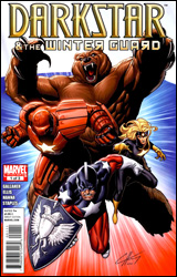 Darkstar and the Winter Guard #1
Publisher: Marvel
Released: 03 June 2010
Writer: David Gallaher
Penciler: Steve Ellis
Inker: Scott Hanna
Colorist: Val Staples
Letterer: Scott O. Brown
Cover: Clayton Henry
Cover price: $3.99
Review: Desmond Reddick
I'm the DC guy. Most of you know that already. If you're new here, you'll find it pretty apparent sooner rather than later. But the one thing I will always say that Marvel has over DC is a great stable of horror characters and international heroes. Beside my obvious affinity for the former and a deep un-abiding love for Alpha Flight, the Soviet Super-Soldiers � or, Winter Guard since Russia went all democratic on our asses � comprise some of my all-time favorite Marvel characters. From their appearances in X-Factor, Uncanny X-Men, and Avengers over the years, these characters, like Alpha Flight, offer a different perspective on the role of superheroes worldwide.
So imagine my excitement at being given this issue to review for you. Unfortunately, it did not live up to my nostalgia. That's not to say it's an awful book. Not at all. It's just not right.
The first eight pages feature the Winter Guard teaming up with the Agents of Atlas against the Atlantean warlord Krang and his three-headed sea monster. This wouldn't ever really be a bad thing anywhere else, but in the first issue of a three-issue series about a team of characters who no one really knows, why team them up with another team of characters who no one knows against a villain that no one knows? Obviously, Gallaher wanted an outsider's view on our virtuous vodka drinkers, but the Atlas team is essentially an outsider team themselves. It would have been much easier to use Iron Man and Captain America. But instead of introducing four new heroes to people, they've decided to clutter the opening scene with 10 characters that aren't exactly in the zeitgeist right now. Speaking of new characters, that brings me to the following.
Out of the four members of the Winter Guard, only one of them is the original. The original Darkstar died in Grant Morrison's New X-Men run, Red Guardian is someone I have never heard of before, and Crimson Dynamo is one of several recruits. Only Ursa Major has returned. Granted, he's a werebear � so that means he fucking rocks � but even the brass in this book is trying to replace him with someone else. Before I make this all negative, I do find it interesting that we are seeing the Russian idea of legacy characters. In the ruthless Russian Federation run by former KGB operatives, everyone is expendable, even the biggest national superheroes.
When you have 24 pages of story � minus the aforementioned team-up in the introductory scene � to introduce a team of four heroes, what happened to their predecessors, their bosses, the world in which they operate, and all the political intrigue it entails, it's a delicate balance. And it is balanced quite poorly here. This book needed as much in the way of extra pages as it could get. But when Marvel decided to price this book out of the market, the only extra pages you get is 10 pages of a shitty X-Men Unlimited story featuring Darkstar with horrifically bad art by Brett Booth and Ron Lim. And even worse writing. And that story continues next issue!
The art for the actual story is nowhere near as bad as Booth and Lim singlehandedly trying to destroy the medium. But Ellis' style still does not fit this book. The cartoony nature of the art belongs more in a slice of life comic about teenagers than it does in the pages of a book about the darkest, most serious nation on earth. In the words of Leo Tolstoy: "It's too fucking bright, man."
Combine this with the stellar cover by Clayton Henry, and anyone who flips through this book is bound to shout "Bozhe moi!" when the cognitive dissonance of the art styles converge. So flip through it. Because in Soviet Russia, book flips through you.
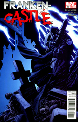 Franken-Castle #17
Publisher: Marvel
Released: 03 June 2010
Writer: Rick Remender
Artist: Roland Boschi
Colorist: Dan Brown
Letterer: VC's Cory Petit
Cover: Mike McKone
Cover price: $2.99
Review: Hannah Krueger
There's a raging war among the world of monsters over an artifact called the Bloodstone that's now been hidden in Franken-Castle's body. If the stone goes wrong, this could turn him into an even worse monster than he already is / was. Well, that's not encouraging at all. The general monster populace thinks that Franken-Castle's pretty damn awesome, and some ninjas are stupid enough to attack Frank at his family's grave. And thus, a whole new round of vengeance and such starts.
I remember seeing the announcement for Franken-Castle a few months ago, and thinking that this would be, at best, laughable, and that there would be no way this would have a chance of lasting. Well, folks, here we are. And you know what? This isn't half bad.
Preston, Dubs, and Des are probably going to kill me for saying this, but this kinda reminds me of Hellboy in a way. You've got the supernatural element at work here, plus a grim and gritty story. However, just because this reminds me of Hellboy does not mean in any way that it compares to Hellboy. This is a cobbled-together poor man's version of Hellboy; it lacks the lore to back it up, and there's more of an emphasis on rah-rah-gore-blood-splatter-shish-boom-bah.
If you've not followed Franken-Castle, this is as good a place for you to jump on as any; this issue wraps up the last arc, as far as I can tell, sets up the new arc, and doesn't rely too heavily on backstory. There's maybe one person who I didn't know, but he happily had some exposition in the form of losing his temper at Franken-Castle to explain that.
That's one of the book's weak points, though; at times, it tells us rather than shows us what's going on, which gets a bit annoying, especially in cases where it could have just effectively shown something rather than expositing to reach the page total. Though, when it chooses to show little things like monsters drawing a triumphant mural involving Franken-Castle and the way some of them react to him in passing, it does it well.
The art is a little rough around the edges, but I kind of expect that in a book like this. The colorist does amazing work on this though, and I have to say that I hope I see more from him. The monster underworld is portrayed as dark and moody, with shades that hint at the darker edges of neutral. But oddly enough, the world above may be even darker, drawn in blacks and blues.
I'd say give this book a flip through; you're probably going to be able to tell within the first few pages whether or not this is something for you. But it's at least worth giving it a shot.
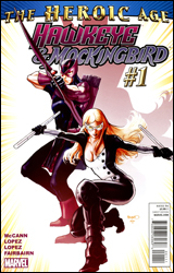 Hawkeye & Mockingbird #1
Publisher: Marvel
Released: 03 June 2010
Writer: Jim McCann
Penciler: David Lopez
Inker: Alvaro Lopez
Colorists: Nathan Fairbairn
Letterer: VC's Cory Petit
Cover: Paul Renaud
Cover price: $3.99
Review: Sean Lemberg
Wasn't that long ago, both Hawkeye and Mockingbird were seen as things of the past. Left behind, killed in action, mourned and buried. The same could be said for the more cheerful, happy-go-lucky style of Marvel storytelling. Left behind as pass�, it was good for its time but not for the present; beloved but outdated. It's appropriate, then, that both are enjoying their rejuvenation, their return to relevance, at around the same time. Last month Marvel rolled out their optimistic new storytelling direction, and now Clint and Bobbi are back with their own ongoing series.
Jim McCann's tale is a throwback in a modern setting. It's a retro-styled look at the classic Marvel method � breathless action scenes, wisecracking heroes, and firm base of operations in New York City � expertly mixed with a more enveloping threat and dialog that's a bit more legible. McCann's captured and continued the bright tone featured in Brian Michael Bendis' Avengers #1 in this issue, which is kind of the point of the Heroic Age. These aren't grizzled, war-weathered, tragic figures; they're people you'd actually want to hang out with. Interesting that the very culture the gritty antihero was created to rebel against is now being used to move the publisher forward into a new age. Archetypes are in vogue again.
This story's excesses are also a good part of its charm. Sometimes it's tough to look past the fact that Hawkeye just jumped from a car doing 60 mph down a narrow city street, landed on his feet, and nailed a perfect shot with his bow. In the detail-centric culture that's sprung since the last time Marvel was this merry, we've been trained to expect elaboration on that kind of situation, whether it's a moment's stumble captured on-panel or a quick note about the pair of steel underpants the hero's wearing for just such an occasion. McCann provides neither, and frankly he doesn't need to. That off-panel discard of what might seem like vital information actually inspired me to lose myself in the story. The writer focuses on moving the plot forward, not getting caught up in the details, and that inspires his readers to suspend their disbelief and buy into the moment.
The artwork, provided by Catwoman alumnus David Lopez, matches that lighter tone at every turn. Lopez works a curvy, energetic style that's ideal for a fast-paced action scene. No coincidence, then, that he gets precisely that kind of situation to make his first impressions in this issue. By the time the story moves into less explosive territory, you'll have already accepted him as a good match for this book. His influences softly transition from Steve Dillon to Tim Sale to Stuart Immonen, with a few extra stops in between, but at the end of the day his work is fresh, sharp, exciting, and wholly appropriate.
I don't know if the Heroic Age will have the legs to stick around for the long haul, but for the time being it's getting the job done. Although the issue does get bogged down around the midway point, when the story's moving, Marvel comics haven't been this much fun to read in some time � and it's not like their throwback style has resulted in a sacrifice in quality or modernity. This month, Jim McCann nails the difficult dynamic between the title characters, gives them each an ulterior agenda that's kept hidden from their counterpart, and doesn't forget to tie in the rest of the Avengers family. It's light enough to read in one sitting, but deep enough to bring its audience back for another installment. This isn't an issue that's going to redefine the way you think about comics, but it's inarguably a fine foundation for future issues to grow upon. Borrow it.
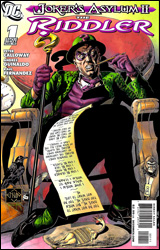 Joker's Asylum II: The Riddler
Publisher: DC Comics
Released: 03 June 2010
Writer: Peter Calloway
Penciler: Andres Guinaldo
Inker: Raul Fernandez
Colorist: Tomeu Morey
Letterer: Patrick Brosseau
Cover: Ethan Van Sciver
Cover price: $2.99
Review: Guest
Alright, I'm officially worried. It's been weeks and I haven't gotten anything completely hate-inducing.
The Joker's Asylum series of one-shots from last year offered a fun look at Batman's rogue's gallery, and even managed to tell some great stories in the process. The Penguin one-shot in particular did more for the character than any other story in recent memory. If I had any real complaint, it was that my favorite, The Riddler, had been left out. Perhaps hearing my pained (yet still manly) cries for a follow-up, DC has delivered.
Though Edward Nigma has found himself on the better side of the law more recently, this issue calls back to a time when he was at the height of his criminal madness, only to become obsessed with winning the affection of a beautiful art student. Understandably, she despises him, which only makes his pursuit all the more dramatic. Now, when I think of The Riddler, the first thing that comes to mind usually isn't "love story," but it works shockingly well here. This woman is the unsolvable riddle, and our "hero" does everything in his power to prove it otherwise. It continues the trend of Joker's Asylum issues being more about sympathetic character studies than well-devised crimes. The writing is such that you really only know as much as the Joker feels you should know, which makes for a unique and often amusing read. Though he rarely does anything for me, the Joker playing the role of the storytelling Cryptkeeper is a good fit for the book, and his involvement plays a part in the larger picture, as the issue itself contains its own riddle that the reader is expected to solve.
The art is fine on its own, but what really makes it stand out are all of the visual details that are in play. There is so much going on in the background that it can take multiple reads before you catch everything. Without spoiling it, there is an obvious theme running through the issue, and nearly every single panel makes a reference to it. Rarely do I find myself studying each page of a comic as much as I did with this one. It's clear that the team had fun creating this story, and it translates to the reader. I'm honestly worried about the rest of the series because I can't see any of them topping this
It may not be for everyone, but a book like this is right up my alley. This is a comic that I already had in my hands before the review was even assigned, and I was all too happy to heap its praises here. It's an easy buy.


