Is It Wednesday Yet?
08 June 2010 — Here we are again with another installment of your favorite comic book review series. As always, the reviews are free of spoilers, so read on without fear of having your experience ruined!
Our grading scale is simple:
Buy: An excellent comic book.
Borrow: A good comic, but save yourself some money by reading a friend's copy.
Flip Through: Give it a once-over at the comic shop.
Skip: This doesn't need to be explained.
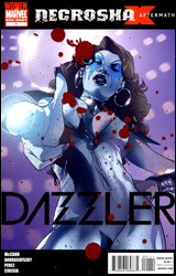 Dazzler
Publisher: Marvel
Released: 26 May 2010
Writer: Jim McCann
Artists: Kalman Andrasofszky, Ramon Perez, Rick Ketcham, Frencesca Ciregia, Robin Ha, and Christina Strain
Colorists: Jim Charalampidis and Cris Peter
Letterer: Dave Sharpe
Cover: Kalman Andrasofszky
Cover price: $3.99
Review: Sean Lemberg
The latest spawn of Marvel's early summer fling with femme-focused one-shots, this month we spend a few minutes with Dazzler. A former member of the X-Men, Alison Blaire was most recently involved in Necrosha, to which this issue is meant to serve as something of an epilogue. Thing is, while the character is loosely tied to the events of that crossover (Alison's sister was actually more intimately involved than she was herself), very little of its plot and almost none of its mood is all that tightly connected.
At the outset of the issue, writer Jim McCann is at least kind enough to grant his audience a token nod towards present continuity. As usual, Alison's between a rock and a hard place, trying to get her career back on the fast track and hunt down her rogue sister all at the same time. By somewhere around the fourth page, though, most of that has been swept under the rug in favor of a more timeless, run-of-the-mill romp through one of Arcade's expansive, confusing obstacle courses. Longtime fans of the character may find something familiar in that premise, and it won't be the last time they're escorted down memory lane. While newer readers won't have any trouble accepting this issue as a bouncy, if haphazard, action tale, it's really intended for long-term fans. The fistful of references and throwbacks to Alison's self-titled series from the early 1980s will sail right over most folks' heads, while the diehards will eat them up. It's pure fan service.
McCann's a good choice for that kind of story. A self-proclaimed lifelong admirer, McCann cut his teeth with Dazzler on a short story in Marvel Heartbreakers, but hasn't really had the chance to show how well he knows her before this month. His understanding of what makes Alison tick and what she's gone through earlier in life are major positives. The actual power of the story itself, however, doesn't quite reach the emotional peak I think he was searching for, even when the fireworks cease and the story takes more of a focus on its characters.
Kalman Andrasofszky and Ramon Perez handle the artwork within the first chapter, detailing Alison's big action scene in Arcade's playground. The two have complimentary styles, but it's clear as day when they swap panels. Andrasofszky's work is more vivid, his splash pages more striking, while Perez's work is a bit rougher around the edges. Andrasofszky's action scenes are more organized and easy to read, with an emphasis on a few very specific dynamic poses. Perez's are more like weakly orchestrated chaos.
The book changes gears in its final pages, introducing the ultra-minimal style of Francesca Ciregia. Ciregia's work is more stylized and interesting than the others, often taking a cue from Eduardo Risso's efforts with 100 Bullets, although about once every page I caught myself wishing she'd shown a bit less restraint. Particularly in close-ups, of which there are several during Alison's emotional phone call with her mother, it felt like Ciregia was sacrificing sentiment for the sake of an extremely low line count.
Your enjoyment of this issue is going to depend on your existing knowledge and appreciation of the character. Jim McCann reinforces Dazzler's personality, but he doesn't give her anything new to play around with. He also doesn't spend a lot of time spelling things out for less-invested audiences. What you take out of this one is going to depend on what you put into it; fans will find enough to make them flash a retro-induced smile, and longtime haters will only see more fodder to ignite. Neither can claim it's one of the better issues of the character's lifespan, though. Flip through it. There's something here, but its success is conditional and fleeting.
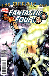 Fantastic Four #579
Publisher: Marvel
Released: 26 May 2010
Writer: Jonathan Hickman
Artist: Neil Edwards
Colorist: Paul Mounts
Letterer: Andrew Currie
Cover: Alan Davis
Cover price: $3.99
Review: Preston Nelson
Older than both the Avengers and the X-Men, the Fantastic Four has always been a part of Marvel. And as the company and the industry have changed, the team of Reed, Sue, Johnny, and Ben have changed alongside it. But, through all of the changes and growth, one thing has always been a constant: Reed Richards is the biggest douche on the planet.
This is a guy who regularly goes against Dr. Doom and Namor, and somehow, they look more appealing than him. This is a guy who has beaten Galactus, Ronan the Accuser, and moderated peace with the Inhumans. This guy should be Earth's greatest hero, and yet, I can't honestly name a person I know that likes Reed. Ben, Johnny, Sue, sure, they all have their fans. But Reed is almost universally despised or ignored, and why? Because Reed Richards is more shortsighted than any character in all of comics: "Let's beat those Commies into space! I'm sure there are no cosmic rays that might kill or disfigure my best friend, my underage-ish girlfriend, and her even more underage brother, right?" And though this is the first example, it's hardly the only one. Seriously, does no one ever say things like, "Hey, Reed, we have no idea what sort of eldritch abominations might lurk in the Negative Zone, are you sure you want to blow open a portal to that place?" As recent as Civil War and World War Hulk, Reed Richards has been making dumb decisions that have come back to bite him, and of course, this issue starts with Reed making another one.
Y'see, because all of the scientists on Earth are becoming old fuddy-duddies, Reed quits his big global science team to start a school for super-geniuses. Including his daughter, some Atlantean kid-fish-things, Moloids, a clone of The Wizard, Dragon Man, Alex Power, and some other characters I couldn't be arsed to lookup. I don't know, and I don't care. Basically, Reed is teaching a bunch of kids of supervillains how to build better ray-guns for dear old dad. And if this story ends with anything that isn't one of these kids turning on him, I'd be mighty surprised.
The good members of the team get about five pages combined, including a genuinely amusing sequence with Franklin trying out catchphrases with Uncles Ben and Johnny. The art is gorgeous, but the story is just so wall-bangingly stupid that I just cannot care. Reed Richards is boring and so is this comic.
Oh, and before anyone accuses me of "not getting it," you're right, I don't. I love the Fantastic Four, but Reed has never worked for me. He's not a leader; both Sue and Ben have proven themselves to be as capable, if not more. When I read Fantastic Four, I want to read about a family, not the brainless patriarch probably destroying another universe. I think this is supposed to be something of a jumping on point, but it's a terrible one. Flip through it.
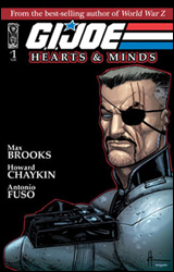 GI Joe: Hearts & Minds #1
Publisher: IDW
Released: 26 May 2010
Writer: Max Brooks
Artists: Howard Chaykin and Antonio Fuso
Colorists: Aburtov and Lovern Kindzierski
Letterer: Robbie Robbins
Cover: Howard Chaykin
Cover price: $3.99
Review: Michael David Sims
Major Bludd is a ruthless terrorist who's also a loving family man, and Spirit is a tracker who hates the curse that allows him to do his job so well. That's this issue. If you're looking for action — be it the traditional lasers that don't kill anyone or the modern real world stories — this is not the GI Joe comic for you. Max Brooks' aim is to ground the characters, to show us who they are by letting us into their, well, hearts and minds. Unfortunately, he has a little too much in common with the old cartoon: he doesn't quite hit his mark.
However, Hearts & Minds is not a bad comic. Not at all, in fact. It's just a little flawed. By featuring two stories in each issue — one about a Joe, the other a Cobra — Brooks isn't allowed the room he needs to tell the introspective tales he wants. (In fact, I only knew the first story was over when I turned the page and saw a new artist and setting, causing me to flip back to make sure I didn't skip something.) This cuts his stories off at the knees, providing only a surface-level look at characters that are long overdue for fleshing out.
That said, what little we do get of the two men is interesting. Though it was hardly deep, by the end of the Major Bludd story you now know why he's chosen this life. Do we agree with his actions? No. But can we understand a man not wanting to suffer the same fate as his father and his father before him, thus attempting to take control of his life and the world around him? Yes. And can we understand him doing bad things to make a cushy life for his wife, children, and elderly father? If you've seen The Godfather or The Sopranos, yes. It's just disappointing that we didn't have more time with the Bludd clan, if only as a way to juxtapose his barbaric battlefield persona against his softer side.
The Spirit story is a lot like many issues of Daredevil; he has the ability to see and hear everything, drowning him in senses that nearly drive him mad. Nothing new is really brought to the table in this regard, but it does add a dimension to the character we didn't know was there before. With a full issue, though, Brooks could have pushed Spirit away from the Daredevil comparisons and into his own spotlight.
Howard Chaykin handles the Bludd story, while Antonio Fuso takes on Spirit. And both men do an admirable job. Chaykin is very restrained here. Gone are the overabundance of background sound effects, hurried lines, and, best of all, Cabbage Patch heads. This is a Howard Chaykin I would gladly read more of. He also does a fine job juggling the scenes that mirror Bludd against his forefathers. Often that's rather cheesy, but here it works because the sequences are quick and kept to a minimum.
Antonio Fuso's resume is not deep, so chances are you haven't heard of him or seen his work before. Me, I've been a fan since I first read GI Joe: Cobra late last year. Of his work, I once wrote, "It's clean and simple, but so very emotive and dynamic. It does a wonderful job moving the story along, while taking its time during the slower moments." And my opinion stands. In a few years time he'll be drawing Daredevil or Detective Comics, and then everyone will know his name.
I truly want to give this one a buy, if only for the new take on the property and effort put forth by all involved. But the dual-story nature of the book betrays the concept. That said, it is very much worth reading, so borrow this one. (It looks like Chaykin and Fuso will be sticking around for the entire miniseries, so that's a bonus.)
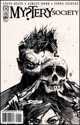 Mystery Society #1
Publisher: IDW
Released: 26 May 2010
Writer: Steve Niles
Artist: Fiona Staples
Letterer: Robbie Robbins
Cover: Ashley Wood
Cover price: $3.99
Review: Guest
Oh dear. Please tell me someone kidnapped Steve Niles and stole his identity.
Really, considering the creative team behind this book, I thought I had my score pretty well figured out beforehand. Steve Niles is the man responsible for some of my favorite comics of the past few years, and Fiona Staples is a fun artist destined for great things. This should have been an instant buy for me, but the sad truth is that it's just not very good.
I'd say the biggest problem is with the lazy storytelling. Our hero, Nick Hammond — a charismatic chap with a pedophile mustache — has been arrested for an assortment of spectacular crimes and is hounded by the media on the way to imprisonment. Despite the officers telling Nick to "make it quick," he proceeds to recall the origin of the Mystery Society. He also makes sure to note to a reporter that origin stories are boring before spending the rest of the issue telling a boring origin story. It's almost as if Niles knew he'd be criticized for such an uninspired method of exposition, and figured he'd be safe if he pointed this out before them. This happens again when a character spews a line so bland and cheesy that Nick notes that it sounds like something out of a comic book. This is not the writer being self-aware. This is the writer so unhappy with his own work that he has to comment on its poor quality in an attempt to save face. The sad part is that if he hadn't noted how dull origins were or how stale that line of dialog was, I likely wouldn't have noticed or cared. Instead, it takes me out of the book and away from the story.
Speaking of the story, there isn't much of one. Nick is your standard adventuring James Bond / Indiana Jones type that is part of the Mystery Society, a group that he founded with his wife with the intention of doing something or other. (I suppose I'll have to check out the next issue for that one.) His wife exists to look smart and be ogled. And there's a random guy in a skull mask. That's really the extent of it. For a story focused on spy action and mystery, it's shockingly dull, and the writing honestly reads like it was done by someone else entirely. The personalities feel forced and their pursuit seems fruitless. Nick is constantly making quips but never manages to be funny. It's not horrible. Really, it's more sad than anything.
Fiona Staples is good here. I've always liked her work and her unique style is really the savior of this book, much like it was on North 40. Unfortunately, Mystery Society has all the self-referential tedium of that book without any of the Lovecraftian chaos to hide it.
Staples deserves better. Niles can do a hell of a lot better. Sorry, Steve. This is a flip through, at best.
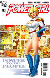 Power Girl #12
Publisher: DC Comics
Released: 26 May 2010
Writers: Jimmy Palmiotti and Justin Gray
Artist: Amanda Conner
Colorist: Paul Mounts
Letterer: John J. Hill
Cover: Amanda Conner
Cover price: $2.99
Review: Hannah Krueger
This is the last issue of Palmiotti, Gray, and Conner's run on Power Girl, and you can tell that up front because every character from every plotline that's happened throughout their run shows up here. It's quite a fun issue, with resolution, amusing interactions, and warm feelings. There are cats, intergalactic suitors, girl bonding, villains dealing with other villains, cute family moments, people being awesome, and just general wonderfulness. It's a feel-good romp from start to finish, and you can't help but wish that other runs could end on this high of a note.
But, as good as the story is, it won't be the main reason you're reading this comic: that'd be the art. And Amanda Conner does some damn fine work on this title. Yes, a good part of this qualifies as cheesecake, 'cause hey, it's a Power Girl comic. But you know what? It's well-drawn cheesecake, and it doesn't take away from the story at all. She pays a lot of attention to designing her girls, and it doesn't look lecherous or skeevy. And an equal amount of attention is paid to the other characters and background.
I picked up Power Girl back when I had the money to be following comics, and it quickly made its way onto my regular pull list. It was consistently entertaining from month to month, and it had really great artwork. It may not have been the deepest or most dramatic comic on the market, but it could put a smile on my face. This is still the case, and I'm kinda sad to be catching up only as this team's run ends.
I don't know the circumstances of exactly why the three are exiting, but I do know that Conner originally announced that she was leaving, and Palmiotti and Gray chose to follow her. I have to say, I think this is the right choice. From what I know, they work really closely, and having one without the other just wouldn't be right. I feel like this was entirely too short of a run, but they shined in the time they had, which says a lot about the work they put out. I'll definitely follow whatever they may be working on after this.
Go and buy this. It doesn't matter if you haven't been following it up until now; it's a funny comic that resolves what's come before, and cleans house for the new creative team. Plus, boobs. Those are always good.
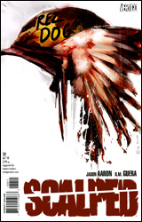 Scalped #38
Publisher: DC Comics / Vertigo
Released: 26 May 2010
Writer: Jason Aaron
Artist: RM Guera
Colorist: Guila Brusco
Letterer: Steve Wands
Cover: Jock
Cover price: $2.99
Review: Preston Nelson
Going into this one, I had no idea what to expect. I had never read Scalped, and though I'd heard people talk about it, I hadn't ever bothered to investigate it; I was going in blind. Immediately, I was caught by the awesome cover, riffing on the poster for Kubrik's Full Metal Jacket. But, also, I was immediately worried by the idea of a Rez Dog. I've spent plenty of time around Native Americans — I've seen the men rich from casinos, and some of the poorest parts of the reservations in South Dakota — and I think it's fair to say that Native Americans haven't always been given the best shot in comics. So, big points for the cover, but I remained decidedly skeptical.
The first page basically assuaged all my doubts. I began reading through the story and actually started contemplating if there was something supernatural going on. These miracles that continued to occur were honestly that: miracles. Everything's possible, just extremely unlikely. The book follows a Native American solider simply known as Wade, and it stands alone as an example of how to put a believable Vietnam on the page. Unflinching in it's depiction of violence, this issue feels like an Oliver Stone film, with the political crap filtered out and replaced with honest introspection. It's Platoon by way of Eugene O'Neill and it's brilliant.
Wade is real. No matter what happens to him, no matter what he does, he's real. He speaks with the voice of a man who has seen too much to sleep at night, and his every movement is wracked with guilt and pain. Most of the other characters are set-pieces and that's fine. This book is all about the journey of one man through Vietnam and back to his home in South Dakota.
I loved the art, too. There was literally a splash page that made me gasp — not with its violence or gore, but with its incredible composition. The color palette, lines, and inks are perfect; everything sits delightfully on the eye, leading your journey through the page.
Before I read this issue, I had never even glanced at Scalped. Once I finish typing this sentence, I'm going to order the first trade. Buy it.
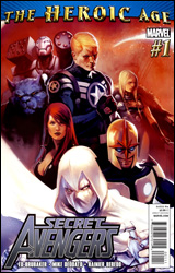 Secret Avengers #1
Publisher: Marvel
Released: 26 May 2010
Writer: Ed Brubaker
Artist: Mike Deodato
Colorist: Rain Beredo
Letterer: Dave Lanphear
Cover: Marko Djurdjevic
Cover price: $3.99
Review: Michael David Sims
Now the top cop in the world, Steve Rogers has put together several teams of Avengers, including his black ops Secret Avengers. Together — War Machine, Beast, Black Widow, Ant-Man (Eric O'Grady), Valkyrie, Moon Knight, Nova, and Sharon Carter — they're tasked with taking down the shadowy threats to the Marvel Universe before they have a chance to cause mass panic and destruction.
In this debut issue, Ed Brubaker's already assembled his team and sets them on their first mission: preventing the Serpent Crown from falling into the wrong hands. What the crown does or why it's wanted, however, are never stated. Why Steve chose this specific team also goes unsaid. And that's the biggest flaw with this issue; we're supposed to accept everything from the start, never stopping to wonder the whys and wherefores. In a normal Avengers comic, where the costumed foes' goals are usually controlling or destroying the world, that's fine. We know and love the cliché. But in this kind of book, one that's all about covert missions and being proactive, we should be briefed. Granted, starting in medias res is acceptable, but a flashback outlining the threats, mission, and goals isn't a bad idea.
The characterization is also lacking, and with established heroes it shouldn't be hard for Brubaker to dig into a few of them in his initial outing. Considering his runs on Gotham Central and Daredevil, the writer has proven that he's a master at finding something to latch onto and developing that trait into a new take on a character. Here we see none of that craftsmanship. In fact, I'm seeing shades of his first 12 issues on Uncanny X-Men, though it's nowhere near as bland. Hopefully he's learned from that experience and will be able to better manage a team book.
Continuing directly on from Dark Avengers, artist Mike Deodato is the right man for Secret Avengers. His liberal use of shading and inks adds the black to black ops, but the one thing he's never quite nailed is the female form. They're stuck in the 90s, with impossibly arched / curved backs and pushed out breasts. His style has surely grown since then, so why hasn't his handle on women? It's a pose that never looked good, as is now 15 years out of date. Besides that, everything looks great; from the action to the villains, the ships to the various locations, this is a stunning book.
That said, I feel I must mention Beast's costume. As a former member of the X-Men, Hank McCoy is accustomed to wearing a letter on his person. Usually it's a tiny X. Here, however, he has a giant Avengers-font A splashed across his midsection. It's a nitpick, sure, but ugly nonetheless.
And speaking of Beast, didn't he quit the X-Men because he vehemently disagreed with the creation of the modern X-Force — a covert, violent, and sometimes deadly team? Yet here he is on a black ops team filled with shady characters and killers. I take no issue with Beast being an Avenger — quite the opposite really, as I think he's a better fit there than on the X-Men — but this isn't the team for him. The publicly heroic Avengers proper should be his home.
All my gripes aside, Secret Avengers #1 is an okay book. Considering the creative team, however, it should have been better. If these abovementioned problems are tackled, it will become a solid read. For now, though, it's a flip through.
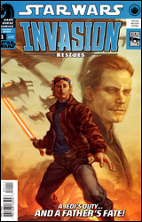 Star Wars: Invasion - Rescues #1
Publisher: Dark Horse
Released: 26 May 2010
Writer: Tom Taylor
Artist: Colin Wilson
Colorist: Wes Dzioba
Letterer: Michael Heisler
Cover: Jo Chen
Cover price: $2.99
Review: Hannah Krueger
Reviewer's note: Originally, my plan was to repeat "Fuck you, George Lucas" in order to reach the word count. Unfortunately, boss man turned that idea down. Therefore, I begrudgingly present you the following review of Star Wars: Invasion - Rescues #1.
There are refugees. They are listening to stuff about politics. And then they are blown up. Han and Leia had kids apparently. And they are Jedi. They are talking with another kid who is training to be a Jedi or something, and is somehow connected to the refugees. And then another ship comes in, and blows up another ship, and they are also connected to the refugees somehow. And there is stuff about destiny. After reading the little blurb that's supposed to catch us up, I still have no idea what the hell is going on.
Now, maybe you're avidly following the Star Wars Expanded Universe, which appears to be set around the Solo children. And Luke maybe. I don't know. Maybe if you follow the EU, you could write a better review of this than I can, but this is nowhere near new reader friendly. I don't know why I should care about these people, other than the fact that they are the spawn of more popular characters.
The artist does a good enough job; when the kids are meant to resemble the trinity of main characters, they look like carbon copies, or at least like a blend of the three — like they were scrambled through one of those What Would Your Baby Look Like generators you see on Facebook. All the rest of it is passable enough; you can tell what's going on during the action scenes, and the characters don't look mutated or deformed in any way.
This is branded with the Lucas Comics imprint, loud and clear, even overshadowing the Dark Horse logo. And it's pretty damn clear that this is nothing but an attempt by Lucas to make even more money off of Star Wars, probably enough for him to play around some more and make this into a new trilogy. And maybe that's part of why I dislike this so much.
This has earned a new rating from me: Fuck you, George Lucas. If you're already invested in the Expanded Universe, you'll maybe get more out of it. But if you're not, don't bother feeding into the Lucas money-making machine.
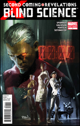 X-Men: Blind Science
Publisher: Marvel
Released: 26 May 2010
Writer: Simon Spurrier
Artists: Paul Davidson and Francis Portela
Colorist: Chris Sotomayor
Letterer: Rob Steen
Cover: Gerald Parel
Cover price: $3.99
Review: Sean Lemberg
It's time for a field trip with the science class! Taking a break from cracking the mutant genome and solving the present repopulation crisis, the X-Club (aka Cyclops' pet science division) has been thrust into the heart of the field team's battle with Bastion. Tasked with sneaking aboard the enemy's mysterious oil rig and sabotaging it from within, the science team has inadvertently stepped right into a trap. Now, deep inside an unfamiliar stronghold that's outfitted with technology years from being discovered, they're watching an alarmingly short-fused timer swiftly count down to zero.
Of course, the problem with dedicating an entire issue to resolving the team's ultimate fate is that we've already seen them leap to safety in X-Men Legacy #236. What could've possibly happened between "timer counting down to annihilation" and "leaping clear from a fireball" to fill out 34 pages? Actually, quite a bit more than you'd think, although nearly all of it is immediately spoiled by a half-baked, telegraphed twist ending.
This isn't to say it's a completely bad trip. Look past the craptastic climax and you'll find this is actually an unusually offbeat, interesting story, especially considering its location near the epicenter of the greater X-Men mythos. The X-Club is an entertaining mix of personalities and capabilities, a group that offers a more pragmatic, less plasma-blasting / adamantium-slashing answer to the kind of problems the X-Men have been facing for the last decade or so. Dr. Nemesis in particular gives the group a decidedly different flavor than I'm used to seeing from the X-family, threading irony and sarcasm into his remarks so effortlessly it begins to resemble an entirely different language. Writer Simon Spurrier may not nail the characters exactly as they've been seen in other titles, but he does maintain the group's fascinating dynamic and feeds them plenty of solid lines and unexpected problems throughout the issue.
Paul Davidson and Francis Portela team up for this one-shot's artwork, which varies wildly in subject and atmosphere from page to page. One panel may feature the sleek, clean backdrop of a sterile laboratory, while the next overflows with decrepit buildings, living shadows, and constant strikes of static electricity. The two manage these sudden flying leaps decently enough, changing styles like an experienced bicyclist shifts gears on an incline. The dark treatment that coats the issue is its most successful, with a detailed, shadow-hazed look demanding immediate comparisons to Jae Lee, but it's also missing a beating heart. Each member of the team comes off as a stiff, soulless marionette, posed for the scene but looking and feeling more than a little bit unnatural. That's not enough to spoil the fine work that's done on scenery and composition, but it does take away from an effort that's otherwise quite strong.
Blind Science is nothing if it's not inventive. Simon Spurrier's fever dream of the club in an unusual post-apocalyptic setting is a fully functional mind dump that yields a frequent, fruitful harvest. Just don't expect it to answer any questions or reveal any new information about the team, their actions during the crisis, or the X-Men as a whole. This is a fully self-indulgent fantasy, and nothing is out of bounds — even contradicting itself at the end of the third act. It's a good time, but most readers will find themselves too busy feeling betrayed by the ending to realize that. Flip through it.


