Is It Wednesday Yet?
01 June 2010 — Here we are again with another installment of your favorite comic book review series. As always, the reviews are free of spoilers, so read on without fear of having your experience ruined!
Our grading scale is simple:
Buy: An excellent comic book.
Borrow: A good comic, but save yourself some money by reading a friend's copy.
Flip Through: Give it a once-over at the comic shop.
Skip: This doesn't need to be explained.
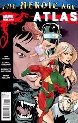 Atlas #1
Publisher: Marvel
Released: 19 May 2010
Writer: Jeff Parker
Artist: Gabriel Hardman
Colorist: Elizabeth Breitweiser
Letterer: Ed Dukeshire
Cover: Terry Dodson and Rachel Dodson
Cover price: $3.99
Review: Desmond Reddick
In this issue we catch up with the modern day 3-D Man, formerly Triathlon, in the post-Skrull invasion world. You see, as a member of the new Skrull Kill Krew, 3-D Man killed him a lot of little green men and even a hero. So now people don't really like him very much. Adding insult to injury, he's being blamed for another death in this issue. So, he has decided to seek out the fine folks of Atlas who had a connection to the original 3-D Man in the 1950s.
It's a little convoluted and convenient to get him involved in the series, but it's nice to add new blood to a team that's very comfortable with each other. Beyond that, it's an interesting and fun little book. I'm almost completely new to the 3-D Man character. He's pretty well fleshed out in this issue and, besides the silliness inherent to the character, is quite intriguing. He promises to add some tension and excitement to the team dynamic.
Gabriel Hardman continues to prove himself as one of the most textured and vibrant storytellers Marvel has. His dark and gritty look owes as much to Alex Maleev as anyone else, and yet his depiction of superheroics isn't as awkward as Maleev's. His balance between colorful heroes and noir realism is never out of place. He's as at home with talking heads as he is with flying saucers and talking gorillas. He wasn't the guy who defined the style, but he's certainly become the torch bearer.
The backup featuring art by Ramon Rosanas looks distinctly different from Hardman. Perhaps too different. The cartoony nature of the art is okay. In fact, it's right for this team, but when the story is all about the heroes versus zombies in the 1950s, it needs a darker edge. Especially when they're trying to drum up tension as far as the danger these characters face. Hint: they live through it because we've just read a story about them set in the modern day. On its own, it doesn't have a lot of merit.
I mentioned the backup because it's the reason — or rationalization — for the $3.99 cover price. And while the opening story is fun and beautiful to look at, the backup is hardly worth reading at all. There is no justification for spending $3.99 on this book other than the support to keep it alive. Unfortunately, that's not enough of a validation for me.
Though I like Atlas #1 and it deserves the support, the price makes it so I cannot defend it in any other way than the trade paperback format. So I'll have to say borrow it and see if you like it.
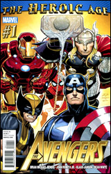 Avengers #1
Publisher: Marvel
Released: 19 May 2010
Writer: Brian Michael Bendis
Penciler: John Romita, Jr.
Inker: Klaus Janson
Colorist: Dean White
Letterer: VC's Cory Petit
Cover: John Romita, Jr.
Cover price: $3.99
Review: Sean Lemberg
With the conclusion of Siege also came the end of the modern Avengers and an era for the publisher. To commemorate the beginning of "The Heroic Age," as Marvel has dubbed it, they've relaunched the entire fleet of Avengers books, shuffled their rosters, and even let the metaphorical sun peek its way through the clouds again. That new direction begins right here with a new team, a new first issue, and, naturally, a new threat.
As the active transition point from the nightfall of the last decade to the dawning of a new epoch over at Marvel, it shouldn't be much of a surprise that a large part of this issue is spent on establishing shots, cameos, and reintroductions. It also shouldn't be that shocking to see that the tone is very noticeably different from what we've seen from the Avengers family of late. Missing are the dark corners, back alleys, and secret hideouts that served as scenery for the majority of New Avengers and Dark Avengers, with the public adoration and round-table discussions that have more traditionally been team mainstays taking their place.
In a lot of ways, this issue feels like a major league throwback to an era when the skies were always shiny and our heroes always wore a smile. It's like the kind of dreams I'd imagine a comic geek like you or I having if they fell asleep in a time machine aimed at the 1960s. Bearing that in mind, it's also worth mentioning that Brian Michael Bendis has his fingers in every panel of this issue — particularly (and predictably) in the conversations that drive it. The story is a sort of half-breed; it's an old school, chest-puffing superhero team-up with modern off-the-cuff dialog. In that way, it has a lot in common with the first arc of Mighty Avengers, when the pro-SRA heroes still enjoyed public adoration and government appreciation before Norman Osborn took over. That's quite a change in scenery from where we stood just last month, but Bendis does a good enough job of reminding us that a lot's changed for these characters since then.
He also doesn't ignore the trials they've endured or the bridges they've burned. Particularly interesting are the few panels shared by Steve Rogers and Tony Stark, whose tenuous relationship is the heart of this team. Bendis doesn't wait long before he throws the team right into a conflict, but what time he does spend elsewhere is wisely invested. Those icebreaking moments are vital to convincing his readers that this team could actually work, even after all they've been through and everything they've said and done to one another.
Looking to guarantee the new series gets off on the right foot, Marvel has assigned a resident legend to handle the artwork: studio mainstay John Romita, Jr. Romita's had his ups and downs over the years, but one constant is that the titles he's on generally tend to be important, either because they're legitimately big events or because his name value gives them that extra nudge toward "must-read" territory. In this case, he nails both targets. Although his weak cover artwork may not give any indication, this issue is one of his most complete showings in recent memory. Romita's really taken the time to make this premiere shine, whether he's fleshing out a landscape with detailed background scenery or blowing us away with the payoff to a powerful action scene. His work doesn't seem as loose and carefree as it's been lately, and such a return to form couldn't have happened in a better place. I'm tempted to announce "JRJR is back," but that would suggest he'd gone away in the first place. Maybe it would be more appropriate to say he's awoken from hibernation.
This issue is good news for Avengers fans of all shapes and sizes. It has the colorful veteran roster, cosmic scale, and heavy-duty feel of the most classic Avengers stories, plus the lighter dialog, quicker plot, and ongoing continuity of the more recent stories. Bendis does occasionally stick a distracting word or two in an unexpected place, but his first test drive with the new team makes for a great ride, and John Romita, Jr.'s artwork looks as good as it ever has. Buy it.
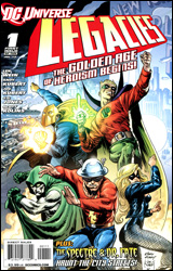 DC Universe: Legacies #1
Publisher: DC Comics
Released: 19 May 2010
Writer: Len Wein
Pencilers: Scott Kolins, Andy Kubert, and JG Jones
Inkers: Scott Kolins and Joe Kubert
Colorists: Mike Atiyeh, Brad Anderson, and Alex Sinclair
Letterer: Rob Leigh
Cover: Andy Kubert and Joe Kubert
Cover price: $3.99
Review: Guest
At this point, it's safe to say that we've all been involved in — or a least read — a discussion on comics and their liberal use of violence in place of storytelling. Regardless of what side you take in the argument, I think we can all agree that there is a certain appeal to the stories of a bygone era, back during a more "innocent time." Make no mistake, I have no desire to set the art of comics back 60 years, I don't think Sinestro should be a dancing jester, and the only time the Joker should be talking about his boner is during a viewing of Batman XXX: A Porn Parody. I do, however, think there's a place in the industry for fun, old school storytelling.
If you've been reading my reviews for any length of time, first of all, I'm sorry. Secondly, you've no doubt noticed that I tend to loathe the origin story. Most have nothing to offer outside of a few really forced character moments, and take time and effort away from better stories that could be written in the present day. The few times they are done right, it's because they offer something that's different from the status quo, a refreshing perspective on familiar stories.
DC Universe: Legacies feels like something fresh. Through the eyes of everyman bystander Paul Lincoln, we see the post-WWII formation of what would soon become the Justice Society of America. It's a format we've seen before in books like Marvels, and it serves much of the same purpose here: to show these Golden Age heroes as gods walking amongst man. What makes it work so well here is that Len Wein doesn't just homage the Golden Age, he revels in it, and it's incredible just how effective it can be. I've read stories with rape, murder, dismemberment, and everything in between, but when heroes expel cheesy quips here with every punch they dish out to random punks, I can't help but smile. When the Crimson Avenger (or as I call him, Crimson Awesome) bursts through a wall to dish out justice like a Kool-Aid Man from Hell, I cheer a little on the inside. When the Sandman leaves his poetic calling card on a beaten mob boss, I get chills.
The art isn't Andy Kubert's best; that cover, in particular, is rather unsightly. But once you get into the book itself, things aren't too bad. Honestly, if you've seen a Kubert book before, you know what you're getting into. Certain panels are a little too loose for my liking, but it works most of the time. It helps that he excels in drawing people in that 40s and 50s era, as seen in his other work.
There's a backup, also written by Wein, featuring some really good JG Jones art. It briefly touches upon Doctor Fate and The Spectre, but really, the story isn't too important. It's just eye candy.
With 10 issues spanning the history of the entire DC Universe, I can't say for sure if the rest of the series is going to be as effective as this issue, and it's quite possible that the combination of nostalgia and tone that makes this one so unique will wear thin in the coming months. But as far as this issue goes, it's a definite buy.
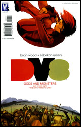 DV8: Gods and Monsters #1
Publisher: DC Comics / Wildstorm
Released: May 19th
Writer: Brian Wood
Artist: Rebekah Issacs
Colorist: Carrie Strachan
Letterer: Jared K. Fletcher
Cover: Fiona Staples
Cover price: $2.99
Reviewer: Hannah Krueger
So, there's a girl named Gem Antonelli, who has a codename of Copycat, and she's being interrogated for some reason. (The details aren't really clear.) From what I can tell, she's clearly been experimented on and given powers. It is also revealed that the Earth has (or will) somehow explode. I'm not quite sure. This whole prelude is really kind of vague. From there, we go into an extended flashback, and, at times, a flashback within a flashback, detailing how other teenagers like Gem have arrived in what appears to be either the Stone Age or some parallel primitive universe. There they're being treated as gods by the local tribes, because of their superpowers. I'm sure this will end well.
I remember Mike saying on the forums that he didn't much like this. Sorry, boss man, but I'm going to have to disagree with you. (Please don't fire me. It's only my second installment.)
Admittedly, I'm a bit out of the loop on most of the characters and backstory involved in this, as this is a miniseries that's reintroducing characters from the 1996 series of the same name — which ran for 32 issues, and was initially written by Warren Ellis.
But you know what? I love Wood's writing on DMZ, and I'm seeing the same quality here. The characters and situation are well established, and the internal monologue of Gem — which seems to be a hallmark of Wood's writing — is spot on. Admittedly I'm a sucker for the whole "characters thrown into another world" trope, and, from what I can tell, this is doing it really well. And I really want to see what happens next with this, so I might go out of my way to find the next issue — or at least the trade.
If you're worrying about not having followed the original series, don't be. Wood establishes a basic status quo, and gives us at least a basic knowledge of what's going on with the situation and the characters.
The art is really nice. Issacs does a good job of drawing each character clearly and consistently, especially in contrast to the tribes that are serving them. They stand out a lot, and, in this case, they should. Backgrounds are also done well, as are the action scenes; you have the brutality of the warfare, and then how the powered teenagers bring a whole new level to the fighting.
At the very least borrow this, if not buy it. This serves really well as a hook to interest new readers in both the mini and the old series, I feel. I'm probably going to go see if I can find anything on the previous series after I'm done writing this, and I rarely do that. So this is pretty high praise coming for me.
 The Expendables #1
Publisher: IDW
Released: May 19th
Writer: Chuck Dixon
Artist: Esteve Polls
Colorist: Marc Rueda
Letterer: Simon Bowland
Cover: Lucio Parillo
Cover price: $3.99
Reviewer: Hannah Krueger
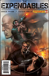
You've all probably gotten those e-mails from the Nigerian prince, the ones where you're somehow the next of kin to a rich guy and he's willed you an obscene amount of money. Hopefully, you're not stupid enough to have fallen for it. Well, for those who have, a software firm has hired a crack team of something-or-other in order to get your money back. So this team goes into Nigeria in order to intimidate and...
Okay, I'm sorry, I have to go laugh my ass off here for a bit. I mean, I can't tell whether or not I'm supposed to be taking this whole thing seriously or not. For Christ's sake, our main characters' names include Yin Yang, Toll Road, and Hale Caesar.
Obviously this is meant to whet your appetite for the upcoming Expendables movie, and as far as I can tell from the trailers, the movie's taking itself seriously. So by the transitive property of whatever, we should probably be taking this comic seriously. But this thing reads like a parody of every 90s action movie I've ever seen that's trying desperately to play it straight. I mean, apparently the Nigerians learned English from their boss listening to Lakers broadcasts, and at one point, Gunnar Jensen (the Swedish crack shot, of course), says, in reference to a child soldier before he shoots him, "Once, he was his mama's child. Oh, he's mine now." And at the end of the comic, the name of the team is revealed in what's supposed to be dramatic fashion, but is just hilarious. I mean, really, how do you expect me to take this seriously when you have what seems like the writing conspiring to make me laugh at every possible moment?
It's like this kid that's all dressed up in an oversized Rambo costume and is carrying a gun that's clearly too big for him. It's absolutely ridiculous, but he's so cute that you indulge him so you don't kill the poor kid's self-esteem. And if the movie is anything like this comic, I'm probably going to be going to see it just to see if it's so bad that it's good.
In terms of the art, it's nothing really to write home about. The main characters' faces are in shadow a lot, and at times, they suffer from what I'm now going to term Daniel Acuna Syndrome — in which you can't tell what the hell the faces are supposed to be conveying because they're so poorly drawn. The action scenes do their job well enough, though.
I'd say give this a flip through. You'll probably be able to tell in the first few pages whether or not you're going to take this seriously, or just end up reading it as a parody of big-budget action movies.
 Legion of Super-Heroes #1
Publisher: DC Comics
Released: 19 May 2010
Writer: Paul Levitz
Penciler: Yildiray Cinar
Inker: Wayne Faucher
Colorists: Hi-Fi
Letterer: Sal Cipriano
Cover: Yildiray Cinar
Cover price: $3.99
Review: Sean Lemberg
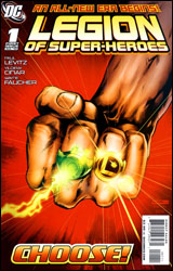
Continuing on from their recent rejuvenation within Final Crisis: Legion of 3 Worlds and "Superman and the Legion of Super-Heroes," everybody's favorite futuristic platoon of superpowered alien humanoids has returned from hiatus with a new ongoing series. Residing on and around an Earth that's rescinded its recent objections to extraterrestrials, the new Legion has been asked by their former persecutors to prove the strength of their morality. The Terran government may have moved on from the anti-alien sentiment that gripped it all too recently, but the road to redemption isn't without its twists and turns. More pointedly, they've already given the new LoSH an ultimatum: adopt and rehabilitate Earth-Man or find a new base of operations.
Of course, the real focal point of this issue — at least in terms of personnel — is the return of longtime writer Paul Levitz, who penned the Legionnaires for a lengthy stint in the mid-to-late 80s. It's not often you'll find an author so intimately familiar with his cast and their historical significance, particularly within a first issue. Levitz's past relationship with many of these characters helps it to feel less like a reboot and more like a direct continuation of a story that's many times larger than it initially lets on. Although his dialog often comes off as somewhat clunky and dated, I have to admit this writer's choice of an initial storyline — the forced redemption of Earth-Man — is intriguing in its complexity. Having apparently realized the error of its past ways, the Earth's government is looking to the Legion for both inspiration and validation. If the LoSH is going to preach universal acceptance and equality, what better way to test their conviction than to demand they adopt the man responsible for the very anti-alien discrimination that recently plagued them?
Like his partner's writing, artist Yildiray Cinar's work is a rich blend of old and new, exaggeration and realism. His style — a blend of Gary Frank's tight rendering, Art Adams's playful compositions, and Mark Bagley's casual body language — seems like a nice fit for the series; it's flexible enough to deal with a large cast, but restrained enough to keep the pages easy to navigate. Cinar's work is constantly dodging an onslaught of word balloons, but despite the intrusions it retains a simple, uncomplicated look and still finds time to properly detail the background scenery. That's no easy task. And while his success with some cast members is more obvious than with others, for most of the issue Cinar goes above and beyond what's expected of him.
My fear going into this issue was that it, like many of the Legion's past runs, wouldn't be written with fresh readers in mind. That it would exist to pay lip service to dedicated followers at the expense of gaining any new ones. In a way, those worries were both embraced and resisted. Paul Levitz is smart enough to include a very brief identifying blurb each time he introduces a Legionnaire, but their numbers are so great, their histories so rich, that it's tough to boil everything down to fit inside a simple narrative box. Really, the best way to appreciate an issue like this one (and the method that's actually suggested by a note in its final pages) is to do a bit of homework online. That's not exactly a good means to an end for new readers on the fence about a fresh ongoing series, but it's about as much as I think could've been expected for a book that seems to be more interested in moving forward than looking back. The new Legion is open for new minds without feeling redundant to the experts. Borrow it.

