Is It Wednesday Yet?
18 May 2010 � Here we are again with another installment of your favorite comic book review series. As always, the reviews are free of spoilers, so read on without fear of having your experience ruined!
Our grading scale is simple:
Buy: An excellent comic book.
Borrow: A good comic, but save yourself some money by reading a friend's copy.
Flip Through: Give it a once-over at the comic shop.
Skip: This doesn't need to be explained.
 Astonishing Spider-Man & Wolverine #1
Publisher: Marvel
Released: 05 May 2010
Writer: Jason Aaron
Penciler: Adam Kubert
Inkers: Mark Morales and Dexter Vines
Colorist: Justin Ponsor
Letter: Rob Steen
Cover: Adam Kubert
Cover price: $3.99
Review: Desmond Reddick
This issue opens in the distant past with Peter Parker � donning a fantastic Robinson Crusoe beard � trying to figure out why he's there. Wolverine is with him, but instead of figuring stuff out he's become the warlord for a race of people. The explanation for how they ended up there is given in the stereotypical foiling of a bank heist with one of my favorite obscure villains, but, seeing how this is a six-issue miniseries, the actual reason is not given.
I was ready to not like this book. I really was. I don't love it, but it is actually alright. Jason Aaron has a good grasp of both characters. A really good grasp. But they're arguably the easiest characters to grasp in the Marvel U, so their handling isn't necessarily inspiring. Unfortunately, the plot is lacking and that is what's needed in order to sell the story for me. There are hundreds of comics out there featuring Wolverine and Spider-Man bantering and fighting.
This book needed depth, and I think it was attempted in the time travel mystery, but the wackiness overtakes any kind of mystery. It's very oddly balanced that way. Save for a pretty wild last page, there's just not enough substance in this first issue to make me want to come back.
Kubert's art, on the other hand, is stylistically beautiful. Despite a few missteps � which I feel may have been inking issues � it's pretty awesome. But again, I have major problems. There are a lot of double-page spreads, which I don't have an overt problem with, but here they're confusing. All of them have panels, and there's no bleed over the centre page. So you read one page and it seems terribly written, and you read the next and it also makes no sense. Then you realize what's going on � that it's a double-page splash � and you have to go back to understand it.
As a comic book reader, I've been conditioned to read comics a certain way, but it took a second reading of Astonishing Spider-Man & Wolverine #1 to actually figure it out. The first time I didn't even finish the book. I put it down and said, "Okay, only one review for me this week." On the second reading, I discovered the inconsistency.
This might seem like a minor complaint, but Kubert is someone whose life has been completely involved in comic book storytelling, so it should come naturally to someone widely considered to be a master storyteller. It is in this area the book fails miserably.
There is no way I can recommend this one. Both creators have done much better in the past, and the two characters have been teamed up in far more effective ways. Go check out one of those and skip this one.
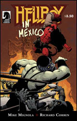 Hellboy in Mexico
Publisher: Dark Horse
Released: 05 May 2010
Writer: Mike Mignola
Artist: Richard Corben
Colorist: Dave Stewart
Letterer: Clem Robins
Cover: Richard Corben
Cover price: $3.50
Review: Guest
I'm on to you, Sims.
Yeah, don't think I don't know what you're trying to do. You can't find anyone else to review the new issues of Bomb Queen, so you're going to lure me back with what looks like a good comic. Well, I'm not buying it. I'm just going to sit here and read it right now.
A few minutes later.
Fine. You win. I unquit Earth.
Back in 1982, Hellboy and Abe were stuck in the Mexican desert, lugging around a box and waiting for their ride out of town. It wasn't long after that they stumbled upon some forgotten pieces of Hellboy's past, alluding to a brief partnership with a trio of vampire-hunting luchadores in the 1950s.
Really, once you pull the vampire-hunting luchadores card, there is really no chance of me hating it. If Cable had vampire-hunting luchadores, I'd buy it every month.
What's most surprising about this issue is how it manages to balance all of the El Santo-esque silliness with a very grounded and profound story of friendship. A friendship that feels like it's just as much about developing in defiance of cultural boundaries as it is about undead mayhem. In the span of only a few pages we get a sense of the camaraderie and trust these masked men have for their Hell-born companion. It honestly shouldn't work nearly as well as it does, especially considering the fact that I'm talking about Mexican wrestlers and a demon. If anything, this is proof that it's possible to make readers invest in your stories, no matter how absurd, as long as you treat the subject with some respect. It's a lesson that far too many comic book writers could learn from.
Richard Corben's art is perfect for this book. I'm not even convinced that Mignola himself could have done a better job here. I can't remember the last time I've been rewarded so much for studying the panels. While certainly not what one might traditionally call pretty, a lot of details have been put into everything.
This is definitely a buy. I barely follow Hellboy and I was able to not only understand but enjoy this issue completely on its own. One-and-done storytelling is not dead and this absolutely proves it.
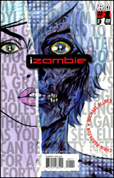 I, Zombie #1
Publisher: DC Comics / Vertigo
Released: 05 May 2010
Writer: Chris Roberson
Artist: Michael Allred
Colorist: Laura Allred
Letterer: Todd Klein
Covers: Michael Allred
Cover price: $1.00
Review: Guest
If you've spent any time at all in college, it goes without saying that at some point you've ran into one of those people. You know, a hipster doofus that is so deeply terrified of being normal that everything they say feels like their screaming "I'm unique! Please be impressed with me! I listen to the Arctic Monkeys, and I read Hunter S. Thompson once!"
Yeah, that's this comic.
Honestly, I couldn't tell you what this book is about, either. There's the main girl, Gwen. She's a zombie, but she's also a lesbian, 'cause, you know, it's edgy! Her girlfriend is the ghost / reincarnation / they-don't-really-explain-what of a girl from the 1950s, which the book explains as being "over forty years ago." Thanks, book!
There is no story. This is supposed to serve as an introduction to the world and its characters, but after 10 pages I'd already decided that I never wanted to see any of these people ever again. Everyone is trying so goddamn hard to be trendy that I can't imagine caring about any of them. The entire book is just a bunch of jokes and gags designed to show us how cool Gwen is. She's so bored by all of this crazy stuff around her, she must be interesting! Oh noes! There are some crazy vampires in the woods. I'm so glad one of them made a joke about being hungry, otherwise I would have had no grasp of her intent. Oh, there's Spot. It's funny, you see, 'cause he's a weredog. And everyone calls him Spot. But that's totally not his name! His name is Scott and everyone just screws it up! Feel the subtlety!
No one talks like this, and acting self-aware doesn't forgive horrible writing. It's as if the writer saw My So-Called Life, decided it would make a good comic, then proceeded to make this in complete ignorance of everything that made the show interesting.
While we're being all self-aware, why do none of Gwen's coworkers comment on the fact that she's purple? Why does it look like the letterer was putting letters on the character's T-shirts whilst simultaneously washing his dog? If this is all that's required for publication, how the hell am I not a millionaire?
The art exists. Honestly, the only thing it did successfully was remind me that I need to grab that new Daria set that just came out.
I was going to give this a flip through simply on the virtue of it being a dollar, but fuck that; there are better ways to spend a dollar. Skip it.
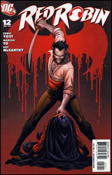 Red Robin #12
Publisher: DC Comics
Released: 05 May 2010
Writer: Christopher Yost
Penciler: Marcus To
Inker: Ray McCarthy
Colorist: Guy Major
Letter: Sal Cipriano
Cover: Marcus To
Cover price: $2.99
Review: Desmond Reddick
You ever feel like you're cheating? That's the feeling I got reading this issue. More on that in a moment.
This issue has Tim "Red Robin" Drake, facing off against Ra's al Ghul during the culmination of what he believes is his coup de grace. What happens is that while Tim is not biologically Bruce Wayne's son, his skill and intelligence makes him a more than worthy heir.
This is the first issue of Red Robin I've read. I haven't been too impressed with the Batman books not written by Grant Morrison as of late, so I gave this one a pass on my previous experience reading Yost's work. Hint: not a fan. But, even though this is the culmination of a year's worth of storytelling meant to bolster Morrison's work, it is entirely accessible without a recap page. In short: this is how you write a comic book.
Ra's and Tim facing off is not something I would have ever expected to be excited about, but the two play off each other well, and Tim's actions remind me why I liked the character in the first place. He is a match for a man who is possibly the only real match for Batman, and cements why he is an essential part of Batman's mythos.
Yost's voice is brilliantly adaptive to nearly every character in the Batman / Titans universe in this issue, and it is a pleasure to read. In fact, Damian � who I'm not sure I really care about � only has three short lines in this issue, but it's enough to tell us all we need to know about the character. Each line on its own is a fun addition to the banter inside the book, but taken as a whole, rounds the character more than any writer next to Morrison. Maybe even more than Morrison.
Add to that the fact that the stakes are high in this climactic issue, and this is a damn fine read. Marcus To's gift with facial expressions, storytelling, and action is on full display here. I'm not sure I've ever seen his work before now, but I want to see more. There is one sequence in particular that I cannot outline � for fear of spoiling it � that is so cinematically portrayed, it is perhaps the finest five or so pages I've read in a comic this year.
I'll do more than read this series from here on out; I'll be going back and checking out the first 11 issues. If you're a fan of Batman then you should do the same. Yost is putting Dini, Daniel, and every other writer trying to equal Morrison's vibrancy to shame in the Batman corner of DC Comics, and it's being illustrated beautifully to boot! Pull this book.
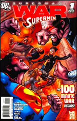 Superman: War of the Supermen #1
Publisher: DC Comics
Released: 05 May 2010
Writers: Sterling Gates and James Robinson
Penciler: Jamal Igle
Inker: Jon Sibal
Colorist: Blond
Letter: John J. Hill
Cover: Eddy Barrows
Cover price: $2.99
Review: Sean Lemberg
For a first issue, the opening shot of Superman: War of the Supermen takes a whole lot for granted. Wasting no time on backstory, today's installment throws Kal-El and family right into the fray, firing the gun to begin the race before some readers will have even reached their starting blocks. This gave me the impression that I was always playing catch-up, often a page or two behind the story's fast pace, and it's a situation that writers Sterling Gates and James Robinson take full advantage of on several occasions.
I've never been a dedicated reader of the Superman titles, so a lot of the finer points of this issue were probably lost on me, but I could still glean enough scraps of information from the scenery to get a pretty good picture of what's going on. Clearly Gates and Robinson didn't compose this story with irregular readers in mind, as they've been building to it since the beginning of their respective runs nearly two years ago. Despite missing some of its finer points, though, the broader picture of this issue (and the impact of its big surprise around the halfway point) was never in question. The two writers do spend an awful lot of time and effort on long, dry collections of word balloons � so much that I was gearing up to bear another issue-wide storm of such material � but in this case that worked to a greater good. The excess of dialog elsewhere in the book only heightens the shock and awe inspired by the handful of wordless reaction pages surrounding the big reveal.
Jamal Igle's artwork fares particularly well on such pages. His more straight-laced, Gary Frank-inspired style does endure a few ups and downs throughout the story, but it enjoys a well-timed peak during the pages in which it's most desperately needed. In Igle's hands, Superman himself doesn't quite feel larger than life, which is both a blessing and a curse. We're missing that one iconic panel to take our breath away and command our respect, but the lack thereof makes Big Blue a more approachable character. That's vital when a certain climactic event results in a more human look from the story's centerpiece than we usually get to enjoy. On a few occasions, Igle oversteps his bounds and overcomplicates a scene with extra details, but when he keeps restraint in mind, his work is a natural fit.
Superman: War of the Supermen #1 cuts to the quick and concentrates on introducing the impetus behind the three issues soon to follow. Some of the preliminary work may have already been done, but this is still very much an opening volley. And it's a very good one, if not a great one. Borrow it. The stage is set for big things down the road in this series, but I wish I had more confidence that it's going to realize that potential.
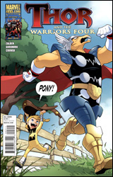 Thor and the Warriors Four #2
Publisher: Marvel
Released: 05 May 2010
Writer: Alex Zalben
Artist: Gurihiru
Letterer: Dave Sharpe
Cover: Gurihiru
Cover price: $2.99
Review: Sean Lemberg
It's not like the Power Pack to stand idly by when faced with adversity, whether it's superpowered or natural in origin. And so it should come as no surprise that, when their grandmother's health takes a turn for the worse, they don't stand around welling up with tears. Instead, they take the second most natural course of action: to seek out Thor in his mythical abode up in the sky. The kids are after a life-giving golden apple, one which only grows in the kingdom of Asgard.
As silly as this premise may sound, it took me all of four pages to become completely engrossed. There's something about the innocence and honesty of these four siblings that's both appealing and unusual. How many times have we seen a Marvel character traverse the Rainbow Bridge to Asgard without questioning its feasibility? Better still, why did it take a child to ask such an obviously natural question? Alex Zalben does a fantastic job of establishing the Power Pack as an instinctively inquisitive bunch of youngsters without rendering them wide-eyed and brainless along the way. These kids certainly aren't as mature as your average Marvel superhero � therein lies a lot of the fun of watching them � but that doesn't mean they have to babble like idiots.
Zalben could never be accused of overwriting this issue, either. It's light fare by design, which is right in line with the simple, matter-of-fact tone embraced by both the plot and its key players. Reading this issue was akin to watching a Miyazaki movie: friendly and exciting enough to hook a younger audience, but attractive and intelligent enough to also appeal to their parents or older siblings. It's a great example of what many fantasy stories strive to be, allowing the wild concepts and engrossing adventures to take center stage without a lot of competition from dialog balloons or elaboration.
Almost synonymous with Power Pack by now, the artist team of Gurihiru has been associated with the kids for the vast majority of their return from hiatus. Their sleek, excessively simple style bears a strong manga influence, but also manages to work in a nice set of traits borrowed from modern Western cartoons. That results in a flavor that's perfectly matched for the innocent, happy-go-lucky tone of most of the team's adventures, including this one. Their take on Thor isn't the best I've ever seen, as I don't usually think of the God of Thunder smiling broadly on every page like He-Man in a winged helmet, but that's a fairly minor complaint. During the frequent action scenes, Gurihiru's work is explosive and entertaining. In quieter, more storyline-focused panels, they keep things light and playful with a few well-timed background gags. They and the four children at the epicenter of this series were made for each other.
Thor and the Warriors Four is the rare example of a book that's exactly where it wants to be. It doesn't strive to be more, instead it's perfectly happy just getting better and better at being what it is. Most readers will see this cover, read the title, and move on, which is fair. It's not for everybody, but it's probably a much better fit than most readers would suspect. Give it a chance, I'll guarantee it's far better than you think it is. Buy it.


