Is It Wednesday Yet?
20 April 2010 � Here we are again with another installment of your favorite comic book review series. As always, the reviews are free of spoilers, so read on without fear of having your experience ruined!
Our grading scale is simple:
Buy: An excellent comic book.
Borrow: A good comic, but save yourself some money by reading a friend's copy.
Flip Through: Give it a once-over at the comic shop.
Skip: This doesn't need to be explained.
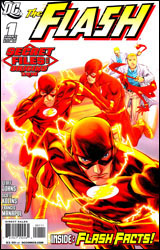 The Flash: Secret Files and Origins 2010
Publisher: DC Comics
Released: 07 April 2010
Writer: Geoff Johns
Artist: Scott Kolins
Colorist: Michael Atiyeh
Letterer: Rob Clark Jr.
Cover: Francis Manapul
Cover price: $3.99
Review: Desmond Reddick
This book delivers what is essentially the first post-Flash: Rebirth introduction to the Flash universe. As someone who enjoyed the first half of Rebirth and felt cold towards the end, I was intrigued when this book come across my desk. Needless to say, the forthcoming review contains spoilers from that miniseries.
The story itself deals with Barry Allen coming to terms with the death of his mother at the hands of Professor Zoom. This retcon was a mixed bag for Barry Allen fans, but I quite enjoyed the fact that it was dealt with inside the story as a means of setting a new status quo for The Flash. Zoom went back in time, killed Barry Allen's mother, and haunted him throughout his young life. It's a great set-up for a great villain in my eyes.
Barry's acceptance of this is aided by Jay Garrick and the rest of what can only be called the Flash Family, and some interest is piqued in the subplot of the Rogues unveiling quite possibly the most hilarious failsafe for a hero's return in comics history.
So, while the story is plodding and slow at times � which feels weird for a Flash book � it does a better job of giving us reasons why we should care about Barry Allen than Rebirth did. This short story is only meant to introduce us to the world, and I think it's a good jumping on point for new readers. The back end of the book is filled with pin-ups of the principle heroes, villains, places, and things you'll need to know if you plan on reading the new series, including one bio for a villain who may or may not have received a Brightest Day-style resurrection.
The Scott Kolins art is the best I've seen him do. And I'm a fan of his. He, more than anyone, is best suited to a Flash book. His work looks both frantic and soulful at the same time. This art, however, may have changed this reviewer's personal opinion of trade-waiting on all new books. He is an artist whose style has been adapting since I first saw him and it continues to do so here. It is a career best, and you get the feeling from looking at this and his previous work in Blackest Night: Flash that it's only getting better.
The pin-ups are beautifully illustrated by Francis Manapul and colored by Brian Buccellato in a watercolor style. These make for not only great character bios, but for awed gazing. And I am not regularly enamored by Manapul's work.
But, the inconsequentiality of the story throws into question my ability to fully recommend it. I would say borrow the book until it's collected in a trade paperback.
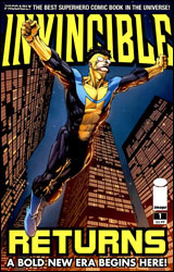 Invincible Returns #1
Publisher: Image
Released: 07 April 2010
Writer: Robert Kirkman
Penciler: Ryan Ottley
Inker: Cliff Rathburn
Colorist: Fco Plascencia
Letterer: Rus Wooton
Cover: David Finch
Cover price: $3.99
Review: Guest
Put me in the camp that wouldn't be particularly heartbroken if Robert Kirkman never had to write another non-zombie book for the rest of his life.
This isn't to say that the man doesn't try. If anything, he tries to do too much, which may be part of why Invincible has never really clicked for me. This oversized issue is a shining example of that. Designed as a crash course for new readers of the ongoing, it took no time at all for Kirkman to throw a dozen characters into the fray that were never named, and after a few pages, never referenced again. This happened multiple times in the span of 40-odd pages whilst also trying to juggle four (or was it five?) different plot threads, only two of which seem to be important to the upcoming "Viltrumite War" event. There's just enough set-up in the final pages to redeem the issue a bit, but what precedes it is more of what makes me avoid Invincible as a rule; exceedingly stupid fights with large and completely ignored civilian casualties, the character of Atom Eve and her stubborn refusal to even attempt to do or say something that will inconvenience her boyfriend, and transparently expositional dialog that makes me question if The Walking Dead is actually the work of a ghost writer.
Why would Mark have to explain the last two years worth of story arcs to his girlfriend? How does putting yellow back in his costume completely change his outlook on killing? Why did we need cameos from every character in the Invincible universe when you're trying to introduce the title character to new readers? It's a real mess from a writing standpoint, and a chore to slog through if you're someone that really doesn't care for the character (RE: me).
If anything saves the book, it's the art. It's bright, clean, and gorgeous. There are a lot of gruesome, visceral flashbacks, and one double-page spread in particular does more to tell the story than a million speech bubbles could hope to do. That spread alone was enough to improve my grade, and I can't say that the book wouldn't have been better served to just have had page after blood-soaked page of Invincible in battles past, as that's the only time I was able to muster any feelings for the hero and his plight.
If you're an avid reader of Invincible, then there are some developments here that you'll no doubt find interest in. But if you're a new reader trying to get into the series, this may not be the greatest place to start. Flip through it for the art, if nothing else.
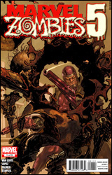 Marvel Zombies 5 #1
Publisher: Marvel
Released: 07 April 2010
Writer: Fred Van Lente
Penciler: Kano
Inker: Tom Palmer
Colorist: Val Staples
Letterer: Simon Bowland
Cover: Rafa Garres
Cover price: $3.99
Review: Sean Lemberg
I guess in a world overrun by zombies there's no such thing as a dead horse, so Marvel can feel free to run this concept right into the ground without facing any accusations of beating one. By this point the Marvel Zombies have devoured every living being on their home planet, several parallel dimensions, and a good chunk of outer space. They've swallowed Galactus. They've dined with the Marvel Apes. They've even stared down Ash from Army of Darkness. I wish I were kidding. So what could possibly be next? How about undead outlaws with six shooters and cow-print chaps in the dusty confines of the Wild West?
I'd presume Fred Van Lente felt he needed to do something to shake things up a bit, since the original idea has already been stretched so thin. And to be fair, this is hardly the first time the scenery and genre have wildly changed course in the Marvel Zombies drama, so it's not unprecedented. It's probably not even the most ridiculous direction we've ever been drug in, but that doesn't make it any less idiotic. This series has proudly lumbered around with a black, blood-drenched tongue planted squarely in its cheek from the very beginning, and goofball comedy certainly isn't out of bounds. Most humor usually requires some sort of seed that's genuinely funny, though, and I just can't find it here. It's soulless, coming off as a desperate publisher asking a writer to throw random, bland ideas at the wall and hope against hope that one of them sticks.
Having already run out of first and second-tier heroes to slaughter, reanimate, and / or chew up, in this fifth installment Van Lente has moved on to the also-rans. Seen enough of Spidey chowing down on Mary Jane's severed left arm? Then you're almost certainly ready for the fury of the zombie Phantom Rider, or the bottled comedy gold of an undead-huntin' Howard the Duck. The well of bad ideas is deep, my friends, and the bodies of the discarded characters stacked in there could stretch for miles.
Kano does a fair enough job in his first shot as artist for the long-running series. When his work tightens up, he nails a few panels over the course of the issue. But the rest of the time his contributions are merely passable. Kano never really takes over the show or brands the issue with a fresh style of his own, and that lack of true enthusiasm carries over to the reader. When the story is plodding so is the artwork, and when the pace picks up the visuals drag their feet.
Like a major network television station, Marvel is almost never going to let a moneymaking series die, even if there's no obvious direction to take the story. Like many similar titles, it's only a matter of time before the former Marvel Zombies furor fades into a whimper and ultimately disappears completely. This issue is only proof that we're planted firmly on the downward slope of that progression. Skip it.
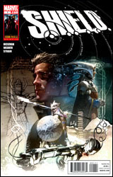 SHIELD #1
Publisher: Marvel
Released: 07 April 2010
Writer: Jonathan Hickman
Artist: Dustin Weaver
Colorist: Christina Strain
Letterer: Todd Klein
Cover: Geral Parel
Cover price: $3.99
Review: Guest
Finally, a book that speaks to me. A book that understands what I'm looking for and delivers. Bravo, Marvel. Bravo.
You see, I have chronic insomnia. I can often go days at a time without sleeping, with no immediate remedy in sight. I've tried everything, too: warm milk, calming music, you name it. I even tried watching The English Patient once and managed to stay awake through all 162 unholy minutes of it. Then Marvel came along and made what is easily the dullest, most pointless comic that I've read in ages. I had to read this book two pages at a time because I kept drifting off into that dream of Gilligan's Island where I'm the Professor and Kate Beckinsale is Mary Ann. I was making a coconut radio and... oh yeah, the comic.
So apparently SHIELD wasn't founded by Nick Fury in the aftermath of World War II. No, instead, it's an actual shield, the catalyst of which formed a secret alliance through the ages, you know, back during the well-documented Brood / Egyptian War, and in the good old days of Galileo creating laser cannons to fight Galactus.
Now I know what you're thinking: How can a concept that stupid possibly be so boring? As I slipped in and out of blissful slumber, I struggled to figure that out myself, only to find myself asking a more pressing question: Who would possibly pay four dollars for this? Even if you're a complete Marvel zombie, why would you care about Leonardo da Vinci creating a hole in the space-time continuum to give a MacGuffin to some kid in an underwater city in the 1950s? I quickly came to the conclusion that there is no one. I don't mean "not many." I mean there is literally no one that wants to buy this. I'm convinced that Marvel simply gave this book away to retailers, then had a squad of ninjas invade comic shops across the country in the middle of the night to steal back their unsold product. That's the only way this makes any sense at all.
This is the kind of comic that non-comic fans make fun of us for; bland, self-important, overpriced tripe that shoves continuity up its own ass for the sake of stupid, shock storytelling.
This is a babychest if there ever was one. Now where's that pillow?
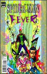 Spider-Man Fever #1
Publisher: Marvel
Released: 07 April 2010
Writer: Brendan McCarthy
Artist: Brendan McCarthy
Colorist: Steve Cook and Brendan McCarthy
Letterer: Steve Cook and Brendan McCarthy
Cover: Steve Cook and Brendan McCarthy
Cover price: $3.99
Review: Sean Lemberg
True confession time: I don't enjoy Doctor Strange stories. I just can't get into the character, and the mystical mythos surrounding him only confuses and irritates me. Which means the question indirectly posed in this series by jack-of-all-trades Brendan McCarthy is: Can Spider-Man temper my disdain for Strange enough to get us all through a miniseries relatively unscathed?
McCarthy's quirky storytelling might take a bit of getting used to, but it also excuses several of Strange's eccentricities. He belongs in this kind of wide-eyed, whimsical atmosphere, filled with spontaneously exploding books and a hearty helping of magical special effects. The whole issue reads like some kind of tripped-out voyage into the psychedelic 60s, when colors were bright, spirits were ponderous, and dialog was only there to explain what the hell was supposed to be going on. Either Strange has a blind invisible friend chilling in the room with him at every moment, or he really enjoys muttering the obvious to himself underneath his breath.
Yet for all the little bits and pieces that should have annoyed me to no end, I actually found this issue to be strangely charming, no pun intended. There's a certain innocence and honesty to this brand of fantasy, one that had me often flashing back to the classic, outrageous tales of Amazing Spider-Man's early chapters. That's most apparent during the half-issue that focuses directly on Spidey, of course, but it's there during the Strange narrative too, whenever the Doc manages to shut his mouth long enough for it to surface. Brendan has an interesting spin on the "real" world � for all three pages in which this story resides there � but once the direction takes a turn for the mystical, his style is completely submersive.
It's a good thing McCarthy handles the visuals himself, because I'm not really sure how he'd direct another to bring some of these concepts to life. His pages are something else, with panels bleeding into one another, splash pages telling three or four stories within a single composition, and hidden symbology thrown into every bit of empty space. Navigating his visuals is often a cloudy, uncertain experience, like trying to make sense of a dream after a night of heavy drug abuse. It would be utterly frustrating if it didn't fit the fevered tone of the story so very well.
If you're after something with a lot of substance, this isn't your ticket. It's a pleasure cruise through the screwy subconscious of the writer, and while it's often overwhelmingly imaginative, it's also fairly vaporous. Spider-Man Fever won't change your perception of the characters or alter their personalities in the long-term, but it will keep you entertained � dare I say captivated � from start to finish. It's utterly trippy, bending the reader's mind in unexpected ways, and sometimes babbling incoherently, but the main narration remains surprisingly lucid. I shouldn't have liked this nearly as much as I did. Borrow it.
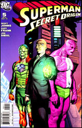 Superman: Secret Origin #5
Publisher: DC Comics
Released: 07 April 2010
Writer: Geoff Johns
Penciler: Gary Frank
Inker: Jon Sibal
Colorist: Brad Anderson
Letterer: Steve Wands
Cover: Gary Frank
Cover price: $3.99
Review: Desmond Reddick
Lex Luthor, fed up with all the press Superman is getting, has a plan set in place to destroy him. It involves a little green rock whose radiation turned a normal man into the Parasite. Meanwhile, Lois Lane's dad (a general in the US Army) has sent Sergeant John Corben (Lois' ex) to woo his daughter one last time. When she spurns him, Luthor has found the right guy to pilot his Superman-killing machine.
So, the story is simple. There's nothing out of place, but since DC's continuity has been messed up since the 1940s, they need to do this whole re-origin thing once in a while. I'm not really against the fact that Superman: Secret Origin exists, more like I wish that it didn't need to happen in the first place.
After that, what we get is a pretty bog-standard Superman story set near the beginning of his career, with a few interesting implications � especially those involving the intelligence of one Lois Lane. Hint: she's not as stupid as she's been portrayed before, but she's still a little stupid.
There are some great moments in this book that take me right back to Superman II, like when Clark Kent meets Sergeant Corben. Their unspoken communication is the tops! But overall, I'd have to say that the story is light on plot. Really though, how much do you expect in issue five of six?
I really like Gary Frank's work. I think he's just getting better and better at storytelling, and he's one of the guys out there right now whose style looks distinct without being visually offensive. A huge hurdle I have to get over whenever I look at his Superman, is the creepy factor of Christopher Reeve staring back at me. Can DC editorial put a moratorium on this now please? It's weird. And I'm not sure how respectful it is of the dead, for that matter.
I love Frank's design of Parasite. His awkward pudginess sets him apart from every other alien-looking villain Supes has ever faced, and it still offers a look of sickness that the character needs. Great stuff.
This story won't change your life. Nor, I'm sure, will the entire miniseries when it's all said and done. In fact, you can pretty much ignore this and keep on enjoying your regularly scheduled Superman books (though from what I've heard, that's not happening much). But if you want a break from New Krypton and literally millions of new characters being added to the Superman supporting cast, this one offers a nice little classic Big Blue story. Borrow it.


