Is It Wednesday Yet?
30 March 2010 � Here we are again with another installment of your favorite comic book review series. As always, the reviews are free of spoilers, so read on without fear of having your experience ruined!
Our grading scale is simple:
Buy: An excellent comic book.
Borrow: A good comic, but save yourself some money by reading a friend's copy.
Flip Through: Give it a once-over at the comic shop.
Skip: This doesn't need to be explained.
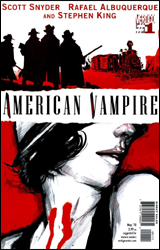 American Vampire #1
Publisher: DC Comics / Vertigo
Released: 17 March 2010
Writers: Scott Snyder and Stephen King
Artist: Rafael Albuquerque
Colorist: Dave McCaig
Letterer: Steve Wands
Cover: Rafeal Albuquerque
Cover price: $3.99
Review: Guest
Was anyone begging for more vampires? No? Tough. Have some more.
If there's anything that can be said about American Vampire, it's that it's trying something. Whether or not the book is ultimately successful is a different story, but it definitely tries � which is a plus.
The first story is handled by Scott Snyder, who introduces us to Pearl, an aspiring actress looking for her break in Hollywood during the 1920s. While Snyder is a fine writer of dialog, the problem here is that he stretched about five pages of story into 20. As a result, things drag out to the point of boredom. Characters that have no significance are introduced and quickly forgotten, and the ending seems to nullify everything that came before it.
The second half is written by an up-and-comer by the name of Stephen King. As much of a fan I am of the man's work (at times), in this he barely hits his mark. While his part of the book is surely better paced than Snyder's, it still results in little more than a lot of talking heads, and doesn't really pick up until the last few pages. I'm all for horror building to a climax, but the truth of the matter is that the entirety of both stories are astoundingly predictable and lacking any sort of impact.
Rafael Albuquerque is the savior of this book, handling art duties for both halves. Even though he's given next to nothing to work with outside of the aforementioned bantering, he manages to make his characters distinctive and full of expression, even changing his style as it suits the tale. In Snyder's story, his work is more rounded and cleaner, while King's half is harsher, at times showing even a hint of Ben Templesmith.
I'd say flip through it for the art. The writing is very by-the-numbers, but there's a chance this could go somewhere in the future.
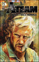 A-Team: War Stories - Hannibal
Publisher: IDW
Released: 17 March 2010
Writers: Chuck Dixon and Erik Burnham
Artist: Hugo Petrus
Colorist: German Torres
Letterer: Neil Uyetake
Cover: Michael Gaydos
Cover price: $3.99
Review: Desmond Reddick
This is a prequel one-shot for the upcoming film co-written by Chuck Dixon. If you haven't already skipped to the next review, then perhaps you are interested in this comic. And for that, I'm sorry.
Do you remember Desert Storm? I remember very vividly watching a news conference with Norman Schwarzkopf where he presented to the media, and to the world, a video taken from above the "luckiest man in Iraq" and then made a rearview mirror joke of the bridge behind the van being obliterated. Because, you know, dropping bombs is hilarious. Anyway, that guy in the van? That was Hannibal from the A-Team. That's the entire plot of this book.
But there's plenty of stupid to be found between those plot points. We are made to believe that a cigar-chomping white American with white hair and a fake black mustache speaking admittedly poor Farsi can convince a squadron of highly trained Iraqi Republican Guards that he is in fact a high-ranking Iraqi general. Their general. And what is it that gives him away? The tread of his American-made army boots look a little different than the Soviet-made army boots that they wear. If the squadron leader is intelligent enough to recognize the difference between American and Soviet boots, you'd think he'd be able to recognize a white guy in a Groucho Marx mustache. Plus, I know there are all kinds of people all over the world, but I have never seen a Persian guy who looks like Liam Neeson.
Speaking of Liam Neeson, Hugo Petrus � an amazingly skilled artist whose movement out of the Marvel Illustrated ghetto was met with the movie tie-in ghetto � spends so much time making sure his Hannibal looks like the actor, he neglects to tell a story. To be fair, I don't think the script he got made it very easy. I really hope that he can move away from The Crazies and A-Team books to do some stories with some substance soon.
At one point a tank runs into another tank and goes flying about 30 feet in the air. I just felt that needed to be said. I've never been in a war, but I'm pretty sure that isn't possible in the realm of physics � theoretical or otherwise.
Ultimately, what you come away with from this story is that war is fun, Iraqis are dumb, and the creative team thinks that you are too. Fuck this book. Sorry.
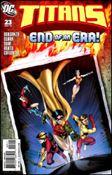 Titans #23
Publisher: DC Comics
Released: 17 March 2010
Writer: Eddie Berganza
Pencilers: Scott Clark and Ardian Syaf
Inkers: Dave Beatty and Vicente Cifuentes
Colorist: Hi-Fi Design
Letterer: Travis Lanham
Cover: Angel Unzueta
Cover price: $2.99
Review: Desmond Reddick
The cover of this books promises "the end of an era" while depicting a burning photograph of the original Teen Titans. Ooh, symbolism.
Why is it the end of an era? Tempest is dead. Oh yeah, and something is happening with the guy who used to be Green Arrow's sidekick. And apparently, the three remaining original Teen Titans � Dick Grayson, Wally West, and Donna Troy � have gathered to brood about their past and how much of a motherfucker Roy Harper used to be before going to visit the armless archer in the hospital. Great tribute to a friend in trouble, huh?
The whole push behind this story is to show us that the Silver Age wasn't so squeaky clean for the Titans. Since this is Titans and not Teen Titans, they do so with sex and violence. Thank you Judd Winnick.
Now, the best parts of this book are set in the modern era where we see the adult Teen Titans (Robin is Batman, Kid Flash is Flash, and Wonder Girl is, well, I don't know) discussing their past. Even though the story is handled without any kind of tact, the idea of these former sidekicks taking on the roles of adult superheroes � and in most cases, those of their mentors � is steeped in history and ripe for story potential. This is the vindication for having the Teen Titans exist in the first place. Too bad it isn't worth a damn.
What we gather from the story is that Aqualad is a pussy, Kid Flash is a psychopathic punch-drunk asshole, Wonder Girl is a clich�d timid girl, and Robin and Speedy are the only people on the team with personalities. For the record, those personalities are high-strung control freak, and emotional wild man with a heart of gold. I'll let you figure out who's who.
From an art standpoint, it feels to me like future golden boy Ardian Syaf only actually drew a page or two. As a Stormwatch fan from way back, I'd know Scott Clark anywhere � even though his flashbacks to the Silver Age have him doing his best Jae Lee impression. The art isn't bad, it's just inconsistent because the modern era is represented in a late 80s realism leading towards the extra lines of the 1990s. One might say, "Well, there's the delineation between artists," and I say no. It isn't. Because it's clear that Clark drew the vast majority just with an eye for differing styles in the different time periods. Really, it should have been switched. Or I think Syaf would have done a great rendition of either time periods, freeing both artists to do a bang-up job on their respective portions of the book. But I have a feeling that Syaf was batting cleanup on a book that Clark couldn't finish.
In the end, this is a golden opportunity that was shamefully wasted on revisionist storytelling with rapidly oscillating art styles from page to page. Really, ends of eras should be handled with a bit more reverie and gusto. This is just another dead duck along the path of modern Teen Titans comics. Skip it.
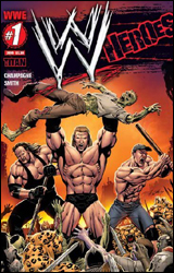 WWE Heroes #1
Publisher: Titan Comics
Released: 17 March 2010
Writers: Keith Champagne
Artist: Andy Smith
Colorist: Hi-Fi Design
Letterer: Comicraft
Cover: Andy Smith
Cover price: $3.99
Review: Guest
Cover page: The Undertaker and John Cena are fighting off a band of zombies and mutated tigers with a spear and a bat, respectively. Triple H is, for some reason, holding a zombie aloft as if he's offering it as sacrifice to the gods above.
Page 4: A cage match between the Undertaker and Kane is compared to two ancient gladiators killing each other with fire and rocks. Kane uppercuts Taker in the junk.
Page 7: A preacher with eyebrow and nose rings is killed by a fire demon. What this has to do with wrestling, I haven't a clue.
Page 8: A Bowflex advertisement, which up to this point is the most entertaining thing about this comic.
Page 10: Dave Batista is the size of fucking Voltron. Steroids are bad, kids. Also, Matt Hardy and Kofi Kingston are apparently Knights of the Round Table. (I'm not making this up.)
Page 12: Giant shot of 11 wrestlers in a ring that appears to be five feet wide. Most of them bear no resemblance to actual WWE wrestlers, with the exception of Mark Henry, who appears to be shoving his fist up someone's ass. More mutated tigers, 'cause why the hell not?
Page 14: Triple H is a bad guy, despite being a babyface on television for at least three years now. I think he's fighting John Cena. I think because it looks more like they're posing in each other's general direction. (I could honestly eat a crayon and shit out better art than this.)
Page 15: "Game over, Triple H!" Well, he sure told him.
Page 18: The Undertaker is compared to a Yankee soldier in the Civil War. To cap it off, the Yank proclaims that "slavery is wrong" during the fight. The big bad of the story is a Confederate soldier.
Page 22: Lots of words. I didn't read them.
Page 23: Every wrestler in this book has apparently taken enough steroids to kill exactly 14 elephants.
Page 24: In the most offensive panel of the entire book, John Cena is portrayed doing a crossbody outside of the ring...
... with his hat on.
Page 27: Still wearing the hat.
Page 28: A group of terrorists sneak a case full of guns into WrestleMania.
Page 29: In a preview of our next exciting issue, a squad of wrestlers are being held a gunpoint by Robocop, apparently. Triple H is standing in an alley in his wrestling trunks. John Cena still has his hat on.
This officially surpasses Bomb Queen as the worst comic I've ever read.
As a comic book fan and as a wrestling fan, I implore you to burn every copy of this book within your sight. You will be doing a service not just to your country, but to the world.


