Is It Wednesday Yet?
16 March 2010 � Here we are again with another installment of your favorite comic book review series. As always, the reviews are free of spoilers, so read on without fear of having your experience ruined!
Our grading scale is simple:
Buy: An excellent comic book.
Borrow: A good comic, but save yourself some money by reading a friend's copy.
Flip Through: Give it a once-over at the comic shop.
Skip: This doesn't need to be explained.
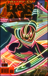 Astro City: The Dark Age, Book Four #2
Publisher: DC Comics / Wildstorm
Released: 03 March 2010
Writer: Kurt Busiek
Artist: Brent E. Anderson
Colorist: Alex Sinclair
Letterer: John Roshell of Comicraft
Cover: Alex Ross
Cover price: $3.99
Review: Sean Lemberg
Kurt Busiek's scrutiny of the superhero genre, and its various transformations over the years, is still going strong in Astro City. Having already covered the more na�ve, innocent era of the 1950s and 60s, the gaudy bravado of the 90s, and the grounded reality of today, The Dark Age is a closer look at the grim, gritty style that swept the scene in the 1970s and 80s. If all that seems a bit dry, don't worry � the series doesn't read like an encyclopedia. Busiek and his collaborators, Brent E. Anderson and Alex Ross, hide their introspections behind a slew of well-rounded characters and a strong series of intertwining plot threads. It's a history lesson buried inside the heart of a really sharp, engaging cover story.
More than most of its predecessors, The Dark Age takes a look at the close relationship between the mood and social climate of the outside world and the direction of the comics that were published at the time. The 1980s weren't just a dark time for the superhero population; they were a decade of widespread distrust, of secret wars. The "peace, love, and understanding" mood of 20 years earlier had slowly crumbled into a dark, hopeless era of commercialism and political helplessness. Busiek nails that recollection early in the issue via a series of narration boxes that we'll later learn belong to Charles and Royal Williams, the focal points of this series.
Noting the rise of a more violent style of hero, the displaced brothers see these signs of the times as a personal call to arms. Stewing for years over the murder of their parents, the pair has decided to join the dark movement, donning matching costumes and hunting down the man they hold responsible. Having missed the preceding 13 issues, I figured this might be a tricky spot to just drop right into the action. And while there were a few moments where I felt overwhelmed, the basic ideas were easy to grasp and the action itself wasn't so fully invested in what had come before that I couldn't figure it out for myself. Busiek does like to lather the page with a good amount of text, but his concepts are never too high and his writing moves quickly enough that it's never more than a faint distraction.
Brent Anderson, an old pro who's been on-board Astro City since the start, brings along a visual style that's starting to look a bit dated, but is still something to appreciate. His old school sensibilities are most appropriate in this arc, which is set right around the same time he enjoyed his first mainstream success in the real world with Ka-Zar and X-Men: God Loves, Man Kills. Anderson's style isn't especially flashy or energetic, but he makes up for it with strong, legible compositions and a master's knowledge of facial expression and body language. It probably isn't something you'll enjoy right out of the gate, but after a few issues I found myself really starting to appreciate his technique.
As something of a blowoff issue, I found this to be mildly lacking � everything seems to fall into place a bit too easily � but Busiek and company still have two issues to add some emphasis to the situation. As always with Astro City, this is something that would probably be better enjoyed in a trade paperback. But as a standalone issue it's nowhere near as intimidating as I'd expected. Very good but lacking a few key elements that would've made it great. Borrow it.
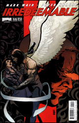 Irredeemable #11
Publisher: Boom! Studios
Released: 03 March 2010
Writer: Mark Waid
Artists: Peter Krause and Diego Barreto
Colorist: Andrew Dalhouse
Letterer: Ed Dukeshire
Cover: Paul Azaceta
Cover price: $3.99
Review: Guest
Irredeemable is a book that's eluded me for some time. I recall checking out issue one a year ago and not being terribly impressed. On the surface, it seemed nothing more than your typical "What if Superman went rogue?" premise that's been done to death. Since then, the series has gotten significant praise, and I was anxious to see how things had grown since.
As it pertains to the story, my opinion hasn't changed too much, though that doesn't hurt the book. Considering the fact that Mark Waid could probably write Superman for the rest of his life and do so with a smile on his face, there's a certain amount of care put into the writing that really transcends the less-than-inspired plot. He's clearly trying to build a universe, and it works pretty well, though the nature of the story he's trying to tell can cause problems when it comes to caring about some of the characters. Seemingly every thought and action revolves around the hero-turned-heel Plutonian, a character that's constantly referenced and spoken of, but only momentarily seen in this issue. This would be fine if not for the fact that there are about a half dozen other scrubs hanging around (one of which looks suspiciously like Cosmo Kramer) that really only exist because an alien is trying to blackmail one of them into revealing her big secret. It all seems kind of silly when I type it out like that, and really, it kinda is, but it's not treated as such by the writing, which can do wonders.
Things are fantastic on the art end. The only real complaint I have is that I wish Diego Barreto had drawn the entire issue and not just half of it. Peter Krause does a fine job in his own right, but he's stuck trying to follow a really tough act. For starters, Barreto draws some fantastic women; they're appealing and vivacious without being cartoonishly sexualized. His clean, vibrant style makes every page a delight, and when it came time for Krause to take over, I definitely noticed.
It wouldn't be fair to say that this book blew me away, but it was a pleasant surprise. There is a ton going on here, and if you've been following the series thus far, this could very well be a big turning point to you. But if you're like me � going in blind for the most part � you may be moderately intrigued by the plot developments, perhaps even enough to catch the next issue, but even with the great art, this one isn't worth more than a borrow.
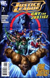 Justice League: Cry for Justice #7
Publisher: DC Comics
Released: 03 March 2010
Writer: James Robinson
Pencilers: Mauro Cascioli, Scott Clark, and Ibraim Roberson
Inkers: Mauro Cascioli, Scott Clark, Ibraim Roberson, and David Beatty
Colorist: Mauro Cascioli, Siya Oum, and Giovanni Kososki
Letterer: Steve Wands
Cover: Mauro Cascioli
Cover price: $3.99
Review: Guest
So here we are, Cry for Justice.
There are certain expectations that go into reviewing a book like this. Yeah, I'm the guy that generally reviews the horrible comics, but with Cry for Justice, I'm in a weird place. Chances are, if you have any interest at all in this title, you know what happens here and you've already formed an opinion of it. Maybe you've even shared said opinions through this complex series of wires and tubes we call the Internet. I'll be the first to admit that I was ready to do another joke review, wherein I engage in some clever subterfuge to avoid having to talk about a horrible comic book. But then a weird thing happened, I actually read it, and you'd be surprised what that can do to your sense of humor.
We comic fans are a picky bunch. We don't want comics to be strictly kids stuff, but they can't be too mature. We want our favorite characters to evolve, but almost never in the same direction the editors do. There definitely is a balance to be reached in either case, and the rather strong opinions concerning the developments in this issue are proof of that. It most certainly is a bad comic. From a pure composition standpoint, that can hardly be disputed. The art is horrendous, the dialog is painfully out of character, and there are nine double-page spreads (no doubt an attempt to make everything feel more grand and epic, but only results in an annoying reading experience). However, my opinions of Cry for Justice revolve less around it being a bad book as it is about the wasted potential.
I can't honestly speak any further of this book without some major spoilers, so consider this your warning.
SPOILERS AHEAD
Without a doubt, the most controversial moment in this issue is the death of Lian Harper. While a lot of people would expect me to jump on the "DC is obsessed with raping and baby-killing" bandwagon, the honest truth is that these sort of things happen all of the time � regardless of the company publishing it � and when done correctly, they can offer a weight and consequence to what should be a very dangerous and difficult profession. Superheroes shouldn't be able to walk out of any situation without real injury or consequences. Does that mean I agree with the killing of the character? No, at least not in this way. A grand total of a page and a half is spent on this moment. I can't say I would have completely disagreed with the decision if done in a better way, but the whole situation reeks of forced editorial mandate that Robinson clearly had no desire to spend time on. What results is a lack of respect for the character that completely distorts what we are supposed to feel as the reader. We're not angry with Prometheus for killing her; we're angry with the creators of the book, which is a clear sign of bad writing. What makes it worse is that the ending � when a vengeful Ollie has been pushed to his brink and kills the evil man that caused all of this destruction � we have no reason to cheer. Instead of thinking "Prometheus committed unspeakable horrors to Ollie and he deserved to die," we collectively go, "Hey, Prometheus was a cool villain. I just know they're going to botch Ollie's character development here." We're forced to think outside the scope of the story because it did nothing to grab us, and that's the true crime here. I honestly believe that this story could have worked if it had been written well.
I don't need to score this. Your mind was made up before I even started. All I ask is that you look at the real problem. This isn't about "gritty violence ruining comics." It's about writing a good story and treating your characters with respect. Any other problems beyond that are irrelevant.
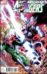 Mighty Avengers #34
Publisher: Marvel
Released: 03 March 2010
Writer: Dan Slott
Penciler: Neil Edwards
Inkers: Andrew Currie with Andrew Hennessy
Colorist: John Rauch
Letterer: Dave Lanphear
Cover: Khoi Pham
Cover price: $2.99
Review: Sean Lemberg
Mighty Avengers has been stuck in the past lately, and I mean that in more ways than one. No, the team hasn't boarded a DeLorean and cruised through the time stream towards parts unknown. What I'm referring to is the squad itself, its current membership, and the style of storytelling that's been employed by its scribe, Dan Slott. Robbed of most of its big names, this looks more like a West Coast Avengers team from 20 years ago than the star-studded squads that have dominated the series over the last decade. Longtime fans may see a team helmed by Hercules, Quicksilver, Vision, and The Wasp and instantly burst into a fit of gleeful clapping and tiny leaps of joy, but speaking personally I never saw the D-list team aspect of the book's past as being all that appealing.
Another thing that doesn't exactly rub me in the right spot is Dan Slott's throwback style of writing, a direct descendent of the Silver Age and all its heavy-handedness. Don't misunderstand, there's plenty to appreciate about that era and Slott has effectively captured some of it here, but he's also drug along many of the age's attributes that were left in the past for a distinct set of reasons. When this series first launched, for example, Brian Bendis reintroduced the thought balloon in an attempt to modernize the concept. It worked for a few issues, but ultimately became more of a distraction than a benefit and slowly disappeared near the end of his run. If that attempt to re-imagine the device failed because it couldn't shake the ghosts of its past, why would a more loyal try be any more successful? But Slott gives it a go, complete with verbiage so corny I'm surprised it didn't include a "golly," and meets a predictable fate.
The anything-goes mentality gives our writer plenty of chances to flex his creativity, with some efforts more fruitful than others. The Infinite Avengers Mansion for example, which allows Jarvis to gather ingredients for the team's breakfast from all corners of the world, is a fun (if inconsequential) little touch that's probably a bit too silly for the other Avenger books to devote any time to. More serious subject matter, though, like Loki's impersonation of the Scarlet Witch, doesn't work nearly as well.
Filling in for the book's regular artist, Khoi Pham, Neil Edwards doesn't manage to turn Slott's ramblings into anything worthy of enthusiasm. I won't lie and claim the Avengers have never looked this stiff, awkward, and dorky, but it's been a long time since that was the case. Edwards endures an epic ongoing struggle with the two-headed beast of perspective and proportion, one he ultimately loses, and fills the issue with dull, pointless background renderings. He has almost no feel for the personalities of each member, his fight scenes lack any measure of excitement, and the team's facial expressions rarely stray from the requisite clenched teeth and squinted eyes. Not a good showing.
Despite a few glimmers of trivial originality, on the large Mighty Avengers genuinely reeks. It means nothing to the big picture, struggles to prove it's even relevant to the small picture, and ultimately resolves nothing. If the combination of a shoddy squad of also-rans, crappy pseudo-retro dialog, a confusing plot, and sincerely hideous artwork is what you're looking for, well, there's plenty to go around. Otherwise, I'd strongly recommend you just skip it.


