Is It Wednesday Yet?
10 February 2010 — Here we are again with another installment of your favorite comic book review series. As always, the reviews are free of spoilers, so read on without fear of having your experience ruined!
Our grading scale is simple:
Buy: An excellent comic book.
Borrow: A good comic, but save yourself some money by reading a friend's copy.
Flip Through: Give it a once-over at the comic shop.
Skip: This doesn't need to be explained.
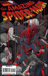 Amazing Spider-Man #619
Publisher: Marvel
Released: 27 January 2010
Writer: Dan Slott
Artist: Marcos Martin
Colorist: Javier Rodriguez
Letterer: VC's Joe Caramagna
Cover: Marcos Martin
Cover price: $2.99
Review: Guest
Ha. Issue #619 stars Mysterio. I get irony.
Spider-Man, as per usual, is going through a fair bit of trouble. Electro has destroyed the Daily Bugle, Aunt May has been possessed by Negative Man, and dead people seem to be mysteriously returning to life. To make things even more complicated, Peter has found himself in the middle of a gang war, the backdrop for a grand production orchestrated by the returning Mysterio.
Say what you will of Dan Slott and his, shall we say, inconsistent writing over the years, but if this book is evidence of anything, it's that every writer has at least one or two good stories in him. Slott in particular strikes me as someone that needs to really care about the character he's writing if there is any chance of him writing a story with actual weight. To his credit, he balances the tense nature of the story while keeping Spidey the bantering teenager that Marvel is determined for him to be. Slott's few quips range between the acceptable to the eye-rolling. One witticism in particular reeks of a middle-aged man trying to stay culturally relevant (RE: a MySpace joke in 2010), but it does little to detract from what is fairly competent writing. Mysterio, a character that's never been higher than C-list in Spider-Man's rogues gallery, is actually portrayed as a psychical and mental threat, to the point that it's difficult to guess exactly how our hero will overcome the odds. It's a simple thing that's too often missing from superhero comics.
I wish I could be as complementary of Marcos Martin's art. It's not bad in as much as I'm not sure it works for a Spider-Man title. The storytelling itself is fine, but oftentimes it feels as if I'm looking at a comic from another decade, like someone got their 50s crime noir in my Spider-Man. This is only made worse by the dreadful coloring. Everything is way too dull and muted. Spidey himself looks horrendous; not only does his mask change every panel, but his suit is a flat, garish red that's been lifted from an era before rendering and highlights were the norm.
In terms of direction, it's refreshing to see that Marvel's flagship character finally has some again — even if a thrice-monthly book does seem like overkill. It's not a pretty book, but the writing is just about the best Dan Slott has ever managed. That may not mean much to some, but here, it's worth at least a borrow.
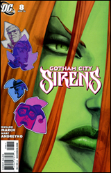 Gotham City Sirens #8
Publisher: DC Comics
Released: 27 January 2010
Writers: Guillem March and Marc Andreyko
Artist: Guillem March
Colorist: Tomeu Morey
Letterer: Travis Lanham
Cover: Guillem March
Cover price: $2.99
Review: Desmond Reddick
In this one-and-done issue, people are dying in a park from a toxin matching the DNA of Poison Ivy. Did she do it? The better question is: do you care? There's also a flashback story involving a desiccated and dying Poison Ivy being saved by an anonymous someone. Is that the person killing people in the park? You better hope so or it makes no sense whatsoever.
The artist, Guillem March, is credited first with both art chores and plotting; which makes sense when you read the book, because it appears as though March illustrated the issue without thinking about story in any way and then poor Marc Andreyko had to come along and add word balloons. It's like the Marvel Silver Age style, only with a 1990s accent on T&A.
Poison Ivy is portrayed the same way she's been portrayed everywhere else since her creation: flat and boring. Harley Quinn is a non-character with only the slightest bit of intrigue making her worth reading. And the only thing this book seems to do right is to provide a monthly comic to feature Catwoman who may be DC's most underrated female character. But even ol' Selina Kyle is barely in this book. It's likely that she's embarrassed to be in it at all.
Whatever story is strung together by the end of this book is so contrived and tired that it becomes nothing but a letdown. But really, if you enjoy this book at all it should be for the art. If not, then you probably enjoy huffing glue.
The art is gorgeous if you aren't worried about storytelling, of which there is none. March has an eye for the female form on par with Adam Hughes, Stephane Roux, and Terry Dodson. They look amazing. It makes up for the fact that there's nothing of substance coming out of their mouths. In that way, I guess it's a lot like ridiculously beautiful women in real life, so maybe I'll rethink how bad the story is. Nope. Never mind. This book is the poster child for a skip.
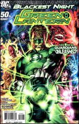 Green Lantern #50
Publisher: DC Comics
Released: 27 January 2010
Writer: Geoff Johns
Penciler: Doug Mahnke
Inkers: Christian Alamy, Rebecca Buchman, Tom Nguyen, Mark Irwin, and Doug Mahnke
Colorist: Randy Mayor and Gabe Eltaeb
Letterer: Rob Leigh
Cover: Doug Mahnke
Cover price: $3.99
Review: Sean Lemberg
Let's just say this: if you don't like a lot of moving cogs in your storytelling, stay far away from Green Lantern #50. If you haven't been keeping up with Blackest Night, the same guideline should apply. Don't have an intimate knowledge of the ins and outs of the variously colored power rings that populate the DC Universe? You guessed it; steer clear. However, if you're a hardcore devotee, an active follower of the latest world-spanning crossover, or just an interested observer with more than a casual understanding of what makes a lantern tick, this issue should be sheer ecstasy.
Geoff Johns has been building to this moment since before the book's relaunch, planting many of the seeds five years ago in the pages of Green Lantern: Rebirth. That makes for an incredibly rewarding climax for devoted followers, a payoff for years' worth of dedication that doesn't leave much room for complaint. The issue is complex because it's thorough, and while that may make for a few chaotic, crowded panels, they can be at least partially justified by the sheer magnitude of parallel storylines Johns is progressing. The author truly leaves no stone unturned, at once climaxing the individual stories he'd been telling in Hal Jordan's solo series and the mega-threads that had been raging through the pages of the crossover-dedicated Blackest Night.
Johns does stray on a few occasions from the traditional DC archetype into something that's more popcorn-greased, especially in a few of the more striking spreads during the raging battle between Black Lanterns and the combined forces of the opposition. Personally, I welcomed the change of perspective as I generally find the publisher's stories often lack precisely that sort of panache. More invested purists may not find the not-so-subtle shift in tone to be as welcome as I did, though.
Doug Mahnke and an entire platoon of inkers tackle the artwork, which is every bit as good as Johns' writing. I don't always enjoy the DC visual style, with its more character-focused, down-to-earth technique and concentration on storytelling over splash pages or exaggerated postures. Following the writer's lead, however, Mahnke has also infused the issue's visuals with a bit more flair than I expected. Effectively bridging the gap between two very different styles, he's managed to spin a visual tale that's overwhelmingly descriptive and brightly narrative, but also excitingly framed and beautifully composed. Mahnke has obviously busted his ass on this issue, and the end result is worth every bit of the effort he's sunk into it.
This isn't the greatest issue ever published. Sorry to mislead you if I gave that impression in my lengthy preamble. What it is, though, is a damn fine anniversary issue that also, miraculously, serves as a fitting pinnacle to a major supplemental series. Not many can even manage the former with any degree of success, let alone the latter. Geoff Johns hands in one of his finest plots this month, and though his dialog has some eyeball-rolling moments, that's not enough to stop the issue from being a real success. Paired with a spectacular artistic showing from Doug Mahnke, he's come up with a real beauty. Buy it.
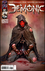 Pilot Season: Demonic #1
Publisher: Image / Top Cow
Released: 27 January 2010
Writer: Robert Kirkman
Penciler: Joe Benitez
Inker: Victor Llamas
Colorist: Arif Prianto
Letterer: Troy Peteri
Cover: Marc Silvestri
Cover price: $2.99
Review: Guest
Scott is a police officer that's recently enjoyed a well deserved week off to spend with his family. He's your archetypal blond-haired, blue-eyed American with a smoking hot wife and a young daughter that he'll do anything to protect. He's also possessed by a demon. Said demon is also demanding he make a nightly sacrifice of souls in exchange for superhuman abilities. Really, for a Top Cow book, it's not a huge deviation from the norm.
Kirkman seems to have an affinity for heroes that try to make the best of often-nefarious circumstances, as Astonishing Wolf-Man will attest, but Demonic is already more appealing from the beginning due to the standout artwork by Joe Benitez. Granted, it shouldn't be a surprise for anyone to hear that a Top Cow book has great art, but it's worth pointing out because I'm not sure that the entire book wouldn't have fallen apart in the hands of a lesser artist. A half-amputated torso getting impaled and then thrown into a helicopter could easy end up looking as silly as it sounds, but it, along with the frequent other occasions of gore-letting, work on an impactful level that almost surpasses the simple story that dictates it.
Since this book is part of the Pilot Season initiative, it's hard to entirely blame Kirkman for what's essentially just a proof of concept at this point. Introducing advanced plot points or a multitude of characters would be a waste of effort for a book that may never get more than this single issue. I, for one, would like to see where this character can go. The mix of tragic superhero with horror elements shown here has legs, and the demon angle could be explored in a lot of different ways. Is he really possessed or is he just crazy? Where did these powers originate? These are the kinds of questions you want from a first issue, and really, the only gripe I have is that the "rules" that this demon appears to operate by are a tad inconsistent. At one point in the book Scott is told that all he has to do is one thing to free himself of his duty, something he staunchly refuses to do. Later on, he finds himself doing that exact thing and yet is no closer to freedom.
All in all, Kirkman's done better, but he's also done a lot worse, and I think this is a book with some major potential. Buy it.
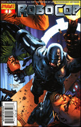 Robocop #1
Publisher: Dynamite
Released: 27 January 2010
Writer: Rob Williams
Artist: Fabiano Neves
Colorist: Diogo Nascimento
Letterer: Simon Bowland
Cover: Stephen Segovia
Cover price: $3.50
Review: Desmond Reddick
After Dynamite published what is perhaps the worst comic I'd read last year featuring the property of one of the best movies ever made, it is needless to say that I had very low expectations of this issue. And when I read the blurb on the inside front cover saying this issue picks up where the first film left off, I thought to myself: "So, Dynamite's done besmirching my favorite Western, now it's time for my favorite science fiction film?"
But I have to say, while this isn't the best comic I've read recently, it is a licensed comic that stays very faithful to its source material and even revels in the same style and tone. Before we get to all that, what's this book about?
Well, following the events of Robocop — and if you haven't seen Robocop, then lift up the rock with one hand and drag yourself out with the other — it's business as usual in Detroit as officers Murphy (the titular Robocop) and Lewis are cleaning up the scum. But OCP is back with a new director and a new vision for crime fighting in Detroit. That vision includes firing all of the police officers and putting a horde of ED-209s on the streets in their place. But they also have plans for Robocop. Evil plans!
The book fits right in with the in-your-face action and pull-no-punches satire. In fact, seeing as I actually like Robocop 2, this is already a better sequel. Beyond the direct representation of themes and characters right out of the first film, there are also hilarious commercial breaks, the same newscasters (including the Leeza Gibbons likeness), and the "I'd buy that for a dollar!" guy.
The violence and language is perfectly in keeping with the film. The creative team should be rewarded for not taking the chance and going all Avatar Press by amping up the violence to ridiculous levels. That would have been a disservice and completely contrary to everything else this book does right.
Williams' story is paced perfectly and there isn't one misstep. It isn't going to win a Pulitzer, but it does kick ass. Ultimately, that's what you want from Robocop.
Fabiano Neves does an amazing blend of Greg Land-type photo reference, but mixes it with palpable action and impeccable storytelling. It really is a crime that he isn't at least as high profile as Land. He's got better chops.
This book really was a nice surprise for this fan of the film and it has a new reader in me. I would say that Robocop is a very solid borrow for the general public, but a definite buy for fans of the film.
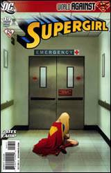 Supergirl #49
Publisher: DC Comics
Released: 27 January 2010
Writer: Sterling Gates
Artist: Matt Camp
Colorist: Nei Ruffino
Letterer: Jared K. Fletcher
Cover: Joshua Middleton
Cover price: $2.99
Review: Sean Lemberg
Since returning to modern continuity, Supergirl hasn't exactly made a lot of non-costumed friends. In fact, she could count on two fingers the number of close acquaintances she knows who don't don a cape, cowl, or other spandex-wrapped wardrobe. As fate would have it, both are in need of her aid this month — one faced with the onslaught of a crazed Silver Banshee, and the other facing something darker.
This month's fill-in artist, Matt Camp, hands in an oddly inconsistent showing. At his best, Camp's style is beautiful in its simplicity. When Lana Lang collapses in a pool of her own blood early in the issue, Camp's stark, matter-of-fact depiction is staggering. I was every bit as shocked and terrified as the doorman who finds her there, struggling for life on the floor. On the very next page, however, it's like the artwork has been handed over to a completely different contributor. Camp's two-page treatment of the scream-off between a possessed Supergirl and the Silver Banshee looks like an afterthought, something that was rushed out the door in no time flat. All of the intricacies that had made the previous layout so striking have suddenly gone missing. The double-sized impact shot pales in comparison to the more conservative single-page, four-panel masterpiece.
That duality carries throughout the whole issue. Some pages, it seems like Camp couldn't care less. Others, he makes an argument for himself as one of the publisher's brightest emerging artists. His struggles are both complimented and compounded by the work of Nei Ruffino, his colorist. In certain instances, Ruffino's heavy influence emboldens the artwork — the scene featuring Lana being a perfect example. It's rich and vibrant, but not in a way that steals any of the spotlight from the panel's composition. In others, an unrelenting flood of excess color overwhelms the cleanliness of the page. Neither artist nor colorist really seems to know precisely what they're doing at any given moment, which makes Supergirl's artwork a real hit-or-miss proposition.
Sterling Gates does his best to write the issue as a character piece, especially after the battle with the Banshee is behind him, but I never found myself personally invested. While the issue's cover gives the impression that the story would be extremely heavy and emotionally draining, its interiors never get close to that target. Lana "dies," — which I'll place in quotes because, let's be honest, that word doesn't mean what it used to — and Supergirl's reaction seems much more like a non-reaction. She's barely let the moment sink in before she's asking questions about her friend's bloodstream and grimly planning to see the body. This doesn't come off as a part of the mourning process, or even something emotional. It just seems like a character trying to turn the page and get on with the next scene so they don't have to force out any crocodile tears. Gates' story climaxes on page three and then goes on vacation.
There's really no reason to read this issue beyond those first three pages. They're the strongest of the book, misleading its audience into believing the rest of the issue can keep it up. However, nothing could be further from the truth. It's a breakneck kick-start followed by a slow coast down the rest of the highway. Flip through it and try not to let anybody see you put it back on the shelf when you're finished.


