Is It Wednesday Yet?
22 December 2009 � Here we are again with another installment of your favorite comic book review series. As always, the reviews are free of spoilers, so read on without fear of having your experience ruined!
Our grading scale is simple:
Buy: An excellent comic book.
Borrow: A good comic, but save yourself some money by reading a friend's copy.
Flip Through: Give it a once-over at the comic shop.
Skip: This doesn't need to be explained.
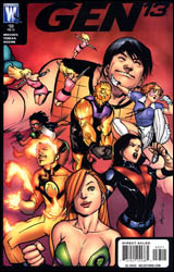
 Gen13 #33
Publisher: DC Comics / Wildstorm
Released: 09 December 2009
Writer: Adam Beechen
Penciler: Cruddie Toran
Inker: Joe Weems
Colorist: Wildstorm FX
Letters: Wes Abbott
Cover: Rafael Albuquerque
Cover price: $2.99
Review: drqshadow
There's a natural rivalry brewing between the members of Gen13 and their apparent successors, Gen14. Only natural that the younger squad would be in a hurry to take over, while their predecessors would take offense to being replaced before they're ready. After coming to an uneasy understanding, uniting to confront their would-be masters in the US military, and making a long journey to the city of Tranquility in the hopes of finding kindred spirits, the teams were met by an unsightly surprise. Tranquility, thought to be home to dozens of retired or inactive superheroes, is no more. In its place is a large, smoldering crater. Subsequently, the unlikely allies have agreed to continue their trek across the country, but with no particular destination in mind.
In their first issue under temporary writer Adam Beechen, it doesn't take long for the tribe to run into some unexpected fireworks. Just one page, in fact, but the ensuing battle doesn't last long. But much as I'm no fan of brainless action sequences just to kill time, in retrospect I think I'd have preferred it to stretch the length of the entire issue. It certainly would've been preferable to the weak attempt at a backstory and the limp-wristed character development that followed. Beechen does little to differentiate each member of the team besides a brief showcase of his or her powers. He doesn't reveal anything new about the cast, lend them any depth, or give his readers a reason to get interested in learning more about them. They stroll through the issue like husks on a clothesline, floating blandly from one dull, over-explained predicament to the next without so much as a yawn's worth of personality.
Beechen's partner in crime, Cruddie Toran, offers his finest J. Scott Campbell impression. At first glance, it's a decent enough approximation � curvy women with long, thin fingers, unusual paneling, and abundant blast lines � but upon closer inspection his shortcomings grow obvious. Not that Campbell's take on the characters was without its own flaws, but at least at the time it was something original.
Toran's illustrations take an already-excessive style and amp it up even further, casting aside any concerns for storytelling or organization along the way. They're a collection of pin-ups that just so happen to contain similar characters in an analogous environment. His work is the embodiment of style over substance, and it's not even particularly good-looking at that. Think what you will about his work in the 1990s, but at least Campbell could draw two different kinds of characters: long-legged, gangly supermodels and thick, chunky, over-muscled bodybuilders. Toran struggles with the latter, often sketching them in laughably effeminate poses with the same dainty legs as their counterparts. And of course, everyone's muscles remain rigid and fully clenched at all times.
This is the very definition of a throwaway issue. The team bumps into a few Wildstorm regulars, fills the audience in on their whereabouts, diffuses a bomb or two, and moves along. There's nothing memorable about it, nothing inside to change or even define the characters it supposedly embraces. The story does little to excite and the artwork doesn't help its case. Skip it.
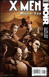
 X-Men Noir: Mark of Cain #1
Publisher: Marvel
Released: 09 December 2009
Writer: Fred Van Lente
Artist: Dennis Calero
Letterer: VC's Clayton Cowles
Cover: Dennis Calero
Cover price: $3.99
Review: drqshadow
Perhaps the most critically admired of Marvel's first set of noir titles, the X-Men of the 1930s concluded their first adventure with something of a cliffhanger. In X-Men Noir: Mark of Cain #1, the story resumes shortly thereafter. Presumably powerless (the final verdict on that one is left to us), Xavier's class in this series consists of a band of sociopaths and delinquents, youths with a black mark on their past who have resorted to outrageous stories of inhuman abilities to attract attention to themselves. It's an interesting way to turn the mutant mythos on its head, a storytelling twist that surprisingly enough doesn't result in a change in the themes of the traditional X-Men dialog so much as it merely shifts the reader's perspective on them
Fred Van Lente, who masterfully penned the first series, resumes his duties in this second chapter, which transplants the team from the detective-flooded streets of New York City to the deepest jungles of Madripoor. But that's not before he takes the opportunity to initiate new readers with a quick, newsreel-styled recap of the first series. It's a perfect way to cover the complicated material of that first tale, while also setting the mood and tone of the era he's emulating. Where that historically appropriate footage leaves off, Van Lente picks up with the issue's dialog, which seems to leap right off of those ancient movie screens and onto the page. It's a cool enough trip down the path of nostalgia that I could almost lose myself in the atmosphere alone.
Eventually Van Lente does trip over a few hurdles, however. Despite the double-sized recap section, much of this story is dependent upon a close understanding of elements from the first series that are left undisclosed to new readers. While his cast's dialect is responsible for much of the issue's flavor, he also refuses to shake it up between characters. Some of the effect is bound to get lost if everybody speaks like a hardboiled detective, and that's precisely the case here. Many times, amid the shadows and identical speaking patterns, it's tough to isolate who's doing the talking and who's merely listening. In the end, are these minor gripes? Sure, but they're valid ones nonetheless.
Dennis Calero's artwork, like those of each of his Noir counterparts, is crucial to the success of this series. So much of what makes such a story work depends on the deep shadows, careful compositions, and sharp mood set by its visuals that it's tough to imagine any revival finding much success in the hands of a middle-of-the-road talent. Calero manages the job effectively, employing a style that's oft reminiscent of Jae Lee in its use of selective lighting and densely layered surroundings. The style is particularly effective in the title's first fight scene, when Logan and Angel are caught off-guard by an onslaught of shadowy natives. The action is quick and chaotic, but deliberately and successfully so. My sole qualm with the artwork lies with the decision to offer it in full color. Especially contrasted by the black and white tones of the newsreel footage that opens the issue, the lush palette and full tones seem at odds with its inspirations. The array of color gives this story a more modern flavor that seems counterproductive to the thick atmosphere and weighty mood the line is chasing.
Mark of Cain may not be as captivating as the original series, but it still holds its own as a handsome addition to the noir-inspired line. It's effectively written, gorgeously illustrated, and despite a few slips and flaws, it's worthy of a closer look from fans of the first miniseries. New readers may find that their mileage varies. Borrow it.

