Is It Wednesday Yet?
08 December 2009 — Here we are again with another installment of your favorite comic book review series. As always, the reviews are free of spoilers, so read on without fear of having your experience ruined!
Our grading scale is simple:
Buy: An excellent comic book.
Borrow: A good comic, but save yourself some money by reading a friend's copy.
Flip Through: Give it a once-over at the comic shop.
Skip: This doesn't need to be explained.
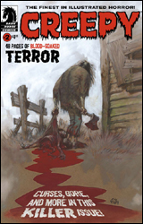 Creepy #2
Publisher: Dark Horse
Released: 25 November 2009
Writers: Dan Braun, Mike Baron, Joe R. Lansdale, Joe Harris, and Dave Sims
Artist: Greg Ruth, Nathan Fox, Rahsan Ekedal, Jason Shawn Alexander, Angelo Torres, and Russ Heath
Letterer: Nate Piekos and Nathan Fox
Cover: Eric Powell
Cover price: $4.99
Review: Desmond Reddick
There is no way on earth my receiving this book to review was seen by myself or you, dear reader, as a surprise in any way. I am the horror guy, I love anthologies when they're done well, and Creepy magazine is among the greatest of all horror comics in the history of horror comics. So I'll stop keeping you on the edge of your seat and just say it: this book lives up to that.
The first issue of this revamped series was a fun read but quite uneven. But this one wastes no time showing us how the format of this series works.
01. An Eric Powell cover: This one takes the cake for the best piece of Powell art that I have ever seen. Amazingly composed and it tells a story. A nasty story, but a story nonetheless.
02. A frontispiece: This is just a fun one-page pin-up showing Uncle Creepy (the classic host of this anthology). This time, Rahsan Ekedal — artist of The Cleaners and a story in this anthology — provides a striking ink-drawing of Creepy and a dead Paris Hilton-type moving through the throngs of undead paparazzi.
03. Four original tales:
I. "Human Nature" by Dan Braun and Greg Ruth is a beautiful and haunting story reminiscent at times of the best kind of art film and at other times the shocking, violent cinema of the 1970s. Ruth's art, already worthy of praise in my eyes, delivers quite possibly one of the most beautiful looking stories I've seen in a very long time. In fact, it's so good it actually overshadows the writing. Unfortunately the story is one of the strongest in the anthology.
II. "Muscle Car" by Mike Baron and Nathan Fox is a spectacular entry in the "killer car" genre that is so bonkers it just works. Now, I'm a fan of Nathan Fox, but I found his art to be very busy and difficult to follow almost throughout. I think I'll chalk it up to the black and white nature of the book. Fox's work in color has a more restrained quality.
III. "Drawn Out" by Joe R. Lansdale and Rahsan Ekedal is a superb example of why these two are at the top of their game. Ekedal, who's relatively new to comics, manages to take Bernie Wrightson, manga, and the Image style and work them together into something unique. His eyes are the most expressive in comics. Joe R. Lansdale is also a newcomer. I don't know much about him, but I hear he's really good. I kid. The story manages to make you squirm, scratch at your skin, and turn your head in revulsion over eight pages.
IV. "The Curse, part two" is a continuation of the story from the first issue, where a boy gains the ability to make people do whatever he wants. Dan Braun and Jason Shaun Alexander bring a story so dirty in both delivery and look that you'll want a shower after you read it. And there's still one more installment to go! This story has the best "twist in the tale" in a short horror comic story that I have read since old issues of the original Creepy.
04. "Loathsome Lore" has the writing team of Braun, Shauna Gore, and Craig Haffner with Angelo Torres on art chores. They give us a fun little visual history of unique torture devices.
05. And finally A Creepy Classic by Dave Sims and Russ Heath. "The Shadow of the Axe" is a story I've loved for a long time! Honestly, most of the time you see reprints of "classic" stories, the "classic" actually means "old and shitty." Kudos to Dark Horse editorial for actually giving us some of the best damn Creepy stories ever published.
Ultimately, this book won't change your life. If you don't see at least three of the endings coming, you've probably never read, seen, heard of, or been in the vicinity of a horror anthology. But this is easily the best horror comic published this year. Buy it.
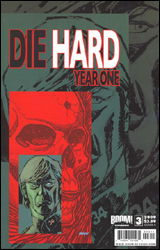 Die Hard: Year One #3
Publisher: Boom! Studios
Released: 25 November 2009
Writer: Howard Chaykin
Artist: Stephen Thompson
Colorist: Matthew Wilson
Letterer: Ed Dukeshire
Cover: Dave Johnson
Cover price: $3.99
Review: drqshadow
Hey, you remember Die Hard, right? The original, that is. Barefoot on broken glass, bad guys crashing through a cop car with several hundred feet of momentum, "Yippee-ki-yay, motherfucker," badass Die Hard? Before John McClane was reduced to escorting the "I'm a Mac" guy through computer-generated fireballs, ducking under sailing cabs, and censoring his own catchphrase to fit within the confines of a PG-13 release. Yeah, that was a pretty good movie. Not sure if it really needed a comic book prequel, exploring the experiences that shaped the action hero's life as we saw it in his cinematic exploits, but that's where the overzealous actions of the merchandising department have taken us. Let's try to enjoy the ride.
Howard Chaykin is the man of the hour, writing this special peek back at a time when McClane was still a beat cop; pounding the pavement, trusting in his superiors' orders, and looking at the world through a much more naďve pair of eyes. As fate would have it, though, the subtraction of several decades' worth of experience has also robbed our lead of most of his charm and charisma. Or maybe Chaykin's just written him into a terrifically boring role. Either way, the guy we're following throughout this issue has little more than a name and a badge in common with the man at the center of the big screen quadrilogy. He doesn't even look like Bruce Willis.
One thing the movies are particularly good at is getting the setup out of the way quickly and diving straight into the action. Once they've fired off a few rounds, the films loosen up and make with some surprisingly solid moments of character development amidst shattering windows and bursting C-4 packets. In that respect, Year One is once again an estranged member of the family. As the middle act of a five-issue miniseries, one might expect something to be happening by this point, but Chaykin seems to have left the gearshift in neutral. When the bad guys finally show their hand in this chapter's closing pages, I was left wondering why it took two and a half issues to get there when the first film worked a very similar plot much more efficiently.
Mercifully, Chaykin does not lend his hand to the visuals. I can only imagine the kind of pouty lips and ass-less chaps that would have adorned McClane's wife-to-be in this issue. As it is, he's written her into wearing one of the more ridiculous outfits in recent memory. Dressed in a head-to-toe spandex outfit patterned after a star on the US flag, complete with knee-high white leather boots, she dons a pea-green muumuu and is suddenly rendered incognito to the pedestrians surrounding her. Stephen Thompson's renditions of mid-70s New York are serviceable, if not era-appropriate. I particularly liked his effective use of halftone shading, and his style is reminiscent of Frank Cho or Adam Hughes, although he's clearly not at their level. There's just nothing here to convince me that this story is set in 1976, rather than the present day, and the cast's lackadaisical body language and facial expressions seem to imply they're just as disinterested in this plot as I am.
This comes across as a completely unrelated story that was merely repurposed and repackaged to take advantage of the Die Hard property — and not a very good one at that. Chaykin's cast moves and acts like a flock of robots, the villains' master plan doesn't make any sense, McClane doesn't have a reason to be there, and I don't have a lot of sympathy for the victims at the heart of the matter. Fans and critics alike will have no reason to rejoice in this one. Skip it.
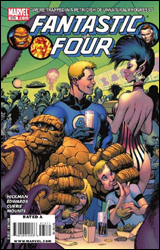 Fantastic Four #573
Publisher: Marvel
Released: 25 November 2009
Writer: Jonathan Hickman
Penciler: Neil Edwards
Inker: Andrew Currie
Colorist: Paul Mounts
Letterer: VC's Rus Wooton
Cover: Alan Davis
Cover Price: $2.99
Review: Guest
The best way to tell you've jumped in the middle of a really uninteresting comic? It starts with people in an alternate world running from something robotic.
As a former Marvel Zombie, I feel it is my duty to explain that I don't want to be disappointed with nearly every single book I have to read coming from the House of Ideas. It just keeps happening. The funny thing is, this issue isn't even a part of the whole "the status quo will never be the same" event storytelling that I've been ragging them for. It's just a boring comic book.
For no clear reason Ben and Johnny have decided to take Franklin and Valeria on vacation to Nu-World, a haven for survivors of a ruined future Earth. This goes about as well as you'd expect. From the moment the crew arrives, they discover that things are different than they remembered! The clichés just roll out like parchment from there. Of course the portal you used to get there only works one way. Of course there's a hoard of evil robots under the command of a maniacal government. To make things even worse, the entire story is narrated from the perspective of Franklin talking to his mom, which serves to completely eliminate any sense of suspense or conflict. You know that everything is going to get wrapped up by the end of the issue.
While I can't completely begrudge the occasional return of standalone issues, they still need to serve some sort of purpose. The only thing this issue really does is make Valeria the focus, as if having one deus ex machina child wasn't enough for the family.
As for the art, it's okay. Edwards does well enough on the robot side of things, but his humans are a mess from panel to panel. Either he's doing his best impression of the Greg Land "female with mouth agape for no reason" pose, or he's drawing deformed men with Leave it to Beaver haircuts. The anatomy is horrible, and it's not helped by awkward poses that look completely impossible. I haven't had the privilege of throwing too many uppercuts in my day, but I imagine it wouldn't begin with me thrusting my left leg forward as if to climb a ladder in the sky.
What makes this all the more frustrating is that the Alan Davis cover makes it look as if this issue was going to be a light, fun, intergalactic adventure that you could pick up to have a good time. It's definitely light all right, but in substance and merit. It's not particularly important, and the entire thing just seems like an excuse to kill off a dangling plot line. Skip this.
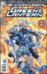 Green Lantern #48
Publisher: DC Comics
Released: 25 November 2009
Writer: Geoff Johns
Penciler: Doug Mahnke
Inkers: Christian Alamy, Doug Mahnke, and Tom Nguyen
Colorist: Randy Mayor and Gabe Eltaeb
Letterer: Rob Leigh
Cover: Doug Mahnke
Cover Price: $2.99
Review: Guest
Reviewing comics on a weekly basis can be rather taxing. Sometimes you just don't feel like reading anything that week, or you've been given the latest drivel of one of your least favorite creators because your editor doesn't want you to live to see 30. Whatever the reason, oftentimes this can feel like a job more than anything.
This isn't one of those times.
Green Lantern isn't a difficult book to review. It's the best ongoing superhero title of 2009 for three bucks. If you have even a passing interest in mainstream comics, this is the book to get.
In an attempt to combat the Black Lantern invasion, Hal Jordan has forged alliances with the leading members of the various other corps. While creating an ally out of Sinestro has been difficult enough, the almost-assembled team have still yet to persuade the two most difficult troops: Red Lantern Atrocitus, and the ever singularly minded Larfleeze.
Geoff Johns has created such a synergy between Blackest Night and the two Green Lantern titles that it can be a daunting task trying to keep up with everything. And while it's certainly true that developments here lead directly into Blackest Night #5, the ongoing issues of Green Lantern have really told their own story — one more scaled down and focused despite the cosmic scope of the tale. Johns' strength has always been less with individual plot points as it's been with the way his characters interact with one another. It's something he's really become a master at, whether his purpose is to excite or humor the reader. Often he'll put his characters over with a line or two, rather than showing how dangerous or admirable a character is in a fight scene.
That isn't to say the book is devoid of action. There is plenty of infighting between the Lanterns, both physical and otherwise, which Doug Mahnke handles extremely well. He's able to keep up with Johns' dialog with fun detail only to go all out when things ramp up. It's clear he had a blast drawing the two more vermilion-tinted Lanterns, with plenty of cool alien characteristics that other artists simply wouldn't bother with.
Honestly, you're either reading Blackest Night or you're not. If you are, then chances are you already have this issue. If for some reason you don't, then it goes without saying that this is an easy buy from me. It's everything you'd want out of a comic book, and you don't have to pay four dollars for it.
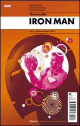 Invincible Iron Man #20
Publisher: Marvel
Released: 25 November 2009
Writer: Matt Fraction
Artist: Salvador Larroca
Colorist: Frank D'Armata
Letterer: Joe Caramagna
Cover: Salvador Larroca
Cover price: $3.99
Review: Michael David Sims
Remember when Tony Stark used to run SHIELD, when he said that no one would ever get their hands on the civilian names of every registered superpowered being? We all knew someone would try one day, but we didn't realize how far Stark would go to protect said identities. With Norman Osborn hunting him down — trying to get his grubby goblin paws not only on the names, but also on Stark's repulsor technology — Iron Man pulled a trump card out of his metal sleeve; to save his friends and mankind, Tony sacrificed himself. Though he stopped short of taking his own life, the armored Avenger erased all traces of the information Osborn sought — including from his own mind. Now in a persistent vegetative state, Stark relies on some of those he saved to "reboot" him.
As the opening chapter in the five-part "Stark: Disassembled," writer Matt Fraction has written himself into the same corner Ed Brubaker found himself in after Steve Rogers was assassinated in Captain America #25; how does one write a book in which the title character is dead — or, in the case of Iron Man, brain dead?
Though both men used the previous issues to build up their supporting casts, knowing they could and would lean on them to keep the books going, Fraction hasn't written Tony out; he's still an active character in the unfolding drama. Sure, he might be hooked up to life-sustaining machines and under the caring eye of Dr. Donald Blake, but thanks to a look into his dreamscape and with the aid of technology, Tony delivers dialog on 14 of the 17 pages in which he's featured.
Not only does this serve to keep Invincible Iron Man Tony's book, and not only does it give us clues as to how he will eventually return, but it also hammers home just how smart the man is. Often it's taken for granted that Tony Stark is one of the smartest men in the Marvel Universe, much to the book and character's disadvantage, but Matt Fraction cleverly reminds us of this fact. Not by showing Tony invent a sentient toaster, but by proving he's many steps ahead of everyone else. He's not just a brilliant inventor, but a strategist, something that's often overlooked when he's in the same room with the Steve Rogers Captain America.
Best of all, where Matt Fraction excels in this issue of Iron Man is by making Tony human. He's broken in the real world, confused in his subconscious, and worried yet hopeful in his prerecorded message. It's the human side of Tony that was lost during Civil War and glossed over in Mighty Avengers. And maybe Fraction has been writing him this way in the preceding 19 issues of Invincible Iron Man — I wouldn't know, as I've only read Invincible Iron Man: The Five Nightmares — but this is a truly refreshing take on a character that's not always easy to relate to.
And just in case you thought this book was all about humanizing Tony and setting up his eventual return, in one page Fraction delivers a truly honest, heartbreaking scene. Pepper Potts asks a question that we in the real world never get to ask, reminding us that the rules of life and death are different in comic books. But more importantly, those rules unfairly favor those who choose to wear capes and tights. Hopefully the writer will play this up post-resurrection — as this could be laying the groundwork for an eventual split between Pepper and Tony — but even if he doesn't, the impact of the moment remains.
Helping to sell the scene, and the book as a whole, is Salvador Larroca. Previously I haven't been too kind to his current artistic style — which often has people looking vacant and mushy-faced, as if they're made of clay — but his work here is much more to my liking. Though some characters still have that lifeless, thousand-yard stare, there's a reason for it here; everyone at Tony's bedside is shock by his condition and flabbergasted by the message he's left them. When we move away from that scene the empty eyes tend to be filled with life, anger, sadness, and drive. Really, though, it's the subtlety that brings Larroca's pencils to life. As Tony delivers his possibly final message to his friends, the artist is asked to draw six eight-panel pages, all from the same angle. In some of them Tony sits unmoving in his chair. In others he gesticulates. But it's in the motionless ones where the character is most active and the artist shines. By adding or removing a few lines, Tony's expression shifts from somber to humored, determined to concerned. Coupled with Fraction's pitch perfect dialog, I've not read or seen Tony Stark better represented in comic books.
Even though his name was tarnished during the superhero civil war, and even though this is Invincible Iron Man #20, and even though you might only be familiar with the on-screen Iron Man, this is truly a rare gem; it isn't often one stumbles upon an ongoing comic book that is friendly to both new and old readers alike, especially one that's deeply rooted in the larger, companywide continuity, but that's what we have here. Buy it for a rewarding experience.
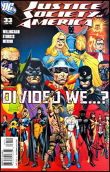 Justice Society of America #33
Publisher: DC Comics
Released: 25 November 2009
Writer: Bill Willingham and Matthew Sturges
Artist: Jesus Merino
Colorist: Allen Passalaqua
Letter: Rob Leigh
Cover: Jesus Merino
Cover price: $2.99
Review: Desmond Reddick
The strength of the Justice Society is that it is unique amongst superteams. It takes the best of the Fantastic Four, the New Mutants, and the Justice League and smashes them together. That's when it works. When it doesn't work it becomes like every other superteam book. I have recently dropped Justice Society of America from my pull list for that very reason.
Willingham and Sturges are crafting a story that pits the ideals of the Justice Society against one another. For the last issue in a story arc titled "A House Divided" — coming out only a week before JSA All-Stars debuts — it's no spoiler to say that this issue has the Society facing off against the army of villains who have come, destroyed their brownstone building, and are trying desperately to collect bounties on the heads of the heroes. Why they all showed up at the same time is beyond me. Also, Mr. Terrific is dead by the hands of a teammate, or is he? And the team breaks up at the end because some of them want to be more of a militaristic organization. Like every other superhero team.
What I did like about the story is that the interplay between the members is good. Not Geoff Johns good, but good nonetheless. There's a decent handle of how the JSA fights as a team even when they're at odds with each other strategically. And the old guard like Flash and Wildcat are given due respect. Also, a long gone character from the Johns era makes a triumphant and kickass return in this issue.
My problem with how some of the characters are handled (and this is gleaned from an issue that is essentially one long fight scene) is that the building up that Johns had done of the youngsters like Stargirl and Jakeem Thunder doesn't appear to be there anymore. These characters are now veteran heroes with leadership qualities, and it's just one of the examples of why JSA was one of the best books DC published.
To be entirely fair, though, I was going sour on Johns' run as he was sowing the seeds of discontent during his Magog storyline. This is just a logical extension of that.
On the art side of things, Jesus Merino burst onto the JSA scene inking Carlos Pacheco on the great JLA / JSA: Virtue and Vice, but he's certainly stepped out of Pacheco's shadow to be a great artist in his own right. Getting this high profile gig is a deserved package of kudos for the man whose action is as dynamic as the tense character moments found at the back of the issue. The violence is big and confusing like it is in real life. I really got the feeling of a war film, like that wonderful opening battle scene in Saving Private Ryan. It's frantic and confusing, but constructed so. The movement is believable and not posed. And best of all, he makes a book featuring a team of about 20 heroes fighting about 30 villains seem easy. If anything, Justice Society of America #33 gets a gold star for art.
If you are new to the Justice Society I would recommend you borrow this book. But if you're a longtime reader this will not seem like your JSA. There are about a dozen trades out there you'll find a lot more satisfying than this "new take."
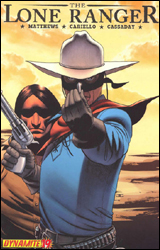 The Lone Ranger #19
Publisher: Dynamite Entertainment
Released: 25 November 2009
Writer: Brett Matthews
Artist: Sergio Cariello
Colorist: Marcelo Pinto
Letterer: Simon Bowland
Cover: John Cassaday
Cover price: $3.50
Review: Michael David Sims
After praising The Lone Ranger: Now and Forever on Earth-2.net: The Show 349, I was so very excited to get my hands on this issue. Going in, I knew some questions would be raised — as I've only read the first six issues collected in the aforementioned volume — but I was willing to work around them for the sake of what I knew would be an enjoyable read.
Well, I was wrong. Wrong about being able to work around my questions and it being "an enjoyable read." And that's a damn shame.
What we have here is the third chapter in a storyline entitled "Resolve," in which (I gather) the Ranger and Tonto have been framed for cold-blooded murder. Now it's up to the duo to discover the real culprit while clearing their names. Though it's a tired old plot, other works of fiction have done well with it, so you can't fault Brett Mathews for using it here — especially when the hero's bullet of choice is so easily duplicated. What he can be faulted for, however, is not doing anything fresh with it. Worse yet, not doing anything with it.
The storytelling is so loose, one wonders why this isn't a one- or two-issue story. I hate to use the phrase, but this is the definition of decompression. It's even apparent in the way Sergio Cariello illustrates the issue. Sequences are needlessly stretched out over several pages by limiting the number of panels per page, and larger panels are oddly placed to fill out pages. There's a sense that this is being done to give this story the standard slow Western pace, but one can tell the difference between a naturally unhurried story and padding.
Furthermore, nothing is explained. Why did the Ranger clock the sheriff? Who's this fed and what's his beef with the masked man? And why does he seem to have it out for the sheriff? Cavendish came into a cache of weapons, but to what end? And why is the supplier of said weapons screaming after them as they leave? (To that one, he's been tied up, sure, but the way the ropes are drawn, he'd have no trouble slipping out.) I don't need or even want everything explained, but put a worm on the hook!
Though I blamed the writing for the artistic missteps here, it isn't the only reason Cariello's falters. Great art can come from a lackluster script, after all. (Supergod #1, anyone?) So when Cariello was handed this needlessly fluffed-up story he should have done his damndest to at least make it visually interesting. (As Mythbusters has proven, you can polish a turd.) But even he seems bored with the story; though some of his faces are expressive, most of the issue is stiff and awkward. Panels often feature one character with no (or a minimal) background. Perspectives are constantly off. The only interesting sequence is when Black Lantern Dan Reid, Sr. creeps out from under his son's bed, but that horrific dream sequence is short-lived, and the following pages look as though Cariello once again lost interest in the project.
Earlier I noted that something, anything should have been written into the book to bring readers back for the next issue. But, really, instead of trying to entice us to come back for the next installment, try making this issue worth our $3.50. And a clichéd cliffhanger doesn't count. Skip it.
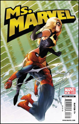 Ms. Marvel #47
Publisher: Marvel
Released: 25 November 2009
Writer: Brian Reed
Artists: Mike McKone, Rob DiSalvo, and Derec Donovan
Colorist: Chris Sotomayor
Letterer: Dave Sharpe
Cover: Pasqual Ferry
Cover price: $2.99
Review: Michael David Sims
As Ms. Marvel draws towards its 50th and final issue, one plot thread I never thought would be resolved was the invitation for a date Peter Parker extended to Carol. Well, color me wrong, 'cause here it is.
Gasp as Carol and Peter suffer through uncomfortable silences! Marvel as they discuss what drinks to order! Cheer as they connect over chili dogs!
Though it might sound like I'm down on this issue, I'm just taking the piss. In actuality, Ms. Marvel #47 is a nice breather before the title characters has her series-ending brawl with Mystique. If more books took the time to slow down and examine their characters, we'd have a richer universe and more relatable characters. Yes there's a superpowered fight in here — two actually — but they're treated as afterthoughts (and that's a good thing) so Brian Reed can focus on the story he really wanted to tell.
When one thinks about all the women Peter has, has tried to, and should date, Carol Danvers isn't the first to spring to mind. But thanks to Reed's crisp writing and willingness to let the discussion get awkward (and silent), one walks away with the sense that these two people actually had a conversation. Too often in comics exposition is shoehorned in, and there's a little of it here, but it feels natural. After all, what are two Avengers going to talk about on a date other than shop? And when they try... crickets. It's funny because — as anyone who's ever dated a coworker knows — it's true.
There are several hints that this is just a first date, and though the series is ending, I truly hope someone continues this new relationship. If not in Amazing Spider-Man, than in New Avengers. And considering Brian Michael Bendis' love for continuity and his working relationship with Brian Reed, it seems only natural for the former Brian to do something with the diamond the latter Brian has handed him.
Where this book suffers — and only slightly, mind you — is in its use of three artists. While the masterful Mike McKone handles the majority of the workload, Rob DiSalvo and Derec Donovan lend a hand. None of their work is lacking. Quite the opposite, really. But even overlooking my preference to have one artist on an issue, none of the three styles blend well, leading to a more than jarring experience. McKone's more human, down-to-earth style leads into DiSalvo's angular, cartoony style leads into Donovan's also-cartoony but completely different style. It's McKone's pencils that make us feel we're on a date, whereas DiSalvo and Donovan remind us it's in a superhero comic book. To be fair, DiSalvo and Donovan handle all of the back-end action well (oh, that sounded bad), but such a change can pull one out of the story. And that's exactly (and sadly) what happened here.
In a lot of ways Ms. Marvel #47 reminds me of Alias #15, and one has to wonder if Reed took a few cues from Bendis. And even if he did, so what, because what we end up with is a fun, normal look at two extraordinary people. Whether you buy this one or not depends on your tastes. If all you want from a comic is capes and tights and flying-fists — and that's understandable, because it provides a nice escape from the humdrum — then this won't be for you. But if you want to see Carol and Peter connect over chili dogs, buy this one.
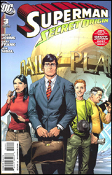 Superman: Secret Origin #3
Publisher: DC Comics
Released: 25 November 2009
Writer: Geoff Johns
Penciler: Gary Frank
Inker: Jon Sibal
Colorist: Brad Anderson
Letterer: Steve Wands
Cover: Gary Frank
Cover price: $3.99
Review: drqshadow
The origin of Superman is one of comics' most well-known, timeless classics. It's universally appreciated by men, women, and children of all ages and nationalities, a true legend of pop culture past, present, and future. So it should only seem natural that more than one creative team would want to take a crack at it over the years, right? Perhaps, and on several occasions that return to familiar territory has been backed by a valid reason. John Byrne's Superman: The Man of Steel, for instance, cast aside the silliness of the Silver Age and paved the way for a revitalized continuity and a more streamlined universe. It was a case of the right place, the right time, and the right man for the job. So where's the pressing need for a similar retelling today?
Geoff Johns makes the case that, while we've seen these events before, we've never seen them from this perspective. Through the innocent, inexperienced eyes of Clark Kent himself, we're promised a rare glimpse at the instincts and motivations that made the big blue boy scout what he is today, blemishes and all. It's a fair point, one that had the potential to really open a few locked doors behind the veneer of DC's most iconic character, but with a few exceptions Johns shies away from the kind of introspection I was hoping for. Instead of sharing Kent's thoughts as he sees the skyscrapers of downtown Metropolis for the first time or the hustle, bustle, and selfishness of the pedestrians on its streets, we're merely along for the ride, and that's nothing new.
We're also drowning in word balloons. Johns fills several pages with so much dialog, the artwork has to fight just to occupy some cramped gutter space. I understand the need to introduce and define familiar characters such as Perry White and Lois Lane, but add a new layer so the retelling is justified. It's an ambitious goal, and often the only way to reach it is through bold dialog. That's not a problem for this author — his writing is clever and effective, and he especially nails the no-nonsense, "get the story at any cost" attitude that defines Lois. There's just so damn much of it, the plot's never given the chance to gather a head of steam. I admire the quality of his work, but I wish it were more concise.
His artist, Gary Frank, captures the wide-eyed wonder of Clark's arrival in Metropolis with flair. I wasn't always a fan of Frank's work, but over the years he's made a believer out of me. It seems that with each appearance he adds a new layer of detail, discipline, and polish to his work, and his take on Superman and company is no exception. Sometimes he does get carried away – as he does with Jimmy Olsen's buck-toothed, freckle-faced, nerdy visage — but given the choice I'd rather see a page with too much character than too little. His more realistic, lifelike tendencies may have been out of place at Marvel, but he's a perfect fit for the DC style.
Secret Origin is a valiant effort, but I didn't find the slight tweaks and irregular glimpses into Clark's psyche urgent enough to necessitate yet another stroll through such familiar terrain. It's only been six years since the last time we dredged up the super-origin (in Mark Waid's Superman: Birthright) and that's not enough time to move on. This is strong work, but that's hard to appreciate because its every move is so thoroughly telegraphed. Flip through it, but don't take its promises of a whole new experience too seriously.


