Is It Wednesday Yet?
01 December 2009 � Here we are again with another installment of your favorite comic book review series. As always, the reviews are free of spoilers, so read on without fear of having your experience ruined!
Our grading scale is simple:
Buy: An excellent comic book.
Borrow: A good comic, but save yourself some money by reading a friend's copy.
Flip Through: Give it a once-over at the comic shop.
Skip: This doesn't need to be explained.
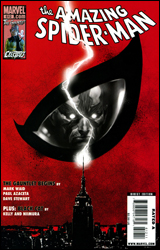 Amazing Spider-Man #612
Publisher: Marvel
Released: 18 November 2009
Writer: Mark Waid
Artist: Paul Azaceta
Colorist: Dave Stewart
Letterer: VC's Joe Caramagna
Cover: Marko Djurdjevic
Cover price: $3.99
Review: drqshadow
Ana Kraven, daughter of the infamous hunter of the same surname, has been licking her wounds and preparing her next onslaught for the better part of a year. After her full-on initial assault on Spider-Man resulted in an undesirable outcome, she's taken a more cautious, calculated approach in her follow-up. Laying low, striking unexpectedly at several of Spidey's past acquaintances, Ana's been slowly pooling power and wisdom, not to mention allies. And now, with the imminent return of the webhead's more prominent rogues, her patience may be on the verge of paying off. If you can't take out Spider-Man at full strength, why not wait until he's completely drained before having another go?
This is the first installment of the much-ballyhooed "Gauntlet" storyline that's promised to reinvent several of the hero's classic foes; but like the young Kraven, it's not in a big rush to get right to the heart of the matter. Writer Mark Waid sets a pace and sticks with it, donating the entire issue to an inspection and reassessment of Max Dillon, better known as Electro.
Waid aims to make the character less of a laughingstock and more of a sympathetic figure, with mixed success. When his introspections are on a personal level, the writer's work is at its strongest. As the tormented loner, desperate to feel another's touch or just go back to the simple life he enjoyed before he became Electro, Dillon seems genuinely relatable � his frantic desperation often misinterpreted by the good guys as simple, selfish villainy. That's the kind of angle that could really work for this kind of a story, but Waid doesn't leave it there. Turning his attention to more topical subjects, he ties Max's present financial struggles in with the rash of investment fraud stories populating real headlines. Where the new glimpse at the character's mentality was appropriate and effective, the attempt to turn him into a folk hero, ranting against government corruption and corporate greed from the rooftops, is more of a reach. It feels gimmicky and unnecessary, and seems like something we'll be rolling our eyes at once it's republished in trade format.
If you're not familiar with Paul Azaceta's previous work in Captain Marvel or Daredevil, picture a blend of Tim Sale, Jack Kirby, and Mike Mignola. Usually I'm wary of this kind of oversimplified artwork when it comes to superheroes, especially ones with a wardrobe as bright as Spider-Man's. Less linework means more space for a glaring, primary-heavy color palette and the accompanying eyesores that always seem to follow. Some artists skirt the issue by bathing the page in deep shadow, but that never really feels like a good fit for the clean-cut Peter Parker. Azaceta manages to sidestep the potential pitfall without resorting to such desperate measures. I'm not sure if it's his knack for dynamic posturing, an effective eye for silhouette, or a careful handle on composition, but he comes out of this episode smelling like roses. Colorist Dave Stewart certainly lends a big hand, using soft, suitable, secondary colors in the background to offset the bright shades of Spidey and Electro's outfits; this ensures the focus remains on the artwork, rather than the crazy tones adorning its subjects.
As opening volleys go, this was lacking a lot of power. It didn't feel like the first chapter of one of Spider-Man's greatest challenges so much as it did another day at the office, and that's both a good and bad thing. It's less intimidating than the epic, tide-turning crossovers that have dominated Marvel's publishing schedule for the last few years, but it's also missing a sense of permanence. Maybe that will change as things play out. Despite a few weak attempts at social commentary, at its heart this is still an entertaining distraction. Waid shouldn't be hosting his own talk show any time soon, but he can still write a good comic book. Borrow it from a friend.
 Dr. Horrible #1
Publisher: Dark Horse
Released: 18 November 2009
Writer: Zack Whedon
Artist: Jo�lle Jones
Colorist: Dan Jackson
Letterer: Nate Piekos
Cover: Kristian Donalson
Cover price: $3.50
Review: Guest
It can never be easy, can it?
Here I was, fully prepared to type out some catchy line like "Dr. Horrible is aptly named" or "It has a PhD in suckitude," but then it had to go and be an awesome comic. Well, that's just great. Now I have to spend the rest of the review telling you how good it is. Where's the fun in that?
Those looking for a comparison between the comic and the source material, sorry, I can't help you. I've never watched Dr. Horrible's Sing-Along Blog, and know little aside from the fact that it involves the lovely Felicia Day. If this comic has accomplished nothing else, it has assured that I will be watching it immediately after I've finished this review.
If you're inexperienced like myself, the premise is quite simple; Billy was a nerd that idolized superheroes until witnessing a fateful encounter between archenemies Justice Joe and Mister Maniacal. Quickly realizing that the latter was the significantly smarter of the two, Billy grew up to be the criminal mastermind known as Dr. Horrible. Actually, "known" is a rather strong word, as his petty attempts at world takeover have been all but completely ignored by the public at large. Even his cursed enemy � the mildly heroic and astoundingly stupid Captain Hammer � has no clue who he is. Not content with a life of obscurity, our doctor sets out to conquer a world that doesn't appreciate his genius, all while trying to muster the courage to talk up the hot ginger girl at the laundromat.
For this reviewer, it hits perhaps too close to home.
What results is one of the funniest books I've read this year. I'm not exaggerating when I say that there is at least one laugh per page. The writing has a rhythm to it rarely seen in even the most high profile books, and it creates a comedic pacing that never fails. Zack Whedon's characters are just absurd enough to be completely believable in most cases, and manage to be witty without coming off as the smarmy douches that his brother has a habit of writing.
Perhaps these comedy beats wouldn't work as well without Jo�lle Jones' artwork. She gives the book a blocky, cartoony style that manages to respect the likenesses of the actors that normally portray the parts. It would not be out of place to see this sort of clean line work on a title such as Invincible or even Spider-Man.
The only flaw I can really find is that it's only a one-shot. Seriously, it's that good. It's friendly to newbies, gorgeous, and funny without having to pat itself on the back in the process. Buy it.
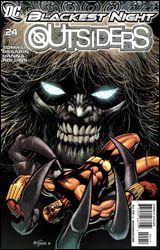 Outsiders #24
Publisher: DC Comics
Released: 18 November 2009
Writer: Peter J. Tomasi
Penciler: Fernando Pasarin
Inkers: Scott Hanna, Prentis Rollins, and Fernando Pasarin
Colorist: Brian Reber
Letterer: Travis Lanhamm
Cover: Tom Mandrake
Cover price: $3.99
Review: drqshadow
Those of us old enough to remember the era when DC's Teen Titans was a genuine rival in popularity for Marvel's mighty X-Men franchise will no doubt recall the story of Terra Markov. The former Titan who betrayed her teammates to Deathstroke and ultimately paid for it with her life has risen from the grave wearing a black ring, and has sought out her brother: Geo-Force. So has death's cool embrace calmed her erstwhile spirit, or is she the same traitorous scamp as a zombie?
This is the kind of thing I've always had trouble coming to terms with about DC's classic cast of characters. They've always seemed so quick to forgive, forgetting a lifetime of betrayal when confronted with just a modicum of questionable remorse. But as fate would have it, it seems that such tendencies annoy this issue's writer, Peter J. Tomasi, just as much as they've bugged me. Does Terra meet a completely hostile reception upon her arrival at the Outsiders' HQ? Nope. In fact, her brother goes out of his way to embrace that longstanding stereotype, welcoming her with open arms and immediately taking everything she says at face value. The rest of the squad, however, appears less willing to buy into her grand story of retribution at the moment of reanimation.
Not that Terra doesn't make a convincing argument. She tugs away at sensitive heart strings, begs her brother to save his lost sister's soul, to the point that even the most unforgiving reader might find a hint of promise in her words. But despite her knack for saying the right things, Terra doesn't find a lot of compassion in Owlman. He's the much-needed voice of reason, saying what most readers are probably thinking, and doing his best to keep the squad from following their emotions into a potentially dire situation. The conversation that surrounds Terra's return is a tough one, without an immediate revelation about which side of the argument is in the right. It does a lot to establish the team as a group of distinct personalities, not to mention fight back the label of DC's heroes as being overly sympathetic.
Fernando Pasarin's artwork does its job admirably enough. He doesn't get a lot of exciting material to embrace in the majority of this issue, as it's largely dedicated to character moments, flashbacks, and heated discussion, but Pasarin still manages to keep the pages interesting. His style is very technical, perhaps a bit lacking in vigor, but it's got character and his obsession with minute detail is a healthy one. On his one chance to impress with a supersized two-page spread, he makes sure the wait was worthwhile.
As has been the case with both major publishers' events of late, I'm really starting to get tired of the lengthy setup stage of Blackest Night. It seems like second gear is becoming increasingly difficult to find in these massive, imprint-spanning epics, and Outsiders #24 is just another symptom of that disease. It doesn't do anything wrong; in fact, it's done everything that's been asked of it, and still managed to come out with a solid standalone story with strong personal ties to the team. But at some point, enough is enough and it's time to shit or get off the pot. This isn't essential reading whether you're following the crossover or not, but that doesn't mean it's without virtue. Borrow it, but don't expect to get too involved.
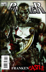 Punisher #11
Publisher: Marvel
Released: 18 November 2009
Writer: Rick Remender
Artist: Tony Moore
Colorist: Dan Brown
Letterer: VC's Joe Caramagna
Cover: Dave Wilkins
Cover price: $2.99
Review: Guest
Really, Marvel? Really?
Say what you will about Garth Ennis. Most people do. But it can't be denied that he's done more for The Punisher in the modern age than just about anyone. Yeah, he's crude to a fault, and his sense of humor doesn't always hit its mark, but he understood one very important thing during his run with the character: make all the jokes you want, but Frank Castle is not the punch line.
Which brings us to Punisher #11, a ball that has been so spectacularly dropped that one would need a satellite view from space to catch a glimpse of where it was initially released. There is a laundry list of things wrong with this comic, and what's perhaps most frustrating about it is that I'm not entirely sure who's to blame. Perhaps it should be Marvel editorial. That's who most people point the finger at � and to be quite honest, I can't think of anything they've done in the past year or so to earn my sympathy � but I can still understand their dilemma. Frank Castle was aging, and as time pressed on, the question of how a man in his 60s was able to fight crime so effectively grew more and more with the comic reading public. So what did they do? They had his old body fail him in a fight with a young, superpowered foe, leading to a demise that was appropriately gruesome for someone that has crossed so many lines in his life. So far, so good.
The main problem is what follows. Obviously, Frank's death was done so that he could somehow come back young and spry, none the worse for wear. Please, dear reader, take a guess as to how this may have been handled.
01. Frank has a touching meeting with his family in the afterlife, who motivates him to continue the good fight, causing him to blast his way out of Hell.
02. Any one of the many magic users in the Marvel Universe revive him.
03. His various body parts are collected by a group of imps and are transported to the Island of Misfit Toys where he is thrown back together to become their liberator.
If you guessed anything but the latter, then you're way too smart for this comic.
So Morbius and the Legion of Monsters need Castle to help them against the humans. It's sort of surreal to see so many great Marvel horror characters take Frank in as one of their own, as if they're handing him a Cleveland Browns jersey and saying, "Welcome to the team!" One could also point out how silly it is that these guys need Castle's help to begin with. You have Man-Thing on your side! You have Morbius the goddamn Living Vampire! Kind of makes them look like punks when they have to paste Castle back together because some human's found boards with nails in them.
I don't know what this comic is supposed to be. Is it the start of a badass revenge tale? It certainly doesn't take the matter that seriously. Is it, then, a comical romp? Well, no, because that would imply that it's funny. It's not funny, it's just insulting. Babychest.
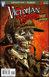 Victorian Undead #1
Publisher: DC Comics / Wildstorm
Released: 18 November 2009
Writer: Ian Edginton
Artist: Davide Fabbri
Colorist: Carrie Strachan
Letterer: Saida Temofonte
Cover: Tony Moore
Cover price: $2.99
Review: Desmond Reddick
A wise man once said, "The trend is dead." To be fair, Phil Anselmo actually screamed those words, and that's what I wanted to use this review to do as well. Zombie comics are dead! And not in the good way.
In fact, very few zombie comics have ever actually worked at all. The Walking Dead has survived almost seven years after its debut. Tag was a new spin on zombies that Boom! introduced, and it was phenomenal. And then the sequel was crap. So was just about every single comic that has featured a zombie since.
I suppose the death gurgle of zombie comics would have been heard of first in Marvel Zombies. There's something about mixing genres with zombie comics that signals their demise. This book is all about mixing zombies with Sherlock Holmes. A premise so tired and lame that it isn't even a good idea to begin with. Not in 2009, anyway. People would have really liked this in 2001.
Synopsis? A meteor passes over London in the 1850s (groan), and an old woman who warns the bystanders that it's a bad omen is laughed at (groan). Hundreds die of an infection leading to zombification. Cut forward to the 1890s where Watson saves Holmes from being killed by a robot (seriously) before we see a work crew try to steal a ring they find on the finger of a corpse as it suddenly springs back to un-life. Holmes is summoned to help with these strange cases by Scotland Yard in a scene so ham-fisted that the dialog is almost thusly:
Holmes: We're working on this case, but Scotland Yard wants us to help on this one?
Watson: Yeah, homie!
Holmes: Alright, this case was just convenient for the plot to introduce us to the modern reader.
And when they show up to start investigating, they meet their first obstacle to the truth! Buh-buh-bahhh!
I tried. Really, I tried to care about this book, but it is just so devoid of intelligence, direction, and a reason for existence that reading it is nothing more than a way to spend time.
It is also pushed as being a much better product than it is by having Tony Moore's cover entice the Walking Dead readers to pick it up. Upon opening the book they will realize that the style is bland, the storytelling is stilted, and the faces are without emotion. In fact, the faces share the same three expressions: blank (most of the characters in the book), slightly scared, and mustache-twirling.
Victorian Undead #1 is the equivalent of grabbing a DVD that "looks good" off the shelf, but when you get home you realize that 75% of the film's $673 budget went to a guy the director knew who was good at Photoshop. So the rich tradition this book featuring zombies and Sherlock Holmes taps into is not that of detective fiction or horror stories; it's of the shitty straight-to-video boom of the mid-90s. Skip it.


