Is It Wednesday Yet?
24 November 2009 � Here we are again with another installment of your favorite comic book review series. As always, the reviews are free of spoilers, so read on without fear of having your experience ruined!
Our grading scale is simple:
Buy: An excellent comic book.
Borrow: A good comic, but save yourself some money by reading a friend's copy.
Flip Through: Give it a once-over at the comic shop.
Skip: This doesn't need to be explained.
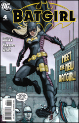 Batgirl #4
Publisher: DC Comics
Released: 11 November 2009
Writer: Bryan Q. Miller
Pencilers: Tim Levins and Lee Garbett
Inkers: Dan Davis, Aaron Sowd, and Trevor Scott
Colorist: Guy Major
Letterer: John J. Hill
Cover: Phil Noto
Cover price: $2.99
Review: Guest
At this point, one has to wonder why anyone bothers taking up the mantle of Batgirl. It's really just become the superhero equivalent of a coffee-fetching office temp. You get no respect, and before anyone can get your name right, someone has replaced you.
So Stephanie Brown is going to be Batgirl for the next six months or so. What's resulted from this is a lighthearted, if not entirely meaningless book that's really not proven itself worthy of the press it's been getting.
With Oracle assisting her, Steph is still adjusting to her new role, and has stepped away from her homework to test-drive her nifty new suit. What follows is a story that's so blatant in its attempts to be Spider-Man that it almost wraps around the blanket of space and time to somehow become subtle. Sure, she has to stop that purse-snatcher, but will she have time to study for her science test? Such riveting questions are presented to us as Stephanie looks to uncover the source of a citywide blackout. The one question that was actually needed � namely, why Batman and Robin are nowhere to be found when all of Gotham is in darkness � is never asked. When the evil perpetrator is discovered, the entire conflict is pretty much thrown away for the sake of some corny banter and off-panel resolution.
This isn't to say that the writing is all bad. Stephanie in particular comes off as likable and self-depreciating, and it's hard to criticize writing that's trying this hard to add some fun into the mix. The problem is more with the plotting. We're four issues in, and aside from establishing this new Batgirl as a clumsy, bantering Peter Parker archetype, we're never really given a reason to care. What purpose does this character serve? Why does Gotham need a Batgirl, let alone this one? Again, more questions that can't (and won't) be answered.
Perhaps it's a sign of how much DC wants this comic to succeed that we have not only two artists, but three inkers on the book. This works about as well as you'd expect. One page will be full of vibrantly striking characters, then you'll be hit with a flat-faced cast that seems to have been struck with an incurable case of boredom. Sometimes this actually happens from panel to panel, and it's impossible to ignore when Barbara Gordon manages to completely change hairstyles in the span of two pages.
Giving this book anything more than a flip through would be a waste of your time and money. The potential is there and it's not a horrible read, but not exactly a deep one either. DC is putting out better superheroine books elsewhere.
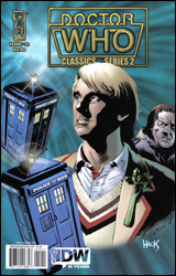 Doctor Who Classics: Series 2 #12
Publisher: IDW
Released: 11 November 2009
Writer: Steve Parkhouse
Artist: Mick Austin
Colorist: Charlie Kirchoff
Letterer: Jerry Paris
Cover: Robert Hack
Cover price: $3.99
Review: Michael David Sims
Initially I was going to assign this comic to DW, what with him being a Doctor Who fan and wannabe Brit. But then I took a look at the cover and hesitated. Oh, not because I thought Sir Dubs would take issue with the book, but rather because it caught my interest. Seeing a second TARDIS and an aged man with a Moe Howard-like haircut, I knew it had to be The Meddling Monk. Even then I was still leaning towards having DW review it, but a look inside changed all that; I knew I had to review it. You see, not only does this issue feature the renegade Time Lord, but another classic Doctor Who foe I've been championing the return of: The Ice Warriors! The Monk, Ice Warriors, and Doctor Vegetable-lapel � "This has to be awesome," I thought.
And, you know, it might be if you have the chance to read the complete story. (This issue of Doctor Who Classics: Series 2 collects the last two chapters of a six-part story, originally published in Doctor Who Monthly #82-83.) As it stands, it's a conclusion to a story you'll only be invested in if you're familiar with the characters. And even then it's mostly lackluster: the Ice Warriors drive a sort of tank at a group of human (humanoid?) soldiers who blow it up. What remains of the Ice Warriors blast off into space, with The Doctor and some of the soldiers giving chase in the TARDIS. The foes grab a crystal they had planned to arm a sonic cannon with, and then the two TARDISes fly through time before The Doctor defeats them. What little explanation we are given is exposition-heavy (though that can be forgiven since this story was originally written in 1983), and the ending is rushed towards without much fanfare.
As a fan of The Monk and the Ice Warriors, it's sad to see both reduced to generic aliens seeking world / universe domination. It's doubly sad to see both defeated as an afterthought; I can almost hear the conversation between editor and writer:
Editor: You need to wrap this up so we can start the next serial.
Writer: Uh, yeah, okay. How's "the ship goes boom" sound to you?
Editor: Whatever.
Writer: Done.
Now, yes, I'm looking back on this story over 25 years after it was first published and with a fanboyish love for the characters, but even still, when a longstanding foe is brought back � be it in 1983 or 2009 � it isn't unreasonable to think they should be given a little more respect � and a better sendoff � than "the ship goes boom."
Where this book shines is the art. It isn't perfect � occasionally characters are a tad stiff, and The Doctor puts on and sheds weight between panels � but it's a strong early 1980s style that holds up. The Ice Warriors are sufficiently creepy and alien; their suits appear to be both stone and leather, truly giving them a battlefield quality their live action rubber counterparts lacked. Mick Austin's faces aren't photorealistic, but they capture the essence of The Doctor and The Meddling Monk, which is what you need when working on a tie-in property; you want to see the characters more than the actors, something a lot of modern photo-referencing artists tend to forget.
Who's going to buy Doctor Who Classics: Series 2 #12? Hardcore and longtime fans of the program, that's who � not the casual fan who pop in every once in a while to see what The Doctor's doing in his non-televised adventures. The book probably deserves a skip, but having a soft spot for the two foes, I can't give this anything worse than a flip through.
 Strange #1
Publisher: Marvel
Released: 11 November 2009
Writer: Mark Waid
Artist: Emma Rios
Colorist: Christina Strain
Letterer: Todd Klein
Cover: Tomm Coker
Cover price: $3.99
Review: Desmond Reddick
Stephen Strange is no longer the Sorcerer Supreme. He has been released from the one element that has made him an impossible character to make effective: he's no longer the Marvel Universe's literal deus out of the machina if you catch my drift. When I heard that Mark Waid � one of the greatest comic book writers alive � was doing the first post-Sorcerer Supreme storyline, I was elated. I grabbed this book, sat back, and was ready to discover what existential crisis a man without a purpose would face in a world that no longer needs his service.
Baseball. That's what this book is about. Hey! Someone got some Claremont in my Waid!
That would have been a long way to get to a joke, but I still wish it was. Casey � who's an uppity rich bitch that's sitting in the nosebleed seats texting her friend � happens to catch a foul ball in the palm of her hand, and throws it away so she can continue to text. Stop. First problem: I hate baseball. I mean I fucking hate baseball. I'd rather watch seniors golf. But even I know that a seat in the upper deck directly above home plate is probably the least likely place on earth for that baseball to go.
I digress, the ball hits an abrasively obnoxious baseball fan in the nose. Turns out the fan is Strange, who uses this chance meeting to gain entry to the office of the team's coach, Casey's grandfather, to save him from � wait for it � the demons playing his team for Casey's gramps' soul. How quaint.
This has all the story quality of a shitty episode of Charmed.
I mean, really. I'm all for the adventures of a virtually powerless Dr. Strange being wacky, but this is just nuts. It's out of left field is what it is. Pun most certainly intended.
The story is also completely devoid of resonance. The ending is a little whimsical, and if you were interested in the uppity rich bitch (of which I'm certain you'd have to be an uppity rich bitch yourself or someone who idolizes them) you might purse your mouth and raise your eyebrows at the ending. But for the actual human race, there's nothing to enjoy.
The art isn't anything to write home about either. Emma Rios has that American manga look that all the kids are going crazy about these days, but I just wish they'd get off my lawn. I also appreciate that Waid brought someone from his Boom! Studios stable of artists, and got her on a somewhat high profile gig at the House of Ideas. However, there are half a dozen artists working on Boom! books that are much better suited to draw a Doctor Strange book than Rios. Her work is good for what it is, but it is so far from a proper fit that it's staggering.
More than anything, this was a major disappointment to me. The character is at too important a crossroads in his life to not capitalize with a story full of power and emotion. Instead we get demon baseball. Skip it.
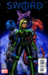 SWORD #1
Publisher: Marvel
Released: 11 November 2009
Writer: Kieron Billen
Penciler: Steven Sanders
Inker: Craig Yeung
Letterer: Dave Lanphear
Cover: John Cassaday with Laura Martin
Cover price: $3.99
Review: Guest
Okay, before I even get too far into this book, I have a question to ask: what in the furry blue hell happened to Beast? Judging from the cover of this book, I was under the impression that Hank was still generally feline in appearance, but now he has apparently undergone another mutation that has resulted in him becoming a combination of Jim "The Anvil" Neidhart and Chester Cheetah. I found this change so astoundingly distracting that I often had to reread parts because I'd been too busy looking at this creature that had been drawn on the page. And no one mentions it, either. Everyone just acts like he's always looked like this. Even Abigail Brand, the main character of this book and Beast's girlfriend, is completely unfazed by this new look of his. Did everyone just assume that the vacuum of space stretched his face out a good foot and a half? The rest of Steven Sanders art is more than fine, but I'm frankly amazed his Beast made it through editorial.
As for the story, it exists. The emerald ice queen Abigail Brand and the eeeeeevil Henry Gyrich are the bickering co-commanders of SWORD. Gyrich spends most of this issue being a douchenozzle and leaving Brand with all the legwork, which includes juggling alien affairs, dealing with bounty hunters, and bantering with her mysteriously transformed boyfriend. Also, Lockheed is on a drinking binge. Yeah.
The thing about the cosmic Marvel Universe is that there are some really fun stories to be had outside of the usual "status quo event dictates everything" feel of most Marvel books, but at the same time, if you're not already accustomed to these characters, this issue doesn't really help you out. For a first issue, it's commendable how quickly things get rolling, but perhaps it's a little too quick. We get some really good character moments between Hank and Abigail, but if you haven't read any issues of Astonishing X-Men you'll be a bit in the dark on their relationship up to this point. There's also no real indication as to why Hank has joined this team, or why Brand doesn't mind the idea of making fun times with a giant blue wolf / horse thing.
Really, Beast's design is that distracting. I dare anyone to pick up this comic and try to explain what the artist was thinking. The book is a solid borrow on its own merits anyway; while it's not entirely new-reader friendly, there's enough for you to get the gist of what's going on, and to see the potential in future issues.
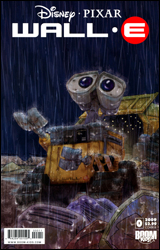 Wall-E #0
Publisher: Boom! Studios / Boom! Kids
Released: 11 November 2009
Writer: J. Torres
Artist: Morgan Luthi
Colorist: Digikore Studios
Letterer: Jose Macasocol, Jr.
Cover: Morgan Luthi
Cover price: $2.99
Review: Guest
A brief assessment of my living quarters and you are bound to find the following: comic book action figures, an unhealthy stack of video games, and several DVD versions of Alice in Wonderland. Despite the evidence to the contrary, I feel it necessary to point out that I am, in fact, not a kid anymore. In particular, I've never really taken the time to see any of the Pixar movies that have been released in the past five years, because the only thing worse than going to the movies alone is going to Up alone. It is my understanding that these films have at the very least kept the traditions of children's storytelling alive by being visually appealing, easily quotable, and depressing as all hell.
This brings us to Wall-E #0, a strange comic if one's ever existed. The kid-friendly source material would imply a fairly light, comical read, but in actually this is a rather morose book that left even a grown man such as myself rather confused as to what happened.
For starters, the comic is almost completely devoid of text, and with mostly single-word responses. As Wall-E and his robotic companions traverse through a pile of junk, the story is mostly a visual one, including subtleties that would fly over the heads of most children. Surely some experience with the movie is a prerequisite, but that still doesn't change the fact that despite some brief moments of humor, this book is a real downer. As such, it's probably the last thing you'd want to give to a young one.
It's beautifully drawn, and perhaps it's my own cynicism that's reflecting itself on the story, but either way, this is a difficult book to grade. It's a well-constructed issue, but it seems like something more appreciated by adults than by its target audience. Flip through it to see if I'm crazy here, but I don't know if this is something a little one would care for.

