Is It Wednesday Yet?
18 August 2009 — Here we are again with another installment of your favorite comic book review series. As always, the reviews are free of spoilers, so read on without fear of having your experience ruined!
Our grading scale is simple:
Buy: An excellent comic book.
Borrow: A good comic, but save yourself some money by reading a friend's copy.
Flip Through: Give it a once-over at the comic shop.
Skip: This doesn't need to be explained.
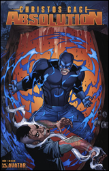 Absolution #1
Publisher: Avatar Press
Released: 05 August 2009
Writer: Christos Gage
Artist: Roberto Viacava
Colorist: Andres Mossa
Letterer: William Christensen
Cover: Digikore Studios
Cover price: $3.99
Review: Dan Toland
John Dusk is a policeman with superpowers, or an enhancile. In his time, he's seen some of the darkest, nastiest things humanity has to offer, and he finds that he can be pushed only so far before he starts pushing back.
In Absolution, Christos Gage has managed to create an intrinsically good man who has experienced over and over again the worst of humanity, and you can feel it chipping away at him. It doesn't become a question of whether John will be pushed over the edge; it's a question of when it will happen, and what will finally make him snap. While I found myself liking the main character well enough, no one else in the book had nearly the same level of characterization. The story didn't flow so much as set up beats for John's journey toward the dark side. And what happens tends to happen too quickly. It's hard to wholeheartedly recommend a story that feels rushed to a certain degree. With that said, John is a very well-established character, and it'll be interesting to see what happens as he goes on his journey.
The art couldn't really be better suited to the story Gage is telling. It's not going to blow you away with its technique or anything, but Viacava illustrates the horrors John sees every night in a fashion that sells them to the reader. Moreover, his rendition of John is amazing; you can see the weariness, the defeat in his eyes in almost every panel. His other characters, not as much. Some of the artwork seems a little hurried at times. It's nothing that will interfere with your enjoyment of the story, but it prevents this issue from reaching some of the heights it could have.
It's borderline, but this just gets a borrow. You'll need more time than you can spend flipping through this in the store to really appreciate what Gage and company are going for here.
 Exiles #5
Publisher: Marvel
Released: 05 August 2009
Writer: Jeff Parker
Penciler: Casey Jones
Inker: Karl Kesel
Colorist: Anthony Washington
Letterer: Simon Bowland
Cover: Dave Bullock
Cover price: $2.99
Review: drqshadow
Blink's back in action — which should please fans of the classic Age of Apocalypse storyline — and she's leading her own crew of multidimensional outcasts in Exiles. Constantly traipsing from one parallel reality to the next, the gang has surfaced on an isolated landscape, a world that was conquered and smothered long ago by rebellious machines. But, lest you imagine something in-line with the portrait painted by the Terminator franchise, don't forget that the Marvel Universe has more than its share of fully synthetic heroes and villains, too. Rather than Skynet, with its T-100s, the AI conqueror of this land goes by the name of Cerebro: commander of an army of Ultrons.
Although the title's impending cancellation may have rushed the pacing, the majority of Jeff Parker's plot is still easy to follow and infectiously energetic. Blink and company are always ready to push the action, which serves to drive both the storyline and its characterization. The Exiles have become accustomed to constantly playing the part of strangers in a strange land, and that's made them a bit too eager to react without thinking. They mean well, but they're also prone to making mistakes, which in turn makes them much more human and sympathetic.
Although Parker does tread a bit too deeply into the realm of unstable molecules and Pym particles for my taste — over explaining the pseudo-science of the robots' master plans — he gets it over and done with very quickly, and it's not entirely unexpected nor unimaginative. In fact, most of the Exiles themselves seem to space out during the jargon-heavy technical bits, which has grave results a moment later, when Cerebro's henchmen launch a surprise attack. It's a smart way to emphasize the important points of the story for the casual audience without dumbing things down, and a perfect example of just how clever Jeff Parker's writing can be in the right predicament.
Sadly, I have a less glowing review to write for this issue's artist, Casey Jones. With one or two exceptions late in the book, Jones turns in work that's mostly flavorless and unfocused. While I can understand the need for a lighter, friendlier style to match the generally happy-go-lucky personality of the team itself, that doesn't mean it needs to look like a part of the Marvel Adventures family. This issue seems unfinished and under-detailed, devoid of personality and flair. In other words, the opposite of the smart, rich writing it's here to accompany.
Don't let the bright, cheery visuals throw you off, because at its heart is an intelligent, intriguing adventure. The team is wonderfully fleshed out, a surprisingly tight-knit group with more than its share of depth, shortcomings, and surprises. In emptying out all the twists and turns he had in store for this series before its sudden conclusion next month, Jeff Parker is proving just how fantastic it could have been over the course of a long, sustained run. The only thing holding it back now is the generic artwork. Borrow it and mourn what's about to come to an end.
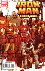 Iron Man & The Armor Wars #1
Publisher: Marvel
Released: 05 August 2009
Writer: Joe Caramagna
Artist: Craig Rousseau
Colorist: Val Staples
Letterer: Dave Sharpe
Cover: Skottie Young
Cover price: $2.99
Review: Chris Johnson
The original Armor Wars is one of the most popular stories in Iron Man's canon, probably second to Demon in a Bottle. Apparently it's quite popular with Marvel editorial, as this is the first of two re-imaginings coming out this year, the other being a miniseries set in the Ultimate Universe. Taking place outside of any real continuity, this series is slanted more towards younger readers, filling the void left by the cancellation of the excellent Marvel Adventures Iron Man. Tony Stark has relocated to Los Angeles, seeing it as a fresh start after establishing a new direction away from weapons for Stark Enterprises. The policy isn't showing itself to be a successful venture so far, with the company losing money fast. Tony feels confidant that a research armor he's developing for the government will put the company back in the black, but unfortunately, the suit is stolen before it can be unveiled. To make matters worse, after fending off the Crimson Dynamo, Tony returns to his armory to find all of his armors missing. To make matters even worse, the government is close to arresting him for treason, and one of the Marvel Universe's most powerful villains pays him a visit at issue's end.
On the positive side, the conversation at the beginning of the issue did a good job establishing the status quo and the Tony / Rhodey friendship, while the fight between Tony and the Crimson Dynamo shows that even an armorless Stark can hold his own in a fight. While aimed at a younger audience, there are also little bits here for older readers, such as a reference to a creator long associated with Iron Man, and Tony being under fire from the government.
My main issues with the story lie in the opening scene and the characterization. While the scene is slightly humorous, a miniseries that promises fights between Iron Man and his most famous rogues should open with a bang, not Iron Man taking down a no-name villain. And while the characterization is mostly good, there are little moments that seem off — most noticeably with the villain at the end. While his first line starts things off on a good note, his second is more schoolyard bully than supervillain.
Craig Rousseau's artwork is quite cartoony, which is not a bad thing. Personally I think mainstream comic book artwork has gotten too realistic in some respects, so it's nice to see books with artwork like this. Rousseau's style is very much his own; I can't really think of an artist to compare it to. It's so stylized that I think it may be quite divisive. And though it serves the story well, the armor sometimes feels a tad off.
If you're looking for an Iron Man comic to give to a child, skip this in favor of the Marvel Adventures Iron Man digests. For older readers, it gets a flip through.
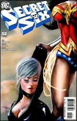 Secret Six #12
Publisher: DC Comics
Released: 05 August 2009
Writer: Gail Simone
Penciler: Nicola Scott
Inkers: Doug Hazlewood and Mark McKenna
Colorist: Jason Wright
Letterer: Steve Wands
Cover: Daniel LuVisi
Cover price: $2.99
Review: Dan Toland
In this issue, Wonder Woman and Jeannette have a fight. And that's about it.
Oh, no, wait. Also, Artemis wakes up.
Yeah.
Why is everyone so hot on this book, again?
Maybe I'm just not seeing it. Maybe this story is the ultimate example of writing for the trade and it will all make sense when the six-issue arc is collected. But when that happens, you're going to get an issue where the lead characters do precisely fuck all.
What kills me is that it's so incredibly well-written "fuck all." Gail Simone can write, and she gives Jeannette a hell of a speech in her battle that truly evokes the pain and despair of someone who's known death intimately. It's beautiful work. However, one page later, we get back to an entire truckful of nothing happening. It's all just setting up what will come later, and I'm sorry, but I'm not spending three bucks now for what's presumably coming down the road. We aren't really treated to the characterization that Simone's so good at, either, whereas at least last issue had that as something to point to as a positive.
Nicola Scott's art continues to be good, if unremarkable. There are some images that truly stand out; however, this is countered by a fight scene that tends to be a little wooden and stagey. On the whole, it's decent stuff, and I wouldn't mind seeing her work on a higher-profile book.
There's really nothing bad about this issue. It's not great, it's not awful, it's just kind of dull. Give it a flip through to see if anything stands out for you, then put it back and move on with the rest of your life. Again, when this makes the rounds as a trade, it may be another story altogether, but as I said, I can't justify spending any amount of time or money on 22 pages of buildup.
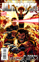 Ultimate X-Men: Requiem #1
Publisher: Marvel
Released: 05 August 2009
Writer: Aron E. Coleite
Artist: Ben Oliver
Colorist: Edgar Delgado
Letterer: Comicraft's Albert Deschesne
Cover: Mark Brooks
Cover price: $3.99
Review: drqshadow
I guess the question shouldn't really be how the X-Men can move on from the events of Ultimatum, but who's really left to pick up the pieces. The path to Magneto's final defeat took a hefty toll, and following the deaths of Wolverine, Cyclops, and Professor X, there's a noticeable vacancy at the top of the team's ranks. Who's ready to stand up and take the reins of leadership for all of mutantkind? How can they hope to overcome the black mark Magneto's actions have left on the public perception of their race? I guess this farewell one-shot would be the first step.
Assuming, that is, that your first step on the road to recovery is to have a three-on-three fistfight with the leftover bad guys, which is just about all that really happens in Requiem. As the last writer to deal with the series, Aron Coleite is tasked with sending it off into the history books. Strangely, though I'd imagine the thinking was to use a writer familiar with the characters to ensure a proper sendoff, from all indications this is Coleite's first time playing around with the team. With the obvious exception of their mutant abilities, he provides nothing to distinguish one face from the next, and it doesn't take long before they forego even that small shred of individuality to concentrate on simply throwing angry haymakers at the enemy and shouting. Coleite can't even manage to do that right. Where did Mystique and Sabretooth go? One minute they're in the midst of a brawl, the next it's time for quiet reflection on the surface of a mass grave with no sign of them. Did the good guys just throw them on top of the pile? Where did Captain America come from? I'm looking high and low for the answers, but they aren't here.
Ben Oliver's artwork pairs with Edgar Delgado's colors to produce some breathtaking work in this issue, although their collaboration is frequently too vivid for its own good. Oh sure, when they come together and hit the mark, the stylized realism of Oliver's linework teams with the added dimension and texture of Delgado's colors to produce something genuinely fantastic. Their pin-up style portraits of Mystique midway through this issue and Sabretooth a few pages later are truly breathtaking, poster material if I've ever seen it. But that doesn't make it suitable for the subtleties and implied motion of regular panel work. Many times I found myself lost, confused by the sheer number of competing hues on a single page. It's an information overload, more description than you'd want or need in a single moment, and it single-handedly slows the pace of this issue way down. There's a certain flow inherent in great artwork, something that sleekly moves your eye from one major point of emphasis to the next, and it's missing in Requiem.
I suppose it's a fitting tribute to this series that its final bellow is such an accurate representation of the sins that led to its demise: flashy artwork that's pretty but fundamentally lacking, and vague writing with plot holes the size of Magneto's floating island. Ultimate X-Men began with such vigor and life, it's hard to imagine this is where it would ultimately (no pun intended) wind up, but here we are. This is inessential to the core, something that wants to have depth and substance in the worst way but doesn't really know how to get it done. Flip through it and then walk away.
 Warlord #5
Publisher: DC Comics
Released: 05 August 2009
Writer: Mike Grell
Penciler: Chad Hardin
Inker: Wayne Fauchter
Colorist: David Curiel
Letterer: Rob Leigh
Cover: Mike Grell
Cover price: $2.99
Review: Chris Johnson
I'm not exactly sure how I feel about this comic. Part of me thinks that it does not work at all, while another part thinks that it comes together quite well. From what I can gather, the series takes place on two worlds: Earth and Skartaris. On Skartaris there's an army of heroes marching to engage a group of villains looking to reawaken a collection of Atlantean war machines, while Morgan (the Warlord) and his comrade McBane raid a Chinese military post for modern weapons.
Mike Grell is the best writer DC could have gotten for this title; after all, he created Warlord back in the 1970s. I get the feeling that he's picking up where he left off by writing the continued adventures of the characters. I'm sure this title has been a welcome addition to the pull lists of fans of the original series, but I'm not so sure about newcomers. I felt lost, in terms of both the rules of this fantasy world, and who the characters are. To Grell's credit, he did make mention of the family connections of certain characters, which helped, but it didn't help enough. Despite feeling lost, there was something compelling about the story. I thoroughly enjoyed the scene where Warlord and McBane raided the military post and shot their way back to the portal home, especially the flashback to an important moment in McBane's life. And while I think the villains might just be a tad generic, the war machines are quite cool. I wouldn't say this issue is a good jumping on point, but it is quite effective at piquing one's curiosity as to what came before.
While I'm somewhat perplexed by my feelings towards the story, I'm certain that I'm a fan of the artwork. Hardin was able to effectively draw the elements of both worlds that play into the series. Dinosaurs, knights, Chinese soldiers, evil sorcerers, guns, Atlantean war machines — Hardin draws them all and draws them well. He also employs a storytelling tool that I'm now quite a fan of. There are a number of double-page splashes in the issue, which are supplemented by inset panels at the bottom of the pages. While this cuts off some of the spread, this configuration allows for both something pretty to look at and progression of the story. My favorite of these is the one where the raiding duo arrives in Tibet, with a fantastic snowscape and starry sky, supplemented with reflection by Morgan. I had never heard of Hardin before this issue, but he's now on my list of artists to keep an eye out for.
When I first finished reading this issue, I was fully prepared to give it a skip. But the more I thought about it and the more I flipped back through it, there was something about the book that grabbed me that I can't really explain. As such, I recommend flipping through this to see if it grabs you too.


