Is It Wednesday Yet?
07 July 2009 � Here we are again with another installment of your favorite comic book review series. As always, the reviews are free of spoilers, so read on without fear of having your experience ruined!
Our grading scale is simple:
Buy: An excellent comic book.
Borrow: A good comic, but save yourself some money by reading a friend's copy.
Flip Through: Give it a once-over at the comic shop.
Skip: This doesn't need to be explained.
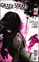 Greek Street #1
Publisher: DC / Vertigo
Released: 01 July 2009
Writer: Peter Milligan
Artist: David Gianfelice
Letterer: Clem Robins
Colorist: Patricia Mulvihill
Cover: Kako
Cover Price: $1.00
Review: drqshadow
In his new series, Greek Street, writer Peter Milligan sets his sights on modernizing and, perhaps, romanticizing a vaguely familiar set of myths and parables. In this instance, those influences are noticeably (and, given the title, predictably) Greek. Although the timeframe is decidedly modern and the location undeniably British (the real life Greek Street is situated in London), there's no mistaking the origin of many of the stories within this issue. Eddie, the first chapter's fleeting focal point, wastes no time in revealing himself as a modern-day Oedipus. And the various Mafioso that control much of the city call themselves the Fureys. It's not exactly rocket science if you're aware of the subject material, but Milligan does a decent enough job of casting these ancient myths in a modern light, freshening things up along the way.
But that isn't to say this is a particularly easy read. Actually, quite to the contrary. We're introduced to so many new faces, expected to remember so much, that many of the finer points of each personality undoubtedly slips by the wayside. Some characters speak in riddles, others try to make sense of it, and in the end the readers are left feeling like they've just tangled up a big mess of cords behind the entertainment center. The more we try to settle down and understand where these people are coming from, the more tightly that little ball of confusion squeezes together.
David Gianfelice brings a visual sense to the title that's right at home in a Vertigo series. His stylized, restrained efforts show the influences of a broad variety of artists � Chris Bachalo and Mike Mignola in particular � while adding a graceful, European sensibility to the mix. Although his methods are minimalist at heart, Gianfelice doesn't shy away from details, neither in the foreground nor the scenery that fills his backdrops. In fact, the world represented within the pages of Greek Street is surprisingly vibrant and lush; it's detailed with the utmost care, but also not obsessed over.
This issue moves along fairly quickly, but Gianfelice maintains a firm hold on the reigns and never lets the pace get out of control. His storytelling abilities are admirable; they're able to do their job and step out of the way without drawing too much attention. And although his illustrations are generally very simple, the grace and elegance of his linework is unusual in a good way. At a glance, his work doesn't seem particularly involved or even all that special, but upon closer inspection it really begins to shine. Keep an eye on him.
It's tough to climb in on the ground floor of a series like this one and offer a definite verdict, because there's still so much that's yet to be revealed. Certainly, all the pieces seem to be in place for Greek Street to deliver something significant, but that's neither here nor now. As regular-sized debuts go, this piqued my curiosity, if nothing else. Like many of his Vertigo predecessors (and contemporaries), Milligan's writing leaves a lot up in the air, with even more open to interpretation. His teammate, artist David Gianfelice, is more immediately appreciable. If you're a fan of the imprint, first issues like this one should come as no surprise � you'll know that the eventual payoff is usually worth the initial tease. It's worth a longer look than usual, but isn't something that's going to grab your imagination with both hands and start twisting. Not right away, at least. Borrow it.
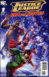 Justice League: Cry for Justice #1
Publisher: DC
Released: 01 July 2009
Writer: James Robinson
Artist: Mauro Cascioli
Letterer: Steve Wands
Cover: Mauro Cascioli
Cover Price: $3.99
Review: drqshadow
After all this time, why haven't the mainstream heroes taken a more proactive stance against their enemies? That's the question posed, more or less, at precisely the same time around the planet by Green Lantern, Green Arrow, Supergirl, the Atom, Shazam, Congorilla, and Starman. United by a terrible sense of personal loss and motivated by a shared yearning for justice, this unlikely group of heroes seems destined to meet up sooner than later. The real question isn't how far they're willing to go, but rather how their actions will be perceived by their more straight-laced former teammates.
James Robinson's take on Hal Jordan is about as solid as they come. When Green Lantern stands before DC's big guns and asks what the "justice" in Justice League stands for, it's more than a rhetorical question. As he observes the changes their enemies have made over the years, notes the terrible losses they've suffered, and bemoans the group's stagnation, it becomes clear that none of the other leaguers have an answer for him. Robinson delivers a Green Lantern that's stern, but not without reason. He nails the close friendship of Hal and Green Arrow, although the two only share a few brief pages together. Just about any time there's an emerald-themed hero on the page, in fact, you're in for a treat.
That statement doesn't always hold true when the book turns its focus to the other protagonists. While the writer's rendition of the past and present Atoms (Ray Palmer and Ryan Choi, respectively) is equally effortless, I can't say the same for Starman or Congorilla. The same level of care and personal investment that Robinson delivers to the better-known heroes isn't afforded to their associates, which is odd because the writer actually cut his teeth on Starman years ago. Either way, this results in a plot that starts out exceptionally well and slowly fizzles away over the course of its final pages.
Mauro Cascioli's blend of traditional pen and ink with vivid, picturesque painted colors is also initially impressive, but eventually overstays its welcome. When Cascioli gets a powerful scene to really dig his teeth into � as he does more than once in this issue � his work is dazzling. The shot of Ollie and Hal levitating away from a tongue-tied Justice League is some fantastic work. It's the moments in between � the meat of Hal's speech to his teammates, the unsettling quiet in the Congo after a massacre � that don't seem suitable to such precise detail, such intense visual scrutiny. That makes for an issue full of tense, postured, constantly flexing characters, even when the situation is wholly inappropriate for that kind of pose.
Does it look good? Frequently, yes. I'm a big fan of painted sequential artwork when it's done well, and on a few occasions I'd absolutely use that phrase to describe Cascioli's work in Cry for Justice #1. But I also believe that painted visuals can be just as much a detriment to the story if handled irresponsibly. And, more often than not, that's the case here. Is Superman always clenching his stomach to show off his perfect abs, even when one of his oldest, dearest friends is threatening to walk away? This issue's artwork largely plays out like a series of sparsely related pin-ups, rather than a single cohesive piece. The continuous word balloons may be enough to tie it all together, but that shouldn't be their concern.
While I get that the one thing unifying these heroes is their shared, renewed sense of purpose, by the end of the issue things begin to seem a bit redundant. Yes, they've each suffered a loss, and they each seek justice. But did they all really need to take the time to shout the word at the top of their lungs, especially when it made no sense in the context of their conversation? I see it's in the title of the miniseries, but damn, could it have been any cornier?
Ultimately, my opinion of this issue is split. When it's focused and relevant, it's genuinely moving. Hal's scolding of his JLA teammates makes for some fantastic reading, and then ends with a conundrum with no easy solution. Pity it isn't always that driven. And when the writing begins to slump, the artwork follows suit. Flip through it and pay close attention to the first half-dozen pages. It's all downhill from there.


