Is It Wednesday Yet?
07 April 2009 � Here we are again with another installment of your favorite comic book review series. As always, the reviews are free of spoilers, so read on without fear of having your experience ruined!
Our grading scale is simple:
Buy: An excellent comic book.
Borrow: A good comic, but save yourself some money by reading a friend's copy.
Flip Through: Give it a once-over at the comic shop.
Skip: This doesn't need to be explained.
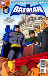 Batman: The Brave and the Bold #3
Publisher: DC Comics
Released: 25 March 2009
Writer: Matt Wayne
Penciler: Andy Suriano
Inker: Dan Davis
Colorist: Heroic Age
Letterer: Swands
Cover: Andy Suriano
Review: Preston Nelson
I've been one of the biggest champions of the Cartoon Network / DC Comics collaboration Batman: The Brave and The Bold, because it's been freaking awesome! When this issue showed up in my inbox, I was utterly pumped. If you could take this show, with all of its fun and Silver Age-charm intact, you'd have one heck of a comic. You'd get something lighthearted, something that's a delight for both children and adults.
Well, we don't quite get that.
What we do get is good fun, but it's still lacking the charm of the show. The comic format does allow for things that we can't get in the show, namely some more high-profile Bat-villains, and a certain superheroine that most would recognize. It's cutesy, and perhaps a bit more whimsical than the show, with this story being something that feels straight out of the Silver Age: President Batman. After the cold open, Batman and Green Arrow are called in to protect the President, as he's been threatened by a super-terrorist. Batman uses something on his utility belt to generate a holographic image of the commander-in-chief over his own body, while Arrow plays secret service agent. It's a solid premise with a couple of fun little vignettes before the inevitable showdown with the villain.
Something about the art is hurt by not being in motion. The show thrives on the simple artwork, because there are almost no still moments, something is always happening. But as soon as you freeze that, it becomes bland. But the character designs are good, and the colors are bright and bold.
I was ready to rip this book apart, but then I went to the letters page, and therein saw something that warmed even my icy heart. A young boy sent in a drawing of some superheroes. Did he draw Superman or Batman? No. There were drawings of the Alan Scott Green Lantern, Red Tornado, Dr. Fate and even Ralph Dibny! I read these letters, and I realized that looking at this book with my critical eye is really selling it short. It's not meant for me, it's meant for kids. It's meant to be a gateway to the world of comic books. And in that respect, it's terrific. Don't buy it for yourself, buy it and share it with a child in your life.
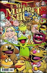 The Muppet Show #1
Publisher: Boom! Studios
Released: 25 March 2009
Writer: Roger Langridge
Artist: Roger Langridge
Colorist: Digikore Studios
Letterer: Deron Bennett
Cover: Roger Langridge
Review: drqshadow
I have a hard time imagining that anyone was especially clamoring for a new Muppets comic book, but as the cover so boldly proclaims, this series is aimed directly at kids. Formerly the industry's lifeblood, the younger market has been sorely overlooked in recent years, as the industry has catered to a much more mature audience and largely lost sight of its roots. Marvel's tried to recapture that demographic via their Marvel Adventures line, but without any ties to the core universe, those books look and feel like something of an afterthought. With its Muppets property, however, Boom! Studios has landed a brand that's long been adored by children, while still remaining appealing to adults. The question now is whether they're still relevant or even recognized, 11 years since the cancellation of their most recent television series and nearly a decade since their last motion picture.
Roger Langridge provides both the story and the artwork, both of which are rooted deeply in the source material, but ever so slightly askew. These characters are so widely known and instantly recognizable that it's tough not to arrive with a preconceived notion of exactly how they should look and act. Langridge does his best to overcome that perception with his artwork, which takes a noticeably different angle on this familiar cast. The characters are still easy to identify, but at the same time they seem somewhat foreign. Kermit's face is just a bit too tall, Gonzo's appearance is a little too manic, Miss Piggy's body is a hair more realistic than I'm comfortable with. I realize how petty these details may sound, but in conjunction with one another (and dozens of similar miscues on every other character) they really do add up.
Although his intentions may have been to give the artwork a sense of loose spontaneity, in practice it feels regimented. A lot of the fun of the TV series was in the casual way everything was orchestrated; puppets hanging limply from the roof or being hurled like a rag doll through the air. That's missing from Langridge's disciplined inks. Backgrounds and characters alike are sketched with a stern eye for order. It's like he was so concerned about getting everything just right that he sabotaged himself.
Langridge's writing is much more in line with what I was expecting. A direct continuation of the Muppet Show format, he follows the crew from skit to skit, then backstage during the chaos that takes place in between sets. The jokes and puns are every bit as cheesy as ever, but the show's innocent nature and wholesome image make it all okay. He works hard to include as many familiar faces as possible from the enormous cast, but manages to do so without overcrowding the issue or losing sight of the more well-known characters. It's both fun and easy to read, still entertaining for the kids but, amazingly, also for their parents.
The artwork needs to be a bit rougher around the edges, but overall I found this to be a worthy successor to the long-dead Muppet Show. Older fans will find a lot to like here, and younger readers might be surprised by how much they catch themselves enjoying it. Borrow it.
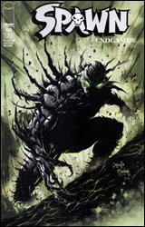 Spawn #190
Publisher: Image
Released: 25 March 2009
Writers: Todd McFarlane and Brian Holguin
Layouts: Greg Capullo
Pencils: Whilce Portacio
Inker: Todd McFarlane
Colorist: Jay Fotos
Letterer: Tom Orzechowski
Cover: Greg Capullo, Todd McFarlane and Jin Han
Review: drqshadow
It's been 10 years and 100 issues since I finally laid my passion for this series to rest, severing my ties and removing it from my pull list. During that time I've grown, both as a person and as a reader, while I perceived Spawn as standing still in time � doing the same things in the same way over and over again. Whether that reputation was justified or not, I can't say, but on the occasions I would chance a peek at an issue to satisfy a certain, fleeting curiosity, the book did nothing but reinforce that belief. There's been little variety in this book, even when its focus shifts away from the title character, and that's what ultimately drove (and kept) me away. When you've read 90 issues of the same stuff, no matter how good it might be (and this wasn't always that good), you're going to start looking for something different.
For better or worse, a lot of that remains unchanged. The series is still like a bicycle with one gear, sticking to what it's always done and showing no interest in trying anything dramatically different. If anything, it's more set in its ways than it's ever been. Like I said, it's been ages since the last time I sat down with an issue of Spawn, but I didn't even need a recap page to jump right back in and feel like I was already up to speed. I can remember the excitement and adventure of this title's early days, when McFarlane was inviting the biggest names in the industry to come on board for an issue and tell a few stories in his sandbox. Neil Gaiman introduced us to Medieval Spawn and Angela, Alan Moore took a look at the Violator's lewd siblings, Frank Miller investigated a gang war in the streets of New York. It was headed somewhere genuinely different, and I wanted to be there when it arrived. It wasn't long, though, before McFarlane's baby had lost its way.
Now, Spawn fancies itself as the bringer of a much more subtle style of horror / fantasy, a goal which isn't always in sight. Gone are the more garish run-ins with costumed evildoers, complete with glowing hands, lime-green eyeballs and constant blasts of gunfire. In their stead, this issue focuses on a much more pedestrian perspective. It's a good direction for the series, but even on the occasions that the plot is moving somewhere promising, McFarlane still isn't much of a writer. His cohort, Brian Holguin, doesn't exactly help the cause. For the amount of plot progression this issue makes, there's entirely too much dialog, and it's not the kind of stuff that's going to hold my attention. That transforms the issue from a quick, 10-minute read into a 30-minute sitting, which is enough to drain even the staunchest supporter.
The visual marriage between Image co-founders Whilce Portacio and Todd McFarlane looks just like it sounds. As a big fan of both artists back when they were in their prime, I noticed bits and pieces of each personality shining through the panels at any given time, and the two have proven to be surprisingly compatible. Portacio's tendencies to over-detail and fill the page with stiff, blatantly postured characters have been restrained by McFarlane's inks. Todd's predisposition for losing his focus and going over-the-top with his love for exaggeration is kept in check by Portacio's much more stern, vivid, realistic renderings. Together, they compensate for each other's shortcomings and respect each other's natural strengths. I see a lot of McFarlane when the panels are in close on a character's face, but it's almost all Portacio when the angle is a bit wider. It's still a good looking series, even with colorist Jay Fotos sapping the life out of every page with an unrelentingly dull, drab color palette. I get it, everything is bleak and the colors match the tone of the story, but he's hindering the artwork.
In this issue, my foregone conclusions were proven to be both right and wrong. Spawn is trying a few new things, and the book is currently enjoying a restored sense of direction, but it's going about things in the same old ways. It has no heart, there's a notable lack of passion in the writing, and it's still desperately in need of a major change in pace. This wasn't as bad as I'd feared, but it hadn't improved as much as I'd hoped. Flip through it and see if you can deal. It's worth a look just to climb into the time machine and enjoy some fresh artwork from Portacio and McFarlane.
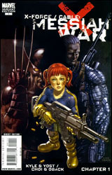 X-Force / Cable: Messiah War #1
Publisher: Marvel
Released: 25 March 2009
Writers: Craig Kyle and Christopher Yost
Artists: Mike Choi and Sonia Oback
Letterer: VC's Cory Petit
Cover: Kaare Andrews
Review: Preston Nelson
By all rights, I should hate this book. It's Wolverine's team hunting down Cable in the future. And if you know me, you know how poorly this should sit with me. Wolverine hardly needs another team book, but at least this one fits him. X-Force works for Wolverine, because they've been sent by Cyclops to do the things that the X-Men can't. And Cable is such a mess as a character. There are incarnations that I love and incarnations that I hate, but lately it's been hard to say much positive about the would-be messiah. His solo book, as a whole, stinks. So, it's easy to see why this book just shouldn't work. But for some reason it does. It overcomes its limitations, and honestly, it's good fun.
If you don't know the backstory to this, it's extremely complex, but I'll try to lay it out for you as simply as possible. Cable decides to save the first mutant baby born since M-Day, by hopping into the future. This pisses Bishop off, so he shoots Xavier in the head and gives chase. Problem is, Cable can no longer jump back in time. Meanwhile, Cyclops sets up the aforementioned X-Force. Once Beast finally gets a lock on where Cable is, Cyclops has Beast throw himself, Logan, Archangel, X-23, Warpath, Domino, Elixir and Vanisher into the future in an effort to bring Cable and the child (appropriately named Hope) back to the present. And this whole ordeal feels like a military mission, which lends itself to what happens within the pages. And one of the coolest things is the appearance of a certain Merc with a Mouth, who's somehow still alive 900 years in the future.
The art is actually awesome. Great composition, very cinematic, bringing to mind post-apocalyptic films like Mad Max. The character designs are incredibly well-done. I dig the black and silver X-Force uniforms, particularly Archangel and Logan. Deadpool is also a welcome change of pace from the norm; he's literally stitched his costume together, as it's fallen apart over the last millennium. The backgrounds are great, giving a sense of emptiness and solitude to the panels. It's got some excellent violence, especially in the blood splatter effects.
It's a fun story with a smattering of black / slapstick humor. It's hardly perfect, but it's miles better than anything I expected. It's worth a borrow.


