Is It Wednesday Yet?
31 March 2009 � Here we are again with another installment of your favorite comic book review series. As always, the reviews are free of spoilers, so read on without fear of having your experience ruined!
Our grading scale is simple:
Buy: An excellent comic book.
Borrow: A good comic, but save yourself some money by reading a friend's copy.
Flip Through: Give it a once-over at the comic shop.
Skip: This doesn't need to be explained.
 Azrael: Death's Dark Knight #1
Publisher: DC Comics
Released: 18 March 2009
Writer: Fabian Nicieza
Artist: Frazer Irving
Letterer: Sal Cipriano
Cover: Guillem March
Review: Preston Nelson
Few characters embody the 1990s like Azrael. Jean-Paul Valley's run as Azrael and Batman are both sort of dirty little secrets in Batman continuity, one of the fairly modern things that's tossed aside as quickly as stories about Bat-Mite. He's hardly the most beloved character around, and the most prominent Azrael is actually dead, so it's more than a little shocking to see him get a miniseries in the wake of Batman's death.
Something is rotten in the city of Gotham, outside of the terrible writing that is. People are getting murdered, beheaded, as it were. And the wounds are cauterized, leading to two suspects: Darth Vader and Azrael. Sadly, it's Azrael, but the thought of Nightwing versus a Jedi gives my fanboy bone a tickle. Nicieza is a personal favorite of mine, at least when he's writing funny stuff. Here, when he's forced to write the grandiose style required by Azrael and his surrounding characters, he resorts to becoming overly wordy. The main story is intriguing, revolving around the idea that people in high places had their own plan just in case Batman were to die. Sadly, it's a weak story, and the highlights are small panels featuring Bat-regulars like Harvey Bullock and Nightwing. New characters are injected, and the "Azrael-in-training" is most intriguing, if not well-written.
For all the weakness of the story, the art more than makes up for it. I'm not familiar with Frazer Irving, but he's the sole artist of the book, and the book resonates strongly with his emotive, powerful work. There's very strong interplay of light and shadow that really speaks to the themes of sin and salvation that are so central to the character of Azrael. However, Irving's proportions are far from the best, and his faces are all over the map. He does, however, make Azrael look awesome, and gives the swords an ethereal, unearthly look. He's not for everyone, but I think he's worth a gander.
The story is admittedly weak, and the characterization is nonexistent. The book feels remarkably disjointed, but the art makes it worth a quick peek. Flip through it, if only to get a taste of Irving.
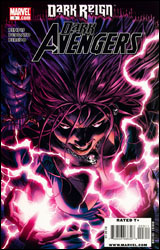 Dark Avengers #3
Publisher: Marvel
Released: 18 March 2009
Writer: Brian Michael Bendis
Artist: Mike Deodato
Colorist: Rain Beredo
Letterer: VC's Chris Eliopolus
Cover: Mike Deodato
Review: Preston Nelson
I really wanted to hate the idea of the Dark Avengers, maybe that's because I really dug the dual teams of Avengers that preceded it: the Mighty Avengers and the New Avengers. But all the same, the team of Bendis and Deodato is one that excited me from the get-go, because I loved Bendis on Mighty Avengers and Deodato's run on Thunderbolts was excellent.
The opening of this issue is one of the greatest examples of characterization in recent memory. For those of you that read Mighty Avengers, you know that the Sentry is a ball of introspective psychoses, and that it's always been a crippling character defect. Sentry got his powers through a chemical injection, and that drove him completely nutty. So, to resolve this, why don't we sit him down with someone who has gone through the same thing: Norman Osborn. Fundamentally, I think that trusting a guy that spent a significant amount of time trying to murder a ton of other people, while committing all sorts of crimes against science and man, is a bit suspect, but no one ever questions it when it happens to Lex Luthor, so I guess I can roll with it. Truthfully, Osborn is very much Lex Luthor as written by Marvel. He's not only conniving, but he's genuinely likeable. He's a bad man doing good things, and even though he's probably doing them for the wrong reasons, it's fun to enjoy the ride. The rest of the Dark Avengers are well-represented in their battle with Morgana Le Fay, but it's Osborn who steals the show, with a smattering of Victor von Doom.
Mike Deodato is a master of his craft, and it should come as no surprise that I have only one complaint with his work in this issue; it's his photo-referencing, namely Norman Osborn. Alex Ross is great at using photo references, as he changes features, he reshapes, he makes sure that it's not clear who he's drawn. Deodato's Osborn is Tommy Lee Jones, and this is something that's bothered me all the way back to his time on Thunderbolts. It's not a problem when it's subtle, but it's so glaring here that it's a point of distraction. Otherwise, I truly enjoy the art. Deodato works with shadows masterfully, especially in the quieter scenes with Sentry and Osborn, but all the same, he pulls together some incredible stuff in the larger scenes with the whole team in battle.
Beginning to end, a very above average book. Borrow it, if only to see the opening.
 Groom Lake #1
Publisher: IDW
Released: 18 March 2009
Writer: Chris Ryall
Artist: Ben Templesmith
Letterer: Robbie Robbins
Cover: Ben Templesmith
Review: drqshadow
It's been two years since Barnabus Bauer (and his furry buddy, Scruffs) disappeared on a drive along a rural route somewhere in New Hampshire. His family has moved on, left him behind, carried on with their lives � but now there's a federal agent on his son's doorstep, claiming dear old dad is, in fact, still breathing. He's alive, but he certainly isn't well; the experiments he endured on that flying saucer have left him somewhat physically impaired. And by somewhat, I mean the man now has six arms and an interesting growth on his forehead. From there, things start to get a little weird.
While the subject of grey-skinned, black-eyed visitors from another planet with a penchant for probes may look like something straight out of the early 90s, the material feels fresh enough that this trip down memory lane is a pleasant one. If anything, I admire Groom Lake's gumption for taking on a theme that's all but taboo at the moment and meeting it head-on without a flinch. I'm sure we're all tired of aliens and extraterrestrial culture since the subjects were run into the ground some time before 2000, but it's refreshing to see them again in such an imaginative, mildly satirical modern story. Chris Ryall's plot draws from both The X-Files and Men in Black, matching the constant unease of Scully and Mulder's investigations with the oddball characters and large alien population of MIB headquarters. It's strangely grim and somber in tone, but keeps an energetic pace and constantly works to surprise its audience. Ryall's cast is colorful and interesting, a broad mixture of different personalities that's already begun to gel into a single unit. If the first issue is any indication, I'm anxious to see the twists and turns they'll endure in the next few months.
I've been a big admirer of Ben Templesmith's artwork since I picked up the first issue of Fell, his collaboration with Warren Ellis. If you're already familiar with his abstract, textured style, it should suffice to say he stays that course in Groom Lake. If this is your first time, well, you should really grab a few issues of Fell or Wormwood: Gentleman Corpse while you're out, because you're probably going to want to see more. Templesmith's ability to take control of the page is a sight to behold, and it's in full evidence here. Coloring over his own artwork, he subtly sets an early tone with an eerie, unsettling green tint that slowly rolls in over the first few pages. It's a gentle change, like the shift from sunset to dusk, so casual that I didn't even notice until the little green men materialized to surround the narrator.
I could swoon over some of Templesmith's larger compositions. The simplicity of his rough, sketchy line drawings is balanced neatly by the sharp graininess and dirty tendencies of his coloring and additional effects. He's one of the few real talents out there who's able to not only produce something I'd be proud to hang on my wall, but to do so on a very regular schedule.
Groom Lake was a nice surprise. I feared the worst when I first laid eyes on the cover, which looks like something that was left behind when I moved out of my old high school bedroom, but it was worth the risk. This is an unusual mix of black humor and disturbing science fiction that features a strong, small cast, simple, believable dialog and one of my favorite current artists. Buy it.
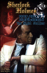 Sherlock Holmes & Kolchak: The Night Stalker #1
Publisher: Moonstone
Released: 18 March 2009
Writer: Joe Gentile
Artists: Carlos Magno and Andy Bennett
Colorists: Ken Wolak and Patrick J. Williams
Letterer: Bernie Lee
Cover: Joe Corroney
Review: drqshadow
There's not much I can say about this book's plot that its title doesn't already answer. In Sherlock Holmes & Kolchak: The Night Stalker, a certain pair of relatively well-known fictional detectives team-up to crack the case and send everyone home happy. Of course, this isn't your usual pairing; by the time Kolchak is introduced to the situation, Holmes is long dead and so is the original client. It's only through the efforts of a particularly insistent (and lovely) young relative that he even agrees to open the case. But once the Night Stalker does dig in, he quickly realizes this isn't the kind of story that's easy to put back down.
Interestingly enough, Holmes and Kolchak never meet face-to-face. I'm not even sure how that would've been possible, but it was a relief not to see any time machines or mysterious teleporting phone booths scattered throughout this issue. No, the two detectives communicate strictly via print. Holmes enlists the Night Stalker's help through an aged, century-old journal that, as fate would have it, miraculously finds its way right into the modern detective's hands. How the famed British sleuth knew this would be the case, or that Kolchak would even exist a full generation before his conception, are questions for another day.
Writer Joe Gentile treats both characters with care, ensuring their words and actions stay true to each distinct personality. As a beat writer for The Hollywood Dispatch, Kolchak's scenes are primarily told through his writing, which takes the form of a continuous stream of narration boxes. While this is somewhat obnoxious at first, it doesn't take long to adopt them as a substitute for the kind of running monologue common in film noir pictures. Holmes, on the other hand, is accompanied by little more than Dr. Watson, his wit and his spoken dialog. Similar touches are scattered throughout the issue, simultaneously pointing out both the similarities and the sharp distinctions between these kindred spirits.
Carlos Magno and Andy Bennett split up the artwork chores, with Magno taking on the bulk of the work and Bennett filling in for a small scene at the story's onset. I wasn't particularly taken by either of them. Bennett's style is akin to a less-disciplined Michael Gaydos, uncomplicated and pedestrian, but also very dry. To his credit, there's only so much you can do with five pages of banter in a newsroom, but he certainly didn't liven things up much. Magno's work, which is set about a hundred years in the past, takes an era-appropriate Victorian slant that does a fine job in changing the setting. His artwork is more sophisticated, but likewise not especially dynamic. I'm not sure the story calls for anything more energetic, but this issue needs something more and that isn't being delivered here.
This first issue is basically a Sherlock Holmes story with a handful of Kolchak panels thrown in for good measure. That's neither a positive nor a negative; the detective work is enthralling and right in line with Holmes' other cases, but it does seem like it's missing a sense of balance. Maybe Gentile intended this to be more of an even split, then just got so caught up in the Holmes story that he lost track of time? That would explain a lot, particularly the issue's abrupt ending. Regardless, it's a fine story that could have benefited from a better artistic showing. Ultimately, it really depends on your opinion of the characters. If you're familiar with either and enjoyed their previous adventures, it's worth borrowing. If not, you might not like what you see.


