Is It Wednesday Yet?
27 January 2009 � Here we are again with another installment of your favorite comic book review series. As always, the reviews are free of spoilers, so read on without fear of having your experience ruined!
Our grading scale is simple:
Buy: An excellent comic book.
Borrow: A good comic, but save yourself some money by reading a friend's copy.
Flip Through: Give it a once-over at the comic shop.
Skip: This doesn't need to be explained.
 Action Comics #873
Publisher: DC Comics
Released: 14 January 2009
Writer: Geoff Johns
Artists: Pete Woods, Renato Guedes and Wilson Magalhaes
Colorists: Brad Anderson and David Curiel
Letterer: Rob Leigh
Cover: Ladronn
Review: drqshadow
When a recent run-in with Brainiac resulted in the enlargement of the bottled city of Kandor, the world rejoiced. Now, instead of relying on just one flying, impervious superman from a long-dead planet, they could enjoy the protection of 100,000. But as the Kandorians explored the Earth, it was quickly made clear that while they shared a set of powers with the Man of Steel, their morals weren't on the same level. With tensions rising and new anti-Kryptonian laws about to go on the books, it's only a matter of time until everything boils over.
Geoff Johns fills this issue with a few strong observations, both about modern civilization and about Superman's place in it. Set against the backdrop of an invasion of flawed supermen is a narrative on the warlike nature of the human race, about how anything frightening or different is almost always met with anger and hostility. Though they believe themselves to be noble at heart, the Kryptonians have always been seen as a proud, almost arrogant race, so it's easy to see how they could come off as stuffy and elitist to a more working-class population; neither side can see the wrong in their own actions, and while we, as observers, can note the benefits and drawbacks of both perspectives, we can also understand where each is coming from.
Though Johns and his Superman collaborators James Robinson and Sterling Gates have delivered a complex plot to their respective books in the form of "New Krypton," I was disappointed by the dialog in this issue. It serves the purpose of pushing the storyline forward, but it's missing a touch of warmth and personality. And while I can understand the concept that native Kryptonians might speak with a different inflection than their human cousins, that's no excuse for filling an entire issue with emotionless, robotic drones. And these problems aren't even exclusive to the citizens of Kandor: Lois, Ma Kent and Superman himself all speak in a similarly monotonous voice. It's like Harrison Ford said when he first read the script for Star Wars: "You can write this shit, but you sure can't say it." I have a hard time imagining anyone firing off lines like these on a whim.
An entire stable of artists have followed Johns into the fray, with contributions of varying lengths coming from Pete Woods, Renato Guedes and Wilson Magalhaes. Woods handles the vast majority of the issue, with a style that's sometimes a little awkward but generally solid. He keeps the page crisp, smooth and clean, although he's constantly forcing Supes into some very odd, uncomfortable poses. Woods enjoys his best moments this month in the two back-to-back splash pages around the middle of the issue � a set of large, panoramic landscapes that succeed without accompanying dialog.
As another chapter in the "New Krypton" saga, it should go without saying that new readers probably won't want to jump onboard with this issue. While it does its best to keep the action understandable for fresh observers, too much of the story still depends on a knowledge of what's come before to make much sense of things. It's occasionally bland with a few dashes of flavor, but it's really just about average. Flip through it if you're curious.
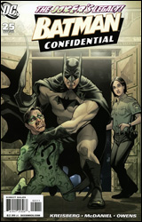 Batman Confidential #25
Publisher: DC Comics
Released: 14 January 2009
Writer: Andrew Kreisberg
Penciler: Scott McDaniel
Inker: Andy Owens
Colorist: ILL
Letterer: Jared K. Fletcher
Cover: Stephanie Roux
Review: Preston Nelson
You know what the Batman mythos doesn't need? The exploration of things we've had explained very nicely. Like the origin of Arkham Asylum. For those of you unaware, Arkham's origin is told brilliantly in Arkham Asylum: A Serious House on Serious Earth; it's dark, violent and scary as hell. It opened its doors in the early 20th century and has been tormenting inmates ever since.
Well, except for the time that it was closed and almost turned into condos.
I'm not making this up. This book would have you believe that somewhere, someone was stupid enough to say: "Hey this former psychiatric hospital, known for its long history of violent inmates and patient abuse, would be the perfect place to live for young adults fresh out of college." I'm no real estate expert, but that's just messed up.
But since Arkham is closed, Batman and Jim Gordon are left with the problem of what to do with the Joker, since he's already escaped from Blackgate, and killed a whole mess of people. There's a problem in that they just use eminent domain to take Arkham back. So they sold this psychiatric hospital to a real estate developer, only to take it back when they realize that they need a place to put the criminally insane.
If you're not crying blood, you didn't think about that hard enough.
Not only that, but they put Joker in a cell literally right next to a man whose wife he murdered, allowing Joker to torment this poor bastard all day long.
And speaking of torment, Joker is written terribly in this issue. He's not sinister or scary, he's Yakko Warner. And if this is early in Batman's career, as it's portrayed, why is the Joker making a Grey's Anatomy joke?
The art is an awful fit, too. If you're doing a story about the Joker, a vengeful cop and Arkham Asylum, you do not get cartoony. You don't do bright and flashy and cute.
Nothing in this book sat well with me. Skip it, then go back into the shop and skip it again.
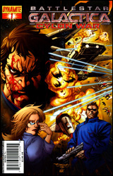 Battlestar Galactica: Cylon War #1
Publisher: Dynamite
Released: 14 January 2009
Writers: Joshua Ortega and Eric Nylund
Penciler: Nigel Raynor
Colorist: Adriano Lucas
Letterer: Simon Bowland
Cover: Stephen Segovia
Review: Preston Nelson
You might as well take my nerd card now, as I know exactly "frak" about Battlestar Galactica. But coming into this with exactly zero prior knowledge, it was easy enough to follow, I guess. And as someone who's an outsider, I feel confident enough to say that this book was a shining example of, well, not being bad. Like if beige was a comic book, this would be it.
Not to say it didn't have good moments, because it had some nice visuals during a couple of space battles, and even did a really nice job of painting some shades of grey about the protagonist. But for all this, they made some weird choices. The protagonist goes through his entire military academy experience in one page. It's not a bad decision, it's just an odd one.
Raynor's lines are sweeping and emotive, lending themselves to the story that's being told. Some of the character designs are strange to me, as the military commander looks to be 12, but that could be part of the mythos that I don't get. The colors are nicely done as well, particularly in Lucas' use of reds and oranges during some ground-set battle scenes.
Early on, the book goes for some strange, pseudo-religious imagery, but that falls flat and is quickly shunted away. To the book's credit, I think it knows where the weak spots are, and it does its best to mask them. It's a shame though, because if it knew how to fix them outright, this would be a really solid comic. But as it is, it's just okay.
There's just not much to say about this book; it's a middling effort, with the occasional bright spot. If you're a huge fan of the series, go for it, otherwise I say skip it.
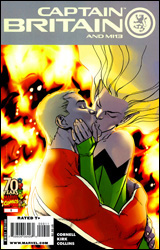 Captain Britain and MI13 #9
Publisher: Marvel
Released: 14 January 2009
Writer: Paul Cornell
Pencilers: Leonard Kirk and Mike Colins
Inkers: Jay Leisten with Cam Smith
Colorists: Brian Reber with Rain Beredo
Letterer: VC's Joe Caramagna
Cover: Stuart Immonen
Review: Guest
Gah! British people. Marvel knows my one weakness.
As one to never find much stock in hype, even from those whose opinions I respect, I have to admit that I was fully prepared to be disappointed by this book. I mean, the adventures of Captain Britain and his obscure friends? "Surely this is not the sort of tale to whisk me away to a land of glee and merriment," I said to no one in particular. Thankfully, the room was empty when I said this. Mostly because whoever was in the room would have thought me to be a schizophrenic, but also because a regular reader of this series surely would have stabbed me with a pencil. And after reading this issue, I can't say I could really blame him.
What we have here is a "how to" guide on making a comic that anyone can read, even with little to no knowledge of the characters involved. I recognized three people in the entirety of this book, and by the end, I was more than ready to grab some back issues and learn about the rest. Considering that this is not only a series that I've never touched before, but this is the ending to a rather involved story arc, it really defies all common logic that I wasn't lost at all. Either I became really goddamn perceptive all of the sudden, or this is just a damn good book. (All signs point to the latter, in case you were wondering.)
The artwork here is great, managing to be sharp and impactful without overdoing it. Every time there was a splash page, instead of rolling my eyes at melodrama or goofiness, I found myself exclaiming, "Hell yes!" Which is what splash pages are actually supposed to do. It's easy to forget considering how overused they can be, but in this issue, each panel is really used to its maximum effectiveness, and combined with a very tight narrative, it's one of the easiest and most entertaining reads that I've come across in quite some time.
In what has to be a new record for me, I had my score for this book decided by page four. It has action, drama and the inherent greatness of Pete Wisdom. Buy it now, and buy it again next month.
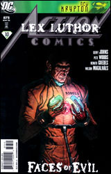
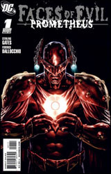 Faces of Evil: Prometheus
Publisher: DC Comics
Released: 14 January 2009
Writer: Sterling Gates
Artist: Federico Dallocchio
Letterer: Swands
Cover: Mauro Cascioli
Review: drqshadow
Serving as a prelude to the upcoming Justice League #1, Faces of Evil provides a revealing peek behind the fa�ade of the man who once singlehandedly overpowered the entire League. When the villain awakens in his cell within Blackgate Penitentiary, two years have passed since his last memory, thanks to a mental blockade provided by Martian Manhunter. But if the real Prometheus has been catatonic for all this time, who's been using his name to pull petty heists throughout the city over the last 20 months? Better still, what will the real deal do to him when they eventually cross paths?
In Faces of Evil, writer Sterling Gates is tasked with reinvigorating a popular character who's recently fallen on hard times. Prometheus never really returned to form after his spectacular first appearance left the entire JLA begging for mercy, and if he's to be used as the spoiler for the launch of the team's new series, it's going to take some doing before he can be taken seriously again. Fortunately enough, Gates has come up with a fine solution; the excuse that it's been a mere imposter running around in his clothes all this time may sound a bit too Ben Reilly for some readers, but in this situation it actually works. Gates immediately draws a thick line between the intellectual prowess of the real Prometheus and that of his stand-in, leading me to wonder how anyone could have mistaken one for the other in the first place. He emphasizes that, no matter what you may have seen or heard from him over the last two years, the real Prometheus is back, and this time he's extra pissed.
A lot of this issue takes place in the form of memories. While his body was unresponsive in a jail cell, the villain's mind had all the time in the world to dwell on its adventures, its mistakes and how best to exact its eventual revenge. The situation allows for an easy segue into a brief recap of the character's origin, his history and his relationship with the Justice League. Gates blends fresh details with old stories, effectively catching new readers up with the character's past and rewarding those already familiar with his exploits. When he opens his eyes for the first time in that jail cell, I caught a shiver. This guy means business.
Federico Dallocchio's artwork has its moments. At his best, he's an offbeat mixture of Jae Lee and Tony Harris, abstracting the page with adventurous camera angles and thick, bulky characters. Dallocchio is capable of delivering some nice work, but we only see his best in a few brief glimpses this month: a fantastic panel of the imposter Prometheus leaping from a hotel rooftop in a driving rainstorm, for example. His finest moments are almost good enough for me to overlook his worst, were they not so much more widespread. Federico's page layouts are often so busy and detailed that they border on illegibility. His unique choices in perspective are hit or miss, with every fantastic shot from an original angle matched by three or four choices so bizarre, it's nearly impossible to figure out what it is we're looking at. With a bit of restraint and a focus on consistency, Dallocchio could be a solid contributor, but he's presently lacking on both counts.
That said, this remains a good issue. As a one-off with a specific goal in sight, the story doesn't linger. It retells a concise, convincing origin for the character, returns him to a spot near the top of the villainous pecking order and almost immediately reminds readers of what made him such a cool freaking enemy for the League to face in the first place. Borrow it.
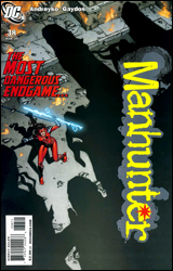 Manhunter #38
Publisher: DC Comics
Released: 14 January 2009
Writer: Marc Andreyko
Artists: Michael Gaydos, Dennis Calero and Fernando Blanco
Colorists: Jose Villarrubia and Dennis Calero
Letterer: Sal Cipriano
Review: drqshadow
Federal prosecutor Kate Spencer has seen enough guilty men walk free on technicalities to fill a bus two miles long. When one particularly unsettling villain enjoys the same treatment, skipping out on a mass murder conviction and celebrating by slaughtering a pair of prison guards, Kate decides she's finally seen enough. Using equipment "borrowed" from an evidence room, she tracks and kills the man, inadvertently launching her own career as the costumed Manhunter along the way.
Sadly, this month marks the final issue of Manhunter. Though the title had dodged two previous threats of cancellation, low sales number have finally caught up with Kate and her friends. To his credit, writer Marc Andreyko doesn't allow the issue to read like an epilogue. It's business as usual for Kate, her ex-husband, their son and the bad guys out on the street, and the story casually cruises along without any real sense of urgency.
Andreyko's goal seems to be a careful balance between the insignificant drama of Kate's personal life and the sudden physicality of the hours she spends in costume. And, so long as her two lives are kept isolated from one another, that works just fine. It's only when they begin to intertwine this month that the story loses its focus. The dry humor and casual indecision shared by her supporting cast may be charming over dinner, but when a pair of villains crash her son's graduation party, I'd expect a different set of emotions. Instead, the guests confront the intruders with bad puns and false bravado while Kate changes into her Manhunter costume. What's the point of wearing a costume when every spectator will be able to recognize you? Why is granny squaring off with that bad guy? Why doesn't the FedEx truck parked in the fountain disturb anyone? I have no idea, and the plot isn't exactly forthcoming with explanations.
Michael Gaydos, Dennis Calero and Fernando Blanco each have a hand in the artwork this month. Gaydos, who's been the book's primary artist since its return from hiatus, handles the first half of the issue and showcases a strong familiarity with its cast. If you're aware of his contributions to Marvel's Alias, it should be easy to imagine what his interiors look like in Manhunter. His style includes a lot of rough, jagged edges, an armload of shadows and an amazingly light touch. Although his lines are selectively limited, his work is never lacking in detail or realism. He's one of the few artists who can deliver near-photorealism without drowning the page in ink. Gaydos' characters look human and wear their emotions on their sleeve, whether they're scuffling in an alleyway or chatting on the phone.
When the other artists climb into the picture, the drop in quality is both harsh and swift. Calero tries to emulate the style that Gaydos has brought to the series, but his approach is too sterile and vacant. Although he doesn't make the same attempt to shift his artwork to match his big-name contemporary, Blanco's pages don't fare much better. Next to the moody, dark-veiled efforts of the other artists, his more expressive, cartoonish efforts are a huge mismatch.
I can see why this series is being cancelled. While the concept of an angry Fed hunting the guilty with a suit of armor may sound serious, Manhunter never offers more depth than a bad sitcom. While Michael Gaydos contributes artwork that's best suited to a somber tone, Marc Andreyko is writing a story that's more goofy than gritty. This is a weird blend of styles, flavors and directions, and while sometimes great things can come from unexpected combinations, Manhunter completely misses the boat. Skip it.
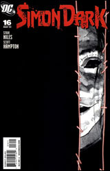 Simon Dark #16
Publisher: DC Comics
Released: 14 January 2009
Writer: Steve Niles
Artist: Scott Hampton
Colorist: Daniel Vozzo
Letterer: Todd Klein
Cover: Scott Hampton
Review: Preston Nelson
You know how I said that Gotham needs to be dark and gritty? This book nails it. Simon Dark is another Gotham-based hero that's emotionally crippled and prefers to stick to dark alleys, but he has a way better reason than Batman: Simon is an amalgamation of dead body parts sewn together. He's an intriguing main character: childlike and innocent, while disgusting and grotesque. And he's surrounded by regular people; there's no Batman or Killer Croc here, just his creator, a coroner and a gaggle of school girls. And by placing normal people in the horrifying cesspool of Gotham City, the story seems grounded.
This book takes a great, unflinching look at gore. Bad, bloody horrible things happen, and you're forced to take it in stride. It's got a brutal sensibility in the dialog, the art and even the lettering. Every tiny aesthetic thing is bound together to create a sort of dark fairy tale that's both demanding of and rewarding to the reader. The world created here has its own rules, namely that the most innocent characters suffer the most. It's heart-wrenching at points, but it's extremely deep writing.
The art is like nothing I've seen in a comic book before. It calls back to Andy Warhol's work in the 1960s; it's photorealistic, but extremely stylized. And while I enjoy it, there are a few spots where it does take me out of the story. It really adds to the feel of the story, though, as it gives the characters within a sort of hollow feel, like they're the approximations of a person. In my head, I found myself offhandedly referring to Simon as "the little wooden boy," as he really just is a Pinocchio figure.
And while a fair amount of DC's magic / horror characters have been farmed out to Vertigo, it's a refreshing change of pace to see our delightfully macabre little antihero under the DC banner. It's a niche book, but it nestles in nicely to the larger DC universe. Not that you'll ever see Simon in the midst of the Justice League or trading punches with Solomon Grundy, but there's a place for a Simon Dark character. Simon is the little wooden boy, he's growing into his role and it's a wonderful growth to watch it. Buy it.
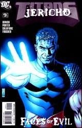 Titans #9
Publisher: DC Comics
Released: 14 January 2009
Writer: Judd Winick
Pencilers: Howard Porter and Jim Calafiore
Inkers: Wayne Faucher and Jim Calafiore
Colorist: Edgar Delgado
Letterer: John J. Hill
Cover: Tony Daniel
Review: Guest
Hearing that this issue would be about Jericho, you have no idea how disappointed I was to see a lack of wrestling moves. Instead, this is about the mute, curly haired son of Deathstroke. Though I know next to nothing about this character, it didn't take long for me to realize two things. One, Jericho can possess other people, hanging around in their minds. And two, when he does so, suddenly he becomes a verbal diarrhetic. For a mute, the guy really never shuts up, and drives poor Nightwing insane with his incessant whining and babbling about nothing in particular. And all the while, we're supposed to sympathize with him. Now, I'm all for blurring the lines between hero and villain now and again, but at no point do we actually figure out what Jericho wants. The only thing made clear here is that Jericho very badly needs Dick � to help him, that is.
And the art is bad. Really bad. This is probably the worst art that I've ever seen in a DC book not named Countdown. Getting some anatomy off in a panel or two is one thing, but when characters change heights, weights, the length of their limbs and even their nationality from page to page, you have a major problem. I don't know much about the Titans, but I know that Beast Boy is not, in fact, Asian. On the last page of the story we get a rear view of Zatanna, and it was in that moment that I figured out why the art was so bad. Jim Calafiore spent more time drawing that one ass cheek than the rest of the issue. While normally I would applaud such attention to detail, here it's at the sacrifice of the book.
Titans issues, from what I can gather, are usually pretty polarized. Either you get a good, fun story with well-written characters, or you get badly drawn drivel about a character that I couldn't imagine anyone reading this possibly cares about. There really isn't much in terms of middle ground. Skip this.
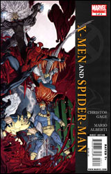 X-Men / Spider-Man #3
Publisher: Marvel
Released: 14 January 2009
Writer: Christos Gage
Artist: Mario Alberti
Letterer: Jared K. Fletcher
Cover: Mario Alberti
Review: Guest
Say there was a TV show that you used to watch in the 90s. For the sake of argument, let's say it was Full House. You watched all of the episodes for years, all the way up to that one where Michelle got the head injury. Then it ended, and you moved on with your life. Now, imagine that next week, the "lost" episodes of Full House just started airing. A bunch of episodes that occurred between seasons two and three that somehow fit into the continuity of the ones you've already seen and that you're supposed to just accept. Would you really have any reason to see them? Surely, there's not going to be any major plot developments that you were unaware of. But suppose you sit down to watch one of those episodes, and 10 minutes in a bear eats Uncle Jesse. Now, you know Uncle Jesse exists until the end of the series, but suddenly, you're being told he meets his demise in the forest.
Comic books like X-Men / Spider-Man are that episode.
On paper, the premise of this book doesn't sound too bad. It's set in the era of Spider-clones and bone claws, a point in time when Ben Reilly was Spider-Man and the X-Men were still relevant. The mutants come to Spidey for help against a plot set in motion by Mr. Sinister, but what it is doesn't matter in the least; for this book to make any sense, absolutely nothing can happen. It's not as if you're going to pick up an issue of Uncanny tomorrow and see Wolverine suddenly say, "Oh yeah, and there was that time we teamed up with Ben Reilly because Sinister did that thing with the clones!" This is issue three of the four-issue mini, and the Earth has not been shattered. In fact, nothing has really happened at all, and until the very last page, I was left wondering if the extent of Sinister's plan was to simply walk around cackling, "I am so delightfully evil today! I think I'm going to go step on a box of kittens! MWA-HA-HA-HA! Fools and such."
Granted, Sinister has never been the deepest of villains, but I'm left with that burning question that Marvel never wants anyone to ask: Why do this? Even if we are to assume the best case scenario and believe that issue four will bring to light some sort of revelation that calls relevance to a current storyline, it's quite obvious after three issues of nothing that this could have very easily been a one-shot. Or even better, we could just mention that Sinister did something very nasty back in the day, and save the time and effort to print what looks to be a pretty meaningless comic.
For what it's worth, the art isn't bad. Mind you, it isn't good either. Cyclops constantly looks like some invisible force is tugging at his bottom lip, and while the thought of Scott Summers doing an Elvis impersonation mid-battle amuses me greatly, it's just one of the many poor visual choices that I found myself ignoring because I was so consumed by trying to figure out why such an issue was made. Poor Uncle Jesse. He never stood a chance. Skip it.


