Is It Wednesday Yet?
16 December 2008 � Here we are again with another installment of your favorite comic book review series. As always, the reviews are free of spoilers, so read on without fear of having your experience ruined!
Our grading scale is simple:
Buy: An excellent comic book.
Borrow: A good comic, but save yourself some money by reading a friend's copy.
Flip Through: Give it a once-over at the comic shop.
Skip: This doesn't need to be explained.
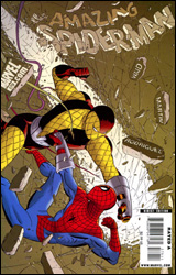 Amazing Spider-Man #579
Publisher: Marvel
Released: 02 December 2008
Writer: Mark Waid
Artist: Marcos Martin
Colorist: Javier Rodriguez
Letterer: VC's Chris Eliopoulos
Cover: Marcos Martin
Review: Guest
After stumbling upon a transit card, Peter has found himself a ride to Manhattan, but a derailment has sent the train under the river. It's now up to Spider-Man to save the day, but Shocker, who caused the mess, is after one of the passengers: J. Jonah Jameson's father.
And so it appears that Spidey has finally been able to break away from the barrage of retcons, Venoms, Anti-Venoms and the ever-useless Jackpot to take part in a much simpler, more grounded story. The writers have the Spider-Man they want, and they do exactly what you'd expect with him: tell a story that could have just as easily been written in 1978 instead of 2008. The characters are safe, complacent and simply there. Jameson hasn't changed much in, well, ever, which makes it equally admirable and baffling that they're now trying to give him a semblance of character.
The good news is that Spider-Man appears to be back to form. He's down in the streets, has some good jokes and is in conflict with the regular people in his daily life. The bad news is that it's the exact thing I've always hated about Spider-Man. This character will never be allowed to evolve. Yes, this is a competent book, but when I can read a book, then immediately not care about it afterwards, that's a problem. I know this is personal bias, but one has to wonder where Peter is going. Is this all there is to his world? It's like Peter Parker was switched out with Bill Murray and now Spider-Man is celebrating Groundhog Day over and over; it's the same Spider-Man you've known forever. Is it a good idea? Probably. Will it sell? Of course. But that doesn't make it interesting, and it doesn't make me want to read the next issue.
Martin's art is a decent fit for the web-slinger. Peter isn't a mountain of muscle, nor is he a prepubescent boy. Everyone feels mostly right, with the possible exception of Shocker. (Honestly, though, a man wearing yellow pillows is never going to look great, so he did what he could.) The faces are a real strong point, and if you can ignore that some people look as if their arms are made of rubber, there's some solid storytelling to be found in the panels.
I didn't hate this issue, but I'm disappointed that Marvel's taken all of these steps to reinvigorate the character, yet we've seen all of this before. Give it a flip through.
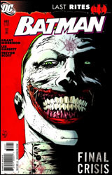 Batman #682
Publisher: DC Comics
Released: 02 December 2008
Writer: Grant Morrison
Penciler: Lee Garbett
Inker: Trevor Scott
Colorist: Guy Major
Letterer: Jared K. Fletcher
Cover: Alex Ross
Review: drqshadow
In the aftermath of "Batman RIP," Gotham faces the uncomfortable prospect of life without its guardian angel. No, despite the preceding crossover's dubious title and the Dark Knight's absence from his city's streets, Bruce Wayne hasn't bit the big one. But maybe a few important portions of his personality have, and the prospect of a Wayne without the heart to continue may be twice as unsettling as the death of a caped crusader.
Grant Morrison doesn't provide a distinct narration this month so much as he does a series of random snapshots. We see flashes and frames of Bruce Wayne's life under the cape and cowl, relationships curtailed by his activities after dark, missed opportunities to step away from his responsibilities as Batman. As an abstract spattering of personality, he nails it, but as a straightforward narrative, it leaves something to be desired. I can get into the occasional trip down memory lane, which is how this was intended, but in such a curt, random form, I found it more like watching a DVD on fast forward: you'll get a basic understanding of what's going on, but it's all kind of crammed together and disconnected.
Morrison has an unquestionable gift for drawing his readers into the situation, emotionally involving them with a startlingly short supply of vocabulary. That fact is reinforced in the pages of Batman #682, but just as quickly as the writer delivers these sharp, compelling scenes, he cruelly takes them away. The writing is great, but its focus is so scatterbrained that the actual experience of ingesting it is often frustrating.
With "RIP" artist Tony Daniels taking a breather before "Battle for the Cowl" begins, fill-in artist Lee Garbett doesn't take too many chances. In fact, his style is so similar to that of Daniels that I'd have to wonder if he's working as some sort of an understudy. Garbett's smooth, cartoony artwork is strong enough, particularly in dealing with Batman himself, and though his renditions of Robin don't fare as well, for the most part he does enough to get by. With the nature of this month's story, I noticed a few missed opportunities for creative license, particularly when the focus is on Bruce's early career, but by avoiding such risks, Garbett ensures his work is inoffensive. He's strong as filler talent goes, but not entirely ready to move up in the pecking order.
As a standalone issue, this issue is a swift disappointment. I'm sure its constantly shifting focus will look much rosier when collected in a trade paperback, but that's neither her nor there. Grant Morrison's writing is terrific, but because it comes in such short doses, I had to really reach to appreciate it. Flip through it for now, but give it a closer look when the full story is revealed.
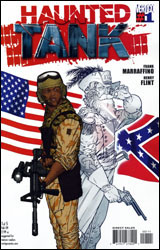 Haunted Tank #1
Publisher: DC Comics / Vertigo
Released: 02 December 2008
Writer: Frank Marraffino
Artist: Henry Flint
Colorist: Lee Loughridge
Letterer: Travis Lanham
Cover: Henry Flint
Review: drqshadow
Usually found within the pages of the old GI Combat series, the ghostly panzer was seemingly abandoned with that series' cancellation in the late 1980s. But alas! So long as there exists creators with sharp memories and editors with space to fill, no character shall remain unpublished for long.
In this fresh interpretation, the Haunted Tank has abandoned its old digs in World War II-era North Africa in favor of a new station inside present-day Iraq. It's familiar scenery � warfare against the backdrop of blackened sand � only modernized in both setting and opposition. Of course, the soldiers on the other side of the conflict are about as clich�d as they come (a ragtag cluster of underdressed, over-armed militants who descend onto the scene shouting about infidels and imperialists), but they aren't the focus of the story and the speed of their arrival is matched only by the haste of their departure. Author Frank Marraffino spends more time this month introducing us to the good guys than he does sending them into action, and it's just as well. While the speedy, intense battle scenes may be more visually impressive and exciting, the real hook of the story is with the ghost of a Confederate General, the boys he rescued from certain death and their offbeat, uneasy relationship. Besides, there'll be plenty of time for bullets and 'splosions later in this five-issue miniseries. And from the small taste we get this month, I know it'll be worth the wait.
Henry Flint's artwork is the real superstar of this issue. He must have been the kind of kid whose Trapper Keeper was filled with sketch after sketch of machinery, because he treats this job like a labor of love. His renditions of a desert-bound tank and the mechanical competition it encounters are strikingly accurate, but not stifling or lacking in individuality. His machinery wears its scratches and grime like a medal of honor, reminders of battles once fought and terrain left far behind. It carries its personality on its thick metal hide, and is identifiable as a character unto itself. Perhaps most importantly, Flint never misses an opportunity to remind his readers just how gigantic a tank really is, spotlighting its size in comparison to the men behind the controls and allowing it to tower menacingly over a full-sized pickup truck.
Flint has a mastery of impressive, cinematic storytelling, too. This issue reads more like a thoroughly fleshed-out storyboard than a traditional comic, with the artist's impressive attention to detail working with his adventurous camera angles to deliver a fantastic final product. When this tank gets moving, the sense of motion is so vivid you'll swear the panels have started shaking.
Haunted Tank is loads of fun. Its cast of characters is identifiable, admirable and genuinely funny, and their relationship with the ghost that drives their adventures is a bit more complicated than it would seem on the surface. Who could've thought it would take a comic book about a possessed war machine to bridge the enormous generation gap between the Civil War and today? This is dynamite stuff: it's light and goofy when it needs to be, deep and dirty when it doesn't. I'm buying it, give it a shot yourself.
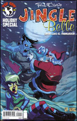 Jingle Belle: Santa Claus vs. Frankenstein
Publisher: Top Cow
Released: 02 December 2008
Writer: Paul Dini
Artist: Stephanie Gladden
Colorist: Felix Serrano
Letterer: Troy Peteri
Cover: Stephanie Gladden and Jorge Molina
Review: Preston Nelson
I hate Christmas so much that when I saw this book, I groaned. I groaned long and hard and wept to myself. But then I noticed two things. One was the name of the writer: the Zatanna-obsessed Paul Dini. That raised my spirits slightly. Then I saw the best part: Santa Claus, Frankenstein and the word "versus" pressed between them.
That is the essence of "What the hell?" ground up, dissolved, distilled and bottled.
The premise is pretty simple: Santa has a half-elf daughter, Jingle Belle or "Jing" to her friends. I don't know exactly how Santa got a half-elf daughter without nasty sexual harassment and divorce lawsuits being filed against him, but whatever. Jingle Belle is very much a Dini leading lady, meaning a slightly less psychotic Harley Quinn: energetic, bouncy, fun and a bit empty-headed. So, Jing goes out snowboarding, instead of working in the toy shop, and she accidentally discovers Mary Shelley's Frankenstein frozen in the ice of the Arctic. She wakes him up and brings him home to daddy. Hilarity ensues!
It's actually really funny. Frankenstein is the star of the book, easily. He's soft-spoken, intelligent and much gentler that anyone expects him to be. Santa is played as a harried sitcom father, with a few jokes here and there. Jingle Belle is mostly intolerable, but she's got a few cute moments. Granted, if you're looking for depth, you're in the wrong book, but they're fun cartoon characters.
The art is straight out of the old Tex Avery school of thought: big eyes, exaggerated features and fluid, rubbery movements. It's fun to look at and it fits the tone of the book nicely. It's hard to critique art like this, because it's a caricature. There's nothing realistic here, but there isn't supposed to be. It's a cartoon on the pages of a book, nothing more. The bodies in motion look solid, the colors are bright and lush. It's all good.
Borrow it. It's a great introductory book for a younger kid just getting into comics, but has a few moments that even got a chuckle out of this grinch.
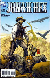 Jonah Hex #38
Publisher: DC Comics
Released: 02 December 2008
Writers: Justin Gray and Jimmy Palmotti
Artist: Jordi Bernet
Colorist: Rob Schwager
Letterer: Rob Leigh
Cover: Jordi Bernet
Review: Preston Nelson
Western comics, as a rule, are a mixed bag, but Jonah Hex is always at the top of the pile. The title character is a little bit of "The Man with No Name," a touch of Rooster Cogburn and a big heap of facial scars. Naturally, he's played like a post-Civil War Frank Castle, rocking his way across the Old West, shooting people that deserve it and drawing the ire of authority figures along the way. Of course, what happens when one of those authority figures manages to track Jonah down and administer his own brand of justice? That would be the crux of this issue.
The issue opens in a really shocking way: Jonah is getting beaten up in the desert. Not like losing a fight, but just getting pummeled, completely unable to fight back. Hex throws more quips than fists, attempting to throw his attacker into a frenzy, but this guy is way too focused. You see, because of Jonah, this man lost everything, but Jonah isn't actually sure what he did. And he really doesn't care.
The sheriff who's beating Jonah down explains his motives, and it's a really great story filled with shades of grey. You feel for the man, because even though he's not completely absolved of blame, he has the best interest of his town and son in mind.
This book is a bastion of characterization. Though the sheriff is a one-off foe, he's more fully developed than many of the already established characters in comics today. He has every right to feel the way he does, and though attempting to murder Hex may be a step too far, that's why he's a villain. Hex, seen as the troublemaking, mysterious stranger, is handled beautifully throughout the whole issue. He's just on the periphery, and the issue is fine that way.
My only complaint is the way the book looks. It has a very stylized feel. There are too many lines on the faces of the important characters, but background characters look like they were ripped straight from the pages of Archie. It's jarring and supremely off-putting. The scenes with the sheriff beating Hex are very nicely done, but calmer scenes look scratchy and rushed. The colors, however, were painstakingly laid on the page, and it shows.
In the end, this is a great story, but the look is just so crippling. Flip through it.
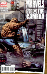 Marvels: Eye of the Camera #1
Publisher: Marvel
Released: 02 December 2008
Writer: Kurt Busiek
Artist: Jay Anacleto
Colorist: Brian Haberlin
Letterer: Richard Starkings and Comicraft
Cover: Jay Anacleto
Review: drqshadow
In Marvels: Eye of the Camera, we catch up with Phil Sheldon, the unassuming leading man of Marvels. A photojournalist in every sense of the word, Sheldon is always on the job and the action always seems to gravitate toward him. He's always in the right place at the right time with a camera on his hip and an itchy trigger finger.
Although Ross is occupied elsewhere, writer Kurt Busiek has returned to the property he co-created nearly 15 years ago. His familiarity with both the characters and, perhaps more importantly, the tone and subject matter, cannot be overstated. I can't imagine this series working nearly as well under another writer's watch. And although the original Marvels covered a wide array of crucial moments in the publisher's timeline, there's no shortage of good material to burn in the follow-up. This month, for example, we're looking at the moment the floodgates opened, when the Fantastic Four held their first press conference and the flow of new heroes burst forth like a blast of water from the fire hose. It's a natural story to tell, one that will be welcomed by fans of the original, but it's missing the fire that made its first run so compelling.
Artist Jay Anacleto wisely doesn't try to match the efforts of his famed predecessor. Even after all this time, there isn't anyone quite like Alex Ross. And though Anacleto does adopt a style that vaguely mimics the painter, he injects enough originality to avoid a direct comparison. Problem is, the new artist's work isn't strong enough to make readers forget about what had come before.
A big part of what made the original Marvels work was its tremendous visuals, which jumped right off the page and into our world. They were sharp and colorful, but mostly relatable. The very concept of a pedestrian perspective into a superhuman world banks entirely on the power of the book's illustrations, and despite his best efforts that's just something Jay Anacleto isn't able to deliver here. His characters don't feel natural; the world they occupy is washed out and short on contrast. Everything is painted over with the same shade of soft, muted grey, like the entire country is dozing off. Rather than enhancing the ordinary, he's muted the incredible.
As a direct continuation, Eye of the Camera is suitable. It touches the same bases, asks similar questions and retains the sense of wonder. It's every bit the spiritual successor I have to think it was intended to be, but it's almost too much of the same thing. When the original series landed, it was like nothing we'd ever seen before: a human perspective into a traditionally superhuman world. Now, years later, it's not quite as original or endearing. Borrow it.
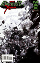 Punisher MAX X-Mas Special
Publisher: Marvel / MAX
Released: 02 December 2008
Writer: Jason Aaron
Artist: Roland Boschi
Colorist: Daniel Brown
Letterer: VC's Cory Petit
Cover: Chris Bachalo
Review: Guest
When one thinks of Christmas specials, the first images to pop into your head are likely really poor Claymation and boring Charlie Brown movies, not Frank Castle shoving a knife into Santa's kidney. I know they've done this sort of thing before, but is there really a more useless idea for a comic book? (Well, yes, but that's not the point. The point here is that you're being expected to pay for this.)
Regular readers know that I love The Punisher. I gush about it almost every time I'm asked to review it. That said, The Punisher is very much the Taco Bell of comic books: sometimes those ingredients are fresh, delicious and leave you wanting more, but occasionally you'll stumble in late at night and the guy making your burrito hasn't changed the meat since noon. Try and guess which book showed up here.
Two mob families are competing for turf in the city, and one of the groups is almost completely wiped out thanks to Frank Castle. The only remaining target is an expected baby that will continue the family legacy. So dozens of mobsters are hired to kill a newborn, because for some reason they can't just wait a few months when maybe the parents aren't, say, in a public place like the hospital. And what does any of this have to do with Christmas? This book is every bad crime movie jammed into one package; people can be shot in the head from 100 yards away with a handgun, everyone turns on everyone and a million people die without the police ever once getting involved. If that wasn't clich�d enough, there's a villain playing golf indoors. I shit you not. The only thing missing is a dramatic helicopter escape, and a plucky young sidekick with a golden movie ticket.
If the recent flop of a movie has shown us anything, it's that this title is supposed to be more than just gun porn. Frank Castle isn't some invincible soldier named Blast Hardcase who hangs upside down from ceiling fans while shooting a dozen guns simultaneously. He's a grizzled bastard that survives by being smarter than everyone else. Frank is so insanely unstoppable in this book that it's a wonder crime exists at all in the Marvel Universe. And there is nothing more boring to read than a hero that never gets into danger and always escapes without a scratch.
Roland Boschi's art is very take-it-or-leave-it; while it serves its purpose (RE: depicting lots of corpses and bloody wounds), the storytelling can be lacking. There was a point in the book where a group of mobsters poured out of a van, but seconds later it appears that Frank steps out of the same van. It might seem like a little thing, but it's a little thing piled on top of other little things, making this a skip. Jason Aaron can do better. I've seen it.
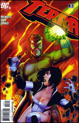 Terra #3
Publisher: DC Comics
Released: 02 December 2008
Writers: Justin Gray and Jimmy Palmiotti
Artist: Amanda Conner
Colorist: Paul Mounts
Letterer: Sal Cipriano
Cover: Amanda Conner
Review: Guest
Oh my! Am I seeing things? Is this really a DC comic with a � GASP! � recap page? Could this be true? Have the heavens finally opened and granted me the one thing (besides Kate Beckinsale) that I ever so desire?
Damn skippy!
The purpose of this miniseries is to establish a new character in the mantle of Terra. She's a young woman named Atlee that looks like she was in the midst of a Zatanna cosplay before running out of fabric. She's ended up in a mysterious land called Markovia, which is led by superhero Geo-Force. Unfortunately, Geo-Force's body has been overtaken by an evil creature known as Deathcoil, who also has control of a zombie army. Man, this is a strange feeling. I actually know what's happening in a DC book for once! Let this be the start of a trend, please.
To cap things off, this is a surprisingly well-executed issue. Atlee comes off as instantly likable thanks to some very smart, very funny dialog. She's almost written too well at parts, to the point that you don't want to see her end up as just another Teen Titan. There's a real presence that she brings, carrying the book on her genuine qualities than anything happening in the story. What starts as a rather grounded, simple tale very quickly twists into a sci-fi-ish drama, complete with some nice character development. There is one particular character that goes through a whirlwind of emotions, blurring the lines between good and evil, and at no point can you really blame him. In a few panels you're able to truly feel for someone you've likely never seen before. Not too shabby for a book that seems to have no ties to big events or major continuity. It's just a fun book looking to tell a solid story. Why is that the exception instead of the rule?
It's a gorgeous book to boot. Amanda Conner, despite being a woman, doesn't skim on the absurd amounts of cleavage for her women, and her sharp, clean style is a thing of beauty. But that's far from the best part! The true highlight here is Conner's portrayal of the alien worlds beneath the planet's surface. The scenery is simply breathtaking. Everything is chaotic, threatening and beautiful all at once. She has become a favorite of mine with this single issue.
Buy this book. It's fun, easy and freaking gorgeous!
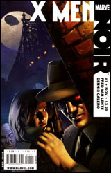 X-Men Noir #1
Publisher: Marvel
Released: 02 December 2008
Writer: Fred Van Lente
Artist: Dennis Calero
Letterer: Blambot's Nate Piekos
Cover: Dennis Calero
Review: Preston Nelson
Like most alternate reality stories, X-Men Noir is an intriguing concept. Take the X-Men and turn them into a very human crime syndicate. Their only powers are being utter sociopaths, trained by Xavier to be a better class of criminal. The concept: kill off a certain redhead on the first page, and set Detective Fred Dukes (Blob) and his rookie partner, Peter Magnus (Quicksilver), on the case.
And while it's a really cool concept, it's not flawless. My very first problem with the book is that I had to think about who's who. Dukes / Blob was apparent from the start, because he looks exactly like Harvey Bullock. But it took me forever to realize that Peter was Quicksilver. And from there, I still had trouble figuring out the rest of the cast. It's not like I'm unfamiliar with my X-history. I know these characters in and out, they're just buried in so much cheesy dialog and shadow that figuring it out is damn near impossible.
Speaking of which: I know that it's noir. I love film noir, I really truly do. But the idea is to use shadow to add to the scene. Make it dark, make it intense, make it suspenseful. But I still want to see what's happening. When I paged back through the book, knowing things, I caught the subtly laid hints, but I missed them the first time around because I wrote them off as shadows.
Another gripe: If you're going to do a noir book, you can do it without cursing. That's fine. Some of the best noir movies don't need to curse. When you make the decision not to curse, stick with it. But if you make the decision not to curse, you'll need to write the script as such. However, don't write the script with the curses then scribble them out. I don't know if this was an editorial decision or a choice the writer made, but it doesn't work. Either curse or don't. It's not a book aimed at children and nuns; no one is going to object to a street-hardened cop calling something "bullshit." There's blood and murder and violence, but naughty language needs to be censored?
This book is nothing more than groundwork for the rest of the series, and if those issues are great, this might be worth it. But, on its own, this book is wasted potential. It's cool to see the X-Men in a very Gotham-like setting, but, really, they're barely in this issue. Skip it.


