Is It Wednesday Yet?
25 November 2008 � Here we are again with another installment of your favorite comic book review series. As always, the reviews are free of spoilers, so read on without fear of having your experience ruined!
Our grading scale is simple:
Buy: An excellent comic book.
Borrow: A good comic, but save yourself some money by reading a friend's copy.
Flip Through: Give it a once-over at the comic shop.
Skip: This doesn't need to be explained.
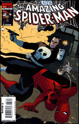 Amazing Spider-Man #577
Publisher: Marvel
Released: 12 November 2008
Writer: Zeb Wells
Artist: Paolo Rivera
Colorists: Javier Rodriguez and Dean White
Letterer: VC's Cory Petit
Cover: Paolo Rivera
Review: drqshadow
Spider-Man and the Punisher share a long, rich history that dates all the way back to Amazing Spider-Man #129. While the heroes' personalities couldn't be much more different, they've managed a tenuous coexistence ever since � although their paths have crisscrossed with such regularity that it's grown a bit beyond mere coincidence. And, since Frank's back in the Big Apple, it should come as no surprise to hear his adventures have once again led him into Spidey's territory.
This issue struggles to determine what kind of story it would like to tell. While the tone of Peter Parker's self-deprecating and oblivious internal monologue is akin to an indie book, it's counterbalanced by an almost cartoony take on the Punisher and his activities. Writer Zeb Wells drops his readers into a realistic New York City, sharing Parker's insecurities as he tries his luck as a cabby, and it works. In fact, maybe too well, as the sudden leap he then takes into costumed brawling, dead criminals and loud explosions feels completely out of place and unwelcome. One minute we're grimacing and identifying with a loser, � la Optic Nerve, and the next we're watching a skull-faced robot shoot up a roomful of mobsters like freaking Robocop. Couldn't we just stick with one or the other for a little while?
The issue's identity crisis is continued, even embraced, by Paolo Rivera's contributions as artist. On some pages he shows the influence of Alex Maleev, Sean Phillips and the gritty current generation of Marvel artists, while on others he channels Ditko, Buscema and the more gestured style of the publisher's old guard. Oddly, his take on Spider-Man himself doesn't look right in either instance. He takes a more disciplined approach to the title character than I'm used to, and while that gives readers a more realistic visual at times, it robs the character of his personality. While hundreds, maybe thousands, of artists have tried their hand with Spidey over the years, one constant has been his grace and rather unique posturing while in costume. Rivera's rendition is lanky, stiff and awkward. It's like watching the old Spider-Man TV series from the 70s: the costume is right, but the guy wearing it has no idea how he's supposed to be moving.
I really can't recommend this one. It doesn't know what it wants to be, and even if it did, I can't imagine it would be executed very well. On the few instances where it settles down on a specific direction, the issue delivers a plot that's paper-thin, renders two characters unrecognizable and craps out dialog that's unfit for any reader. It's frequently ugly, consistently tough to follow and ultimately inconsequential. It's a double-sized issue, too, so skip it twice.
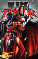 Black Terror #1
Publisher: Dynamite
Released: 12 November 2008
Plot: Alex Ross and Jim Krueger
Script: Jim Krueger
Artist: Mike Lilly
Colorist: Vinicius Andrade
Letterer: Simon Bowland
Covers: Alex Ross and Greg Land
Review: drqshadow
Earlier this year, famed creator Alex Ross teamed with Dynamite Entertainment to produce Project Superpowers, a limited series that focused on a handful of characters from the 1930s and 40s. Originally promoted by a variety of now-defunct publishers during the Golden Age, much of the title's cast had faded into obscurity within the public domain, and Ross took the opportunity to rejuvenate them. Now, following the success of that original series, the title's creative team has come together again to launch a series of individual titles focused on Superpowers' inhabitants, the first of which lands this month in the form of Black Terror #1.
Alex Ross and Jim Krueger share the writing credits, collaborating on the plot while Krueger tackles the script alone. Naturally, Ross is the selling point, so he takes top billing. Black Terror artist Mike Lilly also takes a back seat to the famed creator, who's credited for "artistic direction" in stark contrast to Lilly's "interior art."
For what it's worth, though, the Kingdom Come veteran does seem to have delivered the most successful pieces of this pie. The classic character designs benefit from the light touch but sharp eye seen in Ross' redesigns. Its premise, a set of forgotten heroes who return to an America that's vastly different from the one they left behind, provides a fine commentary on just how much things have changed since World War II. If that sounds an awful lot like Marvel's The Twelve, that's because, superficially, they're almost identical. But where J. Michael Straczynski's characters initially embraced the government, Ross' heroes remain skeptical and choose to observe from the sidelines before jumping in. While the two stories share a similar concept and a commonly jaded outlook, as their events play out they seem less and less alike.
Ross' collaborators don't fare as well. Jim Krueger's script is excessively wordy and tough to work through. I can deal with one or two long-winded, robotic personalities at a time, but when the issue is bursting at the seams with them, it gets to be too much. While this miniseries may be titled after a single character, it's very much a team book, but no one character stands out as identifiable. They're all just stale shades of the same tone, sharing a penchant for out of place film references and sudden, action-halting monologues. Mike Lilly's artwork does more with Ross' influence than Krueger's writing, but even the visuals are generally cluttered, murky and difficult to navigate. Lilly shows some promise in a few spots, but ultimately he succumbs to the strain of trying to tell too much story for a single chapter. He never gets a chance to slow down and breathe, finally buckling under the pressure.
Black Terror #1 had all the ingredients to become something interesting, and its heart was in the right place. And though I've seen more anti-government slants in comics than I care to count, this take on it managed to be both original and compelling. But somewhere in between the imaginary world of concept and the physical land of realization, the series faltered. The artwork is too dense and rich for its own good, and I rolled my eyes so frequently at the book's awkward prose that I felt dizzy when I reached the last page. With a good editor, a tighter vision and a more cohesive creative team, the book could turn a sharp 180, but I'm not holding my breath. Until it can get its act together, you're better off flipping through it and leaving it on the shelf.
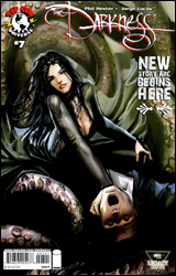 The Darkness #7
Publisher: Top Cow
Released: 12 November 2008
Writer: Phil Hester
Artist: Jorge Lucas
Colorist: Lee Loughridge
Letterer: Troy Peteri
Covers: Jorge Lucas and Stjepan Sejic
Review: Guest
Last time I read / reviewed The Darkness, Jackie Estacado was in the midst of building a narcotics empire centered around the fluids of the Darkness. Shockingly, it didn't work out so well for him, and now he's on the run, headed back to the States. To cap things off, his powers are starting to turn on him, and his grasp of the Darkness appears to be slipping. Along the way, he stumbles into a town under the curse of a nearly naked witch that feeds on dreams and has a vagina from hell. The expected antics ensue.
I have to say that the art in this issue took some getting used to. It's of the expected Top Cow quality, but the usual dark, urban tone is noticeably absent from the first half of the issue. I honestly had a brief flashback to Wolverine: Saudade as I was overpowered with the light Earth tones that assaulted my eyes. Once we got to more familiar territory, however, things fit back together to the point that you actually missed the dark when it wasn't there for Jackie. The style here is different from the glossy, line-heavy panels that we've become used to, but it's actually a welcome change.
The issue itself stands well enough alone. You don't really need to know anything about the character to follow along. As such, this is a great jumping on point; you jump in, get some cool moments and you jump out.
The Darkness is one of the most consistent books put out by any company today. It rarely disappoints, and this issue is no different. Buy it. You'll get a nice story that's worth your money, and it has a monster made out of headstones. What's not to love?
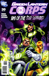 Green Lantern Corps #30
Publisher: DC Comics
Released: 12 November 2008
Writer: Peter J. Tomasi
Penciler: Patrick Gleason
Inker: Rebecca Buchman
Colorist: Randy Mayor
Letterer: Steve Wands
Cover: Patrick Gleason
Review: Guest
A female warrior race known as the Zamarons have been harvesting power from various yellow rings found across the galaxy, using them for their own violet batteries. Various members of the Sinestro Corps have also been taken captive, and are being experimented on by the Zamaron queen, who is looking to focus the power of love in their hearts. The Guardians are weary of their intentions, and seek counsel with them to try and prevent another group from entering the impending war.
Despite reading a spare issue here and there, I can't say that I'm really up on the veritable rainbow of developments going on in the world of the Green Lantern Corps, as each passing week seems to give way to another flavor of ring-bearer that's making some issues seem less like cosmic warfare and more like a Skittles advert.
This isn't to say that the stories being told aren't good ones. Quite the contrary in fact. The Green Lantern universe is the most exciting it's been in quite a while. The only real problem to speak of is that this is clearly not the time to start reading the series if you haven't been keeping up. This issue is very skimpy when it comes to any sort of action. There is a subplot involving a baby-stealing member of the Sinestro Corps, but his encounter with the Greens serves more as support for the impactful developments on the last page, and less of an issue on its own merits. What we have here is a book that is, to steal a term, "meetings-tastic." The difference is that, while it may take you more than one reading to get the gist of what's going on, the meetings do have a lot of value to them; things will come to a head in the near future.
Gleason's work is surprisingly good; he brings energy and life to the page, and for an issue mostly comprised of talking heads, that's quite an accomplishment. There is a creative sense of storytelling here, and Guy Gardner stands out more in how he's drawn than anything that's said.
This is a difficult book to grade, in that while the content may very well blow one person away, someone else could be completely unimpressed � or worse, confused by it. It's a solid borrow, for sure.
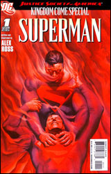 JSA Kingdom Come Special: Superman
Publisher: DC Comics
Released: 12 November 2008
Writer: Alex Ross
Artist: Alex Ross
Colorist: Alex Sinclair
Letterer: Rob Leigh
Cover: Alex Ross
Review: drqshadow
It's a showdown of the Men of Steel! Long after the events of the original Kingdom Come, that world's older, wiser Superman continues to struggle with the ramifications of a lifetime's worth of actions. Would Earth-22 have been better off without him? Does the butterfly effect of his good intentions result in a catastrophic counterbalance of evil? It's heavy stuff, and the elder Supes is tired of waiting around for the answers to reveal themselves. Inexplicably landing on Earth-1, he's sought out familiar faces who haven't the foggiest what he's talking about, and now finds himself trading blows with a younger, more emotionally stable version of himself.
Alex Ross wears two hats in this issue: those of both writer and artist, and both are hauntingly familiar. While I wasn't too keen on the idea of revisiting a story with such a well-defined beginning and ending, especially one as successful and far-reaching as Kingdom Come, if DC had to go back to that well I'm glad they chose one of the original creators to take them there. Under Ross' eye, this issue has successfully recaptured both the look and feel of the original series. The spaced out, paranoid older Superman that's come to our reality isn't far removed from the last time we saw him, and reminds me of just how well-written that series really was. He's haunted by constant flashbacks to the events of that classic miniseries, at once reinforcing the sense of sadness and loss that invade his personality and reminding readers of the story's most memorable moments. In many ways, Earth-22 Superman is more real, more understandable than his regular-continuity brother. His faults make him relatable, his losses lend humanity.
It's an odd sensation to browse an issue of Alex Ross artwork that's been composed with pencils rather than paint. It's a stark, contrasting effect, and one that's not unwelcome. Gone are the lush, vibrant hues and the smooth, lifelike palettes that helped his work reach the top of the industry in the early 90s, but in their absence I've grown to appreciate the man's eye for composition. This issue carries the same panache and detail that I so enjoyed during his heyday, but the everyday color scheme grounds it in a much more identifiable tone. It was easy to write-off the original Kingdom Come as impermanent, a dream, thanks to those soft, ethereal visuals. Now that he's working strictly with pencils and inks, Ross' artwork has a rougher edge and feels more consequential. Or it at least has a common visual footing with the rest of the mainstream DC Universe, so it feels more at home.
This issue would work just fine as a standalone reminder that you should really go back and reread Kingdom Come. That it adds a relevant modern narrative is just icing on the cake. No matter your feelings on the publisher's decision to revisit a world that would have been just fine as it was, this is worth an unbiased look. It isn't often that you'll see lightning captured in a bottle twice, but JSA Kingdom Come Special: Superman is as close as I think anyone could have imagined. Buy it and enjoy the trip down memory lane.
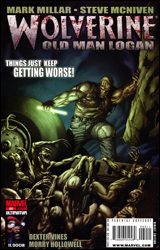 Wolverine #69
Publisher: Marvel
Released: 12 November 2008
Writer: Mark Millar
Penciler: Steve McNiven
Inker: Dexter Vines
Colorist: Morry Hollowell
Letterer: VC's Cory Petit
Cover: Steve McNiven
Review: Guest
When the decision is made to put Mark Millar and Wolverine together, the expected result from my end is a combination of creative hand gestures and more four letter words than a crossword puzzle for truckers. I've made it no secret that I hate Wolverine. He's a contrived, formulaic character that lost every little bit of intrigue once Marvel decided that we needed to read about every major development that had ever happened in his life. He is a portrait of a lot of what was wrong with comics back in the 90s. Mark Millar, by the same token, represents to me a lot of what's wrong with comics today. In his years of work, he's written one story I've liked, and I'm still convinced it was an accident. He has often shown in the past that he cares more for shattering expectations than telling a good story.
All of that said, however, I've actually liked this storyline so far. Maybe all of the X-Men issues from my childhood have given me a soft spot for alternate futures, but the first three issues managed to click together so much that I genuinely cared for Logan and his plight. This, however, is the issue where things look to be heading a bit south.
For those that haven't been following up to this point, there was a great battle between good and evil. Since the baddies vastly outnumbered the heroes, it was only a matter of time before they fell. That was 50 years ago, and Logan, one of the few survivors, hasn't popped his claws since that night. The world is now a criminal wasteland divided among the victors, and the Canuck has settled down with a family of his own, trying to forget all of the violence. Unable to pay the rent (collected by the inbreed kin of the Hulk and his cousin), Logan agrees to escort a now-blind Clint Barton to the other side of the country for a mysterious delivery. Along the way they've encountered all likes of crazy characters, not the least of which is Hawkeye's daughter (who is also somehow Spider-Man's granddaughter; I really don't want to do that math in my head) who for no logical reason wants to kill her father and become the new Kingpin. It's here that we start the issue, and you'd think it would be nothing but nail-biting, high-octane action. And you'd think wrong.
I can forgive the rather slow build up to this point. After all, it's an eight-issue story. But we had gotten to the point that we needed to be told what happened the night the heroes fell. Instead, we have an issue of blatant stalling. There's no other way to put it, really. In this issue, Clint and Logan go sightseeing while Millar takes a second to not only tell us we should be reading Fantastic Four, but he also more or less spoils the ending of the entire story. I wish I was kidding. Subtlety is not the man's strong point.
Steve McNiven's art is what it's always been; quite simply, it's some of the best visual work that Marvel produces. I can't say for sure that this arc would have been able to hook me as much if it were in the hands of a lesser artist. He's the kickstand, holding this book upright, and it goes without saying that anything McNiven touches is at the very least worth a look.
From a story standpoint, this is a nothing issue that really puts the brakes on what had been a very well-paced tale. It's not enough for me to give up on the book, but I'd be lying if I said that some of the magic wasn't gone. Flip through it and get the basic gist of where things are going. (It won't take you long.) With Millar at the helm, I don't have a lot of hope for this story, and his track record with third acts is shaky at best. But it's still a strong concept, and I don't think it's time to abandon ship just yet.


