Is It Wednesday Yet?
04 November 2008 � Here we are again with another installment of your favorite comic book review series. As always, the reviews are free of spoilers, so read on without fear of having your experience ruined!
Our grading scale is simple:
Buy: An excellent comic book.
Borrow: A good comic, but save yourself some money by reading a friend's copy.
Flip Through: Give it a once-over at the comic shop.
Skip: This doesn't need to be explained.
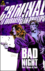 Criminal #6
Publisher: Marvel / Icon
Released: 22 October 2008
Writer: Ed Brubaker
Artist: Sean Phillips
Colorist: Val Staples
Cover: Sean Phillips
Review: Guest
Jacob doesn't look like your average convict. His docile appearance leads itself more to that of a tech support guy or the weird dude down the hall in the office that smells the air whenever the hot chick from accounting walks by. He seems creepy, but ultimately harmless. His design alone is a good representation of what you're going to get with Criminal, as it's a book that thrives on taking your expectations and turning them upside down.
It starts like one would expect: a noir tale full of grit and internal monologue, but after only a few pages, you really get a sense of how complex these characters and their relationships are. Jacob and his de facto partner, Iris, are, in a manner of speaking, pretty fucked up � blurring the lines between violence and sexuality with their every interaction. What makes this all the more chilling is the fact that they barely know one another, let alone their real names. Just when you think you have it all figured out, the book throws you one more curve, and for a single issue, it's surprisingly dense. There is a lot of story here, and because of that, the issue really stands on its own fairly well.
What makes it work is Brubaker's characterization of Jacob. He's not a street-hardened thug. Rather, he's as clueless as we are at times, and astoundingly gullible to boot. He's paranoid and confused, and to top it off, he's being haunted by a guardian angel lifted straight out of Preacher. Even if not for the constant barrage of twists and dream sequences, he is written like all of the best characters: profoundly flawed, yet irresistibly sympathetic. It's the sort of thing we've really come to expect from Bru, but it's no less worth the mention.
If the book has any flaw to speak of, it's the art. While not horrendous or unsightly by any means (although I really could have done without the obese stripper in a thong, thank you), Phillips has some issues with consistency. His visual storytelling is competent and his style definitely works for the subject matter, but his expressions are where things tend to go south. On occasion, he'll draw a face so utterly cartoony or stiff that it can be hard to take what is essentially a humorless book seriously. It doesn't ruin the story, but it's there and it's noticeable.
Due to the nature of Criminal, each arc is self-contained, so this is a great starting point. Not only should you buy it, you should consider picking up some back issues or trade paperbacks. It's that good.
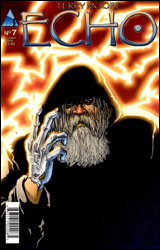 Echo #7
Publisher: Abstract Studio
Released: 22 October 2008
Writer / Artist: Terry Moore
Cover: Terry Moore
Review: drqshadow
Having followed Strangers in Paradise for the better part of a decade, right up to its conclusion late last year, I'm fairly familiar with Terry Moore's work. And while the subject matter of Echo is conceptually very different from what he produced with Strangers, its execution is very similar. After doing just about everything he could with Katchoo, Francine and friends, Moore is clearly hungry to flex different muscles. Instead of drama centered on a friendship that can't tell if it wants to become something more, Echo is more along the lines of a low-budget, high-concept science fiction movie.
But while their subject matter may be about as different as they come, the little spots of individuality and charm that shone throughout Strangers in Paradise are also evident during Echo. The new series features the same slow pace and casual dialog that made its predecessor what it was, and the tone of the story is very familiar. This is still excellent storytelling, if a bit more sluggish than I'd prefer, but because it's so close in flavor to what he's accomplished in the past, I don't think it provides the kind of clean break and fresh start that Moore (or maybe this reader) was searching for.
There are few in the field who can fill out a cast quite like Terry Moore, and Echo provides further proof towards that case. In Julie, a photographer in the wrong place at the right time, he's crafted another strong female lead. At work in the desert, Julie inadvertently witnessed the failed testing of a government-funded battle suit, climaxing in a violent explosion that tore the outfit and its pilot into a million pieces � showing Julie and her truck in liquefied shrapnel. Despite her best efforts, she can't scrub the stuff from her skin, and now that the feds know who she is, the chase is on. Julie, her companions, the agents in search of her and everyone in between benefits tremendously from Moore's skills in this regard. We've only just been introduced, but already I know plenty about each of them.
Echo's artwork is, again, a direct continuation of what was going on in Strangers when it reached its conclusion. When he rewards himself with an active plot and a compelling story to tell, Terry is one of the best at visual storytelling. He benefits from playing dual roles as writer and artist, showing restraint with his narration when a solid panel or two is all the situation requires, and for the most part that helps keep the issue moving at a fairly decent pace. There isn't a lot of action during this month's story, but outside of a few dull conversational panels near its conclusion, the artwork does a fine job of keeping its readers engaged.
Echo isn't the overarching saga that Strangers was. While its cast has a similar amount of depth, they don't connect with the readers like the crew of Moore's previous series and the new sci-fi backdrop hasn't done enough to lift the series up so it can stand on its own. It feels more like a gimmick, something to keep the story from growing too reliant upon the character-driven dialog, and not the focal point that I expected it to be. Maybe that will change as the series picks up speed, but until then I'm going to remain hesitant. Borrow this; it's good stuff, but there's something missing.
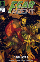 Fear Agent #24
Publisher: Dark Horse
Released: 22 October 2008
Writer: Rick Remender
Penciler: Tony Moore
Inker: John Lucas
Colorist: Lee Loughridge
Letterer: Rus Wooton
Cover: Tony Moore
Review: drqshadow
A throwback at heart, Fear Agent is a long-running love letter to the science fiction classics of the genre's infancy. It spotlights action and adventure above all else � often at the expense of explanation � and asks its readers to suspend their disbelief and overlook the specifics in exchange for a wild ride that doesn't slow down. Take protagonist Heath Huston's latest adventure, for example: stranded on a desert planet alongside a slew of cowboy robots, mutant monsters and buxom ladies, Huston narrowly avoided a surprise attempt on his life. Taking a bullet in the process, he limped to the desolate town of Heaven, where his ex-wife just so happened to be making her current residence. Of all the washed-up, backwater Podunk towns in the galaxy to stumble into...
Rick Remender's storytelling this month is much more in line with a Western than a space-faring adventure. But while his cast may be wielding more six shooters than lasers, they've retained their depth and appeal. Remender doesn't allow the story to take itself too seriously, though a scene near the end of the issue comes close, and still manages to sneak a sudden fight scene into the middle of what's otherwise a fairly low-key, character-driven episode. Though the writer keeps the cast very small, almost surprisingly so, the story never seems to want for more faces. (Like a good film, Fear Agent would rather focus on a handful of developed, recognizable individuals than an armload of also-rans.) The plot keeps a steady pace from cover to cover, sets the pieces for a future brawl and delivers on an ambitious range of emotions. My only complaint is that it wasn't longer.
If you're familiar with Tony Moore's work on The Exterminators or The Walking Dead, his contributions to Fear Agent won't come as much of a surprise. Moore's quick, concise lines and texture-rich visuals lend the book a flippant personality that fits nicely with the tone of the storytelling. Whenever I've had the pleasure of taking it in, Tony's been having so much fun with his work that it quickly becomes infectious. His unconventional renditions of alien creatures are a case in point; refreshingly far from the beaten path, they're one of the book's greatest strengths. (The evil alien mastermind in this issue doesn't even have a face!) While the writing may ask its readers to turn off their brains and just enjoy the ride, the artwork outright demands it.
Although Fear Agent sets the stage for its adventures by claiming it's just a joyride, this month's product shows signs of being much more than that. It's still going through some growing pains and not every emotional shift is a successful one, but the basics are strong and the changes haven't come at the expense of the book's identity. This is a series that's more than willing to take risks with its cast if it makes for an improved story, while still managing to keep hold of its patented sense of humor and eye for wild action. I enjoyed it, and while I don't think it's maximizing its potential this month, it's still worth experiencing: borrow it from a friend.
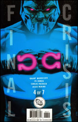 Final Crisis #4
Publisher: DC Comics
Released: 22 October 2008
Writer: Grant Morrison
Artists: JG Jones, Carlos Pacheco and Jesus Merino
Colorist: Alex Sinclair
Letterer: Rob Leigh
Cover: JG Jones
Review: Preston Nelson
Final Crisis is a rare example of almost everything going right in a book. Grant Morrison is on. The art is on. I have some minor gripes, but in all honesty, this is what a huge crossover event should be. And while I'm the first person to say that these massive crossovers are done far too often, DC has found the key to make this one fresh.
You know what makes crossovers boring? It's always the same characters leading the charge. DC has avoided this by taking the top three names out of the equation. Superman is in the future. Batman is going insane. And Wonder Woman is... busy at the moment? This gives some of the older and more minor characters a chance to shine. Alan Scott is not only around, but leading a group of survivors. Green Arrow and Black Canary are making themselves known. Mister Terrific is a huge player. Heck, even a minor villain like The Tattooed Man gets a nice speaking role.
And in this newness of character, DC has really created something special. You have these heroes hidden away while their world is slowly devoured around them. People are falling. Friends are being converted into mindless enemies. Darkseid is winning. This book is somewhere between a George Romero film and the alien invasion from Halo � and it's awesome. There's a real feeling of hopelessness here, and I honestly don't know how the humans are going to pull this one out.
The art is spectacular. I don't exactly understand how they have three artists on this issue, because it holds together that well. I don't know where Jones ends and Merino begins. There's use of light and shadow that evokes the hopelessness that Morrison's writing demands. And the way Darksied has been drawn evokes a sadness that makes him sympathetic. The issue doesn't make mention to it, but if he's not dying or very ill, I'll be incredibly surprised.
I can't say enough good things about this book; it's the best crossover I've ever read. Buy it. Marvel, takes notes!
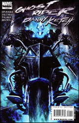 Ghost Rider: Danny Ketch #1
Publisher: Marvel
Released: 22 October 2008
Writer: Simon Spurrier
Penciler: Javier Saltares
Inker: Tom Palmer
Colorist: Dan Brown
Letterer: VC's Joe Caramagna
Cover: Clint Langley
Review: Preston Nelson
Ghost Rider is a weird character. He's such a niche, that he's his own niche. Normally, I'd make some inane comparison about him, but I got nothing. Wait. I got one: he's kind of like John Wayne and Silver Surfer's love child, with a flaming skull for a head. And as weird as the Johnny Blaze incarnation is, Danny Ketch is even weirder. Ketch brought in three of Ghost Rider's most notable ideas: the chain, the spikes on his jacket and the Penance Stare. Ketch brought those in, and then he was gone. Blaze went back to being Ghost Rider, and Ketch got the demon out of himself via an exorcism, presumably to live a normal life.
Of course, things don't always work out like they're planned, and two years later, Danny wound up a miserable drunk begging to get the demon back.
It's a great premise, and it works. Ghost Rider has always had sort of a cowboy vibe to him, and as an avid fan of Westerns this is an update of a classic story. The old gunslinger gets out, but realizes he needs the thrill to be happy. But for Danny, it's not as simple as grabbing his Winchester and saddling up Tornado; he's got to find a way to get the demon back.
This really isn't what I expected from a Ghost Rider book. It's a great character study with some smart bits, but it's not above clich�s, either; namely, the mysterious foreign chick who knows more than she's letting on. But, it's a fun read all the way through.
The art screams Joe Quesada, but it's not. Saltares is clearly influenced by Joe, with big cartoonish faces and rough, scratchy lines. It works with the sort of gritty, dirty feel of the setting. The bar that Danny is in feels like a dive bar, just because of the way Saltares has drawn it. Palmer's colors really shine when Ghost Rider finally hits the scene, but that's when Saltares' pencils start to fail me. Ghost Rider is spectral, frightening, even hellish, but he just doesn't feel it.
I was really surprised by just how good this book was. Ketch is an intriguing character and I'll be keeping an eye on this series. It's a modern Western with a supernatural twist. Buy it.
 Hellblazer #248
Publisher: DC Comics / Vertigo
Released: 22 October 2008
Writer: Andy Diggle
Artist: Leonardo Manco
Colorist: Lee Loughridge
Letterer: Jared K. Fletcher
Cover: Lee Bermejo
Review: Guest
So Lord Burnham has made a grisly deal, guaranteeing him a harem of slave girls after he passes on. Clearly, he valued variety, as there are the expected babes, but then there are children, a donkey and a rotund woman. First things first: what the hell is it with all the naked fat chicks this week? Was there an industry mandate I wasn't aware of?
Anyway, it feels good to wash away the stench of Keanu Reeves and get the real John Constantine for a change; the coke-snorting eccentric whose line of work is finally starting to take its toll. If there was any question as to whether he was a vengeful son of a bitch, he sets things straight pretty early on, as he's clearly not the kind of man that appreciates being trifled with. If the whole issue were like this, I'd be inclined to give this top marks, but we're at the end of an arc, pausing for a moment to lead right into the next one, making this very much a transitional issue. While it's not exactly a bad thing to see John relaxing for a change and sharing a pint with a friend, it doesn't lend itself to the "must-read" category. And the expected cliffhanger just sort of happens. While I'm sure this is going to lead to something interesting down the line, it's more or less a nonevent here.
As for Leonardo Manco's art, I'm a bit torn. It's a cool looking book on the surface and easy enough to follow, but things can look a bit crowded at times. Everything looks like it's been covered in sand. I know it's a stylistic choice, but extra lines are drawn for no reason, almost like there was a pencil that went rogue and told Manco to sit this one out. I suppose you could excuse it as threads of the spirit world bleeding through into our own, but it really just comes off as messy artwork. There is such a thing as too much grit, and when certain panels have John looking like Pigpen, perhaps that's a sign. John might be a bit disheveled, but I imagine he does the wash on occasion.
All that said, I didn't hate or even dislike this issue, it's just that nothing much happens. You should give it a flip through to get the basic gist of what's going on, but you shouldn't need to do much more than that.
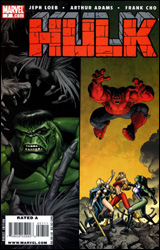 Hulk #7
Publisher: Marvel
Released: 22 October 2008
Writer: Jeph Loeb
Pencilers: Art Adams and Frank Cho
Inker: Walden Wong
Colorist: Peter Steigerwald and Jason Keith
Letterer: Comicraft
Cover: Art Adams
Review: Preston Nelson
This is not a comic book. Do not let the colorful pages and the drawings of the Hulk fool you. This is two comic books. Well, two half-finished comic books, really. These books are both about 11 pages long, and both serve to introduce a story that would be serviceable if fleshed out enough to matter. But as it stands, we get two halves of separate stories.
In the first, we have Bruce Banner being chased through Las Vegas by several Wendigos. They're after Banner because the red Hulk murdered one of their numbers. This is, without a doubt, the weaker of the two stories. You'd think that in a half issue, one would have to worry about too much being crammed in. Not here. As a matter of fact, nothing happens. Banner walks into a casino. Wendigos show up. Banner sort of Hulks out. Hulk fights Wendigos. Story ends. This could have been three pages long; instead it gobbles up the first half of the book.
And I know most things with Hulk can be explained simply by saying, "Oh, he's the Hulk," but I have a huge issue here. You'll notice that I wrote "Banner sort of Hulks out." You see, he doesn't become the Emerald Adonis; he becomes the grey lump of mass called Joe Fixit. Rather than ripping the Wendigos apart, Banner does a terrible Thing impression and causes more trouble than he's worth. I know grey Hulk has his roots in Vegas, but is that the only reason he shows up? Why does Joe Fixit only show up in Las Vegas? Does Banner have a gambling problem? Does he abhor free shrimp and drinks? Maybe the ambient radiation flowing off of Celine Dion keeps him from going full green? I don't know.
I'm only going to say one thing about the art in this half. Pairing Art Adams against Frank Cho exposes every weakness Adams has. He's not a bad artist, but it's just not fair.
In the second half, She-Hulk recruits Thundra and Valkyrie to help her get revenge on the red Hulk for whooping her butt. Again, not much happens. The girls get together, and they head after red. They fight him. And again, I'm left wondering if letting Bruce lay low, just so Jen could actually hunt the red one down and take him out might have been a better editorial decision. Jen's story with red Hulk is a serviceable one, but it's cut too short.
Frank Cho's art is up to his usual standard, which rides a nice line between cartoonish and realistic. Cho is a joy to look at, but it's just not enough to redeem this book.
Flip through it, I guess. Focus on the second half, as that's where the good stuff lies.
 Rest #1
Publisher: Devil's Due Publishing
Released: 22 October 2008
Writer: Mark Powers
Artists: Shawn McManus and Lizzy John
Letterer: Ed Dukeshire
Cover: Tim Sale
Review: Guest
A lot of people complain that there simply aren't enough hours in the day to get everything done. When you really think about it, we spend one third of our entire lives sleeping. But what if there was a wonder drug that completely eliminated the need to sleep? Considering the side effects, would you risk it?
This is the question facing John, a typical daydreaming artist stuck behind a desk. He laments his lot in life, and constantly wishes that he had more time for the things that really matter. Enter Teddy, an old friend offering him the key to happiness: a drug that will change his life. Teddy hasn't slept for six months, and like all slimy salesmen, he's an instant success story that simply wants to share his secret.
Let me start by saying that this is really one of the most unique concepts I've ever read, and that alone deserves some credit. But concept alone can only get you so far. What Powers fails to grasp is that simply being awake is not enough to suddenly make millions. As someone who's been an insomniac over half his life, I can confirm that this is not how things work. Not only does this drug somehow eliminate the need for sleep, but it also improves your mood, makes you irresistibly charismatic and gives you a sudden workplace competence. After taking the drug, you would think that John suddenly has more time for his art, you know, the reason he took the drug to begin with. Nope, he wants to ride carriages with random ladies. (None of them are morbidly obese strippers, however, so I'll give them that.)
To top it off, you can already tell what's coming up, which makes one wonder why they should keep reading. Drugs are clearly a bad thing, people. You don't need to spend money on this series to learn that. Give me two bucks and a bag of M&Ms and I'll tell you the same thing.
The art has a cartoonish, painted look that serves the story well, but it's not particularly remarkable. Certain panels reach an eerie realism, but most are content with slack-jawed posturing and stiff poses. It didn't distract me too much, and with a more focused narrative, I could let this one slide into borrow territory. But the ball was dropped here. I was expecting to be blown away, but I was left shaking my head in disappointment. It's a damn shame, but you should just skip this one.
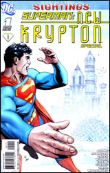 Superman: New Krypton Special
Publisher: DC Comics
Released: 22 October 2008
Writers: Geoff Johns, James Robinson and Sterling Gates
Pencilers: Pete Woods, Gary Frank and Renato Guedes
Inkers: Pete Woods, Jon Sibal and Wilson Magalhaes
Colorist: Hi-Fi
Letterer: Steve Wands
Cover: Gary Frank
Review: drqshadow
As the opening volley of "New Krypton," this annual-sized one-shot picks up right where recent events in Action Comics left off. When a revitalized Brainiac made off with the bottled city of Kandor, then shrunk and bottled Metropolis in the same manner, Superman was forced with a tough decision. Naturally, he was going to stomp the villain, but once both cities were back in his possession, could he really return Metropolis to its regular size without offering the same luxury to Kandor? Ultimately, the Man of Tomorrow decided he could not, and appropriately returned it to a respectable size. Which now asks another question: what to do with a hundred thousand native Kryptonians? Oh, and did I mention that in the process, Brainiac also managed to strike an indirect killing blow to ol' Blue's adoptive human father, Jonathan Kent?
Each member of the Man of Steel's writing staff has joined forces for this bulky volume: Action Comics author Geoff Johns, Superman scribe James Robinson and Supergirl writer Sterling Gates share collaborative writing duties. Their collective writing is invigorated with good ideas, if a bit scattered and occasionally confusing. The heart of this material, though, is good stuff. Together, they've turned Brainiac into a genuinely interesting, challenging foil for Superman, finally expanding his villainous cast beyond Lex Luthor. Every time the bad guy's in the scene, there's an unspoken tension that leads us to believe he means business. It would seem that he can finally make a dent in Clark's thick armor.
Kent, meanwhile, is both mourning the loss of his adoptive dad and dealing with the sudden existence of a legion of Kryptonians, each of whom is developing powers to rival his own. I wasn't sure DC would ever do something with this long-bottled city, let alone the right thing, but this team of writers is handling it excellently and it feels like a landmark event in the big man's long history. While everything is peachy keen on the Kandor front, there's this lingering sense that it won't last for much longer.
The members of the Superman art team aren't being left out of the fun, either. Regular artists Pete Woods, Gary Frank and Renato Guedes have matched their writers' contributions by teaming up on the visuals of New Krypton Special. The three do have uniquely individual styles, but share enough similarities to remain compatible under one roof. None really pick up the ball and run with it for any length of time, and they're each given one or two potentially impressive splash pages to do just that, but they at least manage to keep the story moving and lend identity to both the new Kryptonian city and its residents. This isn't a gorgeous book, but it's not an ugly one, either.
The point of this issue is to catch the casual reader's attention and get them interested in the character's next big event. And in that regard it's successful. That is, assuming the market even gives it a chance. The Superman family is blessed with a trio of writers with strong concepts, a good sense of direction and the motivation to get it where it needs to go. New Krypton Special asks plenty of compelling questions, and for once I'm not really sure how it's all going to pan out. It's a good start, and it deserves your attention if not your four dollars. Borrow it if you can; this isn't the same old lukewarm, complacent Superman I was expecting.


