Is It Wednesday Yet?
30 September 2008 � Here we are again with another installment of your favorite comic book review series, but things have changed! Normally the crew reviews comic books that have yet to be released, and that's still true, but now they'll also be discussing some comics that are a week or two old. The decision to change the Is It Wednesday Yet? format was made so we could better cover the comic book industry, giving you a wider view of what's on the shelves. So when you go to the comic shop this week, you'll know what new and slightly older comics to buy.
As with before, these reviews are free of spoilers, so don't worry about having your reading experience ruined.
Our grading scale is simple:
Buy: An excellent comic book.
Borrow: A good comic, but save yourself some money by reading a friend's copy.
Flip Through: Give it a once-over at the comic shop.
Skip: This doesn't need to be explained.
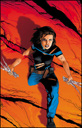
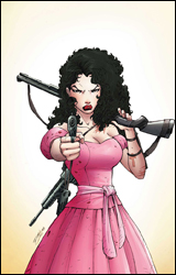 Anita Blake, Vampire Hunter: The Laughing Corpse #1
Publisher: Marvel
Released: 01 October 2008
Writer: Laurell K. Hamilton
Adaptation: Jess Rufner
Artist: Ron Lim
Colorist: June Chung
Letterer: Bill Tertolini
Cover: Ron Lim
Review: drqshadow
What good is our legal system if it doesn't apply to each member of the population? More specifically, why have the living dead been exempt from legal prosecution? That's the question the city of St. Louis was asking itself when it appointed Anita Blake to the shiny new position of vampire executioner. Hey, if these night walkers can't observe regular business hours and refuse to defend themselves in a court of law, we as a society have no choice but to hunt them down in the streets, to speak to them in the only language they seem to understand. Am I right?
Jess Rufner's adaptation of a Laurell K. Hamilton novel provides an unexpected and awkward blend of genres. Having never read the original series, this marks the first time I've been privy to a story that mixes courtroom drama with back alley horror, hard-boiled action and crime fiction. It's constantly struggling with this identity crisis, and while the frequently shifting mood provides a lot of variety, it can also be difficult to navigate. This issue can't settle down to tell one central story, so it scatters its thoughts across a handful of plots and tries to pass it off as one, cohesive arc.
For a comic book that's based on a popular series of novels, this isn't even all that well-written. The issue doesn't make it through its first sentence before slipping over a typo, and outside of Anita herself, the characterization is extremely shallow. The dialog is another stumbling block; once again with the exception of Anita herself, everyone speaks in perfectly proper, stiflingly straightforward English. On one hand, it makes the lead character seem much more down to earth and relatable than everyone she shares the page with. On the other, the rest of the cast seems to have been scripted by third graders. I couldn't name two people I've ever met who speak this rigidly, but Anita knows a whole roomful.
Ron Lim provides smooth, serviceable artwork that's stylish but not entirely fitting. He gives each member of the cast an original look and feel, which is easier said than done when you're dealing with this many attorneys. Anita doesn't have a very broad range of facial expressions (she's either smiling ironically or grimacing), but she at least maintains an air of intelligence, which is crucial to the story. Since the issue is heavily narrated, Lim is never really given a moment to cut loose and impress us. What he's left to illustrate is often dry, straightforward and visually uninteresting. He doesn't do as much as he could to improve the situation.
For a book featuring a smart protagonist, a trio of wildly different situations and a bloody murder scene, this really wasn't all that exciting. Sometimes what works in type doesn't always translate to an illustrated work, and I fear that's the case here. Because Anita, our eyes and ears into this world, is always kept strong, solemn and physically unresponsive, it's tough to develop our own reaction to the story. Whether she's trying on a new dress or walking in on a dismembered corpse, Blake wears the same businesslike demeanor, and her readers follow suit. There's a lot going on here, but I couldn't get excited about any of it. This is worth a flip through at best.
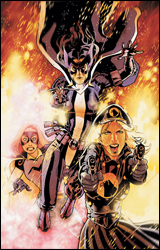 Birds of Prey #122
Publisher: DC Comics
Released: 17 September 2008
Writer: Tony Bedard
Penciler: Michael O'Hare
Inker: John Floyd
Colorist: Hi-Fi Designs
Letterer: Pat Brosseau
Cover: Stephane Roux
Review: Guest
As DC's premier lady superteam, the Birds of Prey tend to lean towards a more lighthearted fare than most, combining liberal amounts of cheesecake and silly action to make for a brisk, kinetic book that, while entertaining, may be a bit less filling than you'd like.
This being the first DC book I've ever reviewed for Earth-2.net, there are two things that I noticed right away, and they sort of threw me for a loop:
01. DC doesn't believe in recap pages. I've actually known this for a while, but after reading so many Marvel books in this format, it's jarring.
02. DC books tend to be more colorful than Marvel ones. And I don't mean just a tad more colorful. I'm talking about the sort of vibrant hues that make you feel as if you'd been dragged into an alley and molested by a box of crayons.
O'Hare's work is good, if a bit inconsistent. In particular, his faces are an issue; expressions rarely correspond with what's being spoken. For instance, though she's thanking a friend, in one panel Oracle looks rather pissed off. Then there's Zatanna, who appears to be Asian. His work on bodies, however, is a bit more defined, but sometimes the ladies look a tad too thin.
As I said previously, this is not a heavy read, with a plot more Charlie's Angels than Gotham Central. The Joker is up to no good and the Birds have to busts some heads. That's about it, really. While Black Canary's absence initially turned me off, the remaining team is strong enough without her. The current roster consists of mainstays Oracle and Huntress, who are now flanked by Manhunter (a woman with deep mental scarring), Lady Blackhawk (the wisecracker of the team), Misfit (the younger wisecracker of the team) and Infinity (a Kitty Pryde-esque character I've never seen before, but she's British, so bonus points there).
The characters are written distinctly enough that you get a pretty good grasp of them. You're thrown into the story with a decent amount of information without being overloaded with expository dialog. And the pacing never lets up, concluding with an impactful ending that will make older fans giddy with anticipation. That said, this isn't what I'd call essential reading. It's a fun book that seems to be going in an interesting direction, but nothing here justifies a purchase. It's a borrow.
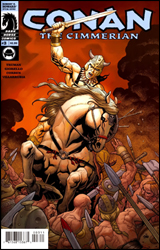 Conan the Cimmerian #3
Publisher: Dark Horse
Released: 17 September 2008
Writer: Timothy Truman
Artists: Tomas Giorello and Richard Corben
Colorist: Jose Villarrubia
Letterers: Richard Starkings and Comicraft
Cover: Frank Cho
Review: drqshadow
With the conclusion of Dark Horse's first Conan series after issue #50 earlier this year, Conan the Cimmerian takes up the mantle as the publisher's new ongoing series for the legendary character. For the pop culture challenged, Conan is a celebrated wanderer, a reaver who walks the land with sword in tow, ready, willing and able to throw down should the opportunity present itself. There's really little else in the way of backstory; all you need to know is Conan is here, he knows his way around a battleground and you should probably get out of his way if he looks at you funny.
One of my biggest problems with period pieces set in the dark ages, such as this one, is the tireless Olde English that usually goes hand in hand with both the narration and the dialog. I've never been much for an excess of "thous" and "arts," and find that such strict dedication to an older way of writing does nothing but test my patience. Mercifully, that's an opinion that Cimmerian author Timothy Truman seems to share. In his script, the cast speaks in a much more familiar, conversational style. They aren't dictating prim and proper literary masterpieces with each statement, and that makes actually hearing what they have to say much easier. Naturally, he'll still slip in a period-specific phrase or two to remind his readers of where and when the story takes place, but he's not bluntly beating them over the head with it in every single word balloon.
Truman seems to have a good handle on what you'd expect from an issue of Conan, too. He doesn't waste a lot of time with backstories or personality quirks when everybody knows that most of these new faces will probably be cut in half before the issue is through. He gives us the barest of introductions � just enough to differentiate one face from another � and then throws us right into the battle. The issue has just enough depth to feel like it means something, and more than enough action to satiate your hunger for swordplay.
Tomas Giorello and Richard Corben team to bring some outstanding original artwork to the classic character. The rough, grainy texture that fills most of Giorello's work provides a rich, warm quality to both the characters and the surrounding landscapes. His layouts seem to float between the sharp edges and stark contrast of fully inked artwork and the more lush, free-flowing nature of the original pencils. Perhaps most impressively, Giorello's work is delivered with a conscious limitation of detail. That focus on storytelling and simplicity without sacrificing quality immediately reminded me of the Kubert family. His work carries their same knack for strong characterization, easy legibility and flowing motion, all the while resisting the urge to become lost in an excess of detail. It's just right.
Corben's artwork isn't quite as good, but still follows many of those same guidelines. Its detail is kept in check, and the artist's similar focus on fine storytelling and easy legibility makes the transition between styles an easy one. Corben's work lacks the sensitive touch that Giorello brings to the table, but his hard edges and dense pointillism provide an excellent counterpoint.
I wasn't expecting much here, since I've traditionally had little time for the character, so I was surprised to find that the series is actually pretty entertaining. It avoids many of the stereotypical pitfalls that had led me to write the character off in the first place, and while it isn't the most involved book I've read all month, it's not meant to be. Conan brings a fine mix of adventure and action, and has never been easier to pick up and read. Borrow it and keep an eye on it going forward.
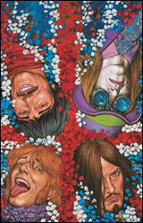 Greatest Hits #1
Publisher: DC Comics / Vertigo
Released: 17 September 2008
Writer: David Tischman
Artist: Glenn Fabry
Colorists: The Hories
Letterer: Todd Klein
Cover: Glenn Fabry
Review: Guest
As the blatant Vertigo lover that I am, it was with little surprise that I would get this in my stack for the week. As with most books under the imprint, we're once again given a vulgar, raunchy tale that still seems capable of having a heart in the process.
Nick Mansfield is a down on his luck filmmaker that hasn't created a hit in over eight years, now at the point in his career when he's begging to get work directing President Dog. When introduced to a woman by the name of Ethel Rothstein, she proposes he bring himself out of "movie jail" by making a high-concept documentary about the legendary 60s superteam The Mates. (As an aside, Nick's father was somehow involved with The Mates, though it's never fully stated how.) This issue shows Nick and Ethel working together, and in some cases taking rather drastic measures to get the stories they need. It also takes a look into the infancy of The Mates. What could be rather jumbled storytelling works surprisingly well; the scene changes are natural, and sometimes draw a parallel between the 1960s and today.
Being a Vertigo comic, this is a mature book. We're talking more than the occasional curse word; we're talking "sex with a transvestite in a car wash" mature. If you laughed at that last sentence, than by all means, this is the book for you, but do not let the kiddies read it. As someone that's personally a fan of abrasive humor, the writing was mostly right up my alley, and the blatant Britishness of it all definitely helped.
For better or worse, Fabry isn't going to surprise anyone with his work in Greatest Hits. It's exactly what you've come to expect from the man who's perfected the same clean, realistic style that Steve Dillon, his Preacher colleague, is known for. Unlike Dillon, however, Fabry has more of a flair for the supernatural, as the action scenes don't feel out of place when viewed alongside the quieter moments. Also, the man can draw a mean bowl cut, which this book has in spades.
With my bias for this type of work flapping out in the open like the dignity of a nudist, I can say with little doubt that this is something you should pick up. The story is full of mystery, and seems as if it could wind up anywhere. It's a smartly written, good-looking book with a unique concept. Buy it and tell your friends.
 New Exiles #12
Publisher: Marvel
Released: 01 October 2008
Writer: Chris Claremont
Penciler: Paco Diaz Luque
Inker: Norberto Fernandez
Colorist: Wilfredo Quintana
Letterer: Tom Orzechowski
Cover: Michael Golden
Review: Guest
Let me answer the three questions that are no doubt running through your brain right now:
01. Yup. I'm reviewing New Exiles again.
02. Yup. Claremont is still writing it.
03. Yup. It's still full of wasted potential.
For those that don't know, the Exiles are a band of Quantum Leapers that go around fixing the Omniverse. As with most issues, you never see the whole team in action; this issue focuses on the Age of Apocalypse Sabretooth, and a version of Kitty Pryde named Cat. Normally I'd complain about such a small sampling of the roster, but considering that Gambit (from Earth 6706) is now a member, it's for the best that we don't see everyone. For those that have never experienced the pain of 6706 Gambit, imagine if Peter Pan and Namor had an effeminate love child. Now please, stop crying.
So an alternate version of Wolverine (simply named Howlett) is part of a group of baddies being lead against the Exiles, and during a scuffle with Sabretooth, sends him plummeting into the earth. Along the way, overdone exposition holds our hand in nearly every panel. "So he drank some water, the clear liquid a symbol of his very life, and swallowed it down into the bowels of his consciousness. Then he had a croissant, the carbohydrates of his soul reflected in the doughy goodness." One has to wonder why Claremont even needed an artist when he is more than content in telling us everything we need to know, along with a lot of things we don't. The dialog isn't much better, narrating the thoughts of characters as if they were stuck in a pulpy detective story. When a character is flung into a rock face, I don't think it's necessary to have them think, "Well, that hurt. Rocks are made of hard stuff, you know." I've concluded that this book is being written for children. Really stupid children. And if it turns out all of his issues of Uncanny were like this in my childhood, then I was a really stupid child.
Paco Diaz Luque does a competent job, but not enough to drastically help or hinder the book. A lot of his facial expressions are pretty silly, and his Sabretooth is seemingly different in every panel. But his environments are serviceable, if not particularly captivating.
I can't express how much I want to love this book. Sabretooth as a hero is a great concept, and traveling through dimensions is full of potential. But until this series gets into the hands of another writer, it will never be as good as it could. Until that happens, skip this.
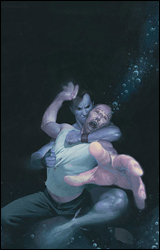 Sub-Mariner: The Depths #2
Publisher: Marvel
Released: 01 October 2008
Writer: Peter Milligan
Artist: Esad Ribic
Letterer: VC's Cory Petit
Cover: Esad Ribic
Review: drqshadow
As a lifelong debunker of all things mythical, fantastic or otherwise unbelievable, Dr. Randolph Stein has heard his fair share of tall tales. Thus far, he's been successful enough at proving their inaccuracy that he's become widely accepted as one of the world's leading experts. So it's only natural that when a deep-sea voyage in search of the fabled city of Atlantis goes missing, Stein is there to uncover the truth: was it an accident, or did the legendary Namor have something to do with it? But when the submarine he's aboard starts to experience unexplained phenomena, the professor decides to test the certainty of his beliefs by climbing into a one-man pod and personally inspecting the dark walls of seawater outside.
It isn't often that a mainstream comic inspires the kind of awe and wonder that must have been prevalent during the birth of the superhero genre. These days, we've become so accustomed to the very idea of a man with wings or a hero with the ability to create fire from thin air that such acts have lost their luster to a certain extent. How does a writer capture his audience's imagination when such spectacular feats have become so commonplace, they inspire more yawns than gasps?
The Depths author Peter Milligan's answer is simple in concept, but infallible in execution: limit our exposure. When something as ridiculous as an undersea monster has been seen so frequently that it's no longer a shock or a surprise to the reader, it loses its value. In centering this story on the overly cynical Dr. Stein, Milligan has given the series a flavor that has more in common with the daily news than its illustrated contemporaries. Stein speaks as I'd imagine you or I would when confronted by such baseless superstition, and the effect is disarming. It takes us out of the typical comic book mindset, convinces us this is a different form of entertainment, then introduces that sense of the unknown.
Esad Ribic provides gorgeous painted artwork that's different enough from his contemporaries to finish driving that point home. His work doesn't aim for precise realism, a trap that snares many painters within this format. Instead, he focuses on toeing the fine line between cartoony exaggeration and grounded realism. His characters are vividly lifelike, but simplified enough to maintain the tone of the story. Ribic's style is perfectly suited for a tale set entirely underwater, and he makes the most of it. Combining unique lighting opportunities with a cool, calming color palette, he immediately convinces us that we're aboard the submarine right alongside the doctor and its crew. The scenes that take place alone in the abyss are mesmerizing, overflowing with blacks and deep blues. From cover to cover, Ribic concentrates on solid storytelling and fills the page with soft, ethereal waves of color. He's a great find, and I can't wait to see what he's working on next.
In this series, Namor is less the wing-footed egomaniac that we all know, and more the spooky, unexpected blur of motion in the corner of our peripheral vision. He appears for all of one panel, and even then only as a silhouette, but the effect he has on the nearby crew tells us everything we need to know. Sub-Mariner: The Depths needs all but two pages to capture its readers' hearts, minds and imaginations. It's extraordinary, a welcome return to the very basics of the medium and something everyone can enjoy. Buy it and share it with your friends. Stories like this one are what comics should be all about.
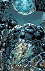 Venom: Dark Origin #3
Publisher: Marvel
Released: 01 October 2008
Writer: Zeb Wells
Penciler: Angel Medina
Inker: Scott Hanna
Colorist: Avalon's Matt Milla
Letterer: VC's Joe Caramagna
Cover: Angel Medina
Review: Guest
I'll be blunt: I loathe the origin story. Comics are the only medium that can get away with going backwards in time so frequently. Sure, you'll occasionally see a movie prequel or a sci-fi book set in the past, but you can literally walk into a comic book store right now and pick up half a dozen retellings of stories that most everyone already knows. They are rarely good, and I don't believe there's a single person reading this that doesn't know where Venom came from. So right off the bat, before I even read the first page, I knew this was going to be a useless book.
So Eddie Brock thought he had a hot story interviewing a serial killer, but the man he contacted was an impostor and Spider-Man caught the real deal. His reputation ruined, Eddie was fired and angry and � never mind. You know this. Let me save you three bucks. After three issues, Eddie finally becomes Venom and destroys things. He also laughs a lot. There's a subplot with his wife, but it really doesn't matter. Granted, this book grasps the random violence brought by Venom, but this miniseries as a whole is unnecessary, especially since Eddie isn't even Venom these days.
Angel Medina did the best he could with what he was given, and his portrayal of the symbiote is eerie and creative, but he's being wasted. His talents could be better used on something more relevant.
I'm going to say something that's probably going to be unpopular, but hear me out: I don't think every character in every piece of fiction needs to be fully fleshed out, or even necessarily deep. Now, I like Venom, but he is not a complex character. He's not supposed to be. His job is to be a wrecking ball and general pain in Spider-Man's ass. That's it. I don't need to know what type of sandwich he had back in 1988 that made him sick for three days. I don't need to hear about what sort of spats he had with his wife. He needs to show up and be feared. But instead he's become trite. The direction that Eddie Brock has taken in Amazing Spider-Man is an interesting one. This is the opposite of interesting; it's routine, and that's the one thing that a comic book absolutely shouldn't be.
To rip-off a classic Devo song: "When some good art comes along, you can flip it, but when you've read some total shit, you can skip it. (whip crack) Skip it good!"
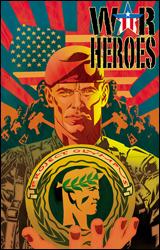 War Heroes #2
Publisher: Image
Released: 17 September 2008
Writer: Mark Millar
Penciler: Tony Harris
Inker: Cliff Rathburn
Colorist: JD Mettler
Letterer: Clem Robins
Cover: Tony Harris
Review: drqshadow
There's been a lot of hype around this book, with Mark Millar announcing that it was a good indication of what he'd wanted to do with Ultimates 3. While I can see some very subtle connections to the Ultimate line's premiere superteam, the similarities stop after the first paragraph. In a world where superpowers are available in the form of an easy-to-swallow gel cap tablet, it should come as no surprise that the military was quick to claim the technology for itself. The US Army is a different place now that men and women can lift tanks, blast fireworks from their fingertips and sail through the air. But while their abilities may have been augmented, at the end of the day the armed forces still need their soldiers to show discipline, and it's that hardcore boot camp atmosphere, not the battlefield itself, where War Heroes has dedicated its focus.
Mark Millar's writing usually walks a thin line between groundbreaking originality and excessive vulgarity. It's only natural, I guess, that pushing the boundaries of good taste sometimes carries a reward and sometimes comes at a cost. This series is, largely, the price without the benefits. It's Millar both at his creative best and his raunchy worst, amusing himself with crude impropriety and crazy ideas, and hey, if his readers are cool with that, they're welcome to climb aboard and enjoy the ride. This issue is composed so loosely, it descends into bad language and uncensored activity so quickly, that it really feels like he's just writing it to entertain himself.
So it shouldn't be unexpected that I have to warn you: War Heroes #2 surprises its readers with an enormous, floppy cock around the middle of the issue. It's so completely surprising and totally out of left field that it's hard to focus on the story afterwards � of which there still isn't much. One moment we're watching just another public display of superpowers, then it's two panels of John Holmes. So don't leave this lying around where a little one might find it. And if you're going to have a problem with a big man-stick in your reading material, you may want to turn away, too. Kudos to Tony Harris for the taint's-eye camera angle he employs in the second panel, though. I don't think I've ever seen that one before.
As a reader of Ex Machina, I'm fairly familiar with the artwork of Harris. When he's on, there's nobody else in the industry quite like him. Harris gives his characters a level of depth, dimension and substance that I really enjoy. There's a certain roundness that grounds his work in real life. But when he isn't giving it his all, as was the case in Spider-Man: With Great Power..., it really shows. Regrettably, it's the latter that defines his work in War Heroes. Harris leaves backdrops severely under-detailed, struggles with consistent proportions and even seems to reuse a few character designs from some of his other work. While the artist can be counted on for a couple of really impressive visuals in this issue, particularly those involving military vehicles, it's still among his weakest efforts.
Were it backed by a solid foundation, I could overlook the excesses Mark Millar seems to enjoy dwelling on between War Heroes' covers, but it's not. It's a potentially great idea that probably didn't flesh out as well as he'd imagined, padded out to fill a six-issue series with so much explicit material Larry Flynt might blush. If it's going to help tell a story, if it's necessary, even if it's a good punch line, I've got no problem with a cock or two poking their heads out in the middle of my reading material. When it's just the latest in a series of segments meant to show you how outrageous the series is and little else, I'd rather look at something else. Skip this if you want substance. On the other hand, if you're after something with shock value alone, nothing else can even compare.


