Is It Wednesday Yet?
09 September 2008
09 September 2008 � Here we are again with another installment of your favorite comic book review series. As always the comics you're about to read about won't be released until tomorrow (10 September 2008), so these reviews are free of spoilers and should help inform your purchases on new comic book day.
Our grading scale is simple:
Buy: An excellent comic book.
Borrow: A good comic, but save yourself some money by reading a friend's copy.
Flip Through: Give it a once-over at the comic shop.
Skip: This doesn't need to be explained.
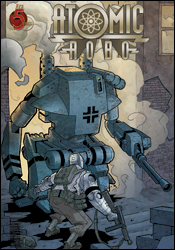 Atomic Robo: Dogs of War #2
Writer: Brian Clevinger
Artist: Scott Wegener
Colorist: Ronda Pattison
Letterer: Jeff Powell
Cover: Scott Wegener
Review: drqshadow
One of Nikola Tesla's finest (and quietest) creations, Atomic Robo is the first and only example of artificial intelligence to walk the planet. Granted American citizenship in exchange for his occasional cooperation with the US military, Robo spends his time battling enemies either dubbed too powerful or too strange for average troops to approach. It's a bit of the former, a bit of the latter this time around, as the metal man is dropped into the heart of Italy during World War II. While his primary goal was to trash a set of walking panzers before they could slaughter our boys, he was ambushed and taken captive by those pesky Nazi scientists.
Writer Brian Clevinger maintains a breakneck pace from cover to cover, spicing up the action scenes with a constant touch of humor in the same vein as the Indiana Jones movies. And while this keeps the issue from feeling like the one long 'splosion-fest it pretty much is, every once in a while that comedy feels a bit inappropriate. The Nazis are presented as battle-hungry war machines, while the Americans (including Robo) are more concerned with firing out one-liners. When one soldier catches a bullet in the face and Robo is back to cracking bad puns less than a page later, it doesn't seem very fitting.
Scott Wegener's fast-paced, gestured artwork blends well with the issue's comical slant and frequent action scenes. Although his work does occasionally trip over its own simplicity (when one of those walking tanks appears before a squad of US soldiers, I wasn't sure if the enemy was a hundred yards down the road or five feet to their left), Wegener's frequent and effective use of subtle plumes of smoke and scattered dust is usually enough to fill in the blanks. Not only that, but they add an element of extreme mass and substance to the clunky, heavy machines that populate most of the book.
For the majority of this issue, when the action is fast and the flavor is cheerful, Wegener is all you could ask for in an artist. On the few occasions that the narration turns more serious � such as the issue's outset, when a war-weary veteran dictates a letter home and struggles to find something hopeful to write about � the artwork is much less appropriate. Wegener never changes gears to match the mood of the story, but fortunately he isn't asked to do so more than once or twice a month.
If it sounds like I'm down on this series, I apologize. For the most part, this was a wild ride through a chapter of history that's usually caught up in the atrocities of war. While the characters' dialog feels a bit too modern to be era-appropriate (did Robo just quote Ghostbusters?), that's just a minor qualm, as are most of my problems with the issue. It doesn't set out to change your life, but it provides an excellent distraction if nothing else. Worthy of a borrow.
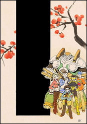 Big Hero 6 #1
Writers: Chris Claremont
Penciler: David Nakayama
Inker: Terry Pallot
Colorist: Emily Warren
Letterer: Ed Dukeshire
Cover: David Nakayama
Review: Guest
Baymax is your new God. That is all.
What? You need more? Alright.
Big Hero 6 isn't the most recognizable name in the world, but they make for an eclectic bunch, if nothing else. For those not familiar, the best way to describe them would be Japan's version of Alpha Flight. There's Hiro, a teen genius. Honey Lemon, the gravity-defying blond bombshell with a magic purse. GoGo Tomago, who is equally gravity-defying (but decidedly less blond) who can turn into a ball of energy. Wasabi No Ginger, who has a rather vague control over psychic daggers of some sort. Fred, who can supposedly turn into Godzilla, but he doesn't make an appearance here. And Baymax, a guardian robot that can turn into a larger robot. He's also the baddest mofo in the world. Believe.
Seems like a simple enough idea, except you're given almost no real concept of any of the characters, the story makes less than no sense and after reading it twice, I really can't tell you what was going on.
Yup, it's a Claremont book.
I'll try my best to explain. Hiro, who appears to be the young leader of this team, is heading to school when bad stuff happens. Yeah, that's about it. In all seriousness, there is more to it than that, but the storytelling is a mess, both from a visual and plot standpoint. David Nakayama is a competent artist with a manga-influenced style, but it's hard to keep track of at times. For example: Hiro's robot, Baymax, stays in Hiro's room, but when he's walking to school, Baymax is somehow coming out of an alley to say good morning. Also, with the exception of a teacher, why is Hiro the only Japanese person at his school? You figure there would be a few, since, you know it's Japan. Even worse, I was initially confused as to how a blond American such as Honey Lemon was a part of the team, and then I later learned that she was supposed to be Asian.
Claremont's usual dialog quirks are here. A lot of exchanges are of the "I'm [insert name], my partner over there is [insert name]" variety. It's also clear that he was trying to match the frantic, nonsensical pacing of an anime: one second our heroes are making rice, then OMG NINJAS~! out of nowhere! Villains outside of school! Oh no! Super big fun explosion! Who's driving car? Oh no! Bear is driving car! How can that be?
To give you an idea of how poor the storytelling is, the main story is followed by about a dozen or so pages of background material. While a nice refresher course, one shouldn't need to read this information to get an understanding of what's going on. These characters have a load of potential, but Claremont is not the guy for the job. It's confusing, disjointed and (despite the inherent greatness of Baymax) not worth your time. Skip it.
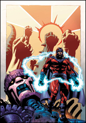 Civil War: House of M #1
Writer: Christos N. Gage
Artist: Andrea DiVito
Colorist: Laura Villari
Letterer: Dave Sharpe
Cover: Mike Perkins
Review: drqshadow
As with House of M: Avengers before it, the temptation to revisit the land first concocted in the original House of M miniseries has once again proven to be too great. In this self-contained mini, we return to a time when Magneto was king, the mutants were in charge and nearly every hero on the planet was granted their heart's deepest desires.
In particular, this month we're examining the origins of (this reality's) old man Magnus, and his unlikely rise from infant Jew in Nazi Germany to beloved king of all modern civilization. Of course, a lot of this is territory that's already been covered several times before. Though the Scarlet Witch significantly rewrote history for a brief time during House of M, the vast majority of those alterations were only evident in the present, with her meddling in major past events kept miniscule at best. It was understandable in the grand scheme of things: Wanda could change what she knew and only guess about what she didn't. Even if you have the power to alter the very fabric of our existence, you still need to know the specifics of what you're modifying before anything can actually take effect.
That disconnect is evident almost from the start. Writer Christos N. Gage makes plenty of ticky-tacky little changes to the status quo, even meddling with the master of magnetism's personal life before Wanda was born. But while he's testing shallow new waters throughout the issue, his storytelling remains very bland, and the heart of his story is basically unchanged from the present canon. When Gage faces Magneto with a baseball bat-wielding bigot, it's tough to shake the feeling that we've seen it all before. By the time the issue draws to a close, that's a sensation you'll be growing accustomed to. For an alternate reality, this land certainly has a lot in common with the present state of affairs.
I found Andrea DiVito's accompanying visuals to be similarly lacking. Perhaps best known for his work on the recent Annihilation crossover, DiVito brings a decidedly old school flavor to the book, especially when he's dealt a page filled to the brim with colorful costumes and radiant displays of mutant power. These scenes just aren't impressive, neither in execution nor composition. When a big splash page gives him an opportunity to really impress his readers, he draws yawns instead. His workman-like contributions are technically sound, but lack an emotional punch, a personal touch to draw readers into his work. What's on display here is nothing to get excited about.
Free from the bonds of regular continuity, both creators had a chance to really cut loose, which makes their failure to do so all the more disappointing. There's really no call for this series at this point: it feels like little more than a return to familiar territory, land that was better suited in the rearview mirror. House of M was a compelling story in 2005, but it was a story with a specific beginning and ending. I can't see further elaboration doing anything more than complicating that. Skip it.
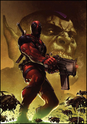 Deadpool #1
Writer: Daniel Way
Penciler: Paco Medina
Inker: Juan Vlasco
Colorist: Marte Gracia
Letterer: Chris Eliopoulos
Cover: Clayton Crain
Review: Guest
After the heartbreaking end of Cable & Deadpool, our favorite Merc with a Mouth is back on his own in a highly anticipated new series. You can throw me in the group of readers excited about the prospects, and I was filled with glee to see it in my pile. So how is this tale?
It's okay. Don't get me wrong, this is a solid book, but it feels like something's missing.
So the Skrulls have decided to invade a baseball game. Why a baseball game? Badminton was too intense for them, clearly. What's even more bewildering is why Deadpool is there, and why he's dressed as a mascot. Either way, Deadpool decides to bring the fight to the green folks and hilarity ensues.
Sorta.
If we were talking about the art alone, this book would be an easy buy. Paco Medina's pencils are sharp and vibrant. His settings are superbly detailed and his faces distinct. Even the various Skrulls are given a bit of personality. Accented by Marte Gracia's colors, the book has a profound energy about it, and each page is a sight to behold. These two make for a great combination, and I demand they be a package deal from this point forward.
The main factor holding this book back a tad is one Daniel Way. Fresh off a rather lackluster run on Wolverine: Origins, he is a peculiar choice for this series, as his style of humor straddles the line between inane and hilarious. He's able to get in at least one really good joke, but then proceeds to beat it into the ground by using it twice more in succession. I find it disheartening that Fabien Nicieza wasn't able to continue his work here, as Way's take on the title character comes off as more of a twitchy neurotic than a gun-blazing jokester. The action is rather neat and Deadpool puts up quite the scuffle, but it's not really all that funny. It's silly and wacky, zany even, but not funny, and that's what hurts it so. When someone opens a book with Deadpool on the cover, they expect to laugh. It can be argued that pretty much everything else is secondary to the all important chuckle-factor, and the sad truth is that I only laughed one time in 32 pages.
This, combined with an ending that completely comes out of nowhere, is in direct conflict with the art � which is so good that it almost makes you forget about the narrative flaws. So I'm in a situation where I can't decide between a buy and a borrow, leaving me very tempted to give this a buyrow (copyright, Dan Toland 2008). Though it hurts me to say it, I was disappointed by this one: borrow.
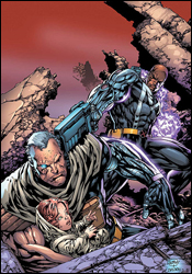 King-Size Cable Spectacular #1
Writer: Duane Swierczynski
Penciler: Ken Lashley
Inker: Paul Neary
Colorist: Frank D'Armata
Letterer: VC's Cory Petit
Cover: Ken Lashley
Review: Guest
For this review, I'm going to need a bit of reader interaction in order to get my point across. Stand up. Okay, now put your hands on the sides of your head. Start squeezing really hard. Yes, I know it hurts, but keep squeezing. Now jump up and down as fast as you can until your legs give out. Don't stop squeezing your head while doing this. Now scream as if a parade of badgers were gnawing at your flesh; as loud as you possibly can. Stand back up and spin in a circle until you fall again. Once you start bleeding from the eyes, you can stop squeezing your head. Congratulations. You now know what it feels like to read an issue of Cable.
Our story picks up somewhere at some vague point in a vague version of a vague future. Cable still has the baby, in case you were worried there. Oh, and she's somehow gone from an infant to a walking, talking toddler since the last time we saw her. Bishop's still there too, and he's still warm on the trail of (as in, always conveniently two steps behind) our hero. Their latest encounter left Cable's circuits damaged, and now he can only travel forward in time. This "spectacular" continues the tale with all of the suspense and impact of a chess game between two blind men. Marvel as Bishop manages to determine Cable's exact time and location in a matter of minutes! Look on in terror as Cable steps into a bear trap like a moron! Feel the rush as grown men grunt and flex their muscles in a manner so utterly silly that you'll likely die of laughter!
If Cable can only go forward in time, then why doesn't he just go forward to a point where his technology is so outdated, any schmuck on the street can fix it? Is one supposed to believe that Cable and Bishop are the only two people to ever have traveled through time? And if Bishop is so damn smart, how does he keep missing a man so stupid? During one of Bishop's jumps, it's established that the language has become a weird amalgamation of French, Arabic and English. Then why, four pages later, does everyone understand him perfectly?
Ken Lashley's art is significantly better than the previous work of Ariel Olivetti, but that's admittedly not saying much. Lashley is capable of the occasional flash of brilliance, but his concept of character, especially their ages, is a tad suspect. Everyone looks to be approximately 100 years old � even the baby is more an adult gnome than a child. His action scenes are big and flashy, but ultimately lacking in impact. And the visual storytelling can be hard to keep track of at times.
As a contributor for this fine website, part of my job is to be objective in the things I'm asked to review. But I have a confession to make: I have this nagging bias. You see, I really like good comics, and I really hate bad ones. I would call this a bad comic, but that would be a grave insult to all the bad comics out there. This is, without a doubt, one of the worst comics I've ever read. It's stupid, it's loud and there are plot holes so large one could drive an ice cream truck through them. Don't buy this, and don't let your friends buy this. If a friend tells you to check this out, disown him. He was never your friend to begin with. Babychest.
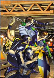 Ultimate X-Men / Ultimate Fantastic Four Annual #1
Writers: Aron E. Coleite and Joe Pokaski
Pencilers: Dan Panosian and Mark Brooks
Inkers: Danny Miki and Troy Hubbs
Colorists: John Rauch and Antonio Fabela
Letterer: Comicraft's Albert Deschesne
Cover: Brandon Peterson
Review: drqshadow
As the opening volley of this fall's big Ultimate Universe crossover, which will be supplanting the regular Ultimate X-Men and Ultimate Fantastic Four books for the entirety of its run, this issue hurriedly throws the entire imprint's current state of affairs out of whack. When the X-Men of the future arrive in the present, they do so with one clear and simple objective: find the present iteration of the Fantastic Four and blow them to smithereens. And, considering the extra years' worth of experience these vets have over their much younger targets, it really shouldn't be much of a fight � that is, until the future Fantastic Four join the fray.
Collaborative writers Aron E. Coleite and Joe Pokaski don't pull any punches, throwing their readers off the deep end from page one with an unfamiliar team of mismatched X-Men. The team's names are recognizable, but their faces and powers are all wrong: Rogue has wings, Kitty Pryde shoots webs and Captain America is wearing an X across his chest. I guess that's one way to quickly, convincingly teach your readers that nothing's off limits in this series. No one except Spidey, that is, as Marvel has already announced that Ultimate Spider-Man will continue uninterrupted beyond this series.
The issue never really slows down long enough to let its readers catch their breath. One jolting, unexpected scene segues directly into the next. Each member of the cast speaks a mile a minute, without individuality. This isn't a cast of characters; it's one voice spread over a dozen bodies. This issue is a wild ride, not without its moments of inspiration, but it's far from being anything I could call well-written. It's a lot of good ideas and a lot of bad ideas all thrown into the same bag and shaken around a bit.
Dan Panosian and Mark Brooks take turns holding the artistic reigns, and have so little in common that the jolt the reader receives upon jumping between their styles is akin to hitting a speed bump at 60 MPH. Brooks provides the framing sequences, and is the better of the two. His bold, textured style is heavily influenced by the work of Chris Bachalo, and while it lacks the flair for the spectacular that Bachalo brings to the table, he makes for a fine stand-in during more static, postured moments. Brooks' characters never seem comfortable, however, and their battle poses are so awkward and strangely composed that his work is sometimes difficult to traverse.
Panosian's artwork is comparatively much more cartoony, often to a fault. While he's being asked to deal with very serious moments that could have long-reaching implications, his thin-lined, exaggerated work often betrays the story's intended tone. His contributions are like a more over-the-top J. Scott Campbell: lumpy, curvy and stylized beyond the point of no return.
There are plenty of chances for the superheroes to flaunt their powers without that compelling of a plotline. Although the writers have tried everything they can think of to convince me that the sky's the limit, I couldn't shake the feeling that a lot of this storytelling is extremely safe. An uncertain artistic offering doesn't do much to improve that situation. Ultimate X-Men or Ultimate Fantastic Four fanatics might find it interesting, but the rest of us would be better off skipping it.
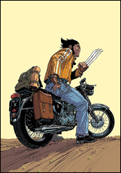 Wolverine: Saudade
Writer: Jean-David Morvan
Artist: Phillipe Bouchet
Cover: Phillipe Bouchet
Review: Guest
You know who doesn't get enough love? Wolverine. I mean, that kid has some huge money-making potential, if only Marvel would stop focusing on those tired old mainstays like Moon Knight and Daredevil who love to hog all of the spotlight.
Luckily for us, someone has answered our prayers and graced us with Wolverine: Saudade. This unpronounceable masterpiece is brought to us by the team of Jean-David Morvan and Phillipe Bouchet, two European visionaries that have come to show us how the sheer artistry of the medium is refined.
Our epic tale starts in Brazil, where our hero Logan is immediately beaten down by a bunch of teenagers, who proceed to steal his scooter. It may not sound like much, but in the matter of only this one page, you get a profound sense of the love this man has for his scooter, and the deep hole in his heart that results. What follows in this unconventional one-shot is a gripping tale of one man's mission to take his clothes off as often as possible in the span of 20 minutes.
The exact time and place of this story is ambiguous, but all you need to know is that there's a villain with deep motivations. This is not a mere stock villain. We learn a lot about him on the five pages he appears. We get a clearly defined sense of his world, and exactly why he must do the horrible things that the does. When he and Wolverine do battle, it is bittersweet, for I did not want this masterwork to ever end, though knew that our hero needed to reach deep within himself to prevail. It makes this reviewer shed a single tear.
There's a "shit" sprinkled liberally on every other page, just so you know that this is a very mature read for those with sophisticated tastes. Gems of dialog such as, "Let's make 'em dance the Death Twitch Samba," and, "Get yer meathooks off my scoot," are just a few of the impactful lines we get throughout.
Bouchet's fantastic artwork is a thing of sheer beauty. His interpretation of the character, mostly resembling an unshaven teenage hippy with lockjaw, is an innovative take on the familiar character, and it's this sort of outside-the-box thinking that makes this entire book a visual delight. Outdated concepts such as shape and form are of no consequence as characters gain and lose up to 50 pounds in each panel. What makes this book most engaging are perhaps the suave fashions that the Canuck sports throughout. You may think that a chain wallet and maple leaf belt buckle are out of style, but you've never seen them done like this before!
One would have to be simply foolish to skip this book. With all the wonderful evidence I've given you here, you couldn't possibly want to skip this. I'll just say skip again so that you'll know exactly what not to do.
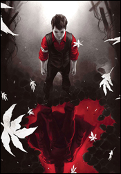 X-Men: Magneto Testament #1
Writer: Greg Pak
Artist: Carmine Di Giandomenico
Colorist: Matt Hollingsworth
Letterer: Artmonkeys' Natalie
Cover: Marko Djurdjevic
Review: drqshadow
Looks like House of M: Civil War isn't the only book to reexamine the birthplace of Magneto's psyche this week. Set once again against the backdrop of Nazi Germany, Magneto Testament takes a closer look at the formative years of one of mutantkind's loudest voices.
There's always been a ready-made connection between the bigoted racism inherent in the Nazi party and the harsh, cruel treatment Marvel's mutants typically receive from humanity at large. It's one of about a dozen real-life movements and tragedies echoed by the currents that underlie every issue of Uncanny X-Men, regardless of the physical threat they may be facing in that issue. The Civil Rights Movement, the persecution of foreign religion during the Spanish Inquisition, even today's struggles surrounding homosexuality, they can each be tied to the same close-minded group thinking that's at the core of these books. Writer Greg Pak understands that simple allusion to the real world, and makes the connection abundantly clear with this tale. When a young Magnus sees an angry mob of swastika-bearing neighbors punishing his family, the correlation to future events is obvious.
Pak tells this story from the right perspective, at the right pace. He sets up his cast in a quiet corner of the city, establishes their simple, understated personalities within just a handful of pages, and then throws the family into the fire almost as soon as his readers have accepted them. The sheer power of the unthinking, unyielding mob that changes these characters' lives shares a powerful message. It's handled carefully but unrelentingly, and is easily some of the best work Pak has ever produced.
Carmine Di Giandomenico's contributed artwork is also captivating. His loosely detailed rendering style and prevalent focus on storytelling bears more than a passing resemblance to the work of Tim Sale, which is a big compliment in my eyes. Were this predominantly a capes n' tights tale, the tone of his work would be out of place. But as a largely pedestrian story focused more on the tragedies surrounding Magnus and his family than his ability to manipulate metal, Di Giandomenico feels right at home. Although he has an obnoxious tendency to grant younger characters abnormally large eyeballs, if that's the worst complaint I can level against an artist, he's doing just fine. The vast majority of this artwork is tremendous, and gives the story the extra personal touch that it was reaching for. And once the civilian nature of Di Giandomenico's illustrations help its readers make that emotional connection to the characters, the story reaps the benefits of their eventual downfall. When the Nazis flex their muscles near the middle of this issue, it's already unsettlingly personal and disturbingly powerful.
If you read one Magneto origin story this week, or this year, or maybe ever, make it this one. It's a fine combination of rich, emotion-charged artwork and a story that captures the simple brutality of a close-minded oppression that's run through human history time and time again. This is as smart as the X-Men have been in years. Buy it.

