Is It Wednesday Yet?
26 August 2008
26 August 2008 � Here we are again with another installment of your favorite comic book review series. As always the comics you're about to read about won't be released until tomorrow (27 August 2008), so these reviews are free of spoilers and should help inform your purchases on new comic book day.
Our grading scale is simple:
Buy: An excellent comic book.
Borrow: A good comic, but save yourself some money by reading a friend's copy.
Flip Through: Give it a once-over at the comic shop.
Skip: This doesn't need to be explained.
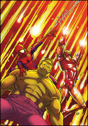
 Marvel Adventures Super Heroes #2
Writer: Paul Tobin
Penciler: Alvin Lee
Inker: Terry Pallot
Colorist: Val Staples
Letterer: Blambot's Nate Piekos
Cover: Roger Cruz
Review: drqshadow
The Earth is once again in danger, this time from an incoming meteor shower, and it's up to Spider-Man, Iron Man and the Hulk to shoot them out of the sky. Sounds simple enough � that is, until they open fire on the first asteroid and it screams. Turns out these meteors are actually men, and they're bombarding the planet as a form of extreme sportsmanship. When the heroes confront them, they agree to hold off on the shower on one condition: that Spidey and company join them on a tour of the craziest stunts and death-defying experiences the universe has to offer.
That should pretty much tell you all you need to know. Where many of the other Marvel Adventures titles I've read recently have been carefully scripted to appeal to both kids and adults alike, this month's Marvel Adventures Super Heroes provides something on par with a mediocre Saturday morning cartoon. The thin storytelling, zany personalities, outlandish situations and wacky adventures probably sounded better in concept than in execution. I'm not sure if Paul Tobin has a lot of experience with these characters, but his renditions of the three identifiable heroes are so out of touch with who they are, I'd highly doubt it. The Hulk is senseless and always smiling, Iron Man doesn't seem to have much in the way of powers outside of flight and Spider-Man's puns are laughable in all the wrong ways.
Tobin doesn't bother with explanations or even the promise of a legible storyline. Why did Spider-Man and the Hulk need to come along with Iron Man? Why did they immediately agree to head out on tour with a group of obnoxious alien rocks? Don't they have other, more pressing responsibilities? When Tobin steps on the gas, he doesn't let-up until he slams the conclusion home, literally, at the last minute. The story's ending is such a ridiculous afterthought that it unintentionally provides the only real laugh of the entire issue.
Alvin Lee's artwork is something of a bright spot, making the most of the dozens of cheesy, over-the-top ideas he's asked to put into play. Lee gets the chance to flex a lot of his underused creative muscles this month, illustrating such scenes as a Kree Gong Show and "Black Hole Bungee Jumping." Auspiciously, his work shines nonetheless, as he's obviously having a lot of fun with the crazy, offbeat mood of the story.
If you're looking for anything more than a creator's sandbox, there's absolutely nothing of merit here. Tobin and Lee were given a little more than 20 pages to pretty much do whatever they wanted, and that's precisely what they did � dragging their readers along, kicking and screaming. If you're the kind of reader who can go back and watch an old episode of Denver, the Last Dinosaur without wondering why you ever enjoyed it, you might find something to identify with here. Otherwise, run away. Despite a workman-like effort from Alvin Lee, you really need to just skip it.
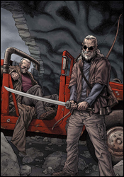
 Wolverine #68
Writer: Mark Millar
Penciler: Steve McNiven
Inker: Dexter Vines
Colorists: Morry Hollowell, Justin Ponsor and Jason Kieth
Letterer: VC's Cory Petit
Cover: Steve McNiven, Dexter Vines and Morry Hollowell
Review: drqshadow
Mark Millar is giving us a glimpse into the future with "Old Man Logan," the current storyline in Wolverine. And, as seems to be the case whenever an �X-book turns its sights forward a few years, things could be a whole lot better. In this case, 50 years have gone by since the heroes lost their final battle. While the bad guys have divided up the United States in the years since that fateful day, the former heroes have either disappeared or submitted to their former enemies' rule. Logan counts himself among the latter.
In "Old Man Logan," Millar has effectively captured the mood he was aiming for. Rather than a traditional superhero tale, this arc takes place on the spot A Fistful of Dollars meets Mad Max. Whether it's Logan's staunch refusal to pop his claws or the low, defeated tone in which its characters speak, it's clear right from the onset that this is a different kind of story. With the narrative set so far into the future, Millar wastes no time letting his readers know that the gloves are off, nothing is sacred and little can be assumed. His treatment of both Daredevil and the Punisher can attest to that. When this writer sets out to impress and surprise his readers, he delivers like few others. I must've grunted my appreciation for this fact a dozen different times this month, turning the page to be kicked right in the gut by yet another incredible, unexpected twist.
With the slate effectively cleared, the story's central plotline gladly takes its readers on a bumpy ride across the unfamiliar countryside. The story's fresh take on familiar characters and exciting, young new faces are equally enthralling. We've known for years what these heroes looked like when they were in charge. How they look after the effects of a devastating loss with the highest of stakes, that's not so familiar. Great loss changes people in different ways, and while its effects on many of these heroes may be initially shocking, they're also completely understandable.
I've been a big fan of Steve McNiven's artwork since he took center stage in the primary Civil War miniseries. If you're familiar with his work during that run, then you should already know what to expect of his contributions here. McNiven's work is gorgeous and descriptive, but strangely organized. He's able to load a character or environment with an incredible level of detail, while introducing a firm sense of legibility and cleanliness to the proceedings. His characters show years' worth of scratches, scrapes, scabs and scars, perfect for the bleak prognosis Millar has painted for them. Likewise, his backgrounds also show their age, and cry aloud for renovation. They look lived in, used and often abused, and that gives the issue a wealth of character.
Mark Millar's storytelling is in top form with this arc, and Steve McNiven's artwork gives the book the visual punch and proven star power it needs to be successful. While this chapter absolutely screams by, it's not for lack of substance. I didn't feel ripped off, like the issue was purposely withholding content to pad the saga out a bit. There's just so much going on here at such a breakneck clip that I was merely disappointed I'd have to wait another 30 days for the action to commence. If the series has a flaw, it's that there's a whole heck of a lot of action and I worry that its conclusion will lack adequate depth, but that's a critique for another day. For now, this is a wild ride, a playground for the creators and a fine display of what can be done when Marvel's premiere characters are unshackled from the restraints of present continuity. Buy it and catch up on the first two chapters if you've missed them. So far, so good.
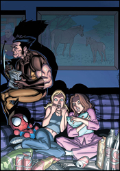
 Wolverine: First Class #6
Writer: Fred Van Lente
Artist: Salva Espin
Colorist: Chris Sotomayor
Letterer: VC's Rus Wooton
Cover: Salva Espin
Review: drqshadow
The last time I sat down with an issue of Wolverine: First Class, I was impressed by the book's casual glimpse at life in the Xavier mansion between fistfights. And, judging from this month's issue, that seems to be one of the cornerstones of the series. I love how matter-of-factly Kitty Pryde explains that the Danger Room actually isn't the most secure place in the mansion; despite its strict security guidelines, it gets "invaded and trashed quite a lot." I was thinking the same thing, actually, and it's nice that the characters don't have such a degree of tunnel vision as to ignore the room's constant use as the backdrop for enemy onslaughts over the years. If the same device has been used enough times for the readers to roll their eyes when confronted by it, certainly the characters should respond in a similar fashion. Because they do, they're granted a certain degree of honesty and believability.
While the title's out-of-continuity status leaves a slightly bitter taste in my mouth � as if we're just treading water, never really accomplishing anything � Fred Van Lente's simple, identifiable dialog and spectacularly everyday plot ensures that such worries are relegated mostly to the back of his readers' minds. Even if the in-continuity Kitty isn't a teenager anymore, the issue's brief, relatable glimpses into her psyche add enough depth to her personality to entertain readers with even a passing interest in the character. Van Lente not only shines with his characterization, his strong sense of comedic timing brings a lot to the table on its own. While the visual puns do sometimes run the risk of going a bit too far, in the end they're kept in check and don't subtract from the experience.
Salva Espin delivers relaxed artwork that fits the cozy nature of the issue. His lightly detailed, casual art direction and focus on his characters' facial expressions and body language reminds me of Stuart Immonen's efforts on Ultimate Spider-Man; although Espin lacks that certain flair for the spectacular that's seen so commonly in Immonen's work. Espin also doesn't bring the kind of care and attention to his backdrops that his USM contemporary consistently delivers, but that's not something I'd say is necessary here. Where Spidey is usually fighting for his life in between petty teenaged arguments, the worst thing Kitty, Siryn and Amp can do in this issue is disturb Logan during the Stanley Cup finals.
This series isn't going to dazzle you with its long, intricate plotlines or shock you with its sudden, unpredictable twists and turns. If you're looking for that style of storytelling, you won't need to look far to find it. Wolverine: First Class isn't your typical X-Men series; it's more interested in the characters than their powers, in adding a touch of humanity to a team that's usually dealing with deeper, darker matters. It's rare that I'll enjoy a lighthearted, semi-serious series as much as I do this one. It's not perfect and it sometimes reads like a teenaged girl's manga, but it never lags and I found my attention rapt from start to finish. I'll recommend you give it a borrow, which is more than I can say for most of the other titles in the X-line.
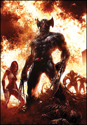
 X-Force #6
Writers: Craig Kyle and Christopher Yost
Artist: Clayton Crain
Letterer: VC's Cory Petit
Cover: Clayton Crain
Review: drqshadow
With Xavier out of the picture, Cyclops has finally taken the big step from field leader to strategic leader of the X-Men. But to say his methods stray from those of his former instructor would be an understatement: take X-Force as a prime example. No longer the playground of Cable and his young recruits, the team is now Scott's black ops hit squad, here to complete the tasks that are deemed too dirty and too dangerous for the regular team. Recently, the group's knack for getting their hands dirty came with a high cost. Having rescued Wolfsbane from a torturous imprisonment, the team brought the injured mutant back to the relative safety of Angel's home. But once there, she snapped, suddenly lunging at her host and tearing the wings from his back. Now, with Angel suddenly reverted to his darker, more macabre personality as Archangel, X-Force has to deal with battles on more than one front.
Clayton Crain, providing both artwork and colors, brings a dark, grainy style to X-Force that really hammers home the title's decidedly mature flavor. With the current storyline testing the waters in the genre of horror, Crain's blotchy-skinned, filthy characters fit almost perfectly. His rendition of Archangel, a character I've never felt was treated as visually ferocious as he deserved, is clearly unstable and borderline terrifying.
However, Crain's tendency to overcomplicate the page reveals his unfamiliarity with basic page layout. His panels bounce around so recklessly that the task of actually directing the reader's eye often falls to an overstretched word balloon. His disorganized storytelling may have been given some leniency were his illustrations a bit simpler, but with this kind of detail and this many moving pieces, there's frequently no way to tell which direction my eye is supposed to move. That makes the issue something of a chore to read, and spoils what would otherwise be a very solid artistic contribution.
Writers Craig Kyle and Christopher Yost are thus far succeeding in their efforts to create an official X-Men title that doesn't feel like an "official X-Men" title. The story's shadowy tone and constant bloodletting sets it far apart from the more straightforward, flashy books that have personified the line for so long. But because they're borrowing many faces from those other series, something just doesn't sit right. When Wolverine grins and mutters, "Sixteen apiece. Kill 'em all," it feels like a totally different character than the one we've been following in Uncanny X-Men for so many years. What happened to rehabilitation, or even a simple berserker rage? In some instances, such as Archangel or Wolfsbane, these characters were in need of a change, and the fresh take is necessary. However, both of those examples ultimately give way to the focal points of Wolverine and his two buddies, X-23 and Warpath.
I can't fault X-Force for striving to create something different within the mutant landscape. That's something it's needed for years, something with enough of an edge to uncover some unexplored corners within the X-Men universe. However, this issue seems like little more than the right attitude driven in the wrong direction. The story and artwork deliver tons of atmosphere, but a thin angelic-themed plot feels more like a recent issue of Ghost Rider. Flip through it if you like, it holds a few surprises, but it's not what it should be or what the publisher needs it to be.

