Is It Wednesday Yet?
12 August 2008
12 August 2008 � Here we are again with another installment of your favorite comic book review series. As always the comics you're about to read about won't be released until tomorrow (13 August 2008), so these reviews are free of spoilers and should help inform your purchases on new comic book day.
Our grading scale is simple:
Buy: An excellent comic book.
Borrow: A good comic, but save yourself some money by reading a friend's copy.
Flip Through: Give it a once-over at the comic shop.
Skip: This doesn't need to be explained.
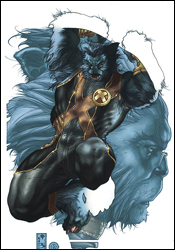 Astonishing X-Men #26
Writer: Warren Ellis
Penciler: Simone Bianchi
Ink Washes: Simone Bianchi and Andrea Silvestri
Colorist: Simone Peruzzi
Letterer: Joe Caramagna
Cover: Simone Bianchi
Review: Dan Toland
The X-Men are wandering around Chaparanga, the "spaceship graveyard," in search of the murderer of what had appeared at first glance to be a mutant, but turned out to actually be an attempt at turning a normal human into a mutant. Cyclops, when not taking time out of his day to explain the whole "I kill people now" thing to Storm, is a brilliant tactician, and comes up with an ingenious plan to bring the murderer down: he's going to throw Wolverine at him.
I miss Whedon and Cassaday.
In truth, this isn't all bad. If Ellis is good at anything, it's dialog, and the X-Men give him a showcase for that talent. It's always good to see these people talk to each other like they like one another, and there are some very good exchanges between Armor, Storm and Wolverine. The story itself is a little slow; this is obviously the start of a larger storyline, and there isn't a lot happening yet. Ellis' stories are written to be much longer, leaving some individual issues to seem unimportant, only to find that one small, easily missed detail becomes vital to the arc three issues later. (This is a shame, because some of the done-in-one issues he did for Transmetropolitan rank as my favorite comics ever.) Whedon wrote for longer arcs as well, but there was almost always enough in the issue itself to make you feel like you got your $3 worth.
Bianchi's artwork is going to take a lot of getting used to, I think. He has a very graceful, European style that's undeniably beautiful in places. It's nothing like anything else Marvel is putting out, that's for damn sure. His Wolverine is the most feral I've seen since Frank Miller's, and he manages to do it without giving him fangs � which is something they were doing for a while. That's not to say this work is perfect, because it's not. Basic anatomy seems to be something Bianchi has a bit of an issue with, and faces vary from panel to panel. It's not always clear what's happening in a given panel, either. And on occasion Storm looks like a female impersonator. But by and large, this artwork is gorgeous and quite stylized in places. My first reaction was, "You got your Heavy Metal in my X-Men," but it would not be the worst thing in the world if superhero comics started looking a little artier.
There's not a huge amount of stuff happening here, and this will undoubtedly make for a much stronger trade collection. However, borrow this book if for no other reason than to pore over the artwork. Though, I wouldn't mind if someone would explain when exactly Cyclops had time to get collagen injections in his lips, but maybe that'll come later.
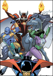 The Last Defenders #6
Writer: Joe Casey
Penciler: Jim Muniz
Inker: Cam Smith
Colorist: Antonio Fabela
Letterer: RS and Comicraft's Albert Deschesne
Cover: Jim Muniz
Review: Dan Toland
When I looked at the first issue of this mini a few months back, I saw a book that was a little rough, but had the pieces in place to put together a halfway decent team book. As the months passed, some of those pieces fell away, and now, as I look at the final issue, I find myself taking a deep, disappointed breath.
The Defenders, that ragtag band of lovable misfits, have seen their roster change on an almost monthly basis over the course of six issues, and now seems to have settled on a vaguely final-ish roster of Nighthawk, She-Hulk, Daimon "Son of Satan" Hellstrom (and his goofy new helmet) and Warlord Krang. Yes, Namor's bad guy. I know. No, seriously, I know. Anyway, they're fighting some kind of artificial version of the Squadron Sinister for the first half of the book, and getting together and hearing various "Come join the Defenders!" sales pitches. So, basically, exactly what the other five issues were about, then.
Casey is one of the better, certainly wittier, writers in comics today. However, there's none of that trademark style here. There's very little joy or fun to be had anywhere in this issue. The battle scene takes up half the book, but it could just as easily have been resolved in a page or two; you never get the impression that the heroes are in any kind of danger, and when they decide to stop messing around and end the fight, they do so in about a page. After this, the book is filled with characters convincing each other to join the Defenders, and Lord knows those scenes are always exciting. There's just no fun here. Nothing to engage the reader on any level. Furthermore, Hellstrom introduces himself to Krang a full two weeks after they fought the Squadron side-by-side, calling each other by name. It's almost as if they said, "Oh, crap. We never actually introduced these two. Oh, well. Slap it over on page 23. Good enough." If the creators clearly don't give a damn, why should readers?
The art style is big, blocky and cartoonish; it's similar to Ed McGuiness, but not as dynamic or fluid. Lots of posing, lots of arms crossed, lots of faces at angles. His She-Hulk remains a highlight, but he's not nearly as comfortable drawing people as he is drawing costumes. He's quite good at action, however, and the pages with battle scenes are pretty vibrant.
Those pages, however, are not enough to make up for the rest of the book. The only possible thing of interest I can see is that there may be a reader out there who's mildly curious as to who the new Defenders are going to be, and since the cover answers that question quite handily, there's no reason to waste your time actually reading this book. Skip over this one.
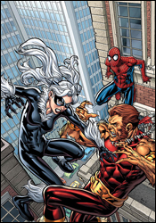 Marvel Adventures Spider-Man #42
Writer: Marc Sumerak
Artist: Vicenc Villagrasa
Colorist: Sotocolor's A. Street
Letterer: Dave Sharpe
Cover: Michael Ryan
Review: drqshadow
The Marvel Adventures line has the ability to produce some of the publisher's most rewarding stories or its most forgettable. The format cuts away the excess and allows a writer to sink or swim based entirely on the merits of their central one-issue plot. Some find it difficult to adjust to the smaller timeframe, where there's little room for the crutches, padding and gimmicks that are beginning to characterize more and more mainstream books. I can remember when a multi-issue story arc was something special. Now it's become so frequent that they've become the norm, while the standalone tales provide an infrequent change of pace.
This issue's author, Marc Sumerak, gets that concept half right. He doesn't waste our time with an excessive background, cuts right to the chase in delivering some web-slinging action and keeps his cast small and uncomplicated. What he doesn't achieve is a reason for this issue to stand apart from every other that had come before. This is very much a stale, redundant Spider-Man story. He plays it so safe with these characters that I think they're sometimes afraid to interact with one another, fearful that they'll somehow upset the status quo and won't have enough time to reset it before the issue draws to a close.
Worse, the entire issue is so clearly telegraphed that I caught myself predicting the twists its plot would take. Sumerak's dialog is equally dull and predictable. Nobody speaks like an actual human being any more than they act like one, casually strolling around the rooftops in spandex until suddenly the light turns green and it's time to fight. The issue's central conflict doesn't come off as a chance encounter between Spidey, the Black Cat and Puma so much as it does a mock stage recital. These guys aren't talking to each other, they're delivering their lines.
Sumerak's artistic partner, Vicenc Villagrasa, doesn't do much to improve the situation. He takes the author's material and simply converts it to linework without enhancing or refining it. Villagrasa's work is stiff and awkward, his lines thick and blunt with no finesse or personality. This looks like an issue that was rushed out in little more than a weekend. It's short on composition, detail, pride and purpose.
That means this issue is both a chore to read and a drag to look at. It's not an example of what can go wrong within the confines of a Marvel Adventures story, it's evidence that sometimes a bad story is just a bad story. This wouldn't have been any more successful in a multi-issue story arc than it was in a single, self-contained adventure. Skip it, even if you're really desperate for a Spider-Man story.
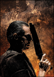 Punisher #60
Writer: Garth Ennis
Artist: Goran Parlov
Colorist: Lee Loughridge
Letterer: VC's Cory Petit
Cover: Tim Bradstreet
Review: drqshadow
Frank's finally crossed the wrong people. In a group of US Army generals, Castle has met an enemy who knows who he is, where he came from and all of his strengths and weaknesses. They've confronted him with a combatant he refuses to fight (United States soldiers), chased him from his most secure safe houses, survived his booby traps and plundered the vast economical reach of the entire army along the way. And, surprise, they've got their wish: he's in captivity. As it turns out, though, the real question isn't how they plan to capture him, but how they intend to keep him there.
The last issue of The Punisher under the watch of longtime scribe Garth Ennis is a conclusion in every meaning of the word. Since launching the series under the MAX imprint (I'd just as soon forget what he did with later issues of the Marvel Knights title), Ennis has left dozens of plot threads dangling, confrontations unresolved and burnt men breathing, and it's all come to a head in this arc. Naturally, that means if you're picking up the series for the first time, you're going to be left almost completely in the dark. But if you've been following it all along, then you're reaping the benefits of years of build-up. It's a rewarding payoff, if not the most instantly accessible.
Strangely, this last chapter in Ennis' skull-chested career isn't his finest hour with the character. The brunt of the action took place earlier in the arc, and this issue is really little more than one last chance to wrap everything up, provide a sense of closure and talk about it. Yeah, let's all sit down with Frank Castle and have one long, introspective chat. Not exactly what I think anyone would expect from an issue of The Punisher. If that weren't drab enough, Ennis breaks up the issue with full-text chapters of Valley Forge, Valley Forge. The biography of a soldier who fought in Vietnam, the book provides an interesting look at the birth of the Punisher through the eyes of a man who was there to see it personally. It's insightful reading, but it's also infuriatingly distracting. I understand that this was probably something Garth wanted to get out in the open before he washed his hands of the character, but it doesn't match the present-day story that it's interrupting, and it feels like an excess of copy, dropped into an already slow-moving narration.
Goran Parlov, Ennis' most recognizable partner during his stay on The Punisher, delivers another strong performance on the artistic side this month. Parlov has caught his share of grief during his work with the character, and while I'll concede that his artwork isn't for everyone, I've enjoyed his stay. In the same vein as Steve Dillon, Parlov's simple, blunt style provides an excellent counterpoint to Ennis' brutal, action-packed storytelling. While his art has shown some signs of decay recently (some of this month's contributions show either a lack of time or effort), his compositions remain strong and I continue to enjoy his work. Even when he's tasked with long, dreary scenes of conversation and not exploding muzzles, sailing body parts and thick fountains of blood, Parlov keeps things interesting and I appreciate that.
This is a rewarding conclusion, no doubt about it. The bad guys get what's coming to them, and you'll be surprised by how easily it all comes together. Unfortunately, it isn't the crowning moment I was hoping it might be. Upon concluding this sensational run, I'd thought maybe Ennis would give himself a better sendoff. Instead, he's produced something that's worth a borrow, but not a buy. It's a fine tale, with roots planted long ago, but that doesn't instantly make it a great read. The excruciatingly slow pace and abundance of words keep this from being all it could be.
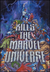 The Punisher Kills the Marvel Universe
Writer: Garth Ennis
Penciler: Dougie Braithwaite
Inkers: Robin Riggs, Sean Hardy, Don Hudson, Michael Halblieb, Martin Griffith and John Livesay
Letterer: Bill Oakley
Colorists: Shannon Blanchard and Tom Smith
Cover: Dougie Braithwaite
Review: Dan Toland
You know how I get down on Marvel comics from the last decade? How I talk about how the writing came second, and that the art was more interested in being "kewl" than in making any kind of storytelling or anatomical sense whatsoever? Well, maybe I'm being unfair. Maybe I'm misremembering. Maybe there was a lot more going on over at the House of Ideas than I'm giving them credit for.
Nope!
This is a reprint of a one-shot that came out in 1995. In this alternate reality tale, Frank Castle's family was killed as innocent bystanders in a battle between the Avengers and the X-Men on one side, and a Brood / Skrull invasion on the other. Frank, a cop who arrives on the scene to find his family dead, pops his champagne cork when Cyclops essentially shrugs his shoulders and says, "Life's like that sometimes," mowing down a heaping helping of superheroes on the spot. From there on, he becomes the Punisher: the killer of every character Marvel holds a trademark on.
This is a 48-page cluster of awfulness from page one. Ennis was an up-and-coming writer for DC's Vertigo imprint at the time; having made his name on Hellblazer and The Demon, Ennis was only a few months away from unleashing Preacher on the unsuspecting comic-buying world. And as Marvel would find out for real in a few short years, he was the perfect writer for The Punisher. This was both his first Marvel work, and his first real superhero comic of any kind. (The Demon might have been set in the DCU, but it's hardly what anyone would classify as a superhero comic.) It's clear he wasn't anywhere near his comfort zone. The only way this could have worked is if everyone was written completely out of character, and so we're treated to a Spider-Man who whines about having a gun in his face, a Captain America who turns his back on Castle and a Cyclops who treats the deaths of innocent civilians as a mild annoyance. And as toothless as the Comics Code was in 1995, it still meant that most of the killings had to be off panel. Which is convenient for the writer, otherwise he would have had to explain how Frank was able to kill Thor, Iron Man and Hercules.
Wrecker: I haven't seen Thor in a while.
Thunderball: Didn't you hear? Some guy shot him!
Wrecker: Someone shot Thor? Can you do that?
Thunderball: Apparently!
Wrecker: Wow, have we been overcomplicating things.
And the art. Hoo boy, the art. This is bad. It's real bad. Everything that could possibly be hated about comic artwork from that era is here on full display in one easy-to-use 48-page container. There's no storytelling. Anatomy is guessed at. Action is wooden and boring. And you can see people's veins through their clothing. It doesn't help that there are six inkers on this damn thing. There's zero consistency from one page to the next. The colorists can't even decide what color Matt Murdock's hair is. This is a hideous-looking comic.
But none of that is going to stop Marvel from trying to get your money � for a third time. (This was first published in 1995, right before Ennis' star rose. Reprinted in 2000, a month before his regular gig on The Punisher began. And now, again, as his final issue of The Punisher sees print. Shameless.)
This one-shot originally came at a time when the title "The Punisher Kills the Marvel Universe" was all that was needed to sell a comic. The artwork and writing were completely incidental. This was a terrible pile of garbage in 1995 and it's certainly no better in 2008. Skip the hell out of this book, and have some pity in your hearts for the comic fans of the 1990s, when everything was like this.
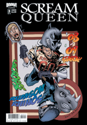 Scream Queen #3
Writer: Brendan Hay
Artist: Nate Watson
Colorist: Andrew Dalhouse
Letterer: Marshall Dillon
Cover: Nate Watson
Review: Dan Toland
Bodies are piling up around Rumson High School student Molly Sarver. People who bully her, bosses who get in her way, anyone who creates so much as an inconvenience in Molly's life is found with their head somewhere further away from the rest of their body. After the fourth, it occurs to Molly, who is never going to have to worry about having to stay awake during one of those long, boring Nobel Prize banquets, that these might not all be coincidences. I wonder if the mentally retarded, misshapen mockery of a human being in a big blood-stained rhino suit might have anything to do with it.
Okay, we'll start with the story. Wrighty, the psycho in the rhino costume, is showing his love for Molly by following her around and hacking up anyone who either makes her life unpleasant, or gives off any kind of vibe that they might want to ask her out. Because as Wrighty says, "No. Other. Boy. Friends." As masked killers go, Wrighty talks to himself an awful lot, but it tends to run along the lines of "Why Molly no like me? No other boyfriends but me! Aargh! Giant rhino head no fit through door! Wrighty smash!" Okay, that last one was mine. I don't know if this is supposed to be a straight up slasher pic in comic book format, or a send-up of a straight up slasher pic in comic book format. It's totally absurd, but so was Chopping Mall. It's not particularly funny, but neither was Scream 3. You can understand my dilemma here. Brendan Hay, a staff writer for The Daily Show, has written a script that takes all the clich�s of the slasher genre, starts to turn them on their heads, but then continues to turn until they're all right-side up again. He then leaves them there, and you have to wonder what all the effort was for.
But the writing is a work of genius when you compare it to the artwork. It's awful. I seriously hope Watson is getting paid in McDonald's coupons or free hugs, because no one should be handing him actual cash money in exchange for this. This is fanzine / high school notebook / amateur-hour stuff. Every character in the book is walleyed, grows and shrinks from panel to panel, has massive cranial deformities and their skeletal structures are composed entirely of rubber. Many panels look like enlarged thumbnails, and more appear to have been first drafts done in ink. It's rushed, it's sketchy, it's over-rendered and when the best-defined character in your book is the guy in a mascot costume, you have a very serious problem on your hands. Hell, when I look at a book and think to myself, "I wonder if this would have been any better if Liefeld was drawing it," you have a potentially catastrophic situation.
On the whole, BOOM! Studios is doing some fantastic work, but this comic is just amateurish; I'm even finding mistakes in the lettering, for crying out loud.
This was worse than Anita Blake.
Babychest.
 Secret Invasion: Runaways / Young Avengers #2
Writer: Chris Yost
Artist: Takeshi Miyazawa
Colorist: Christina Strain
Letterer: VC's Joe Caramagna
Cover: Michael Ryan
Review: drqshadow
If you don't know the full story behind the Skrull invasion by now, just walk away, because you're hopelessly behind and this book isn't going to make a lot of sense to you. With that said, the angle Runaways / Young Avengers takes on this big event is both pertinent and unique. More than just a random tie-in that spotlights unrelated heroes, their brawls with the bad guys and a miniscule part of the story, both of these youthful squads actually count a green-blooded Skrull among their ranks. The Young Avengers' Hulkling and the Runaways' Xavin, each localized former members of the Skrull empire, were caught off-guard by the sudden, jarring assault of their brethren. Now, they find themselves caught between the invading power of their own flesh and blood, and the resisting force of their longtime friends and teammates.
After just a single issue, Chris Yost has dropped both teams into the heart of the conflict, given them an original say in the proceedings and put the whole ordeal into perspective. He never misses an opportunity to remind the reader that children populate both teams, and that kids (even superpowered ones) have a tendency to absolutely panic when the status quo is thrown into question. The Skrull attack is so sudden, so unexpected, that it's easy to identify with those characters who do lose it during that moment of revelation, and to look up to those who keep it together and take command.
Yost keeps the action moving at a breakneck pace, bouncing to a new conflict as soon as the last is resolved, but that doesn't mean this is purely an action book. While the tempo may be fast and furious, there's enough room for conversation within these pages to keep the reader emotionally involved in the proceedings and retain the distinct personalities of both teams. Where Brian Bendis' primary Secret Invasion title is more concerned with what led to this moment, and the diversions involving the heroes in the Savage Land, Runaways / Young Avengers is focuses on the here and now / ground zero of the attack. In that way, it reads more like a primary narrative than the main series, which came as quite a surprise.
Artist Takeshi Miyazawa and colorist Christina Strain make a tremendous visual pairing. Miyazawa's clean, animated style is both dramatic and simplistic, while Strain's colors are vibrant, dramatic and perfectly matched to her partner's work. Hidden within a simplistic grid layout, the issue's inhabitants bounce around the page recklessly, but in the end it's an ordered form of chaos. Miyazawa's layouts are fantastic, constantly testing his boundaries with extreme close-ups, daring new angles and a friendly excess of motion. My eye raced down the page, led through the action brilliantly by the fluid motion of this artwork, before bouncing back to the top to further appreciate the power of each composition. The characters are individualized and amazing to see in action. They display little touches of personality, not just through wardrobe and facial expression, but also through body language. And Miyazawa magnificently plays up their relatively miniscule size in comparison to the sinister Skrulls. It's great work from top to bottom.
While I came in with low expectations, it took all of four pages for this issue to hook me up and reel me in. It's simple, effective storytelling matched with incredible artwork and blow-away colors. Secret Invasion: Runaways / Young Avengers is more than just a side dish, it's an attraction all its own. Buy this up. I had more fun with this issue than I've had with all four episodes of the regular Secret Invasion.
 Secret Invasion: Thor #1
Writer: Matt Fraction
Penciler: Doug Braithwaite
Colorist: Paul Mounts
Letterer: VC's Joe Caramagna
Cover: Gabrielle Dell'Otto
Review: drqshadow
So you thought the Skrull invasion was limited to the human-occupied sections of our planet? Well, in case you've forgotten, Thor and his Asgardian brethren have recently taken up residence in the air above a sleepy Oklahoma town, and from the green skins' perspective that means they're just another civilization in need of demolition. In a two-pronged attack, the Skrulls are moving at once on both Asgard and Broxton, Oklahoma, and Thor can't be in two places at the same time. For this fight, he'll need to call in the reserves.
Matt Fraction's connection between the Skrull empire and the rulers of Asgard is surprising and effective. He gives the aliens a sadistic, downright evil persona that's missing from many of the other Invasion tie-ins. The method in which the Skrulls deliver their warning to Thor and his people is shocking in its brutality and its simplicity, and that gives them a harsh edge that motivates the reader to see them utterly annihilated. Honestly, I've never had the time of day for Thor, but in Fraction's hands I found myself sympathizing and pulling for Beta Ray Bill, of all people.
I was especially impressed by the human element that Fraction added to this issue. When Thor summons a storm to help extinguish the fires ravaging Asgard, it would be easy to overlook the reaction of the common folks on the ground. Instead, he uses it to add a compelling extra layer to the proceedings; he gives us a glimpse at a TV weatherman frantically announcing the sudden storm clouds to the city's population. He relates the startling composure of the city's populace, beaten into submission by the regular late-summer storms that personify life in the guts of tornado alley. Thor and Asgard's lives are intertwined with these people, and it's refreshing to see them treated as primary characters on the same level as the Gods themselves.
Doug Braithwaite's accompanying artwork fluctuates between outstanding and humdrum. His greatest strength (and, clearly, his primary interest) is in architecture and scenery, but he has a hard time with humanity in general. When Fraction tasks him with a two-page spread of Asgard in flames, what he delivers is downright staggering. He captures the epic, towering beauty of the mythical city, and counters it with the disturbing visage of flames in its heart and unnatural plumes of smoke floating through its streets. And then he plants it firmly in reality by adding the simple touch of a flock of frightened birds, scattered in the distance. But then, just one page later, Braithwaite is asked to impress us with Thor's transformation from human to God of Thunder, and he misses on every front. When the getting's good it's great, but when it's bad it's almost unbearable.
Secret Invasion: Thor is told in a style that's markedly different from the rest of the Invasion tie-ins, but it fits into the whole of the event. It's a much darker, more disturbing take on the central events, and that's an angle that the big picture sorely needed. Matt Fraction nails the writing this month, and if he'd had a more consistent artistic pairing, I'd be recommending you buy this. Unfortunately, Doug Braithwaite's weak moments are more numerous than his strong ones. This is certainly worth borrowing if you can, and provides an excellent compliment to the main Secret Invasion limited series.


