Is It Wednesday Yet?
05 August 2008
05 August 2008 — Here we are again with another installment of your favorite comic book review series. As always the comics you're about to read about won't be released until tomorrow (06 August 2008), so these reviews are free of spoilers and should help inform your purchases on new comic book day.
Our grading scale is simple:
Buy: An excellent comic book.
Borrow: A good comic, but save yourself some money by reading a friend's copy.
Flip Through: Give it a once-over at the comic shop.
Skip: This doesn't need to be explained.
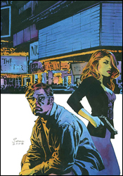 Criminal #4
Writer: Ed Brubaker
Artist: Sean Phillips
Colorist: Val Staples
Cover: Sean Phillips
Review: drqshadow
Thanks to the format, which spotlights different characters in each arc, there's actually no better time to jump into Criminal than the present; new readers don't need a crash course in the title's history to understand and enjoy its contents.
This month we're following Jake, a reformed criminal who'd made an honest life for himself before a fruitless police investigation sent him right back down into the gutter. Years later, missing his family and unable to sleep for more than a few hours at a time, he's fallen into a deep, dark hole of self-pity. Brubaker gives us such a profound, unyielding look at the man's mind that it's hard not to find something to identify with. Even if you've never suffered through the dread of a sleepless night and an overactive imagination, just a few pages of Jake's thoughts are enough to make the incident relatable.
And, just when he's led you to see a little bit of yourself in the character, Brubaker throws him into the fire. He shares enough of Jake's daily routine for us to understand just how deep of a rut he's in, before tossing in a twist that neither reader nor character expects. Once you've taken that plunge, it's a twisty, bumpy ride the rest of the way.
Sean Phillips has been slamming the ball into the stands so routinely on this series that it's become almost too easy to take his artwork for granted. His style — a blend of the emotion-charged simplicity of Tim Sale and the dark, grimy mood of Alex Maleev — is a perfect soul mate for the tone and personality of Brubaker's story. Phillips's work is subdued and pedestrian enough to duck under the spotlight, but adds so much to the series that I can't say it could be successful in another artist's hands. His connection with the book's routinely shifting cast is almost hauntingly accurate. This month, for example, he perfectly captures the empty, piercing stare of Jake's insomnia in the midst of a long night. Not quite awake but certainly not asleep, he stares right through the reader like a ghost. He's looking into your eyes, but he doesn't hear what you're saying. Phillips has really settled into this role, and his familiarity with the material is beginning to pay dividends in his already-strong artwork.
After being disappointed with the last arc, I was pleasantly surprised by the return to form evidenced by this storyline. Sean Phillips' artwork has never wavered, and though he's survived some ups and downs elsewhere, this is all the evidence you'll ever need that Ed Brubaker's writing can be, at times, absolutely perfect. This arc of Criminal should be in your permanent collection. Buy it and enjoy it.
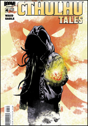 Cthulhu Tales #4
Writers: Mark Waid and Mark Sable
Artists: Chee and Sergio Carrera
Colorists: Andrea Barretto and Andrew Dallhouse
Letterer: Marshall Dillon
Covers: Marco Rudy
Review: Dan Toland
Okay, first a confession: I do not particularly care for Lovecraft's writing. Every time I try to read him, it's just too difficult to plod through. The language, while admittedly lyrical at times, is just too dense and unsolvable to really enjoy. His style does nothing for me. There's a bit too much "someone reads the Necronomicon, sees horror the author can't describe, then goes insane" going on. And his attitude towards non-white people is, even for the time in which they were written, reprehensible. However, some of the stuff he came up with is fascinating. I really dig some of his ideas; the man could create some far-out shit, no denying. The scope of his imagination was astounding, and his reputation is rightly deserved for that.
Which leads us to Cthulhu Tales, BOOM! Studios anthology series starring everyone's favorite Great Old One with a squid for a head.
This issue has a pair of stories. The first, "In the Π of the Beholder," written by Waid and drawn by Chee, the Necronomicon finds its way into the hands of a frustrated mathematics professor desperate for a chance to discover or invent the next great breakthrough. He wants to be the next Einstein or Hawking — to be remembered forever. So against all laws of common sense, he pokes around in the book, which apparently has some math problems in the back, and the result is pretty much exactly what you'd expect.
As slight as this story was, I have to say I really enjoyed it. The professor has an understandable, easily relatable problem, and even though anyone with an even basic understanding of Lovecraft knows where things are headed, it still engaged me. At least part of that was due to the length; at twelve pages, we get a full and complete tale, with absolutely zero filler. Every image, every word is necessary. It's tight. And the art is wonderful. Chee draws sympathetic, realistically designed people, with fantastic mood and just enough surrealism to sell the horror aspect without compromising the realistic tone. And the splash panel is superb. I currently have it as my desktop background.
The second story, "There Will Be Blood," by Sable and Carrera, tells the tale of a very bad day in the life of Hassan Alhazred, descendant of the Mad Arab, Abdul Alhazred, who wrote the Necronomicon 1300 years ago, thereby setting all subsequent wacky antics into motion. Hassan is now following in his family's line as keeper of the book, preventing it from falling into anyone's hands, in order to protect the world and, in some way, atone for his ancestor's really, really, really bad idea. But today, this is sorely tested as Hassan finds himself on the receiving end of an interrogation by American mercenaries who are looking to drink Hassan's milkshake and have no idea what they're poking at.
This story is altogether less successful than the first. Sable's script is a little on the clunky side, and with one notable exception in a flashback detailing Abdul's discovery of the Hidden City, Carrera's art is too sketchy and abstract to successfully convey the horror the story is trying to get across. In fact, the scene in which things start to go bad is more amusing than frightening. I have to wonder if this time the page count worked against the story: things are rushed, and there's no time to set Hassan up as the sympathetic character he's clearly meant to be. This would have benefited from being a little longer.
Anthology comics can be funny things. Multiple stories, varying in quality, make it difficult to really get behind them on any kind of consistent basis. This issue is 24 pages, and even with no ads, it's a little steep at $3.99. In the end, this comic just barely gets a borrow from me. The first story is excellent and merits more time than a quick flip through, and the second certainly isn't bad. (And I love that cover.)
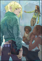 NYX: No Way Home #1
Writer: Marjorie Liu
Artist: Kalman Andrasofszky
Colorist: John Rauch
Letterer: VC's Joe Caramagna
Cover: Alina Urusov
Review: drqshadow
NYX has had a somewhat colorful publishing history. From the original proposal, greenlit and then suddenly canceled before production could begin, to the finished series, marred by so many delays that its artist split for an exclusive contract with DC after four issues, it hasn't been smooth sailing so far. With this new #1, I'm sure Marvel's goal is to leave all that chaos behind in favor of a regular publishing schedule, a stable creative team and a closer focus on the events contained within the book, rather than those surrounding its creation.
Marjorie Liu picks up where Joe Quesada left off, scribing the adventures of a close-knit group of homeless mutant teens in Manhattan. She takes her time reintroducing us to the cast, and while that gives the new artist a lot of room to familiarize himself with the players, it doesn't exactly make for compelling reading. In fact, there isn't really anything of substance here until the final pages. It's great that the new writer is displaying her commitment to characterization, sharing with us the minute ways each mutant's life has changed for the ordinary, but if the primary goal of this first chapter is to capture on-the-fence buyers' imaginations, this isn't a success. The kids' mutant powers, which should be what sets them apart and drives the reader's interest in their personalities, are barely touched upon. This is about 10 pages' worth of drab, conversational storyline stretched over the course of an entire issue.
Original series artist Josh Middleton has long since moved to bigger and better things, so it's up to Kalman Andrasofszky to fill his shoes and help readers move past the shake-up. Fortunately, the new guy produces fine work, and the transition is an easy one. He doesn't try to mimic Middleton, but the two do work a similar style — so there are a few natural similarities. Both artists depend on a lush, stylized, organic treatment, and where Middleton would rely on his own colors to provide much of the details, Andrasofszky is much more dependent on traditional pen and ink. Josh's work is often painstakingly detailed, but his ability to show restraint at opportune moments keeps it from feeling too busy.
The new series artist shines most brightly in his backdrops, although that's not to demean his work in the foregrounds, either. His New York is bustling with activity, alive and unmistakable in every panel. I'm sure Liu didn't mention that panhandler wordlessly seeking a buck or the junkie passed out in the stairwell anywhere in her script, but their addition does a whole lot to tether the book in the real world. There's always something going on; the lead characters aren't above interacting with the extras, and I like that.
This new launch for NYX isn't an unbridled success. Where my initial fears were for the change in artists, it turns out my greater concern should have been for the writing. While Kalman Andrasofszky's artwork is genuinely intriguing, Marjorie Liu's storytelling leaves its counterpart hanging. With a little more direction, this could be outstanding. Right now it's just worth flipping through.
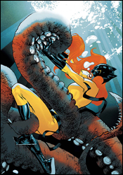 Patsy Walker: Hellcat #2
Writer: Kathryn Immonen
Artist: David Lafuente
Colorist: John Rauch
Letterers: Dave and Natalie Lanphear
Cover: Stuart Immonen
Review: Dan Toland
Last month, Iron Man shipped Patsy Walker to Alaska as that state's Initiative representative. All right, I got that. Then she was attacked by bears with antlers. Yeah. Oh, and she seems to be about to get eaten by a tentacled sea creature.
Now, after fighting said sea creature, Patsy's landed in a tent surrounded by a group of what appears to be Inuit or Yupik tribal elders, who take turns insulting her and preparing to throw her into a situation that really isn't made totally clear. But it involves giving her a station wagon and putting a big ugly stone thing in the wayback that's apparently a map, which spends quite a bit of the trip shouting at Patsy.
Yeah, it's pretty weird.
Not only does this comic not make a shred of sense, it's not really interested in doing so. I didn't read part one, and I don't know if it would have made a difference or not. Nothing actually seems to happen in this issue. It's almost like a bridge between last month and next, and the second issue is way too soon to be doing that. I imagine this will all hang together a lot more effectively as a trade.
Now, with that said, this is not without its merits. In fact, it's a fun read. Immonen's script is pretty amusing, and the manner in which Patsy is hurtled from one situation to the next keeps things moving along very effectively. Immonen's Patsy is a very goofy character with a great sense of humor. Plus, she's a redhead. Mmmmm...
What? Oh, right. Reviewing.
Lafuente's art is a little odd. It's extremely manga-influenced. I don't know if I'd care for it at all in any other situation, but it fits this story perfectly. It's cartoonish, but so is the story. And he brings his own sense of humor to the proceedings. Did you ever see Excel Saga? (No? You should.) This is not a million miles away from that. Well, Excel Saga after taking a couple of Valium. It's not nearly as frenetic, but it mines a similar vein. The facial expressions, movement and background absurdity all add to the appeal of the package.
However, it's still a very confusing package that ultimately goes nowhere. It's hard, because I'm reading this and I want to like it and I want to be able to recommend it. I can't, though. It's too disjointed, too obscure and practically nothing happens. I will be looking at this series in the future to see where, if anywhere, this goes, but the best I can really bring myself to give this book is a flip through. Look it over in the store, see if any part of it does anything for you, but don't think about it too hard.
 Secret Invasion: Front Line #2
Writer: Brian Reed
Artist: Marco Castello
Colorist: Barbara Ciardo
Letterer: VC's Cory Petit
Cover: Juan Doe
Review: drqshadow
We're now into our third major, superpowered crossover, and Front Line, Ben Urich's infant newsprint endeavor, is rolling with the punches. Between the civil war, the Hulk's downtown tirade and now the Skrull invasion, Urich's barely had time to climb out of the trenches, but like a good reporter, that hasn't stopped him from digging to unearth the truths behind these historic events.
Front Line has always been a collaborative piece, with one or two featured storylines and a set of short stories backing it up. For Secret Invasion, that formula has been tweaked: the short stories are gone, and the pair of dueling main plotlines have been split into six equal points of focus around the city. Instead of just Ben and Sally, now we're keeping tabs on Urich, an ER doctor, a cab driver, a designer, his daughter and a police officer. And while that sounds complicated on paper, in practice it does a lot to pull the whole book together.
I was never a fan of the previous format, as I found that none of the chapters were given enough room to breathe and the experience was asking too much of a reader. It's one thing to spotlight four different stories from four different creative teams, like Marvel Comics Presents offers, but when you're also jumping from a traditionally paneled comic to plain text with illustrations and back again, it gets tough to find the proper frame of mind. In the book's new layout, writer Brian Reed is able to tie each of the six primary characters together without losing his readers along the way.
While Reed does tend to overdo it with his dialog, the heart of his story remains interesting. In the same vein as previous editions of Front Line, he portrays the civilian perspective of the Skrull invasion — the view from the street as New York is blindsided by a sudden, jolting alien onslaught. While that's not exactly a fresh concept, as Marvels brought the idea to the forefront years ago, it's used infrequently enough to remain an effective alternative to the flashier, superhero-focused point of view presented in the primary Secret Invasion series.
Marco Castello's accompanying artwork has its moments. He brings an animation-influenced simplicity to the page, which keeps the issue easy to navigate, but lacks the emotion and drama that's usually inherent with such a style. In a few specific panels, his characters' emotions are almost laughably mute, like the woman who casually diagnoses a police officer's injuries (as though she were writing a grocery list) while a massive spaceship zaps the streets behind her. I had trouble getting into Castello's work for the same reason I never really fell head over heels with the Luna brothers or Dreamwave Productions; I admire the simplicity of what they're doing, but I can't really get into a story when it seems like its world is populated by robots. The inappropriate emotions and stiff, unnatural poses are such a distraction that I had trouble appreciating the finer qualities of Castello's artwork. That's a shame, too, because what few action scenes he's granted are very appealing.
This Skrull-focused chapter in the Front Line story is, overall, a much easier read than the two runs that came before. The series benefits from the change to a single creative team, and while it's far from required reading, this at least provides a fresh take on the big picture. Flip through it, nothing more.
 Spider-Man Loves Mary Jane #1
Writer: Terry Moore
Artist: Craig Rousseau
Colorist: Guillem Mari
Letterer: Dave Sharpe
Cover: Terry Moore and Christina Strain
Review: Dan Toland
The first issue of the new Spider-Man Loves Mary Jane series details the first day of school as MJ and friends enter their sophomore year at Midtown High. Over the course of a single day, Mary Jane angsts about boys, goes to drama class, gets a job, thinks about cheerleading and dreams of being carried away by a 30-foot-tall Spider-Kong, even though Spidey is so last year and we shouldn't read anything into it.
This book is absolutely delightful. There's not a single aspect that doesn't work. If you're doing a comic about relationships from the women's perspective, Terry Moore is really the guy you want. If you've been missing Strangers in Paradise, you could do a lot worse than checking this out. Remember a few weeks back, I raved about how X-Men: First Class had the most realistic portrayal of teenage characters in comics? Yeah, forget I said that. In this book, Moore writes characters which are wholly three-dimensional. Mary Jane speaks the way actual, honest-to-god people speak. Well, I mean, she's probably smarter and more mature than she ought to be at her age, but it's something I'm willing to buy into because it's just so damned entertaining. And she speaks differently with Liz Allen than she does with Peter Parker or with her mother. It's done very subtly, but it's there nonetheless. And when she complains to Liz because her mother actually expects her to pay her own cell phone bill? I looked at that, remembered having the exact same argument on both ends (years ago with my parents, and weeks ago with my son ) and immediately recognized that teenage mentality perfectly encapsulated in a single word balloon. Great stuff.
Rousseau's art is going to be an adjustment for people accustomed to Takeshi Miyazawa. Gone is the manga flavor, but it's still instantly accessible. Due to the nature of this book, there's no action or 'splosions or "kewlness" to hide behind; someone who works on a book like this, a very low-key comic entirely based on character interaction, has to be a really solid artist with good storytelling skills. Rousseau comes through quite nicely. You know what MJ is thinking without needing a caption; her expression is clear without being overdone. Peter looks like a skinny nerd. A troubled girl in MJ's drama class sells her anguish even without Moore's dialog. And the look on MJ's face when presented with the frozen casserole she was left for dinner is largely the same as the one I have had many times.
Spider-Man Loves Mary Jane is a fairly transparent bid by Marvel to break into the market of young female readers who devour manga obsessively. With that said, it's a hugely entertaining book that anyone can enjoy. It's an undeniable buy. For that matter, it's going on my pull list as soon as I finish this review. It's that good.
 Venom: Dark Origin #1
Writer: Zeb Wells
Penciler: Angel Medina
Inker: Scott Hanna
Colorist: Avalon's Matt Milla
Letterer: VC's Joe Caramagna
Cover: Angel Medina
Review: Dan Toland
Okay, I admit it: When I saw this in my inbox, I assumed I accidentally kicked a puppy the other day without realizing it and that this book was my karmic retribution. Venom, as a character, holds about as much appeal for me as rush hour traffic. I'll get through it and it won't scar me for life, but it's irritating and there are other things I'd rather be doing.
However, this comic is less interested in having Venom run around trying to eat peoples' faces, than in exploring the character of Eddie Brock, and figuring out what makes the kind of person who would voluntarily bond with a symbiotic alien and proceed to eat peoples' faces. Some time is spent on the requisite unhappy childhood, but Wells seems to be more interested not in detailing the underlying causes of why Brock's life was so bad to begin with, than in exploring his psychology. Brock is desperate for attention, and intrinsically incapable of telling the truth about even the most innocuous things. He's so broken that he seems to believe, on some level, all the crap he's peddling. And he's the only one; he's totally transparent to everyone around him. He's spiraling downwards, making things worse and worse with each lie, and it's only a matter of time before the house of cards he's building comes flying apart. It's absolutely inevitable.
Wells' script is firing on all cylinders. The reader both feels enormous pity for Brock, while simultaneously being totally disgusted by him. A lot of ground is covered in 32 pages, but it never feels rushed. This is a highlight reel (of sorts) of Eddie's life, and enough time is spent with each scene to give the reader all the necessary information, but no more than that.
I'm making myself crazy trying to figure out where I've seen Medina's work before. It wasn't recently, but I know I've seen this style. Anyway, it's really interesting. It's extremely cartoony, to the point of caricature. Gigantic heads sit precariously atop pencil-thin necks. However, his faces are expressive like few other artists', the characters are generally pleasant-looking and the book is easy on the eyes.
This is entirely a character-driven story. That it's at all entertaining is solely on the shoulders of Zeb Wells' script, which has taken a one-note character and given him some humanity. It's not the deepest story ever written, but it does precisely what it sets out to do, and it does it pretty well. Borrow this one, because you'll enjoy it for what it is.
Bill Plympton! That's what the art reminds me of! Oh, that was going to bug me all day.
 Warhammer: Condemned by Fire #3
Writer: Dan Abnett and Ian Edginton
Artist: Rashan Ekedal
Colorist: Fellipe Martins
Letterer: Ed Dukeshire
Cover: Joe Abraham
Review: drqshadow
The Warhammer comics aren't for everyone. Let's get that out of the way right off the bat. Frankly, even that isn't specific enough to really get the point across: these comics are for existing Warhammer fans, folks who know the details of the series through and through, and all others need not apply.
Dan Abnett and Ian Edginton don't make it easy on their audience. This story, set in a medieval fantasy world, wastes no time in driving that point home with both the tone and sheer quantity of its dialog. After just the first page, I'd already read more period-specific vocabulary than I could stand. Take this beauty, for instance; "The others quail and weep, lamenting their lot. There's nought to be served by such Maudlin vanity." I'm not even sure what that's supposed to mean. As with Shakespeare, I spent the majority of my time with this issue attempting to pick out a word or two that I recognized, deriving some sort of meaning from the narration that way. It's a slow, agonizing experience.
Perhaps with a brief setting of the stage, I wouldn't have found myself so completely lost within the plot of this issue. Then again, considering the vast number of allusions and references to the past that the story makes, I worry that such a recap may have eaten up an entire issue or two unto itself. This series clearly takes place within a deep, well-developed mythos, but because I've been privy to precious little of it, I have no frame of reference.
Rashan Ekedal does his part to dress these pages up, and sets a bleak tone for the story from the very first panel. His work is ideal in dark settings, such as the prison that opens this issue, where he's free to play in the shadows and use the infrequent light sources to paint strange shapes on faces and bodies. When his characters are bathed in full light, Ekedal loses his way and turns into just another mediocre talent. Gone are the intricacies on each character's face, the bold lighting choices and sharp touches of personality that we enjoyed in the darkness. On the battlefield, where such lighting is most predominant, his work is at its worst. As was the case with Damnation Crusade, the last Warhammer series I covered, this issue's fight scenes are excessively gory, which gives the book an immature flavor. When I was in middle school, I was all about spattered ink, errant eyeballs, severed heads and red-soaked steel, but nowadays I prefer something a bit more subdued. Handled effectively, blood on the battlefield can make for a spectacular visual, but in the wrong hands it's just another excess.
I can't recommend this series, whether you're a fan of Warhammer with an encyclopedic knowledge of its backstory or a fresh face looking to get his feet wet in time for Age of Reckoning. If you're the former, the slow pace, bad dialog and weak characters will put you off — the latter won't even get that far. Skip it.


