Is It Wednesday Yet?
10 June 2008
10 June 2008 � Here we are again with another installment of your favorite comic book review series. As always the comics you're about to read about won't be released until tomorrow (11 June 2008), so these reviews are free of spoilers and should help inform your purchases on new comic book day.
Our grading scale is simple:
Buy: An excellent comic book.
Borrow: A good comic, but save yourself some money by reading a friend's copy.
Flip Through: Give it a once-over at the comic shop.
Skip: This doesn't need to be explained.
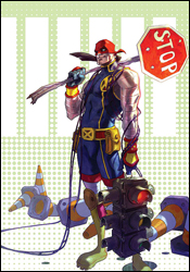 GeNext #2
Writer: Chris Claremont
Penciler: Patrick Scherberger
Inker: Norman Lee
Colorist: Chris Sotomayor
Letterer: Ed Dukeshire
Cover: Doug Alexander Gregory
Review: Dan Toland
Okay, first of all, I kinda dig the concept of this book: an alternate history in which the original X-Men began their training in 1963, and that things have progressed in real-time since then. It's 2008 (more on this in a minute) and there's a brand new set of students: the children and grandchildren of familiar characters.
This issue focuses on two in particular: Pavel "Colossus" Rasputin (grandson of Piotr) and No-Name (a girl who, as far as I can tell, possesses the mutant ability to freak-out and cry). Here's how the bulk of the issue goes: No-Name flirts with Pavel. Pavel flirts back. No-Name goes apeshit and runs away. And... scene. That happens three times. Also, No-Name is Hiding a Dark Past™, which leads to a fight with some other people.
Who wrote this? Oh...
First off, this is what you can usually expect from a Claremont story: it's overwritten and melodramatic. However, it looks like someone is actually editing this book; all the things that make Claremont so lovably Claremont are here, but they've been reined in considerably. A huge part of this has to be that as an alternate history, there's little to no continuity that has to be shoehorned in. However, there's still going to be a lot of "She's flying!" in panels in which someone is flying. (He can't help himself.)
The art is interesting. It's very cartoony, but that fits the tone of the book. A lot of the story is, essentially, Pavel and No-Name standing around talking to each other, and Scherberger's not really being stretched. Also, many of the pages have examples of Pavel's sketchbook � like his grandfather, he's an artist � which fills in some of the gaps as to what all the familiar characters are up to. However, there is a brief fight scene, and in that, there are a couple of things going on; some of the individual panels are perfectly serviceable, but the storytelling needs a little work. Some of the images are muddied and hard to translate, so Claremont's tendency to explain what's happening actually turned out to be helpful. He's got the tools, though, and Scherberger's a new name, so while it remains to be seen how he progresses, the fact is that he has the ability to become very good at this if he works at it.
There was one point of confusion I had, which is when exactly this is supposed to be. At one point, the narration indicates that Xavier's school opened over 30 years ago. If that was in 1963, as all of the surrounding press material says, that would place this book in the mid 90s. And if that's the case, what would be the point of that? The only thing that would accomplish is to explain why Pavel has a bitchin' Steven Seagal ponytail. However, if it is 2008, then the artist has some explaining to do. If we're being charitable by saying Scott Summers was 15 in 1963, he'd be 60 now. On the other hand, the Scott I'm looking at isn't more than 35. And even that's pushing it. Marvel needs to get over this "aging the characters" crap if they're actively pursuing a storyline in which the characters age.
Also, apparently, Henry Pym, not McCoy, is the Beast here. That's either a dumb editorial mistake, or the only example of an unexplained / unexplored wholesale timeline change, which sticks out like a sore thumb. I'm leaning towards the former (the character clearly looks like McCoy), and the editor should have picked up on it.
Although this is an expanded, 48-page issue, the story is a short one. The rest of the book is filled with reprints. The main one is "It's the Thought that Counts," an 11-page story reprinted from X-Men Unlimited #42. The story by J. Torres is very slight and simple, but the artwork by Takeshi Miyazawa (Spider-Man Loves Mary Jane) is wonderful. There are also a pair of one-pagers from What The�?!, Marvel's humor comic that was published irregularly in the late 80s and early 90s. They appear almost to have been pulled at random to make the page count, because they don't add anything to the issue at all.
Unless you really like alternate X-histories, to a degree that borders on the unhealthy, flip though this one.
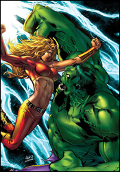 Hulk: Raging Thunder
Writer: Jeff Parker
Artist: Mitch Breitweiser
Colorist: Moose Baumann
Letterer: Blambot's Nate Peikos
Cover: Greg Land
Review: drqshadow
Crossover time! The time-traveling warrior Thundra is back, and her most recent leap through time and space has dropped her right into the middle of a heavy-duty brawl between the US military and a rampaging Hulk. So what happens when the mightiest warrior of the 23rd century faces off with the unbreakable green-skinned monster of today? Well, that's what we're here to find out.
Writer Jeff Parker may have been asked to tell too specific of a story here, and the end result is a slow-moving story that promises the world with its narration but delivers on very little. Although he's meant to be reintroducing Thundra to regular continuity, Parker doesn't do much to modernize the character; it's like he's been given a paint-by-numbers set and gone out of his way to stay precisely inside the lines. She's a noble warrior who'll go out of her way to help her comrades � even at great personal loss. But I've seen that a dozen times before, and it's not really enough to excite me these days. The Hulk, likewise, is treated with kid gloves throughout the issue, and shows the reader nothing out of the ordinary. This is such a generic take on the character that if it weren't for the modern technology he's faced with, I couldn't tell you whether this was set in 2008 or 1978. Hulk meets military, Hulk destroys a few tanks, military flees, commence crossover. Yikes.
Parker spends so much time introducing the characters and repeatedly comparing them to each other that the issue is halfway over before the two even lay eyes on one another. But then, sadly, when they do, the end result made me yearn for the empty, repetitive storytelling that preceded it. There's an interesting story to be told with Thundra, about how her time, with its central battle between man and woman, was shaped by the sexism of our current era. Jeff Parker just isn't the man to tell it. His heavy-handed approach and relentless narration beats readers over the head with the concept until it loses all meaning.
Mitch Breitweiser's artistic contributions follow that same path. His work is hollow, rigid and hard on the eyes. His characters lack personality and enthusiasm; his splash pages rob the story of its already-infrequent moments of impact and importance. This is a genuinely ugly book, cover to cover. Breitweiser's inconsistencies are blatant and repeated, and his action scenes are stiff, unimaginative and tough to follow. I'd recommend you avoid it based on the artwork alone, if the story weren't every bit as bad.
For the sake of relevance, this issue is backed up by a classic Thundra tale from an old issue of Fantastic Four, evidently to remind readers of who she actually is. Don't be fooled by the appearance of a double-sized one-shot, because this is 23 pages of original story and a reprint that's about 30 years old. It's probably a cool flashback for any old-timey fans of the character, but to me it seems like a cheap way to add to the cover price without developing additional content.
Something is rotten in Denmark, and its name is Hulk: Raging Thunder. There's no reason for this book to exist, save the obvious reintroduction of an old face to modern times. It's written poorly, illustrated poorly and conceived poorly. Skip it unless you need to punish someone for a heinous act. But even that might be considered cruel and unusual.
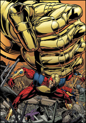 The Last Defenders #4
Writer: Joe Casey
Penciler: Jim Muniz
Inker: Cam Smith
Colorist: Antonio Fabela
Letterers: RS and Comicraft's Albert Deschesne
Cover: Phil Jiminez
Review: drqshadow
As their miniseries heads into the homestretch, Nighthawk and his ragtag group of rogue heroes are finally face-to-face with the piper, and he's looking for a little payment. After going behind the government's back to assemble his own team of Defenders, Nighthawk has finally drawn the attention of Initiative leaders Tony Stark and Henry Peter Gyrich, and they have a few choice words for him. Can the team carry on despite their frequent bending of the Initiative's rules?
Writer Joe Casey is doing a fine job of testing the limits of the very theory of a government-operated superhero program. He's poking and prodding at the little details that couldn't have been imagined when the Initiative was being concocted. Of course, along the way he's filling the page with giant robots, men in spandex with guns and Altantean warrior princes, but you've gotta have a little something for everybody. It can't be bureaucracy all the time.
Casey does a fine job of overlapping his subject matter, too. His superpowered fist fights are generally tempered with a fair dose of intelligence and government-instigated caution, while his explorations into the finer points of the registration program are kept short, meaningful and easy to comprehend. He's asking some difficult questions, but he isn't killing his readers with a series of tedious, complicated answers afterwards. He also manages quite well considering the cast he's given. Sometimes the big names of the industry can be the most difficult to write, considering the vast histories and continuities they drag along with them. Working here, with a team of comparatively clean slates, Casey is free to more concretely define who these guys are, what drove them to become that and where they're headed from here.
Jim Muniz has brought a tight artistic direction to the book, light on actual linework but not on substance. His characters bounce off the page with an animated vibrancy, displaying their emotions with little hesitation. Each individual carries themselves differently and reacts to adversity in their own way. And Muniz effortlessly gives each Defender a unique identity, while still keeping the layout clean and easy to navigate. His action scenes are wonderfully composed in the same vein as Joe Madureira: a fine blend of billowing smoke, falling bodies and firing superpowers. He knows how to balance the weight of his lines to emphasize the shapes of his characters without oversimplifying their appearance. His one glaring weakness is a tendency to overlook his backdrops, but there's usually enough going on in the foreground that any amount of attention to the surroundings would only serve to complicate and overdo an otherwise-beautiful composition. This is a really strong showing for Muniz, who I'm hoping to see more from in the near future.
This is a fine read. It's a different look at the Initiative program, and the civil war in general. We've seen the perspectives of the dedicated pro- and anti-reg heroes, but here we get a peek at the much more vast grey area. The Defenders agree in principle with the idea of government-sponsored superhero teams, but they don't think the Initiative has it right. It's a more realistic look at what would surely be a polarizing issue, and as a result it's quite refreshing. With intelligent writing and crisp artwork, Last Defenders is easily worth borrowing, and may yet transition into a must-buy. Keep an eye on it.
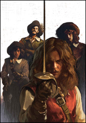 Marvel Illustrated: The Three Musketeers #1
Writer: Roy Thomas
Penciler: Hugo Petrus
Inker: Tom Palmer
Colorist: June Chung
Letterer: Dave Sharpe
Cover: Gerard Parel
Review: Dan Toland
All right, first of all, if this cover doesn't at least pique your interest, there is officially no hope for you.
The latest Marvel Illustrated comic arrives in the form of a novel tailor-made for this sort of thing. Brought to you by the same creative team as The Man in the Iron Mask, one of this story's sequels, we get two pages into the very first issue before a swordfight breaks out. Now that's something that's largely been missing.
You remember Henery Hawk, right? "I'm a chicken hawk, and I'm gonna eat me some chickens!" And Foghorn Leghorn would just, I say, just roll his eyes and point him toward the dog, and all kinds of antics would ensue, as neither Foghorn nor the dog took this ridiculous bird as any sort of serious threat. However, at the end of the cartoon, sure enough, Henery was dragging Foghorn off. Well, in this comic, the role of Henery Hawk will be played by d'Artagnan, the young son of a famous Musketeer en route to Paris to follow in his father's footsteps. He's brave, foolish, headstrong and, to be frank, kind of a twat. He spends the entirety of the issue writing checks his ass can't cash, as he manages to piss off the Musketeers of the book's title by happily getting into duels he's fully aware he has no chance of surviving.
This issue doesn't get terribly deep into the story, but the groundwork it lays is promising. There's an undeniable sense of fun here; these people may be fighting for their lives at any given moment, but nonetheless, they are having a ball. When an outnumbered Aramis looks at the soldiers closing in on him, and when asked whether he intends to surrender, he spreads his face in a huge grin and announces, "We are about to have the honor of charging you." At that point, all I could say was, "Damn. That was cool."
As always, Roy Thomas does the honors, and as always, Roy Thomas delivers a prototypical Roy Thomas script. It's a little old-fashioned and glosses over events a little too quickly; the setup is rushed so that the action can be gotten to more quickly. That makes the story suffer a little, but it's still probably the smartest thing that could be done in this case. You can always tell when Thomas is enjoying himself, and he's clearly enjoying himself here.
Petrus' art is great; it's very clean and bright. Each character has his own recognizable face, and the man draws an astonishing swordfight.
If you read and enjoyed The Man in the Iron Mask, there's no reason you wouldn't like this. Same creative team, same characters. If you read and didn't care for the earlier series, well then, the same thing applies. As an adult reader, I thought this was fun, but largely unsubstantial. As a kid, however, I would have been all over this thing like ugly on ape. I would have devoured it and gone off to read the original. (Which I did, anyway. I was a weird kid.) Flip through this for yourself; the art is good and the story is fun. If you're looking for something to buy a young'un, though, this is it.
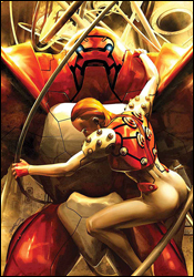 newuniversal: shockfront #2
Writer: Warren Ellis
Penciler: Steve Kurth
Inker: Andrew Hennessey
Colorist: Chris Chuckry
Letterer: VC's Russ Wooton
Cover: Brandon Peterson
Review: Dan Toland
I never read any of the New Universe back when Jim Shooter launched it in 1986. It never really grabbed me, despite the enormous, almost unprecedented marketing push it was getting for at least a full year ahead of its premiere. And I wasn't the only one. Many of the titles were cancelled after one year; the line as a whole didn't make it out of the 1980s, and can now be found in finer quarter bins everywhere. So I have zero nostalgia and very little familiarity with the New Universe coming into this.
Entertain me, Warren Ellis!
Previously: In the wake of the White Event (in which the sky got, you know, all white and stuff), people are developing superpowers. John Tensen (bearing the Justice glyph) thinks he's dead and is taking as many people as he can with him. Kenneth Connell (Starbrand) is in hiding after accidentally killing his girlfriend. Jennifer Swann (Spitfire) has built an armored suit designed to kill superhumans, only to slowly realize she is one. And Izanami Randall (Nightmask) "can access the telepathic underspace known as 'the Superflow.'" (Bonus points will go to anyone who can write in and explain to me what that means.) However, it should be noted that Izzy is the only character whose powers are explained or described in the recap at all.
This issue is largely setting up its players; it deals with the fallout from last issue, and prepares for the unholy shitstorm that's guaranteed to be in the mail. While all this is going on, we also meet Jack Magniconte, better known to longtime Marvel fans as NFL Superpro... no, wait, sorry; he was the All-American, the other American football-themed superhero Marvel was putting out back then. Man, Marvel really went out of its way to suck wantonly when I was in high school.
It's a testament to the creative team that such an unholy fountain of mediocrity that lay as the foundation nevertheless managed to turn into an engrossing, well-crafted story. Ellis, who's been playing with this universe for a couple of years, turns in his usual brilliant job. While his dialog sparkles, the real star of the story is the atmosphere created. The world Ellis is writing is palpable enough that I know I don't want to live in it. Yes, the government is bad and not to be trusted; I get that. But this feels much less ham-fisted than the exact same message being trumpeted everywhere else in the Marvel Universe.
That world is made all the more real by Kurth's artwork. He's come a long way from his cartoony, manga-influenced style from Devil's Due's GI Joe, which caused me no end of frustration back when it was first released. This looks fantastic. People are expressive, realistic and clearly defined. The panelwork is good, and he's not afraid to draw less-than-totally-attractive women. The cops look like cops. And Izzy is, without a doubt, the most realistic-looking Asian character I think I've ever seen in comics.
Despite being a small part of a longer story, this is well worth a read. Borrow a copy of this issue, while I go look for Ellis' first newuniversal series from 2006. I am a convert.
Now, Ellis on NFL Superpro � that I'd like to see.
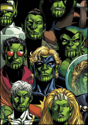 Secret Invasion: Who Do You Trust?
Writers: Brian Reed, Mike Carey, Christos N. Gage, Zeb Wells and Jeff Parker
Artists: Lee Weeks, Timothy Green III, Mike Perkins, Steve Kurth, Leonard Kirk and Karl Kesel
Colorists: Matt Milla, Guru eFX / SotoColor / Fairbairn / Chu, Raul Trevino and Michelle Madsen
Letterer: Cory Petit, Nate Peikos
Cover: Phil Jiminez
Review: drqshadow
Looking for a set of short one-offs that vaguely connect to Secret Invasion? Well, your dream's come true! Because the whole story couldn't be told in the limited series or the dozens of spin-offs, Marvel brings us Secret Invasion: Who Do You Trust? , a one-shot that dares to delve even further into the current Skrull invasion. A whole mess of creative teams have poured out of the woodwork in this giant-sized collection to maybe, hopefully, help you answer the question posed by its title. Who do you trust? Let's find out.
Brian Reed and Lee Weeks offer a contemporary take on Captain Marvel in "Farewell," an all-too brief peek into the character's inner workings. For such a short tale, it covers quite a bit of ground but suffers undeniably from the strict page restriction. Reed's story barely manages to gain traction when it's hastily drawn to a conclusion. Weeks, meanwhile, is an artist I've seen floundering around the outer rim of mainstream comics for years now. I'd never been particularly taken by his contributions before, but he shows quite a bit of improvement here, especially near the end of the tale. Truthfully, his style seems to click around the third page and improves rapidly from there.
Mike Carey and Timothy Green III's "In Plain Sight" is a bit more suited to the medium, offering a handful of brief flashbacks through Agent Brand's life as she floats helplessly through space. If nothing else, it's a good fit for the format, and it makes for a fine change of pace from the more straightforward superheroics of the preceding tale. Green's artwork fits right in with that motif, delivering a tight, highly gestural style that reminds me a lot of Peter Chung's work with Aeon Flux when it was still on Liquid Television. It's totally different from what Lee Weeks was doing earlier in the issue, and that suits the tone of this story just fine.
Christos N. Gage and Mike Perkins follow that up with a throwback to the old days, as they follow the Skrull Beast and the real (?) Wonder Man in an adventure immediately following the tyrannosaur attack from Secret Invasion #2. For fans of the characters in their heyday this might tug on a few heartstrings, but as a reader with little interest in either of their shared histories, I found it to be quite a drag. Gage's writing is excessively verbose and not all that captivating, while Perkins's artwork is cheesy and antiquated.
Zeb Wells and Steve Kurth tackle Marvel Boy in "Master of the Cube," which focuses on the Kree warrior's adventures since being set free from a lengthy imprisonment by the same Skrull virus that crippled Iron Man's personal technology. Artist Steve Kurth must count Bryan Hitch as a heavy influence, because his work here is almost a carbon copy of the current Fantastic Four artist's style. But while his linework is very similar, Kurth is missing all of the enthusiasm and knack for the spectacular that really sets Hitch's artwork apart. Sadly Zeb Wells does little of his own merit to keep the story interesting, and the whole mess sinks like a stone. This is an infuriatingly dull story through and through, which is surprising because it features no less than two exploding heads and a full-scale prison riot. Not your typical recipe for boredom.
Finally, Jeff Parker and Leonard Kirk bring you "The Resistance," focusing on the Agents of Atlas and their own small-scale struggle to repel the invading alien forces. Parker uses this short story as a brief introduction to the team for unfamiliar readers, and while he occasionally gives in to the temptation and fills the page with an excess of narration, for the most part the effort is worthwhile. Any global invasion would have to tackle the smaller cities sooner or later, so it's nice to see someone documenting that side of the story. Leonard Kirk's accompanying artwork serves more as a series of inked breakdowns than a fully polished final effort. The layouts are decent enough and easy to follow, but there's something unfinished about this work. It's like he fired it out over a pair of lunch hours when he had nothing better to do.
All things considered, there was really nothing wrong with most of the individual stories contained within this issue, but as a whole I found it to be a disjointed, confusing read. The Captain Marvel tale encourages us to pick up Secret Invasion #1 to continue the story, but the "Beast" / Wonder Man adventure takes place after the events of Secret Invasion #2. I have no idea where some of the other stories fit into the timeline. The creative teams deliver work that is generally very good on an individual level, but universally suffers from a lack of consequence. If you're really crazy about the Skrull invasion, you may be interested in the stories contained in this issue. But if you're like me, curious about the main plotline but not quite all that taken by the variety of tie-ins, you'll want to give this a pass. It's more than 40 pages of filler. Entertaining filler? Occasionally, but it's filler nonetheless. Skip it.

