Is It Wednesday Yet?
27 May 2008
27 May 2008 — Here we are again with another installment of your favorite comic book review series. As always the comics you're about to read about won't be released until tomorrow (28 May 2008), so these reviews are free of spoilers and should help inform your purchases on new comic book day.
Our grading scale is simple:
Buy: An excellent comic book.
Borrow: A good comic, but save yourself some money by reading a friend's copy.
Flip Through: Give it a once-over at the comic shop.
Skip: This doesn't need to be explained.
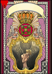 Angel: Revelation #1
Writer: Roberto Aquirre-Sacasa
Artist: Adam Pollina
Colorist: Matt Hollingsworth
Letterer: Dave Lanphear
Cover: Adam Pollina
Review: Guest
I have no idea what I just read.
I mean, I know that it's yet another retelling of a mutant origin ('cause we really needed another one of those), but other than that, I'm really at a loss for words.
Alright, let's start at the beginning. Warren Worthington III is an athletic, popular, upstanding young man who is going through some changes. That's it, actually. That's the whole issue. There are some obnoxiously overbearing religious themes and a really vague villain with rather nonsensical motivations, but for the most part this reads like an episode of One Tree Hill. Granted, I've never actually seen an episode of One Tree Hill, but if you've seen one teen drama about pretty white people with problems, you've seen them all. There's some sort of adolescent bickering, and there's a prickish-looking guy in a varsity jacket who's kind of pissed because he wants to take the virginal blond girl to the ice cream social / sock hop / other such gathering. None of it really means anything, and you're given absolutely no reason to care.
It's absolutely astounding to me that the comic industry has such a boner for origin stories. The question I have to ask is simple: why do we need a new retelling every few years? Hell, they've made an entire imprint based on retelling origins! Are you telling me there's a guy in the Marvel offices who is constantly going, "Gosh, look at this origin story. Stan Lee got it all wrong! They completely missed that time Warren went to order a hot dog with relish, but they gave him mustard instead! We need to fix that!"
The art isn't much better, as Adam Pollina is completely wrong for this book. Granted, he got one thing right: Warren is a skinny kid. That's not the problem. The problem here is that everyone else in this book is just as thin. There's no point of contrast for the future Angel, as 90% of the people in this book look as if they were put through a taffy pull and stretched out to a comedic degree. The other 10% have the most grotesque, misshapen heads and bodies that either remind you of Hey Arnold! reruns or Freudian symbolism. This man could quite possibly work wonders on a horror book, but here he's basically slapping you in the face with style, so much to the point that it's hard to take any part of the narrative seriously — not that the writing helped anyway.
There is no reason this series needed to be made. It's a book that manages to be both laughably simplistic and mind-numbingly overbearing at the same time. The religious imagery only serves to further hinder a book that already takes itself too seriously. And an otherwise capable artist has completely struck out here — both in concept and execution. Skip it.
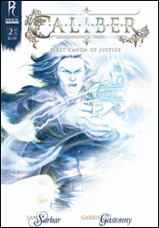 Caliber #2
Writer: Sam Sarkar
Artist: Garrie Gastonny of Imaginary Friends Studios
Colorists: Imaginary Friends Studios
Letterer: Annie Parkhouse
Cover: Stanley "Artgerm" Lau and Yasmine Putri
Review: Dan Toland
Holy crap, this is pretty!
Caliber, Radical Comics' new retelling of the King Arthur legend in a Wild West setting, continues without a recap page, but it's pretty simple to catch-up. Arthur Pendergon and his ragtag band of lovable misfits have ridden into Telacoma, seeking to reclaim the estate of Arthur's father Ulysses. Meanwhile, Jean-Michel Whitefeather has set up a booth in town where, in exchange for a dime, he will let you shoot a gun that doesn't work. A bargain at twice the price!
While I think this is going to be a better story once it's collected, there's a lot to enjoy here. While it works as a King Arthur pastiche, it works far better as a Western. Comics have been doing the Old West from day one, and here we have a particularly successful rendition; you can almost taste the swirling dust. It feels right.
In fact, the art in general is remarkable. That's not to say it's perfect — it's not. Faces are a little off, and one tends to be a little too similar to another, especially in low lighting. Poses can be stiff. Storytelling can sometimes be awkward. But when these things happen, it's brief and easy to gloss over, because, in general, this is a gorgeous book. The art is really breathtaking at times, and any imperfections are forgivable when set against the work as a whole.
The writing is a little off. There are times when it seems a little on the cute side, trying to find clever ways to turn "Uther Pendragon" into "Ulysses Pendergon" and otherwise shoehorn Camelot into its new setting, while simultaneously being obvious enough to wink at the reader. And a big problem is that a lot of times characters come in without sufficient introduction, and we see them for pages and pages with no indication as to who they are. That's a problem; they may have been introduced in the first issue, but someone coming into this cold is going to be confused. In fact, "confused" is the watchword of the day; there are two or three main beats that the creators are trying to hit, and they do, but anything between those beats is disconnected and dissonant. And there's no real motivation to puzzle them out, because they feel inconsequential. However, those major beats are hit, and there really is a lot of story shoved into 24 pages. It can feel overstuffed, but you definitely feel like you got more than an issue's worth.
This is gonna be a theme this week, I think: good art, workmanlike writing. In this case, the art is incredible, and something that is definitely worth a borrow. It's going to take a little bit of time to soak the story in, and I have to think (or hope) that everything will come together once the story ends — and at that point it could be worth another look.
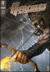 Hercules: The Thracian Wars #2
Writer: Steve Moore
Artist: Admira Wijaya
Colorists: Imaginary Friends Studios and Sixth Creation
Letterer: Todd Klein
Cover: Admira Wijaya and Sunny Gho of Imaginary Friends Studios
Review: drqshadow
Radical Comics' Hercules is a much more hard-edged, gritty take on the character than you might expect. Where Marvel or DC's renditions focus on taking the noble essences of the character and applying them to a smiling, strutting, superheroic face, Radical's story is more of a period piece with a firm concentration on the mythical warrior's dark side. After completing his legendary tasks, this Hercules felt scorned by both the heavens and Earth alike, quickly learning that he could only find solace in bloody conflict. Joining up with six like-minded souls, Herc became a warrior for hire, but now that he's been asked to train an entire army to fight in his own legendary ways, the length of his fall from grace is quickly becoming apparent.
I like this fresh take on the character, who I suppose I've always felt has been something of a joke in mainstream comics. Where his Marvel cousin is fighting alongside the Avengers in an ongoing struggle to keep the world safe, this Herc is guiltlessly slaughtering thousands of men, women and children under the haze of war. He wastes no time establishing himself as one not to be trifled with, and his grim outlook on life is almost enough to distract readers from the fact that he's wearing a freaking lion for a hat. Even that goofy bit of personalization isn't really that tough to swallow, I guess, when you consider the timeframe and his Marvel counterpart's penchant for wearing sandals and a skirt in modern times. When chain mail was still in fashion and you could walk through town bearing a sword without drawing attention to yourself, flaunting the king of the jungle on your head was probably a pretty bold statement.
While writer Steve Moore borrows heavily from Frank Miller's 300 in setting this story's tone, its content is original enough to confine such conspicuous similarities to the back of the reader's mind, if anywhere. Though his dialog is excessively lengthy and in serious need of an editor's touch, Moore keeps the plot moving at a decent clip, which gives the impression that there's more substance here than there really is. He manages to cram three issues' worth of story into a single book, and that means this is slow, but plot-rich reading. I felt overwhelmed by the amount of new characters with confusing names that were thrust at me, especially since about half of them seemed to be inherently dispensable. Combined with huge amounts of shoddy dialog, that does take a toll on the reader.
Admira Wijaya's accompanying artwork is generally sound, but benefits greatly from the painterly colors provided by Imaginary Friends Studios and Sixth Creation. Wijaya is asked to do so much with so little space that I doubt anyone could've truly succeeded in his position, but he still manages to make a fairly good, if unremarkable showing. When the skies open up late in the issue and flood the battlefield with rain, the coloring really takes center stage and gives the book its only truly impressive visual showcase, while the actual layouts remain largely dull and unmotivated.
There was a lot to like about Hercules: The Thracian Wars, but a lot to dislike, as well. Its penchant for flashbacks would've made for a nice aside or two, if it didn't hand them out like candy at every turn. Without so many dialog boxes muddying it up, the artwork may have been able to stand tall on its own. And, as a maxiseries, the story may have been able to let up long enough to give its readers a chance to stop and breathe between panels. As is, this is too much story for this small of a package. If you're looking for a lot of bang for your buck, this will definitely deliver. But if your tastes are more for a cohesive, legible bit of entertainment, you may be disappointed. It's worth a flip through, but could have easily merited a higher score with some selective edits.
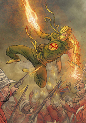 Immortal Iron Fist #15
Writer: Matt Fraction
Penciler: Khari Evans
Inker: Victor Olazaba
Colorists: Jelena Kevic-Djurdjevic and Paul Mounts
Letterer: Dave Lanphear
Cover: Khari Evans
Review: drqshadow
Over the years, 66 men and women have lived with the legacy of the Iron Fist, of which Danny Rand is naturally the most recent. But what of those who came before, of their untold exploits and adventures? Well, for that, we've got Immortal Iron Fist, an ongoing document of the preceding 65 and the paths they tread during their years as the reigning champions of K'un-L'un.
This time we're following the story of Bei Bang-Wen, who held the mantle for much of the mid-19th century. While many of his predecessors (and successors, for that matter) have relied on their powers to handle their problems physically, Bang-Wen was unique in that he was a more intellectual man, choosing to consider his actions at length before diving into the fray. The elder Iron Fist thinks highly of himself, particularly of his strategies in combat, and when he's finally defeated in a large-scale battle, that burden is extremely difficult for him to come to terms with. In Bang-Wen, writer Matt Fraction has brought to life a tragic character, unexpectedly stripped of his pride but not his life, which is in his mind twice as bad as a dishonorable death.
This story is fascinating because it's more than just a look back at a character with identical powers to today's Iron Fist, swinging for the fences and knocking out all the bad guys. In truth, Bang-Wen spends a great bulk of the issue isolated from his powers, which gives readers a great chance to understand the personality and motivations behind such actions. It's easy to use a character's powers as a crutch, a device to drive the story in the place of natural development and good storytelling. In Immortal Iron Fist #15, Fraction proves that he can still spin a good yarn even without the aid of a blazing yellow fist and a killer flying kick.
Khari Evans does a fine job of translating the mood and tone of Fraction's story to the page. I've seen Evans on several midlevel books at Marvel recently, and he seems to tailor his style ever so slightly to match the story he's telling. Here, his work takes on an expressive, animation-influenced quality that regularly jumps right off the page. When Bang-Wen and an ally sprint down a steep embankment to escape a fiery explosion, even though they're illustrated as simple silhouettes, the haste and desperation of their actions are immediately evident. Evans can do a lot with very few lines, and this issue is his playground to do just that.
It's hard to think of this issue as a part of the Iron Fist mythos, which is a good thing. It opens up a lot of fresh potential, on which writer Matt Fraction capitalizes. This reads like an old Chinese fantasy, for better and for worse, and that's not something you'll typically find on the shelves from a major publisher. While it does occasionally get caught up in a bit more narration than it really needs, the basic plot is easy to follow and entertaining. Although it's a continuation of an earlier story, as a fresh reader I found the issue easy to jump into and enjoyable from start to finish. It's not perfect, but it's worth borrowing at the very least, with a serious consideration towards buying.
 New Warriors #12
Writer: Kevin Grevioux
Penciler: Paco Medina
Inker: Juan Velasco
Colorists: Marte Gracia and Matt Milla
Letterer: VC's Joe Caramagna
Cover: Nic Klein
Review: Dan Toland
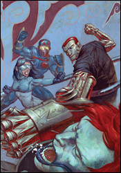
Previously: the New Warriors got their collective ass handed to them by Machinesmith. Yes, seriously. I know, I thought the same thing.
In other news, Night Thrasher is kind of a douchebag. He deserted the team mid-fight, if only to further his own hidden agenda. He's created something called the Transmap to keep the team doing what it's told while he does whatever he's doing. And he even has a small quantity of kryptonite kept away should Superman ever go rogue. Oh, wait. That's Batman. You can see where I got confused, though. (Marvel may keep trying, but I don't think that thrashdickery.com would get as many hits, but I suppose I could have been underestimating the character's appeal for the past two decades I spent not caring about him. It may also be true that thrashdickery.com is something completely different, holding terrors beyond my scope to comprehend and would break my mind in twain.)
Okay, first of all, I haven't seen a whole lot of Machinesmith in quite some time. Machinesmith has traditionally come in two flavors: "I'm in a robot body! Raargh!" and "Im in yr computer / Hackin yr weapon systemz." Neither has traditionally been terribly impressive. So imagine my surprise when he's actually kind of badass here. That's it; just a personal moment of discovery. Yay me.
Do you like word balloons? You do? Excellent. Because they're all in this issue. Man, do these kids like to talk to each other. Talk and talk and talk and talk and talk. And talk. There's a huge 90s feel to the scripting. Admittedly, I usually use "90s" as a catchphrase for "abandon all hope ye who enter here." Now, it's not awful or anything; it's just a little overwritten, at least partially to atone for the fact that the artwork doesn't always make totally clear what's going on. Angel has to shout, "He's absorbing all our weapons," because there's nothing in the artwork to indicate that Machinesmith is doing anything but posing.
Less-than-stellar-storytelling aside (and it's not horrible, it's just not very strong), the art isn't too bad. Medina does action quite well, and he's clearly having a blast with Machinesmith. One thing that I noticed is that everyone has a pretty blank facial expression. There's a scene where something is gone, and the owner of said something cries out, "The [something] — it's gone!" However, the look on his face says, "I thought we had peanut butter. It looks like we're out. Now I have to go to the market. My mild annoyance knows no bounds."
Another thing: nothing happens. Almost literally. Every character — every one — is in precisely the same place they were in at the start of the book. You will open issue 13 and find that all the situations are exactly as you left them at the end of issue #11. Give it a flip through, mostly because of Medina's rendering of the bad guy, which should give you a few seconds of "Hey, that's cool," and still give you time to go look for something else.
 Thor #9
Writer: J. Michael Straczynski
Penciler: Olivier Coipel
Inkers: Mark Morales, Danny Miki and John Dell
Colorist: Laura Martin
Letterer: Chris Eliopoulos
Cover: Olivier Coipel
Review: Guest
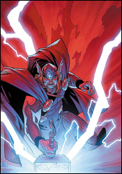
When one grabs an issue of Thor, the expectations are already set. There's going to be wonderment, epic facial hair and a healthy dose of Asgardian whoop ass. Naturally, I expected much of the same. What I didn't expect, however, was to laugh this goddamn much.
In this issue, the beginning of a new story, Straczynski has done what, at the end of the day, every comic writer strives for. He hits all the right buttons, and in the span of 32 pages, he makes us laugh, he makes us angry and he makes us care. His dialog hits the perfect balance between Nordic posturing and schoolyard bickering that makes these larger than life entities feel more human than they ever have before. His ability to weave the language into stinging bits of verbal swordplay is a definite treat, and it's all without the expense of characterization. Loki is as manipulative as ever, and never misses a beat, even though he is now a she.
I feared from the outset that my limited knowledge of the typical Asgard cast was going to leave me trapped in a sea of faceless, nameless, helmet-bearers, but by the end of the issue I knew everyone by name, even those with only a few lines. That is a sign of great writing in spite of the limitations of the medium. Characters don't stop acting like themselves just because they're not the focus of a particular scene, and it's a refreshingly simple idea that other writers can often lose sight of.
What's perhaps most notable is the characterization of Thor himself. The issue is focused mostly on the Asgardians and their plight, most notably Balder. But it's the way Thor is spoken of in his absence that serves to make this god exactly what his name implies, and when he finally does make an appearance, his people look on in awe of their leader.
While some will be disappointed to see that Djurdjevic has moved on, Coipel has made a hell of a return, and has proven that this is most definitely the book for him. His art is good, but not distractingly so. He understands that he's an asset to the story. He's not here to overwhelm you with flashy splash pages, but to move the characters and story where they need to be moved. All of which make this an easy buy, and a great jumping on point for the series in general.
 Ultimate Spider-Man #122
Writer: Brian Michael Bendis
Penciler: Stuart Immonen
Inker: Wade Von Grawbadger
Colorist: Justin Ponsor
Letterer: VC's Cory Petit
Cover: Stuart Immonen
Review: drqshadow
It's hard to believe Ultimate Spider-Man is nearing the buck-and-a-quarter mark. Perhaps even more mystifying is that it's not only still carrying on, but doing so with renewed vigor. The last six months of USM have been among the best in the book's lifespan, and have served as an excellent launch pad for new penciler Stuart Immonen's run with the character.
Part of what I've loved about these recent issues is their renewed interest in the characters behind the masks. For a while, the series had shifted its focus more towards outrageous adventures and interactions with just about every hero and / or villain who caught writer Brian Michael Bendis' fancy. He'd lost sight of Peter's civilian identity, a big part of what made the story connect in the first place, and it didn't look like he'd be going back. For a time, I seriously considered dropping the book. Now, I'm glad I didn't make that mistake; this issue is just the latest installment in USM's about-face, its return to what made it so great at its outset.
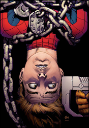
Bendis has such a firm understanding of these characters that it's hard to imagine anyone else ever taking over. Under another writer's watch, the carefree moments between Pete and his buddies would feel dangerously cheesy and happy-go-lucky. With Bendis in charge, they're my favorite part of the story. His cast is comprised almost entirely of teenagers, and they speak and act as such. What's more, they've all shown tremendous growth as individuals from the first issue up to today. Ultimate Spider-Man's cast is among the deepest in any current mainstream book, and Bendis knows precisely when to bring back and cycle out characters. This month, for instance, he's brought perennial punching bag Shocker out of retirement to teach Peter a lesson about complacency, and the message is loud and clear. After almost 125 issues, Parker may have a firm grasp of his powers and his spot in the pecking order, but he should never take anyone lightly. Bendis is still at the top of his game, and it doesn't look like he'll be coming down soon.
And I could say exactly the same thing about Stuart Immonen. It's a real rarity when two top talents come together on the same book and actually serve to push each other to new heights (if anything, the pressure seems to bring the worst out of those kind of collaborations), but that's clearly becoming the case here. Immonen is absolutely on fire in this issue, whether he's working with Peter teasing MJ on the streets of New York or the Shocker pummeling a chained-up Spider-Man in a dark, gritty industrial warehouse. This is gorgeous work, providing detail where necessary while retaining a clean, stylized overall appearance. Stuart gives each character their own face, and has no problem painting them with appropriate emotions without distorting their identity. He may be one of my favorite artists working today, and this issue is some of the best work he's put out to date.
Some of USM's best stories have been self-contained, and this is yet another shining example. It goes in a rich, unexpected direction, grants the reader valuable insight into a handful of central characters and leaves a big impression. What more can I say? If you aren't reading this yet, you should correct that oversight immediately. Buy it and enjoy the greatness of this run while it lasts.
 X-Force #4
Writers: Craig Kyle and Christopher Yost
Artist: Clayton Crain
Colorist: Clayton Crain
Letterer: VC's Cory Petit
Cover: Clayton Crain
Review: Dan Toland
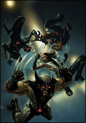
What have we here? Well, the Purifiers, an anti-mutant religious extremist group, have revived Bastion, almost purely in an effort to annoy me personally. Bastion went about his business of putting together the greatest threat to mutantkind the world has ever seen this week . Cyclops takes a look at this, thinks to himself, "Hells no," slaps together X-Force, points them in the Purifiers' general direction and waits for hilarity to ensue. First up is Wolfsbane, who immediately gets captured. Wolverine, Warpath and X-23 go about the business of "slic(ing) through every Purifier cell they could find... with extreme prejudice" (gotta love those recaps) until they find her, suffering through a heroin overdose. They take her to Angel, who in turn grabs the healer Elixir to fix her.
And boy oh boy, does hilarity ensue after that.
The writing here is much better than I assumed it was going to be. It's more cohesive and solid than a comic with two credited writers has any right to be. There's a modicum of characterization, but that's not even close to being what they're going for; it's more of a happy accident. I will say that despite this being part four of whatever, there's definitely 32-pages of plot happening here. There is no filler. Whatsoever.
The real reason people are going to be interested in looking at this, however, is the art.
I have two vastly different opinions on Crain's artwork. The first is that these pages are freaking beautiful. I would happily pay to have framed prints hanging on my wall. No question. It's just stunning work.
The other is that many of the images are murky, and very difficult to decipher. These pages are dark, and a lot of Crain's images are somewhat impressionistic and surreal, which absolutely sells the image in question. But at the same time, when I have to stop and stare at a panel for a few minutes to try to figure out what's happening, regardless of how beautifully it's rendered, it takes me out of the issue.
Also, Wolverine's hair is kinda goofy.
So, at the end of the day, what we have here is a stunningly beautiful book wrapped around a solid, if unremarkable story. The X-books have floated for years on far less than that. Still, as pretty as this book is, I'm having a hard time giving it anything higher than a flip through. The story just didn't grab me, and deciphering some of the pages was just more work than the end result warranted. (Still, if Marvel releases any prints of some of this work, I'll be first in line.)
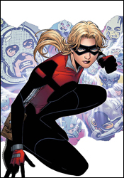 Young Avengers Presents #5
Writer: Kevin Grevioux
Artist: Mitch Breitweiser
Colorist: Brian Reber
Letterer: VC's Cory Petit
Cover: Jim Cheung
Review: Guest
Often times I'll sit here and tell you about a book that deeply disappoints me because of a distinct gap in the individual talents of the creative team. The case is almost always one of a great writer that's burdened by a lazy, rushed or just bad artist. Young Avengers Presents #5 is an exception to that rule, as Mitch Breitweiser has done some really good work here. The characters are distinctive, detailed and emotive, making for a book that's easy on the eyes and mostly flawless.
But Kevin Grevioux had to ruin it for him.
The story revolves around Stature, a girl that can grow and shrink at will. She's having one of those girly moments, and has literally shrunken into depression for some unknown reason. Her friends (Hawkeye, Wiccan and Patriot) decide that one of them needs to get shrunken down to talk with her. (A question, if I may: if Wiccan can shrink someone to talk to Stature, why can't he just, you know, make her bigger?)
And since when does magic consist of saying words faster? Doctor Strange has an elaborate mystical language that he must spew every time he so much as wants to make a cheese sandwich — "By the Cheesy Croissant of Cheddar" — but all Wiccan has to do is say, "I'mhungrymakemesomefoodplease."
I have not seen dialog this bad since that time I rented Troll 2. Chris Claremont has got nothing on this guy; there's exposition up the wazoo, and no one in the real world says the name of the people they're talking to this much. It draws comparisons to those customers that read your nametag at work and assume they're your best friend because they can say your name: "Hey there, Brian! Sure you can help me, Brian. I'm looking for a bandsaw that can play show tunes, Brian. You want to give me a discount on that, Brian?"
What makes this all the more frustrating is that there is actually a somewhat interesting story underneath it all, but it's muddled in melodramatic nonsense and backwards morals. According to this book, the only way to make your depressed friend feel better is to tell them what a worthless piece of shit they are. That will make them forget their emotional turmoil, just in time to grab a pizza.
You tried, Mitch. You tried your heart out. But this book is useless. I say take pity and give this one a flip for the art alone. Don't read a single word of dialog, and you should be okay.

