Is It Wednesday Yet?
13 May 2008
13 May 2008 � Here we are again with another installment of your favorite comic book review series. As always the comics you're about to read about won't be released until tomorrow (14 May 2008), so these reviews are free of spoilers and should help inform your purchases on new comic book day.
Our grading scale is simple:
Buy: An excellent comic book.
Borrow: A good comic, but save yourself some money by reading a friend's copy.
Flip Through: Give it a once-over at the comic shop.
Skip: This doesn't need to be explained.
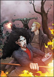 Anita Blake, Vampire Hunter: Guilty Pleasures #11
Writer: Laurell K. Hamilton
Adaptation: Jess Ruffner
Artist: Ron Lim
Colorist: June Chung
Letterer: Bill Tortolini
Cover: Ron Lim
Review: Dan Toland
Oh, what fresh new hell is this?
I haven't even gotten past the recap yet, and as far as I can tell, I've missed 10 issues of hot garbage. It is, quite simply, the most hackneyed, trite, poorly written nonsense I've seen in a book so far. And this is the recap. It reads like they farmed it out to a high school sophomore in a creative writing class: "Anita Blake is the Executioner. She raises the dead and kills vampires. So you would think that vampires would avoid her like the proverbial plague."
That's it. I'm out.
You're putting your name on a professional publication, Marvel. Learn the difference between "lead" and "led." Don't put in headshots of characters that aren't in the story. And rewrite the recap if it's filled with clich�s and awful phrasing. I haven't even turned the first page and I need to go make a sandwich to calm down.
Okay, I'm back.
Crap, this still sucks.
Abandoning the recap, I'm looking at the story itself. I can't really follow it, but I honestly don't care. I'm finding the same thing I often find when looking at an adaptation of a preexisting novel; no adaptation can hope to come close to telling the story as effectively as the original work. I do have to say that the writing is not quite as abysmal as the recap led me to fear, but it's still terrible. Maybe it's this way in the novel (which I haven't read) or maybe it's the adaptation, but the dialog is wooden and awkward. Hard-boiled detective-speak is awful if it's not done right. And this is not done right.
Then there's the little girl vampire. I'm sure it's a totally different little girl vampire than the one in Interview with the Vampire, though. Shoot me. Shoot me dead.
Well, at least Rom Lim is doing the artwork, right? Except... wait... hang on... what the hell happened to Ron Lim? I don't get it. In the 1990s, Lim was the one superstar artist who actually looked like he gave a shit. I used to really dig his stuff. But this has been poisoned by the same Well of Incompetence™ that's taken the writing. Suddenly he can't draw faces, he can't render the human body and his storytelling is downright inept in places. Honestly, folks, Lim can draw. I've seen him do it. However, everything Anita Blake touches is instantly destroyed.
When the best thing about a comic is the 1,484-page Eternals preview Marvel's been beating everyone over the head with for the past few weeks, something is dreadfully wrong.
There was no fathomable reason for this to be printed, let alone shipped. This is easily the worst comic I've ever reviewed for this site. (No, Mike, that is not a challenge.) This may be the worst anything I've ever anythinged for anything. Merely telling you to skip this isn't enough. The sheer destructive power of Anita Blake, Vampire Hunter means that drastic measures have to be taken. Should you or anyone you know see a copy, call the local authorities immediately. The radiation storm subsequently unleashed upon the area will make your town uninhabitable for 500 years, but you can go to your eternal reward knowing that you prevented Anita Blake, Vampire Hunter � which has been categorically proven to be the Anti-Life Equation � from spreading among the general populace.
Holy fuck, I hated this book.
 Captain Britain and MI:13 #1
Writer: Paul Cornell
Penciler: Leonard Kirk
Inker: Jesse Delperdang
Colorist: Brian Reber
Letterer: VC's Joe Caramagna
Cover: Bryan Hitch
Review: drqshadow
What, you thought Secret Invasion was limited to the shores of the United States? No, the Skrulls haven't forgotten about life overseas, as evidenced by Captain Britain and MI:13's activities in this miniseries. It seems that one particularly inventive Skrull has been a member of the British intelligence agency for years, usually taking the form of John Lennon, of all people. I guess I'd be a lot less inclined to distrust the guy who sang "Imagine" than, say, one of the Spice Girls, so the disguise makes sense. This Skrull, though, is one of the good guys. He's been open about his origins since day one, and is working from within to help reveal additional, less-forthcoming Skrulls operating inside the agency.
Writer Paul Cornell uses this series as a sort of roll call for British superheroes, of which there admittedly aren't many. As one on-scene paramedic quips, "I thought they'd go after the States! They've got all the bloody superheroes!" Sure, the primary focus may be on Manhattan, but if this invasion is to be truly taken as a legitimate pass at world domination, the story needs an overseas perspective. I can't think of a better focal point for the struggles in Europe than MI:13, the latest secret British agency to try and unite every local superhuman under a single, unified flag.
Cornell's writing is impressive � intelligent but concise, with a healthy dose of good humor. While they may be impaling Skrulls or staggering through the ruptured streets of London, the heroes can still break the ice with a snide remark that doesn't feel forced or in bad taste. There's a lot of gore in this issue, which may be my sole complaint, but even that is kept to a few specific, important moments. Cornell doesn't want you to take these little victories lightly, but he also doesn't want his heroes coming across as bloodthirsty savages. Somehow, he manages to accomplish both goals.
Leonard Kirk provides this issue with some fantastic artwork, finely detailed without getting overly complicated. While he does show a tendency to lose interest during the conversational scenes, the majority of the issue provides him with enough action to keep that from becoming a real problem. As each British hero is introduced to readers, they're granted a big, impressive splash page, and Kirk takes full advantage. I've never really cared much for Captain Britain or Spitfire, but their appearances here are so visually impressive that I can't help but take an interest in their activities throughout the story. He gives every character a large helping of personality, no matter how small their part in the story (the expression on the Wasp / Thor / Iron Man Skrull's face after the death of his partner is priceless), and displays a great knack for personally driving the reader's emotions. When I was supposed to be impressed, shocked or horrified, I was. And I haven't even mentioned his exquisite backgrounds. If he can work on delivering a touch more consistency, Leonard Kirk stands to be a huge name in the industry.
Captain Britain and MI:13 was a very nice surprise, and actually proved to be a more interesting, character-driven read than the primary Secret Invasion miniseries. Prior to this issue, I had very little interest in these characters, their situation or how it tied into the larger story. Now, having finished the first issue, I'm checking my calendar to see when I can expect the follow-up. Despite a few very minor qualms, I found both the writing and the artwork to be splendid. Buy it and I'm sure you'll find the same enjoyment. This is sure to be a great, albeit overlooked, counterpart to the main miniseries.
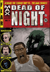 Dead of Night Featuring Man-Thing #4
Writer: Roberto Aguirre-Sacasa
Artists: Nic Klein and Nick Percival
Letterer: Blambot's Nate Piekos
Cover: Kaare Andrews
Review: Guest
Let's be honest. If your name was Man-Thing, you'd be pretty grumpy too.
Dead of Night is very much a throwback. For me, it's a throwback to the childhood I never had, but always wanted, flipping through page after page of pulp horror stories that would keep me awake in bed with the nightlight on. Sadly, this wasn't the case, but it appears that someone heard my silent pleas and made a book just for me. There's no Wolverine or Tony Stark hogging the spotlight here, just a great horror tale that's so steeped in old school ideals that it's become fresh again.
Right from the beginning, our narrator, the ever-sardonic Digger, immediately draws comparisons to the Cryptkeeper, and his role is generally the same: dropping a few macabre puns before taking us into the story. Though Digger's few appearances in the superhero world have labeled him a villain, it should be stated that this character needs his own book right now. I'd buy it every month without hesitation. He only appears in roughly two pages, but you get the feeling that this guy could quite possibly just be fucking with you the entire time, having a demented laugh at your expense. There's a layer to his presence: he's certainly insane, but is he more than the storyteller?
Percival's beautiful portrayal of Digger only helps this fact, as all the gruesome detail that you would expect from an undead psycho is intact, rotted flesh and all. I was already a fan of his video game-related work, and he is just as wonderful here, as his teasingly brief work is a thing of absolute beauty. I would seriously even buy Cable every month if this man was working on it, babychest and all. It's that good.
Nic Klein is no slouch himself, though on a completely different level. His work is also notable as he pulls off a style that many modern artists try so hard, but usually come up short at. He gives us the expected gore with surprising detail, and his portrayal of Man-Thing is solemn � astoundingly more human than some of the flesh-bearers around him.
The simplistic one-shot narrative is almost an afterthought. That's not to say it isn't your expectedly messy romp, but this book is so much more about style than plot development. It's like a Creepshow short in that sense: unflinching violent, cheesy when it wants to be and self-aware. Digger knows what's going on, and so does the reader. You know what you're getting from the start, and it's still great, old school fun.
Am I a biased? You're damn right I am, and any horror fan will be too. It's funny, in your face and beautiful in its ability to be so ugly. Buy it.
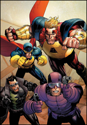 The Last Defenders #3
Writer: Joe Casey
Penciler: Jim Muniz
Inker: Cam Smith
Colorist: Studio F's Antonia Fabela
Letterer: Comicraft
Cover: Leinil Yu
Review: Guest
I haven't a clue what's going on here. The recap page is in the form of a letter to Tony Stark, which is clever, but doesn't help me grasp who's doing what or why they're doing it. But hey, I'm a She-Hulk fan, so maybe we've got something here.
Nope.
You know, as someone who's been reviewing comics for a little while now, I've noticed that I, along with any writer on a fixed schedule, have to try very hard not to become complacent, using the same words to describe these books that we read each week. My initial thought was to simply call this book "a mess" and try to fill the rest of my space talking about the art, current events or the French toast I want to make for breakfast tomorrow, but therein lies the problem. I've read several books in the past that I've already called "a mess," but this book makes them seem as easy to follow as an episode of Full House.
Here's what I gathered after reading the letter / recap over again. Nighthawk and She-Hulk, despite having names that almost rhyme, are the dysfunctional team that's part of a team that isn't really a team because they didn't team the way Tony Stark wanted them to team. In true Defender's fashion, the team almost immediately broke up, apparently, as Colossus and the like are nowhere to be found, but our two heroes went on a rescue mission to save a SHIELD agent anyway. There's also a bomb that isn't actually a bomb, but instead something that makes people insane. Yeah, I don't get it either.
I understood that much until a few pages in, then someone hit the reset button. Too many plotlines featuring characters I either don't know or don't care about exploded from the woodwork. What could have been used as months of plot development was spoiled in the span of a few pages. This book is the equivalent of being told you're going to have steak for dinner, but then, when dinner comes, you're given pork chops � and the pork chops are purple. It makes no sense and doesn't taste right, no matter how much ketchup you use.
Then there's the dialog. No one talks like this. It's all the cornball battle chatter of a Claremont book mixed with all the thought-balloony goodness of Mighty Avengers.
The art, to its credit, is serviceable, though pretty inconsistent. There are panels in which characters look to be suffering from Chaykin Cabbage Patch-head syndrome, but in general, he has a clean style that tends to remind you of a DC book, strangely enough.
I understand that the Defenders are, by their very nature, an erratic team, but when your book is this much of a, for lack of better term, mess, then there's a problem. There's no reason to pick this one up. Skip it.
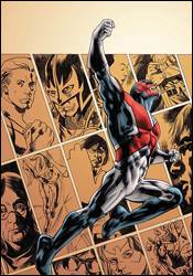
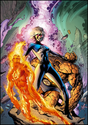 Secret Invasion: Fantastic Four #1
Writer: Roberto Aguirre-Sacasa
Penciler: Barry Kitson
Inkers: Mick Gray, Scott Hanna, Barry Kitson and Paul Neary
Colorist: Chris Sotomayor
Letterer: VC's Joe Caramagna
Cover: Alan Davis
Review: Dan Toland
Okay, here's the deal: this ties directly into Secret Invasion #1. That book came out a couple of weeks ago. You may not have had a chance to read it yet. You may not have heard about it. Which indicates that you may not have an Internet connection, and are studying this column in English class, in a leather-bound volume of The Epic Works of Sir Daniel Toland, published long after I've become a superhumanly successful Nobel Prize-winning author and international super spy. I felt kind of bad when I bumped TS Eliot off your syllabus, but these things happen. On the other hand, if for some reason it is still 2008 where you are and I'm not paying a roomful of assistants to crank out reviews to put my name on as I anguish because my wallet's too small to hold all my money, and you are still somehow unaware of the events of that first issue, then avert your gaze: there may be some inadvertent spoilage happening here.
And hey, here's one: Mr. Fantastic has already been neutralized. Meanwhile, in a brief scene at the end of Secret Invasion, Sue walked into the Baxter Building, ignored her kids (suspicious), walked into Reed's lab, let us know that someone (apparently a he) loves us, which is nice (and yet suspicious), then pushed a button and zapped the bejeezus out of the building. This issue takes that quick scene and expands upon it, spinning it off into its own story that will, presumably, tell us what the FF were up to while Iron Man single-handedly saved the Marvel Universe.
Now, I loves me some FF. You should know that going in. And Aguirre-Sacasa, who had previously worked on the Marvel Knights series Four, writes the team really well. Ben Grimm and Johnny Storm are deceptively difficult characters to write. With Ben, either the voice is all wrong, or the mannerisms are too forced and he winds up cartoonish. Here, though, Aguirre-Sacasa hits every note; this is probably my favorite Thing since Dan Slott's short-lived series. (In the right kind of story, some of us like Dan Slott.) Johnny is usually even worse; at some point in the 90s he began losing brain cells quickly, and nowadays has to be told to open a window before flying outside. Here, though, he returns to being the Johnny I remember reading; he's very smart, but lazy enough to be perfectly comfortable having other people think for him. When he needs to, though, he can pull it together, and it makes for some fantastic interaction between him and "Susan," when he understandably decides to find out what the hell she's doing. There's a super-secret surprise shocking twist at the end that I actually found not to be so super-secret, surprising or shocking. Not because it was telegraphed in any way, but because I, in my fanboy way, thought, "Oh, this'd be a perfect time to bring someone back." You may not need to get out of the house as badly as I, however.
I'm also a fan of Barry Kitson. His images are clean and clear, he's a terrific storyteller and his facial expressions are fantastic. Here, however, the art is a little uneven, especially where the Thing is concerned. I assume this has at least a little something to do with the four inkers on this issue. However, it's never bad. It's always very easy to look at, and at times there are images that really pop.
So, yeah. I liked this. Buy this issue, and then plan on picking up the next two issues in this three-issue miniseries.
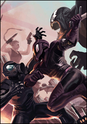 Thunderbolts #120
Writer: Warren Ellis
Artists: Mike Deodato, Jr.
Colorist: Rain Beredo
Letterer: RS and Comicraft
Cover: Marko Djurdjevic
Review: Guest
Apparently it's a requirement for anyone reviewing Thunderbolts to mention that they're a Suicide Squad rip-off, so there, that's out of the way. Anyone that can find it in themselves to overcome the fact that an idea in a comic book isn't completely original will be delighted to find that this series may very well be Marvel's best kept secret.
A sabotage instrumented by recently captured fugitive heroes has caused a rift in the team (it doesn't take much) and now amok is being run, as Swordman's gone off the deep end, slicing up Venom and making things go boom for good measure. While Penance and Moonstone are preoccupied with their own issues, and Songbird is trying (rather unsuccessfully) to get everyone on the same page, Norman Osborn takes it upon himself to supply the solution � a gobliny solution.
And yes, I know "gobliny" isn't a word.
The idea of villains becoming heroes has been explored before, but perhaps never are the lines between good and evil blurred more than they are here. The team, if you can even call it that, consists of some decidedly complex members. Some of them seem to genuinely want to reform, while the others are just happy to have a medium for their brutal instincts. They're, in theory, working towards the same cause, but it can be hard to judge them as a whole. Moonstone is clearly the manipulative bitch-vixen and Swordman's out for himself, but then you have Penance and Chen, who are simply trying to redeem themselves. It makes it all the more bewildering when you see that Songbird actually cares for all of them. The characterization is surprisingly well-done considering how many members there are. Everyone gets their moment to shine, and it makes this a great jumping on point for new readers.
The real star of the show is Norman. This is one of the best portrayals of the character ever. He's clearly insane and undoubtedly terrifying, but, in spite of ourselves, we want to cheer for him. It's an odd position to be in, and a feeling you'll never get while reading Amazing Spider-Man. This is the evil prick who killed Gwen Stacy, but in this book, he's the man.
In the past I've been pretty apathetic about Deodato. He's just never really done it for me. But here, he's really displayed some standout work. One of his splash pages, in particular, is downright frame-worthy, and this is definitely the perfect book for him. His work here has made me a fan.
Buy it.
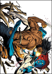 Wolverine #65
Writer: Jason Aaron
Artist: Ron Garney
Colorist: Jason Keith
Letterer: VC's Cory Petit
Cover: Ron Garney
Review: Dan Toland
Wolverine is hunting Mystique. You probably could have gleaned that from the story title: "Get Mystique!" (The exclamation point is not mine.) This is partly because of Cyclops' new outlook on life, which involves killing anyone who betrays the X-Men, is a danger to mutantkind, talks during the movies or dresses their pets in people clothes. This is also partly because back in the 1920s Logan and Mystique were involved in a bank robbery that, frankly, could have gone better. It's a good thing Cyclops sent him after her, though, or he might have let his obviously terrible indignation at Mystique over this event (which happened well over 80 years ago) fester for another few decades' worth of comic stories � seeing as how it's never seemed to come up before.
I gotta say, though, for all the innate potential cheesiness of the story, this isn't a bad issue. Aaron's story is a decent one, and he writes both Logan and Mystique pretty well. A lot of information comes across without being totally overwritten; it touches that line, but doesn't quite cross it. And the dialog rings true throughout, well, except when one character asks another, "You've got my back, right?" Which I wouldn't normally have taken issue with, except it's 1921. But dialog be damned; this issue is about a big ol' fight between Logan and Mystique, and the creators don't disappoint. It's brutal. They really earned their parental advisory sticker this month.
Which brings me to the art: to say that it lacks consistency is an understatement. Some of the images here are gorgeous. Some of them are really gritty and powerful. And some of them are just sloppy. There are times when I can't wrap my head around the fact that the same guy drew page seven and page eight. It's not bad, per se; it's just not all that great. And the continuity of the fight needs work. It's a huge pet peeve of mine: if something happens to rip a guy's shirt to shreds (and in a Wolverine comic that is undoubtedly going to happen at some point), figure out where it's torn, and then please (pretty please with sugar on top) draw the shirt the same way in every panel after that. If there's a big rip down the front in one panel, that rip should probably still be there in the next panel. Also, Wolverine's healing factor is a powerful and amazing thing. However, and I may have to dig out my old Handbook of the Marvel Universe to confirm this, but I'm pretty sure the healing factor doesn't extend to his hat. I know they did a lot of really goofy shit to him in the 90s, though, so I may have missed an issue.
However, the 1920s stuff looks great. And I like his take on both Logan and Raven, even if Logan seems to get shown through Gil Kane's Nostril-Cam quite a lot. And for some reason, I really love the images of Mystique wearing hobo clothes that are way too big for her. I was altogether less enchanted with scenes of Raven graphically vomiting all over Logan's face. It doesn't serve the story at all. It's a big world, and I'm sure there's a market for that sort of thing, but I ain't it. (I do, nevertheless, await next week's search engine forum thread with bated breath.)
The only other (and very minor) nitpick, is that there are a couple of instances of some less-than-subtle airbrushing. See the costume Raven's wearing on the cover? Well, it's the only place she's wearing it. (It's a post-Singer world, kids.) This naturally means there are a lot of boobs covered by shadows, stuff in the foreground obscuring things, posing from the side and things like that. Not a problem. However, it looks like Garney tried to get a couple of things past the editors. And I don't care if the book does go out with a parental warning label; Marvel is not about to let you see Mystique's butt crack.
The colors are astounding. The scenes in the 1920s have a bit of a sepia wash, but it's not overdone. It's just enough to get it across that this is a flashback. And the remainder of the book is just as great; it's dark where it needs to be, bold and bright when that's appropriate. It just looks wonderful.
I had "flip though" on the brain for most of this issue. However, as soon as I got to the end, it earned itself a borrow. For all the inconsistency, on the whole, this is a well-crafted book with some great combat, good character work (especially with Mystique, who I normally could take or leave) and a pitch-perfect end note. It's good, and where Wolverine comics are concerned, that frightens and confuses me a little.
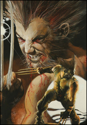 Wolverine: The Amazing Immortal Man & Other Bloody Tales
Writer: David Lapham
Artists: Johnny Timmons, David Lapham, Stefano Gaudiano, Kelly Goodine and Paul Neary
Colorists: Jose Villarrubia, Avalon's Matt Milla and Avalon's Ian Hannin
Letterer: Artmonkeys Studios
Cover: Simone Bianchi
Review: drqshadow
I'm sure you've seen the title of this issue and rolled your eyes just like I did. Another book focusing on Wolverine? What, the 20 other regular monthly appearances weren't enough for Marvel's most overused character? Well, calm those furies for at least a moment, because The Amazing Immortal Man and Other Bloody Tales isn't playing the same game as its peers. Where each of the Canucklehead's other regular appearances focus on the character's straightforward superheroic adventures, Immortal Man writer David Lapham instead explores the concepts that made Wolverine so compelling in the first place.
There's no showdown with Sabretooth, no battle with ninjas in ancient Japan or jarring revelations about Logan's forgotten ancestors. Instead, the double-sized issue features a trio of short stories that take the character in very different directions. While he does occasionally have his faults, the two universal consistencies in David Lapham's work are his strong characters and his imaginative plots. Both are evident in full force in Immortal Man. Under his watch, Logan is more than a man � he's a force of nature. Is he easily misled? Sure. He's never been portrayed as a genius, but he's also never been seen as someone to be trifled with. Wolverine's greatest stories have all come when he's been deeply betrayed, his blood boiling with a thirst for revenge. Lapham's best work has come when he can merely set the stage, nudge the first domino and document the reaction. They make a great match.
The majority of the narrative is through the eyes of the observers. Logan himself, who's seen as everything from a freak to an inspiration, barely even gets a speaking role. While the book's three stories have little in common as far as plot is concerned, they do share a common premise: an examination of the impact a chance encounter with Logan has on the lives of otherwise-ordinary people. That's something which is easy to forget; while the concept of a short, hairy, impervious man with razors embedded in his forearms may have lost some of its impact on readers, it should still come as something of a surprise to the common denizens of the Marvel Universe. Seeing something like that in print is entirely different from seeing it out on the streets, and an encounter with somebody like Logan should certainly have a profound effect on an individual.
The accompanying artwork is about as vastly different from one story to the next as I can imagine, but none of it is really all that good. The first chapter is probably the strongest of the three in this regard: Johnny Timmons's thick, gestural style is minimal, but effective and matches the mood and the setting of the story in the 1930s. Lapham himself handles the artwork for the more outlandish second chapter, displaying several peaks and valleys despite the story's relatively short length. It's not his finest work by any means, but it's good enough, especially when contrasted immediately by Kelly Goodine's mildly clich�d work in the closing chapter. Goodine's work is stiff and over-detailed, and his Logan would be unrecognizable without that trademark hairstyle.
This is a tough sell. The artwork is barely worth mentioning, and while I applaud Marvel's decision to give David Lapham the freedom to do whatever he wants within this issue, some of the material is in desperate need of an editor's heavy touch. The only story really worth your time is the first, and even though that tale runs a mere 11 pages, I don't think it would benefit from any further elaboration. Lapham is a genius, but sometimes he's a mad genius, and this isn't his best showing. Flip through it but don't do much more.
 X-Men: Legacy #211
Writer: Mike Carey
Penciler: Scot Eaton
Inkers: John Dell, Andrew Hennessy and Dave Meikis
Additional Artwork: Brandon Peterson
Colorists: Frank D'Armata and John Rauch
Letterer: Cory Petit
Cover: David Finch
Review: drqshadow
This must be the sixth or seventh time Professor X has miraculously avoided certain death. Hell, it's not even the first time he's been shot in the freaking head. Sure, sure, he's the brightest mutant mind in the galaxy, the most gifted telepath of all time, I get all that, but even a feline would've surely run out of lives by now.
Okay, gripe session over. Yes, Xavier has once again survived an assassin's bullet. After taking a blast to the dome, the founder of the X-Men was revived and reconstructed by Exodus, but he's still missing big chunks of his memory. Removed from his students, Xavier now searches for a role to play in the tumultuous new mutant landscape.
This issue skips around. A lot. Mike Carey takes readers on a journey through the past, the present and even the hypothetical future, but never seems capable of reigning things in before they spiral back out of control. Xavier is potentially one of the Marvel Universe's most intriguing characters, but he's been through so many complicated, unfulfilling adventures and changes over the years that I don't think anyone really knows who he's supposed to be any more. Especially now that his memory's been fragmented, the Professor is an incomprehensible personality, unsure of who he is, where he's been or what he's doing. And that doesn't make for easy reading.
That isn't to say it's all bad. Carey has a few unique ideas, such as Xavier's use of telepathy to control a flock of pigeons, but the writing focuses so resiliently on this empty quest to redefine the man's history that such concepts are cast aside almost before they've been executed. Armed with the right storyline, Mike Carey could make a great match for this series, but this isn't the right storyline and it's costing him. Reading this issue was a chore, like the search for a needle in a haystack; underneath it all, there are some great concepts and ideas, but they're so buried amongst the excess that it's questionable whether they're even worth uncovering.
Scot Eaton is the primary artist this month, with occasional relief from longtime X-Men support artist Brandon Peterson. Eaton's work is technically sound, if not particularly exciting. When the material gets a bit more complicated, as it does for a time at the outset, Eaton's work becomes very tough to navigate. He's struggling with some complex themes (primarily Charles's dreams and shattered memories), and he isn't winning the battle. This stuff is impossible to read and even tougher to decipher. When Peterson takes over during specific flashbacks, the book's identity becomes much clearer; he manages to work a little more emotion and appeal into the same kind of scenes that gave Eaton fits. Peterson's work is clearly several steps above his counterpart, but he's never trusted with more than a page or two at a time, and even that is just conversation, not action.
I can't recommend you give this a second glance. The writing is plodding and dull, and the artwork generally follows suit. If you're a longtime reader, this issue accomplishes exactly nothing, because it's mostly spent treading over old territory. If you're a new reader, you'll be immediately turned away by the complexity of those age-old stories. Skip it no matter what your experience with the mutant squad may be. It's just not worth the struggle.


