Is It Wednesday Yet?
29 April 2008
29 April 2008 — Here we are again with another installment of your favorite comic book review series. As always the comics you're about to read about won't be released until tomorrow (30 April 2008), so these reviews are free of spoilers and should help inform your purchases on new comic book day.
Our grading scale is simple:
Buy: An excellent comic book.
Borrow: A good comic, but save yourself some money by reading a friend's copy.
Flip Through: Give it a once-over at the comic shop.
Skip: This doesn't need to be explained.
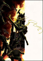
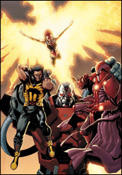
 Avengers: The Initiative #12
Writers: Dan Slott and Christos N. Gage
Artist: Steve Uy
Colorist: Steve Uy
Letterer: VC's Joe Caramagna
Cover: Steve Uy
Review: drqshadow
Tony Stark's band of government-sponsored superheroes-in-training has taken heavy fire lately, and it's come from an unexpected source. When MVP passed through the training program, he was every bit the ideal candidate. But when he was suddenly killed during a drill gone wrong, the brass didn't want to lose an opportunity to spotlight this perfect example of the kind of good their program can produce. They cloned him, multiple times, with much of the team kept out of the loop, and now one of those clones has gone mental. With a dangerous new weapon strapped to his arm, the duplicate (now known as KIA) has cut a bloody path through the Initiative's ranks, slaughtering trainees and full-fledged members alike.
With the fight against KIA now in their past, this month the members of the Initiative are dealing with, perhaps, a more unsettling foe: their explanation-hungry superiors. After the wealth of raw action that preceded it, this issue may seem to be a drastic change of pace. The Initiative #12 spends most of its time focused on the personalities and relationships of the team members: how they respond to authority, how they interact with one another, their public strengths and private weaknesses. It's a good chance for new readers to get to know the squad, but it's not particularly exciting. The issue's tone is very strange for a mainstream superhero book, although I can't quite decide whether that's a good thing or a bad thing. On one hand, it's sculpting what were once little more than background characters into well-rounded, deep, original individuals. On the other, it's a far cry from what many might expect from a series bearing the Avengers namesake. It's the mainstream superhero series that looks and reads more like an indy comic.
In the same vein as Power Pack's GuriHiru Studios, Steve Uy provides every aspect of the artwork; everything from pencils to inks to colors goes through his hands, and that makes for a tight, cohesive visual identity. It's important that Uy handle the colors himself, because his style is so reliant on the palette to provide shading that it could prove to be a real headache in someone else's hands.
His actual artwork is very basic, with a heavy emphasis on composition and posturing. While this serves to keep the pages airy and appealing, that benefit doesn't come at the cost of his characters' individuality. If anything, it gives the artist a greater opportunity to focus on the shape and size of his cast; no two look even remotely alike, neither in facial expression nor in build. If you're familiar with the work of the Luna Brothers on Ultra or Girls, this is a very similar bag of tricks, but I think Uy is doing a better job of it. It's a nice approach that doesn't fall into any of the traps that one might expect, and the book benefits from its presence.
This month's Avengers: The Initiative is the black sheep of the Avengers family. It seems more concerned with what happens after the disaster than how it was averted in the first place, which is certainly a unique perspective for a mainstream superhero book. While co-writers Slott and Gage display a tendency to overload a page with dialog, it's at least a compelling read with the noble goal of expanding and enhancing the cast members. Matched with Steve Uy's distinct artwork, the duo delivers a comic that's unlike any of the other post-Civil War books Marvel's published thus far. Borrow it to see if it's your cup of tea; The Initiative is worthy of a long look.
 The Immortal Iron Fist #14
Writers: Matt Fraction and Ed Brubaker
Pencilers: Tonci Zonjic, Clay Mann and Kano
Inkers: Stefano Gaudino and Kano
Colorist: Matt Hollingsworth
Letterer: Artmonkeys Studios
Cover: Kaare Andrews
Review: Dan Toland
So, the recap says that Danny Rand — the Iron Fist, the Immortal Weapon of K'un L'un — is fighting in a tournament against the Immortal Weapons of the other six cities of Heaven, "to determine who has the best kung fu!" (That is an actual line. Holy crap, it's Dragonball!) Xao — who's kind of like Lex Luthor, except he kinda sucks a little bit — kidnapped Danny's manager, and when Luke Cage, Colleen Wing and Misty Knight tried to rescue him, they got held captive, too. Danny, therefore, had no choice but to accede to Xao's demands, and, um, build a train. (Are you getting all this?) While all that's happening, the tournament is still going on. Sort of. There's a portal that allows K'un L'un's ruling class to hop over to Earth whenever they feel like it, which apparently makes Lei Kung — the Thunderer, Danny's old master — angry enough to raise an army of women to rebel against Yu Ti — the ruler of K'un L'un. Yeah. And Lei Kung has talked some of the other Immortal Weapons into helping. So, forget about the tournament, I guess. Oh, and while all this other stuff is going on, Xao has packed the train with explosives (and supporting characters) and is running it through the rift, right at K'un L'un. Oh, HYDRA's here as well.
Also, the art's not so hot.
I have spent the past hour and a half reading and rereading this comic. I actually think I have a handle on it at this point, but there is no excuse for a comic being this difficult to muddle through. It's the final part of a seven-part story, which explains it to some degree, but when you've got this many plot threads flapping in the breeze, coherency tends to take a back seat. It's almost like Fraction and Brubaker were in a room and kept saying excitedly, "Hey, you know what else'd be cool?" Slapping one thing on top of another has only one outcome: the story will eventually collapse under its own weight. Also, for a comic supposedly about a martial artist at a kung fu tournament, there's an unforgivable lack of action in this book. What little there is, yeah, isn't bad. But when you have a 48-page issue, which is the wrap-up to a storyline that's taken over half a year to tell, and only nine of those pages have any instances of people hitting each other, you're doing it wrong.
There are three pencilers working on this book. Zonjic does a serviceable job, but it looks to be very rushed and a little uninspired. Mann's pages are a little better, mainly for their use of shadow, and his action poses are pretty good. The less said about Kano's pages, however, the better. The fact that these were the first images to hit me really soured me on the rest of the book, to be honest.
If you've made it through the previous six issues of this storyline, then you're a stronger person than I, but I would still not be able to recommend purchasing this. It's an incoherent jumble with slipshod artwork. Feel free to skip this. Spend your $4 on a gallon of gas.
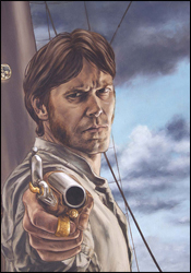 Marvel Illustrated: Moby Dick #3
Writer: Roy Thomas
Penciler: Pascal Alixe
Inker: Victor Olazaba
Colorist: Sotocolor's A. Crossley
Letterer: VC's Russ Wooton
Cover: John Watson
Review: Dan Toland
I love that Marvel is doing this. For years, comics tried to bring classic literature to kids under the guise of exciting adventure stories, and it's great to see Marvel bringing that back to some extent. Not knowing what the sales figures are, I have to wonder how successful this venture could be; kids at the newsstand, seeing an exciting-looking comic depicting a sailor brandishing a harpoon as a vicious white whale destroys his ship, are no longer the target audience for monthly comics. The target audience nowadays has either already read Moby Dick when they were in high school, or studiously avoided reading Moby Dick when they were in high school.
But the matter at hand is whether this issue is worth your time. The short answer: kind of.
Roy Thomas is one of those writers who's always had a place in my heart. His work with All-Star Squadron is one of my favorite runs. And he's perfect for this sort of thing; if there's anything Thomas does well, it's recapturing the feel and flavor of another era. Here, the atmosphere of Melville's book comes across through Thomas' script, without actually subjecting you to the real thing.
There's a fair amount of the novel to get through in this issue, and it moves along steadily. With that said, not a whole lot actually happens; there's not one, but two ships that happen across the Pequod. Both of whom have seen the whale. Both of whom have grim tales of what happened when they tried to mess with the whale. Both of whom advise Captain Ahab not to mess with said whale. And both of whom are promptly ignored by Ahab.
The characters' lives are depicted without glamour or romance, and there are an awful lot of dead whales floating around this comic. Also, someone falls inside a decapitated whale's head. Then he splashes around in it for a little bit. It might be... hang on, I'm thinking about it... no... no... mm-hmm. Yeah. This is definitely the grossest thing I've ever seen. Ever.
Alixe's art is interesting. He has some striking, powerful images here. The character designs, especially of Ahab himself, are quite good. He does action well, and his panels are nice. However, he seems to have some trouble with movement, poses and facial expressions; people look really stiff and unnatural. The minuses don't outweigh the pluses, and if he can work on this he'll be a very good artist.
I'm not saying this is a substitute for the novel; no comic adaptation could be. However, as reading Moby Dick is a lot like repeatedly getting hit in the head with a small hammer while someone shouts Christian allegory at you, that's not entirely a bad thing. As an adaptation of Moby Dick, this does a fine job. As a monthly comic book, it's less successful. Most of the story is missing, and there's not really anything in here that a kid would get terribly excited about. It does what it sets out to do, and when the story is collected I'll read it and reevaluate my score, but as far as this issue goes, I have to give it a flip through.
 The Order #10
Writer: Matt Fraction
Breakdowns: Barry Kitson
Penciler: Javier Saltares
Finishes: Scott Hanna, Victor Olazaba and Nelson
Colorist: Sotocolor's J. Roberts and Wil Quintana
Letterer: Artmonkeys Studios
Cover: Barry Kitson
Review: drqshadow
It was naturally only a matter of time before one of Tony Stark's bitter enemies (of which there are many) used his passion for the Initiative and his special connection to the Order against him. And that's exactly what Zeke Stane (the son of Iron Man's arch-nemesis / corporate rival, the late Obadiah Stane) has done over the last few issues. He's worked out a formula that strips the team's members of their powers, and used it to overload the mind of Mulholland, the crew's resident psychic. The powerful mental outburst led the entire population of Los Angeles to riot, and without their powers the Order is in no position to help. In short, it's one big public relations nightmare for the crimson-clad director of SHIELD.
Matt Fraction's story may be complex, but the basic plot is easy enough to understand. Zeke Stane, the criminal mastermind, makes for great entertainment. He's manic and bloodthirsty, reveling in the moment of his greatest victory. His plans are clever in their simplicity, make for an intriguing conflict and tie neatly into the real uncertainty of modern America. In the same vein as some of Alan Moore's finest creations, he's not laying out his plans to the heroes, leaving them for dead somewhere and hoping they don't miraculously escape to thwart him; he's already executed his plot, and now merely basks in the afterglow.
Zeke's personality stands in such sharp contrast to that of the Order's members that I actually found myself pulling for the bad guy. This team is so wooden and stereotypical that I can't really understand how anyone couldn't. Where Stane is asking questions and making changes, the Order is merely trying to restore the status quo and failing to ask whether it's something that's even worth reviving. Whether or not Fraction's goal was to lead his readers to make that revelation themselves is debatable, but considering the book isn't dubbed Zeke Stane & Friends, I'd be willing to bet that it wasn't really in the plans. This is an intriguing read, but not for the reasons I think Fraction intended.
The artwork struggles to find an identity, and never really seems to settle on one. That can probably be attributed to the half-dozen different artists with their hands in the mix this month, but an understanding of the causes behind this problem won't do much to alleviate it. The visuals feel both dated and rushed, like many of the comics published by Valiant in the early 1990s. They're heavy-handed and uncertain, hard to follow and short on personality. On a few flickering instances, a fine illustration will pop its head through the garbage, but for the most part this is bona fide crap. It's detailed when it needs simplicity to direct the reader's attention, and overly simplistic when the story asks it to help drive the narrative with specific details. There's no flow, no identity granted to the characters and no excitement to inspire the reader to continue reading onward.
This was a series with an identity crisis, and that's never been more evident than it was here in its final issue. Though Matt Fraction's concepts remain fresh, original and wholly entertaining, his execution here is murky. I wasn't given a reason to pull for the team, or even to identify with them, and as a result the big conclusion felt unrewarding and hollow. Mediocre storytelling and awful artwork means The Order #10 lands somewhere near the bottom of my list of recommendations. Although Zeke Stane is a great character that I want to see more of, I'm going to suggest you skip this.
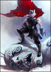 Thor: Ages of Thunder
Writer: Matt Fraction
Pencilers: Patrick Zircher and Khari Evans
Inkers: Patrick Zircher and Victor Olazaba
Colorists: June Chung and Jelena Kevic Djurdjevic
Letterer: Chris Eliopoulos
Cover: Marko Djurdjevic
Review: Dan Toland
I have to hand it to them; occasionally Marvel manages to surprise me. In Ages of Thunder, Fraction and crew give us a look at a period that Marvel mostly ignores: that of medieval / Norse-mythology / pre-Journey into Mystery / frost-giant-fighting Thor. That's not the surprising bit. The surprising bit is the way this is handled.
While it would be the simplest and most obvious thing in the world to present 48 pages of hammer-swinging, giant-crunching and goddess-bedding (and fear not, faithful readers, for there's plenty of that), Fraction instead couches the story almost as a fairy tale or retelling of an old myth; it reads like a written-down version of oral tradition, and this wouldn't have been out of place as an issue of Sandman. (That's not to say Fraction is close to Neil Gaiman's level, but the feel of the piece is very much like Gaiman's work.)
Even the story itself which might seem airy and lightweight, is actually helped by this storytelling style. It's a pair of stories that are as old as storytelling itself: the gods are put in a remarkably foolish situation, directly or indirectly because of Loki; said gods are essentially useless and incapable of finding their way out of a wet paper bag and must call on Thor to rescue them. Eventually, Thor turns up and solves everything in less than a panel, generally by throwing something through someone's head. But that's Thor. That's the role he, or the hero in question, always fills in a story like this. Because this is being couched as an old Norse legend, what's important is not the plot or the ending, because there's a formula it has to stick to. What's important here is the characterization, and it's really interesting. This is not the Thor who fights alongside the Avengers and defers to Captain America. This is the original, pre-Donald Blake Thor, the one Odin decided needed to be taught a lesson in humility. Thor here has bundles of good qualities; humility ain't one of 'em. (Of course, there's an argument to be made that what Odin calls "headstrong and proud" could be termed "willing to call Odin on his bullshit.") Even Loki is given a more human face; he's not the mustache-twirling, bottomless well of evil in this, but rather a weak man who stirs up trouble because he's the God of Mischief, and he really can't help himself.
The art, which is laid out as double-page spreads throughout the book, really giving it an epic feel, is split between the two stories; the fist, by Zircher, is wonderful. It fits in perfectly with the fairy tale feel of the whole thing, while never watering down the impact of some of the more brutal moments. Evans' half is also pretty good, but the first 24 pages are simultaneously charming and awe-inspiring.
This was a very fun, very interesting book that's attempting to do something a little out of the norm for Marvel, and it succeeds pretty admirably. I would advise you to borrow this; anyone who's a fan of this type of storytelling, Thor fan or not, will really get a charge out of this.
 Ultimate X-Men #93
Writer: Robert Kirkman
Artist: Harvey Tolibao
Colorist: Jay David Ramos
Letterer: VC's Joe Caramagna
Cover: Salvador Larroca
Review: drqshadow
It's the coming of Apocalypse. While the X-Men were convinced that school founder Charles Xavier had been killed, the truth of the matter was that he'd been merely displaced, both in space and time. Cable had taken the Professor to the future, training him as mutantkind's last hope against the almighty power of Apocalypse. Now that Xavier has met the monster in battle and fallen, the only thing standing between the X-Men and utter annihilation is the unstable, galaxy-shattering power of Jean Grey's Phoenix Force. Not exactly the cavalry.
Writer Robert Kirkman has certainly strayed from the beaten path with his depiction of Ultimate Apocalypse, and I can't fault him for that. The Ultimate line was founded on the promise of old stories retold against an all-new backdrop, and he's taken that to heart here. His Apocalypse is truly fearsome and intimidating in a way that's completely different from his cousin in the core universe. He's also written the character, for whom I've long held disdain, into a corner with another of my least favorites (the Phoenix) and come out of it smelling like roses. I don't have a lot of time for all-powerful monsters in comics, especially when they've been overused like these two, but their conflict here leaves the X-Men in an unusual "damned if I do, damned if I don't" situation.
So the plot is good by me, although the actual storytelling falls a bit short. The battle between Phoenix and Apocalypse plays out like a turn-based RPG, with each character shouting something impressive and then cutting loose with an assault while the other just stands there taking it. Kirkman's dialog is quite stilted, even for the characters that aren't universe-devouring entities, and seems much more concerned with looking cool than with progressing the story. It's give-and-take throughout the issue, really: every good choice is counterbalanced by a bad one. And the story's ending is the copout of all copouts.
Harvey Tolibao's artwork is so focused on detail that I had trouble following the narrative. His panels are so meticulous, so overfilled with tiny little lines, that they often overflow into one another. This work is busy to a fault, detailed beyond the point of reason, and while it can occasionally work to his benefit, the sacrifices he makes in the issue's legibility aren't worth the tradeoff.
If that weren't enough, Tolibao's odd take on anatomy and his characters' musculature makes his artwork even more off-putting. While his characters are very clearly three-dimensional, impressively weighty and sufficiently dramatic, they're just far enough off the beaten path to be unsettling. Never is this more evident than in his depictions of the Phoenix, whose appearance is basically a nude, orange Jean Grey sans her naughty bits. Here's a character whose design is body and nothing more, and her form is so far from that of an actual person that it's hard to imagine she's even human. His characters' muscles are oddly shaped, their bodies curved in places where they shouldn't be — it's borderline grotesque. And, if his rendition of Phoenix is bad, his take on the men is rotten. Every possible inch of flesh is coated with a spider's web of veins, accentuated by an amount of muscle that's so gratuitous, even a longtime pro wrestling / mixed martial arts / comic book geek such as myself has to look at it and shake his head. Steroids must run rampant in Xavier's mansion.
This issue has a lot of promise, but it fails to live up to that. The storytelling is largely good, but the limitations it displays are enough to keep it from reaching its potential. The artwork is gorgeous in a few specific moments (explosions and backdrops, largely), but is generally well below my expectations for one of Marvel's premiere titles. Come the perfect storm of a great artist and a plot that finally manages to execute, Ultimate X-Men could finally return to greatness. Right now, though, that moment seems like it's still quite a ways off. Skip this; the bad far outweighs the good at the moment, and it's not something new readers are going to want to dive into.


