Is It Wednesday Yet?
15 April 2008
15 April 2008 — Here we are again with another installment of your favorite comic book review series. As always the comics you're about to read about won't be released until tomorrow (16 April 2008), so these reviews are free of spoilers and should help inform your purchases on new comic book day.
Our grading scale is simple:
Buy: An excellent comic book.
Borrow: A good comic, but save yourself some money by reading a friend's copy.
Flip Through: Give it a once-over at the comic shop.
Skip: This doesn't need to be explained.
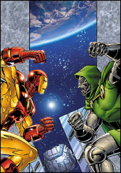
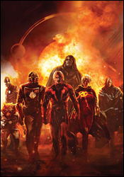 Annihilation: Conquest #6
Writers: Dan Abnett and Andy Lanning
Pencilers: Wellington Alves and Tom Laney
Inker: Scott Hanna
Colorist: Frank D'Armata
Letterer: Joe Caramagna
Cover: Alekski Briclot
Review: Tim Glancy
I know Marvel expects everyone to read everything that relates to its events, but they also need to realize that it is just not possible. So when Nova showed up with a posse in Annihilation: Conquest #6, I was quite confused. I actually had to go to a comic book store on my break to figure out how this group came to be. Once I read the issue in question (Nova #12 for those wondering) everything made sense, but reading the final chapter of a story shouldn't be that troublesome.
That being said, Annihilation is still the best big event to happen in a long time, and Annihilation: Conquest is a very fitting sequel. What really pushes these books ahead of the pack is the way the characters interact with one another and the way they have grown over time. Take Ronan and Super-Skrull for example. Before Annihilation, both of these characters were Fantastic Four villains who were used sparingly at best and always made to look rather worthless. Sure, they appeared in other cosmic comics, but always took the loss. However, in the hands of this creative team, both characters have risen to not only become heroes, but to become leaders as well. They've even put aside their centuries-old conflict to fight for the greater good. In a year, these characters have grown more than they had in decades, and now Marvel has two very strong toys in the proverbial sandbox. That has been, to me, the magic of this series. Instead of just making already popular characters more popular, Annihilation took characters that people couldn't care about and made them meaningful.
The other thing I enjoy is how desperate things always seem. The heroes are facing one of the Marvel Universe's best villains, Ultron, as well as a force of technology that renders any tech the heroes could attack with useless in the Phalanx. Some of the most powerful beings in the universe — including three of the biggest heroes from Annihilation in Drax, Gamora and Nova — have been corrupted by the Phalanx. Heroes have died, strange alliances have been forged and old heroes have returned, but nothing can be done to stop Ultron. All too often these events feature little triumphs by the heroes that build towards the bigger victory in the end. Not here. If the forces of good are going to win this battle, it's going to be a Hail Mary play. There is a deep feeling of gloom, which leaves the readers wondering how the heroes will overcome.
Abnett and Lanning have handled this book tremendously. As the battlefield changed and the characters evolved, the writers never lost sight of the story. Turned heroes have redeemed themselves, surprises were revealed and the climax fit the overall tone of the event. The sun doesn't suddenly shine, and puppies don't leap in the air to lick smiling faces. What people forget is that Annihilation is a war comic that just happen to take place in space, and in war there really aren't winners — just survivors. The writing team gets this. There is no Endor celebration.
This is also a beautifully drawn book, and I think we are looking at a team effort here. Everything is solid, and each piece fits with the other. The pencils and inks look great, and the colors add a wonderful tone to the book. Best of all, this team proved to be very capable of drawing machines and robotic structures. The Babel Spire looked tremendous throughout the storyline, and this is one of the best looking Ultrons you will ever see. All told, without a superstar art team, they've managed to make this book look as good as any other book on the market today.
You knew I was going to tell you to buy this. I hope you do, because it is a great story that touches a corner of the Marvel universe that usually lays dormant.
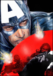 Captain America #37
Writer: Ed Brubaker
Artist: Steve Epting
Colorist: Frank D'Armata
Letterer: VC's Joe Caramagna
Cover: Jackson Guice
Review: Dan Toland
Recently: Bucky Barnes returned from the dead, which broke all sorts of comic book laws. Steve Rogers knocked up Sharon Carter, then she killed him, but one has nothing to do with the other. The Red Skull, with the help of Doctor Faustus, has schemed to take control of America from the inside. His plan includes hypnotizing SHIELD agents (including Carter) and politicians to later do his bidding. Thus far everything has worked to his advantage: Captain America is dead, his brainwashed SHIELD agents shot unarmed civilians on live television, chaos is on the rise, foreclosures and gas pieces are out of control (now that's a well-crafted plan; I just spent $60 to fill my gas tank in real life), his security company (RE: Blackwater) will soon oversee every major American city, his programmed politician seems to be making a successful bid for the White House and Skull just so happens to have an extra Steve Rogers body lying around in his basement. The only kink in his plan, it seems, is Bucky's recent appearance as the new Captain America. But even that might not be all it seems.
Man. I do not envy the guy who winds up following Brubaker.
This is the first part of "The Death of Captain America: Act 3." To that end, there's a certain amount of recap, and a lot of plot threads getting picked up. Those threads, essentially, boil down to:
01. The Red Skull is kinda down on America.
02. A certain number of Steve's protégés are less than thrilled at the fact that Tony Stark unilaterally handed the keys to Bucky.
03. And Sharon Carter needs to figure out exactly what the hell is going on.
Everything that happens stems from one of those three things. This issue is laying some groundwork, and as such there's not time or space to go into any detail about anything. It's very well-done, though, and Brubaker does the job that I think most everyone expects by now. He manages to create some really good character moments, especially regarding the people Steve left behind. He's only here for two pages, but this is the best Clint Barton I've read in a long time. Even the obligatory Tony Stark appearance is more about Sam Wilson than The Further Adventures of Tony Stark, Whose Movie is Coming Out in Two Weeks! See it 02 May 2008!
I'm just gonna say it: Steve Epting's Red Skull is the best ever since Kirby's. The artwork in whole is really good, but for some reason that particular character is just leaping out in front of all the others. There isn't much action here, but what little there is is tremendous. Captain America is one of those characters: he's not hard to draw, but he's hard to be made to look impressive. It's really easy to make Cap look bland, but not many artists can pull off the dynamic figure Cap really ought to be. Kirby, naturally, could do it. Byrne could do it on occasion. Cassaday can do it. And so can Epting. This is an example of exactly the right writer coming together with exactly the right artist on exactly the right title; this is a run that people will look at years from now as an example of an all-time classic creative team.
So, yeah, this is good stuff. If you're not following this book, this makes a very good jumping-on point. If you are following this book, then you already know the score: buy.
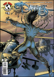 The Darkness #3
Writer: Phil Hester
Penciler: Michael Broussard
Inker: Ryan Winn
Colorist: Matt Milla
Letterer: Troy Peteri
Review: Guest
Anyone that read my review of the Butcher one-shot a couple weeks ago knows that I wasn't exactly blown away by it, despite my inherent giddiness for the source material. I found it to be a smartly written, though thoroughly confusing tale. Well, there's good news and there's bad news. The bad news: the one-shot still doesn't make a lick of sense to me. The good news: I don't really care anymore, as this issue completely makes up for it.
You see, Jackie has found himself in a bit of a bind. Shocking, I know. Turns out that teaming with a mad scientist and starting a drug cartel based on his own demented bodily fluids, while a good idea on paper, ended up making him some enemies, some of which are more dangerous than he realized. Making matters worse is the fact that he's created a lover out of the Darkness (say it with me, "Ewwww!") that may not be as loyal as he'd hoped.
From the first page, this book throws you right into the action, taking few breaks in the process. The sense of scale and grandeur of the Darkness power is shown off in all of its visceral wonder, and we learn exactly how Jackie got himself into this mess in the first place. It's a simple formula: throw some bodies around, give some exposition and some witty dialog, repeat. For some titles, it would feel like old hat, but here, it works. The fighting is epic, and seems to have some real feeling behind it, while the quiet parts offer an interesting insight to the possibilities and consequences of Jackie's near-limitless powers. The story is pretty basic, but also doesn't bother to hold your hand as some other books can fall prone to doing. Don't know who the Mattottis are? You'll still be able to follow everything, and most importantly, you'll want to know more by the issue's end.
Top Cow is home to some amazing artists, but I was still shocked at how good the artwork is here. It's damn near flawless. Broussard's mind-blowing pencils leap off the page with a frenetic energy and detail that most other books could only dream of. My previous criticism of his work on Butcher (mainly, over-rendered faces) can be thrown out the damn window here, as he's struck the perfect balance between detail and style, and it's a sight to behold. No longer does everyone look like a geriatric waiting for the Matlock marathon, but rather, real people in an unreal world. Milla's sharp colors only add to the energy, and the two combine to make this undoubtedly the best looking book I've read this month.
You should buy this book for the art alone, it's that good. The story looks to be running headfirst to a violent conclusion, however, this is a great jumping-on point.
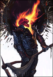 Ghost Rider #22
Writer: Jason Aaron
Artist: Roland Boschi
Colorist: Dan Brown
Letterer: VC's Joe Caramagna
Cover: Marko Djurdjevic
Review: Guest
Ghost Rider is one of those characters that I never really followed all that closely. Granted, I knew enough to realize that the movie was all kinds of horrible, but through all my years of reading comics, it never struck me as essential reading.
Not much has changed.
To be fair, Johnny Blaze himself has been through some changes as of late. After all this time, he's finally come to the revelation that the Ghost Rider isn't a tool of Hell, but rather, one of Heaven, and more specifically, he's bonded to a renegade angel looking to overtake The Throne. You know, because renegade angels don't really have a bevy of other career goals when you think about it. He's also nabbed a boy named Lucas from a Montana hospital and now, following standard hospital procedure, the nurses are violently chasing Johnny down. There's also a lot of demons tossed in there for good measure. Really, the whole thing is kind of a mess.
It's these developments that make it all the more bewildering as to why this book isn't more interesting. There's clearly a lot going on, but none of it seems to matter much at all.
It should be noted, before touching on anything else, that the dialog is horrendous. It's as if Jason Aaron made a bet with his colleagues: "Hey, every time the reader rolls his eyes and groans, you give me a nickel!" I'm betting Mr. Aaron is now swimming in a lake of nickels as if he were one Scrooge McDuck.
The story itself is rather inconsistent as well, as the sheer logistics of Johnny never knowing of his angelic origins this entire time are more than a little suspect, especially considering that his foes also appear to know. What, they never thought to mention it until now? It reeks of a character shake up without any actual rhyme or reason. Even worse, Johnny appears to be the same guy he was before, only now he's mad at a different side. As is usually the case with Ghost Rider, the issue is more or less one long fight scene. It has its moments, though none of which are ultimately memorable, as each just bleeds into the next.
The art doesn't help much, either. It seems as if Roland Boschi is going for a "less is more" approach, but the problem is it completely contradicts the tone of the book. This isn't the book for him, and that's painfully obvious from just one issue.
This is a case of one step forward, two steps back. They really seem to be trying something here, but it fails on nearly every level, and results in a busy, though ultimately forgettable book. Skip it.
 Iron Man: Legacy of Doom #1
Writers: David Michelinie and Bob Layton
Penciler: Rom Lim
Inker: Bob Layton
Colorist: Moose Baumann
Letterer: Artmonkeys Studios
Cover: Ron Lim
Review: drqshadow
Even the planet's brightest scientific minds aren't immune to a bout of forgetfulness. That's the premise behind Legacy of Doom. While disintegrating an old suit of Iron Man armor for recycling, Tony Stark finds an adventure he'd completely forgotten stored on one of the unit's memory chips. While an unexpected meeting with Doctor Doom may not seem like the easiest thing to disregard to you and I, in his defense, Stark is a billionaire, a CEO, the head of SHIELD, an engineer, an adventurer, a scientist and a superhero all balled up into one. He's likely overlooked dozens of situations that most folks would remember to their dying day.
Still, this is Doom — in outer space! I'm sure at some point the act of fighting crime becomes mundane when you're successful enough to be named leader of the Avengers, but it's not everyday you're floating in orbit with a booster rocket strapped to your ass, yukking it up with Doctor freaking Doom. Co-writers David Michelinie and Bob Layton seem to be following the same path as David Lapham's Spider-Man: With Great Power..., in more ways than one. While the books share a historical look back on the undocumented adventures of a pair of Marvel's flagship characters, their greatest similarity lies with their uncharacteristic portrayal of those heroes' personalities. Lapham's Spider-Man was brazen, selfish and unlikable. The Michelinie / Layton Tony Stark is out of touch, predictable and dull. His dialog in particular is awful, seemingly pulled directly from the 1960s, and left me wishing he'd been rendered silent throughout the issue. The duo unquestionably nails Doom's self-important, demeaning presence, but by comparison, Stark is always short on words.
While I'm sure the point can be made that because Legacy of Doom is set in a much earlier chapter in these characters' lives, their words and actions should match the setting. And, to a degree, I'd agree with that sentiment. But when that device stops being a curiosity and crosses into annoyance, it loses my support. That's exactly what happens here; it's an enjoyable throwback for a few pages, but when it dawns on you that the entire series is going to be like this, your patience starts to wear thin.
Ron Lim's artistic contributions are a mixed bag: great on a few occasions and meager on several others. His work is at the very least solid and easy to read, if not always exciting. Maybe I'm allowing myself to be led astray by the dated suit of armor Tony Stark is wearing, but Lim's work comes off as a bit too retro. It's often under-detailed and sometimes borders on unfinished. His take on Doom is extremely drab, and certainly not intimidating. And while his Iron Man is a fair sight better than that, he isn't especially great here, either. Lim tells the story effectively, but he never really enhances the experience.
What starts as an interesting idea — a forgotten incidental adventure of Tony Stark during the glory days — quickly spirals into something that's so large in scale that ol' Ironsides would have to be suffering from a severe bout of Alzheimer's to have overlooked it. That, or his memory of the events would have to be erased, which seems to be the more logical solution of the two. But that, naturally, begs the question: if I've already deduced the story's end after a single chapter, and that end involves erasing every moment of the miniseries from the character's memory, what's the point of reading further? I certainly wasn't captivated by the awful take on the lead character, the randomness of the plot or the inconsistent quality of the artwork. This is the very definition of a throwaway story. Skip it, unless you're an Iron Man lunatic who's been hungering for a taste of the old days. Even then, you may want to substantially temper your expectations.
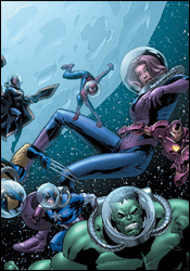 Marvel Adventures The Avengers #23
Writer: Mark Sumerak
Penciler: Kevin Sharpe
Inker: Jay Leisten
Colorist: Ulises Arreola
Letterer: Dave Sharpe
Cover: Leonard Kirk
Review: Dan Toland
After a scene where the Avengers play baseball (which is what you get for having two X-Men in your book; I would love to see Wolverine's internal dialog sometime: "Haven't... stabbed anyone... in days! Quiet moment... must... fill time... with... slow-pitch... softball!"), most of the team disappears, leaving Spidey and Captain America to cobble together a replacement team to help find them.
I have kind of a thing with the Marvel Adventures line. Comics for younger readers are a great thing and I think there ought to be a lot more of them. However, it's possible to write kids' comics and not talk down to them, which I kinda feel is happening here. It calms down pretty quickly, though. Sumerak's characterizations are generally on target, if a little bit one-note: his Spider-Man is the class clown, Captain America is stiff and prone to speechmaking and "forfeit" is in the Hulk's vocabulary. (Well, two out of three ain't bad.) The replacement heroes are all written pretty well, much like their early Silver Age appearances. Speaking of which, I dig the fact that the "unpredictable loner replacement heroes" of the Marvel Adventures universe are familiar 616-Avengers mainstays. It's a neat way to take kind of a sideways look at familiar characters.
The art, well, it isn't great. Faces are weird and over-rendered. Anatomy is sketchy at best. The action is stiff and awkward. And everyone has their arms folded all the time. Kevin Sharpe's work isn't something I'm familiar with, and Marvel.com only has one other credit with his name, so this could just be a case of a new artist growing into a style. There's room for improvement; hopefully he'll come into his own.
I have good news for NASA, though. I found a way they can save themselves a barrel of money. Apparently, as long as you have a helmet on, you can go into outer space in a short-sleeved shirt. Aargh! On the cover, Kirk made the necessary adjustments to Wolverine and Storm's uniforms to at least cover them up, so I could pretend they were super-secret special uniforms that had an internal air supply and temperature regulator. Inside the book, not so much.
One of my biggest peeves about this issue is a whopping spoiler, so feh. I will go so far as to say this: when I was a kid, I loved reading the Official Handbook of the Marvel Universe. What intrigued me most were all the cosmic characters that were popular before my time. They always sounded really dramatic and mind-blowing in their write-ups. Later, I would have the opportunity to go back and read the old comics themselves, and the realities were always a huge disappointment after the picture I had in my head. The antagonist in this issue was the living embodiment of what I just described.
This isn't a bad book, per se, but it's nothing you should go out of your way to hunt down. It's kinda dull and you'll forget about it as soon as you close it. If someone were to run up to you and say, "Read Marvel Adventures The Avengers #23 or I'll shoot your cat!" Then yeah, by all means read it. If that same person were to run up to you and say, "Read Marvel Adventures The Avengers #23 or gimme a dollar!" You could probably think of worse ways to spend a dollar. I gotta say skip this one.
 Powers Annual 2008
Writers: Brian Michael Bendis and Michael Avon Oeming
Artist: Michael Avon Oeming
Colorist: Nick Filardi
Letterer: Chris Eliopoulos
Cover: Michael Avon Oeming
Review: drqshadow
If you were one of the multitude of Powers fans thrown off by the now-infamous "monkey love" storyline a few years ago, I'll get this out of the way right now: you're going to want to skip this one. In Michael Avon Oeming's first outing as co-writer alongside Brian Michael Bendis, Detective Walker reminisces once again about his long, twisted past in the earliest days of human history, and the results are very similar to that polarizing original storyline.
Although this annual contains 35 pages of story, it's actually a much faster read than most of its regular-sized contemporaries. There's very little dialog, and when there is a speaking part, it's quick and monosyllabic. Although Oeming is credited as the co-writer, the bulk of the issue's storytelling falls upon his shoulders as an artist. The story's pacing, its details and its explanations are almost universally unveiled by the artistic direction, and narration is sparse at best.
This is basically a playground for Oeming. He tries all sorts of things to help establish that visual narrative and tell the story in a way that it's never been told before. When it works, it can be tremendously powerful; the tense, thrilling moments that follow a collision between two gigantic apes at the outset of the story is some of his best work as a storyteller. But such experimentation comes at a high cost, specifically the exposure of his faults alongside his strengths.
His paneling work, in particular, wilts under the spotlight. When accompanied by Bendis' frequent word balloons and incidental dialog, the flaws in his work's legibility could largely slip by unnoticed. Now, left to tell the tale on their own, they're frequently confusing and tough to follow. Oeming refuses to obey a strict gridwork for his paneling, and although that gives his work a unique flair, it hampers the story's flow and creates a legibility nightmare. I've had problems following Oeming's panels in previous issues of Powers, but always had the roadmap of a sequential dialog to fall back on. When that lifeline is reduced to a series of Cro-Magnon grunts and moans, the façade collapses and everything seems to lump together into a big, confusing mess.
Oeming's artwork has seen better days. His work has lost the sharp cleanliness that set it apart during the book's prime, and now often seems extremely hurried and under-thought. When it clicks — as it does during the few important moments staggered throughout this issue — his work can still be very effective at delivering a tremendous visual impact, really pulling the reader right into the heart of the moment. When it's off, it drags the quality of the issue down the tubes with it.
Looking back, I may have been overly harsh on this issue. I didn't dislike the experience so much as I was puzzled by it — which is a similar reaction to the one I had the last time Powers ventured into this era. Oeming's writing contributions have given the book a different flavor than I'm used to, especially in the few pages set in the present, and I'm not sure the change is welcome. The creative team was trying something different, and I can't fault them for that, but not every experiment can be a success. This annual was as confusing to read as it was to try and fit into the big picture. If you're a longtime fan, you'll want to give it a shot, but for more casual readers I'd recommend a flip through first.


