Is It Wednesday Yet?
25 March 2008
25 March 2008 � Here we are again with another installment of your favorite comic book review series. As always the comics you're about to read about won't be released until tomorrow (26 March 2008), so these reviews are free of spoilers and should help inform your purchases on new comic book day.
Our grading scale is simple:
Buy: An excellent comic book.
Borrow: A good comic, but save yourself some money by reading a friend's copy.
Flip Through: Give it a once-over at the comic shop.
Skip: This doesn't need to be explained.
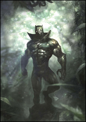 Black Panther #35
Writer: Reginald Hundlin
Penciler: Cafu
Inker: Francis Portela
Colorist: Val Staples
Letterer: VC's Cory Petit
Cover: Dave Wilkins
Review: Guest
It's good to be the king. Well, not if your name is T'Challa. After all, the man known as Black Panther not only has to rule his home country of Wakanda, but he has to be a full-time superhero as well. With such a full plate, one has to wonder what the condition of his homeland is without a constant presence from its leader. Well, the answer is in this book, and to put it simply: things are bad.
As with Moon Knight, I think Black Panther is not only a great, original hero, but rather underused in the grand scheme of the Marvel Universe. I'd heard good things about the series beforehand, so my interest level was pretty high going in. And I wasn't disappointed in the slightest.
Coming back to his homeland without his queen, T'Challa is instantly bombarded with a bevy of problems, not the least of which is the return of perhaps his most persistent enemy � who's proven to be smarter, stronger and more calculating than ever.
A lot of books have the tendency to hit a reset of sorts after the culmination of a big storyline. You get no sense of that here. There's a real urgency to the king's dilemma, and the stakes couldn't be higher, as his personal feelings are in a constant clash with the overall wellbeing of his people. Unlike most heroes, he has a very real connection to those he wishes to protect, and his vengeance becomes, much to his frustration, a secondary priority. Hundlin has done a masterful piece of storytelling here. There's something real about these characters, with some very profound thoughts on just what heroes and villains are; one man's villain is another man's savior. T'Challa's rival is arrogant, but he's not a simple mustache-twirler who pushes old ladies down the stairs; he's a manipulative man with selfish ends, but someone that ultimately believes he's right.
Cafu's pencils are damn near flawless, with a particular strength in facial expressions. There's a sharp detail to everything he does, and it's awe-inspiring to see him build characters that never speak a word.
This is a book with a decided sense of polish and care, with a strong hero that you can get behind and a villain that desperately needs an ass kicking. The art is outstanding, the storytelling is tight and the undertones will give you something to think about. Buy it.
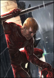 Daredevil #106
Writer: Ed Brubaker
Artist: Paul Azaceta
Colorist: Matt Hollingsworth
Letterer: VC's Chris Eliopoulos
Cover: Marko Djurdjevic
Review: Guest
Finally, a book without Iron Man!
People tend to sympathize with Spider-Man, a guy who flunks a quiz because he's busy saving the world. Or someone like the Hulk, who has trouble controlling his anger. But it would be hard to argue this fact: no one gets the short end of the stick more than Daredevil.
First and foremost, the guy is blind, though that's far from his biggest issue. Even if you want to ignore the fact that he spent the initial part of his crime-fighting career in a gaudy yellow outfit, Matt Murdock lives a life seemingly devoid of happiness. Every time things start to look bright, someone has to mess things up. His secret identity has been revealed, his marriage has been shot to hell, every girl he falls in love with ends up either crazy or dead � it's endless. On the verge of a nervous breakdown, Matt looks to vent his frustrations on the petty crooks of Hell's Kitchen, but you get the sinking feeling that he's really just taking it out on himself.
Brubaker is a damn good storyteller. This really shouldn't be news to anyone at this point, but it bears repeating. He understands that sometimes, to get the best perspective on a character, we occasionally need to be on the outside looking in. While the internal monolog can often give us a deep insight on a character's mindset, people with deep psychological issues can often fail to see it in themselves. Just as an alcoholic can deny his problems, drowning them with more alcohol, Matt claims he just needs to "clear his head" through violent outbursts. So what we're given here is a perspective from the people who care for Matt the most, the friends that so desperately fear that Matt may one day go off the deep end � for good.
To this end, Matt himself barely has any dialog. His occasional words give a bit of perspective on his mental state, but most of the time we're just watching things as they unfold, understanding the how and why even without the aid of text. Azaceta should be praised for his work here, as this story is as much a visual one as anything told in words. His distinct style is perfect for the book, and his dark, hopeless cityscapes are a thing of beauty.
The villain that set all of these catastrophic events into motion doesn't even make an appearance here, perhaps making more of an impact in his absence than he could have with an appearance. We know what he did. We can see it in Matt's face. This isn't a story about stopping bank robbers or saving the world from an army of aliens. This is a character study on one of Marvel's most complex heroes. Buy it. Read it. Then reread. I can't remember the last time I picked up Daredevil and was disappointed. This issue is no exception.
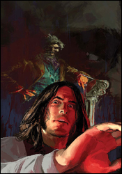 Marvel Illustrated: The Picture of Dorian Gray #4
Writer: Roy Thomas
Artist: Sebastian Fiumara
Colorist: Giulia Brusco
Letterer: Dave Sharpe
Cover: Gerald Parel
Review: drqshadow
The latest in Marvel's series of adaptations from classic stories, Oscar Wilde's Dorian Gray is the story of a portrait, a young man and a wish. When Dorian Gray commissioned a famous artist to produce a portrait, he loved the finished product � but also openly lamented that the painting would remain youthful forever, while he was doomed to fade into old age. After openly wishing he could trade places with his reflection in the painting, overnight it became clear that his dream had come true. Over the years, the portrait began to show the ravages of time and the alterations in his personality, while Dorian himself remained youthful and handsome.
Of all the literature Marvel's adapted recently, I think this is the most apt to succeed in its new format. The story is spread over such a long period of time that the regular monthly chapter breaks are more at home than they are in, say, Treasure Island or The Dark Tower. Writer Roy Thomas, aware of that peculiarity, has embraced it. The pace of this series is a good match for the medium, and Thomas does a nice job of carrying over crucial parts of the book's narration without burying every panel in it. A lot of the dialog is stilted and overly proper, but since the book is set in a historic period, it's not that big a deal.
Although he already has a nicely developed cast of characters to deal with, Thomas gives them each an extra touch of individuality and personality that makes up for the series' relatively short page count. His writing is concise but effective � he's able to effectively tell a giant story in a tiny package without sacrificing anything valuable � and that's extremely important in this situation.
Sebastian Fiumara's art is a nice partner for the story; he brings a good understanding of the era, complete with accurate wardrobe and scenery, but keeps the book from getting too bogged down in it. While he occasionally has problems with basic proportions and anatomy (in one panel, Dorian's hand is small enough to belong to an infant), I could never question his effort. His work is awesome when it's kept simple, which it is for most of the issue, and even when he gives in to the urge to add a few excessive details, his work remains unique and interesting. Action is infrequent in a book like this, but on the brief instance when he's given something active to work with, he maximizes its potential. He especially blossoms in the dark, near-colorless atmosphere of this series, and uses that to his own benefit in the same way that Alex Maleev did during his run on Daredevil.
I was both surprised and impressed by The Picture of Dorian Gray. The writing captures the mood and the drama of the Oscar Wilde original, while granting the series its own personality. The artwork perfectly captures Dorian's slow descent into madness, at the same time placing readers in a specific period without boring or losing them along the way. I'm as surprised as you might be when I recommend you buy this issue, along with the three that came before. It's not without its blemishes, but it's as strong a title as the Marvel Illustrated line has ever produced.
 Mighty Avengers #11
Writer: Brian Michael Bendis
Penciler: Mark Bagley
Additional Art: Marko Djurdjevic
Inkers: Danny Miki and Allen Martinez
Colorist: Justin Ponsor
Letterer: Artmonkeys' Dave Lanphear
Cover: Mark Bagley
Review: drqshadow
Tony Stark's team of government-approved Avengers hasn't had much chance to rest since they came together. Whether it's the threat of a new Ultron, the attack of Venom symbiotes in New York City or a time-traveling adventure with Dr. Doom, the action has been pretty much nonstop for these guys. As if the endless battles weren't headache enough, when Iron Man and the Sentry returned to the present last month, their time-traveling companion, Dr. Doom, was nowhere to be found and an enormous explosion seemingly engulfed Stark.
Although I loved this book at its inception, I've soured on it over the last few months. Brian Michael Bendis has given the series a different flavor than New Avengers, focusing more on cartoony action in contrast to NA's more adult tones. And while it's cool to have such a unique pair of voices for Marvel's premiere teams, I think he's gone a bit too far with this series. It feels like Mighty Avengers is his way of apologizing to older fans that may have been turned off by his radically different take on the team in Avengers: Disassembled, which is noble but ultimately not something he's all that good at. The adventures are too stereotypical, the dialog too casual, the thought balloons too frequent; the gimmicks are starting to wear thin.
Seriously, Bendis' thought balloon experiment is out of control. About a third of this issue is a chat between Doom and the Avengers, and the imaginary bubbles are so frequent and overdone, I wanted to scream. It was a cool idea when he first reintroduced it with the launch of this series, but at this point it's become Frankenstein's monster � overpowering its creator and causing a big mess. Paired with a story that centers on time travel (a tricky proposition of its own), that means this issue is seriously tough to read. I'm not even entirely sure what really happened.
Marvel legend Mark Bagley is providing the artwork for this storyline � one of his last for the publisher before he becomes exclusive DC property � and he's had much better showings. When he took on Ultimate Spider-Man, he clearly stepped up his game. His work was phenomenal month in and month out, possibly the best of his career, and it was a perfect match for the tone of that book. Thus far on his brief stretch with Mighty Avengers, he's taken just as big a step in the opposite direction. His work here is nothing compared to what he proved he could do elsewhere. It's not exciting, even in situations that one would assume would almost fill in the action automatically. He doesn't have a feel for the characters. His renditions of the Black Widow, Ares and the Wasp are nasty, and his Doom is missing the impressive, showy nature that's always made him standout. Bagley's working with an incredible cast, but he just isn't doing anything with it.
I wish I could say I loved this issue, but I just can't. The story never really took hold, the resolution was sudden and coincidental at best, and those damned thought bubbles were everywhere. Paired with Bagley's lackluster effort, the entire issue came across as a disappointment. I expect more from these two, but I guess not every experiment can be an unbridled success. Flip through it to stay current, but don't expect much.
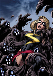
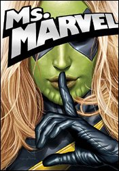 Ms. Marvel #25
Writer: Brian Reed
Penciler: Andrea Melo and Ron Frenz
Inker: Mariah Benes and Sal Buscema
Colorist: Chris Sotomayor
Letterer: Dave Sharpe
Cover: Greg Horn
Review: Guest
Dun dun dun dun dun dun dun... I'm a Skrull, he's a Skrull, she's a Skrull, 'cause we're all Skrulls, hey!
Sorry, but I've been waiting to use that opening for weeks now.
So, is Carol Danvers a dude... I mean, Skrull? Tony Stark sure thinks so, as do a lot of other people, for that matter. This issue marks the beginning of Ms. Marvel's third year running, and to celebrate, Marvel is making sure that every aspect of her life is going completely to hell. Her publicist is blackmailing her would-be boyfriend, she's clearly having that time of the month and there's, of course, that whole shape-shifting alien invasion thing.
What follows is a tale that, in stark contrast to the bright colors you see on the page, is actually rather dark from a plot perspective, which each passing page serving to add more turmoil to Carol's mess of a life. I almost felt as if I was reading Daredevil, as Carol, like Matt Murdock, is clearly a basket case of the highest order, and has some rather obvious anger-management issues, albeit for understandable reasons. The constant internal monolog throughout only strengthens the comparison, as she's so on edge that she feels the need to double- then triple-think every move � even after she's made it. One undoubtedly gets the feeling that Carol is being primed for bigger and better things, and that her role in the upcoming Secret Invasion could be much more significant than we initially expected. As we've seen before, sometimes a character has to be dragged through the mud before they get that breakout, character-defining moment, and there's more than enough mud here to qualify.
From an art standpoint, the book is serviceable. There's the occasional wonky pose that nearly ruins the tone of the issue. This book also marks the second time I've seen an artistic homage to the Silver Age with flashbacks, giving us a look back at Carol Danvers pre-superpowers. We get the expected cheesy dialog and muted colors, but Marvel needs to be careful with their use of this method. When I saw it in Mighty Avengers, it was an awesome detail. When I saw it here, it was still cool. But it risks being overdone.
If there's any criticism, it's the flashback scenes; neat as they are, they're disjointed from the rest of the book. The stories don't really correlate on any significant level, and just seem to be there for the sake of filling a few pages.
What we have is a character that's gaining momentum, with developments that will have ramifications for the big Secret Invasion story, but I still can't recommend a buy here. It's lacking that little bit of something that brings it up from good to great. I say borrow it for the sake of catching yourself up, but the best Ms. Marvel story, I feel, has yet to come.
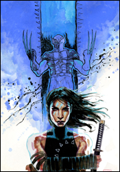 New Avengers #39
Writer: Brian Michael Bendis
Artist: David Mack
Colorist: Jose Villarubia
Letterers: RS and Comicraft's Albert Deschesne
Cover: David Mack
Review: Dan Toland
I have to assume that Mike's Publisher-Sense started tingling, because he seemed to instinctively know how to pry me away from the new Xbox 360 � or as I like to call it, the sleep-depriving, time-sucking, unholy distraction which must be fed, which cannot be sated and is currently sitting about six feet to my left and calling me even as we speak, beseeching me to get killed on an alien planet over and over again. He sent me not one, but two Bendis books to review this week. Dirty pool, Mr. Sims.
I loved the other one. This one � well, it's not bad, I suppose.
This is, more or less, the kickoff to Secret Invasion. I'm not going to get into a huge amount of detail with the issue itself; to be frank, there's not really a whole lot happening. The issue focuses primarily on Maya "Echo" Lopez, and pokes at her place within the Avengers and the superhero community as a whole. It's not a bad issue, by any means; I'll touch on them in a minute, but the writing and art are both very good. But, this issue feels like exactly what it is: a somewhat inconsequential prologue � perfectly enjoyable, but easily skipped over, ramping up to a much bigger story.
This almost feels like a done-in-one story: good guy goes on patrol, finds bad guy, they have a fight, Triangle wins, Triangle Man. Then the bit with the accordion. However, it can't help but feel unsatisfying when instead of the accordion, we get what essentially boils down to "Watch for Secret Invasion (of which this issue was a small and relatively unimportant part), coming this summer!"
For what it is, though, it's not bad at all. It's a trifle, but it's a well-written trifle. Bendis has written some good scenes between Maya and Logan, and the fight is a decent one. If you hadn't read the very brief recap and were coming to this cold, you would have no reason to know that Maya is deaf, and it's only alluded to in the comic once � even though people seem to talk to her when her back is turned, which irked me a little. David Mack's art is damn good, and for the most part, he has a very distinctive Maya (although there are a couple of panels where she looks remarkably similar to Kabuki) that I hope other artists run with. And he manages to draw Wolverine's haircut in a way that looks like it might actually be a hairstyle an actual person would choose to have. There are some instances where the art reminds me very strongly of Tony Harris (Starman, Ex Machina), and I'm still figuring out if I like that or not. I'm leaning towards liking it. It's certainly eye-catching.
This isn't a bad issue, but I have a hard time recommending that you spend money on it. It's a bit of a letdown from last month's Luke and Jessica themed issue, which is a shame. Flip through this one; it won't take any time at all to read, and you'll be finished with it long before the comic shop owner gives you his dissertation on libraries and how you're not in one.
 New Warriors #10
Writer: Kevin Grevioux
Penciler: Paco Medina
Inker: Juan Vlasco
Colorist: Marte Garcia
Letterer: VC's Joe Caramagna
Cover: Nic Klein
Review: drqshadow
While the rest of the New Warriors have been going about business as usual, growing together as both a team and as a family, one member has been conspicuous in his absences. Although her teammates haven't caught on just yet, Jubilee has taken note of Night Thrasher's regular, convenient disappearing acts, and she wants to get to the bottom of things. But Night Thrasher himself is aware of her investigation, and has started taking steps to make sure she keeps quiet about her discoveries.
Kevin Grevioux has written the team into an interesting corner, despite a few hiccups with his dialog. He's built tensions to a boiling point, with field leader Jubilee openly questioning the actions of the team's captain, and the rest of the squad uncertain about whose side they're on. The group shares a certain unspoken bond, but aren't above bickering amongst themselves like a family. They share a recent origin, having each lost their mutant abilities during M-Day, and as such are still learning to rely on weaponry to achieve what they'd always been able to do by themselves. The primary conflict of the issue, Jubilee versus Night Thrasher in a battle of wills, is well-written and cast in a light that gives them both a strong argument and makes the team's ultimate decision between the two understandable. The narrative does jump around a bit, disrupting the flow, but for the most part it's decent.
The artwork, provided by Paco Medina, alternately shines and recedes, like the sunlight on a cloudy day. When it's working, it's quality artwork; he's got a light touch and a great knack for dynamic layouts. He clearly loves detailing a breathtaking backdrop, and he's given several occasions to do just that. When they're in the middle of a battle, the team strikes dramatic, expressive poses and puts on a show. Immediately afterward, however, the Warriors stand in forced, awkward positions and never seem to be at ease or comfortable. It's easy to pinpoint the precise moment the artist loses interest in the subject, which is too bad because he has talent to spare.
Medina never seems to have a handle on these characters. They lack identity, and outside of the intricacies of their outfits, all share the same body types. It's been a while since I've seen Jubilee in an ongoing series, but I don't seem to recall her ever having giant knockers and bulging biceps. It's something she shares with the rest of the women on the team, who could basically swap heads and uniforms without a change in the status quo. They're all the same height, weight and shape. Surely there has to be more to them than that.
For the most part, that summarizes this issue: the feeling that there has to be more to it than this. Both the writing and the artwork are good, but not great. Grevioux and Medina do enough to maintain your attention, but not enough to capture your interest. Unless you already have a vested interest in these characters, there probably isn't enough here to merit reading it regularly. Flip through it and see for yourself.
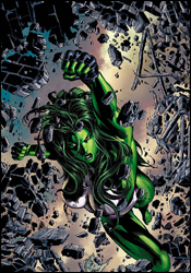 She-Hulk #27
Writer: Peter David
Penciler: Val Semeiks
Inker: Dave Meikis
Colorist: Avalon's Rob Ro
Letterer: Dave Sharpe
Cover: Mike Deodato
Review: Guest
I have fond memories of She-Hulk's past adventures. The tales I read in my youth were light, action-packed and oftentimes hilarious. Sharing Deadpool's unique "power" to break the fourth wall as often as her enemies' bones, She-Hulk was a favorite of mine. Her book always supplied a nice distraction from the overly serious X-comics. I had taken a break from comics for several years and with her angry, sullen portrayal in Avengers: Disassembled, I feared that perhaps the character I grew such a fondness for was a thing of the past.
Damn, was I glad to be wrong!
Jennifer Walters has left her days in the courtroom behind her, now serving as a skiptracer for Freeman Bonding, Inc. Partnered with a Skrull by the name of Jazinda, they traverse the countryside like an emerald Thelma and Louise. Okay, so Thelma and Louise weren't bounty hunters, but you get the idea. In a cruel bit of irony, Jennifer once again finds herself in the courtroom, looking to clean up a mess that she, at least in part, is responsible for. The subject matter itself is pretty serious. Larry Ryan, a grieving widower, is accused of murdering his own wife and covering it up with a story of "space aliens." Peter David has kept the tone of the book alive while not degenerating into total slapstick. The book has feeling, and the moments of drama are accurately set, but the laughs are still there. Even the obligatory Tony Stark appearance is a welcome one, as an adoring female fan points out that he's much more handsome than Robert Downey, Jr.
Semieks' pencils are sharp, and Rob Ro supplies a colorful, appealing foundation for the action, fitting the tone of the book perfectly. In homage to She-Hulk titles of the past, I'm still at a loss as to how Jennifer's entire wardrobe changes along with her green skin. Contrary to Bruce Banner's "invincible shorts," She-Hulk can also change back to Jennifer with the same exact clothes she had before. Knowing that the real stories within comics are the things that happen between the panels, perhaps her would-be criminal adversaries are getting quite the show during transformations.
Just a thought.
Outside of my perspectives on a potential She-Hulk striptease, I have to say that the character I knew and loved so many years ago is still alive and well. While not a major player by any stretch, Jennifer is still a part of this universe. And as with any good hero, she has her own struggles, and her own moments of weakness (despite being able to bend metal bars with her bare hands). I give this one a buy, with a disclaimer of my own bias. It's just an all-around fun book with a good, light story, and I love it.
 Spider-Man: With Great Power... #3
Writer: David Lapham
Penciler: Tony Harris
Artist: Jim Clark
Colorist: J.D. Mettler and Paul Mounts
Letterer: VC's Joe Caramagna
Cover: Tony Harris
Review: drqshadow
It's hard to believe, but there's actually an area of Spider-Man's past that hasn't already been exploited by dozens of retrospective miniseries. Until now, the brief period between Peter's run-in with a radioactive spider and the sudden death of Uncle Ben had been left to readers' overactive imaginations and the deepest, darkest corners of his creators' minds. In With Great Power..., the all-star tandem of David Lapham and Tony Harris finally explore that short, influential period in the web-slinger's career.
I don't know that I've ever read a David Lapham story I didn't like. Ranked among his more recent work, With Great Power... isn't his finest hour, but it's at least an interesting angle on a character who's been largely the same for the last 40 years. It's actually so original a take, though, that I had trouble identifying Peter. Spidey's always been a bashful, nerdy kid at heart, but the way he acts when he's in his costume is totally out of line with that. He's a dog, rushing from lady to lady, excess to excess, which doesn't exactly cast him in the same kind of light he's enjoyed for his entire existence. I can understand the need to beef up the character's immaturity � after all, he's just a kid enjoying the spotlight for the first time in his life, and the wilder his adventures at this point, the greater his regret after his uncle's eventual death � but he's basically unlikable. Lapham is a genius when he's writing hard-edged action and drama, but he seems uncomfortable with a more wholesome, mainstream story like this one.
I'm also a big fan of Tony Harris' artwork, having followed his contributions on Ex Machina since the series launched. He brings a certain authenticity to the table, granting his cast a realistic, approachable appearance that doesn't try to hide its flaws. Although he's been enhancing the political atmosphere of New York's City Hall with that style in Machina for a couple of years now, I can't imagine that climate differing too much from the one found in J. Jonah Jameson's war room, and that makes his transition between titles a natural one. Harris' style is equally at home in an editorial conference as it is in a mayoral debate, and he brings exactly the right blend of false authority and bravado to his rendition of Jameson and his staff.
But while his take on the Bugle staff, the scenery, the supporting cast and even the Fantastic Four are outstanding, his rendition of Spider-Man himself is a bit off. He doesn't feel right, doesn't match his surroundings. Harris' work is a fine blend of detail and simplicity; he conveys every important wrinkle in a lady's blouse, but never gives the rendition so much attention that it feels complicated. His Spider-Man takes that latter technique further than necessary, and comes across as empty and overly simplified. He doesn't look like he fits into his surroundings, and he's certainly not as exciting as he could be. Harris' work here is tremendous, but only when Spidey isn't a part of the picture.
Considering my opinion of the talent involved with this issue, I expected a lot more than I got. David Lapham's story is missing the touches of personality and detail that I'm used to, and it simply doesn't feel like a Spider-Man story. Tony Harris' work is largely even with the rest of his efforts, but he never gets a handle on the main character. At the end of this issue, I felt like I'd been promised something that was never delivered. It's a fine premise, but it never turns into what it could. Flip through this if you need to see what I mean; it's missing a few key elements.
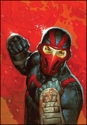
 Ultimate Fantastic Four #52
Writer: Mike Carey
Penciler: Tyler Kirkham
Inker: Sal Regla
Colorist: Blond
Letterer: VC's Rus Wooton
Cover: Greg Land
Review: Guest
Set in a universe in which the superhero civil war hasn't occurred (yet), one can imagine my aggravation when I saw that Iron Man had slithered his way into his 95th Marvel book this month. My anguish soon dissipated, however, when I remembered that in this world Captain America is still alive (for now). So all is once again right.
Well, maybe not.
After the debut of Ultimate freaking Thanos, Sue and Johnny are now his brainwashed goth servants, Ben has been transported to another dimension and Reed is presumed dead. To quote Martin Lawrence from Bad Boys II: "Shit just got real."
As with, well, every Fantastic Four story I've probably ever read, what we get here is a tale with cosmic ramifications that's utterly full of dread. Thanos not only swats his enemies down like flies, but he distorts the world in his own image, reaffirming the belief that if I were a civilian in a comic book world, I would immediate commit suicide. Constantly being killed, kidnapped or generally thrown about by some benevolent ruler? Yeah, no thanks.
This sense of epic scale and doom override any real elements of story. We get a few insights into Thanos' rather eccentric family tree, but there's not a lot going on. That's not entirely a bad thing, as we get a fair share of action along the way, but it also means the book lacks that important feeling. The scenes with Ben Grimm, as expected, are a highlight, supplying a dash of humor and irony � but they're looked on almost as afterthoughts, when they could have just as easily been the main focus of the book.
Kirkham's effort here is, for the most part, a good one, making the apocalyptic scenery come to life, but his characters leave a bit more to be desired. The aforementioned "evil" Johnny and Sue are so radically different that they almost completely lose their recognition. There are other inconsistencies abound, mostly minor flaws in anatomy, but the real snafu that jumped out at me was that Ben Grimm will occasionally forgo his rocky, stiff appearance for one that more closely resembles a gingerbread man. I'll give the art team the benefit of the doubt, as I can imagine the Thing is a difficult character to get consistently right from a visual standpoint.
So, is it worth your time? That depends. If you have an attachment to this arc, and you absolutely must know what Thanos is up to, then this is a book for you. For the rest of us, the answer isn't so clear. It feels to me like a rather average tale with some great scenes, but it's altogether not what I would call essential reading. Give it a flip.
 Ultimate Human #3
Writer: Warren Ellis
Penciler: Cary Nord
Colorist: Dave Stewart
Letterer: Dave Sharpe
Cover: Cary Nord and Richard Isanove
Review: Dan Toland
Do you like comic books about meetings? You do? Well, then � boy, oh boy � have I got a recommendation for you! In this issue of Ultimate Human, 15 of the 22 story pages are devoted to scenes of people talking to each other from opposite sides of a desk. I know, I was excited, too! I was afraid I was going to go yet another month without a comic book featuring page after page of info dumping, but Marvel has finally realized what was happening and has taken steps to correct it. After that, something almost happened, but they lessened the blow by making sure that before anyone actually did anything, another five pages were spent talking about and explaining it first. You know this is something special when Stark and Banner don't even put in an appearance until the second to last page.
Maybe if you read this as a full four-issue story all at once, this section comes across as important and fascinating, but as a single issue � which Marvel has the unmitigated balls to actually charge people for � this is a colossal waste of money, time, paper, printer's ink and Warren Ellis.
Oh, Ellis tried. He really seemed to want to make these meetings fascinating. THRILL! To the different drink orders Peter Wisdom's secretary can fill! GASP! At the snarky office politics of British government! AMAZE! At the trials and tribulations of a military intelligence desk weenie!
All right.
All right.
Calming down.
The art is actually quite good. It's colored directly from Nord's pencils, and it looks pretty nice. The coloring job is also very good. It combines with the pencils to give the book a painted look, which really serves... everything... well. I guess. And the lettering... seems like they spelled everything correctly.
I am really straining for nice things to say.
I once had to, over the course of three days, sit through the full 14-hour version of Der Ring des Nibelungen. That still stands as the most bored I've ever been. Ultimate Human #3 is now officially second. At least the Ring Cycle had the "Kill the Wabbit" song in it. It's just... I don't... Why? Why am I reading this? Why am I spending all this time writing about this ode to corporate infrastructure? I could be sitting in a meeting right now if I wanted to. Aargh. Skip this!
 Ultimate Spider-Man #120
Writer: Brian Michael Bendis
Penciler: Stuart Immonen
Inker: Wade Von Grawbadger
Colorist: Justin Ponsor
Letterer: VC's Cory Petit
Cover: Stuart Immonen and Richard Isanove
Review: Dan Toland
Previously, Peter's classmate Liz Allen was revealed to have mutant powers, making her a female Human Torch. Being fairly anti-mutant up to this point, this came as a surprise to Liz, and brought with it a certain amount of concern. The concern was bumped up a bit when, while Spidey and Iceman tried to get her to calm down, Magneto turned up to give Liz his sales pitch.
Brian Michael Bendis does a lot of things extraordinarily well, but the one thing � the thing he does better than anything and anyone else � is that this grown man can write totally natural dialog for teenage characters. We're 120 issues into this book, and it never fails to astound me. (See, Smallville? It can be done.) Liz reacts in a completely natural, believable way to finding out that she can burst into flame. She's terrified, angry, confused and unable to imagine what could possibly be coming next. So she shuts down.
Also, she can fly � badly. That's awesome on a couple of levels: one, bwahaha, she flies all funny! But also, I think that if I woke up tomorrow able to fly, it would probably take me at least 20 minutes to figure out how to steer myself without careening into the neighbor's dog (fucker is huge). It's important that we get to see this "training wheels" period, because all too often superheroes are sprung fully formed from the wreckage of whatever lab accident created them, and the character instantly and instinctively knows everything about all his or her new abilities. Which is not cool.
(Hey, I just realized: there's an ad here for a cake with Iron Man all over it. They'll even put his face on a cupcake for you. Dear God, please let this movie come out soon so this can be over.)
I'm of two minds when it comes to Stuart Immonen's art. It's very cartoony, and manages to be over-rendered and underdeveloped at the same time. It's quite a trick. Also, his Wolverine looks like Gothar the Monkey-Boy. However, his style has an impressionistic feel to it that isn't easily captured in other, more detail-oriented art styles. You may not be able to tell what a character is thinking by what's on his face (except Wolverine, who wants another banana), but the body language is unmistakable. That is absolutely nailed, and more artists should learn it.
There's not much to say against this issue. The story is great, the dialog is spectacular, the art isn't bad and Spidey teams up with Iceman some more � which is always awesome. This is an absolute buy.
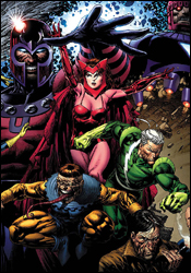 X-Men: Legacy #209
Writer: Mike Casey
Penciler: Scot Eaton and Billy Tan
Inker: John Dell and Billy Tan
Letterer: Cory Petit
Colorist: Frank D'Armata and Brian Reber
Cover: David Finch
Review: Dan Toland
Oh, jeez. The X-Men.
So, what we're dealing with here is another Xavier / Magneto face-off. Of course, they did manage to put a fresh spin on things this time, what with Magneto being powerless and Charles being all coma-y.
Okay, backing up the truck: when last we left the cast and crew of X-Men: Legacy, Exodus (a former follower of Magneto who's opened his own mutant-follower franchise) has apparently stolen Charles' critically injured body (Bishop shot him in the melon), so he can heal Charles by stripping his mind bare (I don't understand either). Charles does not react well to having his mind flayed in this manner, and is rude enough as to go comatose. Way to show your appreciation, Jean-Luc. So Exodus decides that if you're going to wake up Coma Guy, the best way to do it is to have Magneto talk to him. Well, at him, because conversations with unconscious people tend to be pretty one-sided.
So, this story is built on a frame constituted primarily of "Huh?"
Therefore, the really important question is that of what gets built on that frame. When all is said and done, this story examines the Xavier / Magneto relationship and takes it to an interesting place. You can make all the MLK / Malcolm X comparisons you want, but someone has to ask: after all the years of fighting and arguing and talking (and fighting some more), what is actually happening with the state of mutant / human relations? Other than dumbass crossover after dumbass crossover, I mean? The X-Men fight the Brotherhood, and the Brotherhood attacks the X-Men, but at the end of the day, what actually changes? If you're going to hold these guys up to this decidedly lofty level of political and civil discourse, even while one of them is wearing a bucket on his head and a purple cape, this is a question you have to ask. Mike Casey is asking it here. Well done. Furthermore, I have a thing about Magneto. My first instinct is usually to dislike the character intensely. He has to be written really well for me to set that aside, and Casey did it. This Magneto is someone I want to continue reading about.
I have to mention the art. Because of the fact that Charles has that whole "psychic" thing going on, Erik is able to get through to him on that level, and the two worlds (the real world and the one inside Charles' mind) are rendered by different artists. Scot Eaton illustrates the real world sequences, which comprise most of the issue, and they look fantastic. His faces, his body movement, the lighting and the mood, all of it looks topnotch. I really liked these pages. The mindscape sequences, not so much. Billy Tan does the honors here, and these pages are forgettable. Beast and Cyclops are drawn with the exact same body in one panel, and neither of them have a neck. There are some panels that I would swear, by anything I had, were drawn by Rob Liefeld. This cannot stand.
This is a book that has a lot going for it. It raises some issues and is mostly wonderfully drawn. This is going to get a flip through from me; look at the pretty pictures, recoil from the less pretty ones and marvel at the fact that it takes a fairly long time before you realize that there aren't any actual, you know, X-Men in it.


