Is It Wednesday Yet?
11 March 2008
11 March 2008 — Here we are again with another installment of your favorite comic book review series. As always the comics you're about to read about won't be released until tomorrow (12 March 2008), so these reviews are free of spoilers and should help inform your purchases on new comic book day.
Our grading scale is simple:
Buy: An excellent comic book.
Borrow: A good comic, but save yourself some money by reading a friend's copy.
Flip Through: Give it a once-over at the comic shop.
Skip: This doesn't need to be explained.
 Avengers Fairy Tales #1
Writer: CB Cebulski
Artist: Joao Lemos
Colorist: Christina Strain
Letterer: Dave Lanphear
Cover: Claire Wendling
Review: drqshadow
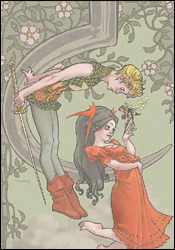
If the mere title of Avengers Fairy Tales doesn't summarize the story's themes clearly enough for you, I don't know what more I can do to help that process along. In this original one-shot, writer Cebulski does his best to tie the Avengers universe to the mythos of Peter Pan in the same vein as Neil Gaiman and Yoshitaka Amano's The Sandman: Dream Hunters. On a few spectacular occasions, the comparison works, especially in the finer details (Wasp, for example, fills the role of Tinker Bell), but the big picture has a few snags.
Since it's relegated to just a single issue, the story feels like it gets off the ground much too quickly, and numerous opportunities for big, impressive visuals and amazing moments are passed over in favor of completing the story within the all-to-brief 23-page format. Some of the characters' counterparts in this story just don't seem to be a good match, and rather than eliminating them from the narrative (or, perhaps, taking a little more creative license and inserting some new faces to the mix), they're crammed into the picture anyway. That's a real shame, too, because for the most part the story works really well, and the majority of the comparisons between Lost Boys and Avengers are surprisingly suitable — but just those few moments of weakness are enough to put a damper on the whole thing.
Joao Lemos' accompanying artwork is marvelous, and would feel right at home behind the cover of any number of children's books. Which isn't to say his style doesn't translate well to a more adult palette; quite the opposite, to tell the truth. Lemos' artwork is so clean and easy to comprehend that it allows the reader to really pinpoint and enjoy the grace and elegance of his gestures and compositions. His light, airy style is even further polished by Christina Strain's gorgeous colors, which respect the simplicity of his work while enlivening its surroundings. The issue's visual style casually floats from ethereal, dreamy watercolor to crisp, sharp separations between darkness and light. The pair works together to create a visual that's frequently on the same level as the best Miyazaki films, the most fantastic Moebius comics. I don't think I could sing much higher praise.
This is quite an interesting concept, and in a few specific moments it really seems to click and deliver on its boatload of potential. The artwork in particular is genuinely beautiful, a perfect fit for the aura that should be surrounding this kind of a story. And the writing gives it as much opportunity to impress as it can afford. Its greatest downfall is its page count, however, and it frequently seems to be screaming at the top of its lungs for another issue or two to really flesh the concept out appropriately. Still, when it's working it's really working. Go ahead and borrow this if you get the chance; it retains all the finer aspects of a great old-fashioned fairy tale, while pairing them with a strangely familiar cast of characters.
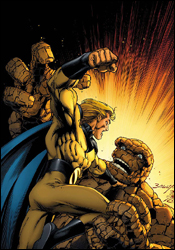
 Avengers: The Initiative #10
Writer: Dan Slott
Artist: Stefano Caselli
Colorist: Daniele Rudoni
Letterer: VC's Joe Caramagna
Cover: Stefano Caselli
Review: Guest
So here's the story: MVP is dead, except he's not. Well, the real MVP died but they cloned him four times, so one's at home on damage control, while the other three serve as Scarlet Spiders. But now there's a fifth clone for some reason. However, he's not MVP. He's KIA. And Gauntlet's gone AWOL and has been taken over by an alien, making everyone else SOL. Meanwhile, Baron Von Blitzschlag is rushing to the scene while Ant-Man and Taskmaster are shooting the breeze watching TV on their iPod.
Confused yet?
What follows this brisk little recap is a book with all the subtlety of a Chuck Norris roundhouse kick to the temple.
Dan Slott knows what he's good at, and doesn't disappoint in bringing the laughs early on, but what follows is a mixed bag of information flying with the bullets and blood. For anyone that hasn't been following the series, it can be rather difficult to get a grasp of what's actually going on, and the action doesn't take too many breaks to drop you a hint. Characters that you've never seen before suddenly appear, and before you know it, there are causalities and injuries to heroes and villains alike. The absence of familiarity can be staggering to a new reader, and potentially frustrating to someone familiar with the arc.
Not helping matters is the fact that it's oftentimes difficult to know what actually went on from panel to panel. While the characters all have a clean, almost anime-inspired appearance, and the art is consistently appealing, the questions of who, what and how often become harder to answer with each passing page.
As said before, Slott's strong point is in his comedy, and he manages to get out a good line or two in the middle of the chaos, but his sense for action, while undoubtedly kinetic, isn't particularly impactful. The dialog that needs to be serious doesn't come off as particularly human, and the villain, while awesomely drawn, is little more than a simpleminded killing machine.
Even the characters themselves are bewildered by the existence of so many "MVPeople" as they advance through the blood and broken walls to the deus ex machina of an ending. It's as if they realized they only had two more pages left and needed to wrap things up as quickly as possible.
With only one more installment left in this story, I'm mildly interested in what's to come. But if this book is any indication, we're going to get a very fast installment that leads into another crushingly sudden ending. Give this one a flip through for the art and take note of the occasional good joke, but don't try too hard to wrap your head around what's going on.
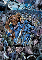 Fantastic Four #555
Writer: Mark Millar
Penciler: Bryan Hitch
Inkers: Bryan Hitch and Paul Neary
Colorist: Paul Mounts
Letterer: VC's Rus Wooton
Cover: Bryan Hitch
Review: drqshadow
Following their critically acclaimed work together on The Authority and, more recently, The Ultimates, Mark Millar and Bryan Hitch have turned their collaborative attention to Marvel's first family, the Fantastic Four. For Millar, it's somewhat familiar territory — he portrayed the team as teenagers in the inaugural issues of Ultimate Fantastic Four. But it's fresh territory for Hitch, not to mention a more deliberate prod into sci-fi for them both. Their previous work always had that intellectual, adult twitch, but it's been constantly set against the backdrop of a fast-paced action scene. With Reed, Johnny, Sue and Ben, the story's always been much more focused on the act of exploration and adventure than the fight at the end of the road.
Fortunately, that fact isn't lost upon Millar, whose writing shifts almost effortlessly to suit the situation. I've found that all of the best FF stories share the ability to transcend pen and paper, to carry that sense of awe and wonder all the way off the page and into the reader's imagination. In Fantastic #555, it took about six pages to hook me for the rest of the issue. While I'm sure it'll change at some point, for now this story has no specific villain, no evil force that must be stopped — and the world doesn't stop turning in its absence. If anything, it's twice as interesting because there's nothing to distract me from the weighty concepts at the story's center.
If I'd read this book when I was younger, I don't think I'd have enjoyed it all that much. Millar fills the page with big language and heavy ideas. This isn't the bright, cheery squad of adventurers you'll find in the FF films or cartoons, and in my simple opinion, that's a very good thing. While the story is generally lacking in action (none of the Four even put their powers to use until the last few pages of this issue), it remains a fascinating read. It stands entirely on the strength of its concepts and the characters' reactions to them, and while that's far outside of the norm for a mainstream superhero book, the change of pace is welcome.
Bryan Hitch's artwork remains constant from his contributions to The Ultimates. In anyone else's hands, I don't know that the nature of Millar's words would have carried the same weight. Hitch brings a certain validation to this book, which justifies the written word his talent accompanies. He goes a long way toward making Millar's high-concept story a much more believable experience. His characters have weight to them, they're muscular, but they don't come off as a cluster of Adonises, either. They look like I have to imagine real people would, if real people spent their days spontaneously engulfed in flame, sailing effortlessly through the sky.
The level of detail in his backdrops is one of a kind, simple enough to keep the panels legible and moderately clear, but tightly rendered enough to mesh beautifully with the foregrounds. When he pulls back the camera and allows the scenery to dictate the storytelling — as he does on a few occasions here — there's simply nobody in the world like him. When the Human Torch tackles a mysterious assailant full-force, driving her through buildings, most artists would choose a tight shot of the pair grimacing, flexing and hurling through space. Hitch puts them far in the backdrop, an almost incidental detail in his portrait of New York's evening commute. It's every bit as striking a visual, but it also ties that moment to the real world. As a result of these kinds of decisions, none of his work can be mistaken for pin-ups (it's simply not something that suits his style), but that doesn't mean they carry any less impact. He's a great partner for this kind of a story, and Millar's lucky to have worked with him so frequently.
In case you didn't get the picture from what I've said so far, this is some dynamite work. After Ultimates 2 slowed down near the end of its run, I thought about skipping the duo's take on this book, but that's a mistake I plan to correct immediately. I can't recommend you buy this book any more strongly. Millar and Hitch's Fantastic Four is exactly what you'd expect it to be — fantastic.
 The Last Defenders #1
Co-Plot / Script: Joe Casey
Co-Plot / Breakdowns: Keith Giffen
Penciler: Jim Muniz
Inker: Cam Smith
Colorist: Antonio Fabela
Letterer: RS and Comicraft's Albert Deschesne
Cover: Steve McNiven, Dexter Vines and Morry Hollowell
Review: Dan Toland
The Defenders was always a weird book. Oh, I liked it well enough, but it never had the family vibe of the Fantastic Four or the close-knit team feeling of The Avengers. The enemies they fought, usually mystical or supernatural in nature, always seemed a little more dangerous and otherworldly to my very small eyes. And more than almost any book in the stable, The Defenders absolutely personified everything that was Marvel in the 1970s. Both the good (the wall-to-wall action, the commitment to strange and interesting concepts, the overall weirdness) and the less-good (the uneven quality, the completely insane characters that couldn't have ever seemed like a good idea, the overall weirdness).
Famously billed as Marvel's "non-team team book," The Defenders liked to trumpet its ever-changing roster, but truth be told, except for people who would show up for a month or two, the roster really wasn't that much more fluid than the Avengers'. Characters like Doctor Strange, Hulk, Sub-Mariner, Silver Surfer, Valkyrie, Nighthawk, Hellcat and Son of Satan all enjoyed a regular stint with the team. So now, when Nighthawk sees the opportunity to reform the team as an offshoot of the Initiative — imagining that he's going to be able to get the band back together — he fails to anticipate Tony Stark's need to stick a finger in every pie. As a result, he finds himself in charge of a small, pre-assigned team of heroes (which Tony has taken the liberty of christening "the New Jersey Defenders" and exiling to Hoboken) who honestly have no idea why they're in the same room together. Iron Man, waiting for this team to fail so he can quickly kill it, has saddled Nighthawk with the Blazing Skull (a borderline schizophrenic holdover from World War II who refuses to take Nighthawk seriously when in civilian clothes), Colossus (finally getting some love outside the pages of Uncanny X-Men) and She-Hulk (who only agrees to join to spite Stark). This really is a non-team.
The Last Defenders starts off with a very Giffen-era Justice League vibe. It performs the same balancing act between humor and action, although Defenders is probably lighter on the comedy. There's a lot thrown against the wall here; multiple potential subplots and story threads are thrown out there, and I'm interested to see how they play out. Casey and Giffen have come up with a good story, and Casey scripts it well.
The art is interesting. Muniz draws a damn fine action scene, and he does well with costumes. Faces, particularly male faces, however, seem to give him problems. It's like the faces are a smidge too small for the heads. His She-Hulk, on the other hand, looks wonderful.
One issue I had was that in showing this non-team who's never had a chance to train together (which is done well, by the way), Colossus has regressed. He's never fought with these people, it's true, but he has been on a team for many years, and he shouldn't need to be told that bullets that hit him can ricochet into a crowd.
That aside, I enjoyed this issue quite a bit. The well-written dialog and very "Giffenian" (it's a new word I'm trying out) character interactions, mixed with the well-rendered action scenes add up to a very fun book that you should buy without delay.
 Mighty Avengers #10
Writer: Brian Michael Bendis
Penciler: Mark Bagley
Inker: Danny Miki and Allen Martinez
Colorist: Justin Ponsor
Letterer: Dave Lanphear
Cover: Mark Bagley
Review: Guest
Iron Man: You're a horror...
Dr. Doom: A lot more people hate you than hate me.
I had to read this book about four times before I could properly review it. Make no mistake, the story isn't that hard to follow, nor did I have a hard time coming up with a rating for it. The only reason I had trouble looking at this one with a critical eye is because I was having too much fun!
During a heated battle with Doom in Latveria, the Sentry and Iron Man get flung back in time along with their nemesis, so they must all find a way back to the future without changing the course of history. But there's a kicker: this isn't just a simple jump in the past. They've fallen back into comic book history.
I'm not one to squeal in delight often, but that's almost exactly what I did when I saw what Bagley and Ponsor had accomplished together. The past is bathed in a sort of filter that causes everyone to look as they did back in the Silver Age, with all the grainy tones and nonsensical action text that you remember. Even the negative space has that aged, off-white hue. The retro look is executed so well that you half expect the cover price to be 12 cents or to catch an advertisement for new episodes of The Andy Griffith Show. You almost don't want to see the heroes return to their own time because the nostalgia trip itself is so engaging.
On the other side of the coin, it's easy to forget how great Brian Michael Bendis really is sometimes, seeing as he works on just about everything, but he very clearly has a love for the characters he writes, and it shines through in his work. The pacing is perfect, and the power of the characters resonates through their actions. The Sentry in particular is quickly becoming a favorite of mine in the role of the Superman-esque hero that's almost burdened by his limitless power. Tony Stark and Doom both serve their roles fantastically as well, as the egotistical geniuses that parallel each other in so many ways while spewing their disgust for each other all the same. Their equivalent sarcasm is a treat, as is the pronounced moment where Stark actually has to ask himself whether Doom has seen Planet of the Apes. As to be expected with Bendis, the dialog is sharp, appropriate (the characters actually have that cheesy Silver Age dialect) and oftentimes hilarious.
If you've been reading comics for a long time, even if you haven't specifically been following Mighty Avengers, you still owe it to yourself to buy this one. It supplies everything a comic should: good action, a few laughs and an explosive ending. It may not actually cost 12 cents, but it's more than worth it, I assure you.
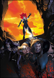 New Exiles #3
Writer: Chris Claremont
Penciler: Tom Grummett
Inker: Scott Hanna
Colorist: Wil Quintana
Letterer: Tom Orzechowski
Cover: Michael Golden
Review: Guest
I've always liked the Exiles concept. It's like Marvel's own little version of Quantum Leap mixed with Sliders, only with superheroes instead of scientists. As with those shows, however, the stories are only as good as the backdrops given to tell them, resulting in a staggering inconsistency that can make the run a tad difficult to get behind.
The base roster of Sabretooth, Psylocke, Rogue, Morph, Sage, Cat and Mystiq supply a good foundation, but only the first three make an appearance here. Seeing Sabretooth in particular in a heroic role is a breath of fresh air, but in yet another sign of Claremont's fall from grace, he, along with his teammates, is portrayed in a dreadfully stale manner. Creed's little more than a taller version of Wolverine in this issue, constantly going back and forth between spouting the same simplistic grunts and catchphrases before suddenly having a scholar's articulation for the sake of info dumping dialog. Oh yeah, and shockingly enough, everyone's shouting.
The world that they visit is equally as bewildering; years ago a meteor storm caused a series of bizarre changes. Most notably, Namor is now a roided-up black gentleman and is married to Sue Storm. You get a distinct feeling that they really can't stand each other as they journey forth, with their children following behind. Oh, almost forgot to mention, one of their kids is Gambit, except that he doesn't look, talk or act like him in the least, instead more resembling an effeminate Peter Pan. This is perhaps the main problem with the book; the alternate reality concept only works when there is a sense of familiarity about the world before it's turned on its head. Such radical changes like these only serve to trigger a disconnect from the world the Exiles are trying to save, and more importantly, the characters that we, as the readers, are supposed to care about.
From an artistic standpoint, Grumment's pencils are more than competent, though his portrayal of the female form is suspect at points, most notably when Rogue's bust size comically changes from panel to panel. It also boggles my mind as to how Iron Maiden's armor can be so provocatively form fitting, but perhaps some questions are best left unanswered. The colors are noticeably muted where appropriate, fitting with the desert theme, while vibrant otherwise, making for a visual execution that's pleasing, but not exactly mind-blowing either.
A reveal on the last page does little to hold up what reads as a mostly by-the-numbers book. This world that the Exiles have been thrown into is too different, too dull and, frankly, too unimportant to care about. As a fan of the concept, and even past runs of the series, it breaks my heart to say this, but you have no reason to give this one a look. Hopefully, with a new reality (and a new writer), this one will finally be given the chance to shine at some point in the future. Skip it.
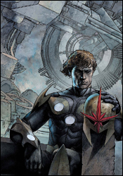 Nova #11
Writers: Dan Arnett and Andy Lanning
Penciler: Paul Pelletier
Inker: Rick Magyar
Colorist: Guru eFX
Letterer: VC's Cory Petit
Cover: Alex Maleev
Review: Dan Toland
I've always liked Nova as a character. He combined the put-upon teenager archetype that Marvel always did well with full-blown, old-fashioned space opera action, which I'm a huge fan of. He's been called a Green Lantern rip-off, right down to the "dying alien cop gives his power to a worthy Earthman" origin story, and while I can't put my hand on my heart and say it's not true, the feel of the character is enough to set him apart from most. And now, with the Worldmind (the living computer which directed the Nova Corps, and holds the entirety of knowledge and life force of the Xandarian people) uploaded into himself, he's got to be considered one of the most powerful characters in the Marvel Universe. Not too shabby.
It's going to be difficult to discuss this issue, as almost anything I say about the story will be a spoiler. Suffice to say that the story is a very good one; it sets up some difficult emotional beats, it's well-written and moves the characters from point A to point A-and-a-half (this storyline's got a ways to go).
Now, a word or two about the art: holy fucking shit! This is beautiful. Absolutely beautiful. I can't remember the last time I stared at artwork this long, just admiring the attention to detail. It's taken me two hours to write this review, because I keep going back and looking at the pretty pictures. Pelletier is just coming off a run on Fantastic Four, and I'd seen his work before and thought it looked good, but this book is absolutely perfect for his style. There are images here that look like they could have been 1940s pulp magazine covers. There's one scene in particular, when the transmode virus threatens to overtake Rider completely, that's one of the most compelling images I've seen in comics in ages. This can't have been easy to ink, and credit has to be given to Magyar here. It would be the easiest thing in the world to let all the detail turn into a cluttered mess, but the finely wrought inking, with the amazing use of shadow, take this to the next level.
I like the coloring job as well. Kvch is awash in hues of orange and red and yellow, and when the scene switches to indoors, everything is crisp and bright. The colors go a long way in selling the alien landscape.
So, absolutely unbelievable art, a wonderful story that is killing me not to be able to talk about and a gigantic "oh noes!" cliffhanger ending that promises something truly massive in the offing? Rush out and buy this. Buy two!
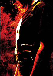 Punisher #55
Writer: Garth Ennis
Artist: Goran Parlov
Colorist: Lee Loughridge
Letterer: VC's Cory Petit
Cover: Tim Bradstreet
Review: drqshadow
This month's Punisher serves as an epilogue to the gigantic "Barracuda" arc that climaxed last month, a sort of tying up of loose ends — as if tearing the villains nose off, slicing away both of his arms, sticking an axe in his chest and unloading a full clip, pointblank into his face wasn't conclusion enough. At the same time, it also serves as an introduction to Garth Ennis and Goran Parlov's next (and final) arc together — a nice segue from one horrifically violent war zone to the next.
There have been a lot of takes on Nick Fury over the years. Stan Lee's James Bond-style portrait. Jim Steranko's legendary surreal, experimental version. Brian Michael Bendis and Mark Millar's mastermind of the Ultimate Universe. In the opening pages of this issue, Ennis adds his twist to the patch-eyed veteran, and it's just as inspired as the creators who have come before. His Fury is angry at the world, at his friends and at himself, and seems to be constantly three inches from a blind rage. While that's a very different side of the character, it's not an altogether unbelievable one either, considering what he's gone through in the last few years. His Fury has a lot in common with the Punisher, which also makes a lot of sense. These two have been working with and around each other for years, and it's understandable that they've become so similar in the twilight of their lives.
While Fury's physical appearance in this story is fairly fleeting, his impact is felt throughout the issue. With this storyline, Ennis gives the indication that he intends to wrap up every single remnant from his four-year run with the character (in MAX format, that is), even those that readers may have thought were already dead and buried. In just the first few pages he ties the Punisher's constant run-ins with Barracuda, along with almost every misadventure since the series launched, to one specific source — and Fury's every bit as pissed about the culprits as Frank is. If this were a video game, this issue would be introducing the final boss. While the breathless explanations and revelations grow a bit too wordy and involved around the midway point of the issue, it comes off as a necessary evil. Three pages of intense dialog and references to countless stories are a fair price for the mother of all storylines.
I'm not sure what more I can say about Goran Parlov's work that I haven't already said before. I love the guy's work, which was particularly well-suited to Barracuda, and while he occasionally stumbles in his first issue since that character's elimination, the majority of his work is still firing on all cylinders. He doesn't dominate the reader's attention unless the story calls for it, and in an issue that's as word-heavy as this one, that's a godsend. His greatest strength is his ability to almost effortlessly give each character a unique, consistent face, even amongst the masses, and that skill has never shone brighter than right here. He's good enough to know what part he needs to play in the process, and for this issue that's to introduce a metric ton of new, unique faces and try to stay out of the way of the word balloons.
As first chapters go, this one wasn't Ennis and Parlov's best. It's got a lot of potential to deliver the goods as the storyline unfolds, though, and after what they've put together over the last few years, I'm willing to give this team the benefit of the doubt. It's a strange premise for a Punisher story, but sometimes those offbeat, unexpected arcs are the ones I look back on the most fondly. Give it a borrow, especially if you've been reading the series, even erratically, during Ennis' run. It could be his finest hour or his meager last hurrah, but you'll no doubt be lost if you try to come in halfway through the arc.
 Thunderbolts #119
Writer: Warren Ellis
Artist: Mike Deodato, Jr.
Colorist: Rain Beredo
Letterers: RS and Comicraft's Albert Deschesne
Cover: Marko Djurdjevic
Review: Dan Toland
Caprice, Mindwave, Mirage and Bluestreak are sitting in holding cells, preparing to launch a psychic attack on the Thunderbolts. Venom is eating people, because, well, that's kinda what he does. Doc Samson is trying to guide Robbie "stop calling me Speedball" Baldwin towards mental recovery. The Swordsman, also known as the new Baron Strucker, has blown up the Zeus (the T-Bolts' aircraft). And Norman Osborn is in charge of the Thunderbolts, because sometimes Marvel is retarded.
Remember John Ostrander's Suicide Squad? Warren Ellis sure does.
There are two Warren Ellises. There's the one who wrote The Authority and Transmetropolitan, a blisteringly intelligent writer with an incredible imagination and a great ear for dialog. And there's the other one: the admittedly entertaining "Internet Jesus," who wants nothing more than to shock and grab attention — who reminds me of a misbehaving child.
Thunderbolts is currently being written, if this issue is any indication, by the former. (Mostly. The latter one comes in and does some punch-up.) This issue is the fourth part of the "Caged Angels" storyline, and it's very dependent on its recap page. Once you get up and running, there's a lot to like here. For one thing, there's never more than a page or so between an explosion, a stabbing, a gunshot wound or a disemboweling. However, despite all that, at no point does the issue get stupid. There's some great dialog and outstanding character beats; Doc Samson isn't prone to getting many badass moments, but Ellis manages to find one for him. And for the first time in a very long time, I didn't hate Venom. Oh, but Norman Osborn suggests grabbing popcorn during the fight, and I hate that. I hate it when the grabbing of popcorn is suggested. That seriously makes my teeth hurt.
Speaking of things I hate, Norman Osborn is in charge here. The government shouldn't be putting him in charge of a superhuman strike force. They shouldn't be putting him in charge of a bake sale. They should be putting him in charge of a concrete cell at the bottom of the ocean, pumping him full of sedatives for the rest of his life. He's the Green freaking Goblin, people. He would steal all the pies at the bake sale. All. The. Pies.
Deodato's artwork is mighty pretty. He's got a photorealistic, almost painterly style that manages to both create mood and atmosphere in the quiet moments, and nail the double-page tributes to violent kickassery that Ellis scripts so well. There is one thing I'm getting tried of, and this isn't just Deodato, this is all over comics: I don't want to be looking at Tommy Lee Jones playing Norman Osborn. Draw your own.
At the end of the day, this is a well-constructed comic that's in the middle of a fairly extensive storyline. It's a pretty quick read that has some good moments, and feels like a solid part of a very good storyline. Flip through this one for now, and reevaluate it when the trade comes out.
 Wolverine #63
Writer: Jason Aaron
Artist: Ron Garney
Colorist: Jason Keith
Letterer: VC's Cory Petit
Cover: Ron Garney and Jason Keith
Review: Guest
Reading a Wolverine comic is a lot like watching a Jean-Claude Van Damme movie: you know exactly what you're getting from the start, only instead of doing the splits and punching some guy in the testicles, you get grittiness that's so gritty that it has to clean itself off just to get gritty all over again.
He's the best at what he does, he's getting to old for this shit and he has no qualms about attacking mostly innocent bystanders just for looking at him funny. It's the Wolverine we all know, and we've seen each and every bit of it before.
Recently Mystique betrayed the X-Men (bringing the counter up to 3,974,378), and, surprisingly enough, Logan's pissed about it. Tasked by Cyclops to take her out by any means, he tracks her to a small Afghan town and hilarity ensues — or something.
I'll fully admit my bias here. I've never liked Wolverine very much. As the alpha male of the Marvel Universe, he has absolutely no sense of vulnerability. He's seen everything and done everything, and thus, is never surprised by anything that happens around him. We get more of a reminder here, flashing back to Logan's life in Kansas, which makes me wonder when they're just going to pull the trigger and show him crossing the Delaware with Washington, or signing the Magna Carta.
The narrative offers no surprises, including the obligatory moment in which Wolverine has to show off his healing factor in a decidedly nonchalant way. The dialog has its bright spots however, especially when Mystique feels the need to point out Logan's affiliation with a half dozen different super hero groups. The Canuck himself even gets the occasional good line, but his internal monolog serves to be a lot more interesting than anything he has to say out loud. A particularly nice touch is when we're reminded that despite his healing factor, Wolverine's heightened senses cause his injuries to hurt much more that those of a normal human, which offers a nice perspective on what is usually an unfazed character. Regardless, the refreshing dialog does little to help what is a pretty basic narrative.
Ron Garney and Jason Keith should both be commended for their artwork, however. The portrayal of Logan here is pretty much spot on as the grizzled unshaven vet, a stark contrast to the offsetting prepubescent boy of Steve Dillon's Origins portrayal. The sharp solid lines leave us with no question as to where our focus should be pointed, and they managed to make a blue-skinned mutant a hell of a lot more attractive than she perhaps had any right to be.
It's for the strong artwork alone that I'd recommend you give this one a flip through. The storyline isn't going to blow you away, and the action is sparse — though there is the occasional witty line. No reason to buy unless you're a diehard Wolverine fan, which then begs the question as to what, exactly, is wrong with you in the first place.


