Is It Wednesday Yet?
08 January 2008
08 January 2008 � Here we are again with another installment of your favorite comic book review series. As always the comics you're about to read about won't be released until tomorrow (09 January 2008), so these reviews are free of spoilers and should help inform your purchases on new comic book day.
Our grading scale is simple:
Buy: An excellent comic book.
Borrow: A good comic, but save yourself some money by reading a friend's copy.
Flip Through: Give it a once-over at the comic shop.
Skip: This doesn't need to be explained.
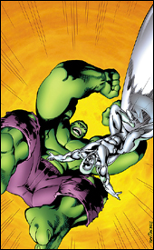 Marvel Adventures Hulk #7
Writer: Paul Benjamin
Penciler: David Nakayama
Inker: Gary Martin
Colorist: Michelle Madsen
Letterer: Dave Sharpe
Cover: Juan Roman Cano Santa Cruz
Review: drqshadow
This month's Marvel Adventures Hulk boasts appearances by a handful of characters who should be familiar to the Marvel faithful: the Silver Surfer and galactic threat Terrax, along with perennial sidekick Rick Jones. Of course, since the Marvel Adventures line is supposed to be about simple, out of continuity storytelling, this means there's a page or two wasted on explanations and introductions. Typically, those moments are where a book like this one lives and dies: if they're handled quickly and concisely, the story doesn't miss a beat. If the process goes on for a while and doesn't feel conversational, it's tough to get the tale back on track. This issue is closer to the former, although that doesn't mean it's all wine and roses.
Paul Benjamin's dialog is awful, almost a parody of Marvel's Silver Age comics. These characters are written as stereotypes, without motivation or personality. The good guys stand for everything righteous and true, and the villains are there to aimlessly thwart them. When the Hulk shouted, "With great power comes great smashability," I nearly choked on my drink. The unbelievable nature that brings all of the characters together in the first place only adds to the indignity.
I understand that this is ultimately a kid's book and there needs to be a certain degree of dumbing down to meet that audience, but that can be achieved without losing any characterization or turning back the clock to the dark ages. Hayao Miyazaki's films manage to appeal to a young audience without sacrificing any individuality or insulting older viewers, why should I expect any less from a Marvel Adventures title? This is so poorly written that I'd be embarrassed if anyone caught me reading it. It's everything that comics have been fighting to get away from for the last 20 years.
David Nakayama handles the issue's artistic chores, and has his moments. When he's at his most raw � quickly sketching a clean, notably under-detailed superhero � his work is at the very least interesting, slightly reminiscent of Phil Hester. Too frequently, however, he moves in for the kill with an abundance of linework, awkward angles and an uncertain grasp on the characters. The size of the Silver Surfer's board varies throughout the issue, as do the proportions of Terrax's face. His work has a few merits, but largely reminded me of something you'd see from a fan, not a paid professional. When he's on, he's almost average, but he's rarely on � and when he's off, it's by a mile.
On just a few glittering occasions, this issue shows promise. The resolution to the big conflict that drives the story is an original concept, but as always seems to be the case with this imprint, it's very light reading. Paul Benjamin's story sets its sights far too highly for the format, and as a result its conclusion carries no weight. Avoid this issue. Even if you're interested in getting a young friend involved with comics, there are far better stories to do it. Skip it and keep looking.
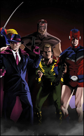 The Twelve #1
Writer: J. Michael Straczynski
Penciler: Chris Weston
Inker: Garry Leach
Colorist: Chris Chuckry
Letterer: Comicraft's Jimmy Betancourt
Cover: Kaare Andrews
Review: drqshadow
The Twelve is the story of 12 (go figure) costumed avengers and their adventures near the end of the European front of World War II. Days before Hitler's death, the superhuman community could smell the blood in the water, as the final tide turned in favor of the Allied forces. Eager to share in a historic moment, everyone with a mask and an alter ego flooded the streets of Berlin. In search of a nest of snipers, 12 such heroes entered a decimated bunker, but found an ambush in its place.
J. Michael Straczynski does a tremendous job of introducing the group. It's a terrific challenge to launch a new book based around 12 heretofore unheard-of characters, but he pulls it off. The historic setting is a plus, too, and provides a sound excuse for some of the characters' more needlessly eccentric tendencies. The 40s were a different time, and these guys are clearly a product of that era, which is something the story really hinges on when the issue's first big twist hits.
Straczynski shoots for the sky with this story, and for at least this first issue he hits the target. I can't really say much about the subject matter without giving away some major spoilers, but around the midway point of the book, when you realize where it's going and what kind of issues he's planning to confront, it suddenly dawns on you that there hasn't really been anything quite like this before. He's delivered an opening chapter that lays the groundwork, establishes the cast and gives readers just enough of a tease of what's on tap to hook them for the next few issues.
Chris Weston works an extremely strict, detailed style that's a welcome change of pace from the cartoonier fare filling a majority of the other books on the market. I can't help but think his work would be better suited to a non-superheroic subject, since his costumed vigilantes usually look awkward and uncomfortable within the super-realistic environments and backgrounds, but he isn't exactly narrating an issue of Infinity Gauntlet here. In fact, most of the heroes he's working with are dressed rather casually (that means a minimum of spandex), which should keep readers from noticing how bad his work on that type of wardrobe really is.
His backdrops are just breathtaking, though. He almost never skimps on that front, and actually seems to welcome the challenge of a new locale. When the heroes invade a ravaged war shelter, for instance, the floors are littered with fallen trophies, burning embers and cracked support beams. He doesn't need to go into so much detail, but since he does it gives the book an added dimension that's rarely seen and even more rarely successful. The closest thing I can compare it to is Gene Ha's contributions to Top 10 or Geof Darrow's Shaolin Cowboy. So much time clearly went into the backgrounds that I constantly found myself refusing to move forward in the story until I could absorb it all. This is about as closely as I can imagine anyone coming to an accurate representation of a gang of costumed men doing battle for the Allies in Nazi Germany.
This has the potential to be a real barnburner, which is typical of the writer's previous work. I've yet to read a first issue penned by JMS that hasn't fascinated me with a strong premise and the promise of bigger things to come, and this story continues that trend. His problems in the past, at least with both Rising Stars and Midnight Nation have come with following through. If he can match the tone he's set in this first book with forthcoming issues of The Twelve, it's set to be a fantastic, landmark series. However, if the writer's track record continues, it'll immediately dive into a plodding series that never matches the intensity of its premiere and eventually grinds to a halt. But hey, that's neither here nor there. As far as first issues go, this is pretty damn good. Buy it and see what I mean.
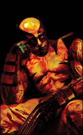 Wolverine #61
Writer: Marc Guggenheim
Artist: Howard Chaykin
Colorist: Edgar Delgado
Letterer: VC's Cory Petit
Cover: Arthur Suydam
Review: drqshadow
I've just read the introduction to this book three times and have to say I legitimately have no clue what it's rambling on about. Evidently, Logan's been fighting a lifelong battle against an angel of death named Lazaer, which has extended his already-lengthy lifespan. What that means is if Wolvie gets his head lopped off or suffers some other sort of life-threatening wound, he goes all Samurai style on this creature and then returns to the mortal plane. If that sounds like a bunch of garbage, it's because it is � and such has been the tone of what I've seen of this book during Marc Guggenheim and Howard Chaykin's run.
This arc is called "Logan Dies," and if nothing else it's delivered on that promise � more than once. The focus of this story is on death, the afterlife and how certain characters can seem to avoid it. I haven't quite worked out how yet, and should've known better than to turn to the storytelling for an explanation. Guggenheim seems content to merely dole out a series of lame, two-page fight scenes, which are then followed by a momentary break for nonsensical ramblings before returning to violence.
Even the fights don't make sense, though! In one panel, Wolverine pops his claws, charges his enemy and swiftly ducks beneath the swipe of his sword. He then lands a vicious uppercut, but his claws have mysteriously retracted. Why pop them in the first place? Presumably so he could carry on a lengthy conversation with the guy while they continued to attempt to knock each other's eyes out. I couldn't follow a minute of this, and I think I'm proud of that fact.
Howard Chaykin's artwork aims to recreate Frank Miller's classic take on the character. He works with extremely thick lines, harsh shadows and flat, underdeveloped backgrounds, and it's easy to see the influence. For all of about one page, it works. That's how long it takes for the artist to lose his patience and return to his habit of physically impossible poses, hideous layouts and downright awful musculature. I have to take the narration's word for it when Wolvie faces off with Lord Shingen Yashida on the book's big opening splash page, because the bad guy is both turned away from the camera and blocking his face with his own shoulder.
That splash page is rather telling, really, because unless Yashida's hands are twice the size of Logan's feet, there's no way those proportions are even close to correct. Never mind the awkward tripping, toppling, contorting pose Wolverine is spontaneously striking in the middle of a swordfight. It's hideous. I don't know how this guy is getting work, let alone on a presumably upper-tier book like Wolverine. It's an utter failure, and would drag the book down to the depths with it if the writing hadn't already done so.
This is garbage, complete and utter crap. I couldn't make heads or tails out of the story most of the time, and on the rare occasion that I did, I quickly wished that I hadn't. The artwork is as bad as I've ever seen in a major comic: tough to read, punishing to observe and flawed in the most basic of ways. This is bad on all fronts. Skip it. God, just skip it.
Is It Wednesday Yet?: Leftovers from 04 January 2008
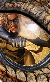 Ms. Marvel #23
Writer: Brian Reed
Penciler: Aaron Lopresti
Inker: Matt Ryan
Colorist: Chris Sotomayor
Letterer: Dave Sharpe
Cover: Greg Horn
Review: Tim Glancy
Looks like it's time for another victim of delayed comics. Ms. Marvel is seemingly fighting monsters on an island while at the same time fighting Ultron in New York City. Now, let's forget that Ultron is also in space so we can focus strictly on Ms. Marvel while learning why delayed comics are the worst thing in this lovely industry. How is anyone supposed to follow or become emotionally invested in a character whose adventures aren't meshing with her appearances in other books? Does this stuff happen after the events of Mighty Avengers or before? Do we know that Skrulls are running around? Are we supposed to think that World War Hulk hasn't taken place yet?
See, for all the great things going on in the Marvel Universe lately, delays have caused a lot of these moments and stories to be overshadowed by the nagging questions left to people trying to follow the universe as a whole. People like to accuse DC of being terrible when it comes to delays, but at least they manage to maintain a somewhat solid timeline. You know when and where most things are taking place, and even though Superman or Batman might appear in a ton of books, there is an attempt to reconcile the timeline at the end of the day.
In the case of Ms. Marvel, the real losers are the fans. Not just because they are grown men reading about a scantily clad supermodel fighting crime, but because it becomes hard to follow the great work that is being done here and is very distracting. Brian Reed does a good job of establishing interesting personality traits for a group of characters that, honestly, most wouldn't think of putting together in a book. If you took a ride in the old DeLorean and told someone in the 90s that Marvel would publish a great book starring Ms. Marvel, Wonder Man, Sleepwalker, Machine Man and assorted agents of SHIELD, they would laugh right in your face. I can speak as someone who would laugh at you today unless I read it first. However, having read it for the last year or so, it's real and it is so good. Everything from the action to the dialog is handled with extreme care � it really reaches out to the reader.
This arc in particular has been a great chance for Reed to showoff a little bit. He has taken these characters out of what you would consider their "comfort zone" and still managed to keep the book true to its roots. He went from telling a story based around Carol leading SHIELD agents to telling one with her fighting monsters and aliens, and he did this without losing any momentum. To me, that is the sign of a great writer. A guy like Ed Brubaker writes a tremendous mystery / crime story, but can't do big action. Reed doesn't seem to have that downfall, at least with this book, and it's nice to know that as long as he is writing it, you can buy it and expect the same quality every month.
And the art team delivers monthly as well. Even though there have been a handful of creators on this book since its inception, the styles have always been similar. Bright colors, animated pencils and fine inks all come together to create one of the better looking books on the market. Much like the writing, the art team is able to diversify and draw anything: aliens, robots, spaceships or a busty superheroine.
However, even though Ms. Marvel is a series that delivers on every level, I can only recommend that you borrow it until they mange to get their timeline and place in the continuity together. It sucks to punish such a good book, but Marvel deserves to know that these delays are really pissing people off. The only way to do that is to hit them where it hurts: the wallet. To the creative team � because I know that you talented pros have nothing better to do than Google your names for reviews of your work � please know that I love this book and think you all do a tremendous job on it; I'm just sick of other books ruining great books like Ms. Marvel, and I want Marvel to feel my frustration.
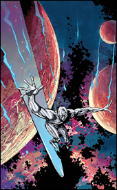 Silver Surfer: In Thy Name #3
Writer: Simon Spurrier
Artist: Tan Eng Huat
Colorist: Jose Villarrubia
Letterer: Corey Petit
Cover: Paul Pope and Jose Villarrubia
Review: Tim Glancy
My birthday recently passed, and what did the purveyor of this website get me for said birthday? This book to review. Thanks, Mike. Thanks a lot.
I have become what most would call a "cosmic Marvel whore" thanks to the events of Annihilation. Seeing the third- and fourth-tier characters elevated to stardom warms my heart. One of the shining moments of the far-reaching event was the four-issue Silver Surfer tie-in. As opposed to the standard Surfer story � one where he flies through space looking for peace and atonement � instead we saw Surfer being hunted. It really set the stage for new kinds of Surfer stories to be told. But now I find myself reading a Surfer book seemingly straight from the 1970s.
Honestly, there wasn't one thing about this book that I liked. The story felt like a rehash of the classic Stan Lee stories. Did we really need to see another "how can the Surfer make amends for his past" story? They were overdone 20 years ago, and now they're wasted paper. I don't know if that's really what Simon Spurrier was going for, but that's what we got. For the first 19 pages of this book, there is nothing happening. At all. There are words and pictures, but I think they were just randomly thrown together because nothing makes any sort of sense. The last three pages are pretty good; the book ends with a rather shocking moment, but even that doesn't really make any sense.
To make matters worse, the art is terrible. This being a cosmic comic, I think Marvel was looking for an all-new, all-different style, but when the panels become a jumbled mess and there is a gross lack of detail, it doesn't matter how different the style is if it doesn't convey the story and characters. From what I could tell there was a bunch of aliens, and a silver guy who I will assume is the Silver Surfer. At some point more aliens appear and they seem to dislike the first group of aliens for some reason, and then stuff happens. Hope I didn't spoil that for anyone.
Really, just skip this book. Don't even gaze upon it. Move along. There's nothing to see here.


