Is It Wednesday Friday Yet?
03 January 2008
03 January 2008 — Here we are again with another installment of your favorite comic book review series. As always the comics you're about to read about won't be released until tomorrow (04 January 2008), so these reviews are free of spoilers and should help inform your purchases on new comic book day.
Our grading scale is simple:
Buy: An excellent comic book.
Borrow: A good comic, but save yourself some money by reading a friend's copy.
Flip Through: Give it a once-over at the comic shop.
Skip: This doesn't need to be explained.
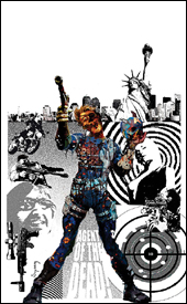
 Moon Knight #14
Writers: Mike Benson and Charlie Huston
Artist: Mark Texeira
Layouts: Javier Saltares
Colorist: Dan Brown
Letterer: VC's Joe Caramagna
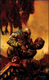
Cover: Arthur Suydam
Review: drqshadow
Moon Knight has been around for ages, usually within the pages of his own struggling, under-the-radar self-titled series. The current run marks the character's fourth volume of ongoing adventures (he's also had a pair of minis), dating all the way back to the very early 1980s. None of his books have lasted longer than five years. The present series is staged against the backdrop of the all-encompassing Marvel Registration Act, and the Knight's recent decision to identify himself to the government.
Honestly, I'm getting a little sick of the big fuss over whether or not to register. What started as a great concept affecting the entire Marvel Universe has slowly been watered-down and disseminated to the point that it's lost what made it so invigorating in the first place. I'd always assumed that the actual registration process (and accompanying rebellion) would be just the first act of a broad, sweeping drama, but it's stalled out. It's been almost two years since the first issue of Civil War, and with all of the publisher's big players already choosing a side in the battle, what we're seeing now in books like this one just doesn't captivate me. What worked on the larger scale of that initial crossover is becoming redundant now that it's been repeated on a much smaller scale in individual books. It time for the second act, but nothing seems to be forthcoming.
While writers Mike Benson and Charlie Huston do touch on Knight's recent registration in this issue, it's only in passing and carries little or no weight, which is strange because I don't know what else they really intended to accomplish. This writing is such recycled crap that I'm amazed it's still finding a place for publication. It's cover-to-cover excess, blood and guts with a brief respite before delving into more meaningless violence. Their characterization is nonexistent and shallow — the only difference between characters is through their glaring physical abnormalities. Marc Spector (Moon Knight himself) has a big scar near one eye. Another character has no legs and a wheelchair. Another wears red sunglasses. This is the only way to tell them apart, because everyone speaks with the same vacant bravado, the same lack of personality.
Mark Texeira's artwork is disturbingly bad throughout the issue. Here's a guy whose rough-edged, textured style set him apart and made him one of my favorites in the 1990s, but evidently the years haven't been good to him. I can't remember the last time I was genuinely moved by his contribution to a series, and he does nothing to remedy that situation with such a half-assed, trashy showing here. His work in this issue is straight-up garbage, which is something that's as painful to report as it was to observe. This is a guy that I used to put up on a pedestal beside Bill Sienkiewicz and Jae Lee — a trendsetter who pushed the boundaries and proved that comics could be both legible and abstract as an art form. How the mighty have fallen.
Although it came in at the very last possible moment, this is clearly the worst book I've read all year. It's nonsensical writing, presumably only there to entertain the writers' tame imaginations, paired with exceptionally bad artwork. It's a formerly entertaining character (and artist) at his absolute worst. It's a train wreck, honestly, and I can only hope it will follow the path of its predecessors in missing its fifth anniversary. Hell, I hope it misses its second. Skip this, skip this, good lord just skip this.
 Thunderbolts #118
Writer: Warren Ellis
Artist: Mike Deodato, Jr.
Colorist: Rain Beredo
Letterer: RS & Comicraft's Albert Dechesne
Cover: Marko Djurdjevic
Review: Michael David Sims
I hate the idea of this new Thunderbolts series. That's not to say I was a huge fan of the previous incarnation — though I did read and enjoy the book when Hawkeye was team leader. The reason it's the object of my scorn is the logic behind it; the United States government has employed some of the world's greatest supervillains (such as Venom, Norman Osborn and Bullseye) as a means to capture unregistered superheroes. Worse yet, they're made to be celebrities with action figures and whatnot. Though I understand Marvel's desire to make Thunderbolts relevant in a post-Civil War world, this team could have been comprised of powerful yet underused superheroes. More and more I find myself not understanding or liking the new Marvel Universe, and it's gaps in logic — such as this — that are the root of the problem.
Furthermore, if the book is to be filled with bloodthirsty killers, why did the majority of this issue involve the characters attempting to escape their inner demons? Oh, Norman isn't such a bad guy. He's simply tortured by visions of his murderous alter ego. Mac Gargan just wants to take a shower, not eat people as Venom. Oh, pity him! The bloody hell is that all about? Sure, sure. I get the need for characterization, but this isn't it. It's not impossible or uncommon for readers to understand a villain's agenda yet still disagree with it. For instance, Magneto has a very valid point; humans will never accept mutants as equals, and, if given the opportunity, would confine them to camps. He's lived that life and refuses to do so again. We get that, but how many people has he killed in an effort to rule over mankind? Instead of attempting to work with world leaders, he'd rather flex his muscles. That's what keeps him on the other side of the angels, and that's what makes him compelling; he might be right, but his means are all wrong. As displayed in Thunderbolts #118, Ellis would rather script these characters flipping over in chairs and cowering in showers than make us understand them. With more meds Norman will be okay. Once Gargan becomes the dominant personality, Venom won't cannibalize the guards anymore. These are the "protectors" of the Superhuman Registration Act: medicated killers played for comic relief. Utterly lame.
Speaking of Osborn, why does Mike Deodato draw him to look like Tommy Lee Jones? It's aggravating! Instead of reading about the former Green Goblin, I see Marshal Gerard. Photo-referencing doesn't bother me as long as I don't see the actor / model being rendered. Use a pose or a background or outfit from a magazine — I don't care. But don't draw Tobey Maguire, Christopher Reeve and Michael Keaton as Peter Parker, Clark Kent and Bruce Wayne. Doing so instantly yanks me out of the comic, and every single time I see Deodato's Osborn, I see Jones.
That said, Deodato's stark angles and harsh blacks are perfect for Thunderbolts. Despite their status as agents of the law, the Thunderbolts are still prisoners. This comes across greatly in the art, especially in Osborn's office; shadows cut the spacious room in rectangular slices, adding a sense of confinement and anxiety to the scenes. No matter what perspective he uses, these cold, dark shadows refuse to take anything but center stage. No matter my misgivings when it comes to the writing and obvious use of Tommy Lee Jones' distinct face, artistically Thunderbolts is breathtaking. Much of that credit falls at the feet of colorist Rain Beredo who knows restraint. Once again, these are killers. And though some of them might wear brightly colored outfits, the shades presented here are much darker — including Osborn's typically vivid Goblin mask. When brighter hues are used, it adds much to the book; orange and white explosions are made more powerful when they split the darkness, an amber sunset means so much more after a brutal slaying, Songbird's pink sound waves show hints of heroism when used to save lives. Colors should add emotion and depth to a comic book, and Rain Beredo does exactly that in this issue.
Though I'm not keen on the concept or the portrayal of the characters, I refuse to give Thunderbolts #118 a skip. Instead it will receive a flip through, because I realize my personal biases might not be shared by you.
 Ultimate Human #1
Writer: Warren Ellis
Artist: Cary Nord
Colorist: Dave Stewart
Letterer: Dave Sharpe
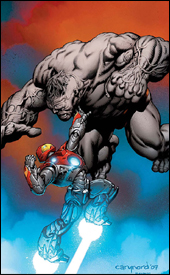
Cover: Cary Nord
Review: drqshadow
Tony Stark and Bruce Banner are as different as any two men can be — at least, as far as brilliant scientific masterminds go. Stark is the supreme success story, achieving miracles through technology that were previously thought to be impossible. Banner is the classic underachiever, constantly failing to reach the potential of his world-class brain, leaving chaos and destruction in the wake of his mangled experiments. How the two have never been paired as such is a terrible oversight, but also something I hadn't even considered before Warren Ellis laid it all out in the first few pages of Ultimate Human.
Truly, the Ultimate universe is the perfect playground for this kind of uncharted territory. Neither individual carries with him the deep, developed history that surrounds their counterparts in the standard 616 universe. As characters, they're both still infants — complete with untapped strengths and unexplored weaknesses. Stark has an addictive personality, and unless he can satiate that appetite with worthwhile scientific breakthroughs, he fills the void with alcohol. Banner is painfully aware of both his intellectual potential and his tragic track record, but it kills him to turn to another to ask for help. In this new series, that's exactly what he does.
Banner knows that Stark was literally born with tiny robots in his bloodstream, the subject of his parents' experiments while he was still in the womb. He also knows that Tony's taken a deep personal interest in the nature, modification and technology behind these nanomachines. In plain English, he wants Iron Man to inject him with more of the same, in the hopes that it will help him control his transformations into the Hulk. Naturally, not everything is going to go according to plan.
It's my humble opinion that Warren Ellis is at his absolute best when he's writing this kind of a story: fantasy wrapped in just enough scientific and medical detail to flip that switch in the reader's brain and convince them that what they're reading is more than just science fiction. While Stark is experimenting on his comrade, in the midst of his horrific transformation into the grey behemoth, we're discovering what's going on inside the man's body during the change. Ever wondered what happens to the Hulk's guts when he shrinks back down to Bruce Banner's size? His skeleton? Ellis explores these concepts and more, and it's just captivating reading. And that's not even the half of it; at the same time, he's introducing new characters and sliding them into the fray, stirring things up from afar even as they grow more heated in Stark's personal laboratory.
Cary Nord's artistic contributions go hand in hand with the writer's reality-grounded storytelling. His style is almost pedestrian, accenting the humanity of two of Marvel's most relatable characters. When Banner's big transformation into the Hulk actually happens, he highlights the physical strain and grotesque, jolting nature of that change. It isn't the simple, pretty fade from tiny man in glasses to tall green man in torn clothes that it's always been; here it's a violent, obviously painful growth. When Banner's eyes stare, unfocused at the floor midway through the change, it really hits home just how vile the process really is. Nord has never been one of my favorite artists, but his work in this issue has led me to believe that he may have been merely working with the wrong type of story. He's great, and fits the bill perfectly here.
This series was a surprise, since I'd never even heard mention of it before it arrived in my inbox as review material. I wouldn't have it any other way — it's surpassed even my wildest expectation, and given me yet another title to add to my monthly pull list. If you were taken by Ellis's work on Ultimate Fantastic Four, if you're a fan of the characters or if you just like an intelligent sci-fi adventure, this will be right up your alley. Take a chance on a new series and buy it.
 Witchblade #112
Writer: Ron Marz
Penciler: Rick Leonardi
Inker: Kevin Nowlan
Colorist: Dave McCaig
Letterer: Troy Peteri
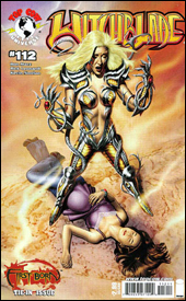
Cover: Mike Mayhew
Review: drqshadow
Sara Pezzini, the original bearer of the Witchblade gauntlet (or rather, the first such individual to star in a self-titled comic book), is now a proud momma. Her daughter, conceived with Darkness-bearer Jackie Estacado, symbolizes a truce between the forces of darkness and light, and has momentarily halted the age-old battle between the two sides. But some wounds, it would seem, run deeper than others. With Jackie already out of the picture, Sara must fend for herself as rogue agents of both the dark and the light aim to eliminate the child and replenish the battlefield.
Writer Ron Marz does a fair enough job of covering the basics in this issue, although I didn't find myself particularly motivated to continue reading the saga or catch-up with what I'd missed. He merely accomplishes what he sets out to, never taking that next step from understandable storytelling to compelling drama. Even when the two bearers of the Witchblade are fighting tooth and nail against the invading forces of both good and evil, it felt like it was strictly a ho-hum affair.
Sara's personal life is the real focus of this series, with the actions of Danielle (who shares the burden of the Witchblade) little more than an aside. That's fine by me, because from what I gathered Sara is far and away the more interesting character. Having said that, her conversations throughout the issue, especially those with Danielle, frequently border on Lifetime made-for-TV movie material. Sure, she just had a baby, so it's understandable that she's going to want to share her new feelings of motherhood with someone. She's also fighting to save the child from the constant threat of otherworldly creatures. I'm going to wager that most comic book readers would be more interested in elaboration on the latter than the former. Instead, the demons and angels are dealt with quickly and then left in the background, while Sara and her friends tell us all about how they'd totally die for this kid and being a mother isn't all that easy and hey, did you know that parenthood changes your life? Marz discards the elements of the story that are working so he can dwell upon those that aren't.
Rick Leonardi's artwork isn't what I expect from a Top Cow book. That's neither a good thing nor a bad thing — it's just not what I expected. Ever since Marc Silvestri founded the imprint back in the first days of Image Comics, it's maintained an artistic style that's very detailed and dynamic. Leonardi breaks that trend with an extremely light, crisp style — often rendering an entire character with just three or four precise, smooth lines. His characters have plenty of personality, they look comfortable in their surroundings, they're consistent. He's quite good at what he does, but again, it's not what I expected when I first looked past the cover. He's taken more of a Joe Quesada approach, while everyone else who I've ever seen work with the character has leaned much more toward the style made famous by Silvestri himself. For the most part, it's a nice change.
Ultimately, this issue is fairly passé. None of the storytelling seemed to carry any weight, not even when spears were being hurled and angels impaled. The artwork was largely successful, but never felt completely suited to the characters. It wasn't really bad enough to recommend you skip it, but it wasn't good enough to go out of your way to enjoy. Flip through it if you're curious about what the characters have been up to recently, I guess. Just don't expect all that much.
Is It Wednesday Friday Yet?: Leftovers from 28 December 2007
 Marvel Zombies 2 #3
Writer: Robert Kirkman
Artist: Sean Phillips
Colorist: June Chung
Letterer: Rus Wooton
Cover: Arthur Suydam
Review: Tim Glancy
The roads of pop culture are paved with interesting ideas that are quickly overexposed and turned on by the general public. Most of these ideas, no matter how hated at the end of their time, are beloved when they come out of the box. The nWo, reality television and boy bands all come to mind as prime examples of concepts that exploded onto the scene with innovation and promise, but were soon overexposed. Comic books are no exception; we readers have seen our share of great ideas ruined by overexposure. And it seems we're about to add another item to that list.
When Marvel introduced the zombie concept in Ultimate Fantastic Four, fans reacted in a very positive manner. The concept was smart, well put together and all around pleasant. Geeks love zombies, and Robert Kirkman writes a mean zombie — so the gimmick seemed natural. And to be completely honest, the first miniseries was one of the better minis to come out in awhile. The way the familiar characters were changed into flesh-eating monsters but still maintained their character traits was tremendous. Then came Marvel Zombies vs. The Army of Darkness, which was cute and attempted to fill the holes created by the first Marvel Zombies series, but it was followed by Marvel Zombies: Dead Days, and Black Panther and Fantastic Four crossovers. And let's not forget all of the zombie covers for non-zombie books. With that we were officially into the "too much of a good thing" realm. The sad thing is that, had they kept the characters confined to the core Marvel Zombies books and not overdone the concept, more comic book readers would be gobbling up Marvel Zombies 2 instead of panning it without having read it.
Robert Kirkman has done a wonderful job here of showing what has not only happened to the zombies, but also to the humans who remained alive at the end of the first series. Kirkman continues the story seamlessly — adding new characters without interrupting the chemistry that he created with the original group of zombies. Best of all, Kirkman has mirrored events from the core Marvel Universe. There's been a civil war — albeit for different reasons, but parallels can be drawn. This issue is where a lot of that comes to a head, as sides are drawn and reveals are made. It's the cliffhanger that pays homage to Civil War, and really helps tie the story together.
The art is exactly what you expect. There is gore and violence, but it's comical enough to avoid vomiting in the comic shops — which is important for this type of book. It would have been easy to offend readers with gross displays of violence, but Phillips keeps it in check. He also keeps track of his characters' whereabouts; no one is lost in the shuffle. And once again I find myself praising colorist June Chung. It's very hard for me to properly express how much I love her work, because a colorist is one of those people whose craft we often overlook — but it's impossible to do so here. Her colors flow with the rest of the art, tying everything together beautifully (or as beautifully as a zombie-ravaged world can be).
So yes, the zombies are overexposed. However, that doesn't mean that this book lacks the same quality as the first Marvel Zombies series. Hopefully Marvel will realize they're killing any interest in an otherwise great concept, and will scale back on the zombie covers and crossovers, focusing more on creating great buys like this one.


