Is It Wednesday Yet?
13 November 2007
13 November 2007 — Here we are again with another installment of your favorite comic book review series. As always the comics you're about to read about won't be released until tomorrow (14 November 2007), so these reviews are free of spoilers and should help inform your purchases on new comic book day.
Our grading scale is simple:
Buy: An excellent comic book.
Borrow: A good comic, but save yourself some money by reading a friend's copy.
Flip Through: Give it a once-over at the comic shop.
Skip: This doesn't need to be explained.
 Amazing Spider-Girl #14
Writer: Tom DeFalco
Penciler: Ron Frenz
Inker: Sal Buscema
Colorist: Impacto Studios
Letterer: Dave Sharpe
Cover: Ron Frenz
Review: Tim Glancy
Sing it with me:
Spider-Girl
Spider-Girl
Who the hell reads Spider-Girl?
Writing sucks
So does art
This book is like...
a rancid fart!
LOOK OUT!
Tim's reviewing Spider-Girl!
Yeah, as you might guess, this is not going to be the most positive review you will ever see. I even thought about breaking out the time machine once again, given how everything in this book feels as though it was created in the 90s, but I couldn't even subject my past self to this. If he read this, he just might commit suicide. Then I wouldn't be here, and there'd be this whole paradox thing going on.
The thing that is exceptionally shocking to me, more so than the terrible quality of the book, is the loyalty of its fans and the way they have saved this book from the chopping block time and time again with their whining and complaining. Why Marvel listens to these people is beyond me.
Hell, just looking at the creative team brings images of the 90s to mind. Tom DeFalco, Ron Frenz and Sal Buscema (who might actually bring images of the 70s to mind if you're old enough) are all here, and they're all names better not seen on modern comic books. This isn't to be mistaken with ageism. This is, however, anti-sucky-comic-booksism. Spider-Girl might be a great character, but as long as Tom DeFalco writes her I'll never know. And that's what makes this so sad: the concept behind Spider-Girl is actually pretty solid. With the right creative team, this book would excel. Instead, we're reading Spider-Man stories circa 1994. As far as I can tell, there are only two differences. The first (and most obvious) is that Spidey has girl parts. Second, the supporting cast is comprised of the sons and daughters of Peter's old friends and enemies. Do the names Hobgoblin, Mindworm and Black Tarantula sound familiar? Instead of creating new villains (or even reinterpreting certain ones), the creative team is simply putting the same old masks on new people. And Spider-Girl's friends are possibly the least interesting characters in comic book history. There's the fat guy, the black girl, the cute boy, the sleazy ex and the whore. It's like someone went and saw a Dawson's Creek marathon and decided that was the perfect cast for this book.
If you are looking for a book that was written in the 90s and looks like it was drawn in the 80s, this is the perfect book for you. If you're looking for a book that is actually good, skip this one like your life depended on it.
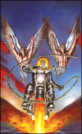 Ghost Rider #17
Writer: Daniel Way
Penciler: Javier Saltares
Inker: Tom Palmer
Colorist: Dan Brown
Letterer: VC's Joe Caramagna
Review: drqshadow
It hasn't been an easy time of late for Johnny Blaze, the Ghost Rider. When the original spirit of vengeance recently escaped from the depths of Hell, he inadvertently freed Lucifer himself in the process. With the devil's consciousness split into 666 recently deceased human bodies, Blaze has taken it upon himself to eliminate every last one before they can do much harm. One catch: for every body the Rider destroys, the demon's remaining avatars become that much stronger.
Daniel Way's storytelling in this issue is blunt and happenstance, almost like he's making it up as he goes without any sort of big picture in the back of his mind. When the Rider's cell phone is destroyed in the midst of a battle, it's treated like a major roadblock for all of two panels, then forgotten until he randomly finds a replacement later in the story. Blaze himself makes so many boneheaded decisions throughout the issue that he's almost a parody of a superhero. He acts first, then responds with shock and horror when he realizes that maybe there were a few consequences for doing so, even when the flaws of his actions were painfully obvious to the reader. I can't sympathize with somebody so patently stupid, and I sure don't feel compelled to follow his adventures any further.
Even the title character's face-offs with two of Lucifer's possessed human bodies didn't produce any moments worth remembering. When the very foundation of the plot doesn't result in any fireworks or intrigue, there's something wrong with your story.
The artwork of Javier Saltares is disappointing at best, and certainly no substitute for Mark Texeira, the book's regular artist prior to this issue. Saltares, who had previously been employed as Tex's inking partner, feels like a bad fill-in artist. His style is so mundane, lacking of any personality, that it's often difficult to look past it to the story he's trying to tell. I actually have a suspicion that Texeira lent a hand in the first page or two of the issue, because there's a sharp drop-off after the introduction. It's a quick downward spiral, not only in terms of the actual illustrations but within the composition itself. Page one tells a great story, complete with vivid background imagery, dynamic shadows and an appropriate amount of linework. Pages two through the 22 are precisely the opposite.
Saltares doesn't seem to grasp the concept of a good action panel. When Ghost Rider hurls himself through the roof of a barn midway through this issue, it's shockingly lacking in excitement — the artist merely illustrates the obvious, without taking any artistic license or adding his own twist on the character. His perspective is way off. He leaves a distracting block of dead space at the bottom of the page, which sticks out like a sore thumb. His rendition of Ghost Rider isn't fearsome or demonic, it's downright goofy. Saltares is a bad fit for this book, and really for any book.
This is some real garbage. I've never been a fan of this character, but I'm not sure if that's because the concept of a leather-clad biker with a burning skull for a head isn't up my alley, or because he's never been given any respect within the pages of his own book. I think I can safely say I've never read an issue of Ghost Rider that's left me interested in the next chapter, and this issue did nothing to change that trend. This is poorly written, inconsequential material, matched with an awful artist. Worse yet, the creative team is on the book until issue #19. Skip this, and consider it a favor to yourself.
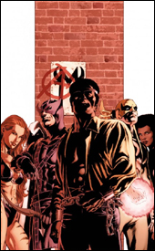 House of M: Avengers #1
Writer: Christos Gage
Artist: Mike Perkins
Colorist: Laura Martin
Letterer: VC's Rus Wooton
Cover: Mike Perkins
Review: Tim Glancy
Some of the most interesting stories to arise during the "House of M" event were those of the non-mutants: Iron Man was a gladiator, the Fantastic Four were prisoners, Spider-Man claimed to be a mutant and Ms. Marvel was the most beloved non-mutant hero in the world. Then there was Luke Cage and his Avengers, fighting against the status quo.
In case I haven't mentioned it in the past, I'll do so here: I love Luke Cage. Love him. You know those T-shirts they make for girls that say "Future Mrs. Brad Pitt" or something? I would totally wear one that said "Future Mrs. Luke Cage." I think Cage is one of the most underrated and entertaining heroes out there, and have been tremendously happy with his current place in the Marvel Universe. So when Marvel announced this book, with Luke as the lead, I ordered it sight unseen. The preview copy could have read, "Written by a team of monkeys and drawn by an infant," and I still would have bought it. Even worse, Marvel could have said it was going to be handled by the Spider-Girl creative team and I still would have read it.
Thankfully, this isn't written by monkeys or has-beens, but instead by someone who I consider one of the best new talents in comics: Christos Gage. Hopefully House of M: Avengers will be the comic that skyrockets Gage's career, because he's constantly turning in excellent work — and HoM: Avengers is no different. Once again he delivers a story that is immense in scale, but never lacking in personal touches. Each character has a very distinct personality and it shows, especially Cage. Though he's essentially a criminal, Gage brings much sympathy to the character while retooling his origin — truly the mark of an excellent author. He understands the medium, and, unlike other writers, he's able to craft personal stories in the short space he's given. Other than that and the praise I've given him in my review of Quasar, I really can't say much more about the man's writing.
Thankfully, the art in this book fits the story extremely well. Mike Perkins, who handles the pencils and inks, has worked with Gage before on both Union Jack and X-Men: Endangered Species. Perkins seems to get what Gage is doing with these characters, and that comes through in the art. Every facial expression, every little bit of body language tells a story. Not a single panel is wasted, and there aren't any missteps either. Along with the personal moments, Perkins handles the action amazingly well; the violence is real and gritty.
The only gripes I can muster are the backgrounds and colors. Perkins uses a lot of explosions and sound effects instead of rending backgrounds, and it happens enough to get annoying. The colors, handled by Laura Martin, are tremendous in a lot of areas — but several areas need work. No matter the lighting or mood, sometimes characters are colored the same in different settings.
Despite that, this gets a huge buy from me. I think this will be a great ride, and there are some characters that people love (like Moon Knight, Hawkeye and Misty Knight) who will probably be handled tremendously by Gage. Check it out, you'll love it.
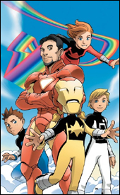 Iron Man and Power Pack #1
Writer: Marc Sumerak
Artist: Marcelo Dichiara
Colorist: Gurihiru
Letterer: Dave Sharpe
Cover: Takeshi Miyazawa
Review: Tim Glancy
While it is easy to give Marvel a heck of a lot of grief and criticism regarding the decisions they make, one decision I think they should be hailed for is the way the stand behind the Marvel Adventures line. Marvel understands that these comics serve a greater purpose: they are meant to give people like me a book to use as an introductory piece for kids into the realm of comics. And that is the reason that these Adventure books are so damn hard to review.
If I go into the book with the mindset that this is another comic book, while I am being fair, I am hardly taking into account the market that this book is aimed at. However, if I go in with the frame of mind being that I am going to go easy on the book because of the market, and someone buys it based on my recommendation, they might be buying it based on a false pretense. And I really don't want to do that to anyone. So I guess the only way to approach it is by giving an outright honest review. But before, I start I must give a disclaimer: unless the book is honestly terrible, it would still be a good book to pick up for a kid, because the Adventure books almost always are.
Writing wise, you are getting six of one, half dozen of another. While the action scenes are easy to follow and are handled well, the plot is paper thin — and that's an insult to paper. We have no idea how anything in this book came to be, how the villain got loose or really why anything at all is happening. It's quite frustrating to have no idea why anything is going on. This is inexcusable for a first issue, especially one meant for a younger audience.
The dialog also suffers from the same problem. The lines that these characters speak are, for lack of a better word, fairly cliché. Several lines sprinkled throughout the book will literally cause you to cringe. However, the writer really gets the voice of the characters correct. You can tell the lines that are spoken by the Power children are that of children, while Iron Man's lines feel like they were written for adults. So that's a plus.
Art wise, this book is certainly not treading any new ground. Average pencils, average inks and bright but pedestrian colors are the order of the day. The action scenes are certainly better than the slower moments, but even those scenes are not exceptional. For the second time this week, I felt as though I was reading a book from the past, and that is not something that should be happening nowadays — not with the sheer amount of talent out there.
I guess you could say that this book is average in just about every way. There wasn't a single thing about it that made me take notice of any of the creative talents involved. Make sure to skip this one unless you are grabbing it for a kid. This will be a couple of bucks better spent elsewhere.
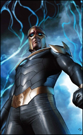 Nova #8
Writers: Dan Abnett and Andy Lanning
Penciler: Wellington Alves
Inker: Scott Hanna
Colorist: Guru eFX
Letterer: VC's Cory Petit
Review: drqshadow
Richard Rider, the current torch-bearer of the Nova Corps, has found himself right in the middle of the Annihilation War, the ongoing conflict between the Kree and the Phalanx. In the midst of fighting the good fight, he found himself infected by the Transmode Virus, rendering him subservient to the Phalanx. But, using the power instilled within him by the Worldmind, he managed to force that virus into remission and escape the war zone. The good news: he's free of the prison that is Kree space. The bad: he's been transported to the edge of the known universe, with no clue where to turn next.
Dan Abnett and Andy Lanning have been putting Nova through the wringer over the last few issues, maximizing his involvement in Annihilation: Conquest and taking plenty of risks with the character. This issue is just a continuance of that latter trend — while he's no longer directly involved with the war, they've handled his potentially jarring transition into another tale beautifully. Where the last few issues had focused on the futility of a battle against overwhelming odds, this month's story shifts that attention to the concept of an outer boundary to our universe and what, exactly, exists there.
In the process of expanding on that idea, Abnett and Lanning introduce a compelling suspense / horror storyline in the same vein as Ridley Scott's Alien. When Nova "washes ashore" aboard a supposedly abandoned living, breathing spacecraft, it's quickly made evident that nothing is as it seems. No one has ever dared explore that section of the universe, for fear of what they might find (does everything simply cease to be?), and the pair of writers do everything in their power to heighten the drama and suspense of these first few moments of cautious exploration. Yet they never lose sight of the narrative that had been established in previous issues. When Richard walks into a firefight, he's reminded that more than 80% of his energy is being used just to contain the Phalanx virus he still carries. Rather than stand his ground against difficult odds at less than a quarter of his usual power, he swallows his pride and runs. It's a little detail in the grand scheme of things, but it's just enough to let you know the authors haven't lost sight of where the character has been.
Handling the art chores, Wellington Alves has his ups and downs. When he's given a giant, important spread he performs phenomenally. His best work shows hints of Jae Lee, with a tremendous attention to lighting and shadow, but he does display a tendency to lose his focus and mail in his effort on slower-moving pages. Since a lot of this issue is dedicated to a series of conversations inside a giant, soulless spacecraft, those seams in his attention span are probably more evident here than they would be in a more stereotypically action-centered book. At the very least, the abundance of these slower, less visually-stimulating pages serve to further heighten the power of those few giant, important panels scattered throughout the issue. Alves does fine work, but he's not quite a superstar.
Nova is one of the most surprisingly entertaining books Marvel's producing at the moment. Although the last page left me a bit concerned about the direction it's heading, I'll give this writing team the benefit of the doubt for the moment because they've already delivered so much with a character I didn't always have the time of day for. If strong adventure, science fiction and horror are your thing, you're going to want to buy this. Don't let the word-heavy "previously in" page fool you; despite a few weighty concepts this really isn't a tough book to read, and it never allows itself to get too caught up in terminology and scientific details.
 Punisher #52
Writer: Garth Ennis
Artist: Goran Parlov
Colorist: Lee Loughridge
Letterer: VC's Cory Petit
Review: drqshadow
Frank's been throwing down with the Barracuda again. Already perhaps the Punisher's toughest enemy, this time 'Cuda has made things personal. Upset over the way Castle dispensed of him in their last encounter (he'd never tasted that kind of a defeat before), he's gone out of his way to make Frank regret ever meeting him. He's dug up an infant girl, the daughter of an old flame, taken her hostage and revealed that the Punisher himself is the father.
Barracuda is a character who really doesn't work unless he's being illustrated correctly. When this arc kicked off in Punisher #50, it left a bad taste in my mouth for that very reason. Goran Parlov, who actually co-created the character alongside Ennis, wasn't the artist of choice in that issue and his absence was a major detriment. Where the fill-in artist for that month rendered the villain in great detail, he also took a much more realistic direction that eliminated a lot of Barracuda's charm and personality. Parlov's loose, cartoony style is perfectly suited to a 400 pound black man with no fingers on his right hand, a grenade launcher on his hip and a gold-plated set of front teeth inscribed with the phrase F- -K YOU (Frank punched out the other two in their last meeting). Sketch him too realistically, and he's just another stereotypical gang-banger on steroids. When in Parlov's care, he's somebody you see on the page and just smile, because the shit is about to hit the fan.
Likewise, I don't think the character could work without Garth Ennis there to write him. He's quickly become one of the author's signature creations, to the point that I'd compare him to Herr Starr of Preacher fame. Ultimately he's a terrible guy, but because he's so driven and self-assured, you can't help but pull for him a little bit.
Despite his cold, all-business demeanor, Ennis's take on Frank Castle is clearly very human. He's frequently reminded of his previous life, whether he's remembering his service in Vietnam or lamenting the death of his family. This story in particular has really emphasized that portion of the character's psyche, as he tries to deal with the prospect of fresh fatherhood when his first pass at it ended so disastrously. He's reacting to Barracuda's attack with the same kind of precise, strategic mindset he always brings with him, but for perhaps the first time he isn't quite sure how it's all going to end, how he even wants it to end.
Parlov and Ennis are becoming quite the team on Punisher, writing the lead character with military precision and dedication, then illustrating him as a larger-than-life monster of a man. They're pairing him off with a phenomenal series of foils, of which Barracuda is easily the strongest. They're taking risks with established names and faces (in this arc alone, Frank's been thrown out of a building, shot, stabbed, freed from police custody and revealed as the father of an infant girl), and wrapping up each story with a distinct set of consequences. This is the kind of material that's going to find itself collected into a Marvel Milestones paperback in a few years, so if you aren't currently buying it, get with the program. The last page of this issue is the stuff legends are made of.
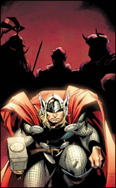 Thor #4
Writer: J. Michael Straczynski
Penciler: Olivier Coipel
Inker: Mark Morales
Colorist: Laura Martin
Letterer: Chris Eliopoulos
Review: drqshadow
It's no secret that Thor has recently made his much-anticipated return to the Marvel Universe, following more than two years' worth of hibernation in an interstellar void. He's got a lot of catching up to do, too, between the Civil War, the Hulk's melee in Manhattan, Tony Stark's rise to power in SHIELD and the split of the Avengers. First, however, he must locate his lost Asgardian brethren, who are scattered around the mortal plane.
It's a shame that J. Michael Straczynski's scripts have so far not lived up to the expectations for this major character's long-awaited return. The story he's provided hasn't been without its impetus (that hunt for scattered Asgardians), but it's missing a hook. Thor is kind of sleepwalking through this title, randomly wandering to spots on the globe and (surprise!!) finding his brothers there without much of a search. And the locations he "randomly" chooses have already been covered so extensively in the news that they're becoming something of a cliché. Last issue, he was trying to help Katrina survivors in New Orleans, this month he's mediating a tribal war in an impoverished African city. What's next, a trip to see the tsunami survivors in Thailand?
Thor himself is so stoic and reserved outside of a battle that it's tough to empathize with him, his battles so short and decisive that there's no question how they're going to play out. This book feels like it's merely treading water, going through the motions expected of it and little more. If Marvel is serious about re-launching the character and allowing the writer to take his own spin on these ancient myths, why isn't he doing something a little riskier? I guess there's the chance that this is all slowly building to something phenomenal, but we're now four issues in. At some point it's time to quit setting the stage and start producing something.
Olivier Coipel's visuals, on the other hand, are downright breathtaking. When I bought issue #3 on a whim last month, it was due exclusively to the preview art I'd seen beforehand. He's taking everything that Chris Bachalo did during his heyday in the late 90s, adding his own twist and bumping it up to the next level. His backgrounds are just detailed enough to fill the page with eye candy, but not so line-heavy that they detract from the foreground. His work is superbly realistic, but also overwhelmingly alive and stylized. When he sets the scene of the first page with an exterior shot of a hotel's sign, he fills the skyline behind it with a flock of birds and a few scattered clouds. It's shockingly simple, but it also immediately sets the identity of that location: a lazy town in the middle of nowhere, nondescript and happy. Every line he provides to the page is necessary, none excessive.
His work isn't strictly beautiful, either. He renders quiet nature scenes and violent gunfights with the same attention to detail and explosive vigor. His take on Thor is treated with the same amount of respect as his rendition of the more human characters populating the rest of the book. But, at the same time, he gives the Norse God an air of dignity and undeniable power that can't be overlooked. Coipel is already well on his way to becoming a major player, and his work on a high profile series like Thor is only serving to further catapult him to popular recognition.
The new Thor is a mixed bag. The writing won't be considered among Straczynski's best, but it's at the very least headed in a distinct direction and easy to follow. It's perhaps too easy to follow, actually, because this issue was some really light reading. But Olivier Coipel's artwork is so astonishing that many readers might want to pick these issues up on its merit alone. On the whole, the safe writing makes this an ultimately missed opportunity, but you'll probably want to borrow it all the same. I can't hate it, but I can't unconditionally love it, either.
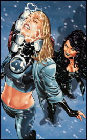 Ultimate Fantastic Four #48
Writer: Mike Carey
Penciler: Mark Brooks
Inker: Jaime Mendoza
Colorist: Justin Ponsor
Letterer: VC's Rus Wooton
Review: drqshadow
Tensions are at an all-time high within the Baxter Building of the (Ultimate) Fantastic Four. After Reed's unsettling obsession with an otherworldly Cosmic Cube drew the Silver Surfer to Earth, he's taken a surprisingly isolationist approach toward continuing his work. He's lashed out at anyone who dares set foot in his lab, driving Sue to the brink of exhaustion. Finally completing his work on the Cube, he rejected an invitation to attend a scientific symposium in frozen Siberia... an offer Sue accepted. When her plane went missing en route, her teammates sprung into immediate action.
Mark Brooks' artistic contributions, while generally very strong, miss the essence of these characters. Part of what made the Ultimate version of this team more approachable than their regular universe counterparts was their age. These weren't stuffy old scientists who'd been to the Negative Zone and back enough times to consider it a routine event, they were brainy kids with a penchant for exploration and adventure. There was a charm to them, a danger to their toying with things they didn't fully comprehend, and it was reflected in their physical appearances as much as it was their actions.
Brooks doesn't visualize them as a cluster of teens outside their element; he sees them as that tired old group of experienced veterans. Reed and Johnny are needlessly muscular. Ben is war-weary and unmoved by the opposition. Sue's a full-grown woman. The difference between illustrating a group of teens and a group of adults can be very subtle, but it should consist of more than the lead character's hairstyle and choice in spectacles.
This is a shame too, because like I mentioned, the majority of the artwork is pretty good. His method of enhancing the impact of Johnny's flame, and his design of the threatening Crimson Dynamo are great. He doesn't skimp on the backgrounds, and his take on the menacing enemies the team faces is just what the story needed. It's just tough to take the rest of that in stride when he misses so badly with the lead characters.
This is a problem that carries through, in a way, to Mike Carey's writing. The bane of any Fantastic Four story is a tendency to get overly technical and overlook the importance of understandable storytelling in favor of scientific credentials, and Carey commits that sin several times within this issue. Did we really need two full pages of debate about the risks and rewards of sending a dead body into the N-Zone? Did we need half a dozen pages of combat strategy and backstabbing explanations immediately after that? The basics of a good story are here: a damsel in distress, a rescue mission in enemy territory, frequent and inventive use of the team's powers — but there's so much excessive dialog that it's difficult to really acknowledge all of that.
This series remains a tale of untapped potential, of a solid foundation spoiled by needless excess and a few artistic mistakes. The laborious explanation behind what's happening to these characters makes reading this issue a slow, drawn-out experience. The artwork shines in spots, but fails in the most crucial areas. This isn't bad stuff, but it's not something you're going to want to instantly add to you collection, either. Flip through this in the store; it's not worth a very long look.


