Is It Wednesday Yet?
25 September 2007
25 September 2007 � Here we are again with another installment of your favorite comic book review series. As always the comics you're about to read about won't be released until tomorrow (26 September 2007), so these reviews are free of spoilers and should help inform your purchases on new comic book day.
Our grading scale is simple:
Buy: An excellent comic book.
Borrow: A good comic, but save yourself some money by reading a friend's copy.
Flip Through: Give it a once-over at the comic shop.
Skip: This doesn't need to be explained.
 Avengers: The Initiative #6
Writer: Dan Slott
Artist: Steve Uy
Letterer: VC's Joe Caramagna
Cover: Stefano Caselli
Review: Tim Glancy
I used to be a huge New Warriors fan. I'm talking about the original team, especially Nova, Speedball and Marvel Boy. The other characters added to the team dynamic, but to me those three were the core of the book. I enjoyed watching a team of young heroes go out and fight the good fight, learning the trade along the way. There weren't any senior members or mentors to guide them; they were just a bunch of kids saving the day.
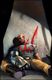
What does this all have to do with Avengers: The Initiative? This book has been built around the mistakes the New Warriors made, with the government overseeing their training so another Stamford doesn't happen. To help stress this point, the head drill instructor, Gauntlet, feels the need to remind the core group of heroes that the government doesn't want any "New Warriors" and he is going to train the "New Warriors" right out of them. Seeing as how Rage and Justice (formerly Marvel Boy) are on the team, this has led to some tense moments, and things really came to a head in this issue: as the cover shows, Gauntlet is found beaten with a bloody "NW" smeared on his chest. Rarely do I touch on the covers in these reviews, but Stefano Caselli did a great job here. Anyone seeing this on the shelf is going to be instantly drawn in by the "what the...?" factor.
Though mostly known as a comedy writer, Dan Slott took an interesting turn with this book. Now the story is more of a crime drama than anything else. This issue reads a lot like an episode of Law & Order, which is a departure from the sweeping story that Slott has been telling thus far. That's not to say that this issue is disconnected from the rest of the series, because that's not the case. Slott manages to take some of the threads that have been dangling since day one, and weaves them into this story as well. How does Cloud 9 handle seeing MVP (or a reasonable facsimile) alive? Where does Hardball go after causing Iron Man to get his head handed to him by Hulk? Slott also picks up some threads from other books, notably with Sally from Front Line and the Tigra / Hank Pym relationship that was last seen in Mighty Avengers. We all knew that Slott could do funny and irreverent after his run on She Hulk, but it's nice to see that he can do a big superhero book as well, one that takes place smack dab in the middle of the Marvel Universe. From plotting to dialogue to the big twists and turns, Slott does everything right with this series and adds another interesting layer to the Avengers mythos.
Steve Uy fills in as artist here, and brings an almost animated quality to the issue that is a departure from series regular Stefano Caselli. As someone who has been reading this series from the beginning, the new artist was a little distracting at first, but after putting that aside and looking at it by itself, I was really pulled in. My favorite element was how Uy handles the females in a realistic fashion. I know that is an odd thing to notice, but after seeing Tigra drawn as a supermodel for the last decade, it's nice to see her drawn as she would be in real life: small, sleek, athletic � like a cat, basically. Uy shows that there are ways to draw sexy women without rendering them with huge breasts and fat asses. All in all, Uy added a nice new touch to the series, and I hope Marvel puts him on a monthly (preferably female-heavy) book soon.
You will certainly not regret buying Avengers: The Initiative #6. It's a solid standalone story with a tremendous reveal at the end. It also serves as a nice jumping on point for anyone who wants to try the series.
 Cable & Deadpool #45
Writer: Fabian Nicieza
Penciler: Reilly Brown
Inker: Jeremy Freeman
Colorist: Gotham
Letterer: Dave Sharpe
Cover: Skottie Young
Review: Tim Glancy
First things first, Cable is nowhere to be found. He's either dead or missing or... somewhere thanks to recent events in X-Men. So if you are looking for a big Cable fix, sorry. Go pick up some old Rob Liefield X-Force.
With that out of the way, let's talk about Bob & Deadpool. Bob is Deadpool's new sidekick, and he is a wayward agent of Hydra. I guess that they had to keep "Cable" in the title, because who in their right mind buys a book titled Bob & Deadpool?" Anyway, this book succeeds because it never takes itself too seriously. From the first page every month, you know you're in for a fun, action packed time. I mean, Bob maintains a Hail Hydra blog on the Internet. You simply don't get that kind of humor in other comic books.
Due to his prior stints on both Cable and Deadpool, Nicieza is the perfect writer for this book. He knows the characters quite well, and is clearly comfortable writing them. Now that Cable's gone, one might expect the book to miss a step, but that's not the case. Fabian gives both Bob and Deadpool their own distinct voices, appropriate time in the spotlight and, surprisingly enough, even the lowly Hydra agent is an interesting read.
Time travel is a hell of a thing to deal with in comics, and Nicieza handles it awesomely here. Some will say that this was probably done as an excuse to get the now dead Captain America into another book (and they might be right), but Nicieza nails the story and does a fine job integrating the characters from the future and the past together. He allows them the opportunity to play off one another perfectly, especially Bucky and Deadpool � their interactions are the highlight of this book.
The art team crafts a style that is very plain, yet it fits the story. Art wise, the action is easily the highpoint: everything is clean and detailed. Despite the action, nothing is cluttered. From panel to panel you can easily ascertain what's going on. The book also shines in the facial expressions department. You can take one look at a panel and, without reading the dialog or even following the story, you can tell what's going on without a problem. The colors, however, were drab, and served to take me out of the book. But that's really my only complaint with the art.
Make sure you borrow this book from someone, because it is a fun story, but it certainly won't be for everyone. If you enjoy She Hulk, you'll love this this. If you're on the fence, borrow it.
 Captain America: The Chosen #2
Writer: David Morrell
Artist: Mitch Breitweiser
Colorist: Brian Reber
Letterer: VC's Cory Petit
Cover A: David Morrell
Cover B: Travis Charest
Review: drqshadow
I'm not really sure what the goal is with The Chosen, which I suppose is as good a place to start as any. I've found that it's often better to go into a story with no expectations than with a positive or negative slant, and when Marvel dropped this book into my inbox amidst little to no fanfare, they accomplished just that. This could be the introduction of the next man to wear the Captain America armor or just a random story featuring Steve Rogers before the Civil War, for all I know, and that appeals to me.
David Morrell's story, though, is at best loosely associated with that star-chested American icon, and lacks any real depth or gravity. The soldiers he's thrown into the spotlight in Cap's place are right in the line of fire throughout the issue, but the threats they face are dispensed so nonchalantly that I never felt like the group was in any kind of danger. Really, that's a theme that runs throughout the book � it's very bland, with every potential point of interest handled so dryly that it's robbed of most of its weight and value. Nobody seems to be all that affected by the events surrounding them, and that influences the reader to react in the same way.
Brian Reber's colors and Mitch Breitweiser's artwork are the most noteworthy elements of this book. Breitweiser's rendering style is extremely tight and realistic, but also dynamic and exciting enough to work within the pages of a superhero comic book. His artwork bears more than a passing similarity to that of Travis Charest, in that it's very detailed while still retaining some looser sketchbook-style qualities. When the panel is a tight close-up of a soldier's face, he finds every individual blemish and shares them with the reader. When it's a broader shot of a group investigating the charred remains of an enemy stronghold, his work becomes more expressive and less painstakingly accurate.
Breitweiser never shirks on rendering an environment or vehicle, either, which is nice to see. He brings a nice noir-ish quality to this book, in the style of Alex Maleev's Daredevil work � a fresh take for a war story. What's probably most impressive is the amount of personality he brings to these inanimate objects. It's easy to tell that the car in that junkyard has a story behind it, and that's something of a rarity. Most artists would dismiss it as just a prop, where Breitweiser sees it as a character.
Reiber's colors are largely a wash of greys and browns, but they perfectly match the mood and the tone of the story and add another level to Breitweiser's artwork. The borders that surround each page are a very faint khaki, which isn't noticeable at first glance but really helps to cast a dirty, sandy shadow over the proceedings, further emphasizing the setting of the tale in the Middle East. This overlying tone also helps the infrequent uses of a bright, brilliant white to stand out and make an impact when necessary. He works with a very subtle, depressing palette, which is a good match for the flavor Morrell delivers with the story.
My sole complaint about the artwork is with Mitch Breitweiser's take on Captain America (his chain mail is gigantic, making him look like a bird with ruffled feathers), but the hero only appears in a few brief panels throughout this issue, so that's somewhat forgivable.
I didn't care all that much for the story, but it was at least passable, and the visuals alone make this issue worthy of a borrow. I'm anxious to see what this team can do with a more interesting plot.
 Immortal Iron Fist #9
Writers: Ed Brubaker and Matt Fraction
Penciler: David Aja
Inker: Raul Allen
Additional Artists: Scott Koblish and Roy Allan Martinez
Colorists: Matt Hollingsworth and June Chung
Letterer: Artmonkeys Studios
Cover: David Aja
Review: drqshadow
Ed Brubaker and Matt Fraction are tackling some different subject matter than they've typically been associated with in Immortal Iron Fist, giving the book a mystical arts / kung fu vibe. Considering the source material (the character was created in 1974, during the height of the martial arts action craze), that makes a lot of sense and actually provides for a very interesting, one-of-a-kind read � at least within the Marvel Universe. While the story does grant a lot of attention to magic and illusion, the kung fu fightin' is never more than a few pages away, and the mystical elements add a good amount of depth and polish to what would otherwise be a fairly rudimentary action tale. There's plenty of fists and fury, but they're grounded by a solid backstory (a tournament to determine the dominant heavenly metropolis) that provides plenty of motivation.
While the story does retain a degree of loyalty to the kung fu movies of the mid-70s, it also draws inspiration from a more modern source � video games. Unfortunately, this association doesn't function quite as well on the written page, and actually stands in the way of fluid storytelling on more than one occasion. When Iron Fist's opponent throws an attack named the "Cudgel of Misfortune" at him, do we really need it to be identified at the top of the panel? It feels very cheeseball, like something they pulled straight out of Mortal Kombat, and doesn't fit the mood they've built to surround it. Asking your readers to accept the reality of a giant tattooed man hurling a lightning-encased whip is one thing. Identifying each of his attacks by name at the top of each panel is another.
Scott Koblish and Roy Allan Martinez fill in for regular artist David Aja on a few pages at the beginning and middle of this issue (to tell the tale of Wendell Randy, Danny's father), and their artwork is something of a mess. They work an oddly detail-rich style, often needlessly so, and obliterate their action scenes with a giant wad of unnecessary speed lines. Their backgrounds are detailed when they need to show restraint, then vacant when there's room for more detail. Their hearts are in the right places, and they bring several very handsome panels to the issue, but they don't seem to understand the nuances of storytelling.
That's one area in which Aja himself really shines. He has a good feel for how to lead a reader's eye from one scene to the next, to render a fight scene that flows just as well as a great action movie, and to convey the minute details of conversational body language. When Iron Fist and Fat Cobra meet in the first round of the tournament, their battle is traced beautifully by the two long bands of fabric dangling from the back of Danny's mask and an echoing pair of bands attached to his beltline. They're a very subtle part of Iron Fist's wardrobe, something that's easy to write off as an extra piece of decoration and ignore, but Aja makes them a crucial piece of the story and they fit the need beautifully.
All things considered, this book has the potential to be something really different, not just for Marvel but for the writers and the characters. I love the respect with which they treat most of the subject matter, I like the direction the story seems to be going, I like the artwork and I like the substantial characterization, but this book's missing something. It's worth borrowing, at any rate, but keep an eye on it in the future. In the hands of these capable writers, it could turn into a sleeper hit fairly quickly... but it's not quite there yet.
 Immortal Iron Fist Annual #1
Writer: Ed Brubaker and Matt Fraction
Artists: Howard Chaykin, Dan Brereton, Jelena Kevic Djurdjevic
Colorist: Edgar Delgado
Letterer: Artmonkeys Studios' Natalie and Dave Lanphear
Cover: Dan Brereton
Review: drqshadow
It's nice to see an annual like this one � treated as something of a double-sized continuation of the story in the main book � when the yearly digests have typically offered little more than a self-contained adventure of little consequence. This one picks up more or less where Immortal Iron Fist #9 left off, although it's primarily a series of flashbacks with a few brief asides in the present. It's just close enough to the current arc of the main book to remain relevant, but just far enough away from any major storyline progression to keep it from being essential reading.
The flashback motif, featuring the adventures of Orson Randall, the previous bearer of the Iron Fist mantle, provides a nice gateway to expanding Danny's powers and exploring the lush history of his namesake. These tales are brimming with lively characters, loud, interesting environments and close calls, although sometimes they do cross the line between entertainment and thick cheese. In this issue, Randle faces off against the Super Lightning Lord? Come on...
Still, after reading this book I'm more motivated to read the continuing adventures of Orson Randall in the 1930s than I am to follow the modern-day struggles of Danny Rand. While Danny's story is supposedly their focus, Brubaker and Fraction have instilled such an outrageous, colorful aura around his predecessor that he's obviously the character they're most interested in writing. This issue is at its best when it's reminiscing, filling the page with bright, vibrant painted artwork and introducing outlandish personalities. So entertaining were these older stories, that I caught myself sighing more than once when the narrative switched back from the unusual flashbacks to the more standardized story set in the present day. That's not to say Danny's story isn't kept interesting of its own merit, just that the flashback tales were so much fun to take in.
Howard Chaykin handles the artwork for the majority of this issue, but doesn't seem to have a great hold on the lead character � Danny has always been portrayed as a thinner guy, definitely not light on power but far from a muscle-head. Yet Chaykin interprets him with a chin the size of Massachusetts and a neck to match. The artwork surrounding Rand didn't give me much cause for celebration, either � all of it detailed to a flaw, overflowing with excessive texturing while failing at the most basic concepts of composition. There's a major disconnect between his work with characters and his background detailing, like they're uncomfortable and out of place beside one another. It really feels like Chaykin just sketched out the cast, then left the backgrounds to a stylized 3-D modeling program or something.
Fortunately, the painted artwork that Dan Brereton and Jelena Kevic Djurdjevic provide for the flashback scenes is a perfect match, giving the book the kick in the pants it's missing when Chaykin is behind the wheel. Every panel could pass as the cover to a 50s adventure serial, which is just what the story needed for these scenes. Their work is far from photographic, but they bring a level of charm to the flashbacks that really set them apart from the present-day narrative.
I'd buy a monthly book focused on Orson Randall. The portions of this story covering his adventures through an outdated society are brimming with life, innocence, adventure and excitement. Danny's story holds some merit, but it really pales into comparison to his predecessor's outlandish adventures, which are really the star of this show. The herky-jerky jumps from past to present and back again hurt the overall package, but this is still worth borrowing. Brubaker and Fraction on an Old Iron Fist Digest would be cause for celebration.
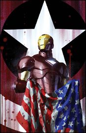 Iron Man #22
Writer: Daniel and Charles Knauf
Artist: Robert De La Torre
Colorist: Dean White
Letterer: VC's Joe Caramagna
Cover: Gerald Parel
Review: Tim Glancy
For as long as I can remember, I have been an Iron Man fan. I'm sure it's a boy thing, but I was always drawn to robots, lasers and explosions, so even when I didn't understand a ton of things happening in the book, I did enjoy a guy in a suit blasting people. It wasn't until I was older that I could also appreciate the fact that the guy in the suit was getting blasted at the same time. Tony Stark has always been a complex, tragic character, and that is truly one of the things I enjoyed about the book for years. It's easy to write a billionaire with no worries and with no issues who goes and puts on his super suit and kicks ass. But creating a rich character with great power and with issues takes work. The other aspect about Iron Man was that he didn't always win. He lost his company, people stole his technology, his friends and colleagues died, there was always a sense of loss no matter how much Stark won.
And then Marvel went and turned him into Batman. Now, and since the Civil War, Tony Stark can't lose. He's some kind of futurist or something, and is using this ability, as well as his new SUPER ARMOR~! to win every fight and every battle put in front of him. Oh yeah... and now he's the director of SHIELD. We have seen Tony go toe-to-toe with everyone lately, winning and surviving battles that he shouldn't have won. Hell, he out planned Captain America, who is supposed to be the best military mind in the world. As the months have gone by, the rise of Stark has gone from being an interesting plot point to just all around crazy.
However, recently, Tony Stark has seemingly come back to earth a little bit. That trend really continues in this comic. He is seeing his "ghosts" in the truest sense of the word, and is seemingly going a little bit insane. The Knauf brothers handle this aspect of Stark's personality very well, just as they're handling how others see him nowadays. You catch small comments from members of SHIELD about his mental state, and you can just see him struggling with his demons once again. Also, among all the major league stuff that a writer on this title needs to tie in to the book, they have still managed to create a nice little mystery involving, well, characters that you probably don't know � including Captain Ultra. It's nice to see that, even though Iron Man is a power player in the global community, he still has time to investigate a simple murder in Oklahoma.
The art team handles this material very well. It's moody and dark, which is perfect for a story such as this. Usually I would hate a superhero book with art like this, but I really feel like it pulled me into the story and helped me take a lot away from it. The facial expressions are excellent, as are the backgrounds. The art really delivers on the writing's promise.
I was dreading reviewing this when it came to my inbox. I was pretty much sick of Iron Man, and really didn't want to read another story with him unless it was one that was going to explain the continuity involved with him being in 75 different books each month. However, the creative team pulled a rabbit out of their hat and made a pretty exposed character fun to read. Buy this one and hopefully regain some respect for Iron Man.
 The Order #3
Writer: Matt Fraction
Penciler: Barry Kitson
Inks: Mark Morales
Colorist: Dean White
Letterer: Dave Lanphear
Cover: Barry Kitson
Review: Tim Glancy
The Order, which if not for some legal wrangling would have been known as The Champions, is the latest Initiative-based book to be churned out from Marvel. When the book was being advertised and hyped, it was said to be a look at the celebrity side of superheroes. With the book being set in Los Angeles, and the Order being California's super team, it made sense to do so. The first issue explored that, with a majority of the team getting fired for partying too hard (which flies in the face of their contracts). To me, more interesting then the celebrity angle is the contract angle. Each team member is signed on for a one-year term with the team and, at the end of the term, they will lose their superpowers.
While this certainly sets up an interesting angle one year from now (assuming their time is equal to our time), I can't really say too many great things about the book at this moment. Matt Fraction, who is writing one of my current favorite books, Punisher War Journal, seems to struggle with what he is looking to do here. He gives the characters a lot of depth, which is a necessity thanks to them all being new heroes. In this issue, the focus is on Calamity, and he is instantly a character that anyone who has ever been wronged can relate to. However, there are times when this book feels like a part of a larger story that is still waiting to be told, and therefore doesn't do anything for someone picking the book right off the shelf. To me, and to others, this is the trap that the major comic companies have fallen into. The focus nowadays is to tell great four-, six- and even 12-issue arcs, later packaging them as collections to be sold at Borders. I'm not sure how much of the blame here falls on Fraction and how much falls on Marvel, but there is blame to be shouldered. The battles, the dialogue, everything is written very well, but it feels like there are gaps needing to be filled � or that have already been filled elsewhere.
The characters and look of the team is handled very well, but the action is pretty sloppy and the backgrounds just seem to be there with no real thought given. Thankfully this issues focuses more on the people than the action, so the glaring trouble spots aren't so glaring.
You are going to want to go ahead and skip this one at least until the collection comes out. Maybe in that form the story will feel complete.
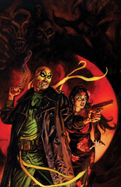
 Sub-Mariner #4
Writers: Matt Cherniss and Peter Johnson
Artist: Phil Briones
Colorist: Paul Mounts
Letterer: VC's Joe Caramagna
Cover: Marko Djurdjevic
Review: drqshadow
As one of Marvel's oldest characters, Namor is astonishingly well-developed and remains one of the publisher's most interesting individuals. His confrontational nature never fails to incite something interesting, but his intellect and respectable motives keep him on friendly terms with the heroes of the surface world.
Writers Matt Cherniss and Peter Johnson are pulling no punches so far with this new series focused on the Atlantian prince. In three issues, Namor has lost control of his kingdom, crossed Charles Xavier, Tony Stark and the entire United States, faced a royal coup and seen Venom viciously rip the wings from each of his ankles. If there's one thing these writers can't be accused of thus far, it's sticking to the status quo. They've thrown the title character into one hell of a quandary, and it should be a lot of fun watching him work his way out of it.
Most importantly, the duo has Namor's persona nailed down to perfection. When he speaks, it's always with such disdain for the perceived inferiority of those that surround him that one can't help but wonder if he really has to be such an asshole. That, combined with his uncanny ability to right those wrongs through his actions, is what makes this character such an interesting paradox. Cherniss and Johnson get that aspect of him, and it's never been handled better.
My main problem with this book was with its dialog. It's all so stilted, so stiflingly proper, that it becomes very wearying to read after a point. On one hand, sure � Namor is royalty, and such language is expected of him. I can't expect a king to stand up from his throne and immediately speak fluently with the peasants. But when he's interacting with characters who speak in exactly the same tone, even if it's in direct conflict with their personality (would the Invisible Woman really say something like, "You must accept my offer"?), it gets to be a bit much.
Phil Briones's artwork didn't do much for me, to be honest. While he occasionally impresses with a flashy panel here and there, his work as a whole frequently reminded me of the fill-in artists of the mid-90s. His work feels very rushed and underdeveloped, and his style is outdated. His renditions of the Fantastic Four, Iron Man, Venom and even the Atlantian warriors don't connect. Even Namor, the one character he had to get right, doesn't seem to be himself. He exudes arrogance throughout the issue, but I think the storytelling is more to thank for that than the artwork. This is almost a deal breaker to me, because paired with some phenomenal art, this story could have really taken off. With Briones on board, it feels like just another series.
I'm going to recommend you flip through this one. While the plot is a bit unrefined and the dialog is occasionally a hurdle, the writers aren't afraid to try new things with one of the oldest characters in comics. While I didn't care for the art one bit, it fits in with the generic Marvel style at the very least, so if you can stomach a mediocre visual this might be worth your while.
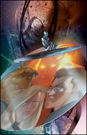 Ultimate Fantastic Four #46
Writer: Mike Carey
Artist: Pasqual Ferry
Colorist: Justin Ponsor
Letterer: Rus Wooton
Cover: Pasqual Ferry
Review: Chuck Brouillette
I'm sort of glad I came into the review of this five-part story on its closing chapter. I always wanted to do that. Over the years I've read other reviewers complain about how awkward and incoherent it is for most readers to pick up a later chapter in a multi-part tale. Now I can judge for myself what it feels like to be that latecomer. Refusing to track down the missing four books, I dove into Ultimate Fantastic Four #46 eager to engage and apt to enjoy. By appearances alone, thanks to Pascal Ferry's palpable and pulsating artwork, my enjoyment was more than likely to follow. Ferry's art first grabbed me on his Action Comics run a few years back and then again on the Adam Strange mini he followed up with. Here, the House of Ideas has him and they should consider that a very good idea. Ferry's forms and framing follow the FF though the action fluidly, making the spectacle of the interaction with their aid and adversary even more impressive.
I have to credit Marvel with the introduction of the prologue page in recent years and this time I needed it. Although the main antagonist mentioned in the prologue is not who I expected it to be (word association, I say Silver Surfer, you say...), from the first page I felt like I've been reading along from the get-go. Beginning in grand fashion with the title team's dramatic approach and reconnoiter with the statuesque Norin Radd's alter ego, this reader, in meeting Ultimate Silver Surfer for the first time and finding him to carry a touch of Shakespeare (one of Stan Lee's most swipe-worthy fellow scribes) in his dialog, I see this retro-element to the silver one's oratory very well aimed at making any classic FF fans well up with glee.
The quintet of adventures is tasked with the taking down of the overlord who created a gilded, carefree cage for his populace and sees himself as only benevolent and beneficiary. The resolution of the final conflict is executed in true FF form, thanks to Mike Carey's understanding of the characters. Ever since I read his Mole Man story in Ultimate Fantastic Four Annual #2, I knew that he knew what Marvel Comics' First Family was all about. And it's the emotional impact of their power as people that Carey come through with here. Unless you already own the first four parts, borrow this one.
 X-Men: First Class #4
Writer: Jeff Parker
Penciler: Julia Bax
Inker: Kris Justice
Colorist: Val Staples
Letterer: Blambot's Nate Piekos
Cover: Eric Nguyen
Review: Chuck Brouillette
I get a kick out of seeing Marvel retcon current culture into the early history and personalities of their characters. I get why DC Comics does it. It's really quite irresistible with those sometimes-stiff / iconic characters. But Marvel boys and girls were hip, fully-formed, people from the get-go, that's what made them so unique. They fought crime in the same flashy costumes as the people on that other universes' infinite Earths, but then they still had to pick up their dry cleaning and get their aunt's medicine. So it almost seems redundant when they do it in the Marvel Universe now. Because of that concern I didn't know what to expect when I picked up Jeff Parker's "Road Trip" adventure recounting the early days of Professor X's first class of students in X-Men: First Class #4. I was eager to see how the current powers that be at the House of Ideas would portray those original gifted while on a two-week recess from their earliest days at Xavier's.
Ever since I acquired Uncanny X-Men # 1-40 back in college, I've been a fan of finding out what occupied the spare time of the original team of X-Men. I was in school, these guys were similarly, getting a more formal education (albeit, while fighting crime, creepy mutants and avoiding obstacles in the Danger Room), and even though I was reading these adventures 20 years after they were written, that was the most interesting part of the story. They still worked.
Here, "Road Trip" focuses on Hank and Bobby, the two original X-Men who always seemed to have the most fun in off hours. While Scott and Jean were angsting over each other, and with Warren often hovering, it was always these two guys who kept the book light. But regret of regrets, this story doesn't focus on one of Hank and Bobby's double dates. No coffee houses and no Zelda. (Sob! Zelda!) Instead I get the impression that this title is intended for a younger X-audience as the tone is very safe, and entirely avoids any focus on any amorous intentions that the boys might have. Instead, thanks to the thoughtful intervention of Charles Xavier, this one offers up a slam-bang road trip with quick cuts of action and changes of scenery that allow the two, young, and similarly introverted, X-Men to share their most insecure thoughts with each other � forging their friendship in the process. And in keeping in touch with that signature Marvel Method of old, this entire adventure cleverly deals with human conflicts of man and nature. (No evil mutants or like-minded sorts spoil this adventure.) Their initial stop introduces readers to an intriguing concept in physics that engages Hank's curiosity, even if it's to the detriment of a young boy's sense of wonder. (That is, until Bobby expands Hank's consciousness a bit. It's a nice moment.) Highlights include Bobby having fun with his ice powers when dealing with the hassles of camping out, and the means behind the final, calm-after-the-storm night they spend together on the road. I also enjoyed seeing Hank's handy hand and footwork once again. Sigh! I miss seeing him bound around the page like the balletic bulldozer he use to be. (Why doesn't he do that any more? Is it like Ben Affleck as George Reeves in that final scene in Hollywoodland?) The art is clean and direct and perfectly fitting to the tone of the tale. It's obvious by issue's end that this one takes place prior to the double dating these guys did under Stan Lee's tutelage. 'Nuff said. Borrow this one.


