Is It Wednesday Thursday Yet?
05 September 2007
05 September 2007 � Here we are again with another installment of your favorite comic book review series. As always the comics you're about to read about won't be released until tomorrow (06 September 2007), so these reviews are free of spoilers and should help inform your purchases on new comic book day.
Our grading scale is simple:
Buy: An excellent comic book.
Borrow: A good comic, but save yourself some money by reading a friend's copy.
Flip Through: Give it a once-over at the comic shop.
Skip: This doesn't need to be explained.
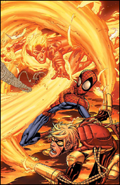
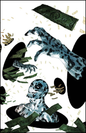
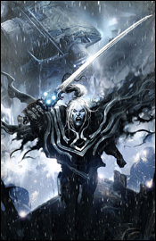 Annihilation: Conquest - Wraith #3
Writer: Javier Grillo-Marxuach
Artist: Kyle Hotz
Colorist: Gina Going Raney
Letterer: VC's Cory Petit
Cover: Clint Langley
Review: Tim Glancy
While World War Hulk is gaining a lion's share of the publicity and sales for Marvel, Annihilation: Conquest is actually producing the better stories. As I have mentioned before, in my review of Wraith #2, I am far from a "space" comic book fan. However, the last issue really turned me back onto the superhero / sci-fi genre, especially Marvel's galaxy. In fact, I was so pleased by the second issue that I went and read all of the other books related to this series. Yes, the characters are hardly known and very alien, but that honestly works to the creators' advantage, because it allows them to tell a tremendous story that isn't tied into the main Marvel Universe. For example, in WWH, Iron Man has to look like he is the smartest, most awesome hero ever because that is how, for some reason, he has been written for the last year or so. In "reality" Hulk would destroy Stark, but the editors and creators need to find ways to keep him alive. In Annihilation no one is safe because no one has a multimillion dollar movie or video game on the horizon. This frees the writers to tell the stories they want to tell, and not what the company wants due to outside factors.
This issue of Wraith exhibits this trend perfectly. Picking up right where the second left off, Javier Grillo-Marxuach continues to tell the story of Wraith, and we find out what the Phalanx did to him after last issue. Grillo-Marxuach, again, takes this character and adds a lot more to his backstory while still moving forward with current events. Last month we learned that Wraith is a Kree who was basically tortured throughout his whole life after his parents were killed, and he rose up to kill his tormentors and used the pain they had taught him to begin the hunt for revenge. This month we learn how Wraith views himself, and what fuels his desire for revenge. I think the best thing I can say for Javier here is that he does something I always harp on, and will continue to harp on, and makes this book easy for anyone to pick up and get into. By the end of the first page you know who Wraith is, his powers, what drives him, who the villains are and that Ronan is a main player. A lot of books can't do this in four pages, and Javier does it here � in one.
Javier also gives us a better look at the Super Skrull, Ronan and the Phalanx here, and you really see how these characters tie into the rest of the Annihilation saga. I've always enjoyed Ronan's appearances in Avengers and Fantastic Four, and I am happy to see him fleshed out here and brought into the spotlight.
Art wise, once again, everything is spot on for this type of book. The pencils and inks are extremely detailed. Hotz draws the humanoid characters very well, and when the time comes to draw a Phalanx or other tech-related character, the pencils are equally awesome. There isn't a thing in this book that Hotz doesn't draw well, and this is best shown on page 12: a splash page of the Super Skrull surrounded by Phalanx equipment. To be honest, that's amongst the best pages I've seen in a long time. Raney's colors are equally stunning: they're bright when they need to be, but mostly dark and moody. He also makes sure that no two characters look too similar; often characters are a shade or two off from one another, really setting them apart.
My only complaint actually comes from the format. Several portions of the book could have been fleshed out, resulting a reading experience that's much too quick. Again, this isn't the writer's fault. Marvel commissioned a four-issue story, so Javier Grillo-Marxuach's stuck with that format, resulting in pacing that's a tad off. Hopefully Marvel will realize Wraith's potential, and put him in his own ongoing � or at least an extended miniseries.
Still, this is a really minor complaint and is nowhere near enough of a reason to give this anything but a buy.
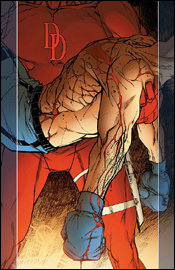 Daredevil: Battlin' Jack Murdock #4
Story: Carmine Di Giandomenico and Zeb Wells
Script: Zeb Wells
Artist: Carmine Di Giandomenico
Letterer: Artmonkeys Studios
Cover: Carmine Di Giandomenico and Richard Isanove
Review: Athena Miles
Straight off the bat, I'm a huge sucker for boxing movies and that may bias my review of this issue. I knew more or less nothing about Matt Murdock's father, Jack Murdock, going into this issue, but I came out knowing a hell of a lot about him. What I read was excellently plotted, and by the end I cared for the character greatly.
Although the supporting characters seemed underdeveloped, it was probably due to the fact that I didn't read the first three issues. Despite that, they filled their roles perfectly. And what may surprise some people, Matt Murdock, Jack's blind son who would eventually become Daredevil, played a large role in the issue without overshadowing his father's story. Jack's story also helped the seedy world of boxing come alive. Di Giandomenico and Wells made Murdock's world breathe. It too is a character in this series.
The art, on the other hand, was disappointing at times. At first I could feel the blows the boxers took, as well as the emotion on Jack's face. As I read along, I began to notice that Jack's expression rarely changed. They were etched into his face. From there I noticed it with other characters. And though the antagonists looked ridiculous, they set the tone of the book. Even though faces might have been a bit stale, the art set a mood that was eloquently pervasive throughout the whole book, adding to its cinematic style and story.
The art left a little to be desired, but on the whole the issue was strong. The writing lit me up, thanks to the boxing story / environment I'm a sucker for. Though I'm sure the series will be overlooked by most, I'd say this is a buy.
 Exiles #98
Writer: Chris Claremont
Penciler: Ronan Cliquet
Inker: Amilton Santos
Colorist: Wil Quintana
Letterer: Simon Bowland
Cover: Tomm Coker
Review: Tim Glancy
Every now and then a book comes along that both critics and fans alike really get into. Exiles is one of those books. Great characters, plucked from infinite worlds, combined with unique stories that could never be told in the primary Marvel Universe made the series an instant hit. Over the years the book has seen multiple cast rotations and several creative teams have come and gone, yet it remains popular.
And I hate it.
I do try, honestly, to enjoy it. I read the trades just about every time a new one comes out, and I just can't see the appeal. I think that this stems from my extreme dislike of all things "multiverse" and a general hate for the concept. I hate it when DC uses it (then doesn't use it, then uses it, then doesn't) and I hate it when Marvel does it as well. And I especially hate whenever there is a crossover between two universes. I guess that I am alone in this, because everyone seems to love these types of stories. But if I am alone, I am proud to be.
Now, since you are aware of my stance, this wasn't all that bad. I'll be the first to say that the Chris Claremont of 2007 is nothing like the Chris Claremont of 1980. Hell, some of his stuff has been down right embarrassing to read, especially his issues of New Excalibur. However, with Exiles he is being given a blank canvas to play with, and you see some old Claremont here. There's adventure here, a rarity in the modern superhero comic. What I mean is, most superhero comics are a few pages of getting to the fight, and then the rest of the book is nothing more than punching and explosions and whatnot. When adventure is written into a comic, the characters explore their surroundings and / or the world before getting to the punching and explosions and whatnot. Claremont has always done a great job of building to a fight; he makes them feel important. That said, there are a few battles here, but it's the getting to them and the reasoning behind them that's more important than the battles themselves.
The other thing that Claremont nailed here was the dialog and characterization. Oftentimes writers will attempt to make multiverse characters the complete opposite of the characters the readers are used to, making the story hard to read. The best multiverse stories are the ones where the characters are the same; they often have the same motives and powers and maybe even look, but with a slight difference here and there � often to the world, thus forcing the character to change. Claremont gets that here. On this planet, Victor von Doom wasn't disfigured. Reed Richards was, and that set a huge chain of events that culminated with Doom ruling the world. Same characters, same motives, same purpose � yet one small alteration changed everything.
The art, on the other hand, leaves a lot to be desired. If Claremont stepped his game up and created a modern book, Ronan Cliquet and the rest of the art team crafted a book that feels like it is straight out of the 90's. This is actually a problem I have with a lot of comics nowadays. There are some artists, a lot actually, who have created a new style and are trying to move forward, but there is also a huge population of artists that are content on creating a book that looks like Avengers circa 1997. Unfortunately, I can't put a finger on it, or name one specific part, but the whole book just looked like it was so old and tired that I couldn't believe it was coming out this week. I was really disappointed, because although Claremont's writing pulled me into the story, the art took me right out � and that was a damn shame.
So once again, we have the best and worst all wrapped up in one book. Claremont's writing is the best I have read since the 90s, and I really enjoyed it. He nailed the characters, crafted a good story and made a multiverse experience I could get into. The art team let him down big time; no matter what Claremont did, I had a hard time paying attention, because the art was of another time.
Go ahead and flip through it but don't be surprised when you put it down. Maybe there's another universe where the art is the same as it was a decade ago and that Tim Glancy loves it, but not this Tim Glancy and certainly not here. It's a shame, and Chris Claremont should be pretty upset.
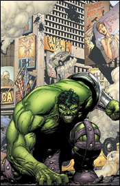 Incredible Hulk #110
Writer: Greg Pak
Penciler: Carlo Pagulayan
Inker: Jeffrey Hunt
Colorist: Chris Sotomayor
Letterer: VC's Joe Caramagna
Cover: Gary Frank and Chris Sotomayor
Review: Christopher Brosnahan
It's the fifth part of "Warbound," the tie-in to World War Hulk. Don't look here for big events, because that's not how Marvel tie-ins work these days. This is where the side-stories take place, the deleted characters and scenes from the theatrical release of the main story. This isn't a bad thing; in fact it's far more sensible than the old system where you'd have to buy every single tie-in, just in case there was a major plot point in one panel.
This issue is pretty quiet, actually, which makes it feel somewhat like it's treading water. It probably feels like this because it is doing exactly that. But, if you're looking for a nice accompaniment to the main story, this should fit the bill nicely.
Amadeus Cho (a character I'm unfamiliar with) talks to the Hulk in this issue. He's testing a theory he has regarding Hulk's personality. Now, without giving too much away, this theory somewhat damages the main story, by suggesting that the danger that is the entire thrust of the series may not be quite as serious as it seems. If you can deal with that, it's a fun little issue.
The writing is good, although some of the dialog is clunky. The opening lines, in particular, remind the reader of a Simpsons gag: "Well, here we are at the museum." "That's a strange thing to say." But, in fairness to Pak, this isn't about the snappy dialog that, say, a Joss Whedon would bring to it. This is about Pak setting the chess pieces in play for the five-issue World War Hulk miniseries. It looks as if, by the end of this series, everybody involved will have had a nice, simple motivation, and nice, simple aims. It's classic conflict.
As a result, the issue is decent. It's not great, not by any means, but it's perfectly acceptable comic book fare. The same must be said of the art. It's decent, and it tells the story nicely, however, neither is it great. Pagulayan has a somewhat Liefeld-like approach to backgrounds, which isn't necessarily distracting, but does mean that the art lacks depth. Also, his Hulk is sp over-muscled that the sheer physics of him bending his arms just don't make any sense. That said, this is nitpicking. The art is workmanlike, and it serves to tell the story.
The decision to make Amadeus Cho a major part of the story is strange. It's entirely possible that I'm missing something here, having not really followed the book before World War Hulk, but I don't quite get why he's the star of the comic. He's not a bad character by any means, but he doesn't exactly grab the reader either (or at least, not this reader).
There are obviously long term plans for the character, which explains his starring role in another character's title. Although "seventh smartest guy in the Marvel Universe" isn't the catchiest character in history. Not least because it leads to the obvious questions: who are the other six? And who ranked them? And what constitutes smart? Are we talking book smart? Street smart? It's not the kind of thing you can easily categorize.
There's definitely some fun stuff in this. If you're looking for a decent read, pick it up. Otherwise, flip through it. It's good, but it's nothing you'll miss either.
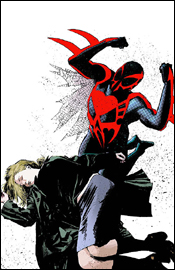
 Marvel Adventures Spider-Man #31
Writer: Peter David
Penciler: Pop Mhan
Inker: Norman Lee
Colorist: Guru eFX
Letterer: Dave Sharpe
Cover: Scherberger, Lee and Guru
Review: Athena Miles
The Marvel Adventures books seem to be kiddified versions of the original Marvel stories we know and love. That certainly doesn't make it bad; actually this issue was quite good. David put in a lot of witty dialog and interior monologues in this issue, and made good use of secondary characters like Liz Allen and Flash Thompson. It's a good reminder of how awkward high school was, which is something we don't get to see in the core Spider-Man comics, what with Peter being an adult now.
Since this is aimed at a younger audience, there's a message Peter and readers are supposed to learn. It kind of reminded me of old wholesome TV shows; yes, it's hokey but I'm not the intended audience. But if I was raising a child, this is a comic book I'd let them read because the message offsets any violence in the book.
Nonetheless, the plot is at times exciting and more importantly the characters really are true to form, especially Peter's interior monologues which shine the brightest. Although they do switch from a third-person narrative to a first-person monologue early on, which was quite weird but forgivable.
The art is perfect for the book. It's overflowing with eye-catching colors, making it look like a living, breathing cartoon. There's also an anime influence at work here, which I am not too fond of. At times Peter Parker looked like a woman, but Pop Mhan's Spider-Man was great.
The plot proceeds pretty remedially but that's just a consequence of the intended audience and taking the book from that perspective, I noticed that it's pretty damn good and worth a buy for the intended audience and a borrow for everyone else.
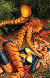 Ms. Marvel #19
Writer: Brain Reed
Penciler: Aaron Lopresti
Inker: Matt Ryan
Colorist: Chris Sotomayor
Letterer: Dave Sharpe
Cover: Greg Horn
Review: drqshadow
In addition to conveying the adventures of the title character, Mighty Avengers field leader Carol Danvers, Ms. Marvel also seems to serve as a check-in point for a variety of other non-central Marvel characters. In this issue, for instance, we get lengthy appearances by Machine Man, Sleepwalker, Tigra, the Puppet Master and Silverclaw. None of the above are really characters I'd deem worthy of their own ongoing monthly series, some having already crossed that bridge and failed, but as far as supporting characters go, they're good options.
After spending some time under the scrutiny of a large-scale book (Silverclaw and Tigra, for instance, were once Avengers) these guys have all been given more backstory and personality than you'd expect from a backing cast. That really gives this book more depth than you'd expect, especially after reading through that roster of has-been and never-were superheroes. For example, I can remember when Sleepwalker had his own monthly series; it was a good concept, but the character never clicked and the stories were redundant. I wrote him off and shook my head when I saw that Marvel was still using him, but as a supporting character he really finds his niche. Such is the case with nearly all of these characters: left to their own, their greatest shortcomings are revealed. But in small doses, they can still tell a fine story.
Brian Reed understands that, and showcases his ability to do so with this tale. Never overly ambitious, he keeps the scale smart, manageable and within the heroes' limits. If the master plan were too large, the stakes too high, I'd wonder why the big guns hadn't come out to put a stop to it. The conflict is just small enough to slip below the notice of Iron Man or Spider-Man, but serious enough to retain a bit of suspense and intrigue. The underlying mood is fairly light, but that doesn't mean there's no tension or drama, and the dialog is kept loose and entertaining.
Aaron Lopresti's artwork matches that tone � detailed and intelligent, but not over-treated or needlessly dynamic. He has a distinct personality, which shines through in many of these panels, and a good understanding of the subtleties of most of the cast. Occasionally he'll run into a problem with a character or two. Silverclaw, for instance, never jumps off of the page with the same kind of life he bestows upon Tigra or Sleepwalker, but his rendition of Danvers herself is pretty close to ideal. I've seen so many artists use her costume and powers as an excuse to over-exaggerate her physique that it's nice to see somebody who can render Carol a bit more realistically without losing sight of her identity or charm. He's a good fit for this series.
End to end, I have to say I got more than I was expecting from this book. Although this is the middle chapter of a three-part tale, I was brought up to speed very quickly (and without any assistance from the "last month" blurb on the opening page) and never felt like I missed anything vital to my enjoyment of the story. Sufficient progress is made for a standard 22-page story, and nothing felt forced, clich�d or out of place. I'll give this a strong recommendation to borrow, with a lot of potential for the future.
 New Excalibur #23
Writer: Chris Claremont
Penciler: Jeremy Haun
Inkers: Dave Meikis & John Dell
Colorist: Laura Villari
Letterer: Tom Orzechowski
Cover: Billy Tan
Review: drqshadow
Back in the late 80s, Excalibur was one of my favorite members of the X-family. Chris Claremont and Alan Davis were collaborating on something special, a superpowered team with a lighter take on their adventuring. The team actually felt like a group of siblings, the way they got along together and shared a friendly dialog. It was a wonderful change of pace from the angst-ridden main X-titles of the day, and I still remember the issues fondly. This new series is a near-direct continuation of those stories. The team is still led by Captain Britain, but if this issue is any indication, the similarities end there.
Chris Claremont's writing has never seemed as outdated as it does here. His cast is entirely emotionless, calmly speaking in a presumably dull monotone while they tear apart downtown London. It's all business, no emotion, all the time. Nobody seems worried about the havoc they're wreaking in one of the world's most identifiable cities, it's like they're completely emotionally detached, no matter which side they're on.
Add that to a plot that's so overly convoluted that I still have no idea what the hell was going on. I know there was a big throw-down in the city, I recognized a few faces, but I don't know what they were trying to do, who I was meant to be rooting for, what was going on beneath the surface or why the fight was happening in the first place. Despite what I'd consider to be more than a passing knowledge of the X-universe and four paragraphs of "previously in New Excalibur" intro copy, I remain at a complete loss. This book has too many characters, too many storyline twists and too many intricate details for any mortal man to follow. I'm sure that in the depths of his own imagination, Claremont is telling an epic, scene-altering story that makes perfect sense when you sit down to think it all over, but in practice it leaves his readers utterly dumbfounded, lost without a map.
The writer sees to it that no two individual characters have distinct personalities, just different powers to talk about � and talk they do, incessantly, endlessly, until the panels overflow with needless chatter. If their use had been properly introduced to the proceedings, Dazzler wouldn't need to tell me exactly what she's doing with her mutant abilities. The Juggernaut shouldn't have to say "What the � I'm goin' straight back up on a platform of ice!" The artwork should make it obvious enough.
But it doesn't. Jeremy Haun's pencils straddle the line between too detailed and too simplified, taking some of the worst elements from both. He has an ongoing struggle with perspective, ruining a "test of strength" panel by failing to reveal the actual size of the statue one character lifts above his head. His posturing is repeatedly stiff, awkward, rigid and lifeless. He takes the natural drama out of a scene by detailing the wrong areas of a panel, drawing the focus away from the spectacular and towards the mundane. How do you spoil the timeless comic book scene of a superhero effortlessly flying above a cityscape? By focusing so exclusively on the dull buildings in the backdrop that the character himself is lost amongst the details.
This just isn't a good book. Chris Claremont butchers a simple firefight with too much information, too much dialog and not enough old-fashioned firepower. His partner in crime, Jeremy Haun, doesn't help matters with a lame duck style and soulless main characters. If you're into bad art, bad dialog, an abundance of thought balloons and a cast of uninspiring characters, this is exactly what you're looking for. Otherwise, please do yourself a favor and skip this. It's awful.
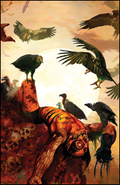
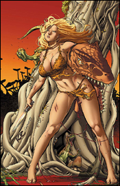 Shanna the She-Devil: Survival of the Fittest #2
Writers: Justin Gray and Jimmy Palmiotti
Penciler: Khari Evans
Inker: Jimmy Palmiotti
Colorist: Paul Mounts
Letterer: Artmonkeys' Dave Lanphear
Cover: Khari Evans
Review: Athena Miles
You ever wonder what happens when you cross Jurassic Park: The Lost World, Xena and Indiana Jones? Yeah neither did I. Well that's the best way I can begin to describe this book, especially for those of you who are like me and have never even heard of the book. Basically Dirk and his pirate crew stole a bunch of diamonds, got shipwrecked, ended up on this dinosaur island where they meet up with a warrior woman named Shanna and are being chased by a Chinese gangster. That's a lot of stuff and frankly the book never slows down... ever. So it also never gets a chance to explore the characters, making them appear as flat as the paper they're printed on. In this book, the characters have no motives, no personality and nothing to make readers care about them. It seems like the writers purposely have too much stuff going on, to distract readers from the lack of character development / exploration. The problem with that: everything seems randomly stuck together and is, frankly, a bit clich�d. Oh yeah and campy! This book is campy and it knows it's campy and that's the best part of the book (arguably the only good part of the book). I'm not a huge fan of camp, but there were times where I laughed out loud because of how funny it actually was. It's like the B movie you love to laugh at. Besides the camp factor, this book doesn't have much going for it.
The art, well, it doesn't shine even when it gets the chance. And believe me, it gets its chances. I had a couple problems with the art, mainly, that I had a hard time telling the minor characters apart. The major characters have distinct looks to them, but the rest of Dirk's pirates and the Chinese gangsters all look too similar. If the art has a strength, it's in the dinosaurs; imagine the raptors in Jurassic Park and you'll have an idea of what they look like here. Besides the lead Chinese gangster, the rest of the art is sadly bland.
Oh and the dialog is pretty pitiful. It's laughable most of the time. Only a few characters have actual voices: Ivan (the guy who's always scared), Shanna (who says very little) and the Chinese gangster (who has typical bad guy speak). The rest is pretty interchangeable and that shows how badly these characters are developed.
Yeah, maybe I'm being a little harsh on it, but it's still a bad book. The camp and the dinosaurs got me to enjoy it a smidgen, but otherwise I'd say skip this one.
 Super-Villain Team-Up / MODOK's 11 #3
Writer: Fred Van Lente
Penciler: Francis Portela
Inker: Terry Pallot
Colorist: Guru eFX
Letterer: Blambot's Nate Piekos
Cover: Marko Djurdveic
Review: Tim Glancy
Every now and then an idea for a comic comes out that seems so out there and so far away from the norm that the instant opinion is that the book will either be tremendous or it will be awful. Super-Villain Team-Up is one of those books. Well, not so much the villains teaming up, but more along the lines of the "MODOK's 11" portion of the title. Don't get me wrong, MODOK can be a great character when used right, as he was recently in Ms. Marvel, but more often than not he is the butt of a joke � used for a cheap laugh. And the title of this mini didn't seem to be doing much to change that aspect. Factor in the fact that his "11" maybe equal one real supervillain, and there was little reason to think that we were going to see a new, more serious version of MODOK in this story either.
And you know what? That is exactly how this book should be handled. Anyone looking at this title or picking this up needs to know exactly what they are getting into. This is a lighthearted heist story. Fred Van Lente has done a good job of keeping the tone of this book light, and packed with fanboy moments. Are there moments of intense action and seriousness? Yes, there are, and they are excellent. Van Lente perfectly captures the internal conflicts these characters face every single time they commit an act of villainy, and really opens the doors to these lesser known characters. Hopefully other writers will pick up on some of these characters and use them in their stories.
However, this book is certainly not without its problems. Some of the dialog is extremely forced and heavy-handed. You expect that from M.O.D.O.K, but when it comes from Armadillo or Living Laser, it's a little too much to bear. Also, I am really disappointed with the lack of growth between the characters. I understand that these are villains, and thus are not known for their natural ability to be friendly, but I would have liked to have seen at least one or two personal relationships forged between the individuals, because it is not uncommon for people who are forced into strange situations to bond and find personal connections. And if you can find me a stranger situation than being paid by a huge floating head to rob a group called "The Infanticide," let me know.
The art is strong in some areas, but little things pulled me out of the book. The characters were all beautifully drawn and colored, almost to a fault, and some of the backgrounds were lacking in the detail department. This was especially annoying because there were often pages where the characters were in the same area, and the background would look great at the top of the page and extremely different by the end. It's not as if either was bad, but it was annoying to see it change. Also, as I mentioned above, the characters seem a little over-detailed for a book of this tone. An art team with a slightly lighter style might have helped pull me into this one a little more. Again, the art team is good, but they just feel wrong for this book.
However, even with the flaws, this was still a pretty fun read. If you are looking for some humor, a little action, some tech and a heist, borrow a copy and give it a shot. It really is a fun book.
 Uncanny X-Men #490
Writer: Ed Brubaker
Artist: Salvador Larroca
Colorist: Jason Keith
Letterer: VC's Joe Caramagna
Cover: Salvador Larroca
Review: Christopher Brosnahan
Ed Brubaker is currently one of my favorite writers in Marvel. His Daredevil run is just superb, and adds layers upon layers onto the groundwork Bendis laid in place. It's one of the most complex, rich tapestries in comics. His Criminal series is (for my money) the single best comic out there right now, setting new standards for noir comic fiction.
Meanwhile, X-Men was the comic book that got me into comic books in the first place. Oh, I'd read some Batman before, but X-Men was the one that got me buying monthly comic books.
So why is it that you put these two ingredients together, and I find it difficult to get enthusiastic?
Is it the artwork? Salvador Larroca's work is definitely nice stuff, but it does remind me a little bit too much of Alan Davis' work. Don't get me wrong, I like Davis' art and style. His run on Captain Britain is one of my absolute favorites. The problem is that I never quite thought his style suited the X-Men. Perhaps it's due to me growing up on Jim Lee and Joe Madureira.
Is it the roster choice? This could definitely have something to do with it. Ever since Halle Berry was cast as Storm, I've found her character difficult to care about (seriously, the amount of hate I have for the Berry thing is really quite frightening). However, since she became a regular in Black Panther, the dislike I have for that book has flowed across like an overfilled septic tank. Panther is a good read, in small chunks, but it's so unbelievably, incredibly smug that I dislike it. T'Challa has become the ultimate Mary Sue ("Nice armor, Doom. I designed one better when I was twelve" "Nice weapons, Tony. For a dumbass. I did better when I was eight."), and when I picture Storm being that smug and then being played by Halle Berry... well, sorry, but it's off-putting.
Is it the fact that it feels very much like a "best of" hits compilation? Let's see, there's a McGuffin that might as well be Destiny from the Brotherhood. We've got a Morlock cult, which is remarkably close to what the Morlocks were always like. And we've got Storm in a situation that we've not seen her in since... ooff, at least a year.
However, the problem I've actually found with Uncanny X-Men is the fact that, as solid as the writing is, it never kicks out of the lower gears. The Shi'ar storyline was a fun read, but it dragged. Dear Lord, how it dragged. And then, partially due to the characters and the plotting, it's been dropped from my reserve list.
Skip it. But feel bad about it. It's a good comic, but I can't justify keeping it on my pull list when I'm trying to save money.
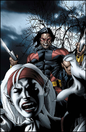
 Wolverine #57
Writer: Marc Guggenheim
Artist: Howard Chaykin
Colorist: Edgar Delgado
Letterer: VC's Cory Petit
Cover: Arthur Suydam
Review: drqshadow
Wolverine is all over the place, possibly more so than ever. Between Astonishing X-Men, appearances in X-Men, New X-Men... well, all the X-comics including World War Hulk: X-Men, the New Avengers, a recent stint in Cable & Deadpool, his frequent guest shots and a pair of ongoing solo titles, Logan constantly pushes the boundaries of overexposure. Judging from this issue, that overuse and over-saturation is beginning to show.
Writer Marc Guggenheim has an intriguing take on the character. So many times we've traced Logan's steps as the feral super-mutant, sniffing the air and immediately understanding where the opposition lies, that we take his abilities for granted. Guggenheim takes the time to explore those animalistic senses just a bit further than the authors who came before him. No matter the occasion, he's reminding us that Logan's faculties are much sharper than our own, for better or for worse. While he's gripping the bottom of a speeding aircraft, for example, we're reminded that "at mach-20, a speck of dust or a hailstone hits you like a bullet." When he's reminiscing about his own wartime experiences, he recalls the occasion through the scents, tastes and sensations that he associated with each locale. It's a fresh new interpretation of the character, and a great device for delivering a little more detail to his adventures.
Too bad, then, that the rest of the story couldn't match that level of originality. Take away the interesting asides about his heightened senses and this would be just another run-of-the-mill "Wolverine vs. mysterious threat" storyline with an open ending. Logan takes a randomized mission somewhere in the world, kills a few bad guys, meets a serious challenge, finds himself in peril, tune in next month. That's it?
I know Logan isn't the brightest bulb in the fixture by any means, but I've got to believe he's smarter than the way he's presented here. Sure, he has a history of charging into battle, but there's enthusiasm to throw down and then there's pure, mindless idiocy. Here we see Logan act with uncharted levels of stupidity. Guggenheim treats the character with such a small amount of respect that it's staggering.
Howard Chaykin's work as this issue's artist feels much more like a fill-in than a regular gig. He doesn't connect with Logan, rendering him with an uncharacteristically bulging, thick jaw line and a tiny face. He's missing his trademark stubble and the clean-cut look doesn't fit the character he portrays at all. On the large, Chaykin's style is incredibly uneven and unrefined. I can't tell if he wants to be Jim Lee or Bryan Hitch here, but he's a long ways off in either instance. His artwork in a few select panels throughout the book is so bad that I couldn't fathom how he wasn't turned away from this job.
He was even granted the big opportunity to design and introduce a new villain in this issue, but what he delivers looks so common and unspectacular that I kept mistaking him for his own henchmen. His battle with Logan yields a few great opportunities for a big, dynamic panel or splash page, but Chaykin misses almost universally. His paneling is tough to follow, his foreshortening is a major stumbling block and his action scenes feel lame and unexciting. His constant missteps taint the book as a whole, giving it an amateurish vibe.
Outside of the opening flashback, where Guggenheim works most of his magic with Logan's heightened senses, this issue is tough to read. The dialog is nothing special, the story has been revisited a dozen times already in Logan's past, and the artwork is often hideous. I'm giving this a skip, and I'm almost ashamed for Marvel. This isn't nearly up to the standards I'd expect from one of the biggest books on the market.


