Is It Wednesday Yet?
14 August 2007
14 August 2007 — Here we are again with another installment of your favorite comic book review series. As always the comics you're about to read about won't be released until tomorrow (15 August 2007), so these reviews are free of spoilers and should help inform your purchases on new comic book day.
Our grading scale is simple:
Buy: An excellent comic book.
Borrow: A good comic, but save yourself some money by reading a friend's copy.
Flip Through: Give it a once-over at the comic shop.
Skip: This doesn't need to be explained.
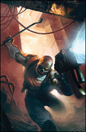
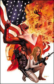 Captain America #29
Writer: Ed Brubaker
Artists: Steve Epting and Mike Perkins
Colorist: Frank D'Amata
Letterer: VC's Joe Caramagna
Cover: Steve Epting
Review: drqshadow
Ed Brubaker, Steve Epting and Mike Perkins check in this month with Captain America #29, the fifth installment in "The Death of the Dream." There's a lot going on in this book at the moment, especially considering the marquee character bit the bullet several issues back.
The artwork of Epting and Perkins is best suited to a story with simple gunfights, deep characterization and a minimum of hands-and-fists action, and that's almost exclusively what they're given to work with here. In the few occasions that they are asked to delve into more traditional comic book action sequences, their collaborative style just doesn't hold up. They reach for supreme realism above all else, and that doesn't mesh well with the idea of a man in a skin tight, red and white avian-themed costume throwing kicks and punches at a gentleman with a flame thrower.
When they're in their element, however, these two can deliver some really nice work. Their rendition of the city of New York is breathtaking — a sea of lights, bricks, mortar and concrete — and their knack for creative camerawork really emphasizes that strength. When the Winter Soldier is infiltrating an enemy's operation at the pinnacle of a downtown skyscraper, clinging for dear life to a dangling American flag, the effect is both dizzying and captivating.
While their style may not have the kind of flash and personality to catapult them to the top of the artistic heap, the subtleties of their work are worthy of some praise. For the most part, they're right at home in this kind of espionage book, although writer Ed Brubaker does ask them to fill an awful lot of pages with talking heads and computer monitors. Epting and Perkins' work is a great match for the mood this series evokes, although I wonder if it will hold up once Cap makes his inevitable return from the grave and the focus shifts back to more traditional costumed fare.
Brubaker's script is very, very complex. He aims to tell an epic, involved, detailed story filled with twists and turns, but that's tough to do in brief (RE: monthly) installments like this. Maybe it all makes sense in the long run, but as a fresh reader coming in midway through this story arc, I was completely and utterly lost within the first six pages. This is obviously an extremely layered, delicate storyline and the actual writing within the issue is compelling, but when I had trouble following the "previously in Captain America" blurb, I knew it meant trouble.
It's difficult to tell who's on which side as the tale progresses, as well. Between Tony Stark, the Black Widow, Sharon Carter, the Falcon, the Winter Soldier, the Red Skull and Crossbones, there seem to be no less than four competing alliances and coalitions, and that's just within the confines of this issue. It's one thing to spin a yarn with depth and unpredictable twists, it's another to tie a knot and confuse your audience. I fear Brubaker may have grown a bit overambitious here.
If you're a longtime Cap follower, or the kind of reader who prefers to wait for the collected edition to hit store shelves, this story may be right up your alley. It's interesting enough that I'm curious about the full story and may grab the trade when it arrives in my local shop, but as a standalone story it has quite a few shortcomings. If you're brave enough, borrow it from a friend and try to comprehend what's going on. It's got potential.
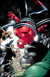
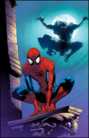
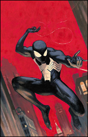 Friendly Neighborhood Spider-Man #23
Writer: Peter David
Penciler: Todd Nauck
Inker: Robert Campanella
Colorist: John Kalisz
Letterer: VC's Cory Petit
Cover: Todd Nauck & Rub Stull
Review: drqshadow
Peter David and Todd Nauck conclude their run on FNSM with this issue, which also serves as a sort of bookend to Spidey's actions during the superhero Civil War. Last issue, J. Jonah Jameson fired longtime Bugle editor Robbie Robertson in a characteristic hissy fit. This month, Peter confronts Triple J in person about those actions and a few lingering issues left over from his public unmasking more than a year ago.
The story is a sound, character-driven read that plays with a lot of the longstanding conflicts between Jameson's editorial direction and Parker's involvement with the paper. I've long considered Peter David's work on X-Factor in the mid-90s to be among my all-time favorites, and he carries the same style to his approach here with Spider-Man and company. He's great at humanizing the life of a superhero (or team of superheroes, whichever the case may be), grounding them to the same reality occupied by the rest of us. His characters may fire beams of pure plasma from their hands from time to time, but they have the same insecurities and hang-ups as you and I. That's especially the case in this issue, as Peter and Jonah's emotions collide, both verbally and physically.
David's approach typically treads a thin line between charming and cutesy, however, and he does cross from one side to the other a few times as this issue plays out. When Jameson visits Robbie's home during the first few pages of this issue, for instance, his back and forth with the entire Robertson family provides some great dialog, but eventually goes to the well once too often and spoils the effort. Jonah's argument with Peter later on, though, is much more balanced and carefully scripted, which results in a more enjoyable, entertaining read.
Nauck's artwork is a good fit for the more lighthearted Spider-Man material, with a stylized, cartoonish feel. His work is a sort of Madureira / Wieringo mix, with thick linework and exaggerated expressions. For the most part, it works (he really does the dark Spider-Man costume justice, giving it a smooth, leathery texture) but he has some odd problems with maintaining consistent proportions. JJJ's hands kept changing size throughout the issue, to the point that it became increasingly distracting, and nobody had a normal-sized nose. To an extent, I can chalk that kind of stuff up to artistic license, but at some point it turns into a flaw.
This issue has high hopes. David and Nauck aim to finish their run with a memorable issue that allows Jonah and Spidey to finally work some of their frustrations out on one another, but the end result is a bit underwhelming. The big exchange between Peter and Jonah didn't carry the weight I was expecting, and was over and done with before I knew it. While it was actually happening it was good stuff, fun to finally see... but because it was so concise, it didn't feel like that big of a deal. This wasn't a bad read, but it didn't knock my socks off, either. Flip through it on the shelves, but don't invest too much time.
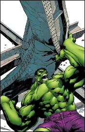 Marvel Adventures Hulk #2
Writer: Paul Benjamin
Penciler: Juan Santacruz
Inker: Raul Fernandez
Colorist: Wilfredo Quintana
Letterer: Dave Sharpe
Cover: Pagulayan, Huet and Sotomayer
Review: Tim Glancy
A common complaint over the past few years is how inaccessible comics have become. Storylines are no longer contained in a single issue, but are multi-tiered events with preludes, tie-ins, interludes and epilogues. And all of it connects to a "crisis" or "war." In the mainstream Marvel Universe, it has become almost impossible to pick up an issue of Amazing Spider-Man or Avengers and show that to a child and turn them onto comics. I still remember the first issues of Amazing Spider-Man I ever read. It was the first part of a two-part storyline with Silver Sable teaming with Spider-Man to take on the Sinister Syndicate. I was five, maybe six, and I remember going to the store with my dad every week after that waiting for the next issue to come out. Sure, back then there was cross-pollination between the Spider-Man books, and the first one I really remember was the awesome "Kraven Last's Hunt" storyline. But even that wasn't too big a hassle, because at least it was still a Spider-Man book. Nowadays, however, there's just too much going on for younger readers to grasp. Marvel, however, knew this and created their Marvel Adventures line. Like most things Marvel, it started with Spider-Man but soon grew to include the Fantastic Four, Avengers and Iron Man. The latest addition to the line is the Hulk. With a little bit of Hulkapalooza going on in the mainstream universe, Marvel knew that Hulk was going to be very visible and figured that now would be a great time to introduce an all-ages Hulk title.
The result is a book that is fun to read and really hearkens back to the Hulk stories of old. It's Banner and Rick Jones traveling the country and having adventures, more or less. Paul Benjamin does a great job of making this feel like one of those Hulk stories. In recent years, Hulk has either been too scientific with a lack of fighting, or the exact opposite. Benjamin walks the line between the two here, and manages to mix them in a very interesting way, where the science actually leads to the violence, which is fixed by the science. It's a premise that could have been extremely complicated, but the writer remembers the age group he is writing for and writes this at the right level. He also works in a guest star that you would almost never expect in a book like this, and does so fantastically.
The art, however, is almost too simple. The characters are fine, but the backgrounds are lacking detail and finesse. Santacruz draws Marvel Adventures Hulk almost like two different artists. The scientific scenes lack life, while the action is handled fairly well. With the science being such an important part of the writing, the art really lets the book down. Same with the colors. The rest of the Adventures titles use bright, vibrant colors. Here they lack the excitement needed to grab youngsters
This is a book that is worth checking out, especially if you're a fan of comics from a bygone era. However, for the purposes of introducing new readers to the medium, stick to Marvel Adventures Spider-Man or Avengers. That said, I have to call this one a borrow. Despite the art's shortcomings, the story is quite fun and brings some unique elements to the table.
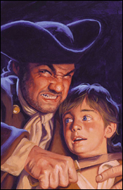 Marvel Illustrated: Treasure Island #3
Writer: Roy Thomas
Penciler: Mario Gully
Inker: Pat Davidson
Colorist: SotoColor's A. Crossley
Letterer: VC's Joe Caramagna
Cover: Greg Hildebrandt
Review: drqshadow
The latest in Marvel's series of classic literature translations, Treasure Island is a coming of age tale set within the confines of a swashbuckling pirate story. If I've ever read the original, it's been long enough that I've forgotten about it, so this is a fresh experience for me. I doubt I'm the target demographic here, though, as I'd imagine the ultimate goal is to expose a younger audience to these time-honored classics.
It's a shame, then, that Mario Gully's artwork and Roy Thomas's storytelling miss that mark so entirely. If the intent is to interest youths with these stories, the issue should be bursting at the seams with life, personality and enthusiasm. I should be able to pick this up, open to the first page and immediately lose myself. Instead, those introductory panels are painfully stiff, extremely word-heavy and ultimately very dull. This looks like something my grandparents would be interested in reading, which is exactly the kind of atmosphere that's keeping kids away from the novels in the first place.
Gully's work is strict to a fault, like the stuff you'd expect to find in "Prince Valiant" with your Sunday paper. From my own experience as a child, "Valiant" was the one strip I would go out of my way to avoid every weekend in the funny pages, and I'm sure I can't be the only one. Truthfully, I still avoid it today for the very same reasons. As the issue carries on the artwork loosens up a bit, but even at its best it's nothing I'd consider to be up to the task of capturing the imagination of a younger audience.
The excess of captions and word balloons throughout only serve to further muddy an already murky style of rendering. Every single panel has no less than two full sentences of narrative crammed in, which gives the entire issue a very weighty, overdone feel. Granted, the very idea of the story is that it's adapted from the personal recollections of several participants. However, where that approach might be effective in the context of a novel, within the confines of a highly visual medium like a comic book, it's ineffective. Although the story itself is filled with adventure and excitement, the excessively descriptive text turns the act of reading about it into a chore.
There's a real lack of characterization in this tale, too, which is downright shocking considering the source material. The entire cast of villainous pirates functions as one single-minded unit, not a cluster of individuals. The levelheaded crew of honest men are rigid, faceless and totally lacking in personality. Even Jack, the youthful face of the story, seems to exist only to react and never to participate. A handful of men lose their lives as the story progresses, but their deaths never mean anything because they were never proven to be valuable to the story. It's like writer Roy Thomas cut out the meat of the original tale and retained the fat.
Regardless of the desired target market, this issue fails to connect. On a few rare occasions, the brilliance of the original story is given an opportunity to shine through, but those moments are few and far between. In the meantime, you're left to wade through an excess of text describing the artwork it conceals, a lightweight cast and a dull artist. Skip this and mourn the missed opportunities.
 New X-Men #41
Writers: Christopher Yost and Craig Kyle
Artist: Skottie Young
Colorist: Skottie Young and Jean-Francis Beaulieu
Letterer: Dave Sharpe
Cover: Scottie Young
Review: Tim Glancy
Sometimes you can pick a book up midstream and fall right into step. You get the characters, the story and their motivations.
And sometimes you read New X-Men #41.
Before now, I've never read New X-Men because I honestly didn't have any interest in reading about the next generation of mutants. I have a hard enough time keeping up with the current generation, so why bother with the next? Plus between Runaways, Young Avengers and Teen Titans, I was already up to my eyeballs with teen angst in my comic books. After reading issue #41, I am very happy with my decision.
Part of my problem was that this is the end of an arc, but I felt as if there was no effort made to embrace readers who missed the first few issues. A lot of comics do this, so this mistake isn't native to New X-Men. But what creators need to remember is that, no matter what, every comic is someone's first comic. There will be a kid who walks into a comic shop this week, and for one reason or another (e.g. he likes the cover, he's seen the X-Men movies, a friend told him it was a good read, whatever) makes this his very first comic book. And he'll be lost almost from go. Not the best way to make a first impression. Best I can tell, this book features one of the things I hate most in comics: magic. The New X-Men have been sucked into Limbo by Belasco, who's scouring the land in search of Illyana Rasputin / Magik.
In this issue all hell breaks loose, pun intended, and the action is extremely hard to follow. I really had no idea what was going on from one panel to another, let alone from page to page, and I really didn't know whom to blame. Surely the writers shoulder some of it, because they are telling the story and are giving the direction on where the panels go and how the layout should look. But, with all that being said, they aren't drawing the confusing mess of panels. Skottie Young's style has changed little since he burst onto the scene, and it still looks like manga light. Actually, all of the earmarks of a manga are present: big robots, monsters, scantily glad woman, etc. But here it's all done in a way that just shoehorns everything into the book, making everything feel unnatural — especially the characters.
Despite the one touching moment near the end, the action was too kinetic to keep my attention. Maybe it's my age; I am sure teenagers will love this, but I'm no teenager. Do yourself a favor and flip through this one to catch the tender moment at the end, but don't stop to actually read the book.
 Spider-Man Family #4
Writer: Jeff Parker
Penciler: Leonard Kirk
Inker: Kris Justice
Colorist: Michelle Madsen
Letterer: Nate Piekos
Cover: Leonard Kirk
Review: Tim Glancy
With few exceptions, I really dislike titles such as Spider-Man Family. I respect that Marvel is trying to give different, less mainstream writers a chance to work on an A-list character, and also push some lesser known characters and aspects of the Spider-Man Universe. I think that is a noble cause. However, the execution is almost always flawed. Look at X-Men and Spiderman Unlimited from the 90s (or even earlier this decade) to see exactly what I mean. While you might get the occasional story that feels import, most come off as throwaway tales. And that proud tradition continues here with Spider-Man Family.
The book kicks off well with a tale featuring the Puppet Master. Anyone who's read the Franklin Richards comics will be familiar with the tone and style of the story here. This little story is the best new work in the book, and shows that children's comics, when handled with respect and talent, can be enjoyed by children and adults alike. From there, we get into the meat and potatoes of the book: a team-up between Spider-Man and the Agents of Atlas. You read that right. It should come as no surprise that the writer responsible for the Agents of Atlas miniseries is Jeff Parker, who writes this issue as well. If this issue is indicative of the Agents mini, don't expect me to pick that up anytime soon. I'll be nice to start and say that Parker nailed Spider-Man in regards to the wisecracking, humorous vibe that the character requires. However, from there, the story becomes quite confusing and all around frustrating. There were times when I had to read pages two or three times to understand exactly what was going on, and that is not good for a book like this. Spider-Man Family should be fairly accessible for everyone: children, new readers, adults and comic book vets.
I don't think the art helped either; although the characters looked good, the panels were hard to follow and often cluttered. While the colors caught my eye and the inks didn't (which is good, because it means they didn't overpower the pencils), the art as a whole can best be described as average.
The rest of the book is a series of reprints. Mary Jane #1 is first, and of course that is tremendous. The whole Spider-Man Loves Mary Jane series has featured the best Spider-Man stories in years, and this is the book that really started it all. However, with a $4.99 price and the digest of Mary Jane only costing $7.99, the inclusion of the story here isn't reason enough to grab Spider-Man Family #4. Amazing Spider-Man #178 is also packaged in this 104-page beast. This classic tale is another chapter in the Spider-Man / Green Goblin rivalry, and is worth reading. And then finally we get to Spider-Man J, a reprint of a Spider-Man-inspired manga series. Despite my feelings about manga as a whole, this was pretty good. It's a solid action story. Even though it wasn't my cup of tea, it was funny and enjoyable, and honestly added something to the book.
The main event isn't hefty enough to warrant a borrow, but when you walk by the shelf make sure to flip through Spider-Man Family for the other tales.
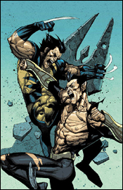 Sub-Mariner #3
Writers: Matt Cherniss and Peter Johnson
Artist: Phil Briones
Colorist: Paul Mounts
Letterer: VC's Cory Petit
Cover: Leinil Francis Yu
Review: Tim Glancy
If I am being completely honest, until recently I never had much time for Namor. I know this is going to sound crazy, but I think the reason is his look. I just could not get interested in a character with little wings on his ankles dressed in his underwear. However, his recent inclusion in both Civil War and New Avengers: Illuminati, along with his blue jumpsuit, have helped to really peak my interest. I think there is an interesting way to handle the character, and that is what we are seeing nowadays. Namor is a man who is both a monarch and a terrorist at the same time, and seeing that interplay is tremendously interesting. It's almost as if we are gazing through the looking glass at how other countries must see us. At times, we are the nice, helpful country that lends ourselves when natural disasters strike. Other times we are storming through streets in Baghdad looking every bit as terrifying to those people as we are welcome by others. This series is really playing that angle, and doing quite a good job of it. There was an explosion in Kansas, and it is believed that Namor had something to do with it, especially after the events of the superhero Civil War. When Tony Stark leads a SHIELD team to Atlantis, all they find is a body; apparently Namor has been chained to his throne, and all of the other Atlanteans are nowhere to be found. Namor makes his way to the surface, looking for help, and the government dispatches Venom to capture him.
Now that we are all caught up, allow me to say that my brief recap does not do this miniseries justice. The writers are doing a tremendous job of telling a superhero story that is filled with intrigue and espionage. There is plenty of action here to keep fans of such things tuned in, but there's enough of a mystery to capture the interest of thriller fans. In this issue alone we get two tremendous battles, two big reveals and two hanging threads. All of which make the next issue a must read. The characters — from Namor to Wolverine, from the random military personal to the terrorists — all act within character. The writers have their hands full in terms of the number of characters their playing with, but they're all represented well. Reading Wolverine here is like reading him in his own book or X-Men, Venom is just as crazy here as he is in Thunderbolts. The best thing I can say is that the writing team has managed to take Namor — a character I previously had zero interest in — and made him so interesting I can't help but read the next issue in this series. I really hope sales and overall fan interest dictate the turning of this mini into an ongoing — with this creative team held intact, of course — because I don't think that five issues does what they are trying to accomplish justice.
The art is very detailed, and it really fits the tone of the book. The fight scenes are really important to this issue, and they are handled expertly. Personally I prefer a slightly more cartoony style, but that would not fit this series at all. Having Humberto Ramos pencil a series about a king looking for the people responsible for destroying his kingdom and besmirching his good name would look severely out of place. Here, when Namor is battling Wolverine, you see the expressions on their faces and you can tell that they are battling with all their might. At the same time, when Namor is in a discussion, or the story turns to Stark, you really can read their thoughts through their expressions. And that is paramount in a book like this.
Really, I could probably continue praising Sub-Mariner, but there is one thing that bothers me ever so slightly: the bad guys aren't fleshed out enough for my liking. We know what they're doing, but their motives, methods and personalities are missing. That said, I am more than willing to give the creative team the whole five issues to get to that — and I think they will. So make sure to buy this on Wednesday. And if you missed parts one and two, grab those as well. You won't regret it.
 Super-Villain Team-Up / MODOK's 11 #2
Writer: Fred Van Lente
Penciler: Francis Portela
Inker: Terry Pallot
Colorist: GURU-eFX
Letterer: Blambot's Nate Piekos
Cover: Marko Djurdjevic
Review: drqshadow
Quite possibly the most heavily punctuated comic book title of all time, Super-Villain Team-Up / MODOK's 11 greets its readers with a summary so simple it brought a smile to my face. Rather than establishing what had been accomplished in the first issue with a wordy write-up, the inside cover lays out a photo montage of the entire cast and their specialized roles. It's quick, it gets the job done and it stands out from the pack right out of the gates. I like that.
Along those same lines, much of the dialog between villains is kept light and conversational, though MODOK's speeches (god, I'm already sick of typing that name) can get pretty longwinded. I caught myself vegging out more than once as he outlined his master plan, but writer Fred Van Lente seems aware of the problem. He actually turns it around on the reader, as a few of the villains themselves lose their attention during the monologue.
As a book focused exclusively on the activities of supervillains, you'd have to expect a certain degree of ulterior motives, backstabbing and conspiracy, which Super-Villain Team-Up provides in excess. Nearly every single character has an ace up their sleeve or a failsafe backup plan that involves incriminating their peers. It's nice to read something that's so polar an opposite to what's usually provided in a team-up book, but eventually it stops being unique and loses its edge.
We're still getting to know a lot of these characters, so the majority of this issue is spent fleshing them out and exploring their personalities. Problem is, only about half of the cast is deep enough to merit this kind of closer inspection and the lower-tier villains wind up doubly exposed for the effort. Now that I know Rocket Racer is a bit of an idiot who stutters when he speaks, does that make me care about his fate? Not really.
Francis Portela's artwork is enticing, and his light detail work gives the colors plenty of room to work their magic. The two facets work together in a way that bears more than a passing resemblance to Steve McNiven and Morry Hollowell's efforts on the main Civil War book last year. Portela doesn't hesitate at the prospect of rendering some of the more offbeat subject matter of a book like this, and he shows a good understanding of when to go crazy with a dynamic action frame and when to show some restraint. He's got a firm handle on each of these characters, too, which isn't always a guarantee on a team book.
When its focus isn't on a deep-seeded conspiracy from within or MODOK's penchant for longwinded instructions, this is a fun book that doesn't really have a peer. I enjoyed the way these overlooked villains worked together during their downtime, but when the story turns a bit more serious near the halfway point, much of that is lost. Flip through this and enjoy the good stuff. If it were more consistent and could've resisted the urge to veer from its more humorous path, I'd have enjoyed it a lot more.
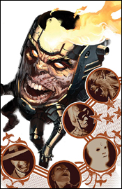
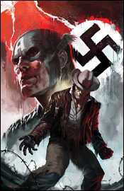
 Terror, Inc. #1
Writer: David Lapham
Artist: Patrick Zircher
Colorist: June Chung
Letterer: VC's Joe Caramagna
Cover: Jelena Djurdjevic
Review: drqshadow
David Lapham, known for his work on Stray Bullets, collaborates this month with Patrick Zircher (Nightwing, Cable and Deadpool) for this miniseries relaunch of Marvel's Terror, Inc. A holdover from Epic Comics in the late '80s, Terror is the story of Shreck, a creature cursed with eternal life. "Why's that a curse," you ask? Only his soul is undying, while his flesh and bones rot at a rapid pace. To retain mobility and appearances despite these trying circumstances, he need only tear a limb from another (formerly) living creature and affix it to his own body, which adopts it as its own. In the act of doing so, he also absorbs the talents and memories of the limb's former owner. So, in terms of abilities, there really isn't anyone else like him.
While much of Terror's backstory remains intact from the book's original run, Lapham has done wonders with both simplifying and expanding upon it here. He's brought the book forward to the present without losing sight of the character's rich history or dating the material. He tells just enough backstory to allow the reader to appreciate Shreck's unique perspective and to plant a few seeds for future tales, but not so much that the entire story reads like a period piece.
In the present day, the lead character takes work as a contract killer, specializing in particularly tricky situations. We're along for the ride on one such predicament as the first issue comes to a close, which gives Lapham all the room he needs to flex his muscle and show just how original and exciting this book can be. Though he kills with little remorse (a remnant from his life before this affliction, where he was a marauding warrior), Shreck remains likeable. He's well-defined, knows who he is and what that means, and works with a smile on his face. And, although he has one of those metal arms that were all the rage for no particular reason in the mid '90s, his actually has a reason to exist.
Patrick Zircher's artwork is a bit of a departure from his previous stuff, and proves to be a very welcome change. This shift is perfectly suitable for the much darker, horror-meets-action tale Lapham has spun, and makes for a great fit. His take on Shreck is grotesque, but not faceless (well... physically faceless, yes). In addition, his art doesn't feel out of place in the Middle Ages nor modern day Los Angeles, and actually seems to shift ever so slightly to better suit the era he happens to be illustrating. When we're raiding villages in 455 AD, the art feels more in keeping with Conan the Barbarian. When we're detonating grenades in an LA high-rise, it's more like Tim Bradstreet's Punisher covers.
This is some straight-up outstanding material; a great premise, amazing execution, a story that's off and running from the first page, a perfectly complimentary art style and just enough of a cliffhanger to leave me hungry for more. I'm adding this to my pull list posthaste, and you'd better do the same. Buy it, buy it, and buy it again.
 Ultimate Spider-Man #112
Writer: Brian Michael Bendis
Penciler: Stuart Immonen
Inker: Wade von Grawbadger
Color: Justin Ponsor
Letterer: VC's Cory Petit
Cover: Stuart Immonen
Review: Tim Glancy
When I was sent this one for review, I really struggled with what I would say about it. Honestly, what hasn't been said at this point? Over the last seven years Ultimate Spider-Man has been both a critical and commercial success, and is one of the most popular comic books Marvel has ever published. I personally haven't misses an issue. There are thousands of reasons that can be given for its success, but one of the biggest factors was the consistency of the creative team. From the start the creative team has remained unchanged: Brian Michael Bendis and Mark Bagley created this world, and will forever be linked to it. Despite criminally late comics such as The Ultimates and All Star Batman and Robin, the Boy Wonder, Bendis and Bagley managed to pump out 16 issues a year.
However, everything changes with this issue, because for the first time in seven years, Mark Bagley isn't handling the art chores. Stuart Immonen is. I guess it's only fitting to start this review not with the writer, as I usually would, but with the artist, because that is really where the big news is this month. The question on everyone's mind is, of course, can Immonen live up to the monumental shoes that Ultimate Spidey vet Bagley left to fill? I am thrilled to say that the answer is 100% yes. In terms of action and energy, their styles are similar enough to make the transition as smooth as possible, but Immonen differs by adding a sense of realism to the pages. Simply put, when you grab this issue you'll still know that it's Ultimate Spider-Man, which isn't often the case when creative teams change. Stuart keeps things simple when needed and turns up the pace with frantic energy when it's time for action. The other thing I really dig, and this isn't something that I felt you always got with Bagley, is that the kids look like kids. There are times, especially with Harry Osborn, that you felt like some of the kids were adults. But Stuart brings a certain youthfulness to the characters. So, Ultimate Spider-Man fans, rest assured because this book is in very good hands.
Now, as far as the writing is concerned, it's awful!
HA! Just wanted to make sure you were still there.
It's actually very good. Bendis is a phenomenal writer, and in a book like this, his attention to dialog is unparalleled. Bendis is comfortable with these characters, especially Peter / Spider-Man. He gets his witty sense of humor and teenaged / high school angst. Good times or bad, anyone who remembers high school will feel right at home reading Bendis' take on the relationships, classroom whispers and assignments.
Where Bendis excels, however, is his attention to detail. The way he ties one story to the next, referencing threads long thought dropped, is stupendous! A certain character hasn't appeared in years, but he's back and it feels like he never left.
There is a reason why this book is one of the best selling and most popular comics in the world, and it's because of the overall quality and consistency of the product. Out of the 112 issues, there have been very few bad ones. And this isn't one of them. If you aren't already buying Ultimate Spider-Man, now is a great time to start. With Immonen's addition to the creative team, this is the perfect jumping on point. If it isn't already obviously, this is probably the most confident buy I'll ever give out.
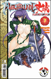 Witchblade Takeru Manga #7
Writer: Yasuko Kobayashi
Translated By: Shoko Onoo and Brian Buccellato
Artist: Kazasa Sumita
Colorist: Blond
Letterer: Troy Peteri
Cover A: Kazasa Sumita
Cover B: David Mack
Review: Tim Glancy
The country of Japan has brought some fine, fine things to us: Sony's PlayStation, Godzilla, Transformers and Nintendo to name but a few. However, if there is one thing that I wish our Japanese friends had kept to themselves, it's manga. Lord only knows how many times I have gone to the local Borders to try and read or purchase a graphic novel and had to climb over a bunch of teens and tweens wearing pants that are eight sizes too big and black T-shirts (along with wrist bands and wallet chains) just to get to the good ol' American comics. I just don't see the appeal of androgynous characters with swords and crazy powers yelling until tears roll out of their entirely too-large eyes. Then there's the scantily clad, disproportioned sexpots with big guns fighting mutant robots.
So imagine my dismay when Witchblade Takeru Manga arrived in my inbox.
My trepidation was rewarded within the first four pages. In those pages we get our first crotch shot of a scantily clad, disproportioned woman (even by Witchblade standards, the skin and large jiggling parts is crazy) fighting some mutant robot / monster or something while some guy watches and gets caught in the crossfire. This book is like a "Why Tim Hates Manga" guide. The story, from what I can gather, is okay, but it is very hard to follow thanks to awful panel placement and weird word balloons. Really, this issue is just one long fight scene. Spewing blood, nearly bare breasts and gratuitous camel toe shots are the order of the day.
This is by far the hardest book I've yet to review. The story is nonexistent, so critiquing the writer is next to impossible. I can tell you he writes a good fight scene and some gruesome deaths, but that's all there is. As for the art, it's typical manga T&A. The colors pop, so that I can praise, but the art itself isn't anything new. If you've read one adult-themed manga, you've read Witchblade Takeru Manga.
I guess what it comes down to is that, honestly, I am not the market this book is going after. I am a family man with my eyes set on Marvel and DC, so this style does not connect with me. Teens who hate Amazing Spider-Man circa 1986, they'll love this. This book is aimed at emo boys who have trouble getting girls and want a book full of violence, panty shots, big boobs and blood. Lady Death and the other bad girl comics of the 1990s would be proud. So unless you're a sophomore or a socially repressed, girl-free loner, skip Witchblade Takeru Manga. I'm sure there's a market for it, I'm just glad I'm not part of it.
 Wolverine: Origins #16
Writer: Daniel Way
Penciler: Steve Dillon
Inker: Cory Petit
Colorist: Matt Milla
Letterer: VC's Randy Gentile
Cover A: Marko Djurdjevic
Cover B: Ed McGuinness
Review: Tim Glancy
When Marvel decided to give Wolverine his memories back, I was in the camp that was severely concerned with how this would play out. One of the things that made Wolverine so interesting over the years was the fact that he was a mystery — not just to us, but to himself as well. At the end of the day and despite his violent nature, the character was quite tragic. Imagine not knowing anything about your life. Imagine having to figure it out in bits and pieces. That's Wolverine. A lot of people were worried that once he regained his memories nothing would change for the character; he would simply call himself James and go about his business as usual. Marvel than announced the Wolverine: Origins ongoing series, which was meant to tie together Logan's various histories and gaps in his memory. The series has walked a fine line between telling great stories (such as the initial tale about Nuke) and being pretty damn confusing (as happened with the Omega Red and Maverick storyline). However, the one thing that this series has accomplished issue in and issue out is making Wolverine a much more three-dimensional character.
Issue 16 looks to offer the best story to date. Tying directly into Uncanny X-Men #266 (which is reprinted here), Daniel Way looks to further explore the interconnected histories of Wolverine, Captain America and the Black Widow. This issue takes place between the panels of Uncanny X-Men #266, and it's interesting to see another writers take on one of the most popular stories from that era. Way has done a tremendous job of weaving decades-old stories into the current Marvel landscape. Nothing feels shoehorned, and the characters are nailed just about every time Way sets pen to paper. What's interesting, however, is how they differ from one time period to the next. Look at how you act now and compare that to how you acted a decade ago. There's quite a difference, and comic characters shouldn't be any different. Way gets that. These characters don't feel like their modern incarnations transported to the past; they're wholly different people. It's a hard thing to do — writing characters that are true to themselves, yet entirely different due to a lack of life experience — yet Way nails it.
The art in this series is really best described as solid and unspectacular. To me, it reminds me of the way Tim Duncan plays basketball, in the sense that it is technically strong and always delivers, but lacks the flash of a Lebron James or Dwayne Wade. Dillon delivers crisp, clean art, but lack the visual flair of a Michael Turner or Joe Mad. And that, to me, is a good thing. I will take solid, well-drawn characters and backgrounds that help enhance the story over flashy, over-rendered characters any day of the week. The best compliment I can give actually came to me while reading the preview for Wolverine #56 (which was also included in this issue). Dillon's art reminds me of Howard Chaykin, and that is an extremely high praise. Dillon manages to give the characters distinct designs when they're in different time periods. Both Logan and Steve Rogers appear younger, as they should. You can almost see the naive streak running down Caps back, thanks to the art.
Also, as I mentioned above, with this issue you get a preview to Wolverine #56 and a full reprint of a classic Uncanny X-Men tale. And you know what? Marvel didn't need to include any of that to have a great book on their hands here. Way and Dillon have put together an interesting comic over the past year, and this new storyline looks to build upon that pedigree. Make sure to buy this on Wednesday, because you won't be disappointed.


