Is It Wednesday Yet?
24 July 2007
24 July 2007 — Here we are again with another installment of your favorite comic book review series. As always the comics you're about to read about won't be released until tomorrow (25 July 2007), so these reviews are free of spoilers and should help inform your purchases on new comic book day.
Our grading scale is simple:
Buy: An excellent comic book.
Borrow: A good comic, but save yourself some money by reading a friend's copy.
Flip Through: Give it a once-over at the comic shop.
Skip: This doesn't need to be explained.
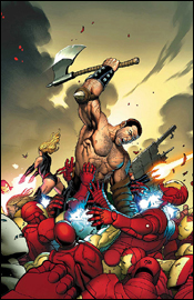
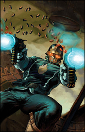 Annihilation: Conquest — Starlord #1
Writer: Keith Giffen
Penciler: Timothy Green II
Inker: Victor Olazaba
Colorist: Nathan Fairbairn
Letterer: Rus Wooton
Cover: Nic Klein
Review: Desmond Reddick
I wanted to like this series... I really, really did. I haven't been following the Annihilation event but Star Lord is a 70s character who in itself was an homage to the space pulps. That I like.
What I wanted, and what the cover was advertising, was a shoot 'em up space opera pulp series. But the cover, as beautiful as it is, could not be further from the content of the book if it was a picture of a raccoon climbing a tree, literally. Instead, what we get is a satirical take on the character. Satire is okay, if it is done right. Here it is not.
As far as the satire goes, one would assume that Giffen's gift for comedy would work, but here it truly falls flat. Perhaps it was my ruined expectations that soured the comedy for me, but I feel that a more serious look at Starlord and his cohorts would have served the story (and the overall attempt to bring Marvel's cosmic universe to the forefront) much better.
You see: the art is beautifully reminiscent of European science fiction often found in the pages of Heavy Metal. It's innovative character design and cold, stark realism mixed with a healthy does of realistic comedy makes this style nearly unbeatable in North American science fiction comics. The colors and textures are beautifully portrayed in that European style as well. For that the artist earned a lot of respect.
The unfortunate thing is that much of the European style of storytelling is here adopted. You see, European comics are most often delivered in the graphic novel format and thus, they can afford to have 22 pages where nothing happens in a 150-page graphic novel. A 22-page comic book, on the other hand, cannot afford this. The only action in this issue is done in a stilted flashback shown in solitary images with no fluidity whatsoever. While the art is wonderful, it doesn't help that the rest of the issue is essentially filled with talking heads.
Nothing happens in this book besides needless exposition, and gags. One would think that the catch-up page at the beginning of the issue would let the story have some breathing room without trying to explain what is going on in all of the other books. It would have been better served as a two-part backup story in a book where something happens.
Despite the wonderful cover and interior art, it is for the story that I say skip it.
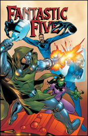 Fantastic Five #2
Writer: Tom DeFalco
Penciler: Ron Lim
Inker: Scott Koblish
Colorist: Avalon Studios
Letterer: Dave Sharpe
Cover: Clayton Henry
Review: Michael David Sims
If there's one thing I can't stand in comic books it's dialog which outlines what we can clearly see, and that's exactly how this book opens. As Doctor Doom crashes through the Fantastic Five's headquarters, Reed exclaims, "Use your force field to protect yourself, Sue! Doctor Doom has returned!" Dialog like this wouldn't be so bad if Dr. Richards was delivering it to a rookie member of the FF, but when bestowed upon Sue it comes off as patronizing (as if she's too stupid to realize that their old enemy has just burst through the wall) and does nothing for characterization.
Sue's been a member of the team just as long as Reed, and knows how to handle herself against the toughest opponents. So when Reed orders Sue to protect herself, he comes off as the overly protective father / "I know what's best for you" type. And that's not who he is. Worse yet, it gives off the impression that Sue is weak — inexperienced, even — which is something she's most certainly not.
Opening characterization and clunky dialog aside, the rest of the issue is handled well. More powerful than ever, Doom's in his typical Richards-hating ways. Which is always good. (Some might call it clichéd, but, really, this is classic Doom here.) The Thing's flashbacks serve to explain why he'll never quit, no matter how slanted the odds may be. Johnny's frustration is very real — who among us hasn't felt like they were being belittled by an older relative or boss? So at least in that regard, the characters are on.
The story itself isn't anything new, but seeing Doom destroy the expanded clan is made all the more powerful when one realizes that in a single issue he was able to best not four or even five superpowered heroes, but six (and that doesn't count the events of the preceding issue). Seeing as how Doom's a personal favorite of mine, this brought much joy to my reading experience. I know in the end he'll suffer his comeuppance (just as I know telling you he wiped the floor with the team early on in the miniseries isn't a spoiler; it's expected), but for the time being the sight of Doom triumphant is a pleasant one.
As mentioned during episode 128 of Earth-2.net: The Show, Ron Lim has always been a personal favorite of mine. His sleek artistic style lends itself to cartoony imagery, but he isn't afraid to get down and dirty. And I appreciate that. An artist who can mold his style to fit the script is a master, and that's what Lim did in Cable & Deadpool #42 and that's what he did here in Fantastic Five #2. When Doom's presence needs to be felt, the art is powerful. When rage fills a character, our hearts race. When emotions run high, the tension can be felt. A lesser artist wouldn't be able to express so much from one panel to the next, but it's all there thanks to Lim's experience and willingness to go the extra mile for his craft. And that last page... oh, that last page!
My only problem with the art — and it really does pain me to say anything negative about Lim's work — is that Susan looks no older than her current in-continuity self. In fact, at times she appears younger. Everyone else looks a tad older (Reed's face is a little aged, Johnny's hair has receded, Franklin is a young man, Ben... well, Ben is missing a limb), but Sue is actually slimmer than I've ever seen her — and that includes her Ultimate counterpart. It doesn't hurt the issue per se, but we can't forget that she'd be pushing 50-ish in this timeline.
Despite a weak start, the issue picked up (thanks mostly to Ron Lim) and remained strong throughout. Not strong enough to buy, but surely strong enough to borrow. My suggestion on how to improve future issues: more Lyja.
 Heroes for Hire #12
Writer: Zeb Wells
Penciler: Clay Mann
Inker: Terry Pallot
Colorist: Brad Anderson
Letterer: VC's Joe Caramagna
Cover: Takeshi Miyazawa
Review: Michael David Sims
Unlike Civil War, I'm not buying any of the World War Hulk tie-in issues. Not for lack of interest or because there's too many (there's not); it simply boils down to economics. I buy what I buy and can't really expand my horizons beyond that. But if this issue is any indication of the quality of Heroes for Hire under writer Zeb Wells, I almost wish I had dropped something so as to add this nearly cancelled title to my monthly shipment.
To the book, or at least this issue, Wells brings a very dark, perverse humor. Humbug's actions are both funny and repulsive. On one hand I want to like the guy and can empathize with the outsider, but on the other... he's Humbug. I just can't connect with a bug-loving superhero (Spider-Man and Ant-Man excluded). But it's fun trying.
As a tie-in, the issue does an excellent job of folding the Heroes for Hire into World War Hulk. Never did I feel the concept being stretched too thin. If anything, I wanted more.
The main story runs a mere 16 pages, with a needless six-page backup story rounding out the remainder of the comic. More scenes with Hulk's Warbound and their interactions with the Heroes would have served the story and characters better. As is, I felt like I only got to know Humbug and maybe Shang-Chi (though his dialog is limited). Now the last thing I want is every character vying for attention in an ensemble comic, but when characters do nothing but stand around in the background I'm left wondering why they were included. I understand it's a delicate balance between telling the story and representing each character, but it can be done. Here, not so much. But I don't blame Wells for that; the 16-page format is to blame. Had the story been allowed the full 22 pages, I'm convinced Tarantula and Colleen Wing would have been given more time and dialog in which to illustrate their character.
Don't get me wrong, the characters who take center stage are strong, but it's a shame to see other characters reduced to what amounts to wall-leaning.
Set against a backdrop of alien insects and a grim spaceship, Clay Mann did a splendid job of capturing the haunting (dare I say "icky"?) world the Heroes must infiltrate, and truly excelled when it came time to express the emotions of the hiveling who befriended Shang-Chi. This relative newcomer has a bright future, and I hope Marvel is wise enough to keep him busy once his tenure on Heroes for Hire has come to an end.
Even though I liked this book, I can't give it a buy. The connection to Planet Hulk and World War Hulk might confuse readers who are coming in with no prior knowledge of either series. Yes, there's a brief PH / WWH recap page, but it doesn't do much in the way of explaining who these aliens are and why they matter to the overall World War Hulk storyline. With the story taking place on their ship, a greater emphasis should have been placed on explaining who the Warbound are. (In addition to the recap page, brief bios about the aliens would have sufficed.) That said, borrow.
 Incredible Hulk #108
Writer: Greg Pak
Penciler: Leonard Kirk
Inker: Scott Hanna
Colorist: Chris Sotomayor
Letterer: VC's Joe Caramagna
Cover: Greg Land
Review: Michael David Sims
It's one thing for ancillary tie-ins to feel like filler. Hell, it's almost expected. Companies want to make money and the best way to do that is to slap a banner across the top proclaiming it as part of the big summer event. Usually this results in creators setting their plans aside for a few months in order to serve the company, rather than the book their working on. Stories suffer. Characters suffer. Fans suffer. Yet the companies make money. It's a sad fact of reading superhero comic books that we've come to accept. However, it's something else when one of the crossover's main titles feels like filler.
World War Hulk isn't a yearlong epic; it's five parts. It doesn't need to be stretched and filled with useless material like a 52-part weekly series. Each issue should be tightly packed with action, drama and characterization. What Incredible Hulk #108 offers is a comparison of Hulk's two closest friends: Rick Jones and Miek.
It's interesting that their pasts are so similar and it makes one wonder if writer Greg Pak planned to draw the parallels all along, but the connections didn't need to fill an entire issue of Incredible Hulk. A one-shot where we see how the Warbound aren't so dissimilar from Hulk's former friends and allies? Sure, that might actually be cool. Here it feels like wasted time.
Unless Miek and Rick ally themselves in the end, or Hulk has to choose between saving one or the other, or one of them is killed at the other's hand, I just don't see the point in retelling these three origins (Hulk's being the third).
Hopefully Incredible Hulk will get back on track after this, because the previous issues were quite good. Until then, skip this one.
 Mighty Avengers #4
Writer: Brian Michael Bendis
Artist: Frank Cho
Colorist: Jason Keith
Letterer: Dave Lanphear
Cover: Frank Cho
Review: Desmond Reddick
I'll preface this by saying that I've been reading this series since its inception. I was going through a bit of Bendis fatigue even though I consider him the best dialogist in the business. However, this book is not just great as far as dialogue goes; not only does it excel in superhero action; it is an experimental departure of sorts for Bendis.
Bendis has single-handedly brought back the thought balloon and is using it to amazing effect. The thought balloon was hokey because it offered artists an out. They didn't have to render expressions thanks to the balloons, because readers were being told what was going on — rather than being shown. The beauty of a visual medium is that it is so much easier to show than it is to tell, and Frank Cho plays off of this very well. He leaves the thought balloons to show us what the characters are really thinking. This process gives a book full of unbelievable superhero action heavily reliant on the suspension of disbelief a dose of reality.
First I'll mention that the team Bendis assembled wasn't initially my cup of tea, but they've really grown on me. Not because of single characters, but because of the interaction and team aspects. Iron Man, Black Widow, Ms. Marvel, Wonder Man, Sentry, Wasp and Ares all meld together into an amazing cast that plays off each other in a way that Bendis' other ensemble casts don't seem to.
The story is a continuation of earlier issues where a new version of classic Avengers villain Ultron — who now looks like Janet Pym, a member of the Avengers and the ex-wife of the man who created Ultron — has seemingly consumed Tony Stark before enacting a doomsday protocol. Meanwhile, there are serious rifts in the team that are made apparent with said thought balloons. Whether you like it or not, one can never say that the book is lacking action, character and story.
It's frenetic, action-packed, exciting, surprising and, to top it all off, emotionally powerful. Add in the amazing art of Mr. Frank Cho and you have one winner of a book. Buy this book or I'll send Ares after you.
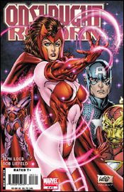 Onslaught Reborn #4
Writer: Jeph Loeb
Artist: Rob Liefeld
Colorist: Rob Liefeld
Letterer: Richard Starkings
Covers: Rob Liefeld and J. Scott Campbell
Review: drqshadow
Jeph Loeb and Rob Liefeld have teamed up to deliver Onslaught Reborn #4, shipping this week from Marvel Comics. Amazingly, it's been 10 years since Liefeld and then-partner Jim Lee teamed up to refresh some of Marvel's most noteworthy properties, and the publisher is celebrating that anniversary with this five-issue limited series. I've missed the first three chapters, so we'll dive right in here with issue number four.
In traditional Liefeld fashion, most of this book's panels aren't afforded the luxury of a background, and those that are given this special treatment overflow with needless winks and nods at the reader, distracting from the story and interrupting the action. A wrecked car sits at the edge of one panel, with a license plate that reads "LIEFELD." It's then shamelessly repeated further down the page before the backdrops are once again left to the imagination of the colorist (Liefeld himself).
Constant inconsistencies with Iron Man's appearance, along with Liefeld's... special grasp on human anatomy don't help matters. I don't know how the Scarlet Witch gets a breath of air into that outfit. She's so top-heavy that if she tried to stand completely upright, her spine would buckle under the pressure... but that's the case with all of his female characters. Every moment of every panel is filled with tight-fitting wardrobe, grit teeth, painfully overflexed musculature and squinting eyes. It's all the worst bits of the Image Comics style without any of the personality or flair.
It's like the guy hasn't learned anything from his rise to and fall from stardom in the mid 90s. His work hasn't evolved, he hasn't addressed the holes in his game and without their outfits I couldn't distinguish one character from another. I feel like I've been reading an old issue of Youngblood with a new writer and a different cast of characters.
I've long been a proud Jeph Loeb supporter, but I can't honestly defend his work here. Some of the dialog he delivers between Iron Man and Captain America is so hokey. I have a hard time imagining that he's actually responsible. I don't think Ant-Man has an original phrase in the book — they're all borrowed from one source of pop culture or another. Onslaught's lines are straight out of the "stereotypical, megalomaniacal evil villain playbook," and the good guys' comebacks are such hackneyed, machismo-soaked garbage that I rolled my eyes a half dozen times before even reaching the halfway point.
Even as a standalone issue, the story is filled with inexplicable holes and coincidental pauses in the action. Battles screech to a halt so characters can deliver their monologues on cue. Villains reuse the time-honored tradition of assuming their plans will succeed before they've actually begun to execute them. I don't even know what happened at the end of the battle between Onslaught and Captain America. It's the sort of story that punishes its readers for trying to think for themselves.
Everybody probably has a book like this one in their collection somewhere, even if they're too embarrassed to admit it. It's an issue produced with little attention to detail, minor personal investment and every intention to look hip, smart and cool on the big stage. Loeb left just enough room for Liefeld to slide in three or four two-page spreads, which have long been his specialty, but beyond that there's really nothing worthy of your attention here. If you're looking for something with even a shred of substance, skip this and raise your head up high. Onslaught Reborn is exactly what you'd think it would be.
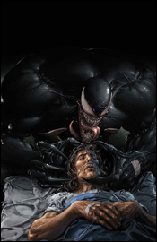 Sensational Spider-Man #39
Writer: Roberto Aguirre-Sacasa
Breakdowns: Rick Hoberg
Finishes: Stefano Gaudiano
Séance Art: Clayton Crain
Colorist: Matt Milla
Letterer: Cory Petit
Review: Desmond Reddick
Part two of two of the "Last Temptation of Eddie Brock" storyline has a cancer-ridden Eddie Brock being haunted by the piece of the symbiote still left in his mind. Of course he is in the same hospital as Aunt May and decides to get his final revenge on Peter Parker by killing her. This is where the issue starts.
The art is suitably dark. Gaudiano is one of my personal favorites and even though he provided finishes, his style really came through. The art is topnotch for this story. Then the séance scene comes along, and the painted Clayton Crain art comes into play. They are distinctly different but play well together. Which is something not often done well. The Crain artwork is very surreal and suits the subject matter perfectly.
The dying Eddie Brock is very compelling. His desperation really comes through and you almost feel sorry for him until you are reminded of his plans for Aunt May. His story in this issue really takes the cake. But then again, I'm not a fan of the séance scene in any kind of medium. Just not my bag, but thankfully the issue focuses on Brock.
What I love is that this is essentially a horror story at heart within a superhero book. Usually that is ruined by superheroics but here it isn't. I am happy that there was enough confidence in the story to run with it and boy did they!
The heart-pounding pace of Brock's story is actually made that much more exciting by the quick breaks featuring Parker and his supporting cast. My heart was actually speeding up by the end of the issue and was hardly left off the hook. This book has a very cool ending which was also a bit ballsy.
As far as "adult content" goes, there are some moments that make me question their inclusion in a Spider-Man comic. Of course, I'm the last to complain about this kind of stuff, but a Spidey book should be able to be read by a four or five year old without worry. And I'm not sure this one fits the bill. But it's just fine for this warped mind.
It's for this reason I'm recommending you borrow it. It may be a little heavy for some, but check it out before you buy it just in case. I don't think you'll be unimpressed.
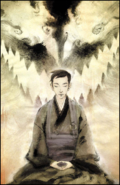
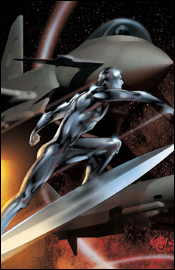
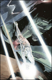 Silver Surfer: Requiem #3
Writer: J. Michael Straczynski
Artist: Esad Ribic
Letterer: Cory Petit
Cover: Esad Ribic
Review: Desmond Reddick
I fully believe that, without the surfboard, Silver Surfer would be one of the most popular characters in Marvel's library. It's too bad he hasn't been evolved in any real way since he turned on Galactus all those years ago. In fact, it is an even greater shame because they are apparently going to kill him off in this series.
It upsets me to see such an amazing character, a Jack Kirby creation no less, being laid to waste as Marvel's rival is doing to the New Gods. If this much effort was put into these characters without killing them, I'm certain they would catch on. Surfer should be a major force in the Marvel Universe.
This issue is a great piece of storytelling as the Surfer tries to make peace with his fate. There are touching moments with a friend and a very Silver Surfery moment with a pair of alien races that punctuate the issue. It is poignant and touching at times as well as awe-inspiring at others. I haven't been the biggest fan of JMS's writing, but he hit the nail right on the head here. While the story is far from innovative, it captures the wonder of the Silver Surfer. It's what a writer should do: serve the character instead of their own ego. It was nice to see.
Not to forget the amazing painted art of Esad Ribic (of the amazing Loki miniseries from a few years back). The art depicts the cosmos and colored light in ways that regular color separation can't. It's lush and deserves only the highest praise. I can't wait to see what Ribic does next. I'd love to see him on Tomb of Dracula. I'm available to write if they can't find anybody...
But I digress. It's bittersweet enjoying this issue knowing that there's a good chance the ending will be very sad for Marvel comics. I am, however, tempted to see him return home to Shalla Bal, so I'll be around for the next issue.
So, dear reader, do comicdom a favor and buy the crap out of this series to convince Marvel to bring ol' Norrin Radd back before too long.
 Spider-Man Fairy Tales #3
Writer: C.B. Cebulski
Artist: Kei Kobayashi
Letter: Dave Sharpe
Cover: Kei Kobayashi
Review: Tim Glancy
Marvel loves to take familiar stories and retell them in new and interesting ways. Seeing as Spider-Man is their flagship character, he is one of the most frequent stars in these types of stories. Sometimes, like with Spider-Man: India or Spider-Man: The Manga, the result is a severe miss. Other times, like with Ultimate Spider-Man, the result is a sure hit. The other thing that Marvel does better than anyone is taking a successful concept and pushing it out to the masses through multiple stories and titles. Case in point, the Fairy Tale line. Last year, X-Men Fairy Tales was released to critical acclaim. The premise was pretty simple: take classic X-Men characters and plotlines and retell them through classic world fairy tales. In the Merry Marvel tradition, we are now seeing this formula repeated with Spider-Man, and the results thus far have been just as good as the previous series.
Issue three takes us through a traditional Japanese fairy tale, but also through the retelling of the turning point in Peter Parker's life and his career as Spider-Man. The visuals here, handled by Kei Kobayashi, are simply breathtaking. The art isn't the typical American or even Japanese styles, but instead a rough, almost unfinished style that I found extremely beautiful and just tremendous to look at. You see the sadness in "Peter's" eyes and face, the compassion in "Aunt May," and the strength that "Uncle Ben" always seems to exude.
However, no matter how great the pages look, it means nothing if the story isn't solid and C.B. Cebulski crafts a wonderful story here. He took a classic tale in the form of Spider-Man's origin, adapted it to a medium that it was never meant to be adapted to and managed to make it as fresh and interesting as it was when it was first presented in Amazing Fantasy #15. The reason that Spider-Man in particular works so well in fairy tale form is that a majority of fairy tales are designed to teach children virtues, and Spider-Man exemplifies that more than any other comic. Cebulski is a writer I am, until now, rather unfamiliar with, but you can rest assured I will pick up future titles with his name attached to them. The pacing of the story is tremendous, and the dialogue never gets in the way. There are plenty of panels without dialogue, but thanks to the art and the emotion written into the characters, there pacing is swift.
As you can guess, I highly recommend this issue and the Fairy Tale concept in general. Comics as a whole have been pigeonholed into superheroics, and it's rare to see a book break that mold and succeed in doing so, especially a superhero book. I recommend this about as highly as I can: it's not just a buy, but a must buy!
 Ultimate Fantastic Four #44
Writer: Mike Carey
Artist: Pasqual Ferry
Colorist: Justin Ponsor
Letterer: VC's Rus Wooton
Cover: Pasqual Ferry
Review: Tim Glancy
I have a confession to make: I love the Fantastic Four. I have another confession: I stopped reading Ultimate Fantastic Four once Mike Carey came aboard. Not that I don't think Mike Carey is a talented writer, because I really enjoy his work. I didn't enjoy the Ultimate retelling of the Fantastic Four because, to me, the early Fantastic Four stories are among the best comics of all-time. You had adventure, romance, comedy, family and action all mixed together in a single book that appealed, and still appeals to all readers. And that is really what made the Fantastic Four a huge success and a favorite to millions of readers. Ultimate Fantastic Four, to me, took a lot of that wonder and action out and tried to go for more in-depth, science fiction type stories. While this works as a new story, it strays way to far from the original model to really work, and creates a book that is good, but in no way an homage to the book it was meant to portray.
So, you can imagine my trepidation when Ultimate Fantastic Four #44 hit my inbox. This is part three of the five-part "Silver Surfer" storyline. I went into a book store today and read parts one and two, and I was actually quite pleased by the plot and pacing. Surfer's introduction was well done, and the action was great. However, as a Fantastic Four story, it again lacked the it that makes the 616 book a tremendous read. This issue is much the same manner. As much as I love Carey's storytelling and Ferry's art, which is severely underrated when talking about the best in the business today, I just couldn't find my way into the story. There humor and human investment are lacking, making it difficult to feel for the characters when they're in trouble.
No matter what I say, those of you who love it are going to buy it, and I get that. In the same sense, if you have made up your mind that you hate the Ultimate Fantastic Four, and I had said I loved it, you wouldn't have bought it. I'm not going to change your mind. The Ultimate line is too polarizing for that, and this seems to be the most polarizing title of them all. I know that a traditional review will come to a concrete conclusion, but this is a case where there are really two trains of thought. If you're looking for a book that feels like an old issue of the Fantastic Four, full of adventure and the same feeling you get reading a Kirby / Lee issue, give Marvel Adventures Fantastic Four a read. Or just buy Essential Fantastic Four, because Ultimate Fantastic Four isn't going to fill that need. However, if you're looking for a tremendous sci-fi comic story, with characters you are familiar with and with tremendous art and writing, give this a shot. Based solely on the merits of the book alone and the story being told, it is a good read.
I'm going to split the difference and call this one a borrow. It's worth reading, for sure, but it may not be your cup of tea.
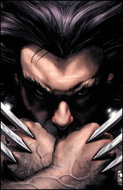 Wolverine #55
Writer: Jeph Loeb
Artist: Simone Bianchi
Colorist: Simone Peruzzi
Letterer: Richard Starkings
Cover: Simone Bianchi
Review: Tim Glancy
The current Jeph Loeb arc on Wolverine, "Evolution" is pretty confusing and all around awful.
Now, I know what those of you who are familiar with my writing are thinking: "Here's negative ol' Tim. He isn't going to give these books a fair shake." But nothing could be further from the truth. The odd thing is, I love Wolverine and I love Jeph Loeb, so I went into this arc stoked to the gills. I couldn't wait to see how Loeb — who wrote what I think is the best modern Batman story since The Killing Joke — took on a character that was really arriving at a world of possibilities, having recently regained his memories. I was a little hesitant in the choice of artists, because I think Loeb's style lends itself more to the traditional comic book artist, like a Jim Lee, Tim Sale or Ed McGuiness. Turns out the art would be the least of my worries.
The storyline has been at times confusing and at other times all around hard to follow. Apparently Wolverine and Sabertooth are part of some lupine family that also involves Feral and Wild Child and a few other wolf-like creatures from the Marvel U. This story is told through rather random dreams and flashbacks, and when it got down to it, Sabertooth went crazy and killed Feral and now Wolverine is pissed. This all revolves around some character named Romulus, who is still unknown, and is the man behind the relationship between Victor and Logan.
So now we come to the culmination of the arc, and if you go into this one expecting all the questions to be answered, prepare to be disappointed. There are some good moments, but it feels like it should be the middle part of an arc — not the end. We're treated to the same mix of flashbacks and random memories that have filled the previous issues in this storyline, and they continue to confuse the matter. There were times when I literally didn't know what was going on from page to page, and in some cases panel to panel (what panels there are at least), and that is all down to the writing and the page layout.
As mentioned above, the art is not the weak point here, and Simone's style has grown on me to a tremendous degree. The visuals are clean, easy to follow and help convey the emotions of the characters. You feel that Creed has lost it, and that Wolvy is pissed and going to end it. The emotions raging through these characters, as well as their personalities, are one of the few things Loeb got right in this arc. Everyone from Wolverine to Storm to Black Panther act as you would expect them to in any other comic. It's just a shame that when a talented writer was handed one of the most interesting characters in the Marvel U, he crafted such a hard to follow story — not to mention a story that strays so far from what we know of the character. The arc has built towards one moment, and that moment is handled well, but I am skeptical to say the least.
At the end of the day, I really have to recommend skipping this book. Unless you've read the first five parts, there's no reason to grab this one.
 X-Men #201
Writer: Mike Carey
Penciler: Humberto Ramos
Inker: Tim Townsend
Colorist: Edgar Delgado
Letterer: VC's Cory Petit
Cover: Humberto Ramos
Review: drqshadow
Last issue, Mystique blindsided Rogue's squad, reformed the Marauders and nearly decimated the heroes in one fell swoop. This month? Fightin'. Lots and lots of fightin'.
Humberto Ramos is an artist that I've always meant to get really into, but never really got around to investigating more closely. It's been years since I've seen his work and while there were always similarities between his art and that of Chris Bachalo, over the years he's accrued a nice variety of styles. I'm seeing shades of Joe Quesada here, bits and pieces of Joe Madureira there, and enough fresh work to know that he isn't ripping any of them off.
Ramos really excels in these battle scenes, where the dialog is kept to a minimum and he can focus on the story of a large-scale brawl on his own. He maintains Wolverine's squat proportions, while keeping his appearance ferocious and dangerous — which is nowhere near as easy as it seems. His take on Cannonball is explosive and intriguing. Seeing both in the heat of the battle only serves to further highlight his talent. It takes a good writer to trust his collaborator with this kind of a scene, and an even better artist to make it work.
While I'm slowly becoming an even bigger fan of his work, Humberto does have his little quirks and seams. Almost everybody has their mouth hanging wide open throughout the issue, which initially makes for an outstanding visual. After a few panels, however, one starts to wonder how they're keeping the bugs out of their throats and whether there's a big problem with lockjaw among the superhuman community. He also tends to overemphasize the size of his characters unnecessarily, and occasionally struggles with facial expression. There's a panel midway through this issue where Kitty Pryde looks like she has some sort of a mental disorder. An overwhelming, enveloping visual style can be both a good thing and a bad thing, and Ramos doesn't quite know how or when to show restraint. It's all-dynamic, all the time.
Mike Carey does a fairly good job of balancing the high-intensity fight scenes that dominate this issue with a few scattered change of pace segments. While he's dedicated to advancing the main plot through explosions, mutant powers and knock-down-drag-outs, his best writing in the issue is with a conversation between Kitty and Peter back at the mansion. He explains more about these characters through a short chat about scary movies than he could with any amount of fireworks or fistfights. As a matter of fact, there's a fair amount of dialog throughout the issue for an action book, but it's never too verbose and it remains realistic and subdued throughout.
My main complaint about the issue is that it reads too quickly. Since it's primarily an action issue with a few brief asides, that's to be expected, but it remains a problem. Unless you're familiar with a lot of these characters, you're likely to be overwhelmed, too. There are a lot of faces scattered around these pages — more than four teams' worth of heroes, villains, tweeners and outsiders — and there isn't the room nor the inclination to introduce them all for first-timers.
The artwork is outstanding, the writing has moments of brilliance and neither creator is hesitant to take serious risks with these big-name characters, which makes for a fun read. If you're any kind of an X-Men enthusiast, this book will already be on your radar, regardless of my opinion, and with good reason. If you're like I've been, casually browsing the titles for some time but never seriously following them, borrow this book. You might see a few things that you'll like.
 X-Men: First Class #2
Writer: Jeff Parker
Artist: Roger Cruz
Colorist: Val Staples
Letterer: Nate Piekos
Cover: Eric Nguyen
Review: drqshadow
Telling the forgotten stories of Charles Xavier's first cluster of mutant pupils, First Class serves as a sort of "Year One" for the X-continuity. Before the Beast was blue, before Warren Worthington had gone to the dark side (and back again), there were these tales.
Cruz is no stranger to the X-Men, as he's jumped around the various books beneath that umbrella for several years, and shows a lot of promise as a regular artist here. His style is an interesting mesh of detail and simplicity, never overcomplicating his characters' bodies, but also never pulling any punches on their surroundings. Truthfully, his greatest strength is his work on backdrops and environments. I was twice as taken by the ocean liner surrounded by cloudy skies that carried the team early in this issue than I was by the mutants themselves, and a jungle setting provides him plenty of space to play throughout the story.
When he does get a chance to go detail-heavy in the foreground, as is the case with a few of the monsters in this issue, Cruz really hits the ball out of the park. I'm a big admirer of the work of Geof Darrow, and Roger channels his work nicely in that respect. His understanding of the peaks and valleys of action storytelling are dead on, too. When the fur starts to fly, your eyes rush frantically to the next panel, but when the drama hits a lull he doesn't lose your attention.
Jeff Parker's story is kind of bargain-basement, unfortunately, and reminded me more of the freebies Marvel gives away on certain occasions than a real meat-and-potatoes book featuring some of their most marketable characters. The narrative is stilted and often unnecessary, and the story has some serious issues with pacing. He brings plenty of fresh ideas to the table, but the conflicts are presented and resolved so quickly, it hardly feels like there was much of a threat to begin with.
I had a hard time specifying a timeframe for this story. As a flashback title in premise, I found a lot of the dialog to be way too modernized for its own good. Iceman and Angel play the more freewheeling members of the team, and throw around words that I can't imagine anyone using conversationally in the 60s or 70s, which is when one would presume this is meant to be set. Then again, I guess that would mean these original teamers are pushing 60 in today's books, and we all know that's not the case. Such is an inherent problem when dealing with a "lost stories" title — it forces readers to confront the inaccuracies in the main cast's aging processes.
All things considered, it's not an awful tale — it's just very light reading. Jeff Parker has an excellent grasp of the team's interactions with one another, and delivers good comedy in the story's frequent lighthearted moments. Just don't go in expecting God Loves, Man Kills. Roger Cruz still has a few wrinkles with his style, and may be best suited as a dedicated background artist, but he's got a great grasp on the fundamentals, which is refreshing. This isn't something I'd jump to add to my pull file, but it's worthy of a flip through.


